griffin and sabine by nick bantock andrea wightman english 392a october 16, 2003
TRANSCRIPT

Griffin and Sabine by Nick Bantock
Andrea Wightman
English 392A
October 16, 2003

2
Document Design
Audience: Art lovers, people interested in books that deviate from normal storytelling
Purpose: To entertain, to inspire, to relay the correspondence between two “people”.
Context: Canadian artist who decided to put words to his art.
First book in the trilogy.
3
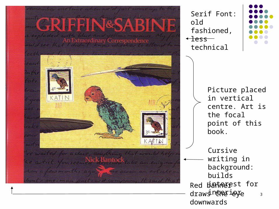
Serif Font: old fashioned, less technical
Picture placed in vertical centre. Art is the focal point of this book.
Cursive writing in background: builds interest for interior
Red banner draws the eye downwards

4
Guttenberg Diagram:
Art follows the reader’s natural focus.
Feather is divided, but continuous.

5

6
Map: Inside Cover
Brings together the worlds of Griffin and Sabine
Sabine’s is more archaic, disorganized Griffin’s follows strict lines, logical Map parallels their life, writing, and art Follows a grid system to divide the
worlds

7
8
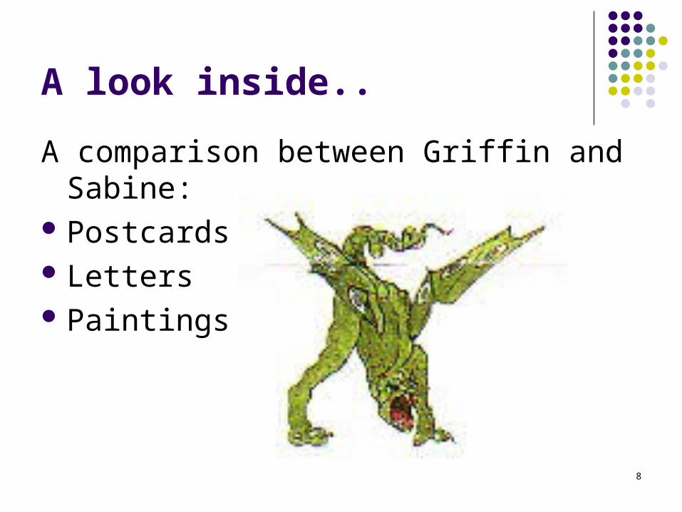
A look inside..
A comparison between Griffin and Sabine: Postcards Letters Paintings

9
Cursive, feminine hand writingDoodle adds noise to the message
Stamp is missing from the back of the postcard.
10
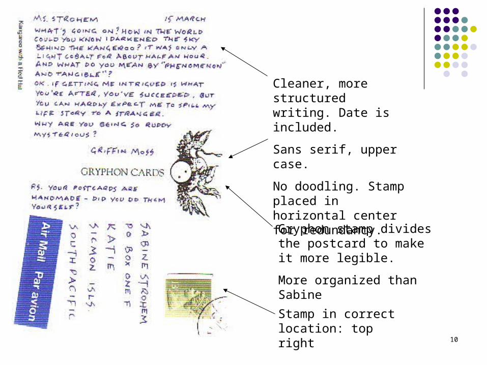
Cleaner, more structured writing. Date is included.
Sans serif, upper case.
No doodling. Stamp placed in horizontal center for redundancy.
Stamp in correct location: top right
Gryphon stamp divides the postcard to make it more legible.
More organized than Sabine

11
Similarity vs. Proximity
Law of Similarity
Things that are similar are perceived as being the same.
Bantock uses this law to distinguish Sabine and Griffin’s letters: both have recognizable hand writing.
Law of Proximity
Things that are close to each other are perceived as being together.
Bantock defies this law by placing the front and back of the postcards on opposite pages.

12
No breaks in paragraphs. Message was written quickly?
More pictures in the margin = noise.
Beige background

13
Letter is written on a type writer, date is included.
Clear divisions between paragraphs.
Signs of editing are visible; more care has gone into this letter.
Absence of noise.

14
Haphazard drawings, little organization
Stamp placed on the front, as if as an afterthought, or put on display

15
Painting follows the Guttenberg diagram: objects fall in the diagonal from left to right
Color of the sky is mimicked in the pond below, trees are reflected for symmetry.
“Kangaroo with a Red Hat”:
Name of the painting is written on the back side.

16
Gestalt Principle
The whole is greater than the sum of the parts. Parts: the individual postcards and letters Whole: the correspondence between Griffin
and Sabine
We cannot understand the meaning of a single postcard without reading the entire text.
Bantock on Gestalt: If you have 2 contrary things going on at once, separate them and allow them to speak with their own voice.
17
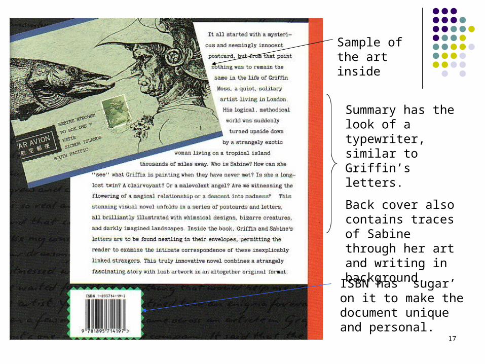
Sample of the art inside
Summary has the look of a typewriter, similar to Griffin’s letters.
Back cover also contains traces of Sabine through her art and writing in background.
ISBN has ‘sugar’ on it to make the document unique and personal.

18
Conclusion
Establishes a balance between image and word in this document.
Differentiates the two writers through their hand writing, design choices and paintings.
Entices the audience to read the entire document, and to anticipate the next edition.
Questions? Comments?