graphing and data analysis (statistics). must do’s in graphing 1. title: the effect of iv on dv 2....
TRANSCRIPT
Graphing and Data Analysis (Statistics)
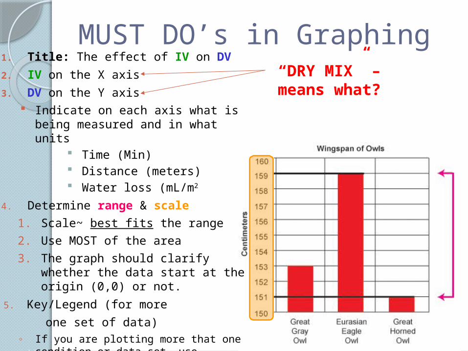
MUST DO’s in Graphing1. Title: The effect of IV on DV
2. IV on the X axis
3. DV on the Y axis Indicate on each axis what is being
measured and in what units Time (Min) Distance (meters) Water loss (mL/m2
4. Determine range & scale
1. Scale~ best fits the range
2. Use MOST of the area
3. The graph should clarify whether the data start at the origin (0,0) or not.
5. Key/Legend (for more
one set of data)◦ If you are plotting more that one condition
or data set, use different lines or symbols for each data set such as circles, squares, triangles
“DRY MIX” – means what?
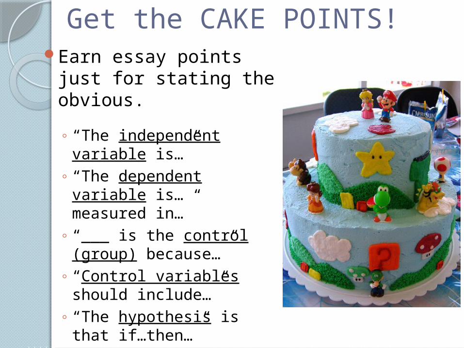
Get the CAKE POINTS!Earn essay points just
for stating the obvious.
◦ “The independent variable is…”
◦ “The dependent variable is… measured in…”
◦ “___ is the control (group) because…”
◦ “Control variables should include…”
◦ “The hypothesis is that if…then…”
◦ Discussing analysis of data
◦ Drawing conclusions about data
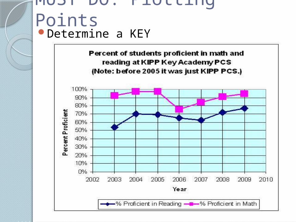
MUST DO: Plotting PointsDetermine a KEY
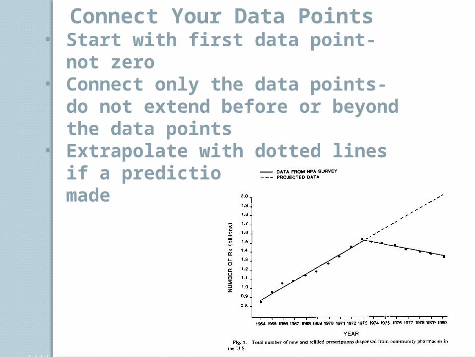
Connect Your Data Points• Start with first data point- not
zero• Connect only the data points-
do not extend before or beyond the data points
• Extrapolate with dotted lines if a prediction needs to be made
The Effect of Length of Worms on Number of Worms Found
Num
ber
of W
orm
sWorm Length (cm)
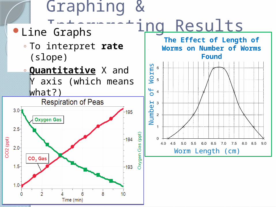
Graphing & Interpreting ResultsLine Graphs
◦ To interpret rate (slope)
◦ Quantitative X and Y axis (which means what?) What if slope is straight,
horizontal line?
The Effect of pH on Enzyme Activity
Rea
ctio
n R
ate
(mg
/sec
)
pH
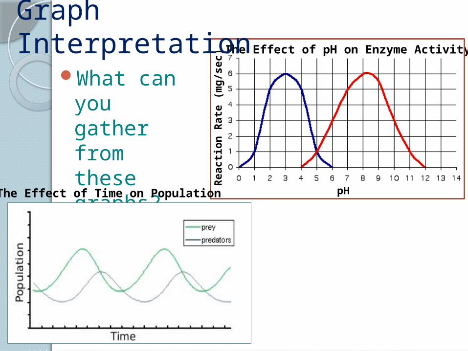
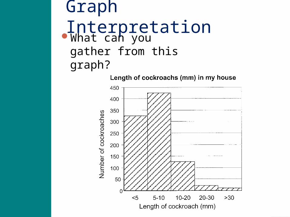
Graph Interpretation
What can you gather from these graphs?
The Effect of Time on Population
Graphing & Interpreting Results
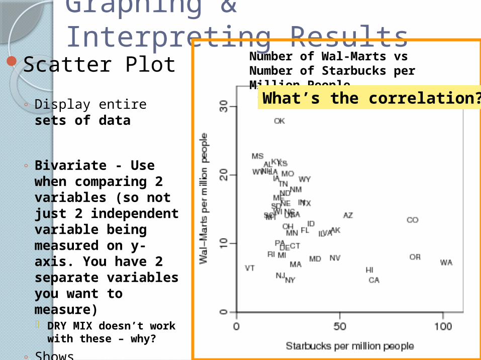
Scatter Plot◦ Display entire sets
of data
◦ Bivariate - Use when comparing 2 variables (so not just 2 independent variable being measured on y-axis. You have 2 separate variables you want to measure) DRY MIX doesn’t
work with these – why?
◦ Shows relationships or correlations between variables
Number of Wal-Marts vs Number of Starbucks per Million People
What’s the correlation?
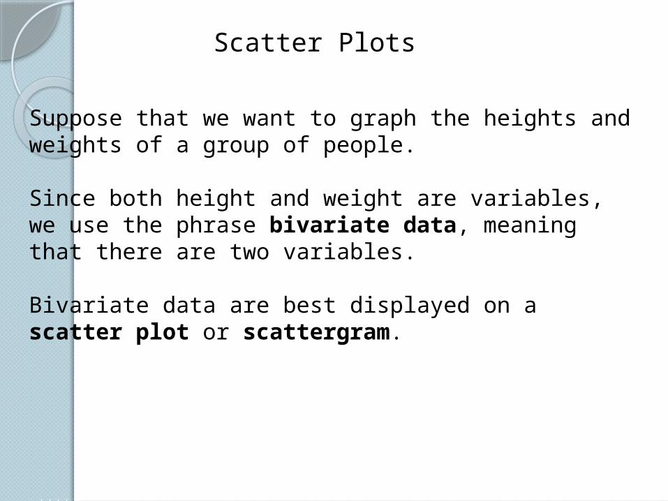
Suppose that we want to graph the heights and weights of a group of people.
Since both height and weight are variables, we use the phrase bivariate data, meaning that there are two variables.
Bivariate data are best displayed on a scatter plot or scattergram.
Scatter Plots
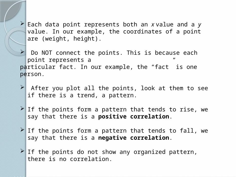
Each data point represents both an x value and a y value. In our example, the coordinates of a point are (weight, height).
Do NOT connect the points. This is because each point represents aparticular fact. In our example, the “fact” is one person.
After you plot all the points, look at them to see if there is a trend, a pattern.
If the points form a pattern that tends to rise, we say that there is a positive correlation.
If the points form a pattern that tends to fall, we say that there is a negative correlation.
If the points do not show any organized pattern, there is no correlation.
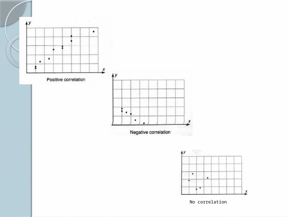
No correlation
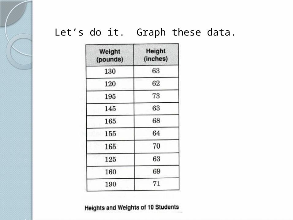
Let’s do it. Graph these data.
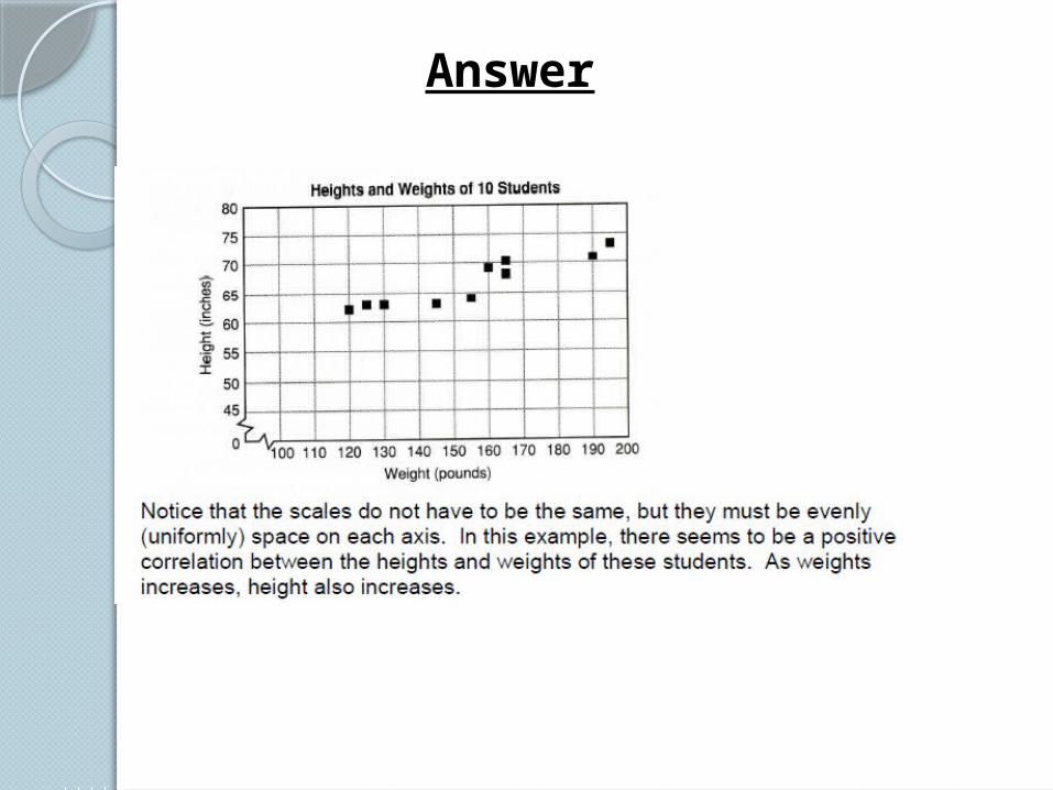
Answer
The Effect of Type of Animal on Heart Rate
Hea
rt R
ate
(bea
ts p
er m
inu
te)
Domesticated Animals
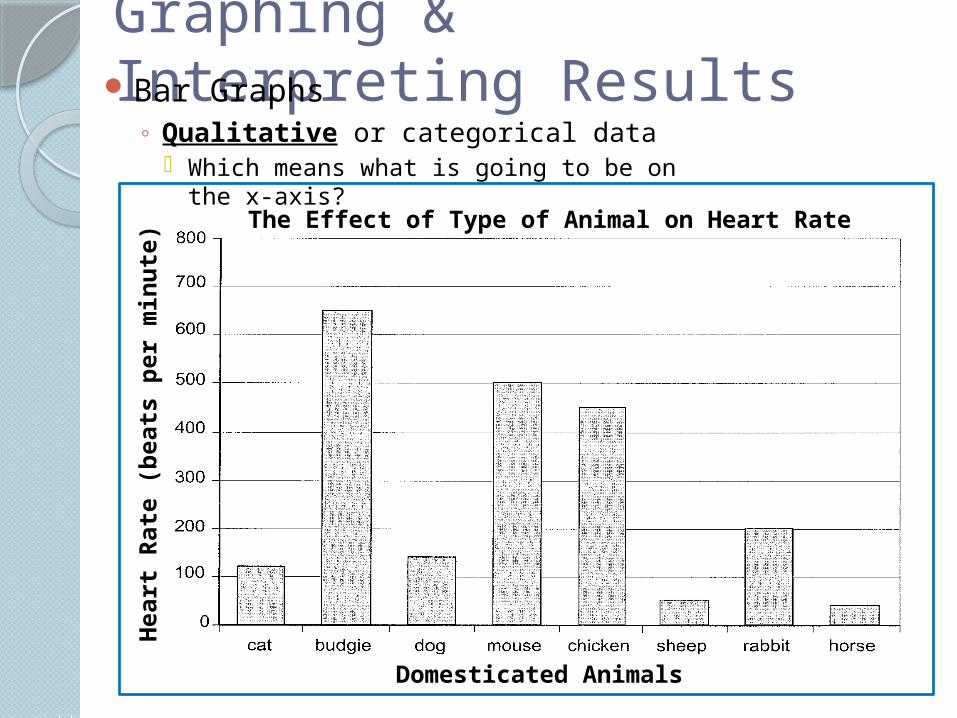
Graphing & Interpreting ResultsBar Graphs
◦ Qualitative or categorical data Which means what is going to be on the x-
axis?
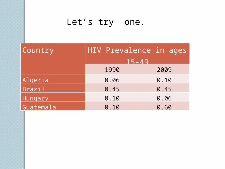
Let’s try one.
Country HIV Prevalence in ages 15-49
1990 2009
Algeria 0.06 0.10Brazil 0.45 0.45Hungary 0.10 0.06Guatemala 0.10 0.60
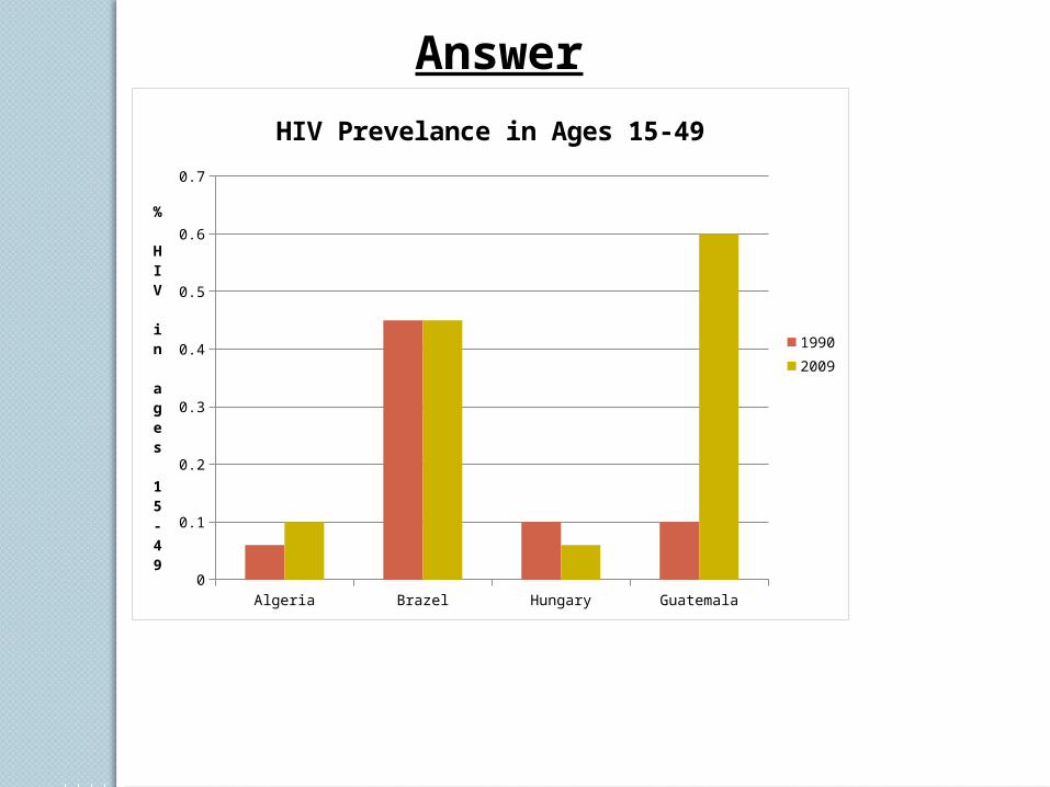
Algeria Brazel Hungary Guatemala0
0.1
0.2
0.3
0.4
0.5
0.6
0.7
HIV Prevelance in Ages 15-49
19902009
% HIV in ages 15-49
Answer
Analysis of data: Mean, SD (Standard Deviation) and SE (Standard Error of the Mean)
If the data has a normal distribution we can find the mean, SD and SE
Mean – summarizes the entire sample◦If a large enough sample size is used
it may estimate the actual population’s mean.
◦Even so, the mean can often be misleading because it suggests to show a representation of all of the data. If the data range is very wide then the average may not truly tell the whole story.
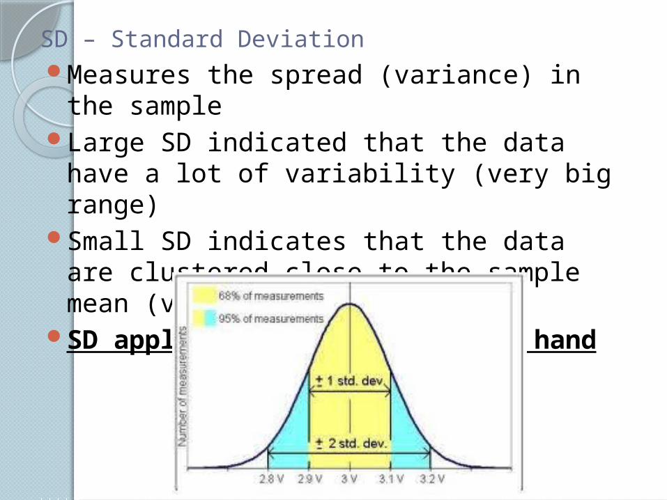
SD – Standard DeviationMeasures the spread (variance) in the
sampleLarge SD indicated that the data have a
lot of variability (very big range)Small SD indicates that the data are
clustered close to the sample mean (very small range)
SD applies to the data set at hand
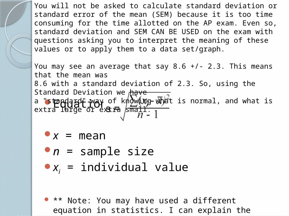
Equation x = meann = sample sizexi = individual value
** Note: You may have used a different equation in statistics. I can explain the difference if you need me to.
You will not be asked to calculate standard deviation or standard error of the mean (SEM) because it is too time consuming for the time allotted on the AP exam. Even so, standard deviation and SEM CAN BE USED on the exam with questions asking you to interpret the meaning of these values or to apply them to a data set/graph.
You may see an average that say 8.6 +/- 2.3. This means that the mean was 8.6 with a standard deviation of 2.3. So, using the Standard Deviation we havea "standard" way of knowing what is normal, and what is extra large or extra small.
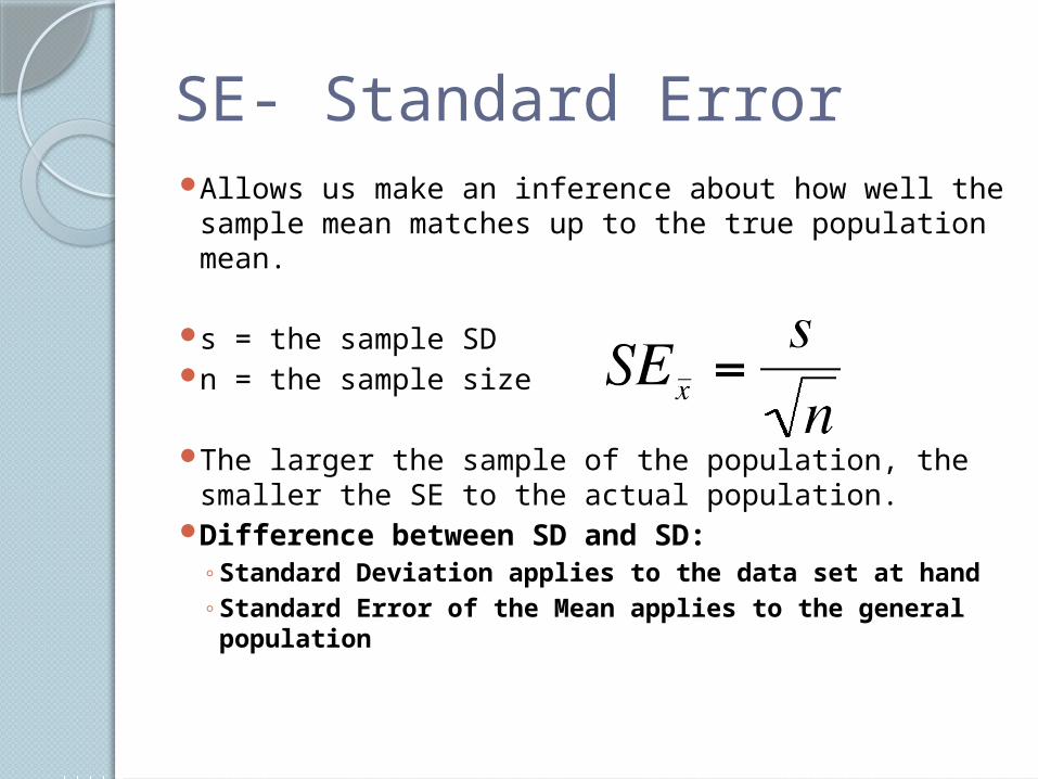
SE- Standard ErrorAllows us make an inference about how well the
sample mean matches up to the true population mean.
s = the sample SDn = the sample size
The larger the sample of the population, the smaller the SE to the actual population.
Difference between SD and SD:◦ Standard Deviation applies to the data set at
hand◦ Standard Error of the Mean applies to the
general population
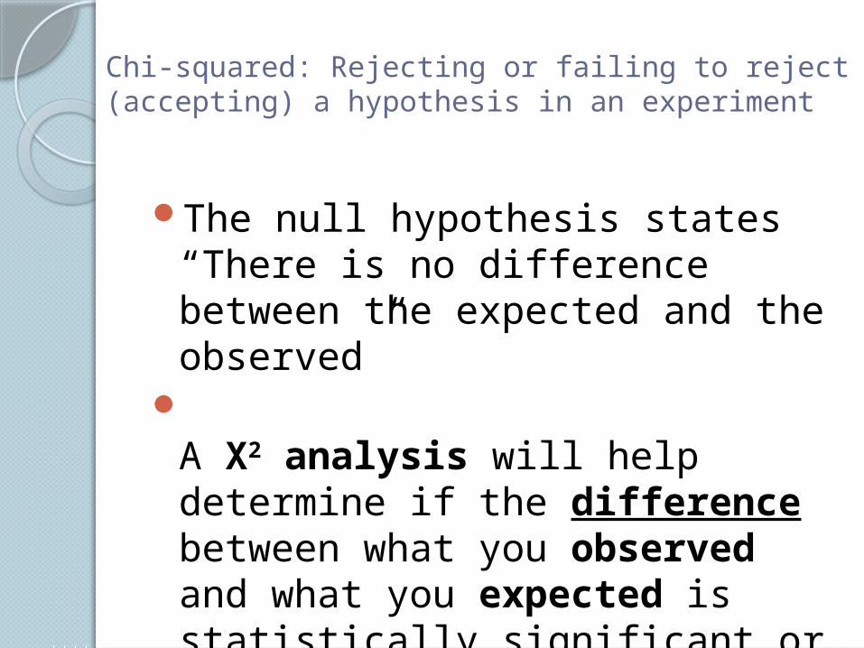
Chi-squared: Rejecting or failing to reject (accepting) a hypothesis in an experiment
The null hypothesis states “There is no difference between the expected and the observed”
A X2 analysis will help determine if the difference between what you observed and what you expected is statistically significant or not.
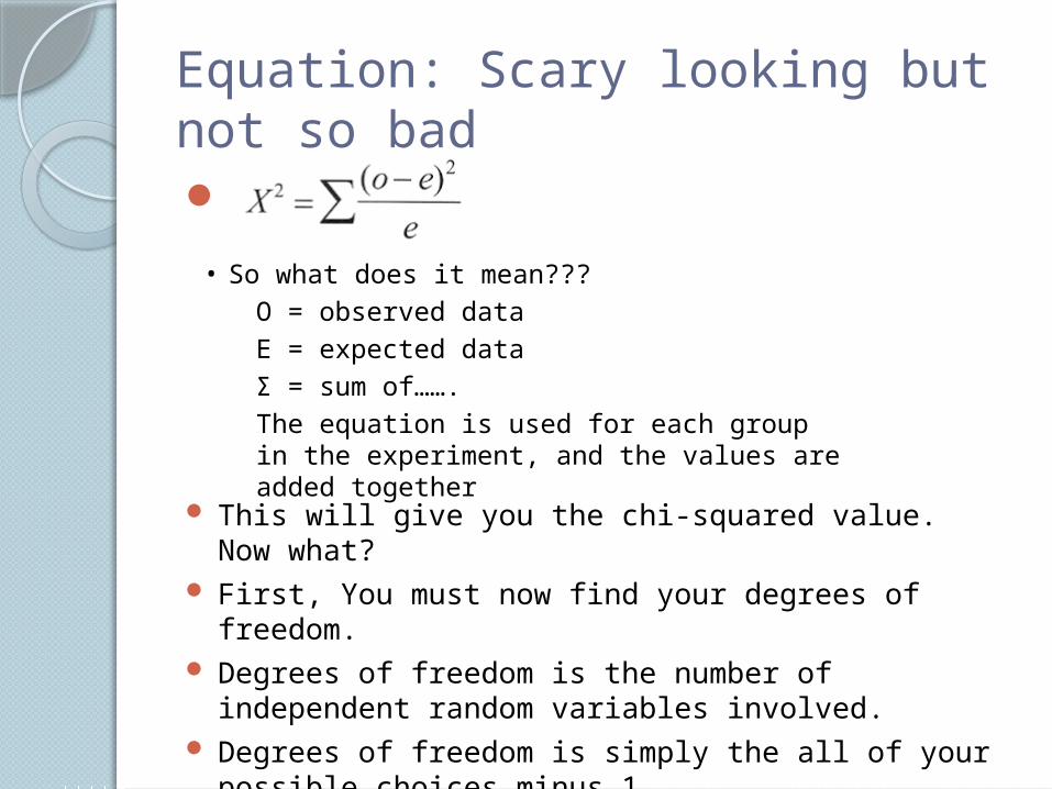
Equation: Scary looking but not so bad
This will give you the chi-squared value. Now what? First, You must now find your degrees of freedom. Degrees of freedom is the number of independent
random variables involved. Degrees of freedom is simply the all of your possible
choices minus 1.◦ Marker Example
• So what does it mean???O = observed dataE = expected dataΣ = sum of…….The equation is used for each group in the experiment, and the values are added together
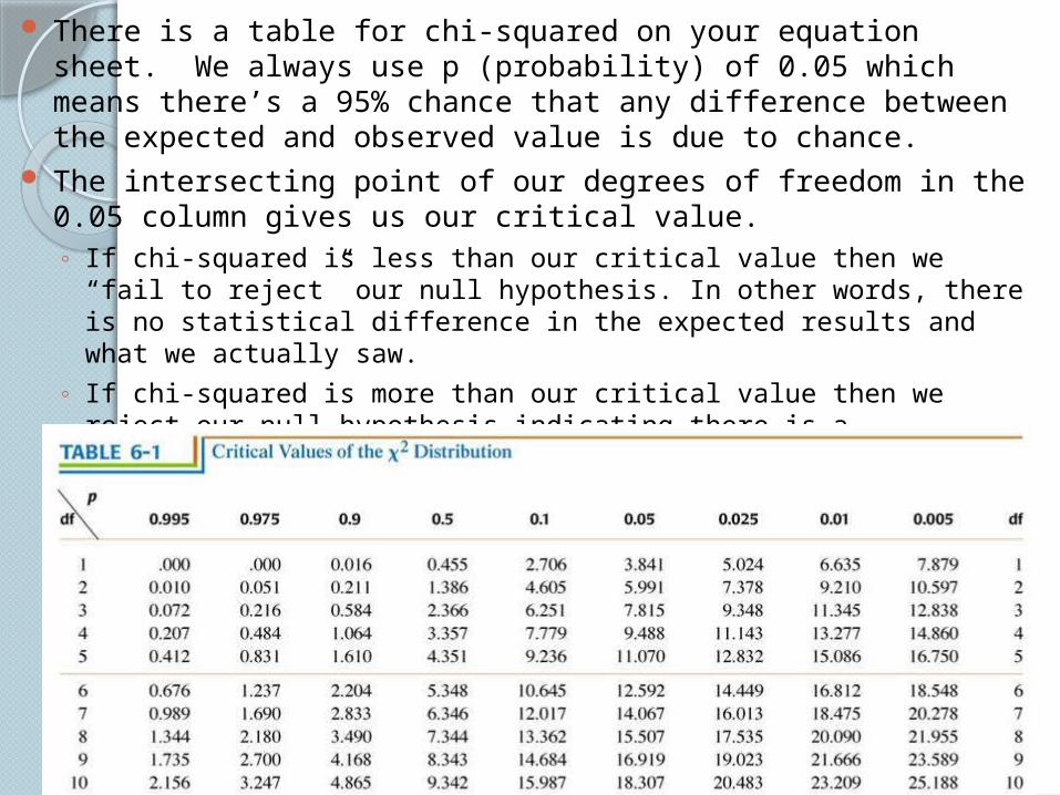
There is a table for chi-squared on your equation sheet. We always use p (probability) of 0.05 which means there’s a 95% chance that any difference between the expected and observed value is due to chance.
The intersecting point of our degrees of freedom in the 0.05 column gives us our critical value. ◦ If chi-squared is less than our critical value then we “fail to reject” our
null hypothesis. In other words, there is no statistical difference in the expected results and what we actually saw.
◦ If chi-squared is more than our critical value then we reject our null hypothesis indicating there is a statistical difference in the expected and observed results.
◦ M&M chi-squared.
To sum it up…..
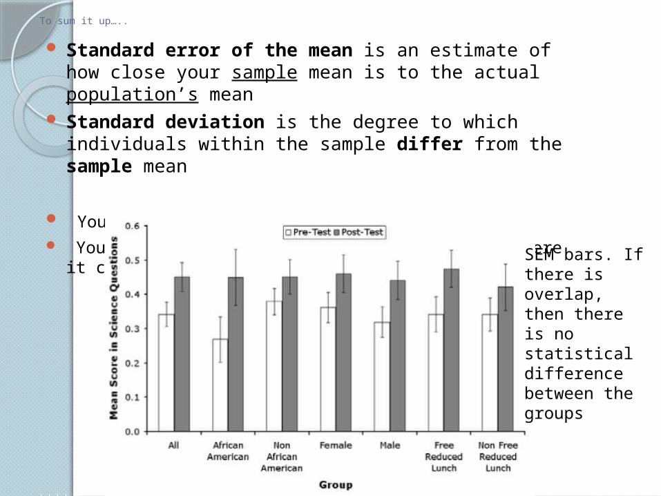
Standard error of the mean is an estimate of how close your sample mean is to the actual population’s mean
Standard deviation is the degree to which individuals within the sample differ from the sample mean
You will not have to calculate these values. You should understand what it tells you and where it comes
from.SEM bars. If there is overlap, then there is no statistical difference between the groups
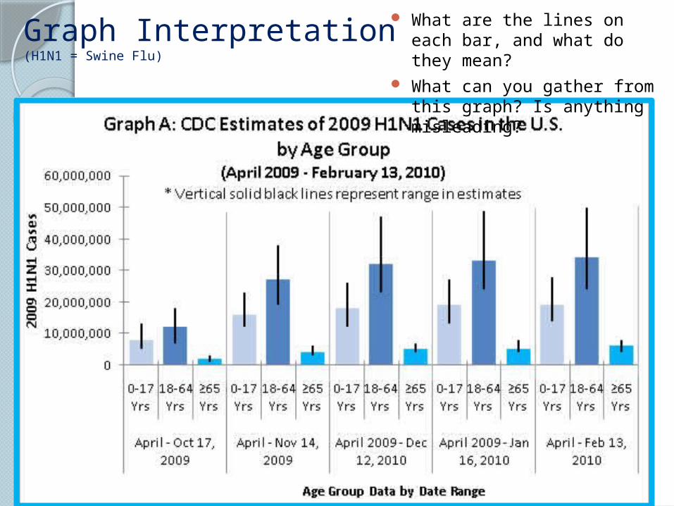
Graph Interpretation(H1N1 = Swine Flu)
What are the lines on each bar, and what do they mean?
What can you gather from this graph? Is anything misleading?
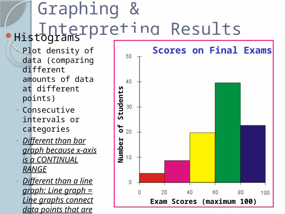
Graphing & Interpreting ResultsHistograms
◦ Plot density of data (comparing different amounts of data at different points)
◦ Consecutive intervals or categories
◦ Different than bar graph because x-axis is a CONTINUAL RANGE
◦ Different than a line graph: Line graph = Line graphs connect data points that are somehow related. Histograms display distibutions of data (how much in certain ranges).
Scores on Final Exams
Nu
mb
er o
f S
tud
ents
Exam Scores (maximum 100)
What can you gather from this graph?
Graph Interpretation
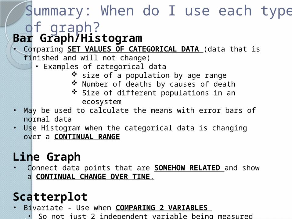
Bar Graph/Histogram• Comparing SET VALUES OF CATEGORICAL DATA (data that is finished
and will not change)• Examples of categorical data
size of a population by age range Number of deaths by causes of death Size of different populations in an ecosystem
• May be used to calculate the means with error bars of normal data• Use Histogram when the categorical data is changing over a CONTINUAL
RANGE
Line Graph• Connect data points that are SOMEHOW RELATED and show a
CONTINUAL CHANGE OVER TIME.
Scatterplot• Bivariate - Use when COMPARING 2 VARIABLES
• So not just 2 independent variable being measured on y-axis. You have 2 separate variables you want to measure
Summary: When do I use each type of graph?
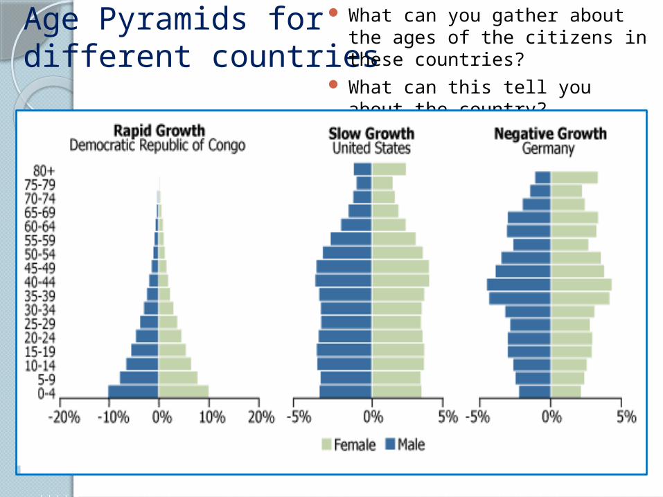
Age Pyramids for different countries
What can you gather about the ages of the citizens in these countries?
What can this tell you about the country?
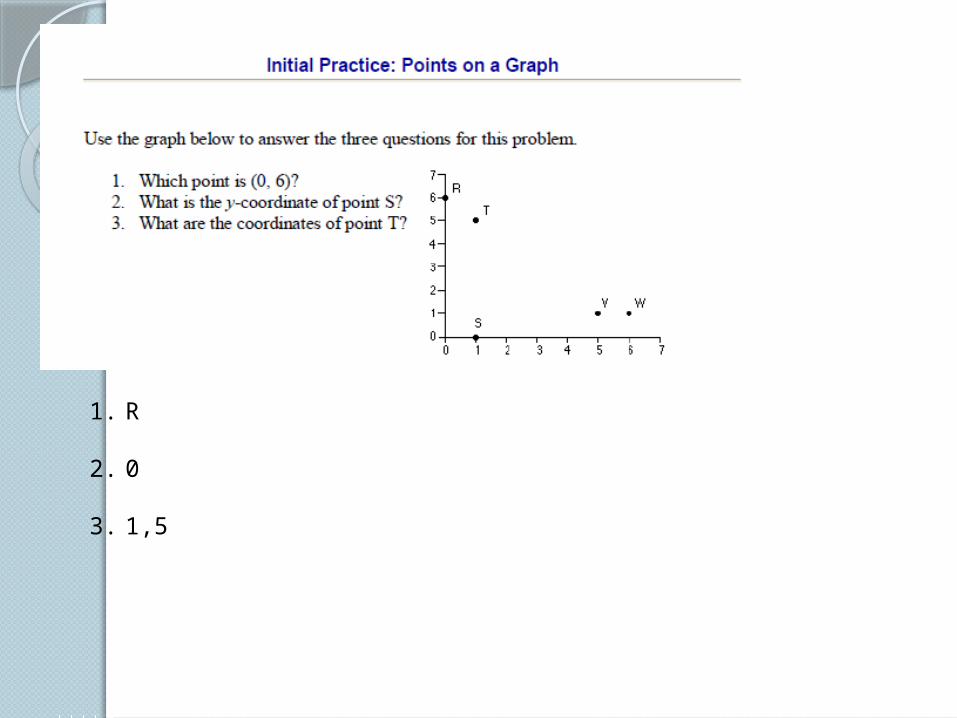
1. R
2. 0
3. 1,5
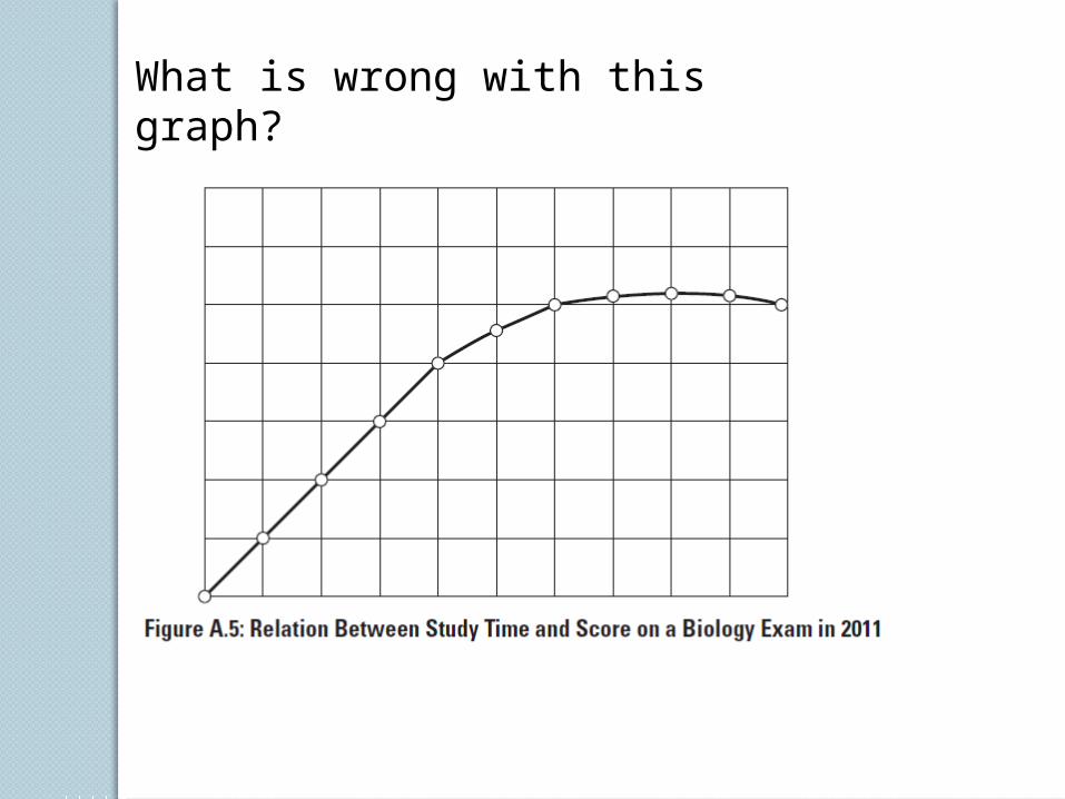
What is wrong with this graph?

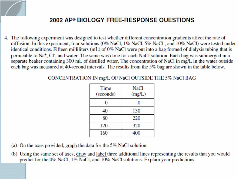
Draw your answers here
Draw your answers here
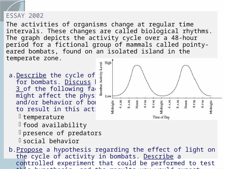
ESSAY 2002The activities of organisms change at regular time intervals. These changes are called biological rhythms. The graph depicts the activity cycle over a 48-hour period for a fictional group of mammals called pointy-eared bombats, found on an isolated island in the temperate zone.
a. Describe the cycle of activity for bombats. Discuss how 3 of the following factors might affect the physiologyand/or behavior of bombats to result in this activity pattern. temperature food availability presence of predators social behavior
b. Propose a hypothesis regarding the effect of light on the cycle of activity in bombats. Describe a controlled experiment that could be performed to test this hypothesis, and the results you would expect.
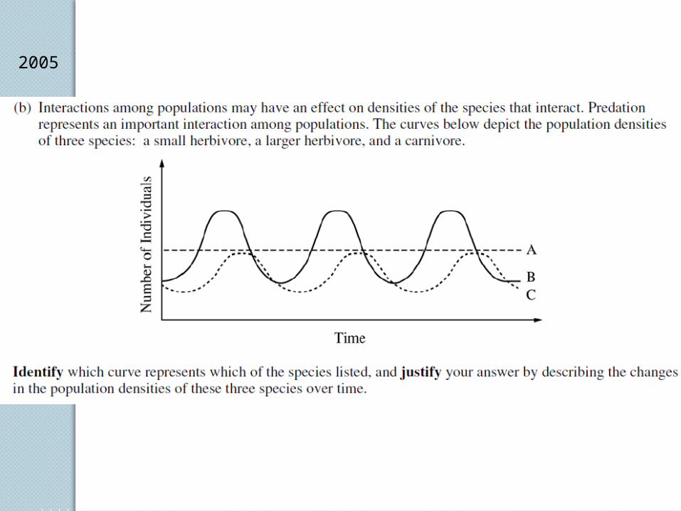
2005
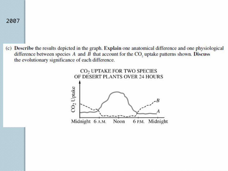
2007