graphic design manual - multiconsult · pdf filegraphic design manual branding design elements...
TRANSCRIPT
GRAPHIC DESIGN MANUAL BRANDING DESIGN ELEMENTS THE IDENTITY IN
PRACTICE DIGITAL PLATFORMS MUST SUBSIDIARY
© Multiconsult
Branding Vision and values Environmental considerationsUse the graphic design manual! How the identity was developed
Design elementsLogoColours The triangleThe gridThe friezeBusiness area symbolsOur corporate fonts
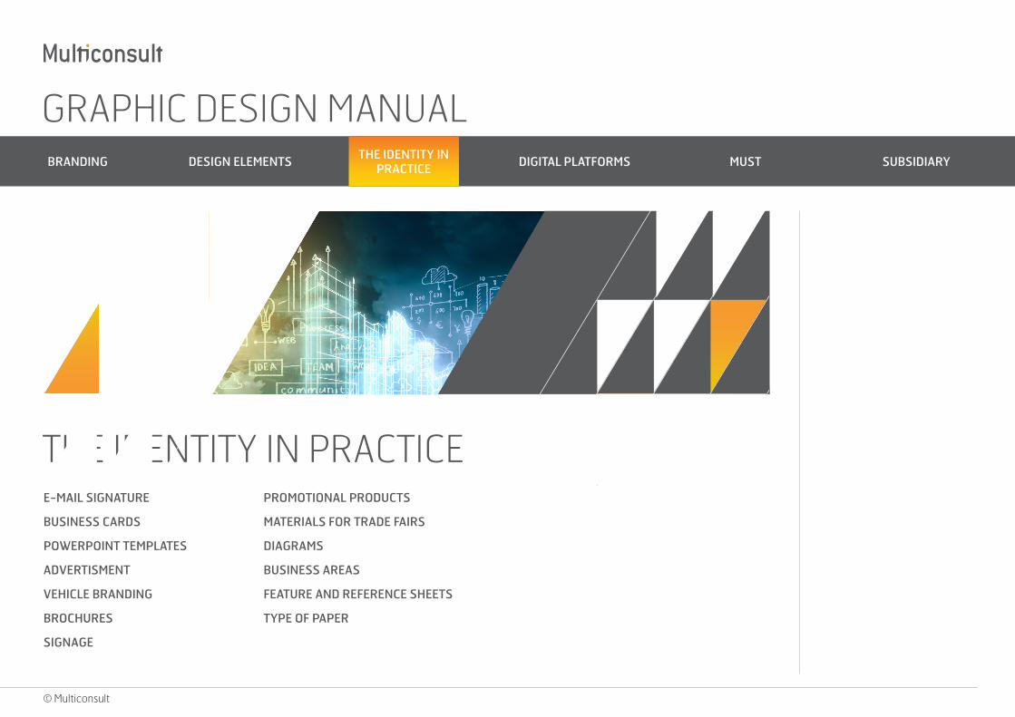
The Identity in practice E-mail signatureBusiness cards PowerPoint templates Advertising Vehicle brandingBrochuresSignagePromotional productsMaterials for trade fairsDiagramsBusiness areasFeature and reference sheetsType of paper
Digital Platforms
Must Logo Graphic elements The various design elements in MUST
Subsidiary Analyse og strategi
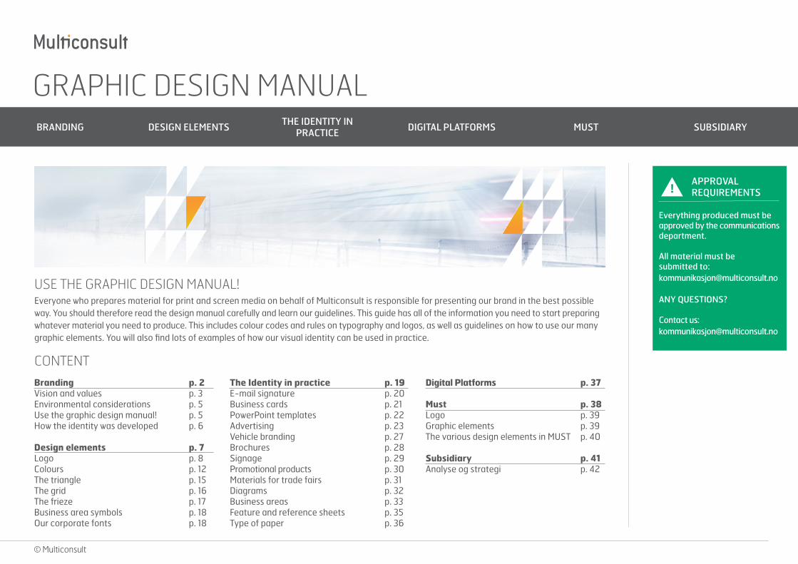
USE THE GRAPHIC DESIGN MANUAL!Everyone who prepares material for print and screen media on behalf of Multiconsult is responsible for presenting our brand in the best possible way. You should therefore read the design manual carefully and learn our guidelines. This guide has all of the information you need to start preparing whatever material you need to produce. This includes colour codes and rules on typography and logos, as well as guidelines on how to use our many graphic elements. You will also find lots of examples of how our visual identity can be used in practice.
CONTENT
p. 2p. 3p. 5p. 5p. 6
p. 7p. 8p. 12p. 15p. 16p. 17p. 18p. 18
p. 37
p. 38p. 39p. 39p. 40
p. 41p. 42
p. 19p. 20p. 21p. 22p. 23p. 27p. 28p. 29p. 30p. 31p. 32p. 33p. 35p. 36
!APPROVAL REQUIREMENTS
Everything produced must be approved by the communications department.
All material must be submitted to: [email protected]
ANY QUESTIONS?
Contact us: [email protected]
GRAPHIC DESIGN MANUAL BRANDING DESIGN ELEMENTS THE IDENTITY IN
PRACTICE DIGITAL PLATFORMS MUST SUBSIDIARY
BRANDINGVISION AND VALUES
ENVIRONMENTAL CONSIDERATIONS
USE THE GRAPHIC DESIGN MANUAL!
HOW THE IDENTITY WAS DEVELOPED
© Multiconsult
GRAPHIC DESIGN MANUAL BRANDING DESIGN ELEMENTS THE IDENTITY IN
PRACTICE DIGITAL PLATFORMS MUST SUBSIDIARY
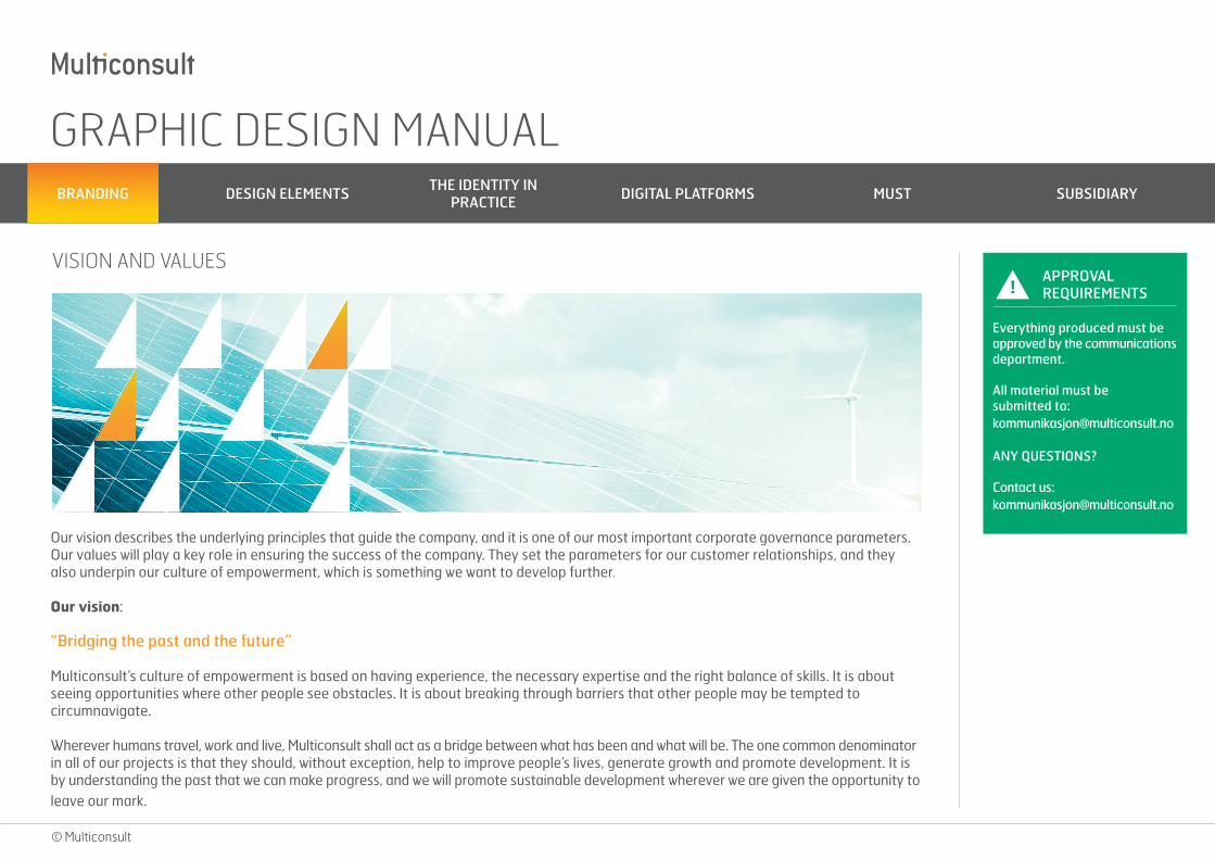
Our vision describes the underlying principles that guide the company, and it is one of our most important corporate governance parameters. Our values will play a key role in ensuring the success of the company. They set the parameters for our customer relationships, and they also underpin our culture of empowerment, which is something we want to develop further.
Our vision:
“Bridging the past and the future”
Multiconsult’s culture of empowerment is based on having experience, the necessary expertise and the right balance of skills. It is about seeing opportunities where other people see obstacles. It is about breaking through barriers that other people may be tempted to circumnavigate.
Wherever humans travel, work and live, Multiconsult shall act as a bridge between what has been and what will be. The one common denominator in all of our projects is that they should, without exception, help to improve people’s lives, generate growth and promote development. It is by understanding the past that we can make progress, and we will promote sustainable development wherever we are given the opportunity to leave our mark.
VISION AND VALUES!
APPROVAL REQUIREMENTS
Everything produced must be approved by the communications department.
All material must be submitted to: [email protected]
ANY QUESTIONS?
Contact us: [email protected]
© Multiconsult
GRAPHIC DESIGN MANUAL BRANDING DESIGN ELEMENTS THE IDENTITY IN
PRACTICE DIGITAL PLATFORMS MUST SUBSIDIARY
What our vision means.Our vision describes the underlying principles that guide the company, and it is one of our most important corporate governance parameters. It reflects the notion that Multiconsult should achieve commercial success by maintaining a healthy balance. The most important factors that need balancing are as follows:
• We shall always maintain high levels of expertise, but also continuously learn and develop.• We respect client specifications, but always try to promote sustainable and green development.• We believe strongly in technical excellence, but we also realise that the ability to make money is vital to the development of our cus-
tomers, the company and members of staff.• We set our employees high standards, and measure their performance, but we also understand the importance of job satisfaction and
a good working environment.
Our core values:
From our values, we have chosen three representative core values, which are the most important values to Multiconsult’s business activities:
“Commitment, teamwork and responsibility”
Commitment
Commitment means both enjoying finding better solutions to problems than other people and having the courage to go down new avenues and challenge one’s own creativity. Commitment is contagious, makes cooperation enjoyable and stimulates people to find new solutions and share their knowledge. Commitment is what allows Multiconsult to constantly develop as a company. Commitment is one of our key success factors.
Teamwork
Good teamwork is one of Multiconsult’s strengths. As a multidisciplinary company, working on projects in a wide range of fields, it is vital to the achievement of our goals. Teamwork is important within the company, and in our work with others, as it is what allows us to realise the benefits of multidisciplinary collaboration and achieve the best possible results.
© Multiconsult
!APPROVAL REQUIREMENTS
Everything produced must be approved by the communications department.
All material must be submitted to: [email protected]
ANY QUESTIONS?
Contact us: [email protected]
GRAPHIC DESIGN MANUAL BRANDING DESIGN ELEMENTS THE IDENTITY IN
PRACTICE DIGITAL PLATFORMS MUST SUBSIDIARY
Responsibility
We take responsibility. Responsibility is Multiconsult’s most important value, and it permeates everything we do. We consider it a priority to have accountable employees, who take responsibility for adding value on behalf of their customers, owners and other stakeholders. At Multiconsult we take responsibility for wider society and local communities, for ourselves and for those around us. This includes our joint responsibility for reducing impacts on the environment. It goes without saying that we comply with laws and regulations, but we are also proactive in our corporate social responsibility, so that we stay ahead of the curve.
ENVIRONMENTAL CONSIDERATIONS
USE THE GRAPHIC DESIGN MANUAL!
Multiconsult has built up a reputation for being responsible, honest and reliable in everything we do. We aim for sustainable solutions in all of our projects. By putting HSE considerations at the heart of our consultancy and design services, we are able to create sustainable solu-tions that both we and our customers can be proud of.
The vast majority of our offices are Eco-Lighthouse certified, which means that they have implemented measures in order to meet certain standards in relation to environmentally friendly operations and a good working environment.
We encourage electronic distribution of marketing material where appropriate, and environmental considerations is also an important factor when choosing external partners.
Everyone who prepares material for print and screen media on behalf of Multiconsult is responsible for presenting our brand in the best possible way. You should therefore read the design manual carefully and learn our guidelines.
This guide has all of the information you need to start preparing whatever material you need to produce. This includes colour codes and rules on typography and logos, as well as guidelines on how to use our many graphic elements. You will also find lots of examples of how our visual identity can be used in practice.
© Multiconsult
!APPROVAL REQUIREMENTS
Everything produced must be approved by the communications department.
All material must be submitted to: [email protected]
ANY QUESTIONS?
Contact us: [email protected]
GRAPHIC DESIGN MANUAL BRANDING DESIGN ELEMENTS THE IDENTITY IN
PRACTICE DIGITAL PLATFORMS MUST SUBSIDIARY
HOW THE IDENTITY WAS DEVELOPED
In 2013, Multiconsult decided to create a new visual identity for the company. Our previous identity had served us well for many years, but the time was ripe to modernise our brand image.
The new visual identity is based on work that was done in conjunction with the development of 3-2-1, our new strategy for the period leading up to 2017. A team including Multiconsult employees and external partners was established to come up with proposals for a new visual identity for the company. First we held introductory workshops with mood boards, and a number of different stylistic directions were considered before we hit upon something that everyone agreed on. This lay the foundations for the extensive and exciting process of creating our new identity.
The first task was to create a new logo. Three separate proposals were presented, but right from the start one of them stood out as a particularly strong candidate. After careful consideration the other proposals were discarded, and the logo in question was adopted as Multiconsult’s new logo.
It is a simple, typographic logo. It has a unique appearance, but it also combines excellent readability with timeless simplicity. The logo has two colours: orange and grey. The grey symbolises our technical expertise, while the orange represents the human aspect – our employees. If you look carefully at the letter ‘i’ in the logo you will notice that part of the bottom has been sliced off at an angle. The angle is precisely 59.92 degrees. That is the latitude of Oslo, where our history began more than a century ago. As a curiosity, this figure is also the approximate percentage of the Moon that is visible from the Earth.
In parallel with developing a new logo, the team started work on a complete visual identity. They came up with a rich colour palette, elegant typography and an exciting and flexible array of graphic elements. One of the key elements of our visual identity is a grid consisting of triangles. One of the triangle’s angles is 59.92 degrees, so it is the same shape as the part of the ‘i’ that has been sliced off from our logo. Whereas the logo symbolises the whole corporate group, the triangle symbolises our employees and their cutting edge expertise.
The process of developing a new visual identity has been incredibly exciting, and based on feedback from both within and outside the company, we can be proud of the final result!
© Multiconsult
!APPROVAL REQUIREMENTS
Everything produced must be approved by the communications department.
All material must be submitted to: [email protected]
ANY QUESTIONS?
Contact us: [email protected]
GRAPHIC DESIGN MANUAL BRANDING DESIGN ELEMENTS THE IDENTITY IN
PRACTICE DIGITAL PLATFORMS MUST SUBSIDIARY
© Multiconsult
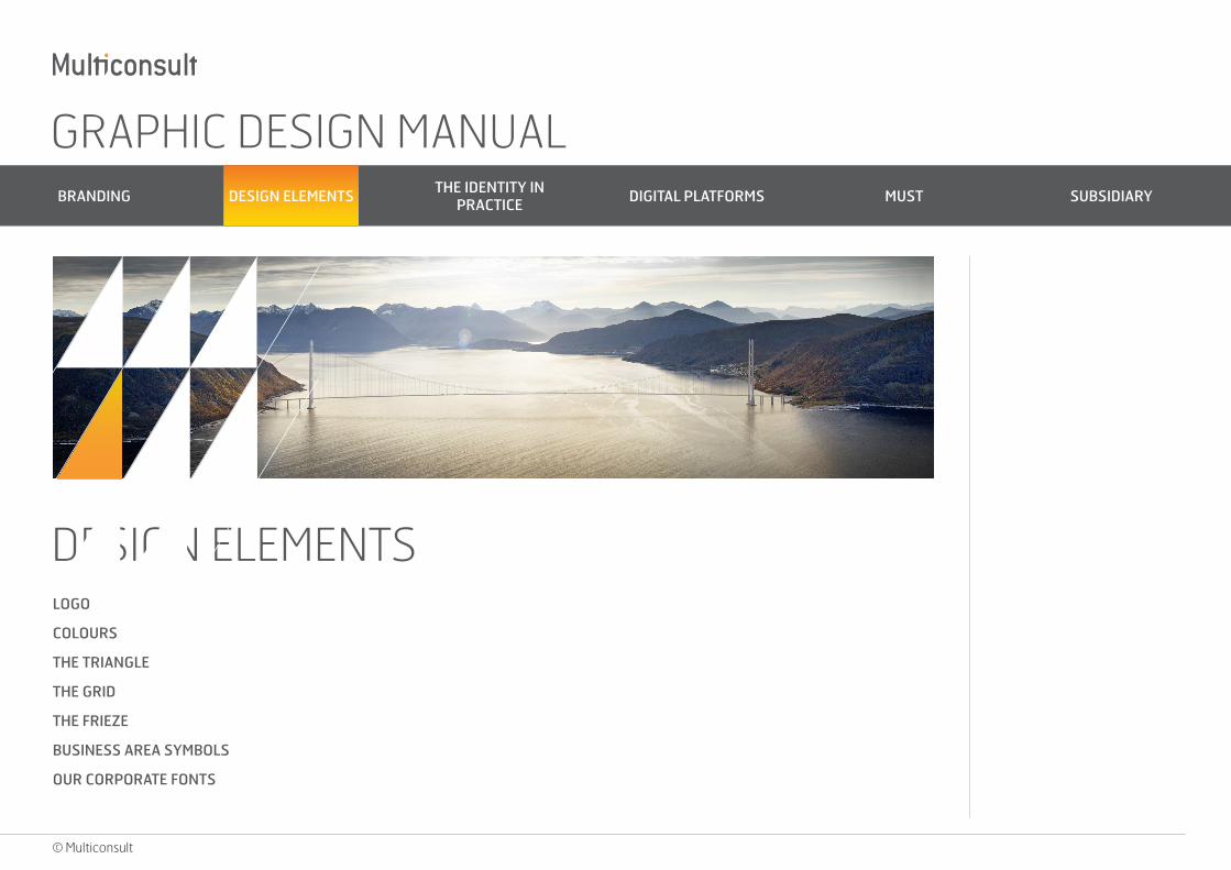
DESIGN ELEMENTSLOGO
COLOURS
THE TRIANGLE
THE GRID
THE FRIEZE
BUSINESS AREA SYMBOLS
OUR CORPORATE FONTS
GRAPHIC DESIGN MANUAL BRANDING DESIGN ELEMENTS THE IDENTITY IN
PRACTICE DIGITAL PLATFORMS MUST SUBSIDIARY
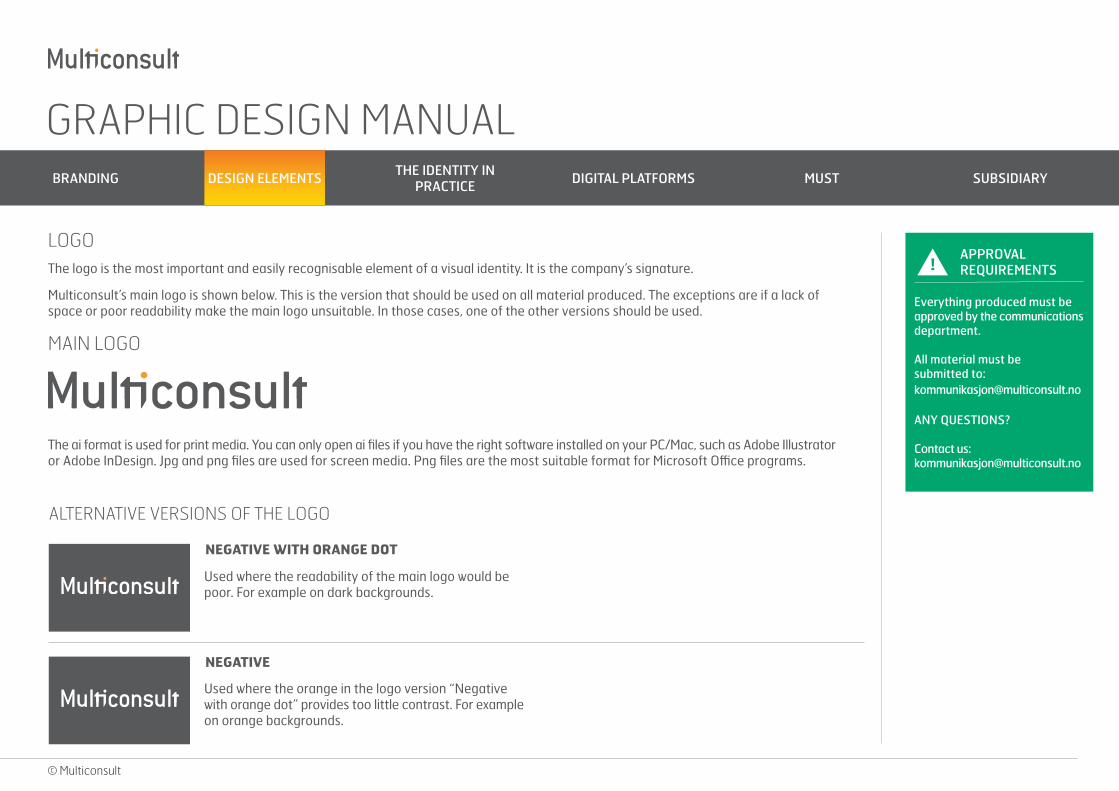
LOGOThe logo is the most important and easily recognisable element of a visual identity. It is the company’s signature.
Multiconsult’s main logo is shown below. This is the version that should be used on all material produced. The exceptions are if a lack of space or poor readability make the main logo unsuitable. In those cases, one of the other versions should be used.
© Multiconsult
!APPROVAL REQUIREMENTS
Everything produced must be approved by the communications department.
All material must be submitted to: [email protected]
ANY QUESTIONS?
Contact us: [email protected]
MAIN LOGO
The ai format is used for print media. You can only open ai files if you have the right software installed on your PC/Mac, such as Adobe Illustrator or Adobe InDesign. Jpg and png files are used for screen media. Png files are the most suitable format for Microsoft Office programs.
ALTERNATIVE VERSIONS OF THE LOGO
NEGATIVE WITH ORANGE DOT
NEGATIVE
Used where the readability of the main logo would be poor. For example on dark backgrounds.
Used where the orange in the logo version “Negative with orange dot” provides too little contrast. For example on orange backgrounds.

GRAPHIC DESIGN MANUAL BRANDING DESIGN ELEMENTS THE IDENTITY IN
PRACTICE DIGITAL PLATFORMS MUST SUBSIDIARY
© Multiconsult
CENTRED
CENTRED NEGATIVE WITH ORANGE DOT
Used where space considerations make it more appropriate than the main logo. This version should never be used purely for preference and should always be considered subordinate to the main logo.
Used where the orange in the logo version “Negative with orange dot” provides too little contrast. For example on orange backgrounds.
CENTRED NEGATIVE
Used where the orange in the logo version “Negative with orange dot” provides too little contrast. For example on orange backgrounds.
!APPROVAL REQUIREMENTS
Everything produced must be approved by the communications department.
All material must be submitted to: [email protected]
ANY QUESTIONS?
Contact us: [email protected]
GRAPHIC DESIGN MANUAL BRANDING DESIGN ELEMENTS THE IDENTITY IN
PRACTICE DIGITAL PLATFORMS MUST SUBSIDIARY
© Multiconsult
!APPROVAL REQUIREMENTS
Everything produced must be approved by the communications department.
All material must be submitted to: [email protected]
ANY QUESTIONS?
Contact us: [email protected]
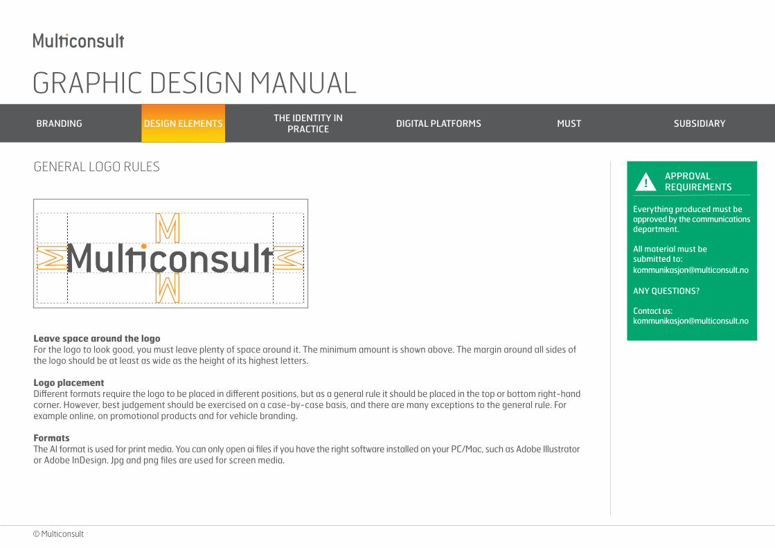
GENERAL LOGO RULES
Leave space around the logoFor the logo to look good, you must leave plenty of space around it. The minimum amount is shown above. The margin around all sides of the logo should be at least as wide as the height of its highest letters.
Logo placementDifferent formats require the logo to be placed in different positions, but as a general rule it should be placed in the top or bottom right-hand corner. However, best judgement should be exercised on a case-by-case basis, and there are many exceptions to the general rule. For example online, on promotional products and for vehicle branding.
FormatsThe AI format is used for print media. You can only open ai files if you have the right software installed on your PC/Mac, such as Adobe Illustrator or Adobe InDesign. Jpg and png files are used for screen media.
GRAPHIC DESIGN MANUAL BRANDING DESIGN ELEMENTS THE IDENTITY IN
PRACTICE DIGITAL PLATFORMS MUST SUBSIDIARY
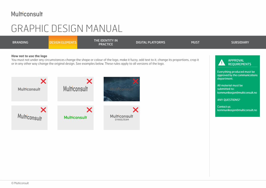
How not to use the logoYou must not under any circumstances change the shape or colour of the logo, make it fuzzy, add text to it, change its proportions, crop it or in any other way change the original design. See examples below. These rules apply to all versions of the logo.
© Multiconsult
!APPROVAL REQUIREMENTS
Everything produced must be approved by the communications department.
All material must be submitted to: [email protected]
ANY QUESTIONS?
Contact us: [email protected]
GRAPHIC DESIGN MANUAL BRANDING DESIGN ELEMENTS THE IDENTITY IN
PRACTICE DIGITAL PLATFORMS MUST SUBSIDIARY
© Multiconsult
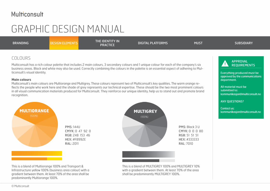
Main coloursMulticonsult’s main colours are Multiorange and Multigrey. These colours represent two of Multiconsult’s key qualities. The warm orange re-flects the people who work here and the shade of grey represents our technical expertise. These should be the two most prominent colours in all visual communication materials produced for Multiconsult. They reinforce our unique identity, help us to stand out and promote brand recognition.
This is a blend of MULTIGREY 100% and MULTIGREY 10% with a gradient between them. At least 70% of the area shall be predominantly MULTIGREY 100%.
PMS: Black 3 UCMYK: 0 0 0 80RGB: 51 51 51HEX: #333333RAL: 7010
PMS: 144UCMYK: 0 47 92 0RGB: 248 153 46HEX: #F8992ERAL: 2011
!APPROVAL REQUIREMENTS
Everything produced must be approved by the communications department.
All material must be submitted to: [email protected]
ANY QUESTIONS?
Contact us: [email protected]
(100%)MULTIGREY
(100%)
This is a blend of Multiorange 100% and Transport & Infrastructure yellow 100% (business area colour) with a gradient between them. At least 70% of the area shall be predominantly Multiorange 100%.
COLOURS Multiconsult has a rich colour palette that includes 2 main colours, 3 secondary colours and 1 unique colour for each of the company’s six business areas. Black and white may also be used. Correctly combining the colours in the palette is an essential aspect of adhering to Mul-ticonsult’s visual identity.
GRAPHIC DESIGN MANUAL BRANDING DESIGN ELEMENTS THE IDENTITY IN
PRACTICE DIGITAL PLATFORMS MUST SUBSIDIARY
© Multiconsult
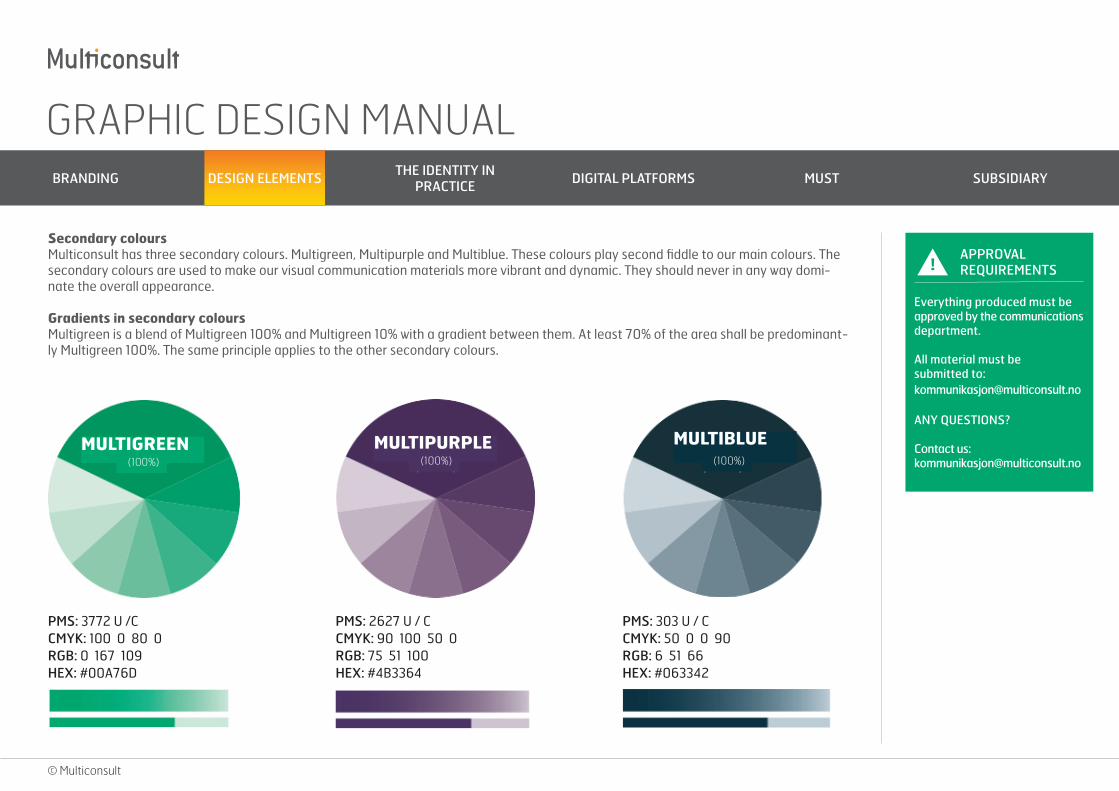
Secondary coloursMulticonsult has three secondary colours. Multigreen, Multipurple and Multiblue. These colours play second fiddle to our main colours. The secondary colours are used to make our visual communication materials more vibrant and dynamic. They should never in any way domi-nate the overall appearance.
Gradients in secondary coloursMultigreen is a blend of Multigreen 100% and Multigreen 10% with a gradient between them. At least 70% of the area shall be predominant-ly Multigreen 100%. The same principle applies to the other secondary colours.
PMS: 3772 U /CCMYK: 100 0 80 0RGB: 0 167 109HEX: #00A76D
PMS: 2627 U / CCMYK: 90 100 50 0RGB: 75 51 100HEX: #4B3364
PMS: 303 U / CCMYK: 50 0 0 90RGB: 6 51 66HEX: #063342
!APPROVAL REQUIREMENTS
Everything produced must be approved by the communications department.
All material must be submitted to: [email protected]
ANY QUESTIONS?
Contact us: [email protected]
MULTIGREEN (100%)
MULTIPURPLE (100%)
MULTIBLUE (100%)
GRAPHIC DESIGN MANUAL BRANDING DESIGN ELEMENTS THE IDENTITY IN
PRACTICE DIGITAL PLATFORMS MUST SUBSIDIARY
© Multiconsult
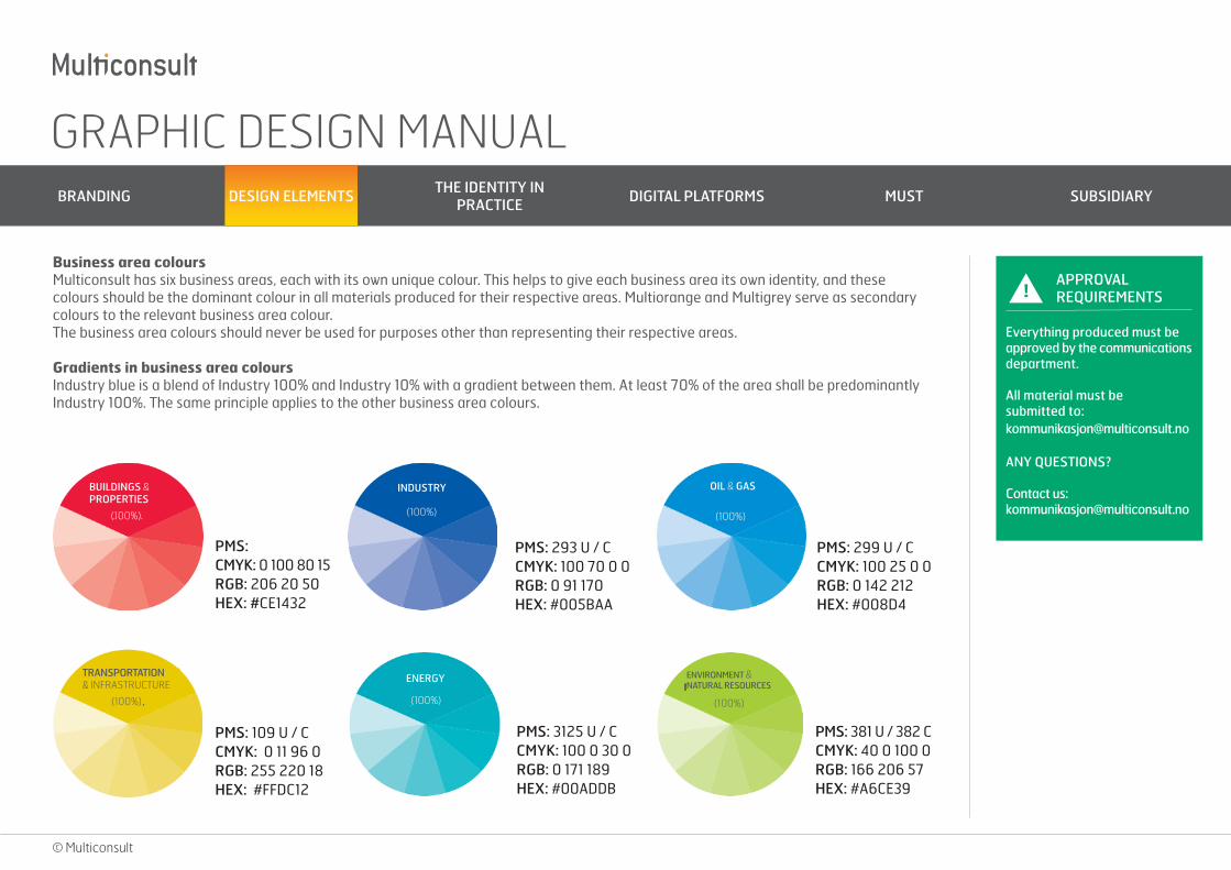
Business area coloursMulticonsult has six business areas, each with its own unique colour. This helps to give each business area its own identity, and these colours should be the dominant colour in all materials produced for their respective areas. Multiorange and Multigrey serve as secondary colours to the relevant business area colour.The business area colours should never be used for purposes other than representing their respective areas.
Gradients in business area coloursIndustry blue is a blend of Industry 100% and Industry 10% with a gradient between them. At least 70% of the area shall be predominantly Industry 100%. The same principle applies to the other business area colours.
PMS: CMYK: 0 100 80 15RGB: 206 20 50HEX: #CE1432
PMS: 293 U / CCMYK: 100 70 0 0RGB: 0 91 170HEX: #005BAA
PMS: 299 U / CCMYK: 100 25 0 0 RGB: 0 142 212HEX: #008D4
PMS: 381 U / 382 CCMYK: 40 0 100 0RGB: 166 206 57HEX: #A6CE39
PMS: 3125 U / CCMYK: 100 0 30 0RGB: 0 171 189HEX: #00ADDB
PMS: 109 U / CCMYK: 0 11 96 0RGB: 255 220 18HEX: #FFDC12
BUILDINGS & PROPERTIES
(100%) (100%)
INDUSTRY OIL & GAS
(100%)
TRANSPORTATION
(100%)
& INFRASTRUCTURE
(100%)
ENERGY ENVIRONMENT & NATURAL RESOURCES
(100%)
!APPROVAL REQUIREMENTS
Everything produced must be approved by the communications department.
All material must be submitted to: [email protected]
ANY QUESTIONS?
Contact us: [email protected]
GRAPHIC DESIGN MANUAL BRANDING DESIGN ELEMENTS THE IDENTITY IN
PRACTICE DIGITAL PLATFORMS MUST SUBSIDIARY
© Multiconsult
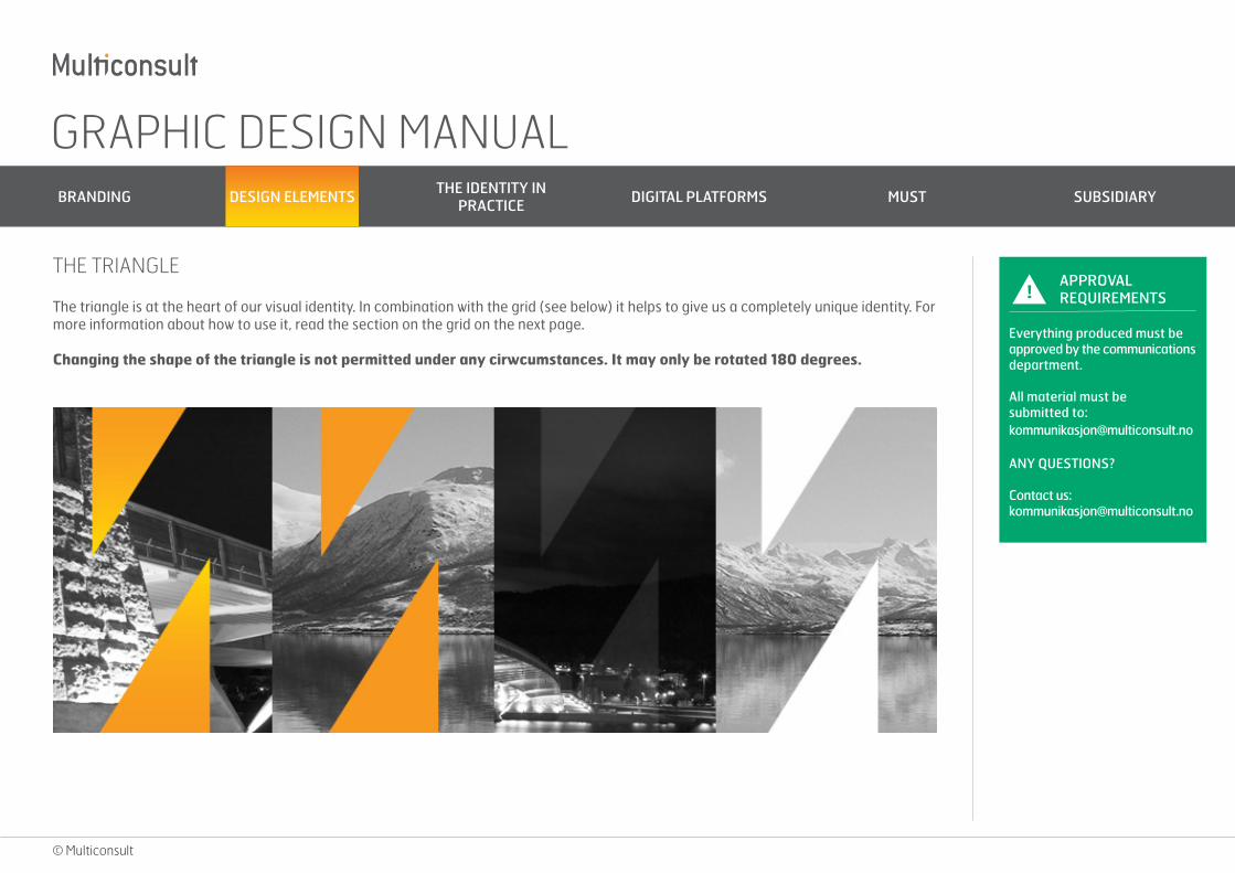
The triangle is at the heart of our visual identity. In combination with the grid (see below) it helps to give us a completely unique identity. For more information about how to use it, read the section on the grid on the next page.
Changing the shape of the triangle is not permitted under any cirwcumstances. It may only be rotated 180 degrees.
!APPROVAL REQUIREMENTS
Everything produced must be approved by the communications department.
All material must be submitted to: [email protected]
ANY QUESTIONS?
Contact us: [email protected]
THE TRIANGLE
GRAPHIC DESIGN MANUAL BRANDING DESIGN ELEMENTS THE IDENTITY IN
PRACTICE DIGITAL PLATFORMS MUST SUBSIDIARY
© Multiconsult
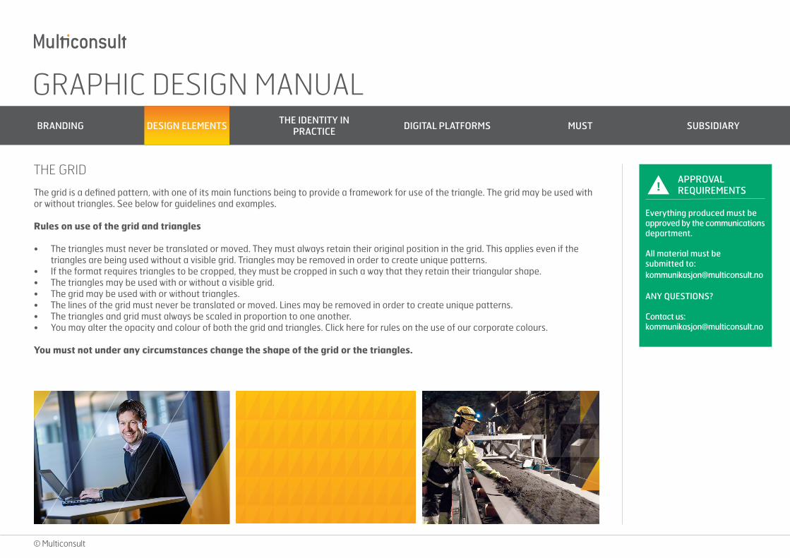
The grid is a defined pattern, with one of its main functions being to provide a framework for use of the triangle. The grid may be used with or without triangles. See below for guidelines and examples.
Rules on use of the grid and triangles
• The triangles must never be translated or moved. They must always retain their original position in the grid. This applies even if thetriangles are being used without a visible grid. Triangles may be removed in order to create unique patterns.
• If the format requires triangles to be cropped, they must be cropped in such a way that they retain their triangular shape.• The triangles may be used with or without a visible grid.• The grid may be used with or without triangles.• The lines of the grid must never be translated or moved. Lines may be removed in order to create unique patterns.• The triangles and grid must always be scaled in proportion to one another.• You may alter the opacity and colour of both the grid and triangles. Click here for rules on the use of our corporate colours.
You must not under any circumstances change the shape of the grid or the triangles.
!APPROVAL REQUIREMENTS
Everything produced must be approved by the communications department.
All material must be submitted to: [email protected]
ANY QUESTIONS?
Contact us: [email protected]
THE GRID
GRAPHIC DESIGN MANUAL BRANDING DESIGN ELEMENTS THE IDENTITY IN
PRACTICE DIGITAL PLATFORMS MUST SUBSIDIARY
© Multiconsult
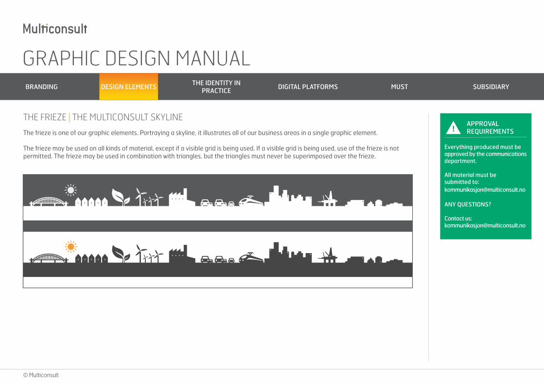
The frieze is one of our graphic elements. Portraying a skyline, it illustrates all of our business areas in a single graphic element.
The frieze may be used on all kinds of material, except if a visible grid is being used. If a visible grid is being used, use of the frieze is not permitted. The frieze may be used in combination with triangles, but the triangles must never be superimposed over the frieze.
!APPROVAL REQUIREMENTS
Everything produced must be approved by the communications department.
All material must be submitted to: [email protected]
ANY QUESTIONS?
Contact us: [email protected]
THE FRIEZE | THE MULTICONSULT SKYLINE
GRAPHIC DESIGN MANUAL BRANDING DESIGN ELEMENTS THE IDENTITY IN
PRACTICE DIGITAL PLATFORMS MUST SUBSIDIARY
© Multiconsult
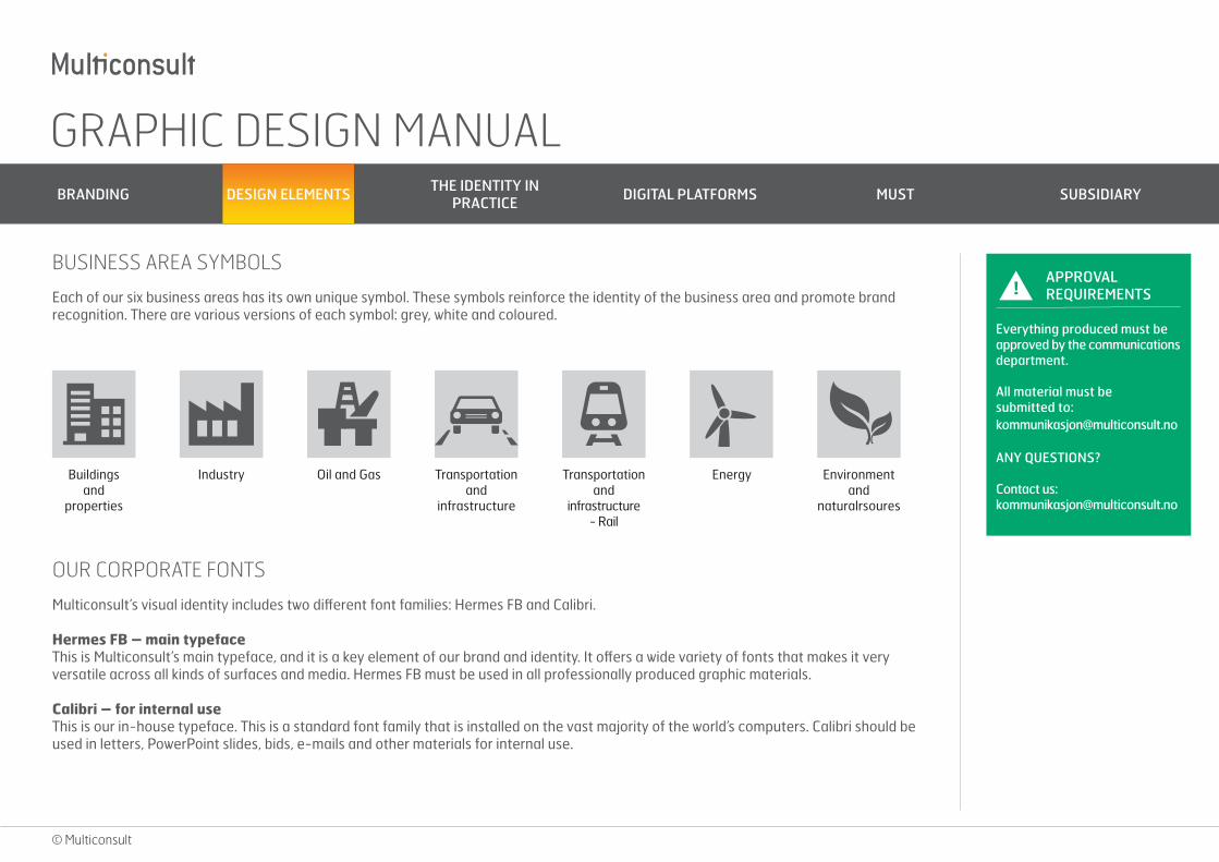
Each of our six business areas has its own unique symbol. These symbols reinforce the identity of the business area and promote brand recognition. There are various versions of each symbol: grey, white and coloured.
!APPROVAL REQUIREMENTS
Everything produced must be approved by the communications department.
All material must be submitted to: [email protected]
ANY QUESTIONS?
Contact us: [email protected]
BUSINESS AREA SYMBOLS
Buildings and
properties
Industry Oil and Gas Transportation and
infrastructure
Transportation and
infrastructure - Rail
Energy Environment and
naturalrsoures
Multiconsult’s visual identity includes two different font families: Hermes FB and Calibri.
Hermes FB – main typefaceThis is Multiconsult’s main typeface, and it is a key element of our brand and identity. It offers a wide variety of fonts that makes it very versatile across all kinds of surfaces and media. Hermes FB must be used in all professionally produced graphic materials.
Calibri – for internal useThis is our in-house typeface. This is a standard font family that is installed on the vast majority of the world’s computers. Calibri should be used in letters, PowerPoint slides, bids, e-mails and other materials for internal use.
OUR CORPORATE FONTS
GRAPHIC DESIGN MANUAL BRANDING DESIGN ELEMENTS THE IDENTITY IN
PRACTICE DIGITAL PLATFORMS MUST SUBSIDIARY
© Multiconsult
THE IDENTITY IN PRACTICE E-MAIL SIGNATURE
BUSINESS CARDS
POWERPOINT TEMPLATES
ADVERTISMENT
VEHICLE BRANDING
BROCHURES
SIGNAGE
PROMOTIONAL PRODUCTS
MATERIALS FOR TRADE FAIRS
DIAGRAMS
BUSINESS AREAS
FEATURE AND REFERENCE SHEETS
TYPE OF PAPER
GRAPHIC DESIGN MANUAL BRANDING DESIGN ELEMENTS THE IDENTITY IN
PRACTICE DIGITAL PLATFORMS MUST SUBSIDIARY
© Multiconsult
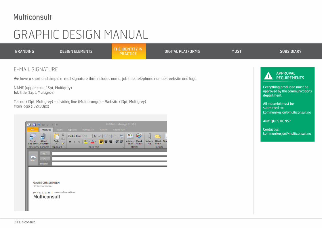
We have a short and simple e-mail signature that includes name, job title, telephone number, website and logo.
NAME (upper case, 15pt, Multigrey)Job title (13pt, Multigray)
Tel. no. (13pt, Multigrey) – dividing line (Multiorange) – Website (13pt, Multigrey)Main logo (132x30px)
!APPROVAL REQUIREMENTS
Everything produced must be approved by the communications department.
All material must be submitted to: [email protected]
ANY QUESTIONS?
Contact us: [email protected]
E-MAIL SIGNATURE
VP Communications
GRAPHIC DESIGN MANUAL BRANDING DESIGN ELEMENTS THE IDENTITY IN
PRACTICE DIGITAL PLATFORMS MUST SUBSIDIARY
© Multiconsult
!APPROVAL REQUIREMENTS
Everything produced must be approved by the communications department.
All material must be submitted to: [email protected]
ANY QUESTIONS?
Contact us: [email protected]
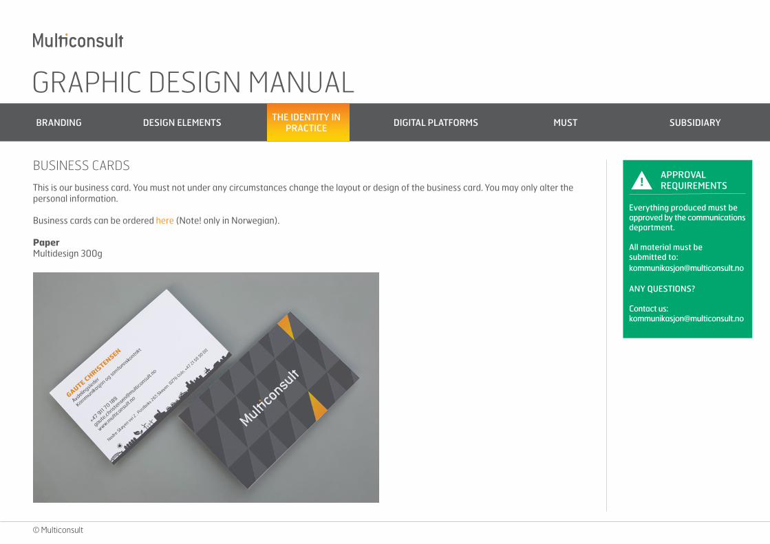
BUSINESS CARDS
This is our business card. You must not under any circumstances change the layout or design of the business card. You may only alter the personal information.
Business cards can be ordered here (Note! only in Norwegian).
PaperMultidesign 300g
GRAPHIC DESIGN MANUAL BRANDING DESIGN ELEMENTS THE IDENTITY IN
PRACTICE DIGITAL PLATFORMS MUST SUBSIDIARY
© Multiconsult
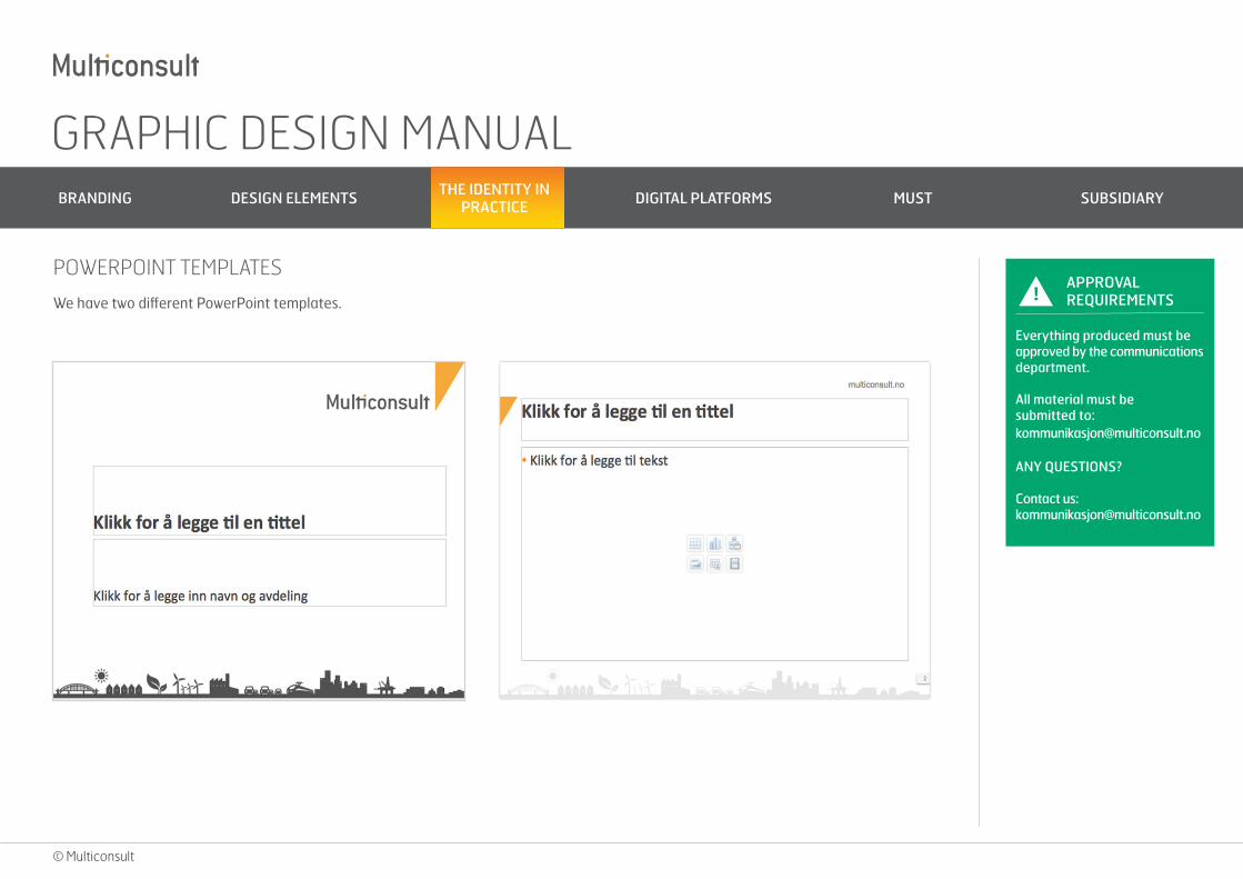
We have two different PowerPoint templates. !APPROVAL REQUIREMENTS
Everything produced must be approved by the communications department.
All material must be submitted to: [email protected]
ANY QUESTIONS?
Contact us: [email protected]
POWERPOINT TEMPLATES
GRAPHIC DESIGN MANUAL BRANDING DESIGN ELEMENTS THE IDENTITY IN
PRACTICE DIGITAL PLATFORMS MUST SUBSIDIARY
© Multiconsult
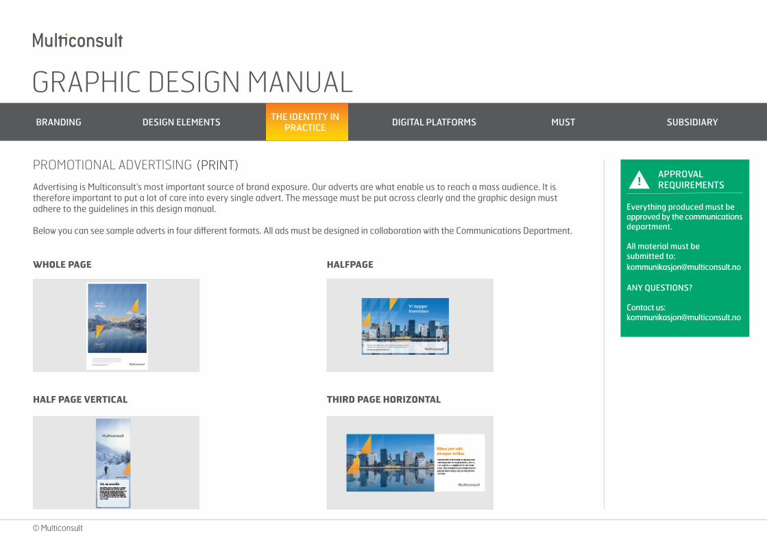
Advertising is Multiconsult’s most important source of brand exposure. Our adverts are what enable us to reach a mass audience. It is therefore important to put a lot of care into every single advert. The message must be put across clearly and the graphic design must adhere to the guidelines in this design manual.
Below you can see sample adverts in four different formats. All ads must be designed in collaboration with the Communications Department.
!APPROVAL REQUIREMENTS
Everything produced must be approved by the communications department.
All material must be submitted to: [email protected]
ANY QUESTIONS?
Contact us: [email protected]
PROMOTIONAL ADVERTISING
WHOLE PAGE HALFPAGE
HALF PAGE VERTICAL THIRD PAGE HORIZONTAL
(PRINT)
GRAPHIC DESIGN MANUAL BRANDING DESIGN ELEMENTS THE IDENTITY IN
PRACTICE DIGITAL PLATFORMS MUST SUBSIDIARY
© Multiconsult
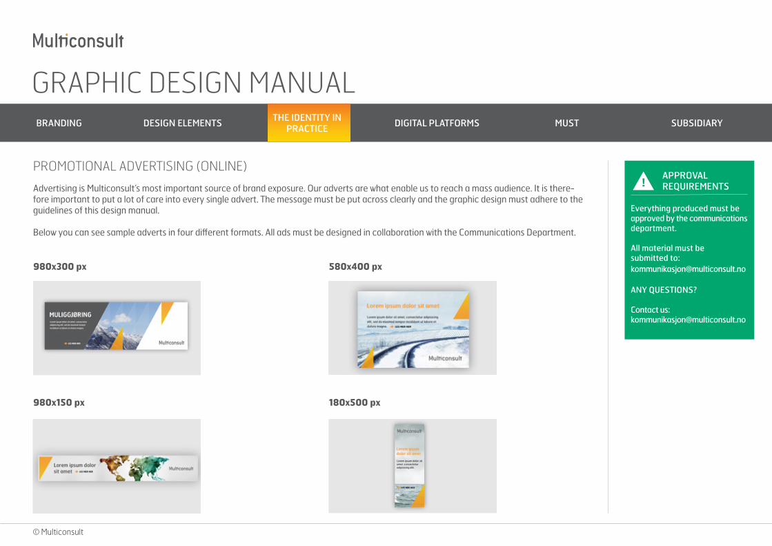
Advertising is Multiconsult’s most important source of brand exposure. Our adverts are what enable us to reach a mass audience. It is there-fore important to put a lot of care into every single advert. The message must be put across clearly and the graphic design must adhere to the guidelines of this design manual.
Below you can see sample adverts in four different formats. All ads must be designed in collaboration with the Communications Department.
!APPROVAL REQUIREMENTS
Everything produced must be approved by the communications department.
All material must be submitted to: [email protected]
ANY QUESTIONS?
Contact us: [email protected]
PROMOTIONAL ADVERTISING (ONLINE)
980x300 px 580x400 px
980x150 px 180x500 px
GRAPHIC DESIGN MANUAL BRANDING DESIGN ELEMENTS THE IDENTITY IN
PRACTICE DIGITAL PLATFORMS MUST SUBSIDIARY
© Multiconsult
Advertising is Multiconsult’s most important source of brand exposure. Our adverts are what enable us to reach a mass audience. It is there-fore important to put a lot of care into every single advert. The message must be put across clearly and the graphic design must adhere to the guidelines of this design manual.
Below you can see sample adverts in four different formats. All ads must be designed in collaboration with the Communications Department.
!APPROVAL REQUIREMENTS
Everything produced must be approved by the communications department.
All material must be submitted to: [email protected]
ANY QUESTIONS?
Contact us: [email protected]
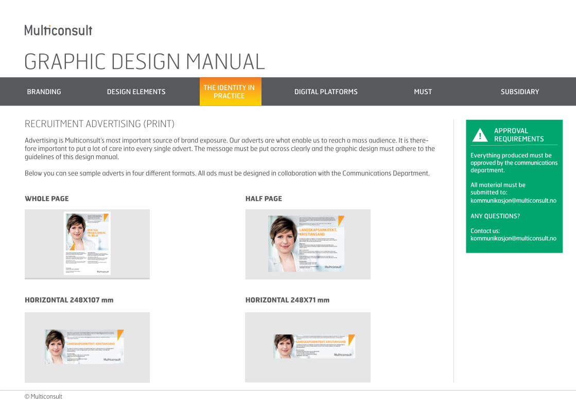
RECRUITMENT ADVERTISING (PRINT)
WHOLE PAGE HALF PAGE
HORIZONTAL 248X107 mm HORIZONTAL 248X71 mm
GRAPHIC DESIGN MANUAL BRANDING DESIGN ELEMENTS THE IDENTITY IN
PRACTICE DIGITAL PLATFORMS MUST SUBSIDIARY
© Multiconsult
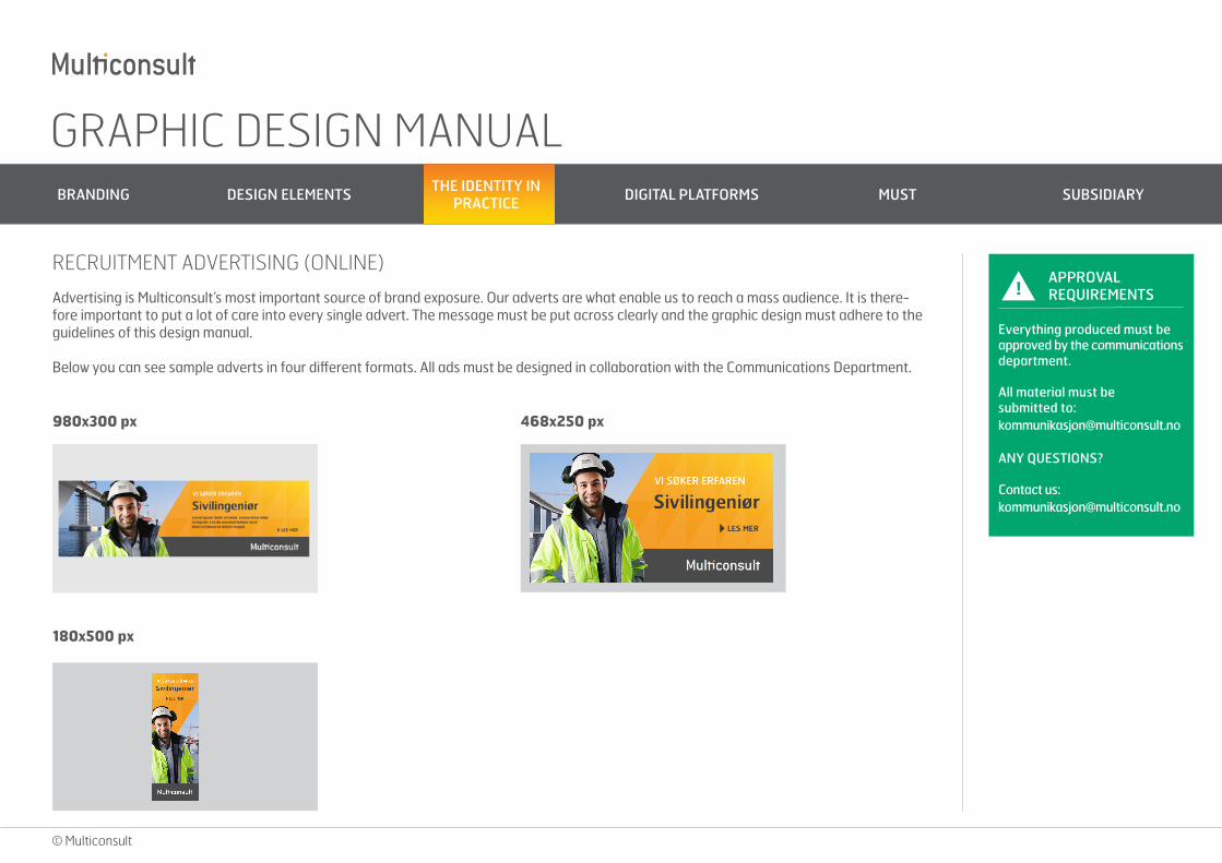
Advertising is Multiconsult’s most important source of brand exposure. Our adverts are what enable us to reach a mass audience. It is there-fore important to put a lot of care into every single advert. The message must be put across clearly and the graphic design must adhere to the guidelines of this design manual.
Below you can see sample adverts in four different formats. All ads must be designed in collaboration with the Communications Department.
!APPROVAL REQUIREMENTS
Everything produced must be approved by the communications department.
All material must be submitted to: [email protected]
ANY QUESTIONS?
Contact us: [email protected]
RECRUITMENT ADVERTISING (ONLINE)
980x300 px 468x250 px
180x500 px
GRAPHIC DESIGN MANUAL BRANDING DESIGN ELEMENTS THE IDENTITY IN
PRACTICE DIGITAL PLATFORMS MUST SUBSIDIARY
© Multiconsult
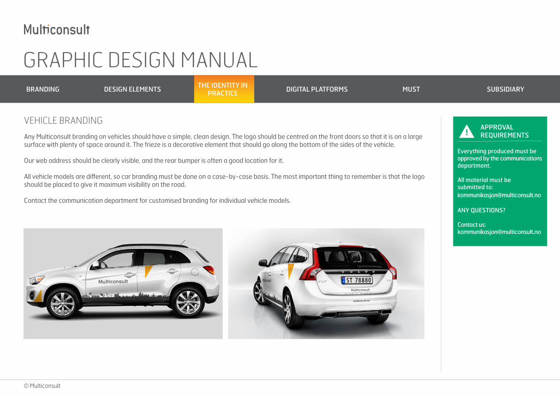
Any Multiconsult branding on vehicles should have a simple, clean design. The logo should be centred on the front doors so that it is on a large surface with plenty of space around it. The frieze is a decorative element that should go along the bottom of the sides of the vehicle.
Our web address should be clearly visible, and the rear bumper is often a good location for it.
All vehicle models are different, so car branding must be done on a case-by-case basis. The most important thing to remember is that the logo should be placed to give it maximum visibility on the road.
Contact the communication department for customised branding for individual vehicle models.
!APPROVAL REQUIREMENTS
Everything produced must be approved by the communications department.
All material must be submitted to: [email protected]
ANY QUESTIONS?
Contact us: [email protected]
VEHICLE BRANDING
GRAPHIC DESIGN MANUAL BRANDING DESIGN ELEMENTS THE IDENTITY IN
PRACTICE DIGITAL PLATFORMS MUST SUBSIDIARY
© Multiconsult
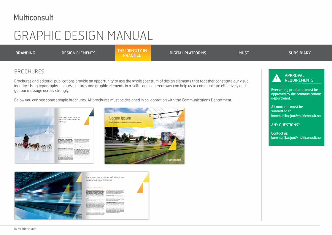
Brochures and editorial publications provide an opportunity to use the whole spectrum of design elements that together constitute our visual identity. Using typography, colours, pictures and graphic elements in a skilful and coherent way can help us to communicate effectively and get our message across strongly.
Below you can see some sample brochures. All brochures must be designed in collaboration with the Communications Department.
!APPROVAL REQUIREMENTS
Everything produced must be approved by the communications department.
All material must be submitted to: [email protected]
ANY QUESTIONS?
Contact us: [email protected]
BROCHURES
GRAPHIC DESIGN MANUAL BRANDING DESIGN ELEMENTS THE IDENTITY IN
PRACTICE DIGITAL PLATFORMS MUST SUBSIDIARY
© Multiconsult
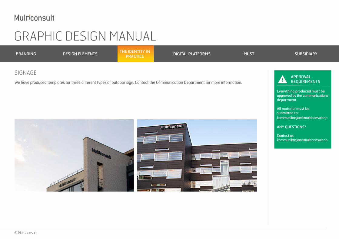
We have produced templates for three different types of outdoor sign. Contact the Communication Department for more information. !APPROVAL REQUIREMENTS
Everything produced must be approved by the communications department.
All material must be submitted to: [email protected]
ANY QUESTIONS?
Contact us: [email protected]
SIGNAGE
GRAPHIC DESIGN MANUAL BRANDING DESIGN ELEMENTS THE IDENTITY IN
PRACTICE DIGITAL PLATFORMS MUST SUBSIDIARY
© Multiconsult
!APPROVAL REQUIREMENTS
Everything produced must be approved by the communications department.
All material must be submitted to: [email protected]
ANY QUESTIONS?
Contact us: [email protected]
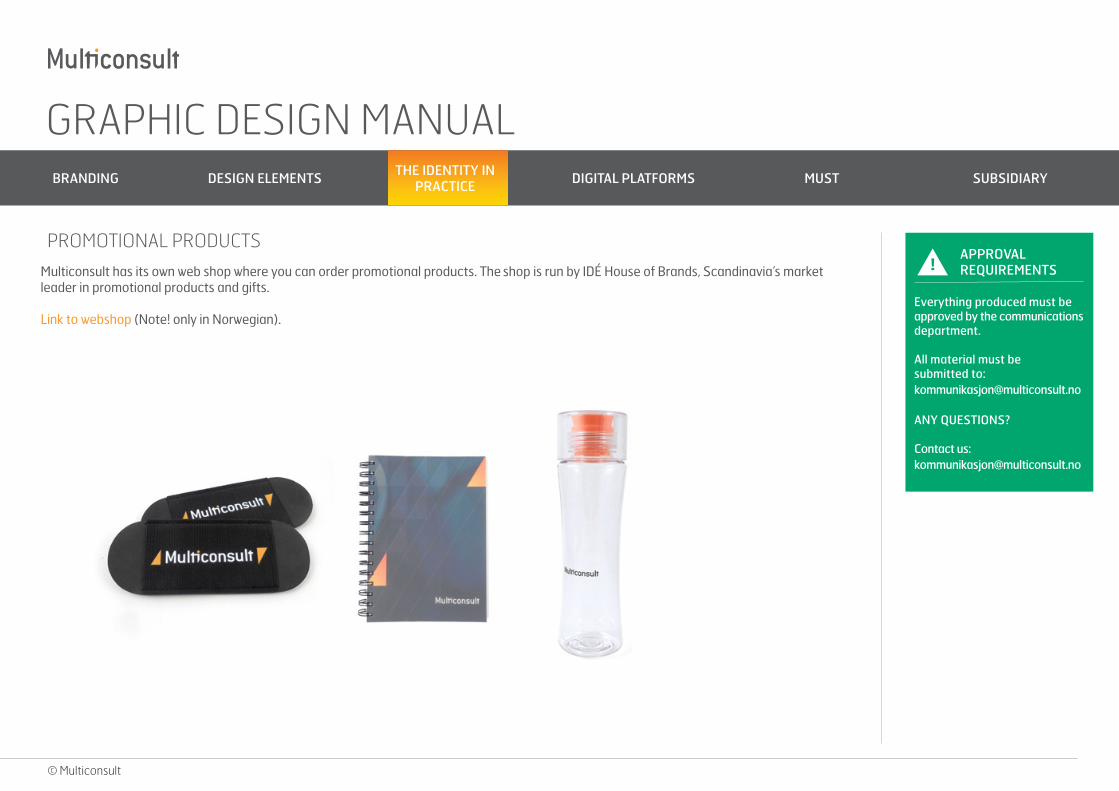
PROMOTIONAL PRODUCTS
Multiconsult has its own web shop where you can order promotional products. The shop is run by IDÉ House of Brands, Scandinavia’s market leader in promotional products and gifts.
Link to webshop (Note! only in Norwegian).

GRAPHIC DESIGN MANUAL BRANDING DESIGN ELEMENTS THE IDENTITY IN
PRACTICE DIGITAL PLATFORMS MUST SUBSIDIARY
© Multiconsult
Roll-up banners are an affordable and effective way to promote the company at trade fairs and on stands, and can also be used to decorate reception areas and open-plan offices. If you want even greater visibility, a pop-up wall can be a good option.
It is important to think about the placement of the logo. It should be high enough to be visible from a distance. Our logo and web address have set positions on our pop-up banners. You often need more than one banner and having the logo and web address in the same place makes the banners neater and more symmetrical.
All materials for trade fairs must be designed in collaboration with the Communications Department.
!APPROVAL REQUIREMENTS
Everything produced must be approved by the communications department.
All material must be submitted to: [email protected]
ANY QUESTIONS?
Contact us: [email protected]
MATERIALS FOR TRADE FAIRS
GRAPHIC DESIGN MANUAL BRANDING DESIGN ELEMENTS THE IDENTITY IN
PRACTICE DIGITAL PLATFORMS MUST SUBSIDIARY
© Multiconsult
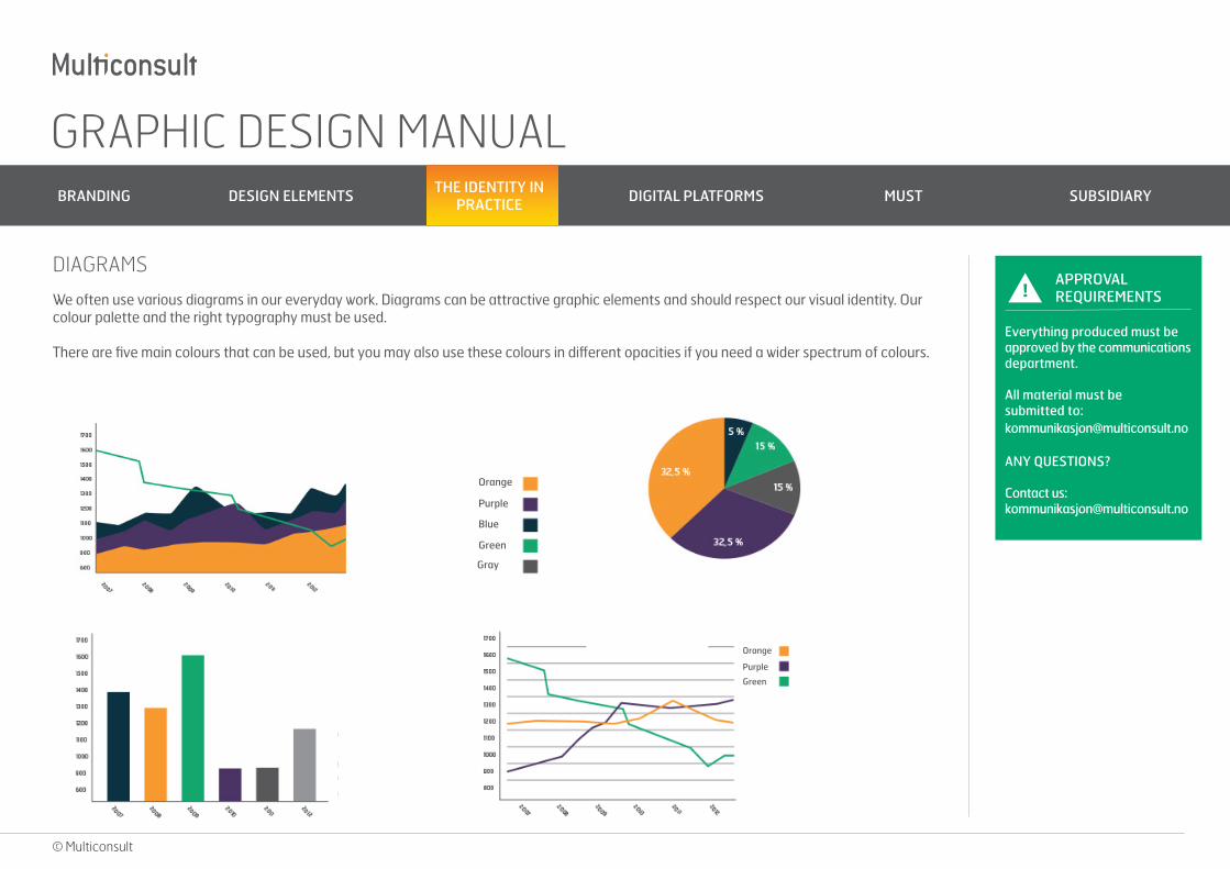
We often use various diagrams in our everyday work. Diagrams can be attractive graphic elements and should respect our visual identity. Our colour palette and the right typography must be used.
There are five main colours that can be used, but you may also use these colours in different opacities if you need a wider spectrum of colours.
!APPROVAL REQUIREMENTS
Everything produced must be approved by the communications department.
All material must be submitted to: [email protected]
ANY QUESTIONS?
Contact us: [email protected]
DIAGRAMS
Orange
Purple
Blue
Green
Gray
Orange
Green
Purple
GRAPHIC DESIGN MANUAL BRANDING DESIGN ELEMENTS THE IDENTITY IN
PRACTICE DIGITAL PLATFORMS MUST SUBSIDIARY
© Multiconsult
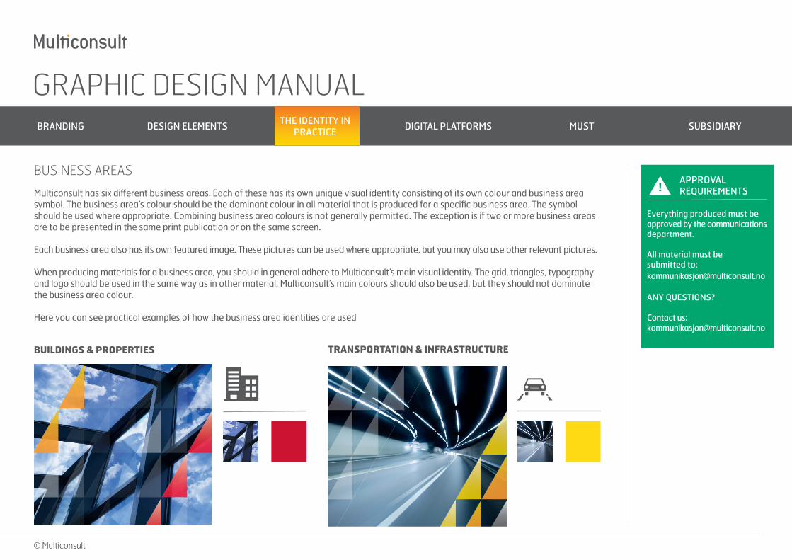
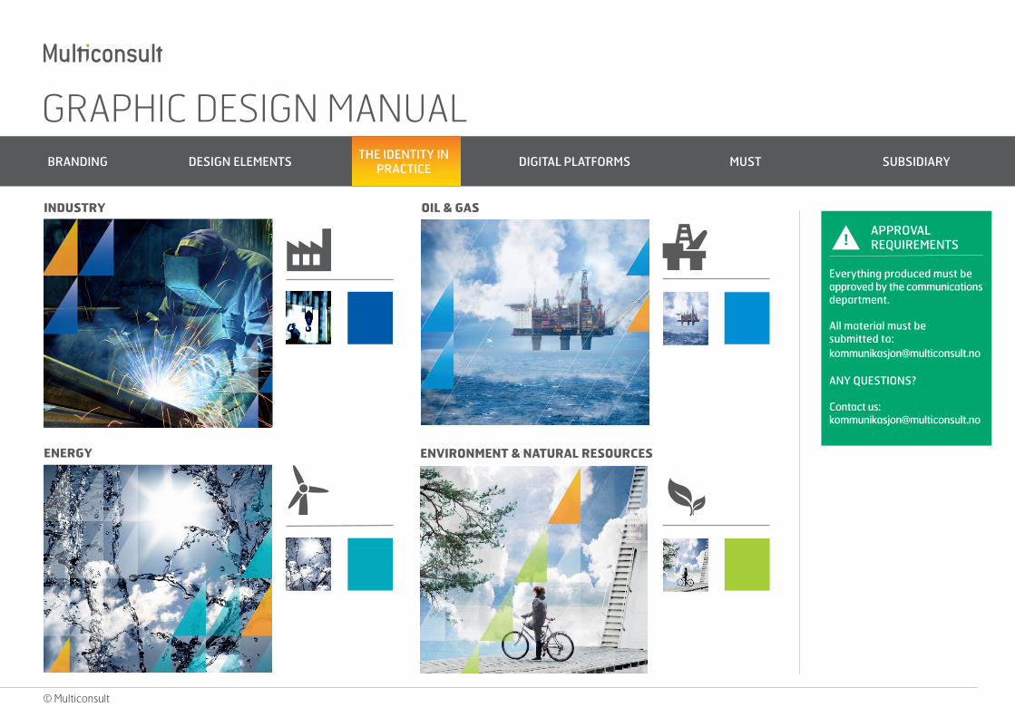
Multiconsult has six different business areas. Each of these has its own unique visual identity consisting of its own colour and business area symbol. The business area’s colour should be the dominant colour in all material that is produced for a specific business area. The symbol should be used where appropriate. Combining business area colours is not generally permitted. The exception is if two or more business areas are to be presented in the same print publication or on the same screen.
Each business area also has its own featured image. These pictures can be used where appropriate, but you may also use other relevant pictures.
When producing materials for a business area, you should in general adhere to Multiconsult’s main visual identity. The grid, triangles, typography and logo should be used in the same way as in other material. Multiconsult’s main colours should also be used, but they should not dominate the business area colour.
Here you can see practical examples of how the business area identities are used
!APPROVAL REQUIREMENTS
Everything produced must be approved by the communications department.
All material must be submitted to: [email protected]
ANY QUESTIONS?
Contact us: [email protected]
BUSINESS AREAS
BUILDINGS & PROPERTIES TRANSPORTATION & INFRASTRUCTURE
GRAPHIC DESIGN MANUAL BRANDING DESIGN ELEMENTS THE IDENTITY IN
PRACTICE DIGITAL PLATFORMS MUST SUBSIDIARY
© Multiconsult
!APPROVAL REQUIREMENTS
Everything produced must be approved by the communications department.
All material must be submitted to: [email protected]
ANY QUESTIONS?
Contact us: [email protected]
INDUSTRY OIL & GAS
ENERGY ENVIRONMENT & NATURAL RESOURCES
GRAPHIC DESIGN MANUAL BRANDING DESIGN ELEMENTS THE IDENTITY IN
PRACTICE DIGITAL PLATFORMS MUST SUBSIDIARY
© Multiconsult
!APPROVAL REQUIREMENTS
Everything produced must be approved by the communications department.
All material must be submitted to: [email protected]
ANY QUESTIONS?
Contact us: [email protected].
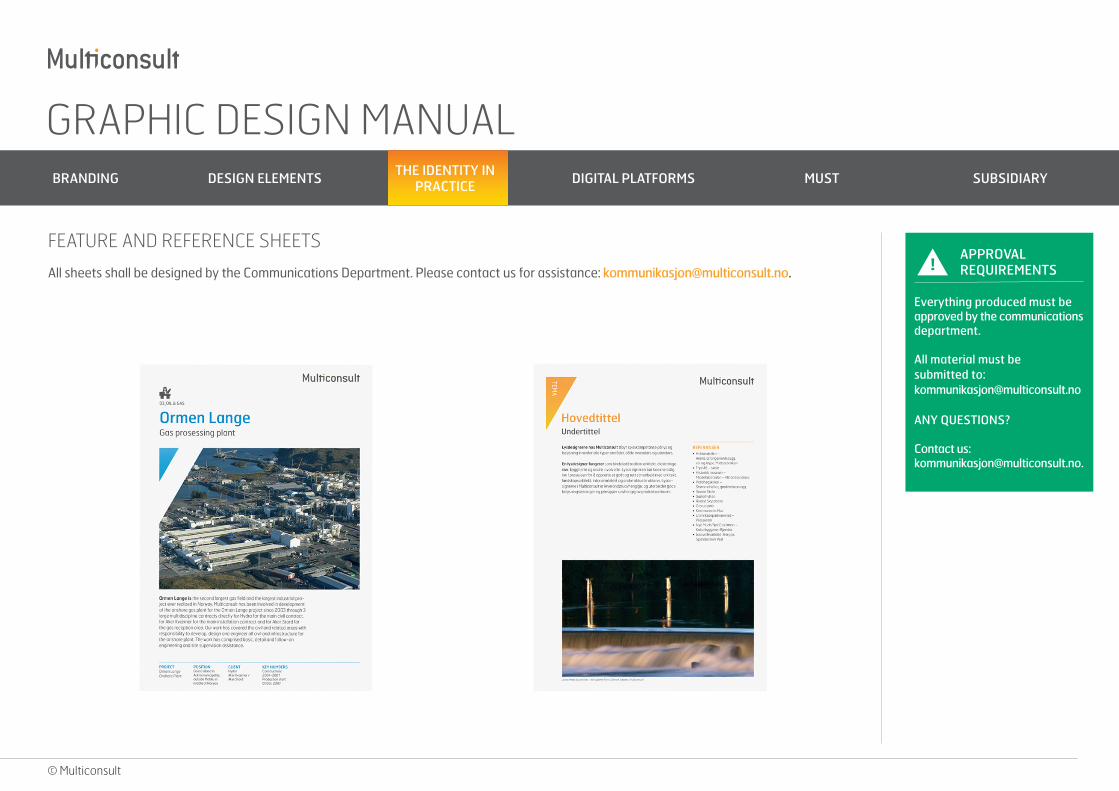
FEATURE AND REFERENCE SHEETS
All sheets shall be designed by the Communications Department. Please contact us for assistance: [email protected].
GRAPHIC DESIGN MANUAL BRANDING DESIGN ELEMENTS THE IDENTITY IN
PRACTICE DIGITAL PLATFORMS MUST SUBSIDIARY
© Multiconsult
!APPROVAL REQUIREMENTS
Everything produced must be approved by the communications department.
All material must be submitted to: [email protected]
ANY QUESTIONS?
Contact us: [email protected]
Multiconsult’s preferred paper is MultiDesign Original White supplied by Papyrus. This is an uncoated paper suitable for all kinds of printed matter.
MultiDesign is excellent for large areas of text, as the text looks very sharp and clear. If using both text and images, it provides excellent contrast.
The paper is ISO 14001 certified and FSC approved.
TYPE OF PAPER
GRAPHIC DESIGN MANUAL BRANDING DESIGN ELEMENTS THE IDENTITY IN
PRACTICE DIGITAL PLATFORMS MUST SUBSIDIARY
© Multiconsult
!APPROVAL REQUIREMENTS
Everything produced must be approved by the communications department.
All material must be submitted to: [email protected]
ANY QUESTIONS?
Contact us: [email protected]
DIGITAL PLATFORMS
GRAPHIC DESIGN MANUAL BRANDING DESIGN ELEMENTS THE IDENTITY IN
PRACTICE DIGITAL PLATFORMS MUST SUBSIDIARY
© Multiconsult
!APPROVAL REQUIREMENTS
Everything produced must be approved by the communications department.
All material must be submitted to: [email protected]
ANY QUESTIONS?
Contact us: [email protected]
MUSTLOGO
GRAPHIC ELEMENTS
THE VARIOUS DESIGN ELEMENTS IN MUST
GRAPHIC DESIGN MANUAL BRANDING DESIGN ELEMENTS THE IDENTITY IN
PRACTICE DIGITAL PLATFORMS MUST SUBSIDIARY
© Multiconsult
!APPROVAL REQUIREMENTS
Everything produced must be approved by the communications department.
All material must be submitted to: [email protected]
ANY QUESTIONS?
Contact us: [email protected]
Students and future engineers are an important area of focus for Multiconsult. We have created a separate visual identity for communicating with this target audience. The identity is based on Multiconsult’s identity, but it also has certain distinguishing features.
MUST – MULTICONSULT FOR STUDENTS
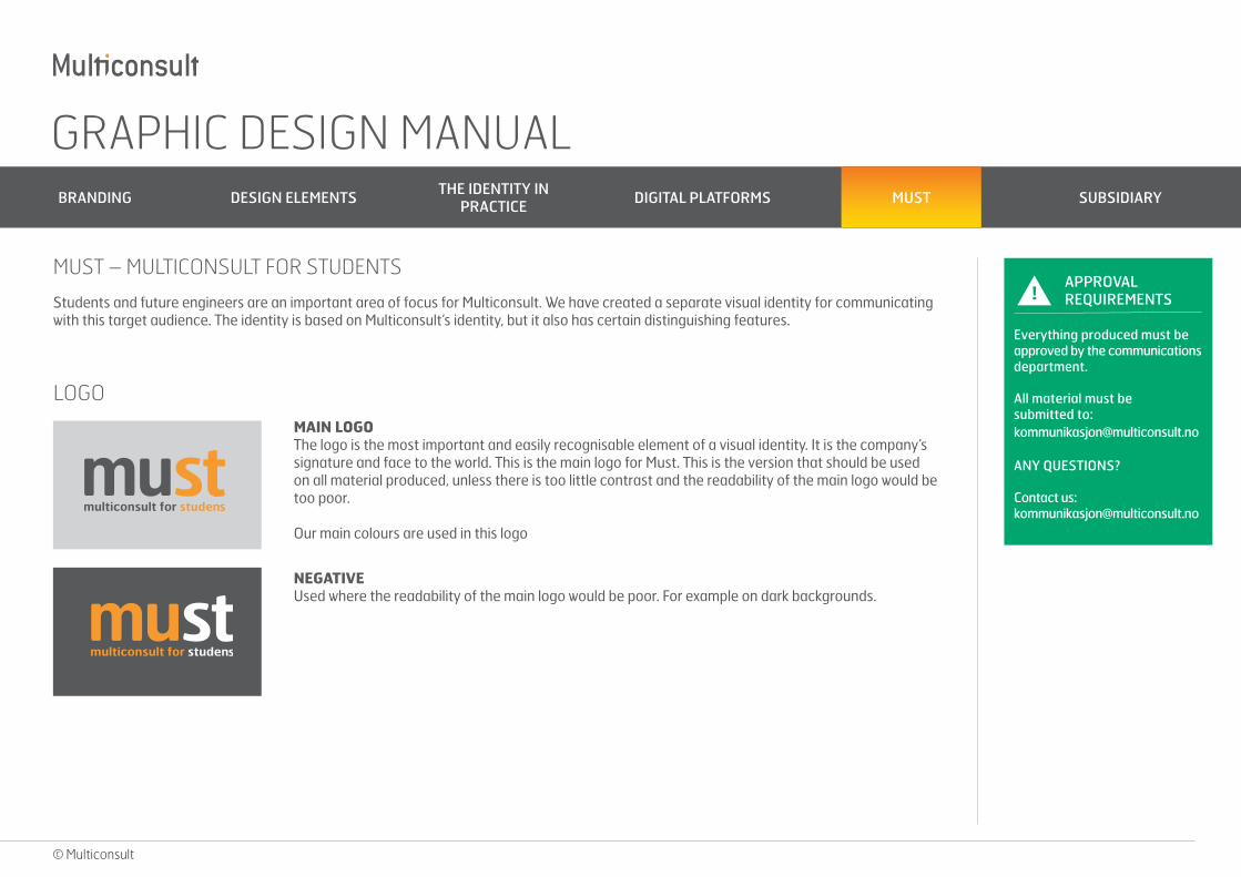
LOGO
MAIN LOGOThe logo is the most important and easily recognisable element of a visual identity. It is the company’s signature and face to the world. This is the main logo for Must. This is the version that should be used on all material produced, unless there is too little contrast and the readability of the main logo would be too poor.
Our main colours are used in this logo
NEGATIVEUsed where the readability of the main logo would be poor. For example on dark backgrounds.
GRAPHIC DESIGN MANUAL BRANDING DESIGN ELEMENTS THE IDENTITY IN
PRACTICE DIGITAL PLATFORMS MUST SUBSIDIARY
© Multiconsult
!APPROVAL REQUIREMENTS
Everything produced must be approved by the communications department.
All material must be submitted to: [email protected]
ANY QUESTIONS?
Contact us: [email protected]
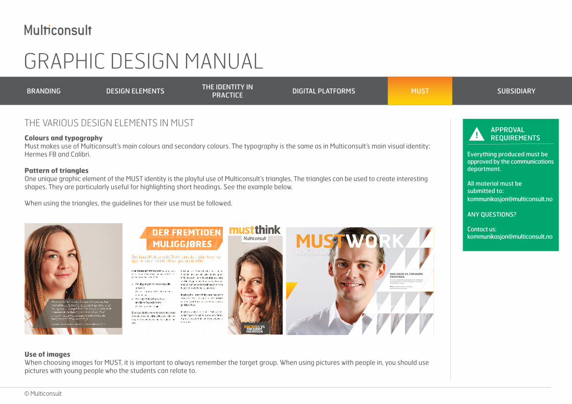
Colours and typographyMust makes use of Multiconsult’s main colours and secondary colours. The typography is the same as in Multiconsult’s main visual identity: Hermes FB and Calibri.
Pattern of trianglesOne unique graphic element of the MUST identity is the playful use of Multiconsult’s triangles. The triangles can be used to create interesting shapes. They are particularly useful for highlighting short headings. See the example below.
When using the triangles, the guidelines for their use must be followed.
THE VARIOUS DESIGN ELEMENTS IN MUST
Use of imagesWhen choosing images for MUST, it is important to always remember the target group. When using pictures with people in, you should use pictures with young people who the students can relate to.
MUSTWORKDINE IDEER VIL FORANDRE FREMTIDENSom et av landets ledende miljøer innen rådgivning og prosjektering er vi helt avhengige av nye tanker for å utvikle oss videre.
MUST er Multiconsult for studenter: www.multiconsult.no/must
GRAPHIC DESIGN MANUAL BRANDING DESIGN ELEMENTS THE IDENTITY IN
PRACTICE DIGITAL PLATFORMS MUST SUBSIDIARY
© Multiconsult
!APPROVAL REQUIREMENTS
Everything produced must be approved by the communications department.
All material must be submitted to: [email protected]
ANY QUESTIONS?
Contact us: [email protected]
SUBSIDIARY ANALYSE & STRATEGY
GRAPHIC DESIGN MANUAL BRANDING DESIGN ELEMENTS THE IDENTITY IN
PRACTICE DIGITAL PLATFORMS MUST SUBSIDIARY
© Multiconsult
!APPROVAL REQUIREMENTS
Everything produced must be approved by the communications department.
All material must be submitted to: [email protected]
ANY QUESTIONS?
Contact us: [email protected]
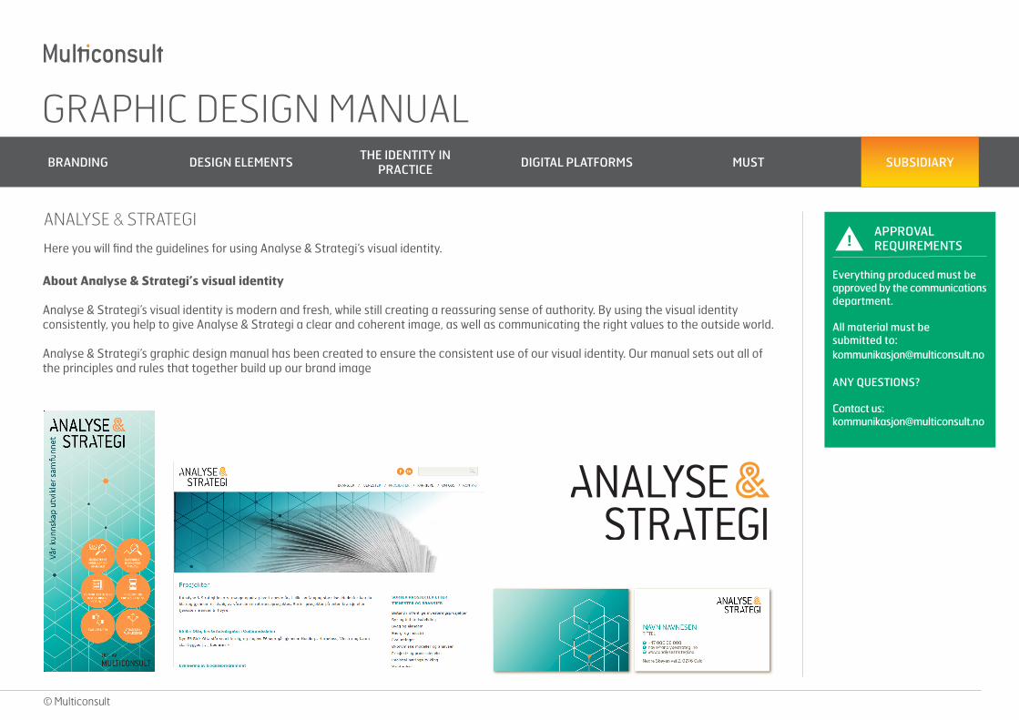
Here you will find the guidelines for using Analyse & Strategi’s visual identity.
ANALYSE & STRATEGI
About Analyse & Strategi’s visual identity
Analyse & Strategi’s visual identity is modern and fresh, while still creating a reassuring sense of authority. By using the visual identity consistently, you help to give Analyse & Strategi a clear and coherent image, as well as communicating the right values to the outside world.
Analyse & Strategi’s graphic design manual has been created to ensure the consistent use of our visual identity. Our manual sets out all of the principles and rules that together build up our brand image