frank lloyd wright -...
TRANSCRIPT
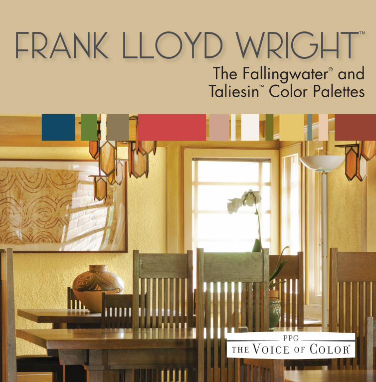
FRANK LLOYD WRIGHT™
The Fallingwater® and Taliesin™ Color Palettes
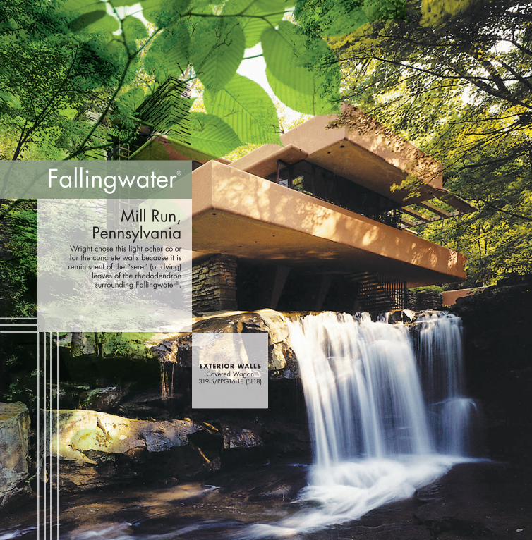
Fallingwater®
Mill Run, Pennsylvania
Wright chose this light ocher color for the concrete walls because it is reminiscent of the “sere” (or dying)
leaves of the rhododendron surrounding Fallingwater®.
EXTERIOR WALLSCovered Wagon
319-5/PPG16-18 (SL18)
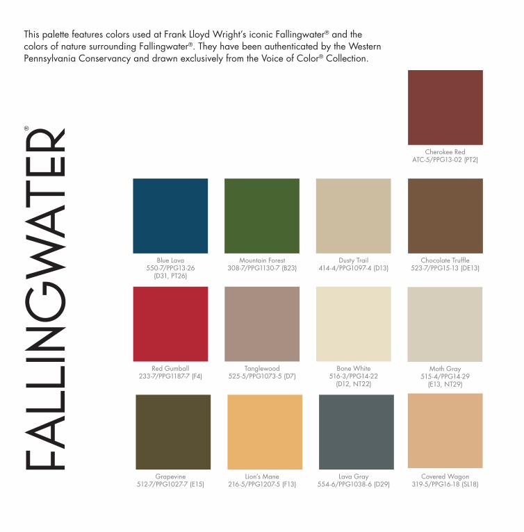
This palette features colors used at Frank Lloyd Wright’s iconic Fallingwater® and the colors of nature surrounding Fallingwater®. They have been authenticated by the Western Pennsylvania Conservancy and drawn exclusively from the Voice of Color® Collection.
Fall
ing
water
®
Red Gumball233-7/PPG1187-7 (F4)
Tanglewood525-5/PPG1073-5 (D7)
Lion’s Mane216-5/PPG1207-5 (F13)
Bone White516-3/PPG14-22
(D12, NT22)
Moth Gray515-4/PPG14-29
(E13, NT29)
Grapevine512-7/PPG1027-7 (E15)
Lava Gray554-6/PPG1038-6 (D29)
Covered Wagon319-5/PPG16-18 (SL18)
Cherokee RedATC-5/PPG13-02 (PT2)
Blue Lava550-7/PPG13-26
(D31, PT26)
Mountain Forest308-7/PPG1130-7 (B23)
Dusty Trail414-4/PPG1097-4 (D13)
Chocolate Truffl e523-7/PPG15-13 (DE13)
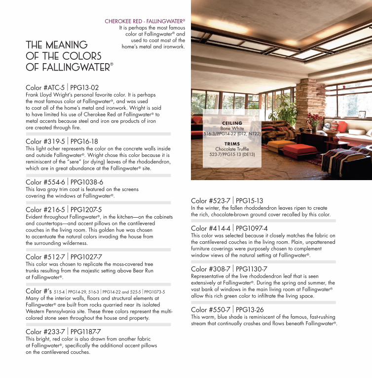
Color #ATC-5 I PPG13-02Frank Lloyd Wright’s personal favorite color. It is perhaps the most famous color at Fallingwater®, and was used to coat all of the home’s metal and ironwork. Wright is said to have limited his use of Cherokee Red at Fallingwater® to metal accents because steel and iron are products of iron ore created through fi re.
Color #319-5 I PPG16-18This light ocher represents the color on the concrete walls inside and outside Fallingwater®. Wright chose this color because it is reminiscent of the “sere” (or dying) leaves of the rhododendron, which are in great abundance at the Fallingwater® site.
Color #554-6 I PPG1038-6This lava gray trim coat is featured on the screens covering the windows at Fallingwater®.
Color #216-5 I PPG1207-5Evident throughout Fallingwater®, in the kitchen—on the cabinets and countertops—and accent pillows on the cantilevered couches in the living room. This golden hue was chosen to accentuate the natural colors invading the house from the surrounding wilderness.
Color #512-7 I PPG1027-7This color was chosen to replicate the moss-covered tree trunks resulting from the majestic setting above Bear Run at Fallingwater®.
Color #’s 515-4 I PPG14-29, 516-3 I PPG14-22 and 525-5 I PPG1073-5Many of the interior walls, fl oors and structural elements at Fallingwater® are built from rocks quarried near its isolated Western Pennsylvania site. These three colors represent the multi-colored stone seen throughout the house and property.
Color #233-7 I PPG1187-7This bright, red color is also drawn from another fabric at Fallingwater®, specifi cally the additional accent pillows on the cantilevered couches.
Color #523-7 I PPG15-13In the winter, the fallen rhododendron leaves ripen to create the rich, chocolate-brown ground cover recalled by this color.
Color #414-4 I PPG1097-4This color was selected because it closely matches the fabric on the cantilevered couches in the living room. Plain, unpatterened furniture coverings were purposely chosen to complement window views of the natural setting at Fallingwater®.
Color #308-7 I PPG1130-7Representative of the live rhododendron leaf that is seen extensively at Fallingwater®. During the spring and summer, the vast bank of windows in the main living room at Fallingwater® allow this rich green color to infi ltrate the living space.
Color #550-7 I PPG13-26This warm, blue shade is reminiscent of the famous, fast-rushingstream that continually crashes and fl ows beneath Fallingwater®.
CHEROKEE RED - FALLINGWATER®
It is perhaps the most famouscolor at Fallingwater® and
used to coat most of thehome’s metal and ironwork.The Meaning
of the Colors of Fallingwater
®
CEILINGBone White
516-3/PPG14-22 (D12, NT22)
TRIMSChocolate Truffl e
523-7/PPG15-13 (DE13)
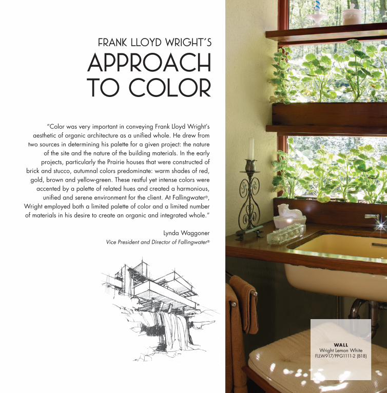
Frank Lloyd Wright’s
APPROACHTO COLOR
“Color was very important in conveying Frank Lloyd Wright’s aesthetic of organic architecture as a unifi ed whole. He drew from
two sources in determining his palette for a given project: the nature of the site and the nature of the building materials. In the early
projects, particularly the Prairie houses that were constructed of brick and stucco, autumnal colors predominate: warm shades of red,
gold, brown and yellow-green. These restful yet intense colors were accented by a palette of related hues and created a harmonious,
unifi ed and serene environment for the client. At Fallingwater®, Wright employed both a limited palette of color and a limited number of materials in his desire to create an organic and integrated whole.”
Lynda WaggonerVice President and Director of Fallingwater®
WALLWright Lemon White
FLLW917/PPG1111-2 (B18)
Phot
o: O
BMA
, ® F.
L. W
right
Fdn
.
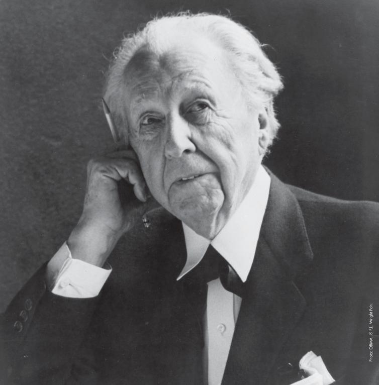
Frank Lloyd WrightFrank Lloyd Wright (1867 - 1959) is arguably America’s greatest architect and among the world’s most gifted. A man of boundless energy, he designed over 1,000 projects and authored nearly 20 books as well as hundreds of articles, letters, and speeches. Early on, Wright defi ned the principles of what he called an “organic architecture” and championed it throughout his 74 year career. Appropriate to time, place and man, an organic architecture “...proceeds, persists, creates according to the nature of man and his circumstances as they both change.”
Wright’s designs included residences, shops, hotels, religious structures, skyscrapers, civic centers, amusement parks, bridges, and museums. Believing the architect should create total environments, he also designed art glass windows, furniture, fabrics, lamps, carpets, china, statuary, urns, and tiles. Graphic, landscape and automobile designs are also found within his body of work.
Thus, we have a formidable design legacy in Frank Lloyd Wright’s work and an extensive written record setting forth the principles that defi ned and supported it. To share this legacy is our privilege.
BOOKS You may like...“Frank Lloyd Wright, An Autobiography,”Frank Lloyd Wright
“Frank Lloyd Wright’s Taliesin and Taliesin West,” Kathryn Smith
“Frank Lloyd Wright: In the Realm of Ideas,”Bruce Brooks Pfeiffer & Gerald Nordland
“The Essential Frank Lloyd Wright: Critical Writings on Architecture,” Bruce Brooks Pfeiffer
“Light Screens - the Leaded Glass of Frank Lloyd Wright,” Julie L. Sloan
“Frank Lloyd Wright’s Romance with Nature,” Lynda Waggoner
“Frank Lloyd Wright’s Fallingwater,” Carla Lind
“The Fallingwater Cookbook, Elsie Henderson’s Recipes and Memories,” Suzanna Martinson with Jane Citron and Robert Sendall
CO
NTEM
PO
RARY
USA
GE
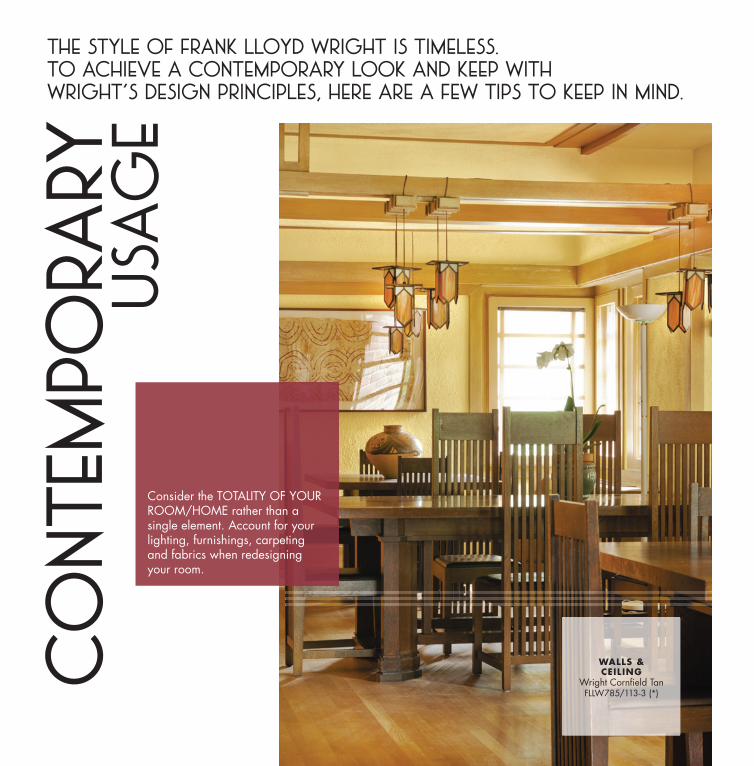
The style of Frank Lloyd Wright is timeless. To achieve a contemporary look and keep withWright’s design principles, here are a few TIPS to keep in mind.
Consider the TOTALITY OF YOUR ROOM/HOME rather than a single element. Account for your lighting, furnishings, carpeting and fabrics when redesigning your room.
WALLS &CEILING
Wright Cornfi eld TanFLLW785/113-3 (*)
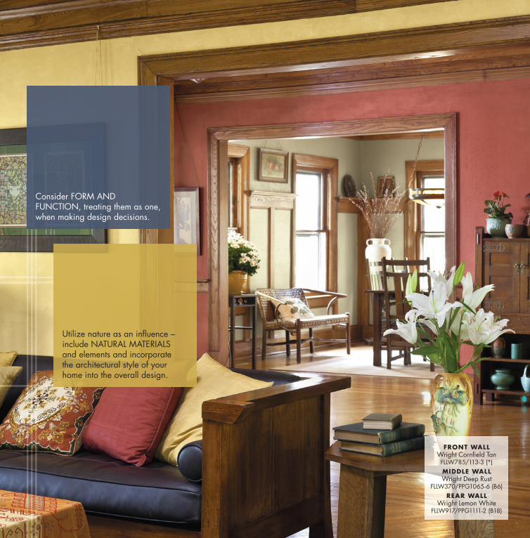
Consider FORM AND FUNCTION, treating them as one, when making design decisions.
Utilize nature as an infl uence – include NATURAL MATERIALS and elements and incorporate the architectural style of your home into the overall design.
FRONT WALLWright Cornfi eld TanFLLW785/113-3 (*)MIDDLE WALLWright Deep Rust
FLLW370/PPG1065-6 (B6)REAR WALL
Wright Lemon WhiteFLLW917/PPG1111-2 (B18)
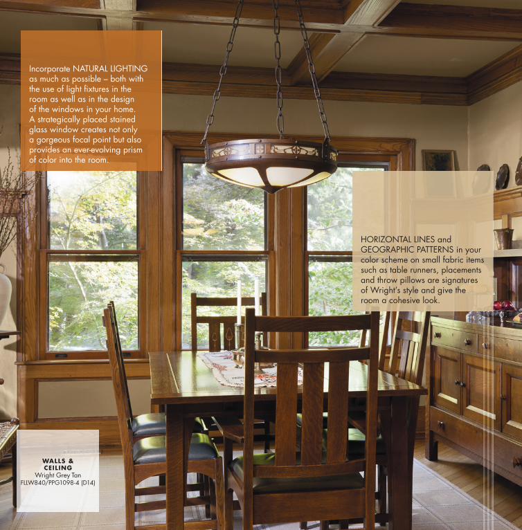
Incorporate NATURAL LIGHTING as much as possible – both with the use of light fi xtures in the room as well as in the design of the windows in your home. A strategically placed stained glass window creates not only a gorgeous focal point but also provides an ever-evolving prism of color into the room.
HORIZONTAL LINES and GEOGRAPHIC PATTERNS in your color scheme on small fabric items such as table runners, placements and throw pillows are signatures of Wright’s style and give the room a cohesive look.
WALLS &CEILING
Wright Grey TanFLLW840/PPG1098-4 (D14)
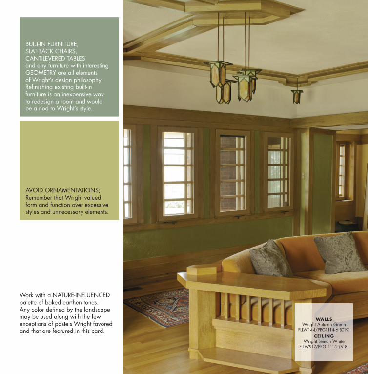
Work with a NATURE-INFLUENCED palette of baked earthen tones. Any color defi ned by the landscape may be used along with the few exceptions of pastels Wright favored and that are featured in this card.
BUILT-IN FURNITURE, SLAT-BACK CHAIRS, CANTILEVERED TABLES and any furniture with interesting GEOMETRY are all elements of Wright’s design philosophy. Refi nishing existing built-in furniture is an inexpensive way to redesign a room and would be a nod to Wright’s style.
AVOID ORNAMENTATIONS; Remember that Wright valued form and function over excessive styles and unnecessary elements.
WALLSWright Autumn Green
FLLW144/PPG1114-6 (C19)CEILING
Wright Lemon WhiteFLLW917/PPG1111-2 (B18)
Frank Lloyd Wright’s
ORIGINAL TALIESIN COLOR PALETTEThe NeutralsSeventeen neutrals were offered, with varying undertones of pink, yellow, green, and blue - ensuring there would be a neutral to pair with virtually any combination of other colors, no matter what their hue or tone.
THE PASTELSPastels might be seen as unlikely hues for Wright, since he was known to lean heavily towards neutrals and strong, earthen hues. Yet the presence of a mere fi ve pastels indicates how thoroughly he considered the marketability and totality of the color card for American consumers.
THE WARM HUESPulling the warm hues of the palette together, some of those neutrals and pastels reappear, but are now fl anked by richer orange and red hues.
THE COOL HUESThe cool hues of the Taliesin palette are just as plentiful as the warm tones, dominated by airy blues and nature-derived greens.
THE MID-TONESAnother way to consider the palette is to isolate the mid-tones, of which there are several from both the cool and warm directions of the palette. When you view these shades only, it’s easy to see how Wright considered colors for fabrics and carpeting.
THE EARTHEN SHADESAnd of course, since we began with viewing almost a full half of Wright’s Taliesin Color Palette from the perspective of Baked Earth, we must of course address the Earthen Shades. This mix of clay-like neutrals, sunset reds and oranges, and natural greens is truly indicative of the Arizona landscape.
THE ETHEREAL SHADESAnd in complete contrast, Wright still managed to include colors that could be considered light as air - like clouds or mist - these are more ethereal shades.
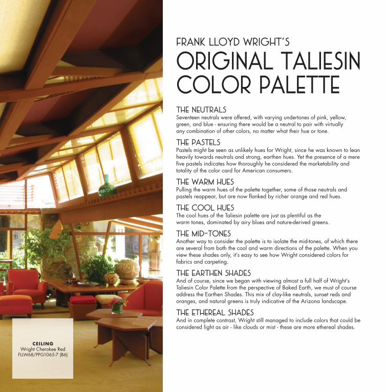
CEILINGWright Cherokee Red
FLLW68/PPG1065-7 (B6)
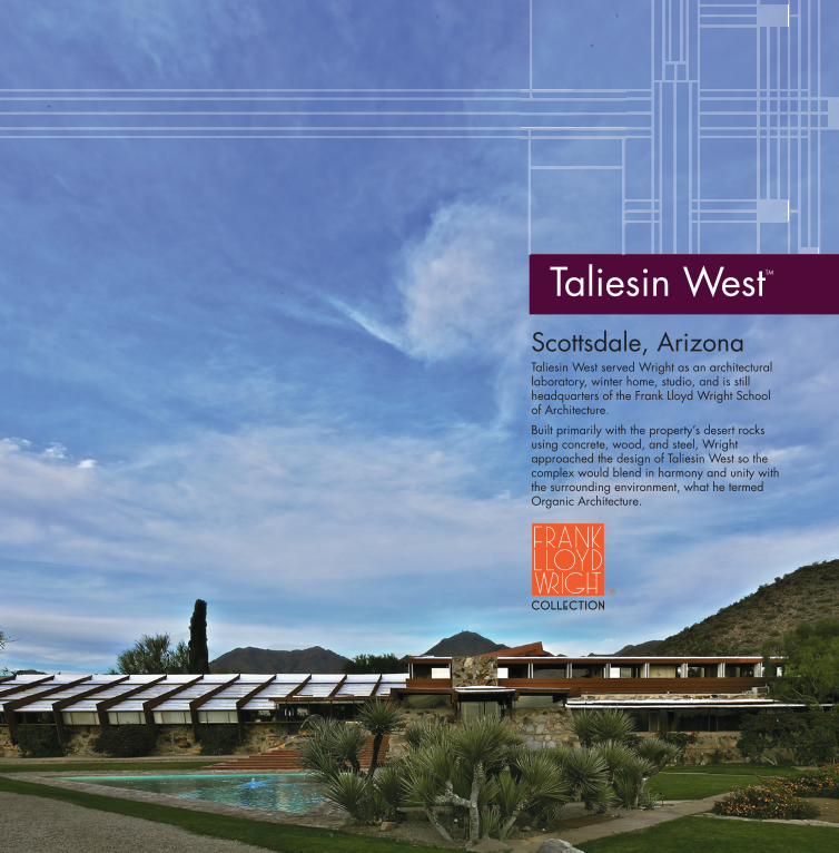
Taliesin WestTM
Scottsdale, Arizona Taliesin West served Wright as an architectural laboratory, winter home, studio, and is still headquarters of the Frank Lloyd Wright School of Architecture.
Built primarily with the property’s desert rocks using concrete, wood, and steel, Wright approached the design of Taliesin West so the complex would blend in harmony and unity with the surrounding environment, what he termed Organic Architecture.

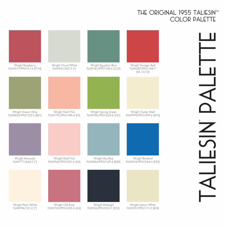
The collection below is the original palette compiled by Frank Lloyd Wright in 1955. The grouping of 36 hues is exceptionally complete and offers exponential variations for micro harmonies. All of these colors have beencarefully and perfectly matched by laboratory color specialists at PPG to be identical to Wright’s original color selection.
Wright Blue MistFLLW892/355-4 (*)
Wright Quiet GreenFLLW618/408-6 (*)
Wright Echo BlueFLLW741/PPG1146-5 (B27)
Wright TurquoiseFLLW518/PPG1235-6 (F28)
Wright Sun TanFLLW570/221-5 (*)
Wright Pearl GrayFLLW918/PPG1097-3
(D13, DE26)
Wright GoldFLLW568/ATC-017 (*)
Wright Pottery RedFLLW539/PPG1191-5 (F6)
Wright Grey TanFLLW840/PPG1098-4 (D14)
Wright Cornfi eld TanFLLW785/113-3 (*)
Wright Autumn GreenFLLW144/PPG1114-6 (C19)
Wright Oak BarkFLLW623/PPG1074-5 (C9)
Wright MustardFLLW321/PPG1214-7 (F17)
Wright OchreFLLW325/PPG1201-6 (F11)
Wright Soft GreyFLLW872/PPG1001-4 (E24)
Wright Pale MustardFLLW724/PPG1111-4 (B18)
Wright Stone GreyFLLW858/424-4 (*)
Wright Cherokee RedTaliesin West
FLLW68/PPG1065-7 (B6)
Wright Dark EggshellFLLW726/PPG15-11 (DE11)
Wright Deep RustFLLW370/PPG1065-6 (B6)
*These colors are legacy PPG colors. If you would like a sample, please go to ppgvoiceofcolor.com and click on Frank Lloyd Wright.
THE ORIGINAL 1955 TALIESINtm
COLOR PALETTE
TALI
ESIN
™
PALE
TTE
Wright Green OliveFLLW620/PPG1122-5 (B21)
Wright RaspberryFLLW577/PPG13-14 (PT14)
Wright MurasakiFLLW771/442-5 (*)
Wright Pearl WhiteFLLW994/121-2 (*)
Wright Flesh PinkFLLW792/PPG1189-4 (F5)
Wright Cloud WhiteFLLW961/507-3 (*)
Wright Shell PinkFLLW943/PPG1051-2 (A3)
Wright Old RoseFLLW705/PPG1050-5 (A2)
Wright Spring GreenFLLW396/PPG1222-6 (F21)
Wright Egyptian BlueFLLW741/PPG1138-5 (C25)
Wright Sky BlueFLLW864/PPG1149-4 (B28)
Wright MidnightFLLW36/PPG1013-7 (E33)
Wright Oyster ShellFLLW999/PPG1099-2 (D15)
Wright Tanager RedFLLW287/PPG1188-7
(F4, CC13)
Wright BluebirdFLLW514/PPG1244-6 (F32)
Wright Lemon WhiteFLLW917/PPG1111-2 (B18)
Fallingwater® is a trademark and a registered service mark of the Western Pennsylvania Conservancy. Photographs of Fallingwater are used with permission of the Western Pennsylvania Conservancy.
This Frank Lloyd Wright Collection product is authorized by the Frank Lloyd Wright Foundation, Taliesin West, Scottsdale, Arizona, U.S.A. “Frank Lloyd Wright,” “Frank Lloyd Wright Collection,” Mr. Wright’s photograph and signature are trademarks of the Frank Lloyd Wright Foundation and are used with permission. A portion of the proceeds from this product supports the conservation and education programs of the Foundation.
©2013 Frank Lloyd Wright Foundation. All rights reserved.
For your neighborhood PPG paints retailer, visit ppgvoiceofcolor.com or call 1-800-441-9695.
PPG Architectural Coatings, Inc. • PPG Industries • One PPG Place • Pittsburgh, PA 15272 • 1-800-441-9695
A17487 • © 2013 PPG Industries, Inc. All Rights Reserved. THE VOICE OF COLOR is a registered trademark
of PPG Architectural Coatings, Inc.; THE PPG LOGO is a registered trademark of PPG Industries Ohio, Inc.
FRONT COVER PHOTOWALL
Wright Cornfi eld TanFLLW785/113-3 (*)
BACK COVER PHOTOWALL
Wright Deep RustFLLW370/PPG1065-6 (B6)