film poster analysis
TRANSCRIPT

Film Poster Analysis
‘’Sleepy Hollow’’

The focal point of the poster is the male and female protagonists that are at the top of the poster, it is a close up shot of the two in close proxemic’s which could suggest that there will be an element of romance to the film. As these two characters have appeared on the official poster it is clear that they are going to play a major part in the film. They are both well known actors, Johnny Depp and Christina Ricci, so therefore the poster targets their fans that will want to come and see the film. The Mise en Scene of these to characters shows that they are most likely from the Victorian era. This is because from what you can see they are dressed in brown colours and the male protagonist is wearing a neck- tie. Also, their hair is styled so it looks slightly messy which is what you would expect. The characters eyes aren’t directly looking at you, they are looking behind you. This gives the poster and film as a whole a spooky feel as if the antagonist is going to get you next and they are stood behind you.

Situated underneath the focal point of the poster is the catch line. It says ‘Heads will Roll’ which carries a huge amount of mystery and makes the audience curious as to what will happen in the film. The phrase ‘heads will roll’ carries a range of different but as this is a horror film the audience will now expect the film to also have an element of concealment and the need to find out who the murderer is. It also helps with again identifying the era the film will be set, however beheading was abolished before the Victorian era.
The catch line has been presented in a clear old fashioned type font in white, this is so it stands out from the dark shades in the background which helps the poster look more gothic and ties it closer to the horror genre. Also, with the font looking quiet old fashioned it means that the audience are able to further understand that the film is set in the 1800’s. The text as been put across the middle of the poster however it is not the focal point. This placement would suggest that this phrase is very important because it gives the audience a sense of mystery meaning they will want to see the film to solve the mystery. Also, you can see behind the text that the main image is fading into the subsidiary image because you can see the female protagonists hair and also some trees fading together. This shows that the text has also been used to make the fading between images look more natural.
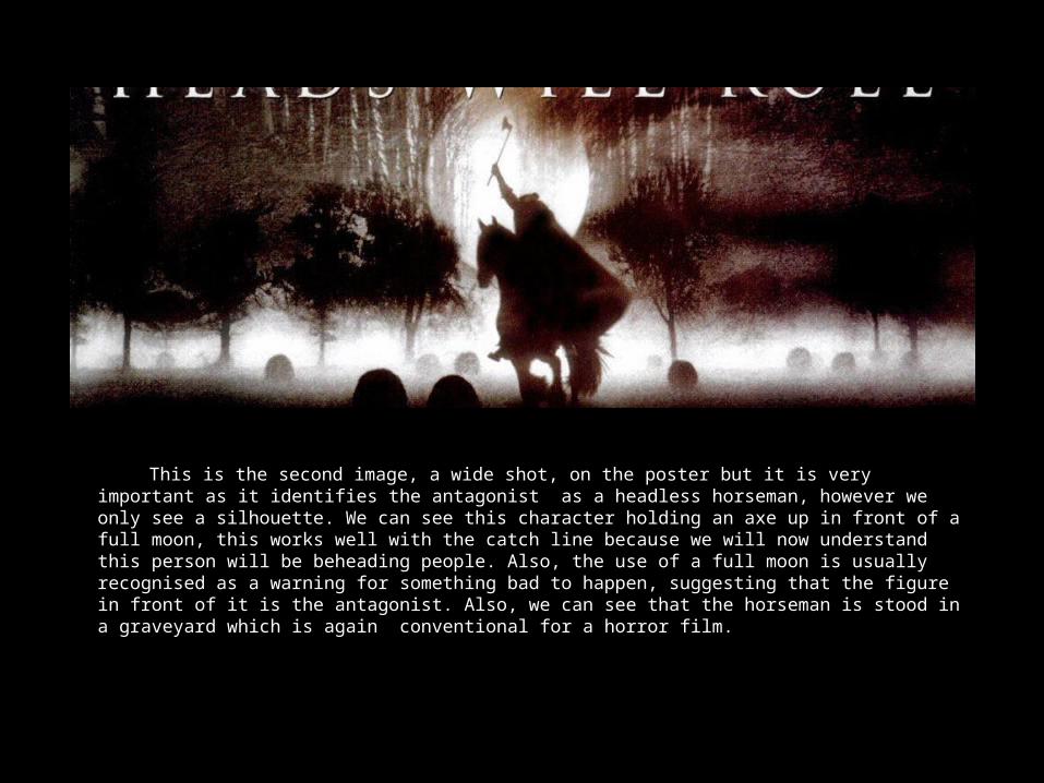
This is the second image, a wide shot, on the poster but it is very important as it identifies the antagonist as a headless horseman, however we only see a silhouette. We can see this character holding an axe up in front of a full moon, this works well with the catch line because we will now understand this person will be beheading people. Also, the use of a full moon is usually recognised as a warning for something bad to happen, suggesting that the figure in front of it is the antagonist. Also, we can see that the horseman is stood in a graveyard which is again conventional for a horror film.

Near the bottom of the film poster is the title of the film, ‘Sleepy Hollow’, which has been presented in a red font. The colour red can symbolise a lot of things but in terms of this poster I would think it has been used to symbolise mainly blood but also the fact that there will be an element of romance in the film. It has also been presented on a black background which has faded from the previous image of the horseman, making the red really prominent. The font is very easy to read and looks a lot like medieval calligraphy which again helps set a time frame for the film. Then above the films title is a credit that reads ‘ a Tim Burton film’, this is so fans of Tim Burton will want to see the film and also so you would know what to expect from the film. This is the same for the two protagonists names, who are pictured at the top of the poster, their fans will want to come see their latest film because they are in it. Their names, along with the directors, are in capital letters and a white font on a black background which suggests importance and are very clear to read.

This is the credit block which is situated directly at the bottom of the poster, it starts with the production companies, ‘Paramount Pictures’ and ‘Mandalay Pictures’. These are accompanied by their logos which are in the bottom corners of the poster. Also, throughout the whole credit block you can clearly see that the names of people and companies are significantly bigger than the words in-between, suggesting importance. The director, Tim Burton, is again mentioned twice in the credit block as well as once before next to the film title this is again showing how important he is to the film. As well as the director being mentioned again so are the lead actors names which just emphasises the fact they are important and play a big part in the film. Also near the bottom of the credit block it give the name of the author who originally wrote the book ‘Sleepy Hollow’, this directly targets fans of the author and fans of the book that will come and see this film. This is also useful for the author as people who enjoy the film may want to read the book after or people will read the book to know what the film is about. A good way to entice your audience is not letting them know the whole story, this technique has been used in the release date, it only says ‘November’ which encourages the reader to be proactive to find out when the film will actually be available to view. Then at the very bottom of the poster is the website address, giving the audience a chance to visit it to learn more about the film and find out the actual release date.