federal reserve bank of dallas southwest
TRANSCRIPT

SouthwestEconomy
FOURTH QUARTER 2019
Federal ReserveBank of Dallas
Gentrification Transforming Neighborhoods in Big Texas Cities}} Texas Sees Job, Output Gains from 2018 U.S. Tax Cut
} On the Record: Rising Demand, Renewables Generate New Challenges for Electric Utilities
} Spotlight: Banks Face Growing Cybercrime Threat
} Go Figure: Assessing the Cost of Longer Border Wait Times
PLUS

President’s Perspective
On Interest Rates and Global Government Debt“It is my view that the level and shape of the Treasury curve are reflective of slowing global growth,
heightened trade tensions and a more pessimistic view regarding the prospects for U.S. economic growth.
Pessimism regarding prospects for global growth is also one key reason why approximately 22 percent of
global government debt is now trading at negative yields.”
“Economic Conditions and the Key Structural Drivers Impacting the Economic Outlook” (essay)—Oct. 10, 2019
On the U.S. Economy “The U.S. may outperform the rest of the world, but we are not immune to slowing global growth and issues
around the world. Approximately 45 percent of S&P 500 revenues come from outside of the U.S. It’s one of
the reasons why manufacturing in the U.S. is weaker than it has been in the last 10 years and why business
fixed investment is very sluggish.”
Comments at the Reinventing Bretton Woods Conference, Washington, D.C.—Oct. 18, 2019
On Recent Trade Developments“Some of the recent deceleration in global growth, weakness in manufacturing and weakness in business
investment has been due to trade uncertainty. So, I think to the extent that there is some moderation in this
escalation, that could be a positive development.”
Comments at the Commonwealth Club of California, San Francisco, California—Oct. 11, 2019
Rob Kaplan, president and CEO of the Dallas Fed, regularly speaks and writes on the factors that affect economic growth in the nation and Eleventh District. Here are some of his recent thoughts on key issues:

3Southwest Economy • Federal Reserve Bank of Dallas • Fourth Quarter 2019
C ities across the country have expe-rienced a wave of robust growth, with city centers increasingly
attracting college-educated and high-income residents.
The trend began in large metropoli-tan areas such as New York and Chicago in the 1990s and has spread since the 2000s to more cities, including ones in Texas. The rise in wealth in central cities since the 1990s has surprised many long-term city-dwellers and research-ers, given that crime and low incomes had long been associated with the urban core.
This influx of affluent residents is also consequential, helping improve neighborhood amenities, such as res-taurants and shops, and leading to an enhanced law enforcement presence. Conversely, it has led to increasing housing costs in these areas, putting central-city living out of reach for some low-income households and at-risk populations.
This process of neighborhood change resulting from an influx of af-fluent newcomers is commonly known as gentrification.
Gentrification in Texas CitiesWhile some of the most prominent
examples of gentrification have oc-curred in coastal cities, such as San Francisco and New York, metro areas in Texas have also experienced the phenomenon.1
Similar to other large U.S. metros, major Texas metros have experienced the greatest increases in college-edu-cated residents in areas closest to the city center, with lesser changes occur-ring farther away (Chart 1).2 San Anto-
Gentrification Transforming Neighborhoods in Big Texas CitiesBy Yichen Su
nio has also undergone these changes, but they haven’t been as pronounced.
Increases in college-educated resi-dents become noticeably weaker for neighborhoods farther from down-town, although the overall change is positive at all distances because the college-educated population has in-creased throughout major metro areas. Not surprisingly, median income has also surged in centrally located neigh-borhoods compared with suburban neighborhoods.
In the Texas analysis, we consider the state’s four largest metros: Houston, Dallas, San Antonio and Austin. For purposes of computational simplicity, downtown Dallas is treated as the city center associated with the Dallas–Fort Worth metropolitan area, even though Fort Worth has an important com-mercial and cultural center that is also experiencing gentrification.
Racial composition in the central cities has also changed considerably since 2000. While the overall non-His-panic white population share declined in Houston, Dallas, San Antonio and Austin as the population grew more diverse, the proportion of non-His-panic whites increased in the urban core (Chart 2). The share of Asian residents increased overall, both in the central cities and suburbs of Hous-ton and Dallas and in the suburbs of Austin.
To provide a more complete picture of the neighborhood transition from 2000 to 2015, Table 1 shows income changes in the four cities based on quintile rankings of census-tract me-dian income. The 2015 measurement is approximated, drawing on data from
}
ABSTRACT: As an influx of new, affluent residents has descended on gentrifying neighborhoods around the centers of Texas’ four largest cities, neighborhood amenities have improved. Meanwhile, increasing housing costs have led some low-income households and at-risk populations to locate in more suburban areas.

4 Southwest Economy • Federal Reserve Bank of Dallas • Fourth Quarter 2019
CHART
2 Non-Hispanic Whites Move into Urban Centers; Asians Often Seek Suburbs
-25
-20
-15
-10
-5
0
5
10
15
20
<3 miles 3-5 miles 5-10 miles 10-20 miles >20 miles
Houston Dallas San Antonio Austin
Change in percentage
A. Non-Hispanic White Residents
Distance from city core
0
1
2
3
4
5
<3 miles 3-5 miles 5-10 miles 10-20 miles >20 miles
Houston Dallas San Antonio Austin
B. Asian Residents
Change in percentage
Distance from city core
NOTES: The measurement for 2015 is approximate and derived from the 2013–17 American Community Surveys (ACS). Charts show change in shares of population from 2000 to 2015.
SOURCES: 2000 census; ACS (2013–17).
CHART
1 College Graduates, Median Income Surge in Central Cities Since 2000
0
5
10
15
20
25
30
<3 miles 3-5 miles 5-10 miles 10-20 miles >20 miles
Houston Dallas San Antonio Austin
A. College Graduates
Change in percentage
Distance from city core
0
10
20
30
40
50
60
70
80
<3 miles 3-5 miles 5-10 miles 10-20 miles >20 miles
Houston Dallas San Antonio Austin
B. Median IncomeGrowth rate, percent
Distance from city core
NOTES: The measurement for 2015 is approximate and derived from the 2013–17 American Community Surveys (ACS). Chart 1A shows change in shares of population from 2000 to 2015.
SOURCES: 2000 census; ACS (2013–17).
est income quintile by distance to downtown along with the percentage of those tracts that have become more affluent since 2000. A large fraction of centrally located tracts started out in 2000 as among the poorest within the cities. By 2015, a larger proportion of low-income tracts in the central cities than in the suburbs had moved up.
the 2013–17 American Community Surveys. On a scale of 1 to 5, the lowest incomes are in the first quintile and the highest in the fifth.3
In each of the cities, centrally located neighborhoods in 2000 had the lowest median income (Table 1, Panel A). In Houston, for example, the average income quintile of tracts within three miles of downtown was 1.87 in 2000, compared with 3.79 for tracts farther
than 20 miles from downtown. By 2015, the average income quintile of the same tracts within three miles of downtown rose to 3.23, much higher than that of the more distant tracts, ex-cept those farther than 20 miles from downtown. Similar changes occurred in Dallas and Austin and, to a lesser degree, in San Antonio.
Table 1, Panel B shows the per-centage of census tracts in the low- (Continued on page 6)

5Southwest Economy • Federal Reserve Bank of Dallas • Fourth Quarter 2019
TABLE
1 Income Quintiles by Distance to Downtown
Houston Dallas San Antonio Austin
Panel A. Income quintile: Average and its change
2000 2015 Chg. 2000 2015 Chg. 2000 2015 Chg. 2000 2015 Chg.
< 3 miles 1.87 3.23 +1.36 1.88 2.81 +0.93 1.31 1.69 +0.38 1.57 2.50 +0.93
3-5 miles 1.98 2.75 +0.77 1.89 2.39 +0.50 1.80 1.76 -0.04 1.65 2.19 +0.54
5-10 miles 2.16 2.42 +0.26 2.09 2.30 +0.21 2.16 2.12 -0.04 2.75 2.67 -0.08
10-20 miles 2.80 2.59 -0.21 2.93 2.66 -0.27 3.84 3.77 -0.07 3.82 3.46 -0.36
> 20 miles 3.79 3.68 -0.11 3.32 3.35 +0.03 3.72 3.87 +0.15 3.29 3.21 -0.07
Panel B. Percentage of low-income tracts and share gentrified over time
Percentage of 1st quintile tracts (2000)
Percentage of 1st quintile tracts that moved up
Percentage of 1st quintile tracts (2000)
Percentage of 1st quintile tracts that moved up
Percentage of 1st quintile tracts (2000)
Percentage of 1st quintile tracts that moved up
Percentage of 1st quintile tracts (2000)
Percentage of 1st quintile tracts that moved up
< 3 miles 53 44 58 47 79 30 64 50
3-5 miles 54 36 54 24 49 27 62 43
5-10 miles 49 25 48 25 27 24 17 8
10-20 miles 17 16 14 28 3 83 0 N/A
> 20 miles 2 44 14 28 3 0 11 0
NOTE: All census tracts in the four cities are ranked by quintile—from 1 (lowest income) to 5 (highest income)—according to median income levels in 2000 and 2015.
SOURCES: 2000 census; American Community Surveys (2013–17).
CHART
3 Central Cities See Less Housing Construction, More Home Price Growth than Suburbs
0
10
20
30
40
50
60
70
80
<3 miles 3-5 miles 5-10 miles 10-20 miles >20 miles
Houston Dallas San Antonio Austin
A. Housing Units
Growth rate (percent)
Distance from city core
0
20
40
60
80
100
120
<3 miles 3-5 miles 5-10 miles 10-20 miles >20 miles
Houston Dallas San Antonio Austin
B. Average Home Value
Growth rate (percent)
Distance from city core
NOTE: The change is from 2000 to 2015.
SOURCES: 2000 census; American Community Surveys (2013–17).

6 Southwest Economy • Federal Reserve Bank of Dallas • Fourth Quarter 2019
disproportionately. Indeed, central locations in all four cities saw a large rise in home values (Chart 3B). Rent increases exhibited a similar pattern.
Displacement of At-Risk Residents Given that high-income and highly
educated residents are flocking to central city neighborhoods—and that housing costs are rising in these loca-tions—is there evidence of displace-ment of low-income residents?
Researchers differ on whether gentrification directly causes the displacement of incumbents. This is mainly because of insufficient de-
tailed data on the migration history of individuals.
However, data analysis of at-risk de-mographic groups reveals that these groups experienced a population loss in the central cities and strong popu-lation growth in the outskirts.
Chart 4 shows population growth rates by distance to downtown for four vulnerable demographic groups that are at risk of displacement: individuals without a college degree, low-income residents (making less than $30,000 annually) and black and Hispanic households. Among all four groups, population growth mainly occurs in the
With a robust inflow of high-income residents into central city locations, one would expect housing demand to increase correspondingly. Yet the rate of increase in housing units in the cen-tral cities in general was much slower than the increase in the outskirts, except in central Dallas (Chart 3A). The slower rate may reflect the higher construction and legal costs of adding housing in high-density areas.
With the inflow of high-income residents driving strong demand for housing, and slower growth in the housing stock, one would expect cen-trally located housing prices to rise
CHART
4 Vulnerable Populations Increasingly Locate in Suburbs over Central Cities
NOTE: The change is from 2000 to 2015.
SOURCES: 2000 census; American Community Surveys (2013–17).
-40
-20
0
20
40
60
80
<3 miles 3-5 miles 5-10 miles 10-20 miles >20 miles
Houston Dallas San Antonio Austin
A. Residents Without a College Degree
Growth rate (percent)
Distance from city core
-60-50-40-30-20-10
01020304050
<3 miles 3-5 miles 5-10 miles 10-20 miles >20 miles
Houston Dallas San Antonio Austin
B. Low-Income Residents (<$30k)
Growth rate (percent)
Distance from city core
-40
-20
0
20
40
60
80
100
120
<3 miles 3-5 miles 5-10 miles 10-20 miles >20 miles
Houston Dallas San Antonio Austin
C. Black ResidentsGrowth rate (percent)
Distance from city core
-40
-20
0
20
40
60
80
100
120
<3 miles 3-5 miles 5-10 miles 10-20 miles >20 miles
Houston Dallas San Antonio Austin
D. Hispanic ResidentsGrowth rate (percent)
Distance from city core
-40
-20
0
20
40
60
80
<3 miles 3-5 miles 5-10 miles 10-20 miles >20 miles
Houston Dallas San Antonio Austin
A. Residents Without a College Degree
Growth rate (percent)
Distance from city core
-60-50-40-30-20-10
01020304050
<3 miles 3-5 miles 5-10 miles 10-20 miles >20 miles
Houston Dallas San Antonio Austin
B. Low-Income Residents (<$30k)
Growth rate (percent)
Distance from city core
-40
-20
0
20
40
60
80
100
120
<3 miles 3-5 miles 5-10 miles 10-20 miles >20 miles
Houston Dallas San Antonio Austin
C. Black ResidentsGrowth rate (percent)
Distance from city core
-40
-20
0
20
40
60
80
100
120
<3 miles 3-5 miles 5-10 miles 10-20 miles >20 miles
Houston Dallas San Antonio Austin
D. Hispanic ResidentsGrowth rate (percent)
Distance from city core

7Southwest Economy • Federal Reserve Bank of Dallas • Fourth Quarter 2019
outer suburbs and population decline in the central city locations.
Due to inflation and income growth between 2000 and 2015, the low-in-come population has declined overall (Chart 4, Panel B). But the takeaway is that the decline of this group is much larger in central cities than in non-central locations.
Does the population decline of at-risk groups in central cities mean that gentrification is driving out longtime residents, who then move farther out? Not necessarily. Even in the absence of displacement (i.e., outflow does not increase), a lessened tendency to move in could result in a population decline.
To put it more intuitively, if low-income individuals searching for new locations increasingly pick suburban lo-cations over central city locations, that could lead to a shrinking low-income population in the central cities, even if no low-income residents already living in these areas have been displaced.
Nevertheless, the declining inflow of less-educated, low-income and minor-ity populations into central city loca-tions may be a cause for concern if this means that they must forego access to public transit, social connections and job opportunities, which tend to be more abundant in core locations.
Causes of Gentrification What has caused high-income and
highly educated residents to increasing-ly seek centrally located neighborhoods? Previously, affluent residents avoided the urban core because of crime fears and a broader lack of amenities.
Some researchers have shown that sharply lower urban crime rates since the 1990s have been a powerful draw.4
Others contend that recent gen-erations of college-educated young people have a stronger preference for restaurants and nightlife than their predecessors.5 Such urban amenities commonly found in central locations of large cities have become a magnet for these new residents.
Long commutes is another reason more affluent individuals have in-creasingly sought central cities.6 A disproportionate rise in the value of
highly skilled workers’ time since the 1990s increased the costs of commuting and led high-skilled workers to reside in central cities, where high-paying jobs are disproportionately concentrated.
This prompted the development of nearby amenities catering to their tastes, which, in turn, attracted more high-skilled workers who were willing to pay higher housing prices for prox-imity to these amenities. A recent pa-per demonstrated a cycle in which the income levels of residents increased, raising the demand for urban luxury amenities and giving rise to still more demand for central city housing.7
Impacts of Housing SupplyRegardless of the causes, gentrifica-
tion will likely continue transforming Texas neighborhoods near urban cen-ters. As more affluent residents move in, more economic opportunities will arise in central city neighborhoods, and amenities and quality of life will improve for local residents. That said, the increasing desirability of these neighborhoods will likely keep driving up housing costs and make central city living increasingly inaccessible to low-income households.
Economists and urban research-ers generally agree that increasing the supply of housing in these central city locations is an effective way to mini-mize rising housing costs and short-ages.8 According to the principle of supply and demand, if housing were abundant enough to keep up with rising demand, rents and house prices could stay relatively low.
Su is a research economist in the Research Department at the Federal Reserve Bank of Dallas.
Notes1 In this article, "city" is used to mean metropolitan area. Four metropolitan areas are considered: Houston, Dallas, San Antonio and Austin. Downtown Dallas is assumed to be the metro center of Dallas–Fort Worth, though historically, Fort Worth has had a freestanding commercial center that has served as a nexus for that portion of the metro area. Because gentrification is concentrated in large cities, only the largest four metro areas are discussed.
2 Each census tract is assigned a Euclidean distance to the downtown location of the metropolitan area to which it belongs. 3 The cutoff thresholds for income quintiles differ by city and by year. The income-quintile cutoffs for metro Houston in 2015 are shown for reference: 1st quintile, ($0–$29,646); 2nd quintile, ($29,750–$38,937); 3rd quintile, ($39,067–$48,072); 4th quintile, ($48,357–$64,940); 5th quintile, ($65,750+). The income measure used in the calculation is the median income reported by census tract in the American Community Survey. Dollar gaps between quintiles occur because there are no census tracts with median incomes equal to the omitted values.4 See “Has Falling Crime Invited Gentrification?” by Ingrid Gould Ellen, Keren Mertens Horn and Davin Reed, Journal of Housing Economics, forthcoming.5 “Urban Revival in America, 2000 to 2010,” by Victor Couture and Jessie Handbury, National Bureau of Economic Research, NBER Working Paper no. 24084, June 2019. 6 “The Rising Value of Time and the Origin of Urban Gentrification,” by Yichen Su, Federal Reserve Bank of Dallas, Working Paper no. 1913, October 2018, https://www.dallasfed.org/research/papers.aspx.7 “Income Growth and the Distributional Effects of Urban Spatial Sorting,“ by Victor Couture, Cecile Gaubert, Jessie Handbury and Erik Hurst, National Bureau of Economic Research, Working Paper no. 26142, August 2019.8 “The Effects of Rent Control Expansion on Tenants, Landlords, and Inequality: Evidence from San Francisco,” by Rebecca Diamond, Timothy McQuade, and Franklin Qian, American Economic Review, vol. 109, no. 9, 2019, pp. 3,365–94. Also see “The Economic Implications of Housing Supply,” by Edward Glaeser and Joseph Gyourko, Journal of Economic Perspectives, vol. 32, no. 1, 2018, pp. 3–30.

ON THE RECORD
8 Southwest Economy • Federal Reserve Bank of Dallas • Fourth Quarter 2019
A Conversation with Paula Gold-Williams
Rising Demand, Renewables Generate New Challenges for Electric Utilities
Paula Gold-Williams is president and CEO of CPS Energy, San
Antonio’s municipal utility, with more than 1 million electricity
and natural gas customers. She serves on numerous boards,
including those of the Texas Public Power Association, the Electric
Power Research Institute and the San Antonio Branch of the
Federal Reserve Bank of Dallas. She offers her perspective on the
electricity market in Texas.
Q. How do the issues your public utility faces differ from those confronting your privately owned counterparts?
The only real difference is since San Antonio citizens own the assets, includ-ing those that generate power, our job is to ensure their electricity needs are met first. Public and private utilities are all producing the same product, but we know who our customers are for the majority of our megawatts. It’s like you own a house versus you staying over-night somewhere. If you own a home, you know it will be there every day, and if you are a nomad, you must figure out your situation each night.
Essentially, we generate electricity and send it out to the grid, and then we match our customers’ electricity require-ments with generation. The Electric Reli-ability Council of Texas (ERCOT) func-tions as the exchange for this matching. Through ERCOT’s system, we are able to sell any excess power to wholesale customers outside of San Antonio at market-based prices.
When you’re a municipal entity, you don’t think about opportunistic activity. We do not build capacity to chase scar-
city pricing. We build capacity to sat-isfy the demand of our customer base. Whatever the power costs to produce and transmit, we basically sell it to our customers at that cost.
Q. What are the most significant changes the electric power generating industry in Texas has faced over the past 10 years?
The biggest change is investment in renewables. There are about 25,000 megawatts of wind capacity in Texas; that’s huge. Twenty years ago, nobody was really doing it since it was exces-sively expensive. Now the technology has gotten better, and you see a whole lot more investment.
The challenge, though, is that renew-ables are “intermittent sources.” They are dependent on the weather and time of day and have actually introduced a whole lot more instability into the mar-ket. A long time ago, variability was due to demand. Now, variability happens on both the supply and demand side.
Traditional power plants are what we call “baseload sources.” You put them online, it takes a good amount of time to safely bring up the plant all the way
to full load, and once it’s up it doesn’t matter what the weather is. Baseload generation is very consistent.
Now, you also need units that can respond very quickly to changes in in-termittent supply and demand. These “peaking” units are smaller plants that usually sit in reserve to produce addi-tional electricity to meet peak demand and can be brought online quickly.
Power from these plants is more expensive, but with more renewables in the system, you need these fast-response plants to compensate for inter-mittency. San Antonio has about 1,000 megawatts of wind power capacity, and so we also have eight peaking units to fill in for their intermittency.
We are also starting to implement and invest in energy storage because it com-plements the renewable intermittency so well. We have a site in San Antonio, on property leased from Southwest Re-search Institute, where we are testing 17,000 solar panels along with four sta-tionary trailers of batteries. Even so, stor-age can only last for about four hours.
Without storage and peakers, if you’re relying on the wind and if it stops blow-ing, you would be without power for hours while the traditional plants were brought to full operating load.
Every type of generation has its bene-fits and its limitations. Traditional base-load plants produce all of the time on a very consistent basis—but they emit CO
2. Wind is clean and renewable, but it
produces power intermittently.
Q. How does the variability of supply and demand affect the uncertainties and costs of power generation?
San Antonio has about 7,000 mega-watts of total capacity. At the peak, cus-tomers generally demand about 5,000 megawatts of power in the summer. So, our reserve margin capacity is about 2,000 megawatts. Still, if a plant goes of-fline unexpectedly, we can immediately move from a supply-rich environment to a deficit, which then exposes the community to higher and more erratic prices. We do a lot of maintenance and prep to ensure our generation units are
9Southwest Economy • Federal Reserve Bank of Dallas • Fourth Quarter 2019
available, but plants are mechanical and can still break down from time to time.
Even if the wind is blowing, peak generation time does not correlate with how people live their lives. The peak of consumer demand is typically 3-7 p.m., when most people are transitioning from work to home, their houses are rev-ving up, business are going and manu-facturing is happening.
Some people will say, “OK, we get it. Wind doesn’t produce at peak, so go after solar. It’s so cheap.” Solar actually peaks around 3 p.m., earlier than cus-tomer demand peaks.
Efficiency is typically lower for renew-ables. Efficiency is measured by the ratio of system output to system capacity, or the capacity utilization rate. A gas plant is typically considered efficient if the rate is in the 80 to 90 percent range. So-lar units may in the summer reach 50 to 60 percent efficiency but on average pro-duce at less than 30 percent efficiency. Wind is about the same. So for all of the renewable capacity you build, you gen-erate a fraction as output.
Average energy prices across the globe, but especially in Texas, are de-pressed right now. Even so, a $1 billion plant must still cover the cost of what it took to finance it.
As plants get old, they need to be taken offline and maintained through reinvestment. However, since energy prices are so low, the incentive is not there right now. Why should we build another plant if the market won’t pay us back for that? So a situation arises where Texas continues to grow and energy de-mand is eking up all the time, but energy supply is not.
Right now, the Texas market has more than enough capacity to meet total customer demand. At our annual state peak, our reserves can dip to around 2,000 megawatts, which is favorable. Except things happen. Plants can trip and stop producing, and the tighter the reserve margin gets, the more we have to worry about these trips.
It could happen that we have more demand than available supply on a par-ticular day. Until more capacity is built, these are things we have to worry about. Right now, that reserve is getting tighter and tighter, which is why prices in the ERCOT market can spike some days.
The bottom line is that the variability of supply and demand means that we need more baseload power plants built to ensure reliability. Constructing new baseload plants does not make eco-nomic sense yet since demand is greater than supply for only a short time out of the year.
Q. What about greater use of peak-load pricing and customer awareness of it?
We have one of the biggest and most successful demand response programs in the state, probably in the nation. De-mand response is a program where we offer rebates to industrial and commer-cial customers to reduce their energy usage from June to September, typically the peak months.
We also have a big residential ther-mostat program called “Reduce My Use.” Participation is voluntary, and on days with unusually high demand, we push out notifications to participants to reduce energy usage. We have 326,000
customers participating who receive messages like, “Tomorrow will be a high heat day; please join your neighbors in reducing energy use tomorrow.”
The real benefit to the customer is that management of usage will ulti-mately translate to savings on their overall energy bill. We are trying to low-er energy demand on a large scale by incenting behavior changes. If people get used to conserving, then over time it becomes natural.
As for time-of-use rates, we currently don’t use them in San Antonio. Instead, it’s all about usage. The less you use, the lower your bill is. Pretty simple.
People argue that if consumers took a bigger hit to their wallets during peak times, they would use less energy. We know there is merit in this, but we also know that San Antonio has a challenged economic position in terms of a high population of low-income families. We have many people here who are chal-lenged just to make a living, and I per-sonally believe that if we implemented time-of-use rates, it would inflict social injustice immediately.
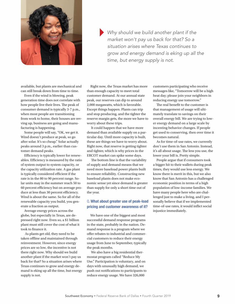
} Why should we build another plant if the market won't pay us back for that? So a situation arises where Texas continues to grow and energy demand is eking up all the time, but energy supply is not.

10 Southwest Economy • Federal Reserve Bank of Dallas • Fourth Quarter 2019
L ower income taxes have a posi-tive impact on the economy in the short run by generally boosting
consumer spending on the demand side and by increasing labor force par-ticipation, hours worked, saving and investment on the supply side.
The Tax Cuts and Jobs Act of 2017 (TCJA), signed into law on Dec. 22, 2017, extensively cut individual income and corporate taxes and is widely be-lieved to have contributed to stronger economic activity nationally in 2018.1
However, relatively little is known about the act’s impact on economic activity at the state level and, more specifically in Texas. Calculations using a tax simulation model indicate that the size of tax breaks varied widely among states.
Texas, realizing a tax cut of almost $1,400 per tax-filing household in 2018, was one of the top 10 states in terms of the size of the average tax cut relative to state-level income. Elsewhere in the U.S., tax cuts relative to 2017 averaged about $1,000 per household.
Early estimates suggest that Texas received a tax break equivalent to about 1.0 percent of its gross domestic product (GDP), which likely boosted the state’s job growth by 0.3 percentage points in 2018.
Texas Sees Job, Output Gains from 2018 U.S. Tax CutBy Anil Kumar
Nationally, the size of income tax breaks appears positively associated with job growth, confirming that the TCJA may have significantly helped drive state-level economic activity in 2018.
Tax Code Overhaul In the most extensive overhaul of the
income tax code since the Tax Reform Act of 1986, the TCJA lowered tax rates and broadened most tax brackets (Table 1). Among the most far-reaching changes, the top individual income tax rate was reduced from 39.6 percent to 37 percent and applied to income exceeding $600,000 for married filers—compared with a $470,700 threshold in 2017.2
Although federal tax law revisions such as the TCJA apply uniformly in all states, recent research presents compelling evidence that changes in average tax rates—the tax change as a percent of a state’s total income or GDP—vary widely across states.3
Importantly, tax changes often vary by income, and states differ in the share of taxpayers in different income groups. For example, analysis of 2016 statistics on tax returns from the Statis-tics of Income division of the Internal Revenue Service (IRS) shows that Texas
}
ABSTRACT: Texas is among the top 10 states in terms of tax stimulus received from the Tax Cuts and Jobs Act of 2017. The law, which took effect in 2018 and generated a tax break roughly equivalent to about 1 percent of Texas’ gross domestic product (GDP), likely played an important role in the state’s stronger subsequent job growth relative to the nation.
TABLE
1 TCJA 2017 Reduces Tax Rates, Broadens Tax Brackets
2017 2018
Tax rate (%) Tax bracket ($) Tax rate (%) Tax bracket ($)
10.0 18,650 or less 10.0 19,050 or less
15.0 18,651–75,900 12.0 19,051–77,400
25.0 75,901–153,100 22.0 77,401–165,000
28.0 153,101–233,350 24.0 165,001–315,000
33.0 233,351–416,700 32.0 315,001–400,000
35.0 416,701–470,700 35.0 400,001–600,000
39.6 Greater than 470,700 37.0 Greater than 600,000
SOURCE: Tax Foundation.
11Southwest Economy • Federal Reserve Bank of Dallas • Fourth Quarter 2019
has a smaller share of taxpayers in higher-income groups than California. Such differences in the distribution of taxpayers across income groups lead to wide variation in state-level average tax breaks.
Differences in taxpayer characteris-tics is another reason why state-level tax breaks could vary. Consider the effects of TCJA changes that nearly doubled the standard deduction and restricted the amount of itemized deductions due to state and local taxes and mortgage interest.4
The new limitations on itemized deductions would not affect as many taxpayers in Texas as in other states be-cause Texas has a substantially smaller share of taxpayers who itemize—24 percent versus 30 percent for the U.S. On the other hand, with 76 percent of Texas taxpayers taking the standard deduction, the increase in standard de-duction from 2017 to 2018 would yield sizeable tax benefits to Texas residents relative to those in other states.
The new tax law also repealed per-sonal and dependent exemptions, in-creased the amount of child tax credit and considerably reduced the scope of the Alternative Minimum Tax (AMT).5 To the extent that states differ in the number of taxpayer exemptions and
high-income taxpayers subject to the AMT, these changes further expand the impact of tax breaks across states.
State Tax CalculationsGiven disparate effects of various
TCJA tax changes across states, an im-portant first step is to measure the over-all size of state-level tax stimulus due to the TCJA. Although 2018 tax return data at the state level are unavailable, tax changes due to the new law can be approximated using 2016 Statistics of Income data. They provide information on the number of taxpayers and their tax filing characteristics for various income groups at the state level.
Taxes by state for the average 2016 taxpayer within various income groups can be calculated under the 2017 and 2018 tax laws using the National Bu-reau of Economic Research’s “Taxsim model,” a way to simulate tax liabili-ties.6 While imprecise, the difference between 2018 and 2017 taxes com-puted this way should yield a good approximation of changes attributable to the TCJA at the state level.
The Taxsim model calculates taxes based on a series of input variables, the most important of which are income, tax-filing status, number of dependents and deductions such as mortgage
interest and property taxes. These input variables are set to their averages in Statistics of Income (SOI) data for each of 10 income groups for 2016.7
State-Level Tax BreaksTax calculations indicate that higher-
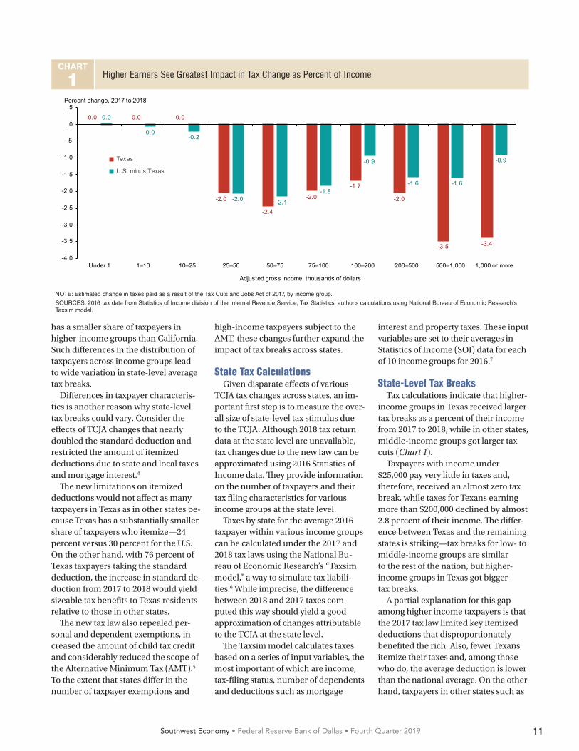
income groups in Texas received larger tax breaks as a percent of their income from 2017 to 2018, while in other states, middle-income groups got larger tax cuts (Chart 1).
Taxpayers with income under $25,000 pay very little in taxes and, therefore, received an almost zero tax break, while taxes for Texans earning more than $200,000 declined by almost 2.8 percent of their income. The differ-ence between Texas and the remaining states is striking—tax breaks for low- to middle-income groups are similar to the rest of the nation, but higher-income groups in Texas got bigger tax breaks.
A partial explanation for this gap among higher income taxpayers is that the 2017 tax law limited key itemized deductions that disproportionately benefited the rich. Also, fewer Texans itemize their taxes and, among those who do, the average deduction is lower than the national average. On the other hand, taxpayers in other states such as
CHART
1 Higher Earners See Greatest Impact in Tax Change as Percent of Income
0.0 0.0 0.0
-2.0
-2.4
-2.0
-1.7
-2.0
-3.5 -3.4
0.0
0.0-0.2
-2.0 -2.1
-1.8
-0.9
-1.6 -1.6
-0.9
-4.0
-3.5
-3.0
-2.5
-2.0
-1.5
-1.0
-.5
.0
.5
Under 1 1–10 10–25 25–50 50–75 75–100 100–200 200–500 500–1,000 1,000 or more
Adjusted gross income, thousands of dollars
Texas
U.S. minus Texas
Percent change, 2017 to 2018
NOTE: Estimated change in taxes paid as a result of the Tax Cuts and Jobs Act of 2017, by income group.
SOURCES: 2016 tax data from Statistics of Income division of the Internal Revenue Service, Tax Statistics; author's calculations using National Bureau of Economic Research's Taxsim model.
12 Southwest Economy • Federal Reserve Bank of Dallas • Fourth Quarter 2019
California and New York were unable to capitalize on itemized deductions to the extent they could in 2017.
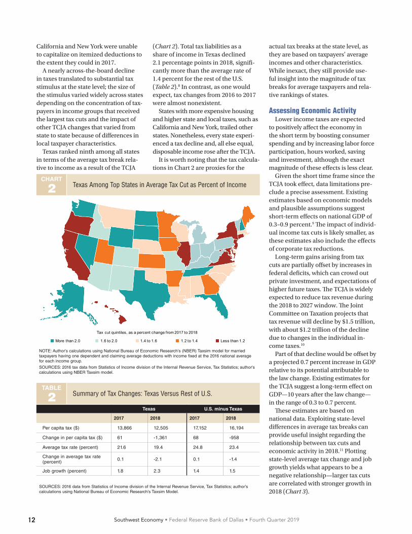
A nearly across-the-board decline in taxes translated to substantial tax stimulus at the state level; the size of the stimulus varied widely across states depending on the concentration of tax-payers in income groups that received the largest tax cuts and the impact of other TCJA changes that varied from state to state because of differences in local taxpayer characteristics.
Texas ranked ninth among all states in terms of the average tax break rela-tive to income as a result of the TCJA
(Chart 2). Total tax liabilities as a share of income in Texas declined 2.1 percentage points in 2018, signifi-cantly more than the average rate of 1.4 percent for the rest of the U.S. (Table 2).8 In contrast, as one would expect, tax changes from 2016 to 2017 were almost nonexistent.
States with more expensive housing and higher state and local taxes, such as California and New York, trailed other states. Nonetheless, every state experi-enced a tax decline and, all else equal, disposable income rose after the TCJA.
It is worth noting that the tax calcula-tions in Chart 2 are proxies for the
actual tax breaks at the state level, as they are based on taxpayers’ average incomes and other characteristics. While inexact, they still provide use-ful insight into the magnitude of tax breaks for average taxpayers and rela-tive rankings of states.
Assessing Economic ActivityLower income taxes are expected
to positively affect the economy in the short term by boosting consumer spending and by increasing labor force participation, hours worked, saving and investment, although the exact magnitude of these effects is less clear.
Given the short time frame since the TCJA took effect, data limitations pre-clude a precise assessment. Existing estimates based on economic models and plausible assumptions suggest short-term effects on national GDP of 0.3–0.9 percent.9 The impact of individ-ual income tax cuts is likely smaller, as these estimates also include the effects of corporate tax reductions.
Long-term gains arising from tax cuts are partially offset by increases in federal deficits, which can crowd out private investment, and expectations of higher future taxes. The TCJA is widely expected to reduce tax revenue during the 2018 to 2027 window. The Joint Committee on Taxation projects that tax revenue will decline by $1.5 trillion, with about $1.2 trillion of the decline due to changes in the individual in-come taxes.10
Part of that decline would be offset by a projected 0.7 percent increase in GDP relative to its potential attributable to the law change. Existing estimates for the TCJA suggest a long-term effect on GDP—10 years after the law change—in the range of 0.3 to 0.7 percent.
These estimates are based on national data. Exploiting state-level differences in average tax breaks can provide useful insight regarding the relationship between tax cuts and economic activity in 2018.11 Plotting state-level average tax change and job growth yields what appears to be a negative relationship—larger tax cuts are correlated with stronger growth in 2018 (Chart 3).
TABLE
2 Summary of Tax Changes: Texas Versus Rest of U.S.
Texas U.S. minus Texas
2017 2018 2017 2018
Per capita tax ($) 13,866 12,505 17,152 16,194
Change in per capita tax ($) 61 -1,361 68 -958
Average tax rate (percent) 21.6 19.4 24.8 23.4
Change in average tax rate (percent) 0.1 -2.1 0.1 -1.4
Job growth (percent) 1.8 2.3 1.4 1.5
SOURCES: 2016 data from Statistics of Income division of the Internal Revenue Service, Tax Statistics; author’s calculations using National Bureau of Economic Research's Taxsim Model.
CHART
2 Texas Among Top States in Average Tax Cut as Percent of Income
Tax cut quintiles, as a percent change from 2017 to 2018
More than 2.0 1.6 to 2.0 1.4 to 1.6 1.2 to 1.4 Less than 1.2
NOTE: Author's calculations using National Bureau of Economic Research's (NBER) Taxsim model for married taxpayers having one dependent and claiming average deductions with income fixed at the 2016 national average for each income group.
SOURCES: 2016 tax data from Statistics of Income division of the Internal Revenue Service, Tax Statistics; author's calculations using NBER Taxsim model.

13Southwest Economy • Federal Reserve Bank of Dallas • Fourth Quarter 2019
Evaluating State BenefitsThere are multiple reasons why
abundant caution is required when interpreting state-level results. First, if the 2017 tax cuts occurred in response to weak economic activity, the relation-ship would underestimate the actual effect. Secondly, differences in 2018 job growth could also be due to other factors likely correlated with tax cuts, conflating its effects.
For example, a permanent reduction in corporate income taxes accompa-nied lower individual income taxes. Thus, if states getting larger individual income tax breaks also gained from corporate tax cuts, then the relation-ship in Chart 3 would be an overesti-mate of the true effect of income tax cuts.12 Furthermore, states may also change their spending policies in response to the tax cuts, in which case part of the relationship in Chart 3 could simply reflect the impact of spending changes.
Nevertheless, after accounting for these other factors, the high correla-tion between tax cuts and job growth across states becomes even stronger.13 Therefore, the more-generous tax break in Texas from the TCJA likely played an important role in Texas’ 2018 stronger job growth relative to the nation.
Kumar is an economic policy advisor and senior economist in the Research Department at the Federal Reserve Bank of Dallas.
Notes1 "The Near-Term Growth Impact of the Tax Cuts and Jobs Act,” by Karel Mertens, Federal Reserve Bank of Dallas Working Paper no. 1803, March 2018.2 These individual income tax changes are set to expire after eight years, in 2025, unless Congress extends them. In addition to the individual income tax changes, the 2017 tax law cut the top corporate tax rate permanently from 35 percent to 21 percent and made far-reaching changes to the treatment of foreign-sourced income and international financial flows.3 “Tax Cuts for Whom? Heterogeneous Effects of Income Tax Changes on Growth and Employment,” by Owen M. Zidar, Journal of Political Economy, vol. 127, no. 3, 2019, pp. 1437–72.4 The standard deduction increased from $13,000 in 2017 to $24,000 in 2018 for married filers. The deduction due to state and local taxes has been capped at $10,000. The mortgage interest deduction was restricted to interest on the first $750,000 of mortgage debt compared with $1 million in 2017. 5 For more details, see The Tax Policy Center’s Briefing Book, www.taxpolicycenter.org/sites/default/files/briefing-book/bb_full_2018_1.pdf.6 All tax calculations used the National Bureau of Economic Research (NBER) Taxsim model, which is available from http://users.nber.org/~taxsim/. See “An Introduction to the TAXSIM Model,” by Daniel
Feenberg and Elisabeth Coutts, Journal of Policy Analysis and Management, vol. 12, no. 1, 1993, pp. 189–194.7 For example, taxes for a representative taxpayer in the $75,000–$100,000 income group in Texas are calculated for the average income within that income group, $86,662, assuming the taxpayer is married and filing jointly, with one dependent and a standard deduction of $24,000 in 2018. Similar calculations were made for representative taxpayers in each state in each major income group.8 While total tax liabilities include federal income, state income and payroll taxes, the decline was almost entirely driven by change in federal income taxes.9 For a review of recent estimates, see “A Preliminary Assessment of the Tax Cuts and Jobs Act of 2017,” by William Gale, Hillary Gelfond, Aaron Krupkin, Mark J. Mazur and Eric Toder, National Tax Journal, vol. 71, no. 4, 2018, pp. 589–611.10 “Estimated Budget Effects of the Conference Agreement for H.R.1, the ‘Tax Cuts and Jobs Act,’” Joint Committee on Taxation, JCX-67-17, Washington, D.C., December 2017.11 See note 3 for source of methodology used in calculation. 12 The relationship will also be an overestimate if states with larger tax cuts also were less adversely affected by 2018 tariff changes and trade policy uncertainty.13 “Did Tax Cuts and Jobs Act Create Jobs and Stimulate Growth? Early Evidence Using State-Level Variation in Tax Changes,” by Anil Kumar, Federal Reserve Bank of Dallas Working Paper, forthcoming.
CHART
3 State Job Growth Correlated with Reduced Taxes
AL
AK
AZ
AR
CA
CO
CT
DE DC
FL
GA
HI
ID
ILIN
IA
KS
KYLA
MEMD
MAMI
MN
MS
MO
MT
NE
NV
NH NJ
NMNY
NC
ND OH
OK
OR
PA
RI
SC
SD
TN
TX
UT
VT
VA
WA
WV
WIWY
-1
0
1
2
3
4
-2.5 -2.0 -1.5 -1.0 -0.5Tax change as percent of income
Job growth, percent
NOTE: Author's calculations using National Bureau of Economic Research's (NBER) Taxsim model for married taxpayers having one dependent and claiming average deductions with income fixed at the 2016 national average for each income group.
SOURCES: 2016 tax data from Statistics of Income division of the Internal Revenue Service, Tax Statistics; Bureau of Labor Statistics; author's calculations using National Bureau of Economic Research's Taxsim model.
14 Southwest Economy • Federal Reserve Bank of Dallas • Fourth Quarter 2019
SPOTLIGHT
ybercrime is on the rise in the Eleventh District, with reported incidents jumping 15 percent
to 31,185 in 2018 and losses increasing 69 percent to about $220 million over the 12-month period, according to FBI data.1 Moreover, the FBI estimates that losses are significantly underre-ported; only 15 percent of victims file a complaint.
Big companies often receive the most attention after cyber incidents—specifically data breaches involving large volumes of records—but small businesses are also at significant risk. For example, according to the Verizon 2019 Data Breach Investigation Report, 43 percent of data breaches reported nationally in 2018 occurred at small businesses. Moreover, those figures don’t take into account other types of cyber incidents at small businesses, such as instances of ransomware or business email compromise.
Cyberattacks are comparatively more burdensome for smaller firms, as they usually do not have the monetary, legal and technical resources of bigger firms.
Banks are particularly attractive cyber targets because they hold money and data. The data include customers’ per-sonally identifiable information, includ-ing Social Security numbers, addresses and dates of birth. Most bank systems operate and data reside on networks that require effective security measures. Cybercriminals make every effort to compromise those security measures to steal money or customer data that they can sell on black markets.
The composition of banks in the Eleventh District influences regulatory oversight by the Federal Reserve Bank of Dallas. Smaller banks predominate in the Eleventh District. There were 484 community banks and seven regional banks as of June 30, 2019. Community banks have less than $10 billion in as-sets and regional banks have between $10 billion and $100 billion in assets.
Eleventh District banks’ regulatory filings and public disclosures suggest
Banks Face Growing Cybercrime ThreatBy John Suek and Michael Perez
C
increasing awareness of cybercrime. The Financial Crime Enforcement Network (FinCEN) requires financial institutions to file suspicious activity reports for incidents that may signal money laundering and other criminal activity, including cybercrime.
Regulators can more easily track cybercrime within financial institutions after FinCEN added a “cyber” category to suspicious activity report forms in June 2018. District institutions filed 561 such reports in the first nine months of 2019, compared with 126 for all of 2018. Of note, the majority of reports involved cyberattacks on financial institution customers and not direct at-tacks on the institutions themselves.2
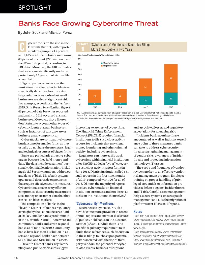
'Cybersecurity’ MentionsReferences to cybersecurity also
have become more prevalent in recent annual reports and investor disclosures of publicly held banks in the Eleventh District (Chart 1). While there is no specific regulatory requirement to in-clude these references, such discussion in these filings touches upon potential risks associated with the use of third-party vendors, the potential for cyber-related events, business disruptions
and associated losses, and regulatory expectations for managing risk.
Incidents bank examiners have encountered as well as industry experi-ence point to three measures banks can take to address cybersecurity threats: strengthening management of vendor risks, awareness of insider threats and protecting information technology (IT) assets.
The scope and frequency of vendor reviews are key to an effective vendor risk management program. Employee training on proper handling of privi-leged credentials or information pro-vides a defense against insider threats and IT risk. Careful asset management helps secure systems, ensures patch management and aids the migration of platforms over IT assets' lifespans.
Notes1 Data from 2016 Internet Crime Report, 2017 Internet Crime Report and 2018 Internet Crime Report, Federal Bureau of Investigation Internet Crime Complaint Center, www.ic3.gov. 2 Data obtained from Financial Crimes Enforcement Network Suspicious Activity Report Statistics (SARS Stats), www.fincen.gov/reports/sar-stats. The FinCEN definition of depository institutions includes credit unions.
CHART
1‘Cybersecurity’ Mentions in Securities Filings More than Double in Two Years
5 518
2525 26
34
55
0
10
20
30
40
50
60
70
80
90
2015 2016 2017 2018
Community banks Regional banks
Mentions of “cybersecurity” in institutions’ 10-Ks
NOTES: Mentions are gathered from all publicly listed banks in the Eleventh District, not limited to state member banks. The number of institutions analyzed has increased over time due to firms becoming publicly listed.
SOURCES: Securities and Exchange Commission–Edgar 10-K Forms; authors' calculations.

GO FIGUREAssessing the Cost of Longer Border Wait Times Design: Olumide Eseyin; Content: Chloe N. Smith and Jesus Cañas
Wait times spiked in spring 2019 when Customs and Border Patrol resources were diverted away from border crossings.
Wait Times at the Texas–Mexico Border, 2019
SOURCES: Bureau of Economic Analysis; U.S. Customs and Border Protection; U.S. Department of Transportation; Center for Risk and Economic Analysis of Terrorism Events, University of Southern California; Census Bureau; “Give Credit Where Credit Is Due: Tracing Value Added in Global Production Chains,” by Robert Koopman, William Powers, Zhi Wang and Shang-Jin Wei, National Bureau of Economic Research, NBER Working Paper no. 16426, September 2010.
Furniture andbedding
$9.6 billion
Medicalequipment
$9.1 billion
Fruits andvegetables
$7.7 billion
AugJulJunMayAprMarFebJan
30
60
90
Minutes
Top imports from Mexico include…
The flow of goods from Mexico was drastically delayed as a result.
$228 billion in imports from Mexico passed into Texas through border land ports in 2018
are intermediate goods that manufacturers depend on
of the content of manufacturing imports is of U.S. origin
Why is an uninterrupted flow of goodsimportant to the U.S. and Texas economies?
40%
Most U.S. imports of avocados, tomatoes, lemons and limes (as well as papayas and strawberries) come from Mexico through Texas ports.
Vehicles and vehicle parts
Machinery
$45.5 billion
Electricalequipment
$43.7 billion
$68.2 billion 22%of fruits and vegetables consumed in the U.S. areimported from Mexico.
70%+
What, no guacamole?
HIGHER COSTS AND LOST SALES
DISRUPTED ECONOMIC ACTIVITY
Damaged perishables Disrupted supply chains
Declines in cross-border trade Reduced tourism and business travel
=Cancause

Federal Reserve Bank of Dallas 2200 N. Pearl St., Dallas, TX 75201
Southwest Economyis published by the Federal Reserve Bank of Dallas. The views expressed are those of the authors and should not be attributed to the Federal Reserve Bank of Dallas or the Federal Reserve System.
Articles may be reprinted on the condition that the source is credited to the Federal Reserve Bank of Dallas.
Southwest Economy is available on the Dallas Fed website, www.dallasfed.org.
Federal ReserveBank of Dallas
PRSRT STD U.S. POSTAGE
PAID DALLAS, TEXAS PERMIT #1851
Federal Reserve Bank of DallasP.O. Box 655906Dallas, TX 75265-5906
Marc P. Giannoni, Senior Vice President and Director of ResearchPia Orrenius, Keith R. Phillips, Executive Editors Michael Weiss, EditorKathy Thacker, Associate EditorDianne Tunnell, Associate EditorJustin Chavira, Digital Designer Olumide Eseyin, Digital DesignerEmily Rogers, Digital Designer Darcy Taj, Digital Designer
Energy Sector Sees More Weakness
oftening oil prices and price expectations, negative stock market returns and tightening credit conditions are putting downward pressure on energy industry
activity and employment.Energy firms are experiencing greater difficulty borrow-
ing in the high-yield credit market because of a divergence in returns and in investor interest between energy and the broader market.
The option-adjusted spread between energy high-yield debt and non-energy high-yield debt in the U.S. rose to 424 basis points (4.24 percentage points) on Nov. 22 (Chart 1). That is the highest spread since April 2016, when the industry was still reeling from the deepest oil bust since the 1982–86 collapse.
Worsening conditions have led to increased layoffs and bankruptcies. The Haynes and Boone law firm identified 33 exploration and production firm bankruptcy filings in the first three quarters of 2019, up from 28 in all of 2018.
—Adapted from the Energy Indicators, November 2019
CHART
1Spread Widens Between Energy, Non-Energy High-Yield Debt
0
200
400
600
800
1,000
1,200
’15
'16
'17
'18
'19
Spread (424 basis points)
Basis points
’15 ’16 ’17 ’18 ’19
NOTES: The number in parentheses is the value for the week ending Nov. 22. Spread refers to the difference in yield between two classes of debt.
SOURCE: Bloomberg.
SNAPSHOT
S