february 2018 framing with visuals: a guide to …...images trigger the same cultural models as...
TRANSCRIPT

1
In becoming more intentional about framing the case for afterschool and summer learning, you may have started thinking more about the choices you make with your visuals. Photos of students, videos of programs, or graphics that illustrate research and evaluation findings can advance and strengthen your language-based framing choices. And there are multiple opportunities to include visual elements—in the design of websites, fact sheets, reports, social media, blog posts, presentation slides, etc.
RESEARCH SAYS:
1. Images trigger the same cultural models as words.
2. Images can undermine a carefully constructed verbal or written frame.
3. Images are visual short hands.
It is precisely because they trigger cultural models that you want to integrate your thinking about images into your overall messaging strategy and be systematic and thoughtful about what they advance and avoid.
Take as much care with your chosen visuals as you do the other language or text to ensure they support the story you’re trying to tell. Don’t make photo choices or the design of visuals an outsourced last step! Where possible and appropriate, bring graphic artists and web designers into the message development process so they understand your overall strategic framing strategy.
What, then, are the factors to consider when planning a visual—whether it is a film clip, photograph, illustration, infographic, chart, or map? In this document, we will consider some essential elements of framing with visuals.
Framing with Visuals: A Guide to Using Photos, Graphics, and Video
WHAT IS A CULTURAL MODEL?
Many communications efforts backfire because they fail to take into account the mental shortcuts people use to make sense of the world. Anthropologists call these deeply embedded, widely shared default ways of thinking “cultural models.” We all use cultural models to process information quickly, but these cognitive shortcuts are often inaccurate.
The FrameWorks Institute has created the STEM Swamp (a visual distillation of their in-depth communications research) to talk about these patterns in public thinking as they relate to science, technology, engineering and math (STEM) learning in formal and informal settings. It’s helpful if you have some familiarity with the STEM Swamp before you read this document.
You’ll also notice references to some of the tested framing strategies that are designed to build public support for STEM, like “Future Preparation” or “Activation.” There’s seven in total, so be sure to review them all, along with our other resources on afterschoolstemhub.org.
Developed by the FrameWorks Institute, in partnership with the Afterschool STEM Hub
February 2018

2
WIDEN THE LENS: AVOID REPRESENTATIONS OF INDIVIDUALS
There are a few reasons why you want to avoid zooming in on individuals. Close-up shots emphasize the personal, concealing environmental and systems-level influences. Ultimately, the narrower the frame, the less opportunity for systems-level thinking. Widening the lens is important because where you focus that lens can either invigorate or inhibit consideration of policies and programs as part of the solution. The way you identify the problem makes all the difference in how people are able to view solutions to social problems. When people understand issues as individual problems, they may feel critical or compassionate, or both, but they won’t see policies and programs as solutions. Often, visuals and photos do not support the text accompanying them. In general, close-up photos may not lead people to consider context and policy solutions (like image A).
Look for images that help you tell more effective stories about abstract things like learning, thinking, and problem-solving (like image B). Can you find ways of capturing activities, programs, and interactions? In the case of out-of-school environments for learning STEM, you will want to use images that have kids active in their communities, showing kids taking the initiative, learning hands-on, and communicating with their peers and members of the community.
FIRST RULE: BE WARY OF STOCK PHOTOS It’s important to anticipate the visuals or symbols that will be applied to your issue if you do nothing to control them. Generic stock photos often will trigger frames that are traditionally associated with a social issue or theme. Beware: they can do harm. Stock images can reinforce stereotypes, emphasize exceptional individuals and details to the detriment of context and trends, exclude solutions, and disperse accountability.
IMAGE A IMAGE B
Look for images that help you tell more effective stories about abstract things like learning, thinking, and problem-solving.
3
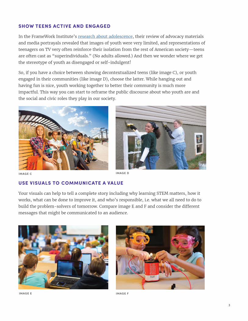
SHOW TEENS ACTIVE AND ENGAGED
In the FrameWork Institute’s research about adolescence, their review of advocacy materials and media portrayals revealed that images of youth were very limited, and representations of teenagers on TV very often reinforce their isolation from the rest of American society—teens are often cast as “superindividuals.” (No adults allowed.) And then we wonder where we get the stereotype of youth as disengaged or self-indulgent!
So, if you have a choice between showing decontextualized teens (like image C), or youth engaged in their communities (like image D), choose the latter. While hanging out and having fun is nice, youth working together to better their community is much more impactful. This way you can start to reframe the public discourse about who youth are and the social and civic roles they play in our society.
USE VISUALS TO COMMUNICATE A VALUE
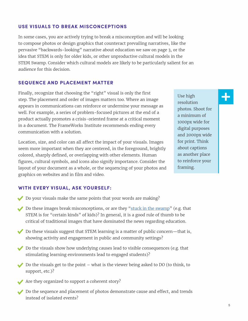
Your visuals can help to tell a complete story including why learning STEM matters, how it works, what can be done to improve it, and who’s responsible, i.e. what we all need to do to build the problem-solvers of tomorrow. Compare image E and F and consider the different messages that might be communicated to an audience.
IMAGE C IMAGE D
IMAGE E IMAGE F
4
DESIGN GRAPHICS WITH INTENTION
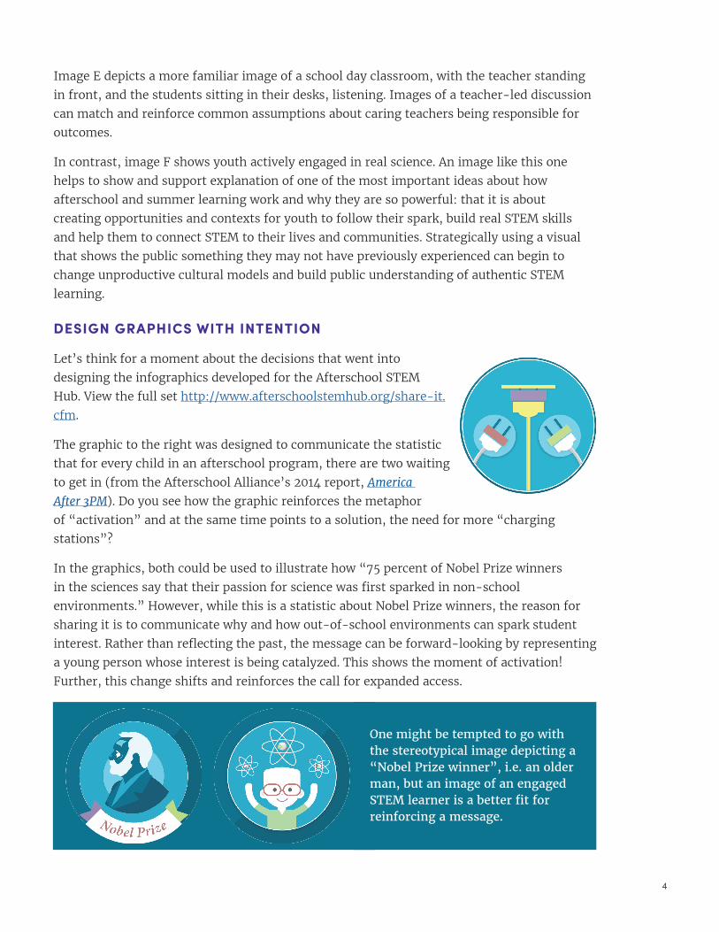
Let’s think for a moment about the decisions that went into designing the infographics developed for the Afterschool STEM Hub. View the full set http://www.afterschoolstemhub.org/share-it.cfm.
The graphic to the right was designed to communicate the statistic that for every child in an afterschool program, there are two waiting to get in (from the Afterschool Alliance’s 2014 report, America
After 3PM). Do you see how the graphic reinforces the metaphor of “activation” and at the same time points to a solution, the need for more “charging stations”?
In the graphics, both could be used to illustrate how “75 percent of Nobel Prize winners in the sciences say that their passion for science was first sparked in non-school environments.” However, while this is a statistic about Nobel Prize winners, the reason for sharing it is to communicate why and how out-of-school environments can spark student interest. Rather than reflecting the past, the message can be forward-looking by representing a young person whose interest is being catalyzed. This shows the moment of activation! Further, this change shifts and reinforces the call for expanded access.
Image E depicts a more familiar image of a school day classroom, with the teacher standing in front, and the students sitting in their desks, listening. Images of a teacher-led discussion can match and reinforce common assumptions about caring teachers being responsible for outcomes.
In contrast, image F shows youth actively engaged in real science. An image like this one helps to show and support explanation of one of the most important ideas about how afterschool and summer learning work and why they are so powerful: that it is about creating opportunities and contexts for youth to follow their spark, build real STEM skills and help them to connect STEM to their lives and communities. Strategically using a visual that shows the public something they may not have previously experienced can begin to change unproductive cultural models and build public understanding of authentic STEM learning.
One might be tempted to go with the stereotypical image depicting a “Nobel Prize winner”, i.e. an older man, but an image of an engaged STEM learner is a better fit for reinforcing a message.
5
USE VISUALS TO BREAK MISCONCEPTIONS
In some cases, you are actively trying to break a misconception and will be looking to compose photos or design graphics that counteract prevailing narratives, like the pervasive “backwards-looking” narrative about education we saw on page 3, or the idea that STEM is only for older kids, or other unproductive cultural models in the STEM Swamp. Consider which cultural models are likely to be particularly salient for an audience for this decision.
SEQUENCE AND PLACEMENT MATTER
Finally, recognize that choosing the “right” visual is only the first step. The placement and order of images matters too. Where an image appears in communications can reinforce or undermine your message as well. For example, a series of problem-focused pictures at the end of a product actually promotes a crisis-oriented frame at a critical moment in a document. The FrameWorks Institute recommends ending every communication with a solution.
Location, size, and color can all affect the impact of your visuals. Images seem more important when they are centered, in the foreground, brightly colored, sharply defined, or overlapping with other elements. Human figures, cultural symbols, and icons also signify importance. Consider the layout of your document as a whole, or the sequencing of your photos and graphics on websites and in film and video.
WITH EVERY VISUAL, ASK YOURSELF:
Do your visuals make the same points that your words are making?
Do these images break misconceptions, or are they “stuck in the swamp” (e.g. that STEM is for “certain kinds” of kids)? In general, it is a good rule of thumb to be critical of traditional images that have dominated the news regarding education.
Do these visuals suggest that STEM learning is a matter of public concern—that is, showing activity and engagement in public and community settings?
Do the visuals show how underlying causes lead to visible consequences (e.g. that stimulating learning environments lead to engaged students)?
Do the visuals get to the point – what is the viewer being asked to DO (to think, to support, etc.)?
Are they organized to support a coherent story?
Do the sequence and placement of photos demonstrate cause and effect, and trends instead of isolated events?
Use high resolution photos. Shoot for a minimum of 1000px wide for digital purposes and 2000px wide for print. Think about captions as another place to reinforce your framing.