eye on the market • energy outlook 2017 … on the market • energy outlook 2017 many rivers to...
TRANSCRIPT

The cost of solar, wind and storage continues to fall, improving cost-emissions tradeoffs for electricity grids. However, there are still many rivers to cross on the road to decarbonization. While renewables have begun to make inroads in electricity, they have barely made a dent in transportation, industry and building/home energy use. This year’s topics include renewable energy projections to 2040; the improving economics of high-renewable electricity grids; unsettled questions on hydraulic fracturing of unconventional oil and gas; Russia’s lower-carbon energy exports and its geopolitical influence; the murky decarbonization potential of forest biomass; and the imaginary greenness of college campuses.
EYE ON THE MARKET • ENERGY OUTLOOK 2017
Many Rivers to Cross
J.P. MORGAN PRIVATE BANK
Decarbonization breakthroughs and challenges

1
Investment products: Not FDIC insured • No bank guarantee • May lose value
Many Rivers to Cross: Decarbonization breakthroughs and challenges Executive Summary
The last three years have seen impressive declines in the capital cost of solar power, energy storage and to a lesser extent, wind. The impact of these changes can be seen in several ways:
• wind and solar reaching 5% of global electricity generation in 2016 (up from 0.5% in 2004), alongside 17% from hydropower
• a large increase in projected US solar capacity by the Energy Information Administration compared to its 2014 projections
• solar power auction prices around the world converging below $100 per MWh (10 cents per kWh), most of which benefits from some level of government subsidy1
• continued growth in US renewable energy capacity additions, which in 2013-2015 exceeded non-renewable capacity additions
• projections from the International Energy Agency indicating that on a global basis, renewable energy will surpass coal as the largest generation source for electricity by 2035, and within the OECD, by 2020. In these IEA forecasts, renewables meet 30%-40% of electricity demand by 2040
1 According to the IEA, 100% of global solar power relies on subsidies; by 2040, that is expected to fall to ~50%.
20
30
40
50
60
70
80
90
100
2010 2011 2012 2013 2014 2015 2016Source: EIA, NREL, Lazard, UBS, Nykvist, et. al. December 2016. Storage proxied by electric vehicle battery packs.
Declining upfront capital costs of wind, solar & storageIndex of upfront capital costs , 2010 estimates = 100
Storage
Wind
Solar
0
50
100
150
200
250
2014 projection 2017 projectionw/ Clean Power Plan
2017 projectionw/o Clean Power Plan
Solar (utility scale and distributed) Natural Gas
Source: Energy Information Administration. 2017.
Since 2014, a big jump in EIA solar capacity projections Gigawatts of US capacity projected for the period 2016-2040
0
50
100
150
200
250
300
2010 2011 2012 2013 2014 2016
Source: International Renewable Energy Agency. 2017.
Global solar auction prices converging below $100/MWh US$/MWh
Peru
India
South Africa
France
Morocco
USA
Jordan
UAE
Germany
Brazil Coal Coal Coal Coal
Natural gas Natural gas Natural gas Natural gasNuclearNuclear
Nuclear NuclearRenewables
Renewables
RenewablesRenewables
Bioenergy
Bioenergy
BioenergyBioenergy
Liquid fuels
Liquid fuels
Liquid fuelsLiquid fuels
0
5,000
10,000
15,000
20,000
25,000
30,000
35,000
40,000
2014 2025 2035 2040
IEA: globally, renewables to overtake coal-fired electr. generation by 2035, global electricity generation, TWh
Source: International Energy Agency New Policies Scenario. 2016.
2
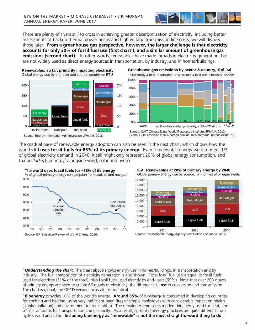
There are plenty of rivers still to cross in achieving greater decarbonization of electricity, including better assessments of backup thermal power needs and high voltage transmission line costs; we will discuss those later. From a greenhouse gas perspective, however, the larger challenge is that electricity accounts for only 30% of fossil fuel use (first chart2), and a similar amount of greenhouse gas emissions (second chart). In other words, renewables have made inroads in electricity generation, but are not widely used as direct energy sources in transportation, by industry, and in homes/buildings.
The gradual pace of renewable energy adoption can also be seen in the next chart, which shows how the world still uses fossil fuels for 85% of its primary energy. Even if renewable energy were to meet 1/3 of global electricity demand in 2040, it still might only represent 20% of global energy consumption, and that includes bioenergy3 alongside wind, solar and hydro.
2 Understanding the chart. The chart above shows energy use in homes/buildings, in transportation and by industry. The fuel composition of electricity generation is also shown. Total fossil fuel use is equal to fossil fuels used for electricity (31% of the total), plus fossil fuels used directly by end-users (69%). Note that over 200 quads of primary energy are used to create 66 quads of electricity; the difference is lost in conversion and transmission. The chart is global; the OECD version looks almost identical.
3 Bioenergy provides 10% of the world’s energy. Around 85% of bioenergy is consumed in developing countries for cooking and heating, using very inefficient open fires or simple cookstoves with considerable impact on health (smoke pollution) and environment (deforestation). The remainder represents modern bioenergy used for heat, and smaller amounts for transportation and electricity. As a result, current bioenergy practices are quite different from hydro, wind and solar. Including bioenergy as “renewable” is not the most straightforward thing to do.
Liquid fuels
Liquid fuelsLiquid fuels
Coal
Coal
Natural gas
Natural gas
Renewables
Electricity
Electricity
0
50
100
150
200
Resid/Comm Transport Industrial
Renewables: so far, primarily impacting electricityGlobal energy use by end-user and source, quadrillion BTU
Source: Energy Information Administration, JPMAM. 2016.
Liquid fuels
Coal
Natural gas
Renewables
Nuclear
0
50
100
150
200
Electricity
0%
20%
40%
60%
80%
100%
World
Electricity & heat Transport Agriculture & land use Industry Other
Source: CAIT Climate Data, World Resources Institute, JPMAM. 2013. Global GHG emissions: 76% carbon dioxide,16% methane, nitrous oxide 6%.
Greenhouse gas emissions by sector & country, % of total
China US EU 28 India Rus Indo Jp BrCa
MxTop 10 emitters sized proportionately, = 68% of World GHG
84%
86%
88%
90%
92%
94%
96%
'65 '70 '75 '80 '85 '90 '95 '00 '05 '10 '15
Source: BP Statistical Review of World Energy. 2016.
The world uses fossil fuels for ~85% of its energy% of global primary energy consumption from coal, oil and nat gas
Nuclearadoption
era
Solar/windera begins
Liquid fuels Liquid fuels Liquid fuels
Coal Coal Coal
Natural gas Natural gasNatural gasNuclear
NuclearNuclear
RenewablesRenewables
RenewablesBioenergy
Bioenergy
Bioenergy
0
2,000
4,000
6,000
8,000
10,000
12,000
14,000
16,000
18,000
2014 2025 2040
IEA: Renewables at 20% of primary energy by 2040Global primary energy use by source, mm tonnes of oil equivalents
Source: International Energy Agency New Policies Scenario. 2016.
3
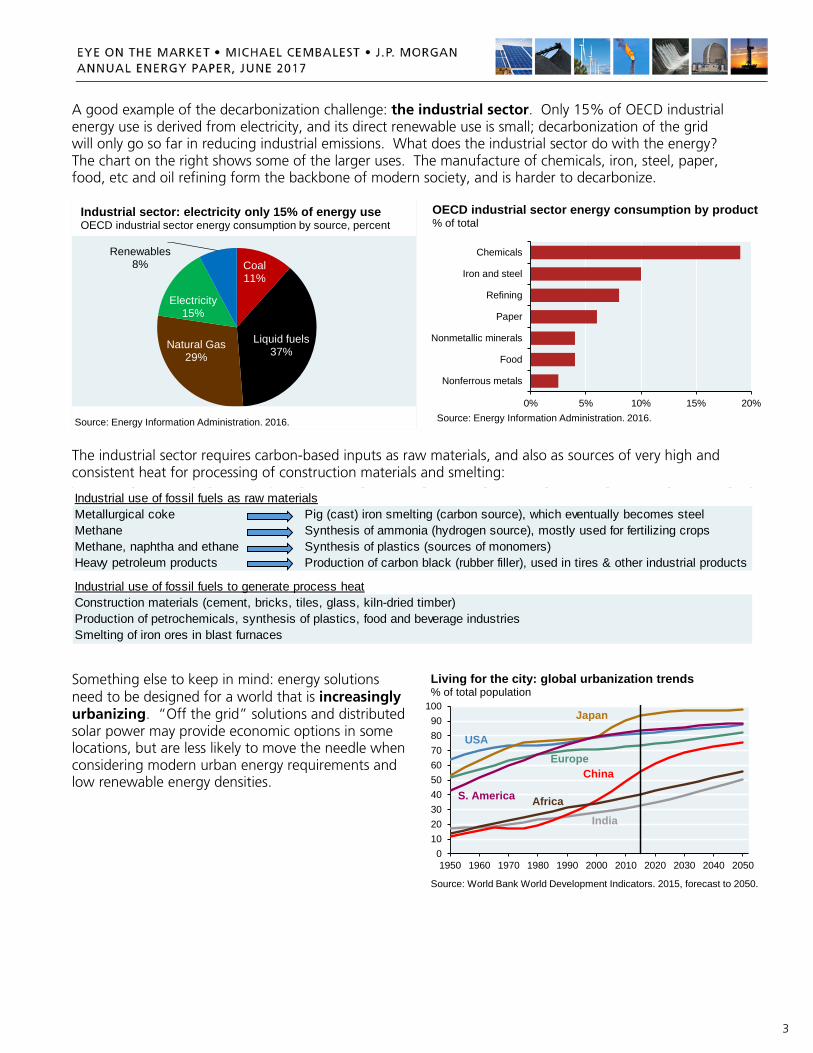
A good example of the decarbonization challenge: the industrial sector. Only 15% of OECD industrial energy use is derived from electricity, and its direct renewable use is small; decarbonization of the grid will only go so far in reducing industrial emissions. What does the industrial sector do with the energy? The chart on the right shows some of the larger uses. The manufacture of chemicals, iron, steel, paper, food, etc and oil refining form the backbone of modern society, and is harder to decarbonize.
The industrial sector requires carbon-based inputs as raw materials, and also as sources of very high and consistent heat for processing of construction materials and smelting:
Something else to keep in mind: energy solutions need to be designed for a world that is increasingly urbanizing. “Off the grid” solutions and distributed solar power may provide economic options in some locations, but are less likely to move the needle when considering modern urban energy requirements and low renewable energy densities.
Coal11%
Liquid fuels37%Natural Gas
29%
Electricity15%
Renewables8%
Source: Energy Information Administration. 2016.
Industrial sector: electricity only 15% of energy useOECD industrial sector energy consumption by source, percent
0% 5% 10% 15% 20%
Nonferrous metals
Food
Nonmetallic minerals
Paper
Refining
Iron and steel
Chemicals
Source: Energy Information Administration. 2016.
OECD industrial sector energy consumption by product % of total
Industrial use of fossil fuels as raw materialsMetallurgical coke Pig (cast) iron smelting (carbon source), which eventually becomes steelMethane Synthesis of ammonia (hydrogen source), mostly used for fertilizing cropsMethane, naphtha and ethane Synthesis of plastics (sources of monomers)Heavy petroleum products Production of carbon black (rubber filler), used in tires & other industrial products
Industrial use of fossil fuels to generate process heatConstruction materials (cement, bricks, tiles, glass, kiln-dried timber)Production of petrochemicals, synthesis of plastics, food and beverage industriesSmelting of iron ores in blast furnaces
0102030405060708090
100
1950 1960 1970 1980 1990 2000 2010 2020 2030 2040 2050
Source: World Bank World Development Indicators. 2015, forecast to 2050.
Living for the city: global urbanization trends% of total population
China
India
Japan
USAEurope
S. America Africa

4
Why all the focus on decarbonization?
I asked Vaclav Smil a few years ago to articulate for our clients why decarbonization is an important initiative. His response is useful context for both those who are convinced by consensus views on climate science, and also for those who are still on the fence:
“Underlying all of the recent moves toward renewable energy is the conviction that such a transition should be accelerated in order to avoid some of the worst consequences of rapid anthropogenic global warming. Combustion of fossil fuels is the single largest contributor to man-made emissions of CO2 which, in turn, is the most important greenhouse gas released by human activities. While our computer models are not good enough to offer reliable predictions of many possible environmental, health, economic and political effects of global warming by 2050 (and even less so by 2100), we know that energy transitions are inherently protracted affairs and hence, acting as risk minimizers, we should proceed with the de-carbonization of our overwhelmingly carbon-based electricity supply – but we must also appraise the real costs of this shift. This report is a small contribution toward that goal.”
What about Trump’s decision to pull out of the Paris Climate Accord?
Trump’s decision to pull the US out of the non-binding, voluntary Paris Climate Accord was received poorly by many climate scientists, but it may not be that impactful. The EPA cannot scrap Obama’s Clean Power Plan, since the US Supreme Court has ruled that CO2 is a pollutant to be regulated. Second, ongoing technological change and economics are the more likely drivers of emissions reductions than the Paris Accord terms. The US had agreed to targets that were likely to be met anyway. Of the 6 largest CO2 emitters, the US experienced the largest decline in emissions per capita from 2000 to 2015, in large part due to switching from coal to natural gas. The bottom line: the Paris Accord decision may not have that much of an impact on the trajectory of US energy intensity, fuel mix or CO2 emissions, despite the message inherent in the decision. What’s behind the gap between different global carbon scenarios?
In the Executive Summary, energy and electricity projections through the year 2040 are based on the IEA’s New Policies scenario. This scenario incorporates existing energy policies as well as additional measures likely to be implemented based on climate pledges submitted for the 2015 UN Climate Change Conference. The IEA projects that in this scenario, energy-related CO2 emissions grow more slowly than in the baseline case, but still rise from 32 gigatonnes of CO2 in 2015 to 37 gigatonnes in 2040.
The IEA also models a case that reduces CO2 emissions sharply by 2040, but this case would require a sea change in energy policies across the OECD and emerging economies. In this “450” scenario, global electricity generation from solar and wind grows by a factor of 7x; nuclear generation expands by 60%; and 1/3 of coal/natural gas power generation is overlaid with carbon capture and storage technology. In this scenario, before the end of the century, all emissions from fuel combustion are either captured and stored, or offset by technologies that remove carbon from the atmosphere.
10
20
30
40
50
1990 2015 2040
Source: International Energy Agency. 2016.
Global CO2 emissions from primary energy demand Gigatonnes per year
New Policies
450 scenario
Current policies

5
With that backdrop, we focus this year on issues that touch in some way on decarbonization: milestones, obstacles, misunderstandings, risks and what lies ahead. Executive summary
Pages 1-6
The grid Falling solar, storage and wind costs: the improving cost/emissions tradeoffs of high renewable electricity grids
Pages 7-12
Hydraulic fracturing
The EPA’s long-awaited 2015 review of hydraulic fracturing gave it a mostly clean bill of health. But now the EPA’s own advisory board has asked some tough questions about the EPA’s findings, prolonging the debate on the environmental cost of unconventional oil and gas
Pages 13-19
Russian energy exports
From a decarbonization perspective, Russian natural gas exports and nuclear power exports should be welcome developments, since they usually replace coal fired generation in destination countries. But what geopolitical leverage is Russia gaining along the way?
Pages 20-22
Forest biomass
Is forest biomass by definition “carbon-neutral”? Not really. The answer depends on which feedstock you use, how it is converted into energy and what time frame matters to you. A closer look based on a new analysis from the Canadian Forestry Service
Pages 23-26
College campuses
Some college campuses claim that they have reached a state of carbon-neutrality. Only in their own minds….
Page 27
Sources and acronyms Pages 28-29
Michael Cembalest JP Morgan Asset Management Acknowledgements: our technical advisor Vaclav Smil
As always, our energy Eye on the Market was overseen by Vaclav Smil, Distinguished Professor Emeritus in the Faculty of Environment at the University of Manitoba and a Fellow of the Royal Society of Canada. His inter-disciplinary research includes studies of energy systems (resources, conversions, and impacts), environmental change (particularly global biogeochemical cycles), and the history of technical advances and interactions among energy, environment, food, economy, and population. He is the author of 40 books (the latest ones, Energy Transitions and Energy and Civilization were published earlier this year) and more than 400 papers on these subjects and has lectured widely in North America, Europe, and Asia. In 2010, Foreign Policy magazine listed him among the 100 most influential global thinkers. In 2015, he received the OPEC award for research, and is described by Bill Gates as his favorite author.

6
Executive Summary supplementary materials
• Renewable electricity generation: hydropower makes up the vast majority of renewable generation on a global basis. The IEA projects that hydropower will still represent ~50% in 2040
• Electricity generation: the IEA projects that in the OECD, renewables will overtake coal around 2020
• Transportation: most passenger transportation energy consumption is related to light vehicles. Electric car penetration has to-date sharply underperformed prior expectations; it remains to be seen how quickly the decline in battery pack costs shown on page 7 in section 1 will translate into greater EV/PHEV penetration, which as of 2015, stood at just ~1%, both in the US and globally
• CO2 emissions by region: whether emissions meet projected climate-related targets will depend a lot on mitigation efforts in developing economies, and in particular China, which as of 2015 still used coal for 2/3 of its primary energy
Geothermal
Hydropower HydropowerHydropower
BioenergyBioenergy
Bioenergy
Wind
Wind
Wind
Solar
Solar
Solar
0
2,000
4,000
6,000
8,000
10,000
12,000
14,000
2014 2025 2040
IEA: hydro dominates renewables now, but wind and solar expected to grow, global electricity generation, TWh
Source: International Energy Agency New Policies Scenario. 2016.
Coal Coal Coal Coal
Natural gas Natural gas Natural gasNatural gas
Nuclear Nuclear Nuclear Nuclear
Renewables Renewables Renewables RenewablesBioenergy Bioenergy Bioenergy
BioenergyLiquid fuels Liquid fuels Liquid fuels
Liquid fuels
0
2,000
4,000
6,000
8,000
10,000
12,000
14,000
2014 2020 2025 2040
IEA: in the OECD, renewables to overtake coal-fired electricity generation by 2020, Terawatthours
Source: International Energy Agency New Policies Scenario. 2016.
Light-duty vehicle
Air
BusOther
Heavy truck
Marine
Other truckRail
0
10
20
30
40
50
60
Passenger FreightSource: Energy Information Administration. 2016.
World transportation energy consumption by modeQuadrillion Btu
0
5,000
10,000
15,000
20,000
25,000
30,000
2010 2015 2020 2025 2030 2035 2040 2045
Non-OECD
OECD
CO2 emissions from OECD and non-OECD countriesMillion metric tonnes
Source: International Energy Agency New Policies Scenario. 2016.

7
[#1] Falling photovoltaic solar and energy storage costs: what’s next for the electricity grid?
Solar and energy storage costs continue to fall. These declines reflect innovation and benefits from mass production, and are welcome signs on the road to greater adoption of renewable energy for electricity.
Before we dig deeper into this, let’s distinguish between two kinds of lithium ion battery storage:
• Electric vehicle battery packs. EV battery costs are sometimes cited solely based on the cost of their component lithium ion cells, but the more useful number is the one which includes the additional materials required to create an EV battery pack [blue line and points in chart]
• Utility-scale storage for replacing peaker plants. When using batteries to store energy for use on electricity grids4, there are additional costs, including DC to AC inverters, power conditioning hardware, software, meters and land/construction costs. The red dots in the chart show a range of cost estimates from Lazard, an actual facility completed in Pomona in 2016 and our forecasts
What does this all mean for electricity grids? After a decade of investment in wind and solar capacity, their contribution to US electricity generation is rising. Total US renewable generation is ~15%, with almost half from hydroelectric. The pace of renewable energy penetration reflects wind and solar marginal costs, and the system costs of integrating them, which entails both backup thermal power capacity and transmission infrastructure from what are often remote places.
4 There will be a lot of lessons learned about the real-life implications of using chemical battery storage for grid purposes. To be clear, this isn’t really happening yet. As of 2015, 97% of global energy storage was still based on hydroelectric pumped storage; batteries like those analyzed in this section represented less than 1%.
$1,000$1,500$2,000$2,500$3,000$3,500$4,000$4,500$5,000$5,500$6,000
'10 '11 '12 '13 '14 '15 '16 '17 '18 '19 '20
Source: NREL, EIA, Lazard, JPMAM. April 2017.
Utility scale solar PV capital cost estimatesUS$/kW-AC, assuming 1.3 inverter DC-AC loading ratio
NRELEIA
Lazard JPMAM$0
$200
$400
$600
$800
$1,000
$1,200
$1,400
'06 '07 '08 '09 '10 '11 '12 '13 '14 '15 '16 '17 '18 '19 '20
Source: Lazard, Nykvist, et. al., Green Car Reports, Utility Dive. April 2017.
Lithium ion energy storage costs: EV battery packs vs utility scale grid storage, capital cost per kWh
TeslaGM
Lazard(range)
JPMAM (range)
Electric vehicle battery packsUtility scale grid storage
0
10
20
30
40
50
60
'90 '92 '94 '96 '98 '00 '02 '04 '06 '08 '10 '12 '14 '16
Hydropower/other
Solar
Wind
Natural gas
Source: U.S. Energy Information Administration. 2015. 2016 are estimates.
Annual electricity generating capacity additions in the US, Gigawatts
0%1%2%3%4%5%6%7%8%9%
10%
'90 '92 '94 '96 '98 '00 '02 '04 '06 '08 '10 '12 '14 '16
Source: Energy Information Administration. December 2016.
Wind, solar and hydroelectric shares of US electricity generation, %
Hydro
Wind
Solar
8
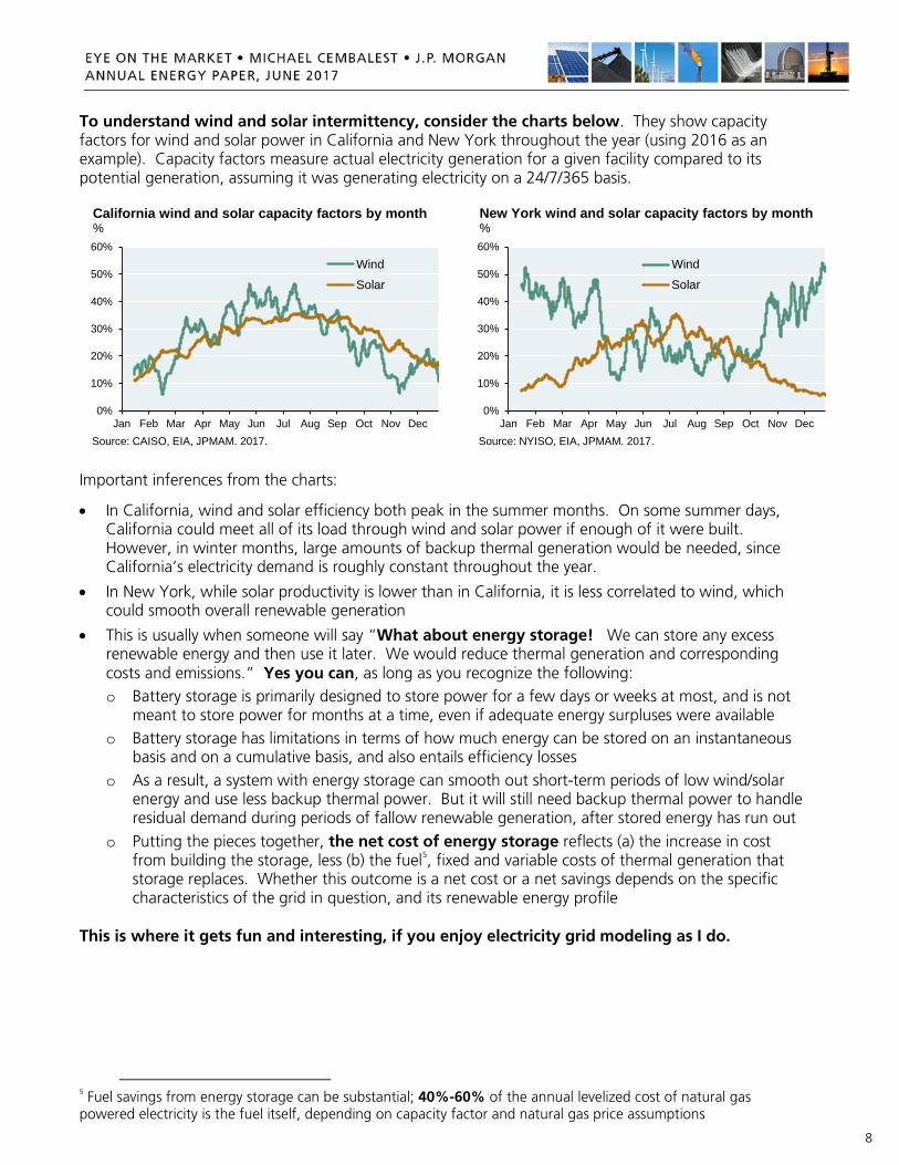
To understand wind and solar intermittency, consider the charts below. They show capacity factors for wind and solar power in California and New York throughout the year (using 2016 as an example). Capacity factors measure actual electricity generation for a given facility compared to its potential generation, assuming it was generating electricity on a 24/7/365 basis.
Important inferences from the charts:
• In California, wind and solar efficiency both peak in the summer months. On some summer days, California could meet all of its load through wind and solar power if enough of it were built. However, in winter months, large amounts of backup thermal generation would be needed, since California’s electricity demand is roughly constant throughout the year.
• In New York, while solar productivity is lower than in California, it is less correlated to wind, which could smooth overall renewable generation
• This is usually when someone will say “What about energy storage! We can store any excess renewable energy and then use it later. We would reduce thermal generation and corresponding costs and emissions.” Yes you can, as long as you recognize the following: o Battery storage is primarily designed to store power for a few days or weeks at most, and is not
meant to store power for months at a time, even if adequate energy surpluses were available o Battery storage has limitations in terms of how much energy can be stored on an instantaneous
basis and on a cumulative basis, and also entails efficiency losses o As a result, a system with energy storage can smooth out short-term periods of low wind/solar
energy and use less backup thermal power. But it will still need backup thermal power to handle residual demand during periods of fallow renewable generation, after stored energy has run out
o Putting the pieces together, the net cost of energy storage reflects (a) the increase in cost from building the storage, less (b) the fuel5, fixed and variable costs of thermal generation that storage replaces. Whether this outcome is a net cost or a net savings depends on the specific characteristics of the grid in question, and its renewable energy profile
This is where it gets fun and interesting, if you enjoy electricity grid modeling as I do.
5 Fuel savings from energy storage can be substantial; 40%-60% of the annual levelized cost of natural gas powered electricity is the fuel itself, depending on capacity factor and natural gas price assumptions
0%
10%
20%
30%
40%
50%
60%
Jan Feb Mar Apr May Jun Jul Aug Sep Oct Nov Dec
Wind
Solar
California wind and solar capacity factors by month%
Source: CAISO, EIA, JPMAM. 2017.
0%
10%
20%
30%
40%
50%
60%
Jan Feb Mar Apr May Jun Jul Aug Sep Oct Nov Dec
Wind
Solar
New York wind and solar capacity factors by month%
Source: NYISO, EIA, JPMAM. 2017.

9
How do we model this? We start with hourly generation and load data for California and New York from 2016. To meet the hourly load, baseload power from nuclear is used first; then renewables of all kinds; then natural gas to meet residual demand. Using current information and applying learning curve estimates for the near future (i.e., 2020), we examined the cost and CO2 emissions of the current grid, a grid with higher renewable penetration, and a high-renewable grid with storage. For our cost and capacity factor assumptions, please see the Supplementary Materials at the end of this section.
California already meets 50% of electricity demand via renewables6. As per our analysis, a California grid which met ~70% of demand via renewables would increase costs by 10%-15% in exchange for a 40% decline in emissions. This trade-off has improved substantially in the last few years. Could energy storage help reduce emissions further? To get to a 60% emissions decline, a larger build-out of solar could be accompanied by energy storage. However, net system costs rise further since foregone gas variable costs are less than the cost of building and maintaining the storage and the additional solar. The slope of the cost increase would look a bit better if storage costs fell to $250/kWh.
Let’s be clear about the limits of these theoretical calculations, since there are some unknowns:
• our estimates include the cost of connecting facilities to the grid, but do not include costs of building high voltage transmission lines from what are often remote locations. Our research on dedicated transmissions lines suggests that their costs could add another $15-$20 per MWh to wind and solar costs, over and above the $2-$4 per MWh assumed by the EIA for grid interconnection
• we optimized the buildout of solar and wind based on 2016 solar irradiance and windiness patterns; actual wind and solar patterns change from year to year, rendering our assumptions less optimal
• the “best” wind and solar locations are often built out first, so one cannot assume an inexhaustible supply of high capacity factor locations as wind and solar capacity expands
• consequences of high-renewable grids may not yet be fully understood (more frequent up/down ramping of natural gas plants; true field-level operating and maintenance costs of wind/solar/storage; wind/solar capacity factor degradation rates due to the passage of time and due to site density)
6 Many US states import energy from neighboring states. We allocate energy imports to respective generation categories using available information. For example, California imports hydropower and wind from the Northwest and solar from the Southwest, which boosts its “look-through” renewable generation percentage to ~50%.
On nuclear, as per state announcements, we assume that California’s Diablo Canyon and New York’s Indian Point plants are closed in the analysis. However, we do not include estimates of decommissioning costs or stranded asset costs, or ratepayer implications of adding wind and solar before the useful life of nuclear plants have expired.
$80
$85
$90
$95
$100
$105
$110
$115
50 60 70 80 90 100 110 120 130 140 150CO2 emissions, metric tonnes per GWh
Current
High renew, no storage
Higher renew, storage: $250/kWhHigher renew, storage: $500/kWh
California electricity cost-emission tradeoffs,US$ system cost per MWh
Source: CAISO, EIA, JPMAM. 2017.
Wind/Solar
Wind/Solar
Wind/Solar
Wind/Solar
StorageHydro/Geoth/Biom
Hydro/Geoth/Biom
Hydro/Geoth/Biom
Hydro/Geoth/Biom
Nat gasNat gas Nat gas Nat gas
Nuclear Nuclear Nuclear Nuclear
0%10%20%30%40%50%60%70%80%90%
100%
Current High Renew Higher Renstorage:$500/kWh
Higher Renstorage:$250/kWh
California electricity generation scenariosShare of electricity generation
Source: CAISO, JPMAM. 2017. Includes allocation of electricity imports.

10
New York. This is more of a theoretical exercise, since in NY, wind/solar comprise only 3% of electricity generation. But in principle, NY could also reduce CO2 emissions to 90 MT per GWh in exchange for a ~15% increase in system costs. One difference vs California is that NY’s build-out would start from a much lower base. The other difference is that storage is less optimal given lower NY solar capacity factors. Instead, a more cost-effective approach to reaching the deeper 60% emissions reduction target would be to build more wind/solar and discard (“curtail”) the unused amount, and not build any storage.
Conclusions. Scale and innovation are creating cost-benefit tradeoffs for decarbonizing the grid that are more favorable than they were just a few years ago, even when including backup thermal power costs. However, this is likely to be a gradual process rather than an immediate one. Bottlenecks of the past were primarily related to the high capital cost of wind, solar and storage equipment. The next phase of the renewable electricity journey involves bottlenecks of the future: public policy and the construction/cost of transmission are two of the larger ones7. As is usually the case with renewables, there’s a lot of hyperbole out there. The likely trajectory: renewables meet around one third of US electricity demand in 2040, with fossil fuels still providing almost twice that amount.
7 The Plains & Eastern Clean Line (Texas panhandle to Memphis) is the first long-distance US HVDC transmission line built in more than 20 years, at annual cost of $15-$20 per MWh. If finished on time, it will have taken 11 years to complete, and required the Dep’t of Energy to invoke Section 1222 of the Energy Policy Act on eminent domain.
$65
$70
$75
$80
$85
$90
$95
50 60 70 80 90 100 110 120 130 140 150 160 170CO2 emissions, metric tonnes per GWh
Current
High renew, no storage
Higher renew; at storage costs of $500/kWh or $250 kWh, none is built
New York electricity cost-emission tradeoffs,US$ system cost per MWh
Source: NYISO, EIA, JPMAM. 2017.
Wind/Solar
Wind/Solar
Wind/Solar
Hydro/Geoth/Biom
Hydro/Geoth/Biom
Hydro/Geoth/Biom
Hydro/Geoth/Biom
Nat gasNat gas Nat gas Nat gas
Nuclear Nuclear Nuclear Nuclear
0%10%20%30%40%50%60%70%80%90%
100%
Current High Renew Higher Renstorage:$500/kWh
Higher Renstorage:$250/kWh
New York electricity generation scenariosShare of electricity generation
Source: NYISO, JPMAM. 2017. Includes allocation of electricity imports.
20
30
40
50
60
70
80
90
100
2010 2011 2012 2013 2014 2015 2016Source: EIA, NREL, Lazard, UBS, Nykvist, et. al. December 2016. Storage proxied by electric vehicle battery packs.
Bottlenecks of the past: upfront capital costsIndex of upfront capital costs , 2010 estimates = 100
Storage
Wind
Solar
Bottlenecks of the future:
• Construction cost and eminent domain issues of high voltage direct current transmission lines often required due to remote wind and solar locations
• True operating and maintenance costs and useful lives of wind, solar and storage observed in the field after prolonged use
• Wind and solar capacity factor degradation from passage of time and suboptimal site placement and/or site density, as installations grow from megawatts to gigawatts, and require hundreds of thousands of acres of land
• Availability and pricing of rare earth elements, lithium and other commodity supply chains
11
Electricity Grid supplementary materials: costs and capacity factors
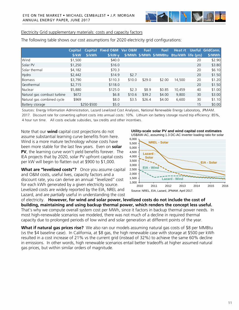
The following table shows our cost assumptions for 2020 electricity grid configurations:
Note that our wind capital cost projections do not assume substantial learning curve benefits from here. Wind is a more mature technology whose costs have been more stable for the last few years. Even on solar PV, the learning curve won’t yield benefits forever. The IEA projects that by 2020, solar PV upfront capital costs per kW will begin to flatten out at $900 to $1,000.
What are “levelized costs”? Once you assume capital and O&M costs, useful lives, capacity factors and a discount rate, you can derive an annual “levelized” cost for each kWh generated by a given electricity source. Levelized costs are widely reported by the EIA, NREL and Lazard, and are partially useful in understanding the cost of electricity. However, for wind and solar power, levelized costs do not include the cost of building, maintaining and using backup thermal power, which renders the concept less useful. That’s why we compute overall system cost per MWh, since it factors in backup thermal power needs. In most high-renewable scenarios we modeled, there was not much of a decline in required thermal capacity due to prolonged periods of low wind and solar generation at different points of the year.
What if natural gas prices rise? We also ran our models assuming natural gas costs of $8 per MMBtu (vs the $4 baseline case). In California, at $8 gas, the high renewable case with storage at $500 per kWh resulted in a cost increase of 21% vs the current grid (instead of 32%) to achieve the same 60% decline in emissions. In other words, high renewable scenarios entail better tradeoffs at higher assumed natural gas prices, but within similar orders of magnitude.
Capital Capital Fixed O&M Var O&M Fuel Fuel Heat rt Useful GridConn.$/kW $/kWh $/kW-y $/MWh $/MWh $/MMBtu Btu/kWh life (yrs) $/MWh
Wind $1,500 $40.0 20 $2.90Solar PV $1,250 $16.0 20 $3.80Solar thermal $4,182 $70.3 20 $6.10Hydro $2,442 $14.9 $2.7 20 $1.50Biomass $3,790 $110.3 $10.0 $29.0 $2.00 14,500 20 $1.20Geothermal $2,715 $118.0 20 $1.50Nuclear $5,880 $125.0 $2.3 $8.9 $0.85 10,459 40 $1.00Natural gas combust turbine $672 $6.8 $10.6 $39.2 $4.00 9,800 30 $3.00Natural gas combined cycle $969 $8.0 $3.5 $26.4 $4.00 6,600 30 $1.10Battery storage $250-$500 $5.0 15 $0.00
Sources: Energy Information Administration, Lazard Levelized Cost Analyses, National Renewable Energy Laboratory, JPMAM. 2017. Discount rate for converting upfront costs into annual costs: 10%. Lithium ion battery storage round trip efficiency: 85%, 4 hour run time. All costs exclude subsidies, tax credits and other incentives.
1,0001,5002,0002,5003,0003,5004,0004,5005,0005,5006,000
2010 2011 2012 2013 2014 2015 2016
Source: NREL, EIA, Lazard, JPMAM. April 2017.
Utility-scale solar PV and wind capital cost estimatesUS$/kW-AC, assuming 1.3 DC-AC inverter loading ratio for solar
NREL - Solar
EIA - Solar
Lazard -Solar
Lazard - Wind
EIA - Wind
12
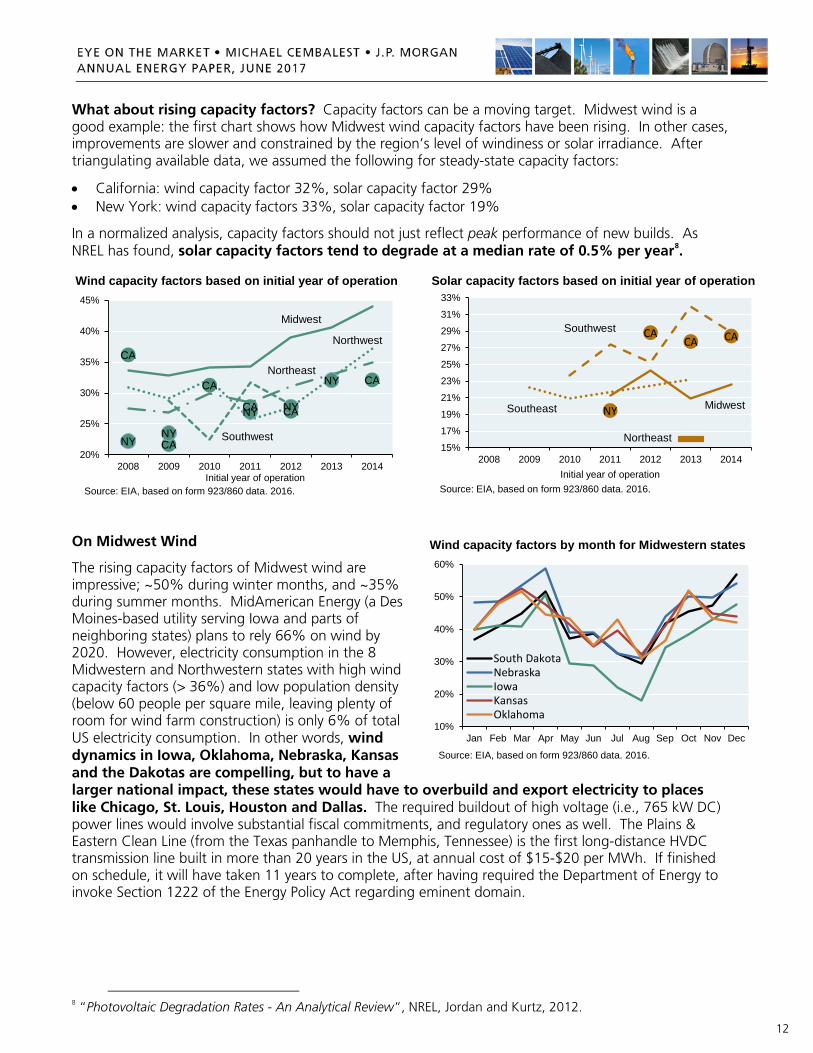
What about rising capacity factors? Capacity factors can be a moving target. Midwest wind is a good example: the first chart shows how Midwest wind capacity factors have been rising. In other cases, improvements are slower and constrained by the region’s level of windiness or solar irradiance. After triangulating available data, we assumed the following for steady-state capacity factors:
• California: wind capacity factor 32%, solar capacity factor 29% • New York: wind capacity factors 33%, solar capacity factor 19%
In a normalized analysis, capacity factors should not just reflect peak performance of new builds. As NREL has found, solar capacity factors tend to degrade at a median rate of 0.5% per year8.
On Midwest Wind
The rising capacity factors of Midwest wind are impressive; ~50% during winter months, and ~35% during summer months. MidAmerican Energy (a Des Moines-based utility serving Iowa and parts of neighboring states) plans to rely 66% on wind by 2020. However, electricity consumption in the 8 Midwestern and Northwestern states with high wind capacity factors (> 36%) and low population density (below 60 people per square mile, leaving plenty of room for wind farm construction) is only 6% of total US electricity consumption. In other words, wind dynamics in Iowa, Oklahoma, Nebraska, Kansas and the Dakotas are compelling, but to have a larger national impact, these states would have to overbuild and export electricity to places like Chicago, St. Louis, Houston and Dallas. The required buildout of high voltage (i.e., 765 kW DC) power lines would involve substantial fiscal commitments, and regulatory ones as well. The Plains & Eastern Clean Line (from the Texas panhandle to Memphis, Tennessee) is the first long-distance HVDC transmission line built in more than 20 years in the US, at annual cost of $15-$20 per MWh. If finished on schedule, it will have taken 11 years to complete, after having required the Department of Energy to invoke Section 1222 of the Energy Policy Act regarding eminent domain.
8 “Photovoltaic Degradation Rates - An Analytical Review”, NREL, Jordan and Kurtz, 2012.
CA
CA
CA
CA CA
CA
NYNY
NY NY
NY
20%
25%
30%
35%
40%
45%
2008 2009 2010 2011 2012 2013 2014Initial year of operation
Midwest
Northeast
Northwest
Southwest
Source: EIA, based on form 923/860 data. 2016.
Wind capacity factors based on initial year of operation
CACA CA
NY
15%
17%
19%
21%
23%
25%
27%
29%
31%
33%
2008 2009 2010 2011 2012 2013 2014Initial year of operation
Southwest
Southeast Midwest
Source: EIA, based on form 923/860 data. 2016.
Northeast
Solar capacity factors based on initial year of operation
10%
20%
30%
40%
50%
60%
Jan Feb Mar Apr May Jun Jul Aug Sep Oct Nov Dec
South DakotaNebraskaIowaKansasOklahoma
Source: EIA, based on form 923/860 data. 2016.
Wind capacity factors by month for Midwestern states

13
[#2] Hydraulic fracturing: the EPA’s advisory board asks some tough questions….of the EPA
In the US, oil and natural gas production are increasingly reliant on hydraulic fracturing. The EPA’s review of its impact on drinking water supplies, and the response by the EPA’s Science Advisory Board, are the basis for this section. A lot is at stake, since unconventional oil and natural gas reserves play a critical role in the energy future of the United States. Here are some of the more important benefits of US unconventional shale gas production:
• The ability to rely more on natural gas and less on coal9, whose environmental footprint is worse than natural gas on a variety of metrics (not just carbon), and which we wrote about here. As stated in the Executive Summary, fuel switching from coal to gas was the primary factor driving down US CO2 emissions faster than other large CO2 emitting countries from 2000 to 2015
• The ability to add more renewable energy to the grid, and respond rapidly with low-cost back-up power from natural gas when wind, solar and hydropower generation is low
• The ability to develop natural gas-powered vehicles and trains with lower fuel costs than gasoline or diesel-powered counterparts, and with greater geopolitical fuel security
• The ability to decommission certain nuclear power plants should their financial, security or environmental costs exceed tolerable levels (there is still no solution to spent-but-still-radioactive fuel rod treatment other than dry casks and above-ground immersion in storage pools)
The chart below shows the US electricity mix with EIA projections to 2040, with our added assumption that natural gas gradually substitutes for certain nuclear power plants, including those already scheduled to close over the next decade10. An electricity grid with less coal, less nuclear and more renewable energy would be highly dependent on abundant, low-cost natural gas.
9 Could “carbon capture and storage” effectively provide a lifeline to US coal reserves? I doubt it. I wrote about this in the 2017 Eye on the Market Outlook; see here. 10 US nuclear power plants scheduled to close within the next decade include Pilgrim (MA), Diablo Canyon (CA), Three Mile Island (PA), Palisades (MI), Indian Point (NY) and Oyster Creek (NJ).
0%
10%
20%
30%
40%
50%
'90 '94 '98 '02 '06 '10 '14 '18 '22 '26 '30 '34 '38
Source: Energy Information Administration, JPMAM. December 2016.
US: natural gas could provide a pathway for more renewable energy, less coal and less nuclear% of total electricity generation
Coal
Natural gas
Renewables
Nuclear
Natural gas CO2 comparisons
• electricity: natural gas emits 50% less CO2 per unit of energy when combusted in a natural gas plant compared with emissions from a typical coal plant
• transportation: natural gas emits 15%-20% less heat-trapping gases than gasoline per mile of travel when burned in a typical vehicle
14
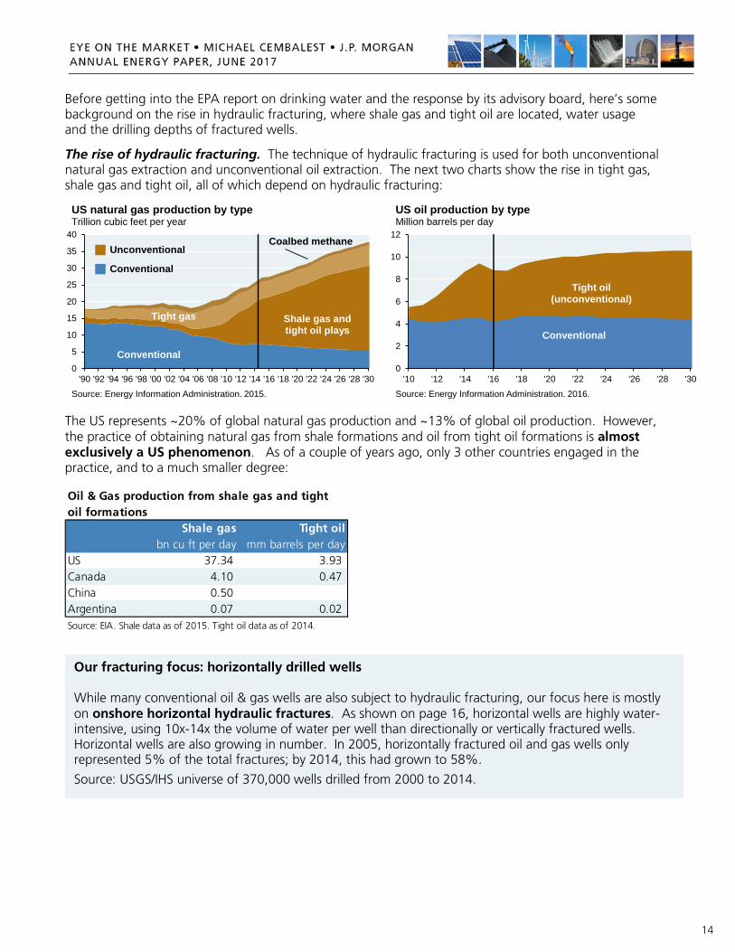
Before getting into the EPA report on drinking water and the response by its advisory board, here’s some background on the rise in hydraulic fracturing, where shale gas and tight oil are located, water usage and the drilling depths of fractured wells.
The rise of hydraulic fracturing. The technique of hydraulic fracturing is used for both unconventional natural gas extraction and unconventional oil extraction. The next two charts show the rise in tight gas, shale gas and tight oil, all of which depend on hydraulic fracturing:
The US represents ~20% of global natural gas production and ~13% of global oil production. However, the practice of obtaining natural gas from shale formations and oil from tight oil formations is almost exclusively a US phenomenon. As of a couple of years ago, only 3 other countries engaged in the practice, and to a much smaller degree:
0
5
10
15
20
25
30
35
40
'90 '92 '94 '96 '98 '00 '02 '04 '06 '08 '10 '12 '14 '16 '18 '20 '22 '24 '26 '28 '30
Source: Energy Information Administration. 2015.
US natural gas production by typeTrillion cubic feet per year
Conventional
Shale gas and tight oil plays
Tight gas
Coalbed methaneUnconventional
Conventional
0
2
4
6
8
10
12
'10 '12 '14 '16 '18 '20 '22 '24 '26 '28 '30
Source: Energy Information Administration. 2016.
US oil production by typeMillion barrels per day
Tight oil (unconventional)
Conventional
Shale gas Tight oilbn cu ft per day mm barrels per day
US 37.34 3.93 Canada 4.10 0.47 China 0.50 Argentina 0.07 0.02 Source: EIA. Shale data as of 2015. Tight oil data as of 2014.
Oil & Gas production from shale gas and tight oil formations
Our fracturing focus: horizontally drilled wells While many conventional oil & gas wells are also subject to hydraulic fracturing, our focus here is mostly on onshore horizontal hydraulic fractures. As shown on page 16, horizontal wells are highly water-intensive, using 10x-14x the volume of water per well than directionally or vertically fractured wells. Horizontal wells are also growing in number. In 2005, horizontally fractured oil and gas wells only represented 5% of the total fractures; by 2014, this had grown to 58%.
Source: USGS/IHS universe of 370,000 wells drilled from 2000 to 2014.

15
Shale gas and tight oil locations. Shale gas production and proven reserves are concentrated in a handful of states, with the greatest concentrations in Texas and Pennsylvania11. You can also click here for a map showing current and prospective shale plays. Tight oil production and proven reserves are primarily concentrated in two formations: Eagle Ford (TX) and Bakken (ND, SD, MT).
Hydraulically fractured well depths. The lowest drinking water depths are ~800 feet, and as shown in the next chart, fracturing generally occurs far below that level, with average well depths from 4,000 to 12,000 feet below the surface12. However, the chart also shows a small subset of shallower fractured wells at 2,000 feet and higher in states like Texas, Wyoming, Arkansas and Colorado. There were 1,200 of such shallow wells, equal to 3% of the observed sample. These wells could pose risks since fractures can propagate upwards. A 2012 paper13 found that the highest recorded upward propagation of a US hydraulically fractured well was ~2,000 feet (although this is unusual; the same paper estimated a 1% chance of a propagation over 1,200 feet due to natural protection from sedimentary rock).
11 In New York, due to a ban on hydraulic fracturing, there is no infrastructure or definitive development plan to extract natural gas resources in the state within five years. As a result, New York’s shale gas fails to meet the EIA’s definition of proven reserves. Some estimates place New York’s possible reserves as high as Ohio.
12 The data shown are based on 44,000 well depth observations reported to FracFocus from 2008 to 2013.
13 “Hydraulic fractures: How far can they go?”, Marine and Petroleum Geology, 2012, Davies et al, Durham University Energy Institute
Pen
nsyl
vani
a
Texa
s
Wes
t Virg
inia
Loui
sian
a
Okl
ahom
a
Ohi
o
Ark
ansa
s
Nor
th D
akot
a
Col
orad
o
All
othe
r sta
tes
0.00.51.01.52.02.53.03.54.04.55.0
Source: Energy Information Administration. 2015.
Where shale gas is producedUS shale gas production, billion cubic feet per year
Pen
nsyl
vani
a
Texa
s
Wes
t Virg
inia
Okl
ahom
a
Ohi
o
Loui
sian
a
Ark
ansa
s
Nor
th D
akot
a
Col
orad
o
All
othe
r sta
tes
0
10
20
30
40
50
60
Source: Energy Information Administration. 2015.
Where shale gas proven reserves existUS proven shale natural gas reserves, trillion cubic feet
WY
WY
TX
TX
COCO
PAPA
WVWV
LALA
ND ND
ARAR
0
2,000
4,000
6,000
8,000
10,000
12,000
14,000
Mean 1% 5% 10% 25% 50% 75% 90%
feet
bel
ow s
urfa
ce
Percentage of wells above indicated depthDepths of hydraulic fracturing wells
TX, WY, AR, CO: small subset of wells fractured closer to drinking
water aquifers
Source: Env. Science & Technology, Jackson (Stanford) et al. 2015.

16
Hydraulic fracturing and water usage. Fracturing starts with water (freshwater, brackish water, municipal water, etc) mixed with sand and chemicals. The mixture is injected at high pressure, creating small cracks in rock formations that allow gas and oil to escape and rise to the surface. What also comes back up is a lot of water: “flowback water” (original fluid injected into the well), and “produced water”, which is naturally occurring and released from rock formations. Over the lifetime of a fractured well, as much as 90% of returning water can be the produced water rather than the flowback water14 (see chart). This is important from an environmental perspective, since produced water can contain toxic substances: lead, arsenic, barium, chromium, uranium, radium, radon and benzene, and high levels of sodium chloride15. Due to its composition, wastewater is usually recycled or reinjected underground16.
The next chart shows water usage at some of the larger unconventional oil locations. The “mother of all produced water” locations is the Permian Basin, whose produced water-to-oil ratio was 6.5x in 2016, vs 1.1x in the Bakken and 0.9x in Eagle Ford. The final chart shows how horizontally fractured oil and gas wells account for an increasing share of water usage vs directionally and vertically fractured wells17.
14 “Quantity of flowback and produced waters from unconventional oil and gas exploration”, Duke, August 2016
15 “Chemical and Biological Risk Assessment for Natural Gas Extraction in New York”, SUNY Oneonta, 2011
16 In places like Texas and Oklahoma, wastewater is often reinjected into deep underground wells (unused saline aquifers), while in Pennsylvania, wastewater is often recycled for re-use or sent to water treatment facilities. Part of the disposal process involves solid material (“cuttings”) and not just liquids.
17 “Hydraulic fracturing water use variability in the United States and potential environmental implications”, U.S. Geological Survey, Water Resources Research (American Geophysical Union), July 2015
02468
101214161820
Bakken Barnett EagleF Gas EagleF Oil Haynesville Niobrara
Injected
Flowback
Produced
Source: Duke University Nicholas School of the Environment, 2016.
Injected, flowback and produced water per wellMillion liters
50,000
100,000
150,000
200,000
250,000
300,000
2013 2014 2015 2016
Source: Digital H20. March 2017.
Average water used per well in US unconventional oil plays, barrels of water
Permian Basin, Texas and New Mexico
Williston (Bakken),
Montana and North Dakota
Eagle Ford, Texas
02,0004,0006,0008,000
10,00012,00014,00016,00018,00020,000
'00 '01 '02 '03 '04 '05 '06 '07 '08 '09 '10 '11 '12 '13 '14
Horizontal GasHorizontal OilDirectional GasDirectional OilVertical GasVertical Oil
Source: US Geological Survey Earth Sciences Center, March 2015
Annual water volume injected per fractured well by typeCubic meters
17
What are the risks? As long as hydraulically fractured wells are properly cemented when they go through water tables and deeper aquifers, there should in theory be no contamination of ground water, assuming strict protocols for proper tank and pond storage of produced water and requisite on-site cleansing. However, given the number of wells involved (600,000 fractures in the US and Canada in 201418), instances of contamination are statistically unavoidable. Potential risks include a failure of cement surrounding the wellbore, and contamination of groundwater from accidents during transport, storage and disposal of fluids and wastewater.
I have read peer-reviewed academic studies on specific instances of adverse environmental impacts from hydraulic fracturing, and to me as a layperson, they seemed conclusive and well-researched. However, these studies were generally deemed inconclusive, dated or in some other way flawed by industry people I showed them to. Similar differences are found in analyses of well failures and risks. A professor from the Colorado School of Mines estimated that only 10 of 17,948 wells drilled from 1970 to 2013 in the Colorado Wattenberg Field failed. In contrast, a 2017 study from UC Boulder found a 7% instance of wells in the Wattenberg field having critical well integrity issues. In this piece, I am not going to opine on environmental impacts and risks; that’s what the EPA is supposed to do, which is why we review their findings, first released in 2015. The original 2015 EPA draft report on hydraulic fracturing and drinking water19
The EPA examined hydraulic fracturing in depth and released a 998-page draft report in June 2015. The draft gave hydraulic fracturing a mostly clean bill of health; at least that’s how it was interpreted in news reports commenting on it. The section that received the most attention: the Executive Summary, where the EPA concluded that while there are mechanisms through which fracturing can impact groundwater, they did not find evidence of widespread, systemic impacts; and that while they did find instances of contamination, they were “small compared to the number of hydraulically fractured wells”. Some other observations from the EPA’s June 2015 report:
• The EPA found that if their estimates were representative, spills could range from 100 to 3,700 spills annually, assuming 25,000 to 30,000 new wells fractured per year
• Most wells used in hydraulic fracturing have casing and a layer of cement to protect drinking water resources. An EPA survey of wells hydraulically fractured by 9 companies in 2009/2010 estimated that 3% of wells (600 out of 23,000) did not have cement across a portion of the cement casing
• Of 225 produced water spills in one study, 8% reached surface water or groundwater
18 “Hydraulic fracturing”, C. Mark Pearson, Liberty Resources and IHS
19 The EPA’s focus in the report was on drinking water resources and not on GHG emissions. On the GHG issue, there’s a debate about methane leakage from natural gas wells. Most research I have seen concludes that methane leakage is well below levels that would negate its GHG benefits vs coal:
• The EPA estimates methane leakage of 1.5% - 2.5%. Recent studies concur with EPA findings, including a 2015 paper which found average methane leakage rates of 1.0% - 2.1% in Haynesville (TX), 1.0% - 2.8% in Fayetteville (AR), and 0.2% - 0.4% in Marcellus (PA)
• Richard Muller (Univ. of California, Scientific Director of Berkeley Earth): leakage rates are below the 5.3% and 12% levels that would negate GHG benefits of natural gas vs. coal when measured over 20 and 100 years
• A team from Harvard, Stanford, MIT, NREL, LBNL and the Environmental Defense Fund concluded that “assessments using 100-year impact indicators show system-wide leakage is unlikely to be large enough to negate climate benefits of coal-to-natural gas substitution”

18
The 2016 EPA Science Advisory Board response
However, the story doesn’t end there. The EPA Science Advisory Board (SAB), composed of industry, academic and regulatory members, issued a 180-page review of the EPA draft in August 2016. Its findings were supported by all 47 members of the SAB. They raised issues and asked questions:
• The SAB found the EPA draft report to be “comprehensive but lacking in several critical areas”
• The SAB had concerns “regarding the clarity and adequacy of support for several major findings presented within the draft that seek to draw national-level conclusions regarding the impacts of hydraulic fracturing on drinking water resources. The SAB is concerned that these major findings as presented within the Executive Summary are ambiguous and appear inconsistent with the observations, data, and levels of uncertainty presented and discussed in the body of the draft”
In response, the EPA released a final draft of its report in January 2017, which included point-by-point responses to the SAB. The EPA removed the sentence on the left and added the one on the right: Original 2015 EPA draft, from Executive Summary
Final EPA report January 2017, from Executive Summary
“We did not find evidence that these mechanisms have led to widespread, systemic impacts on drinking water resources in the United States”
“This report describes how activities in the hydraulic fracturing water cycle can impact -- and have impacted -- drinking water resources and the factors that influence the frequency and severity of those impacts”
The EPA appears to have agreed with the SAB that its original conclusions weren’t sufficiently supported given the data gaps and uncertainties. In addition, the SAB pointed out that they would like to see more follow-up on widely reported issues in certain towns in Texas, Wyoming and Pennsylvania, and asked the EPA to do more work on:
• the probability and significance of failure mechanisms and water quality impacts (from poor cementation techniques, hydraulic fracturing operator error, migration of hydraulic fracturing chemicals from the deep subsurface and abandoned/orphaned oil and gas wells)
• an expanded list of toxicity factors
• the consequences of water withdrawal in areas with low water availability and frequent drought
• concentration of contaminants in wastewater during successive reuse cycles
• a list of best practices to minimize impacts on drinking water resources

19
I don’t know where this all goes from here, particularly given changes at the EPA and other political shifts since the election (i.e., a proposed 30% cut in EPA funding in the President’s budget). One example: the House passed a bill20 (currently in the Senate) which in practice may discourage scientists from serving on the EPA Advisory Board. Why? Scientists that receive EPA funding for their research projects would no longer be allowed to serve on the Board. They also can not apply for EPA research grants within three years of the end of their service on the Board. These changes appear to reflect the view that scientists getting EPA research grants are somehow “conflicted”. The political balance between growth, employment and energy security on the one hand, and environmental safety on the other, has clearly shifted since the election.
In the long run, the best outcome appears to be one in which:
• the US retains the financial, geopolitical and environmental benefits of unconventional natural gas, and financial/geopolitical benefits of unconventional oil
• existing safeguards at multiple stages of the hydraulic fracturing process are applied more universally to all operators
• the EPA conducts additional research to highlight which practices entail the greatest degree of risk, with the goal of further reducing potential adverse environmental impacts
That makes sense to me, since broader restrictions would require the US to either rely solely on its smaller conventional oil and natural gas reserves, or import more oil and gas from abroad.
20 The EPA Science Advisory Board Reform Act, HR1431.

20
[#3] How much energy-related leverage does Russia have over the rest of the world?
From a de-carbonization perspective, Russia’s energy exports should be a welcome development. The country’s exports of natural gas and nuclear technology are often replacements for coal, which was still in 2016 a greater contributor to global primary energy than natural gas (28% vs 24%).
However, there’s some concern about the geopolitical leverage Russia has gained in the process. These concerns may be overstated, but for different reasons. With respect to oil & gas, the West has a growing set of LNG import options (albeit at a higher price). And with respect to nuclear, while Russia has an advantage over nuclear companies in the West, its growing leverage is more in the emerging economies than developed ones; and the nuclear adoption outcomes in the latter are far from certain.
Let’s start with Europe. The first chart shows European oil and gas production vs European imports from Russia. In the 1980’s/1990’s, European imports from Russia were one third of its own production. Now these amounts are almost equal, creating apparent leverage for Russia in its dealings with Europe. For example, 6 Baltic and Eastern European countries rely entirely on Russia for their gas supplies; German reliance is 40%. So, the big question: are there alternatives to Russian oil & gas? As shown in the second chart, this is mostly a gas story rather than an oil story since ~70% of European gas imports come from Russia, vs 30% for oil. If there’s a need to diversify counterparties, finding new gas partners would be the place to start, particularly since domestic gas production in Europe has been stagnant for the last few years.
0
2,000
4,000
6,000
8,000
10,000
12,000
14,000
'80 '82 '84 '86 '88 '90 '92 '94 '96 '98 '00 '02 '04 '06 '08 '10 '12 '14Source: BP Statistical Review of World Energy, Gazprom, Eurostat, Perovic et al, JPMAM calculations. 2015. Europe includes EU, Norway and Turkey.
European production vs European imports from RussiaThousand barrels a day of oil equivalents
European oil and gas production
European oil and gas imports from Russia0%
10%20%30%40%50%60%70%80%90%
100%
'80 '82 '84 '86 '88 '90 '92 '94 '96 '98 '00 '02 '04 '06 '08 '10 '12 '14Source: BP Statistical Review of World Energy, Gazprom, Eurostat, Perovic et al, JPMAM calculations. 2015. Europe includes EU, Norway and Turkey.
Europe: greater counterparty reliance on Russia for natural gas, percent of total European imports
European reliance on Russian NATURAL GAS
European reliance on Russian OIL

21
The good news for Europe: after a decade of investment in liquefied natural gas import terminals, Europe’s LNG import capacity now exceeds its Russian gas imports (first chart). When including planned projects scheduled to open by 2020, Europe’s potential to diversify expands even more. As per the second chart, growing LNG supply indicates ample potential counterparties.
However, there are some caveats here. First, European utilities have signed long-term take-or-pay contracts with Gazprom, reducing Europe’s ability to immediately change providers. But let’s assume that for whatever reason, these contracts were abrogated. The next chart shows how much more Europe might have to pay for gas, either from North African pipelines or from LNG exporters. In other words, diversification and geopolitical leverage for Europe would come at a price. Larger volumes are more likely to be available from more expensive LNG sources in Qatar, the US and Australia rather than via pipeline from Algeria and Libya. Another potential cost: more infrastructure investment. When you look at a map of European pipeline infrastructure, you might think there’s a seamless ability to route natural gas from LNG import facilities on the Atlantic Coast to destinations in Central and Eastern Europe. However, the interconnectedness of Eastern and Western European pipeline infrastructure needs work, since some pipelines can only carry gas from East to West, and not the reverse.
Spain Spain
UK UK
Italy ItalyFrance FranceTurkey Turkey
PolandGreece
Netherlands
Other
Other
0
50
100
150
200
250
300
350
European LNG importcapacity
European LNG importcapacity (incl. planned)
Source: Gazprom, Gas LNG Europe. 2016.
Europe LNG regasification (import) capacity vs Russian pipeline supplies, Billion cubic meters of natural gas per year
European gas imports from
Gazprom
Asia Pacific Asia PacificAsia Pacific
Middle EastMiddle East
Middle EastAfricaAfrica
Africa
LatAmLatAm
LatAm
North America
0
100
200
300
400
500
600
2009 2015 2021 forecast
Source: International Gas Union, IHS. 2016. Capacity only refers to existing projects and projects under construction.
Potential gas counterparties for EuropeBillion cubic meters of natural gas per year
Liquefaction (export) capacity
European gas imports from
Gazprom
$0.0$0.5$1.0$1.5$2.0$2.5$3.0$3.5$4.0$4.5
Russia(Gazprom)
Other pipeline(Alg, Libya)
Low-cost LNG(Qatar)
Marginal LNG(Australia & US)
Source: Goldman Sachs. April 11, 2017.
Gas provider diversification could be costlyBreakeven exporter cost, US$ per million BTU

22
What about reliance on Russian nuclear power?
As shown in the prior section, many European countries are diversifying their gas counterparties. Some of the most exposed countries, like Lithuania, have added regasification capacity and floating storage, and improved their access to the Western European electricity grid. However, other countries are not. Hungary, for example, relies on Russian gas for 80% of its imports, and has contracted with Russia’s Rosatom to expand its nuclear power capacity, after which Russian nuclear will account for 62% of total electricity generation. As shown in the table, 9 other countries are also working with Russia to expand their nuclear power capacity.
Russia’s nuclear pipeline has been boosted by its willingness to provide substantial financing to buyers21. As things stand now, Rosatom is the only vendor providing an integrated nuclear solution (the entire range of products and services necessary to generate power, from nuclear fuel to operations to decommissioning). This may be interesting to countries looking to reduce their CO2 footprint now that Japanese-owned Westinghouse filed for bankruptcy due to cost overruns in the US. France’s Areva is also facing financial distress given delays and cost overruns at its facilities in Finland and Normandy.
Right now, only 4 of 61 reactors under construction around the world are being built by Rosatom, so we will have to watch their pipeline. If Rosatom were actually able to build the 80 reactors that it projects by 2030 in its annual report, Russia’s nuclear leverage could grow substantially. Russia is making important geopolitical inroads in China, India, Iran and Vietnam, and is in preliminary discussions with Egypt, Jordan and Saudi Arabia.
However, Rosatom’s nuclear projections are just projections. Among the real-life constraints that Rosatom might run up against: rule of law issues related to a competitive procurement process. In South Africa, the Constitutional Court ruled that the South African government violated its procurement rules in its dealing with Russia, and moved the discussions back to square one. Furthermore, even if the plants shown above were completed, nuclear power based on Russian support would be less than 10% of total electricity generation in most countries, and in China and India, only 1%-2%. Hungary is more the exception than the rule in terms of its combined nuclear and fossil fuel reliance on Russia.
21 While Rosatom has financed many projects so far, it may seek to expand use of a “build-own-operate” model that it first used in Turkey.
Russian nuclear power plants in other countries: operating, under construction and contracted
Country PlantCapacity
(MW)Est. cost (US$ bn)
Russia financing
Russia eq. stake Status*
Russia-supplied nuclear share of total generation
China Tianwan 1&2 2,120 Operating (1999/2006) 1%India Kudankulam 1&2 2,000 3.0 Operating (2002/2013) 2%Iran Bushehr 1 1,000 Operating (1975/2011) 9%Ukraine Khmelnitski 2 & Rovno 4 1,000 Operating (1983/2004) 5%Belarus Ostrovets 1&2 2,400 10.0 90% Under construction 56%China Tianwan 3&4 2,100 4.0 0% Under construction 1%Armenia Metsamor 3 1,060 5.0 50% ContractedBangladesh Rooppur 1&2 2,400 4.0 90% Contracted 31%Finland Hanhikivi 1 1,200 6.4 75% 34% Contracted 14%Hungary Paks 5&6 2,400 12.4 80% Contracted 62%India Kudankulam 3&4 2,000 5.8 85% Contracted 2%Iran Bushehr 2&3 2,114 0% Contracted 9%Turkey Akkuyu 1-4 4,800 25.0 100% Contracted 15%Vietnam Ninh Thuan 1, 1&2 2,400 9.0 85% Contracted 11%Source: World Nuclear Association, Rosatom. April 2017. Status*: for operating plants, dates show n are for construction start and year of operation

23
[#4] The grass isn’t always greener: forest biomass and CO2 emissions
Some universities claim to have reached carbon neutrality on campus (see topic #5 in this year’s paper). One aspect of their claim that caught my eye was the assertion that biomass is by definition “carbon-neutral”. Some members of Congress agree with them: an amendment introduced in 2016 by Senators Collins (R-ME) and Klobuchar (D-MN) called on the EPA as well as Agriculture and Energy departments to craft a policy to reflect "the carbon-neutrality of forest bioenergy".
Well, forest biomass emissions are more complex than that22. There are things about biomass that should make you suspicious of blanket claims of carbon neutrality (source: Natural Resources Canada):
Wood combustion emits more CO2 than fossil fuels per unit of energy released
CO2 release is much faster when wood is burned than when wood undergoes natural decomposition
CO2 recapture by vegetation is not immediate and is usually achieved over many years/decades
To sort things out, I contacted Jerome Laganiere at the Laurentian Forestry Centre in Quebec, whose biomass study was published this year. The CO2 footprint from biomass depends on the specifics23:
What biomass feedstock is used: harvest residue, salvaged dead trees or live trees? If the latter, what is their growth rate?
Is biomass used to create heat or electricity?
Is biomass used to replace coal, oil or natural gas?
And perhaps most importantly, over what time frame are CO2 calculations performed? Scenarios in which forest biomass replace fossil fuels and generate net CO2 benefits only after 70 or 80 years may not be that helpful, since many climate scientists believe that CO2 emissions need to be reduced in the next 30-40 years to avoid irreversible temperature increases
We’ll take a closer look at the results on the next page. To summarize, biomass is not always as green as many believe, and studies that raise questions about its carbon neutrality are gaining in prominence. In April 2017, a new EU study24 challenged the carbon neutrality of energy from wood after finding that forests can take centuries to re-absorb the CO2 generated through use of biomass. The report warned that a bias towards biomass energy could damage forest carbon stocks which are key to delivering the Paris Agreement, and proposed a “payback” rule to ensure that only energy uses that deliver CO2 reductions within a certain timescale should be considered renewable under EU law. Their conclusion: assuming all forms of biomass energy are carbon neutral is “highly simplistic”.
22 There’s so much confusion around forest biomass carbon accounting that in 2015, a Journal of Forestry article was dedicated to common errors, most prominent of which is failing to consider the fate of forest carbon stocks in the absence of demand for bioenergy. In other words, if trees aren’t cut down, they continue to absorb carbon; and if not used for biomass, harvest residue would release carbon over time, albeit slowly.
23 Laganiere’s analysis was based on Canadian biomass and fossil fuel conditions. The same analysis can be applied to other places, some of which have faster growing tree species such as South Carolina pines or Brazilian eucalyptus, and warmer temperatures that speed up decomposition of salvaged trees and harvest residue (which make biomass comparisons look better). However, even with faster growing trees and warmer temperatures, biomass is not a priori carbon-neutral; its net carbon impact should be carefully measured.
24 “Multi-functionality and sustainability in the European Union’s forests”, European Academies Science Advisory Council, April 2017. In February 2017, the UK’s Chatham House came to similar conclusions on short-term biomass impacts: “Overall, while some instances of biomass energy use may result in lower life-cycle emissions than fossil fuels, in most circumstances, comparing technologies of similar ages, using woody biomass for energy will release higher levels of emissions than coal and considerably higher levels than gas.” See “Woody Biomass for Power and Heat Impacts on the Global Climate”, Chatham House, February 2017.

24
Let’s get to the punchline. Scenarios involving the use of Canadian “harvest residue” to generate heat are estimated to produce cumulative net carbon benefits by year 50, regardless of which fossil fuel biomass replaces. These are the negative values in the chart below. Harvest residue refers to the debris from production of traditional wood products such as branches, tree tops and bark. However, almost all other scenarios we looked at involving the use of salvaged dead trees or live trees, and those in which biomass was used to generate electricity instead of heat, resulted in net carbon costs instead by year 50 (i.e., a net increase in atmospheric CO2 after switching from fossil fuels to forest biomass). Strikingly, even when comparing forest biomass to coal, salvaged and green tree scenarios still generally produced cumulative net carbon costs by year 50.
Source: Natural Resources Canada, Laganiere et al, JPMAM, 2017. Percentages = electricity conversion efficiency for biomass, currently 25%; we also analyzed hypothetical improved 35% efficiency scenarios. Years for green trees = time required to reabsorb carbon emissions from initial combustion and foregone sequestration.
Based on some very rough estimates, our sense is that around 80% of Canadian and US biomass used domestically is used to produce heat rather than electricity; and that around 80% of biomass feedstock is derived from harvest residue from construction, demolition and harvesting activities. If so, both regions would primarily be using harvest residue to create heat, which has the best net CO2 outcome. But these are rough estimates, we don’t know what fossil fuels they’re replacing, and in Europe, biomass is used more often for electricity. As a result, forest biomass projects shouldn’t qualify for preferences and subsidies available for wind, solar and hydro unless it can be demonstrated that their decarbonization benefits are both real and timely.
If you want to understand more about this analysis, see the Supplementary Materials that begin on the next page; we walk through it all in more detail.
Heat v NatGas
Elec 25% v NatGas
Elec 35% v NatGas
Elec 35% v Coal
Heat v Coal
Heat v OilElec 25% v Coal
-12
-9
-6
-3
0
3
6
9
12
15
18
Cumulative net carbon cost (benefit) in year 50 from Canadian biomass use vs fossil fuels1,000 kg of CO2 per gigajoule of energy in year 50
Harvest Residue
net c
arbo
n co
stne
t car
bon
bene
fit
Heat v NatGas
Elec 25% v NatGas
Elec 35% v NatGas
Elec 35% v CoalHeat v Coal
Elec 25% v Coal
-12
-9
-6
-3
0
3
6
9
12
15
18
Salvaged dead trees
Heat v NatGas
Elec 25% v NatGas
Elec 35% v NatGas
Elec 35% v CoalHeat v Coal
Elec 25% v Coal
-12
-9
-6
-3
0
3
6
9
12
15
18
Green trees @ 45 yrs
Heat v NatGas
Elec 25% v NatGas
Elec 35% v NatGas
Elec 35% v CoalHeat v Coal
Elec 25% v Coal
-12
-9
-6
-3
0
3
6
9
12
15
18
Green trees @ 120 yrs

25
Biomass supplementary materials: understanding the analysis
Each chart shows the cumulative net CO2 cost or benefit25 from annual use of forest biomass instead of a specified fossil fuel. Negative numbers are beneficial since they indicate a net reduction in CO2 from switching to biomass. Let’s start with the wrong way, which unfortunately some people use: the first chart ignores the carbon footprint of forest biomass (in this case, harvest residue), and assumes that CO2 benefits are equal to foregone emissions from gas or oil. The second chart does it the right way: by also including the carbon footprint from combustion of harvest residue itself. There are still net carbon benefits, but by year 100, they’re only 50%-70% of erroneously computed benefits from the first chart.
What about using salvaged dead trees or live trees instead of harvest residue? As shown below (left), a much different story. Even when using faster-growing Canadian trees (i.e., trees requiring 45 years to reabsorb carbon emissions from combustion plus foregone sequestration), there’s a net carbon cost to creating heat with biomass rather than using nat gas, even out to 100 years. Eventually, after a long enough period of time, bioenergy from sustainably-managed green trees would show net carbon benefits vs fossil fuels, due to replanting and reforestation. But how compelling are scenarios with net carbon costs out to 100 years or more given the current focus on 21st century decarbonization?
“Silviculture” refers to strategies that accelerate tree growth rates relative to a naturally-regenerated forest: site preparation, optimized tree spacing, vegetation control and selection of optimal species. If Canadian tree growth rates were increased through such operations, green tree biomass could generate net carbon benefits vs fossil fuels, although benefits would still occur after 50 years passed (2nd chart).
25 The Canadian Forestry models compute best case and worst case outcomes. In all of our charts, we plot the midpoint of the two outcomes.
-12
-10
-8
-6
-4
-2
0
2
0 10 20 30 40 50 60 70 80 90 100
1,00
0 kg
of C
O2
per G
J of
ene
rgy
Year
�Harv residue Heat v NatGas
�Harv residue Heat v Oil
Source: Natural Resources Canada, Laganiere et al., JPMAM. 2017
Net carbon benefit
Net carbon cost
What are the carbon benefits of forest biomass if you erroneously ignore its carbon footprint?
-12
-10
-8
-6
-4
-2
0
2
0 10 20 30 40 50 60 70 80 90 100
1,00
0 kg
of C
O2
per G
J of
ene
rgy
Year
�Harv residue Heat v NatGas�Harv residue Heat v Oil
Source: Natural Resources Canada, Laganiere et al., JPMAM. 2017.
Net carbon benefit
Net carbon cost
What are the benefits of using biomass harvest residue to create heat rather than oil and natural gas?
-4
-2
0
2
4
6
8
0 10 20 30 40 50 60 70 80 90 100
1,00
0 kg
of C
O2
per G
J of
ene
rgy
Year
�Green trees 120y Heat v NatGas�Green trees 75y Heat v NatGas�Green trees 45y Heat v NatGas�Salvaged trees Heat v NatGas
�Harv residue Heat v NatGas
Source: Natural Resources Canada, Laganiere et al., JPMAM. 2017.
Net carbon benefitNet carbon cost
What happens when green and salvaged trees are used instead to create heat compared to natural gas?
-10
-8
-6
-4
-2
0
2
4
0 10 20 30 40 50 60 70 80 90 100
1,00
0 kg
of C
O2
per G
J of
ene
rgy
Year
�Green trees 45y Heat v NatGas
�Green trees 30y Heat v NatGas
Source: Natural Resources Canada, Laganiere et al., JPMAM. 2017.
Net carbon cost
Assessing the impact of silviculture operations: faster growing green trees
Net carbon benefit

26
Biomass looks even worse when used to create electricity, since biomass electricity conversion currently averages 25% efficiency26 vs 45% for natural gas. Harvest residue net benefits seen in the prior chart have turned into net costs, and salvaged tree/green tree scenarios showed net carbon costs that are 3x-5x higher than when used to create heat. There is nothing green about this first chart. What if biomass electricity conversion efficiency improved? We re-ran the electricity analysis using 35% instead of 25%. Harvest residue generated small net CO2 benefits, but still showed net costs to year 50 vs nat gas. All salvaged/green tree scenarios still showed net carbon costs to year 100.
In our analysis, we assumed the most favorable circumstances for Canadian biomass: biomass chips used in local markets with no transportation requirement, and where mean annual temperatures are 4 degrees C. We also analyzed the impact of lower temperatures that delay natural decomposition (worsening biomass CO2 scenarios); pellets instead of chips (more energy-intensive to create); and exports to Asia (more energy for transport). When we added all three factors into the analysis, the net CO2 results for biomass vs natural gas were modestly worse whether using harvest residue, salvaged trees or green trees as feedstocks27.
26 While biomass electricity conversion rates are low, biomass co-combustion with coal, and biomass use in combined heat and power plants, can improve efficiency rates closer to natural gas-powered electricity.
27 The Canadian Forestry Service analyzed 3 different forest biomass feedstocks for heat and power. Sawmill byproducts are also used by the biomass industry, which have more immediate GHG benefits. However, sawmill byproducts are limited in scope and have other applications. In the US and Canada, forest biomass accounts for only 1% - 2% of total primary energy. For that to increase, sawmill byproducts would probably be insufficient, which is why the Canadian Forestry Service analyzed other feedstock sources.
-5
0
5
10
15
20
25
30
0 10 20 30 40 50 60 70 80 90 100
1,00
0 kg
of C
O2
per G
J of
ene
rgy
Year
�Green trees 120y Elec v NatGas�Green trees 75y Elec v NatGas�Green trees 45y Elec v NatGas�Salvaged trees Elec v NatGas
�Harv residue Elec v NatGas
Source: Natural Resources Canada, Laganiere et al., JPMAM. 2017
Net carbon cost
What happens when biomass feedstocks are used to create ELECTRICITY when compared to natural gas?
Net carbon benefit-5
0
5
10
15
20
25
30
0 10 20 30 40 50 60 70 80 90 1001,
000
kg o
f CO
2pe
r GJ
of e
nerg
yYear
�Green trees 120y Elec v NatGas�Green trees 75y Elec v NatGas�Green trees 45y Elec v NatGas�Salvaged trees Elec v NatGas�Harv residue Elec v NatGas
Source: Natural Resources Canada, Laganiere et al., JPMAM. 2017
Net carbon benefitNet carbon cost
What if biomass electricity conversion efficiency improved from 25% to 35%?
(2)
(1)
-
1
2
3
4
5
Harvest residue Salvaged trees Green trees
Local mkt, chips, 4 deg C
Export, pellets, 1 deg C
Impact: pellets, exports and lower temperatures1,000 kg of CO2 per GJ of energy in year 50
Source: Natural Resources Canada, Laganiere et al, JPMAM, 2017.
Net carbon cost
Net carbon benefitScenario: biomass used for heat instead of using natural gas
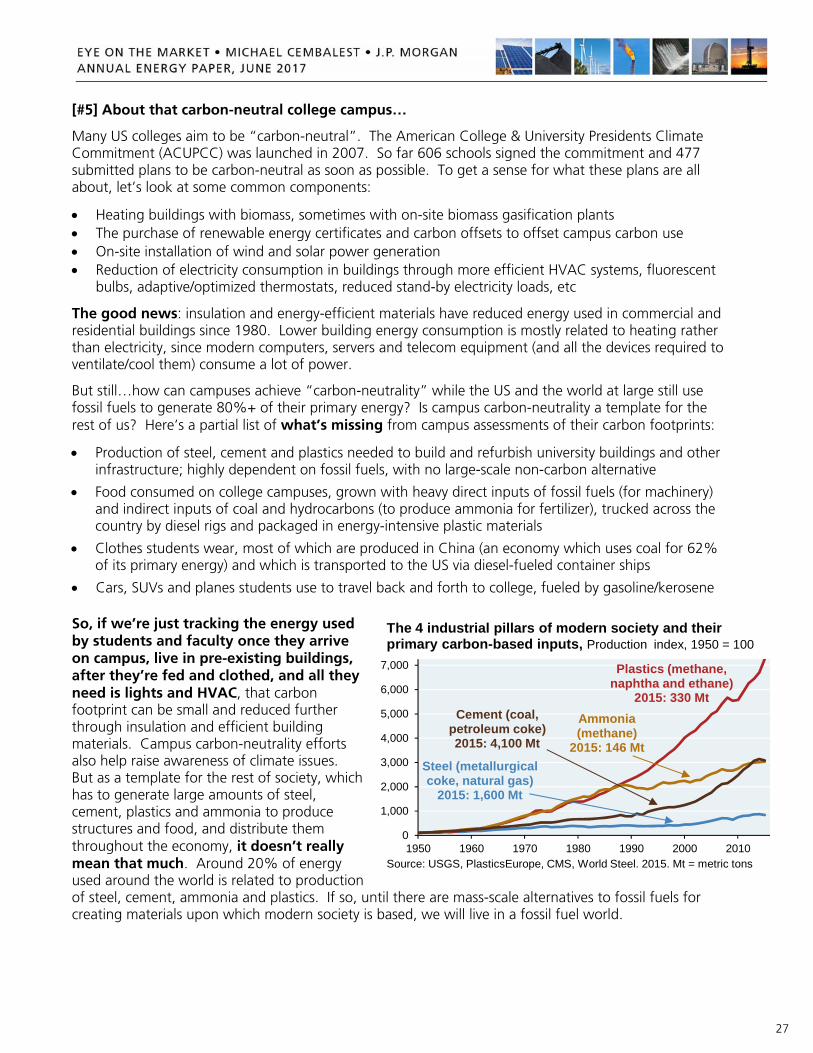
27
[#5] About that carbon-neutral college campus…
Many US colleges aim to be “carbon-neutral”. The American College & University Presidents Climate Commitment (ACUPCC) was launched in 2007. So far 606 schools signed the commitment and 477 submitted plans to be carbon-neutral as soon as possible. To get a sense for what these plans are all about, let’s look at some common components:
Heating buildings with biomass, sometimes with on-site biomass gasification plants The purchase of renewable energy certificates and carbon offsets to offset campus carbon use On-site installation of wind and solar power generation Reduction of electricity consumption in buildings through more efficient HVAC systems, fluorescent
bulbs, adaptive/optimized thermostats, reduced stand-by electricity loads, etc
The good news: insulation and energy-efficient materials have reduced energy used in commercial and residential buildings since 1980. Lower building energy consumption is mostly related to heating rather than electricity, since modern computers, servers and telecom equipment (and all the devices required to ventilate/cool them) consume a lot of power.
But still…how can campuses achieve “carbon-neutrality” while the US and the world at large still use fossil fuels to generate 80%+ of their primary energy? Is campus carbon-neutrality a template for the rest of us? Here’s a partial list of what’s missing from campus assessments of their carbon footprints:
Production of steel, cement and plastics needed to build and refurbish university buildings and other infrastructure; highly dependent on fossil fuels, with no large-scale non-carbon alternative
Food consumed on college campuses, grown with heavy direct inputs of fossil fuels (for machinery) and indirect inputs of coal and hydrocarbons (to produce ammonia for fertilizer), trucked across the country by diesel rigs and packaged in energy-intensive plastic materials
Clothes students wear, most of which are produced in China (an economy which uses coal for 62% of its primary energy) and which is transported to the US via diesel-fueled container ships
Cars, SUVs and planes students use to travel back and forth to college, fueled by gasoline/kerosene
So, if we’re just tracking the energy used by students and faculty once they arrive on campus, live in pre-existing buildings, after they’re fed and clothed, and all they need is lights and HVAC, that carbon footprint can be small and reduced further through insulation and efficient building materials. Campus carbon-neutrality efforts also help raise awareness of climate issues. But as a template for the rest of society, which has to generate large amounts of steel, cement, plastics and ammonia to produce structures and food, and distribute them throughout the economy, it doesn’t really mean that much. Around 20% of energy used around the world is related to production of steel, cement, ammonia and plastics. If so, until there are mass-scale alternatives to fossil fuels for creating materials upon which modern society is based, we will live in a fossil fuel world.
0
1,000
2,000
3,000
4,000
5,000
6,000
7,000
1950 1960 1970 1980 1990 2000 2010Source: USGS, PlasticsEurope, CMS, World Steel. 2015. Mt = metric tons
The 4 industrial pillars of modern society and their primary carbon-based inputs, Production index, 1950 = 100
Steel (metallurgicalcoke, natural gas)
2015: 1,600 Mt
Ammonia (methane)
2015: 146 Mt
Plastics (methane, naphtha and ethane)
2015: 330 MtCement (coal,
petroleum coke)2015: 4,100 Mt

28
Sources and Acronyms Executive Summary
Annual Energy Outlook 2014, Energy Information Administration, 2014.
Rethinking Energy 2017, International Renewable Energy Agency, 2017.
International Energy Outlook 2016, Energy Information Administration, May 2016.
World Energy Outlook 2016, International Energy Agency, 2016.
Bioenergy: Roadmap Development and Implementation, International Energy Agency, 2017.
Renewables 2017 Global Status Report, Renewable Energy Policy Network for 21st Century, 2017. [#1] Falling photovoltaic solar and energy storage costs
“Photovoltaic Degradation Rates”, Jordan & Kurtz, National Renewable Energy Laboratory, June 2012.
U.S. Solar Photovoltaic System Cost Benchmark: Q1 2016, National Renewable Energy Laboratory, September 2016.
Renewable Energy Generating Capacity and Generation, Levelized Cost of Energy & Assumptions sections of Annual Energy Outlook 2017, Energy Information Administration, January 2017.
Form 860 and Form 923 data files, Energy Information Administration, 2016.
Lazard’s Levelized Cost of Energy Analysis – Version 10.0, Lazard, December 2016.
Lazard’s Levelized Cost of Storage Analysis – Version 2.0, Lazard, December 2016.
“US Battery Storage: Upstream Supply Chain Biggest Winner of EVs”, UBS, October 21, 2016.
New York Independent System Operator capacity and hourly generation/load data, NYISO website
California Independent System Operator capacity and hourly generation/load data, CAISO website
“Rapidly falling costs of battery packs for electric vehicles”, Nykvist and Nilsson, Nature Climate Change, March 2015.
“SoCal Edison to build 20 MW storage project at Pomona gas plant site”, Utility Dive, August 23, 2016.
Sentimental Journey, Eye on the Market Special Edition, J.P. Morgan Asset Management, June 2016. [#2] Hydraulic fracturing
“The facts about fugitive methane”, Muller and Muller, Centre for Policy Studies, October 2015.
“Methane Leaks from North American Natural Gas Systems”, Brandt et al, Science Magazine, Feb 2014.
“Quantifying atmospheric methane emissions from the Haynesville, Fayetteville, and Northeastern Marcellus shale gas production regions”, NOAA and University of Colorado, March 2015.
“The water challenge: preserving a global resource”, Barclays Research, March 22, 2017.
“Assessment of the Potential Impacts of Hydraulic Fracturing for Oil and Gas on Drinking Water Resources”, Environmental Protection Agency, June 2015.
“SAB Review of the EPA’s draft Assessment of the Potential Impacts of Hydraulic Fracturing for Oil and Gas on Drinking Water Resources”, EPA Science Advisory Board, August 11, 2016.
“The Depths of Hydraulic Fracturing and Accompanying Water Use Across the United States”, Environmental Science and Technology, Jackson et al, 2015, issue 49.
“Hydraulically fractured wells provide two-thirds of U.S. natural gas production”, US Energy Administration Agency, May 2016
29
[#3] Russia
“Reducing European Dependence on Russian Gas: distinguishing natural gas security from geopolitics”, The Oxford Institute for Energy Studies, University of Oxford, October 2014.
“Reducing energy supply security risks by diversified gas sourcing and adequate investments in pipelines & LNG terminals”, The Oxford Institute for Energy Studies, University of Oxford, February 6, 2017.
“Europe’s New Gas Order”, Goldman Sachs, April 11, 2017.
“Nuclear Power in Russia”, World Nuclear Association, March 22, 2017. [#4] Biomass
“Range and uncertainties in estimating delays in greenhouse gas mitigation potential of forest bioenergy sourced from Canadian forests”; Laganiere, Pare, Thiffault and Bernier; Natural Resources Canada, Canadian Forest Service, Laurentian Forestry Centre, Quebec; GCB Bioenergy, 2017 (9)
“2016 Billion-Ton Report: Advancing Domestic Resources for a Thriving Bioeconomy”, US Department of Energy, July 2016.
“The Burning Question: Does Forest Bioenergy Reduce Carbon Emissions? A Review of Common Misconceptions about Forest Carbon Accounting”, Journal of Forestry, 2015, issue 113 [#5] Carbon-neutral campus
Energy Transitions, Smil, V. Santa Barbara, CA: Praeger, 2017. The number of signatories to ACUPCC and the number of climate action plans submitted as per SecondNature.org, a non-profit that engages with higher education institutions on climate issues Acronyms AC: alternating current; BP: British Petroleum; Btu: British thermal unit; CAISO: California Independent System Operator; DC: direct current; EIA: Energy Information Administration; EPA: Environmental Protection Agency; EU: European Union; EV: electric vehicle; GHG: greenhouse gas; GJ: gigajoule; GM: General Motors; GWh: gigawatt-hour; HVAC: heating, ventilation, and air conditioning; HVDC: high voltage direct current; IEA: International Energy Agency; IPCC: Intergovernmental Panel on Climate Change; km: kilometer; kW: kilowatt; kWh: kilowatt-hour; kW-y: kilowatt-year; LBNL: Lawrence Berkeley National Laboratory; Li-ion: Lithium-ion; LNG: Liquefied natural gas; MMBtu: one million British Thermal Units; MW: megawatt; MWh: megawatt-hour; NREL: National Renewable Energy Laboratory; NYISO: New York Independent System Operator; OECD: Organization for Economic Co-operation and Development; O&M: Operations and Maintenance; OPEC: Organization of the Petroleum Exporting Countries; PHEV: Plug in hybrid vehicle; PV: Photovoltaic; SAB: Science Advisory Board

30
IMPORTANT INFORMATION Purpose of This Material: This material is for information purposes only.
The views, opinions, estimates and strategies expressed herein constitutes Michael Cembalest’s judgment based on current market conditions and are subject to change without notice, and may differ from those expressed by other areas of J.P. Morgan. This information in no way constitutes J.P. Morgan Research and should not be treated as such. Any projected results and risks are based solely on hypothetical examples cited, and actual results and risks will vary depending on specific circumstances. We believe certain information contained in this material to be reliable but do not warrant its accuracy or completeness. We do not make any representation or warranty with regard to any computations, graphs, tables, diagrams or commentary in this material which are provided for illustration/reference purposes only. Investors may get back less than they invested, and past performance is not a reliable indicator of future results. It is not possible to invest directly in an index. Forward looking statements should not be considered as guarantees or predictions of future events.
Confidentiality: This material is confidential and intended for your personal use. It should not be circulated to or used by any other person, or duplicated for non-personal use, without our permission.
Regulatory Status: In the United States, Bank products and services, including certain discretionary investment management products and services, are offered by JPMorgan Chase Bank, N.A. and its affiliates. Securities products and services are offered in the U.S. by J.P. Morgan Securities LLC, an affiliate of JPMCB, and outside of the U.S. by other global affiliates. J.P. Morgan Securities LLC, member FINRA and SIPC.
In the United Kingdom, this material is issued by J.P. Morgan International Bank Limited (JPMIB) with the registered office located at 25 Bank Street, Canary Wharf, London E14 5JP, registered in England No. 03838766. JPMIB is authorised by the Prudential Regulation Authority and regulated by the Financial Conduct Authority and the Prudential Regulation Authority. In addition, this material may be distributed by: JPMorgan Chase Bank, N.A. (“JPMCB”), Paris branch, which is regulated by the French banking authorities Autorité de Contrôle Prudentiel et de Résolution and Autorité des Marchés Financiers; J.P. Morgan (Suisse) SA, regulated by the Swiss Financial Market Supervisory Authority; JPMCB Dubai branch, regulated by the Dubai Financial Services Authority; JPMCB Bahrain branch, licensed as a conventional wholesale bank by the Central Bank of Bahrain (for professional clients only).
In Hong Kong, this material is distributed by JPMCB, Hong Kong branch. JPMCB, Hong Kong branch is regulated by the Hong Kong Monetary Authority and the Securities and Futures Commission of Hong Kong. In Hong Kong, we will cease to use your personal data for our marketing purposes without charge if you so request. In Singapore, this material is distributed by JPMCB, Singapore branch. JPMCB, Singapore branch is regulated by the Monetary Authority of Singapore. Dealing and advisory services and discretionary investment management services are provided to you by JPMCB, Hong Kong/Singapore branch (as notified to you). Banking and custody services are provided to you by JPMIB and/ or JPMCB Singapore Branch. The contents of this document have not been reviewed by any regulatory authority in Hong Kong, Singapore or any other jurisdictions. You are advised to exercise caution in relation to this document. If you are in any doubt about any of the contents of this document, you should obtain independent professional advice.
With respect to countries in Latin America, the distribution of this material may be restricted in certain jurisdictions. Receipt of this material does not constitute an offer or solicitation to any person in any jurisdiction in which such offer or solicitation is not authorized or to any person to whom it would be unlawful to make such offer or solicitation.
Risks, Considerations and Additional information: There may be different or additional factors which are not reflected in this material, but which may impact on a client’s portfolio or investment decision. The information contained in this material is intended as general market commentary and should not be relied upon in isolation for the purpose of making an investment decision. Nothing in this document shall be construed as giving rise to any duty of care owed to, or advisory relationship with, you or any third party. Nothing in this document is intended to constitute a representation that any investment strategy or product is suitable for you. You should consider carefully whether any products and strategies discussed are suitable for your needs, and to obtain additional information prior to making an investment decision. Nothing in this document shall be regarded as an offer, solicitation, recommendation or advice (whether financial, accounting, legal, tax or other) given by J.P. Morgan and/or its officers or employees, irrespective of whether or not such communication was given at your request.
J.P. Morgan and its affiliates and employees do not provide tax, legal or accounting advice. You should consult your own tax, legal and accounting advisors before engaging in any financial transactions. Contact your J.P. Morgan representative for additional information concerning your personal investment goals. You should be aware of the general and specific risks relevant to the matters discussed in the material. You will independently, without any reliance on J.P. Morgan, make your own judgment and decision with respect to any investment referenced in this material.
J.P. Morgan may hold a position for itself or our other clients which may not be consistent with the information, opinions, estimates, investment strategies or views expressed in this document.
JPMorgan Chase & Co. or its affiliates may hold a position or act as market maker in the financial instruments of any issuer discussed herein or act as an underwriter, placement agent, advisor or lender to such issuer.
References in this report to “J.P. Morgan” are to JPMorgan Chase & Co., its subsidiaries and affiliates worldwide. “J.P. Morgan Private Bank” is the marketing name for the private banking business conducted by J.P. Morgan.
If you have any questions or no longer wish to receive these communications, please contact your usual J.P. Morgan representative.
© 2017 JPMorgan Chase & Co. All rights reserved.