evaluation task 2
TRANSCRIPT
How effective is the combination of your main product and ancillary texts?
Evaluation Question 2
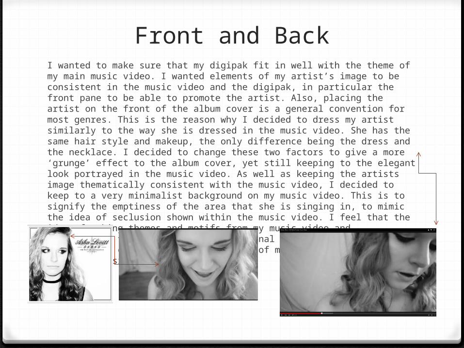
Front and BackI wanted to make sure that my digipak fit in well with the theme of my main music video. I wanted elements of my artist’s image to be consistent in the music video and the digipak, in particular the front pane to be able to promote the artist. Also, placing the artist on the front of the album cover is a general convention for most genres. This is the reason why I decided to dress my artist similarly to the way she is dressed in the music video. She has the same hair style and makeup, the only difference being the dress and the necklace. I decided to change these two factors to give a more ‘grunge’ effect to the album cover, yet still keeping to the elegant look portrayed in the music video. As well as keeping the artists image thematically consistent with the music video, I decided to keep to a very minimalist background on my music video. This is to signify the emptiness of the area that she is singing in, to mimic the idea of seclusion shown within the music video. I feel that the idea of taking themes and motifs from my music video and manipulating them into a more professional and simplistic sense is effective in creating a concrete image of my artist as an indie and emotionally sincere artist.
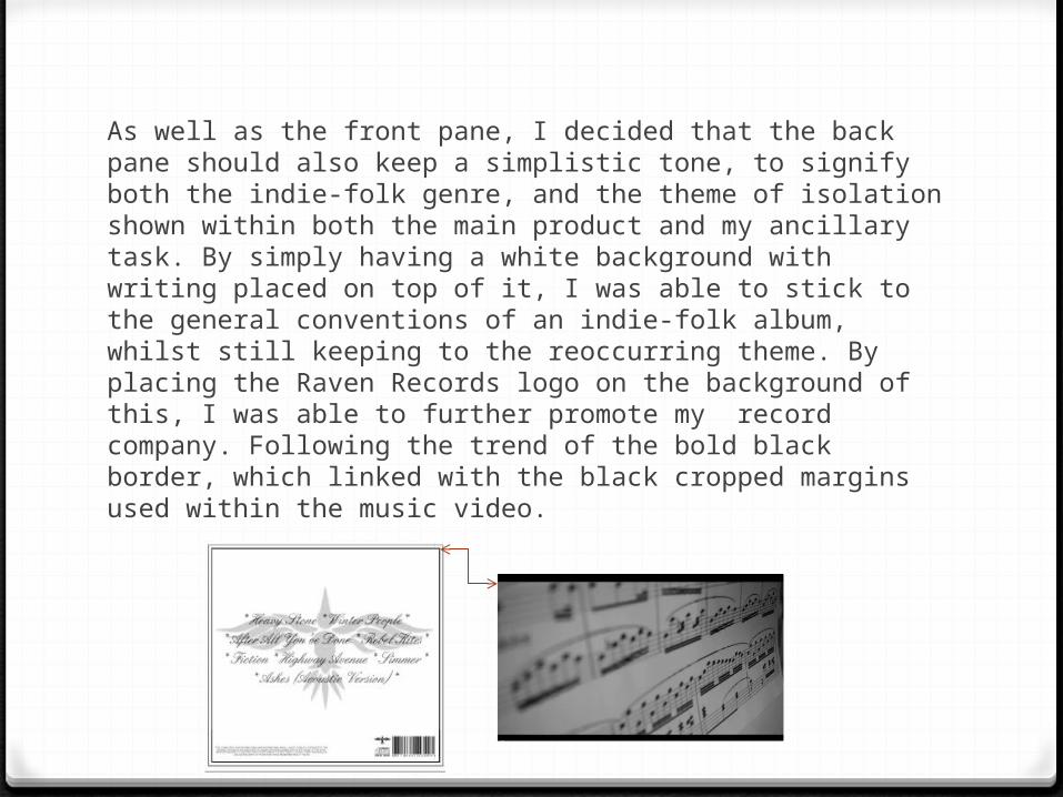
As well as the front pane, I decided that the back pane should also keep a simplistic tone, to signify both the indie-folk genre, and the theme of isolation shown within both the main product and my ancillary task. By simply having a white background with writing placed on top of it, I was able to stick to the general conventions of an indie-folk album, whilst still keeping to the reoccurring theme. By placing the Raven Records logo on the background of this, I was able to further promote my record company. Following the trend of the bold black border, which linked with the black cropped margins used within the music video.
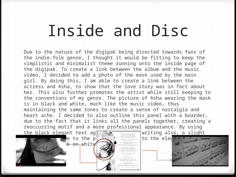
Inside and DiscDue to the nature of the digipak being directed towards fans of the indie-folk genre, I thought it would be fitting to keep the simplistic and minimalist theme running onto the inside page of the digipak. To create a link between the album and the music video, I decided to add a photo of the mask used by the main girl. By doing this, I am able to create a link between the actress and Asha, to show that the love story was in fact about her. This also further promotes the artist while still keeping to the conventions of my genre. The picture of Asha wearing the mask is in black and white, much like the music video, thus maintaining the same tones to create a sense of nostalgia and heart ache. I decided to also outline this panel with a boarder, due to the fact that it links all the panels together, creating a reoccurring motif and a more professional appearance. By using the black elegant text against the white writing also, a slight link can be made to the piano music, due to the elegant style and the use of black on white.
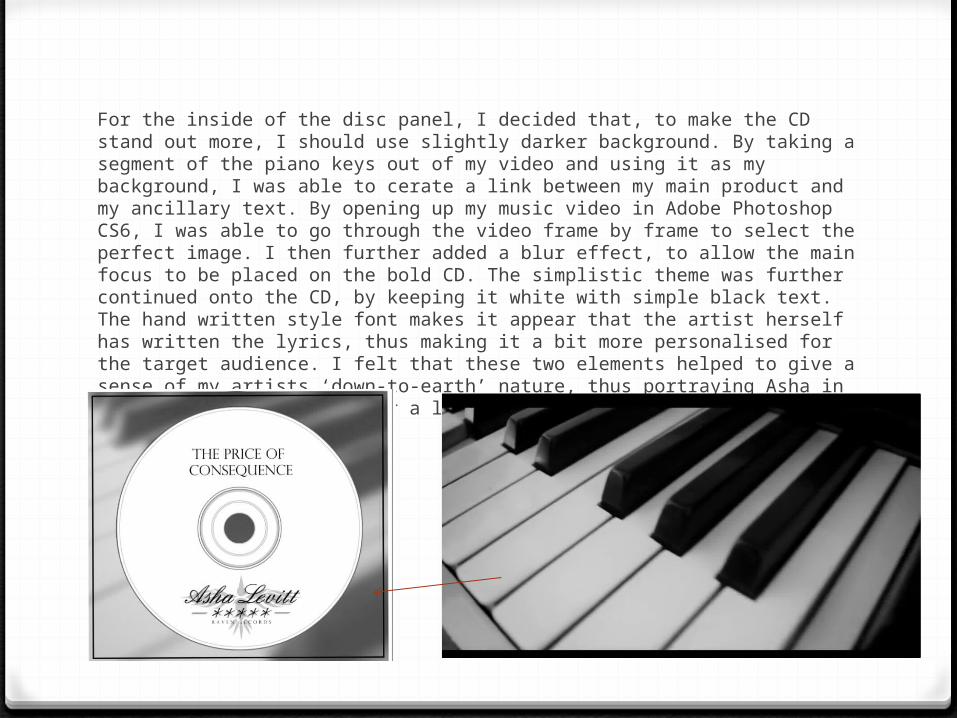
For the inside of the disc panel, I decided that, to make the CD stand out more, I should use slightly darker background. By taking a segment of the piano keys out of my video and using it as my background, I was able to cerate a link between my main product and my ancillary text. By opening up my music video in Adobe Photoshop CS6, I was able to go through the video frame by frame to select the perfect image. I then further added a blur effect, to allow the main focus to be placed on the bold CD. The simplistic theme was further continued onto the CD, by keeping it white with simple black text. The hand written style font makes it appear that the artist herself has written the lyrics, thus making it a bit more personalised for the target audience. I felt that these two elements helped to give a sense of my artists ‘down-to-earth’ nature, thus portraying Asha in a positive like, giving her a likable image.
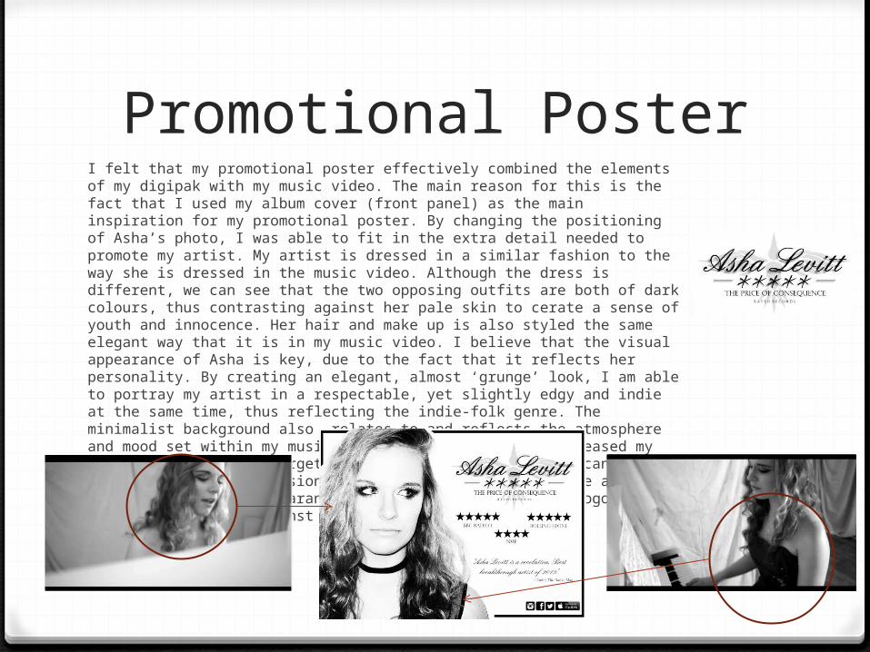
Promotional PosterI felt that my promotional poster effectively combined the elements of my digipak with my music video. The main reason for this is the fact that I used my album cover (front panel) as the main inspiration for my promotional poster. By changing the positioning of Asha’s photo, I was able to fit in the extra detail needed to promote my artist. My artist is dressed in a similar fashion to the way she is dressed in the music video. Although the dress is different, we can see that the two opposing outfits are both of dark colours, thus contrasting against her pale skin to cerate a sense of youth and innocence. Her hair and make up is also styled the same elegant way that it is in my music video. I believe that the visual appearance of Asha is key, due to the fact that it reflects her personality. By creating an elegant, almost ‘grunge’ look, I am able to portray my artist in a respectable, yet slightly edgy and indie at the same time, thus reflecting the indie-folk genre. The minimalist background also relates to and reflects the atmosphere and mood set within my music video. I felt that this increased my artists appeal to my target audience of young adults who can relate to the feeling of seclusion and isolation. Also, to create an elegant and classy appearance, I decided to make Asha’s logo contain a calligraphy font against the record label background.