evaluation question how effective
TRANSCRIPT

How effective is the combination of your main product and ancillary texts?
Gelsomina De LuciaTayla Humphris
Leticia SilvaPatrycia Butrum

How effective is the combination of your main product and ancillary texts?
• All three forms used the same font style which is called ‘Tw Cen MT Condensed Extra Bold ’• This made it easier for the target audience to recognise the trailer and it established the film.
Colour: Blue and (or) White
• In all three forms, the colours blue or (and) white were used.• When used together, they are meant to symbolise evil.• Blue tints are used throughout all the formats as it is a supernatural thriller convention.• Blue was also used in the costume of Leticia.
Colour Scheme and Font colour:
• Throughout the texts, the colour scheme has been blue and white however, this is more applied to the trailer and magazine cover.• The font on the poster just uses white colour as it did not look as effective with blue and white.
Font style:

How effective is the combination of your main product and ancillary texts?
Main image:• The main image on the poster is Gelsomina as supernatural/thriller posters tend to show the victim of the possession at their most
venerable state. • However, the magazine and trailer is shared by both of the main characters as it explores both of their journeys and their venerable
states.• This uses the narrative convention of supernatural thrillers as they are a journey of two people whereby one of the characters as a
supernatural ability.• This is represented through the mid two shot used on the cover of the magazine and the juxtaposition of characterisations during the
montage editing of the trailer.
How effective is the combination of your main product and ancillary texts?
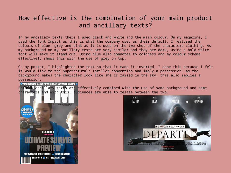
In my ancillary texts there I used black and white and the main colour. On my magazine, I used the font Impact as this is what the company used as their default. I featured the colours of blue, grey and pink as it is used on the two shot of the characters clothing. As my background on my ancillary texts are very similar and they are dark, using a bold white font will make it stand out. Using blue also connotes to coldness and my colour scheme effectively shows this with the use of grey on top.
On my poster, I highlighted the text so that it made it inverted, I done this because I felt it would link to the Supernatural/ Thriller convention and imply a possession. As the background makes the character look like she is raised in the sky, this also implies a possession.
Both my ancillary texts are effectively combined with the use of same background and same characters and with this, audiences are able to relate between the two.
How effective is the combination of your main product and ancillary texts?
• For the ancillary texts the programmes that were used were Photoshop, InDesign and picmonkey.
• Al the programmes allowed us to create ancillary texts that complimented our trailer. • With InDesign we were able to use specific fonts that fell in place with the genre of our
trailer. As it is important for our ancillary to have the specific typefaces that represented out trailer as it is another platform that would help us to advertise our trailers to our audiences.
• Within picmonkey it allowed us to add a great affect on the image very quickly without it being time consuming to make it more appealing to our audiences. This also blends in with the idea that our main product already catches attention and for the ancillary texts it allows us to advertise and portray a high amount tension that was created. The effects that were added on our ancillary texts also allows a wide range of audiences to find our ancillary's texts interesting boosting our secondary audience count to watch our main product.

How effective is the combination of your main product and ancillary texts?
• Compared to my first draft, my ancillary texts have much more relation to the main product therefore the more features from the plot I was adding to my poster and magazine the more it was enforcing the combination.
• The first thing I have changed between my drafts to make the combination more effective was change the theme colour from an innocent white to mysterious black with a red bold title.
• Changing those colours have had a huge effect to the combination with the main product as the black and red enforced ‘possession’ scene.