evaluation (lo5)
TRANSCRIPT

Evaluation For Fashion Spread (LO5) By Olivia Lewis-Brown

Fashion Spread Photo 1

Evaluation Of Fashion Spread PhotoWhen taking this photo my intentions were to create a dreamy/ sunny representation of spring time, including all connotations of the season such as sun, colors, flowers and natural beauty. This final image I selected as my final candidate as I believe it fulfils all my prior intentions, as the halo effect from the high key natural lighting signifies warmth and sun, the inclusion of the flower motif is subtly incorporated and the connotations of the colour scheme such as white symbolises purity and beauty. The shallow depth of field also helps convey the model to be the main focal point as she is the most focused image in the shot. Her use of direct address also connotes traditional magazine spread layout features which I thought would make the spread appear more professional and believable. This image I believe is suitable for a teenage lifestyle magazine spread as it involves a teenage model and uses a modern style to signify the intended target audience appeal. The meaning associated with this image are of promoting natural beauty in spring time as the model is not heavily made up and wears simple colours with limited pattern work to re-establish her as the main focal point.

Completed Fashion Spread 1
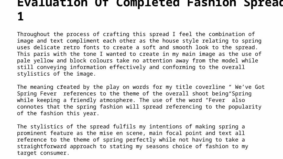
Evaluation Of Completed Fashion Spread 1Throughout the process of crafting this spread I feel the combination of image and text compliment each other as the house style relating to spring uses delicate retro fonts to create a soft and smooth look to the spread. This paris with the tone I wanted to create in my main image as the use of pale yellow and block colours take no attention away from the model while still conveying information effectively and conforming to the overall stylistics of the image.
The meaning created by the play on words for my title coverline “ We’ve Got Spring Fever” references to the theme of the overall shoot being Spring while keeping a friendly atmosphere. The use of the word “Fever” also connotes that the spring fashion will spread referencing to the popularity of the fashion this year.
The stylistics of the spread fulfils my intentions of making spring a prominent feature as the mise en scene, main focal point and text all reference to the theme of spring perfectly while not having to take a straightforward approach to stating my seasons choice of fashion to my target consumer.
Fashion Spread Photo 2

Evaluation of Completed Fashion Spread Photo 2
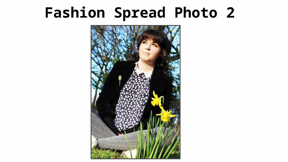
My Intentions when taking this image was to include all the spring motifs incorporated within image 1 to keep the house style by featuring such motifs as flowers, bright colours and sunshine. I feel within this image I have captured these features and more, this selected photo fulfilling all my previous intentions for the spread as bright colours help capture the attention of my target audience, the symbolic reference to spring through the slightly blurred daffodils in the foreground convey the theme and the light on the models face helps establish her and her outfit as the main focal point of the image. I feel this image would be appropriate for a teenage lifestyle magazine spread as the image features a relatable teenage model with a universal retro style which can appeal to all age ranges. The use of the flower motif in this photo is prominent as it establishes the main meaning to spring to be floral and full of life. The use of bright colours and blue tones also create a bright attractive atmosphere.

Completed Fashion Spread 2

Evaluation of Completed Fashion Spread 2I feel the text and image combination worked well as the text described everything in the image, giving the audience all the necessary information needed on the outfit. The outlines description also highlights the importance of the related information as it draws the attention of the viewer to the left side of the image, diversifying the focal points established in all areas of the shot such as the flowers on the bottom right and the main focal point of the model in the middle. My main priority when creating this spread was to make sure the entire frame was filled and no awkward blank spots were featured.The image is appropriate for my target audience as it features clothing from modern popular brands such as river island and references to online fashion stores such as The Hut.com which incorperates the technological side of fashion marketing for my younger teen target audience. This image fulfils my intentions by keeping with the house style established and fills all areas of the frame with a canted angle giving the image a unique edge.
Fashion Spread Photo 3
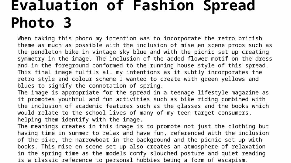
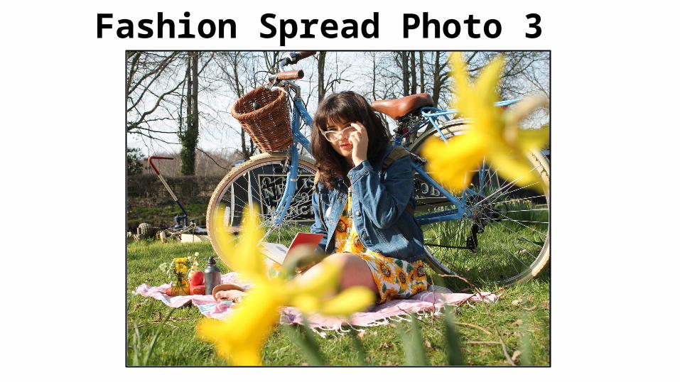
Evaluation of Fashion Spread Photo 3When taking this photo my intention was to incorporate the retro british theme as much as possible with the inclusion of mise en scene props such as the pendleton bike in vintage sky blue and with the picnic set up creating symmetry in the image. The inclusion of the added flower motif on the dress and in the foreground conformed to the running house style of this spread. This final image fulfils all my intentions as it subtly incorporates the retro style and colour scheme I wanted to create with green yellows and blues to signify the connotation of spring. The image is appropriate for the spread in a teenage lifestyle magazine as it promotes youthful and fun activities such as bike riding combined with the inclusion of academic features such as the glasses and the books which would relate to the school lives of many of my teen target consumers, helping them identify with the image. The meanings creates in this image is to promote not just the clothing but having time in summer to relax and have fun, referenced with the inclusion of the bike, the narrowboat in the background and the picnic set up with books. This mise en scene set up also creates an atmosphere of relaxation in the spring time as the models comfy slouched posture and quiet reading is a classic reference to personal hobbies being a form of escapism.

Completed Fashion Spread 4
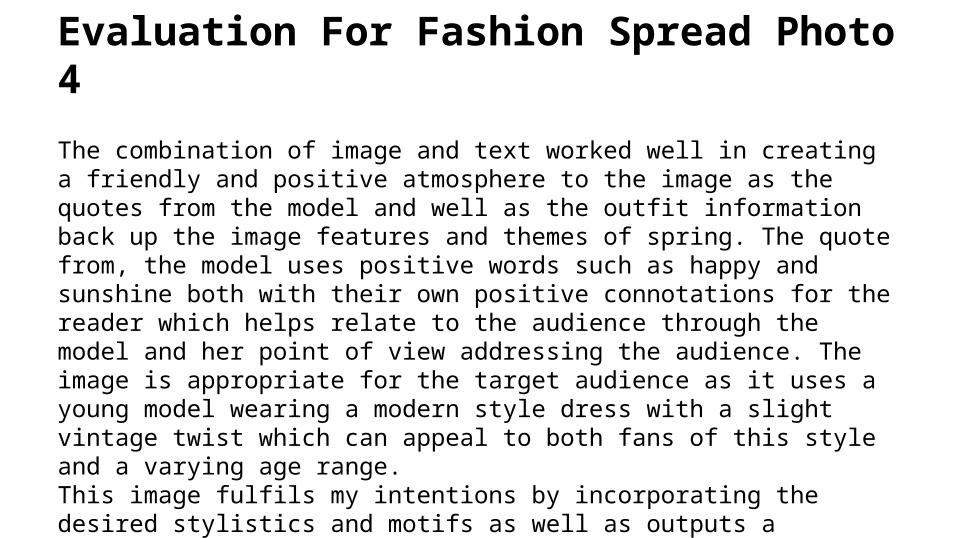
Evaluation For Fashion Spread Photo 4
The combination of image and text worked well in creating a friendly and positive atmosphere to the image as the quotes from the model and well as the outfit information back up the image features and themes of spring. The quote from, the model uses positive words such as happy and sunshine both with their own positive connotations for the reader which helps relate to the audience through the model and her point of view addressing the audience. The image is appropriate for the target audience as it uses a young model wearing a modern style dress with a slight vintage twist which can appeal to both fans of this style and a varying age range. This image fulfils my intentions by incorporating the desired stylistics and motifs as well as outputs a positive message and tone which will relate well to my target consumers

Fashion Spread Photo 5

Evaluation Of Fashion Spread Photo 5
I'm intentions when taking this photo was to create an almost sleeping beauty/alice in wonderland look to signify the change from winter to spring with the mise en scene being leaves turning green with the coming spring. The meaning of this photo was to show the different transitions into the new season with the complementing brown and green tones of the mise en scene juxtaposed with the pure blue and white stripes of the dress my model wears signifying the change in style this summer. This image fulfils my intentions of creating a mid season change photo as I wanted to gradually introduce my audience to the newest styles while also appealing to their current winter/spring style already a present factor in their lives. This image I feel was appropriate for a teenage lifestyle magazine spread as it incorporates fun and girlish pastel colours with a flower motif and a young model which can relate to many of my target consumers styles and age group.
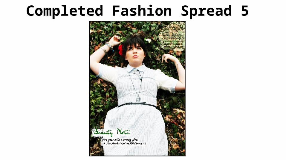
Completed Fashion Spread 5

Evaluation Of Completed Fashion Spread 5
The combination of image and text I feel is effective in this completed spread as the information includes a detailed outfit description and a beauty tip covering not just fashion but complementary makeup which can be seen on the model, complementing the main focal point well in its explanation. The meaning created through this image is that simple beauty is better beauty as the colour scheme and simplicity in the models accessories and makeup creates a bold statement against the plan mise en scene darker tones and lighting. This image is appropriate in relating to my target audience as it gives tips on natural style makeup and affordable brands which my teenage target audience with low disposable income can relate to as they fit into a lower spending profile than an adult consumer, the brand featured all popular within this age range. This overall image fulfils my intentions of creating an effective final spread as it depicts a slow transition from one season style to the next and uses simplicity within its color scheme outfit design and model pose to draw interest which is what I wanted to create when photographing and editing this image.