enhancing responsiveness with flexbox (rwd summit)
TRANSCRIPT
Flexbox Zoe Mickley Gillenwater @zomigi SmashingConf
March 2014
Enhancing
WITH Responsiveness
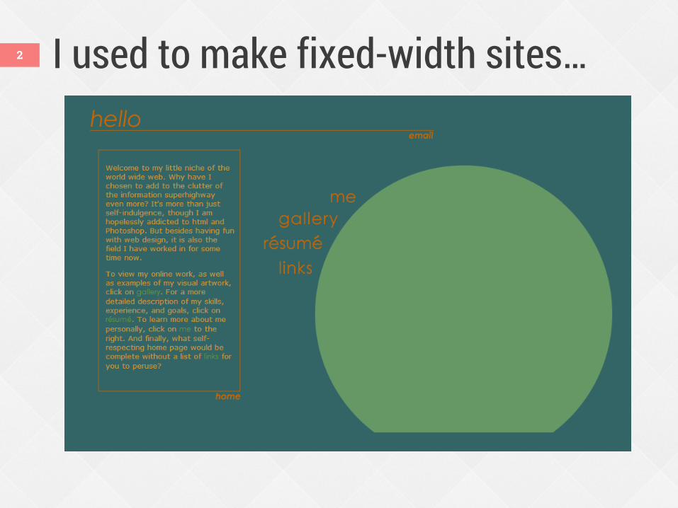
I used to make fixed-width sites… 2
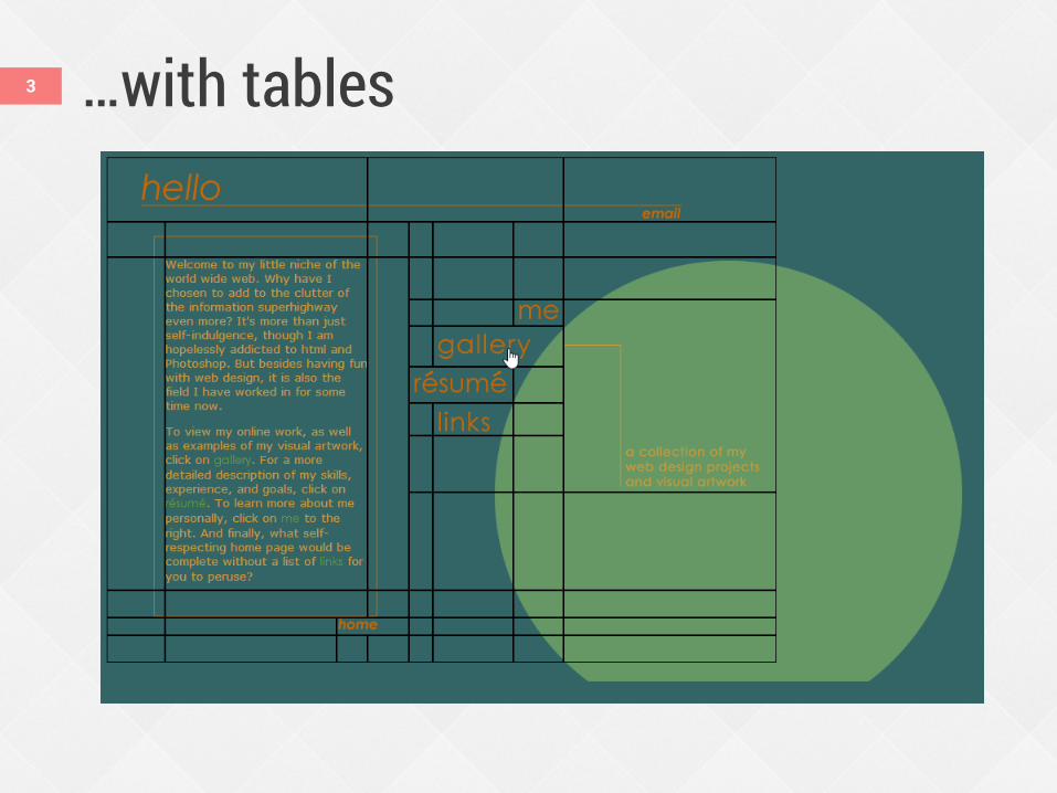
…with tables 3
4
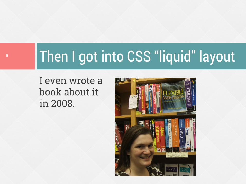
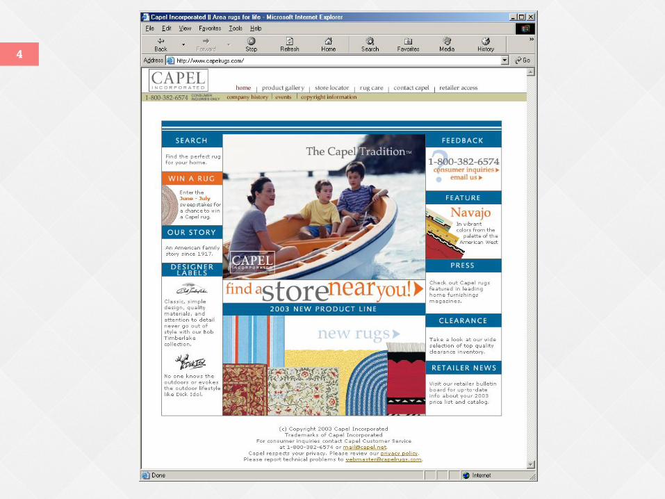
I even wrote a book about it in 2008.
Then I got into CSS “liquid” layout 5
Problems with float layout Difficulty with containment Wrapping/float drop Difficulty with equal-height columns No float:center No vertical centering Visual location somewhat tied to HTML
order
6
The alternatives have problems, too
Source-order dependent
Whitespace in source appears visually
Source-order dependent
No wrapping No IE 7 support
7
Issues with inline-block Issues with table-cell
Flexbox solves a lot of these issues Make boxes automatically grow to fill
space or shrink to avoid overflow Give boxes proportional measurements Lay out boxes in any direction Align boxes on any side Place boxes out of order from HTML
8
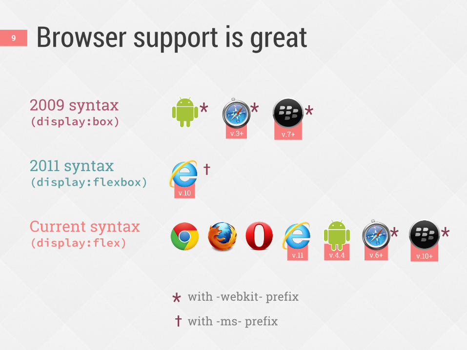
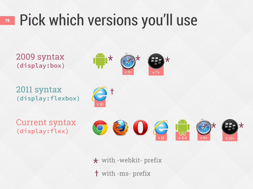
v.10+
2009 syntax (display:box)
2011 syntax (display:flexbox)
Current syntax (display:flex)
v.10
Browser support is great
* with -webkit- prefix
† with -ms- prefix
v.6+
*
†
* v.3+
*
v.4.4 v.11
*
v.7+
*
9
Use flexbox now on UI components as progressive enhancement.
You can use flexbox now 10
Progressive enhancement possibilities Align items in new ways Fill up the gaps in your layout Reorder decorative content Increase responsiveness
11
Responsiveness is a continuum. Flexbox can help make your site more responsive.
RWD is not binary 12
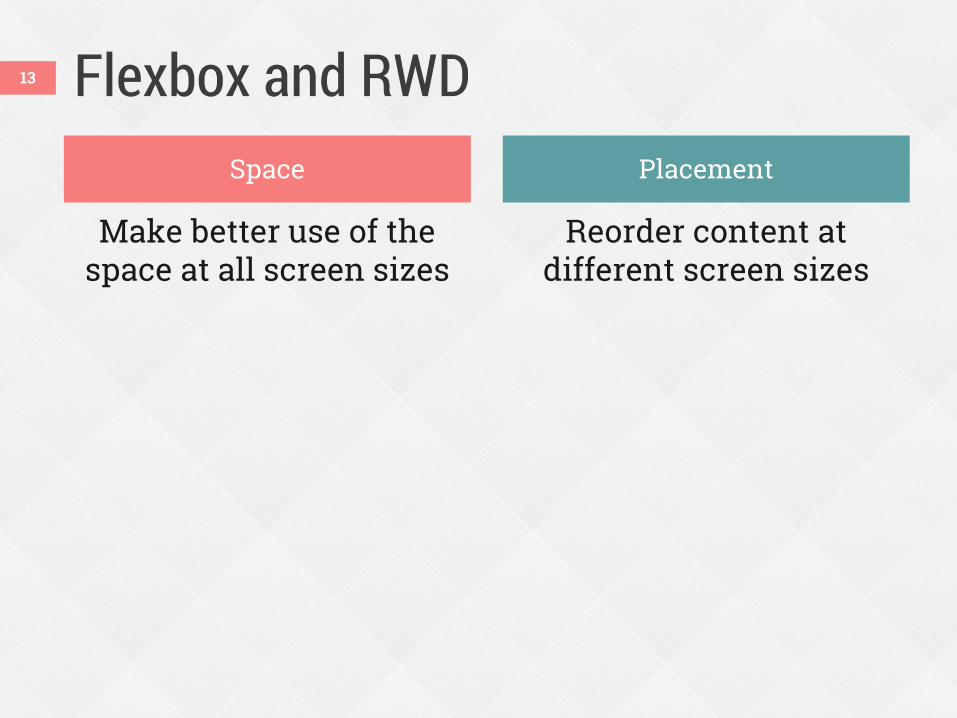
Flexbox and RWD
Make better use of the space at all screen sizes
Reorder content at different screen sizes
13
Space Placement
Making better use of space 14
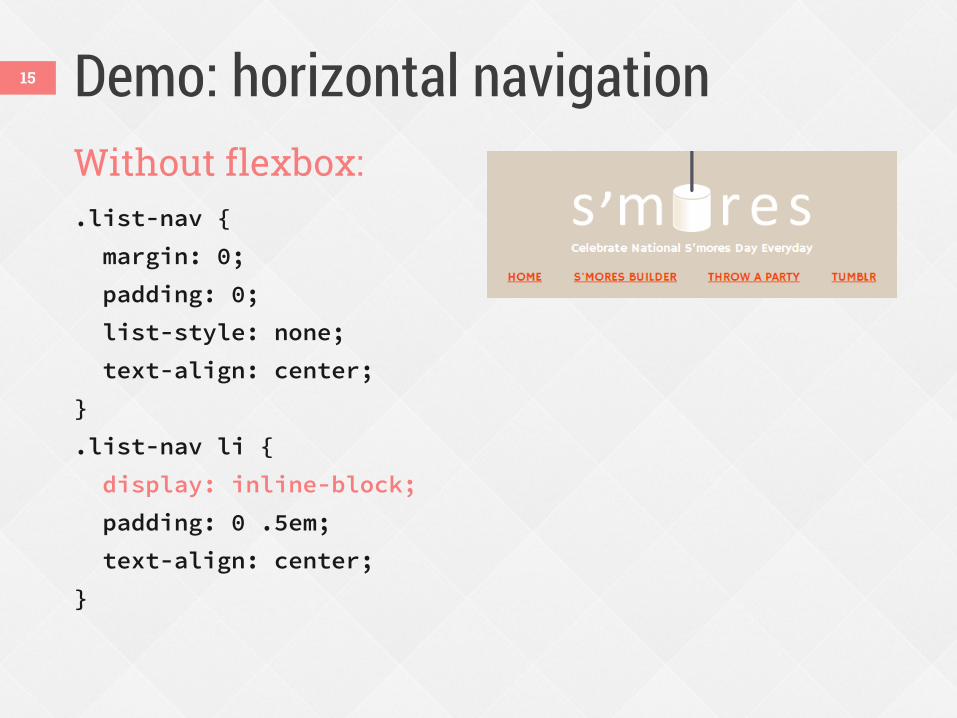
Demo: horizontal navigation Without flexbox: .list-nav {
margin: 0;
padding: 0;
list-style: none;
text-align: center;
}
.list-nav li {
display: inline-block;
padding: 0 .5em;
text-align: center;
}
15
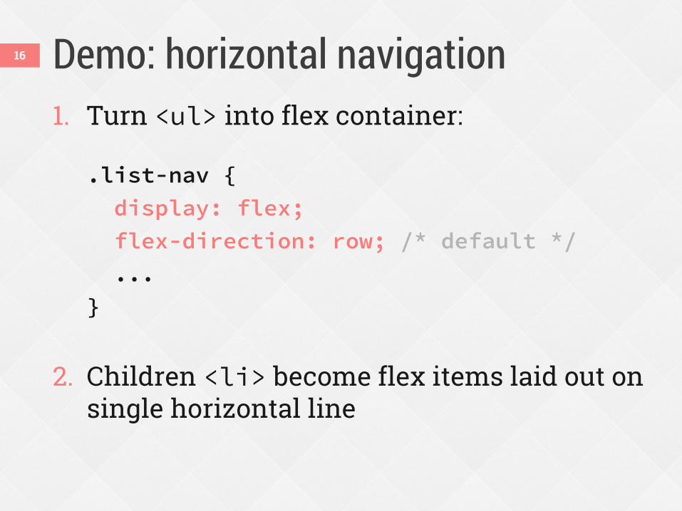
Demo: horizontal navigation 1. Turn <ul> into flex container:
.list-nav {
display: flex;
flex-direction: row; /* default */
...
}
2. Children <li> become flex items laid out on
single horizontal line
16
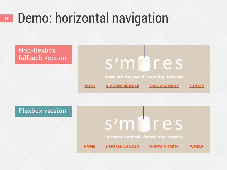
Demo: horizontal navigation
Non-flexbox fallback version
Flexbox version
17
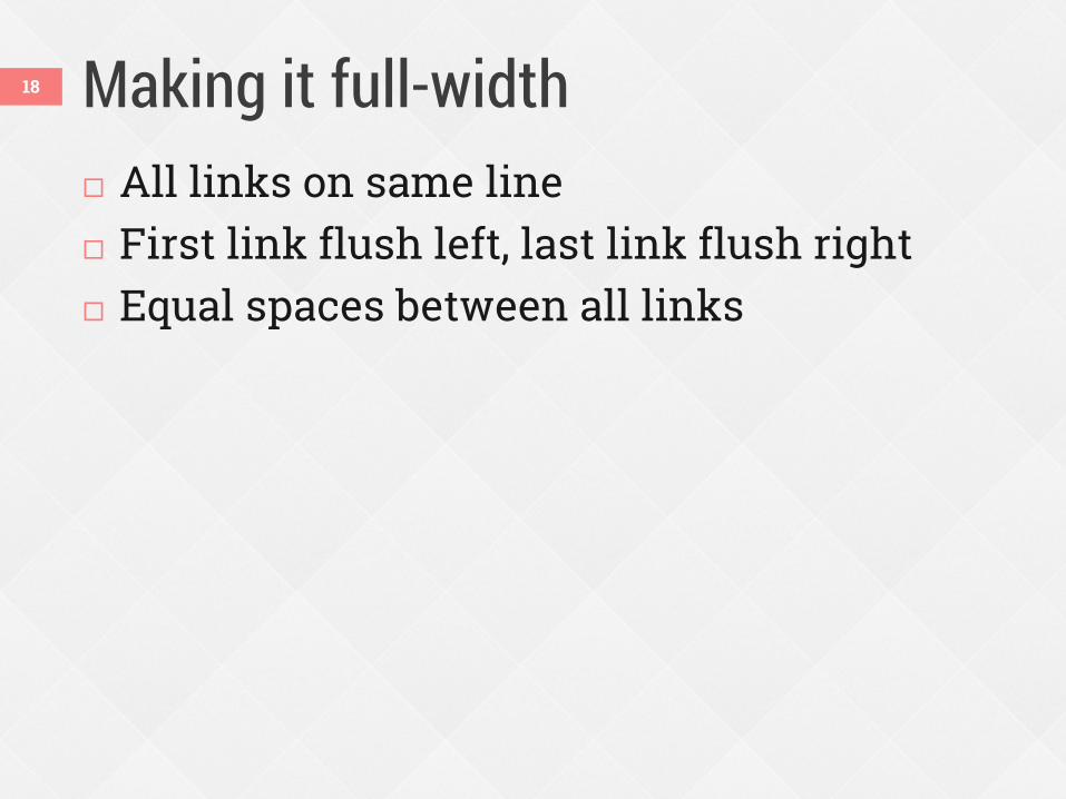
Making it full-width All links on same line First link flush left, last link flush right Equal spaces between all links
18
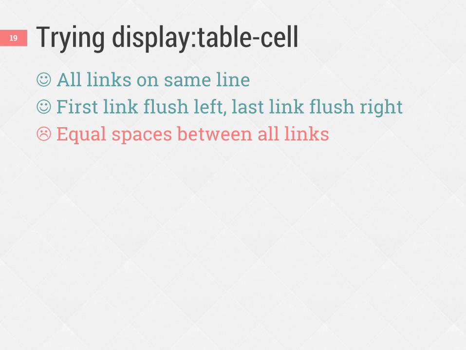
Trying display:table-cell All links on same line First link flush left, last link flush right Equal spaces between all links
19
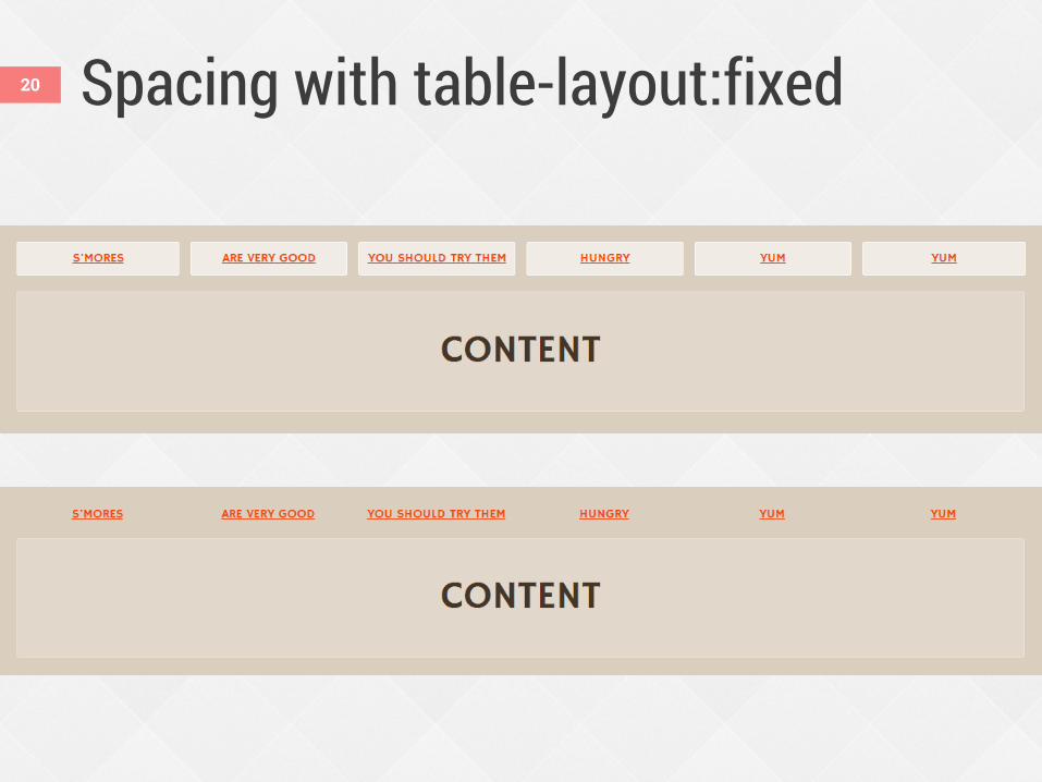
Spacing with table-layout:fixed 20
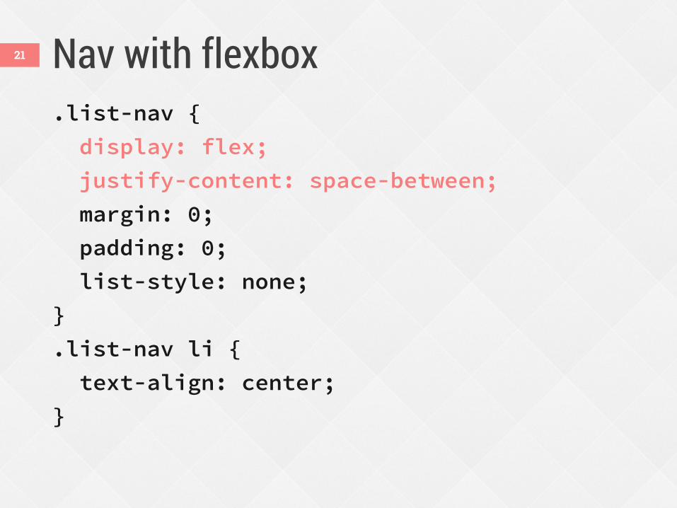
Nav with flexbox .list-nav {
display: flex;
justify-content: space-between;
margin: 0;
padding: 0;
list-style: none;
}
.list-nav li {
text-align: center;
}
21
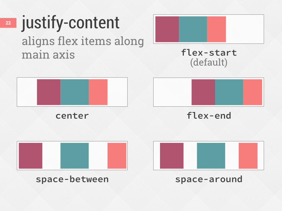
justify-content 22
aligns flex items along main axis
space-around
flex-end center
flex-start (default)
space-between
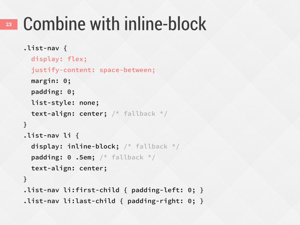
Combine with inline-block .list-nav {
display: flex;
justify-content: space-between;
margin: 0;
padding: 0;
list-style: none;
text-align: center; /* fallback */
}
.list-nav li {
display: inline-block; /* fallback */
padding: 0 .5em; /* fallback */
text-align: center;
}
.list-nav li:first-child { padding-left: 0; }
.list-nav li:last-child { padding-right: 0; }
23
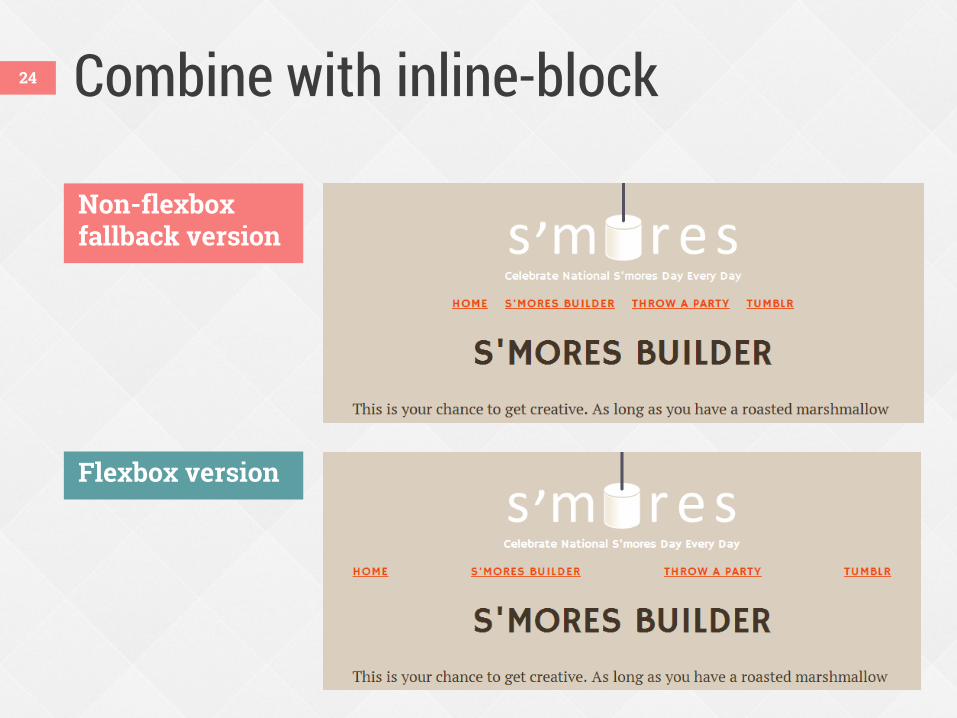
Combine with inline-block
Non-flexbox fallback version
Flexbox version
24
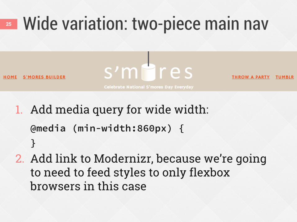
Wide variation: two-piece main nav
1. Add media query for wide width: @media (min-width:860px) {
}
2. Add link to Modernizr, because we’re going to need to feed styles to only flexbox browsers in this case
25
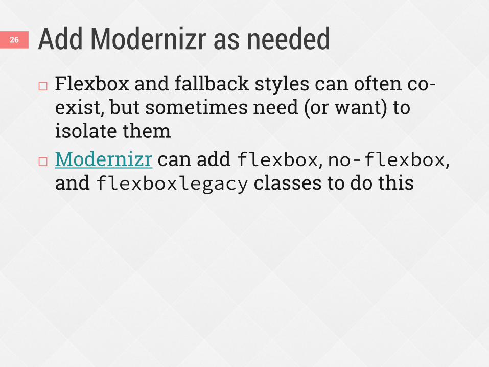
Add Modernizr as needed Flexbox and fallback styles can often co-
exist, but sometimes need (or want) to isolate them
Modernizr can add flexbox, no-flexbox, and flexboxlegacy classes to do this
26
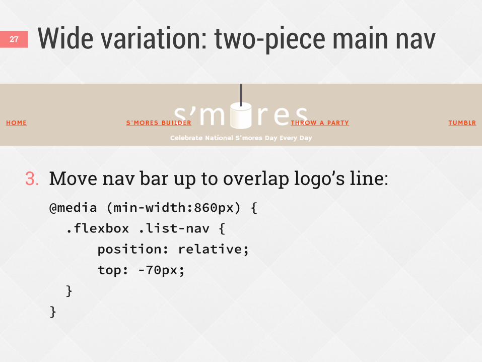
Wide variation: two-piece main nav
3. Move nav bar up to overlap logo’s line: @media (min-width:860px) {
.flexbox .list-nav {
position: relative;
top: -70px;
}
}
27
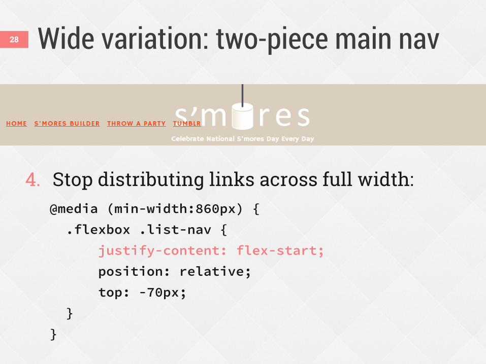
Wide variation: two-piece main nav
4. Stop distributing links across full width: @media (min-width:860px) {
.flexbox .list-nav {
justify-content: flex-start;
position: relative;
top: -70px;
}
}
28
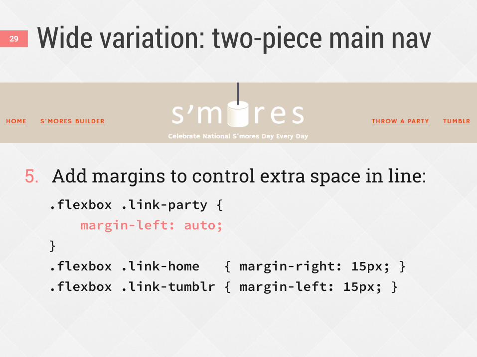
Wide variation: two-piece main nav
5. Add margins to control extra space in line: .flexbox .link-party {
margin-left: auto;
}
.flexbox .link-home { margin-right: 15px; }
.flexbox .link-tumblr { margin-left: 15px; }
29
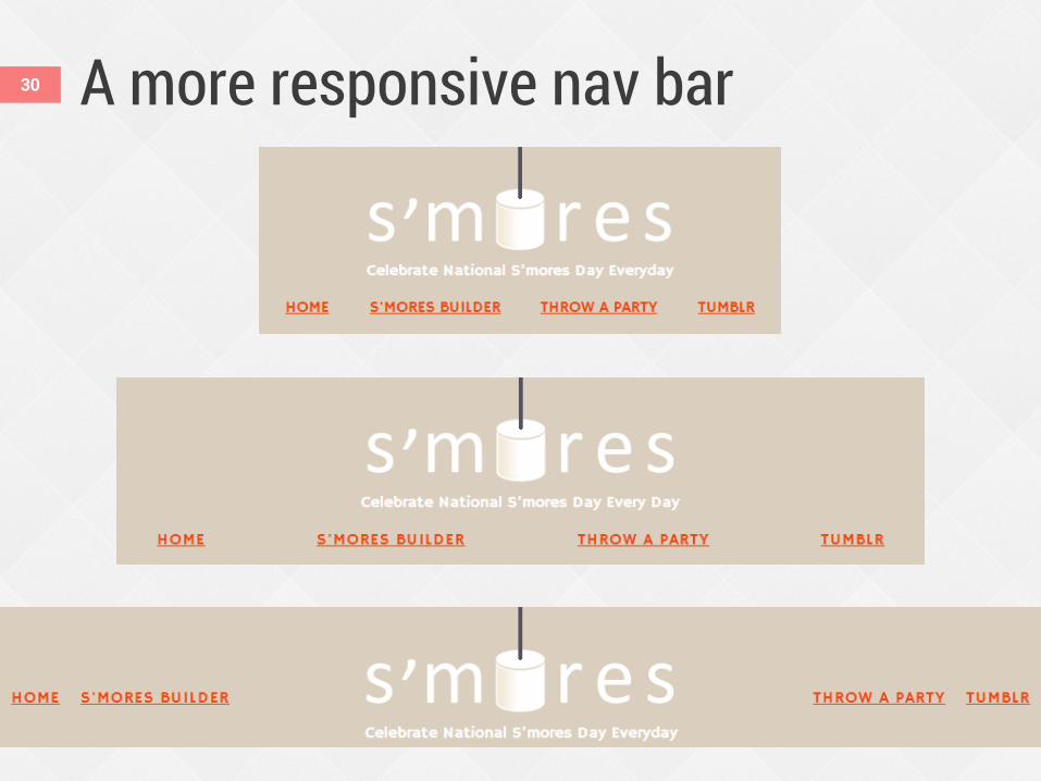
A more responsive nav bar 30
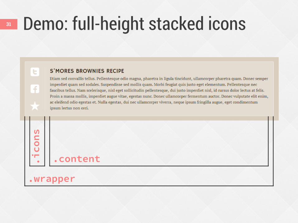
Demo: full-height stacked icons
.wrapper
.icons
.content
31
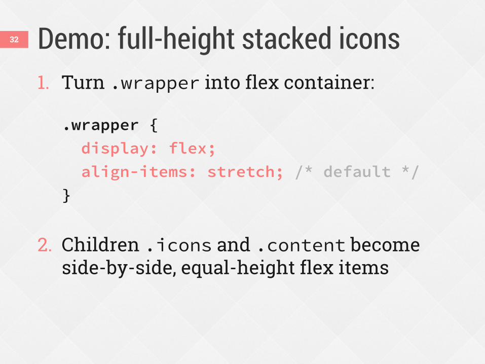
Demo: full-height stacked icons 1. Turn .wrapper into flex container:
.wrapper {
display: flex;
align-items: stretch; /* default */
}
2. Children .icons and .content become
side-by-side, equal-height flex items
32
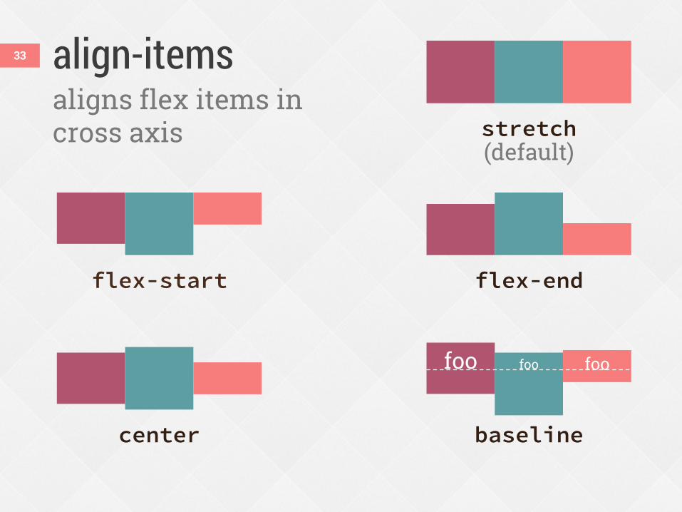
align-items 33
aligns flex items in cross axis
flex-start flex-end
center baseline
stretch (default)
foo foo foo
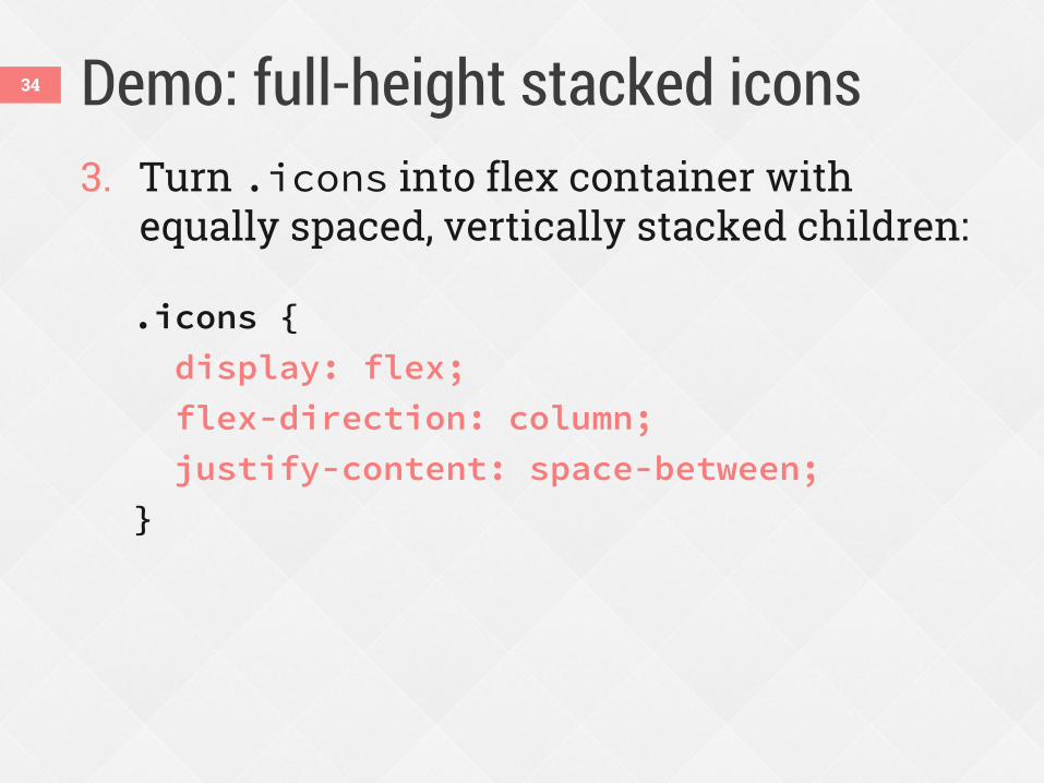
Demo: full-height stacked icons 3. Turn .icons into flex container with
equally spaced, vertically stacked children:
.icons {
display: flex;
flex-direction: column;
justify-content: space-between;
}
34
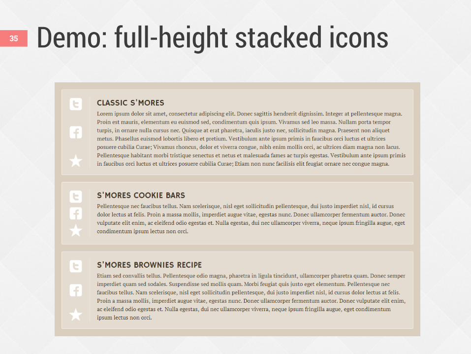
Demo: full-height stacked icons 35
Combine with table-cell .wrapper {
display: table; /* fallback */
display: flex;
}
.icons {
display: table-cell; /* fallback */
vertical-align: middle; /* fallback */
display: flex;
flex-direction: column;
justify-content: space-between;
}
.content {
display: table-cell; /* fallback */
vertical-align: top; /* fallback */
flex: 1 0 0px;
}
36
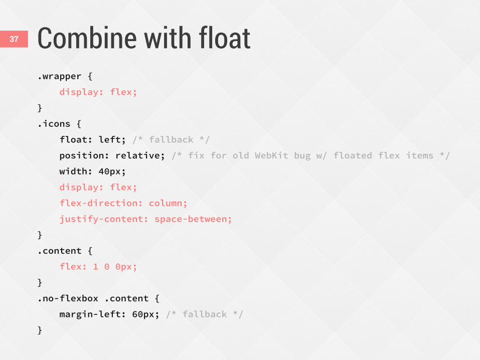
Combine with float .wrapper {
display: flex;
}
.icons {
float: left; /* fallback */
position: relative; /* fix for old WebKit bug w/ floated flex items */
width: 40px;
display: flex;
flex-direction: column;
justify-content: space-between;
}
.content {
flex: 1 0 0px;
}
.no-flexbox .content {
margin-left: 60px; /* fallback */
}
37
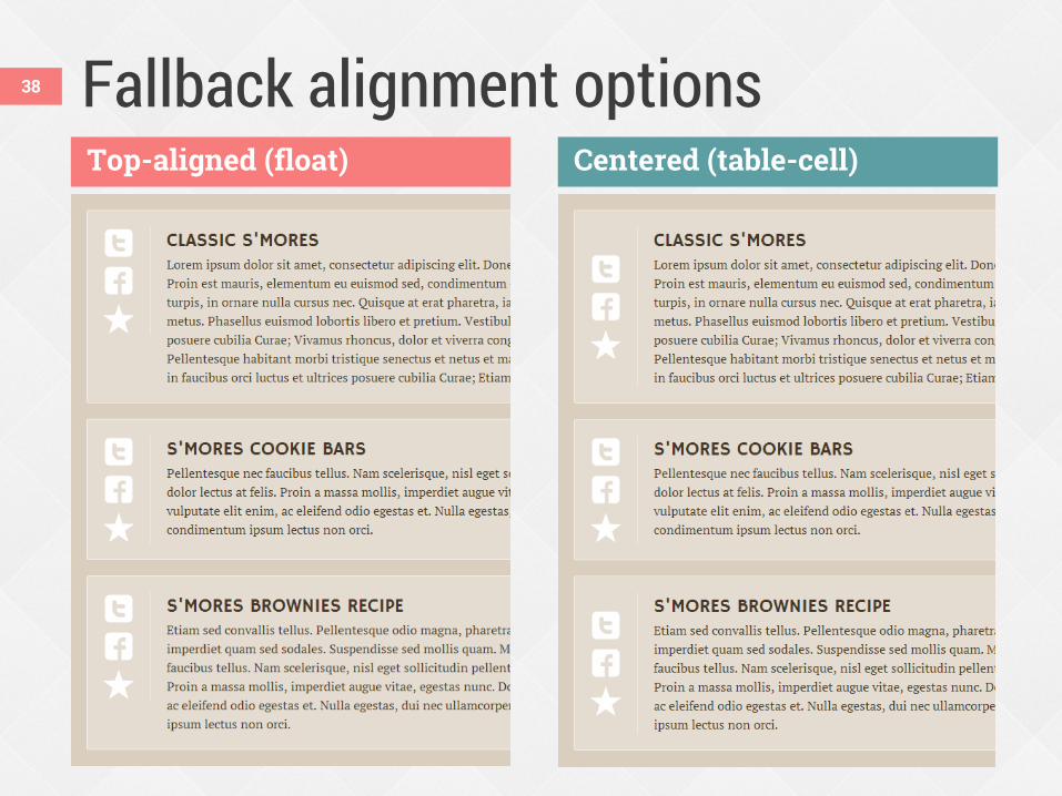
Fallback alignment options 38
Top-aligned (float) Centered (table-cell)
Combining units of measurement across a line can make RWD tricky.
ems + % + px = ? 39
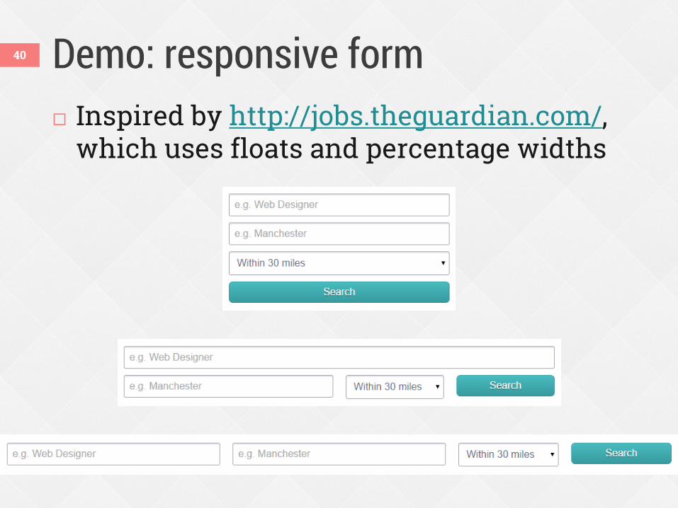
Demo: responsive form 40
Inspired by http://jobs.theguardian.com/, which uses floats and percentage widths
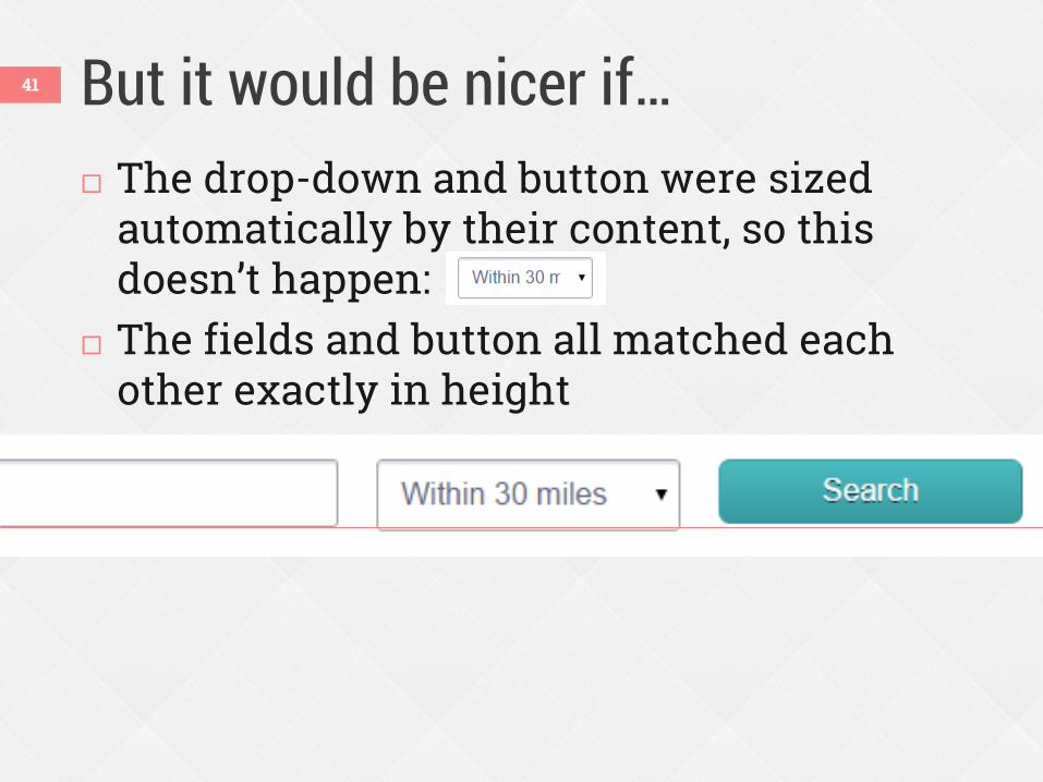
But it would be nicer if… 41
The drop-down and button were sized automatically by their content, so this doesn’t happen:
The fields and button all matched each other exactly in height
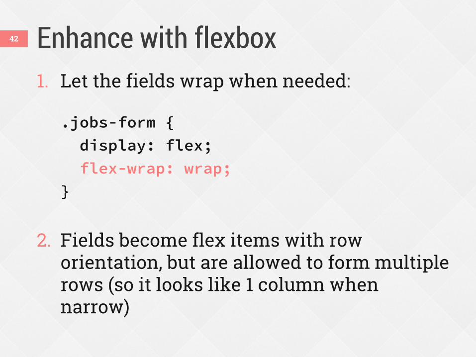
Enhance with flexbox 42
1. Let the fields wrap when needed:
.jobs-form {
display: flex;
flex-wrap: wrap;
}
2. Fields become flex items with row orientation, but are allowed to form multiple rows (so it looks like 1 column when narrow)
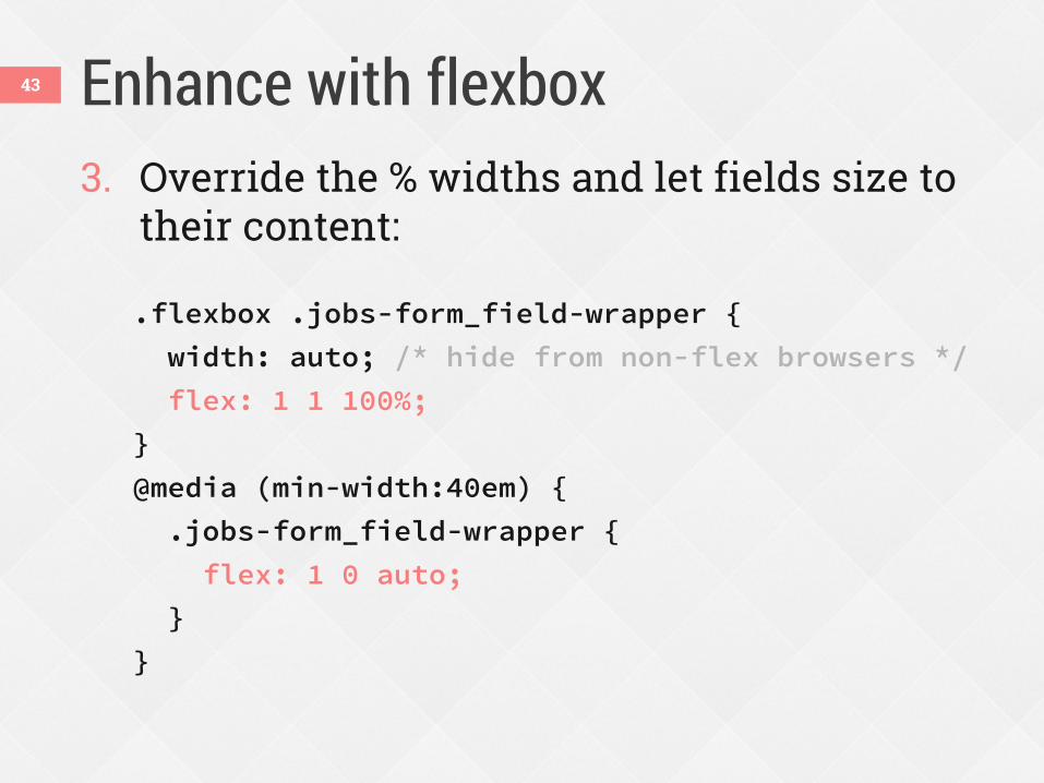
Enhance with flexbox 43
3. Override the % widths and let fields size to their content: .flexbox .jobs-form_field-wrapper {
width: auto; /* hide from non-flex browsers */
flex: 1 1 100%;
}
@media (min-width:40em) {
.jobs-form_field-wrapper {
flex: 1 0 auto;
}
}
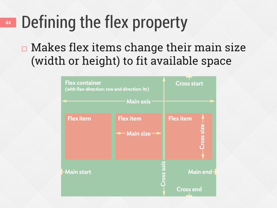
Defining the flex property Makes flex items change their main size
(width or height) to fit available space
44
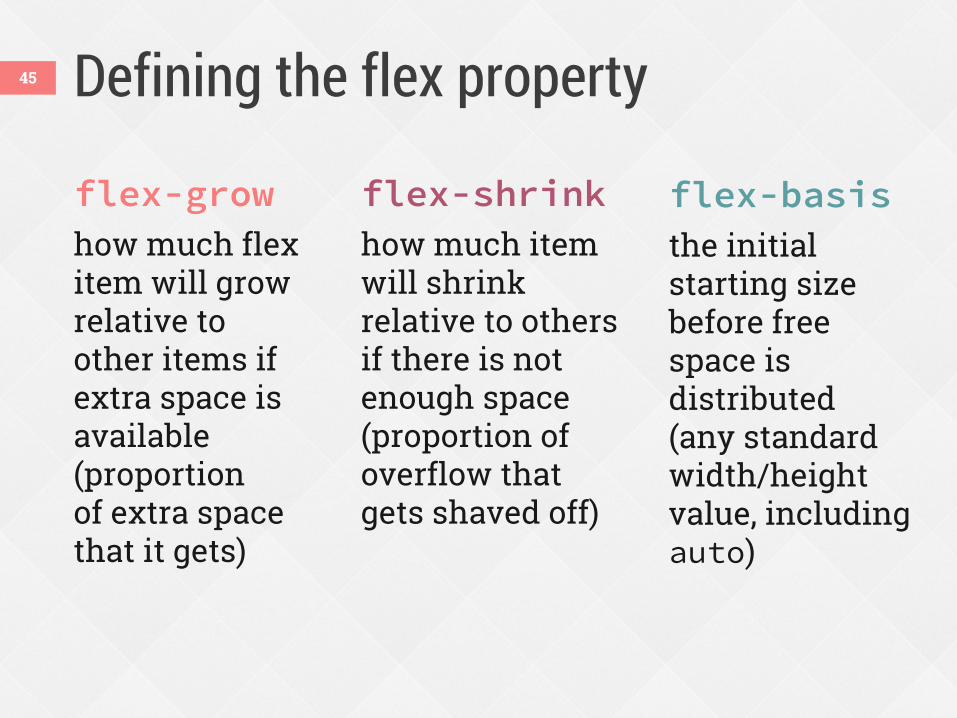
Defining the flex property
flex-grow
how much flex item will grow relative to other items if extra space is available (proportion of extra space that it gets)
flex-shrink
how much item will shrink relative to others if there is not enough space (proportion of overflow that gets shaved off)
flex-basis
the initial starting size before free space is distributed (any standard width/height value, including auto)
45
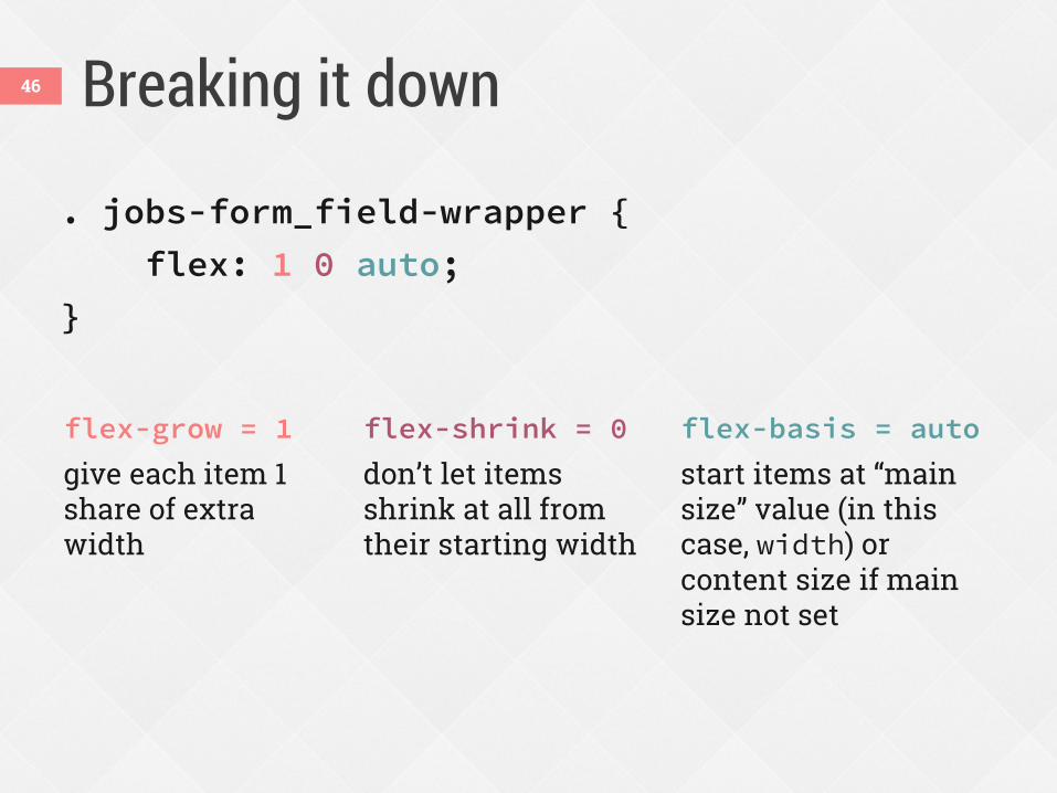
Breaking it down
. jobs-form_field-wrapper {
flex: 1 0 auto;
}
flex-grow = 1
give each item 1 share of extra width
flex-shrink = 0
don’t let items shrink at all from their starting width
flex-basis = auto
start items at “main size” value (in this case, width) or content size if main size not set
46
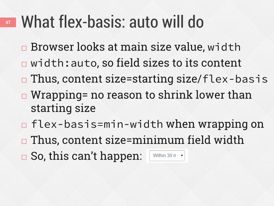
What flex-basis: auto will do 47
Browser looks at main size value, width width:auto, so field sizes to its content Thus, content size=starting size/flex-basis Wrapping= no reason to shrink lower than
starting size flex-basis=min-width when wrapping on Thus, content size=minimum field width So, this can’t happen:
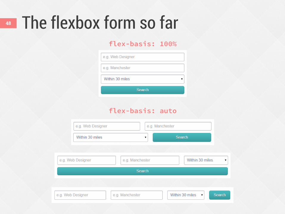
The flexbox form so far 48
flex-basis: 100%
flex-basis: auto
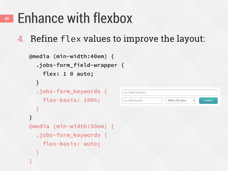
Enhance with flexbox 49
4. Refine flex values to improve the layout: @media (min-width:40em) {
.jobs-form_field-wrapper {
flex: 1 0 auto;
}
.jobs-form_keywords {
flex-basis: 100%;
}
}
@media (min-width:50em) {
.jobs-form_keywords {
flex-basis: auto;
}
}
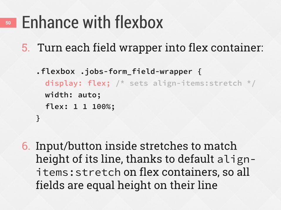
Enhance with flexbox 50
5. Turn each field wrapper into flex container: .flexbox .jobs-form_field-wrapper {
display: flex; /* sets align-items:stretch */
width: auto;
flex: 1 1 100%;
}
6. Input/button inside stretches to match
height of its line, thanks to default align-items:stretch on flex containers, so all fields are equal height on their line
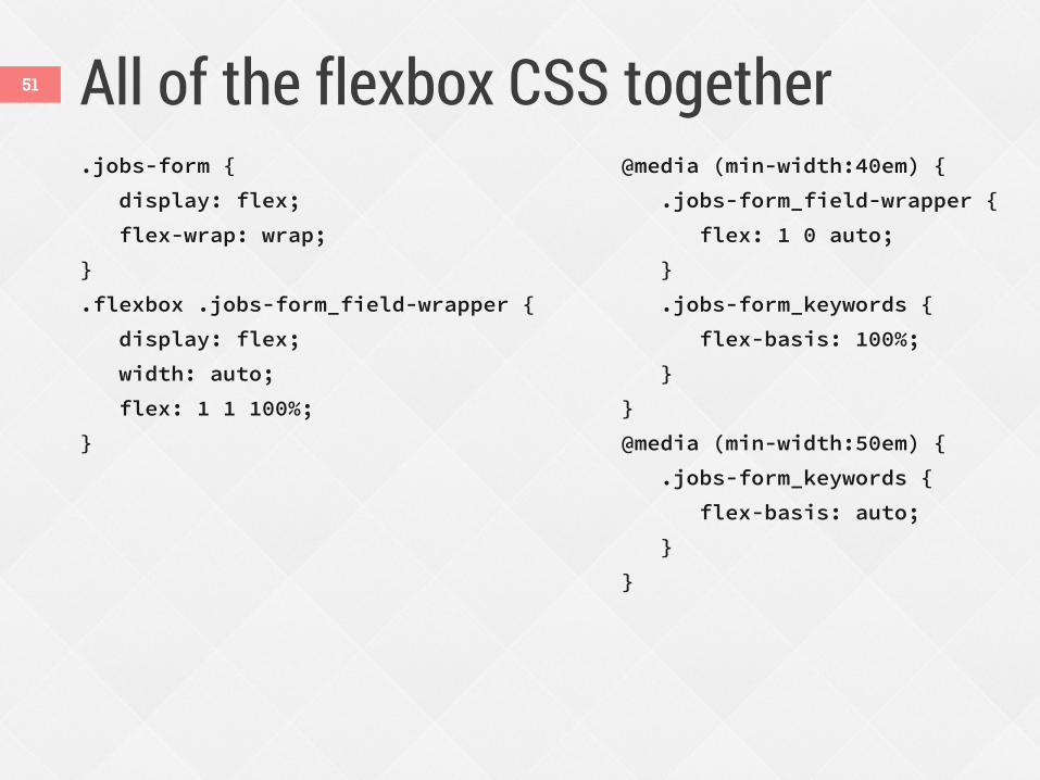
All of the flexbox CSS together .jobs-form {
display: flex;
flex-wrap: wrap;
}
.flexbox .jobs-form_field-wrapper {
display: flex;
width: auto;
flex: 1 1 100%;
}
@media (min-width:40em) {
.jobs-form_field-wrapper {
flex: 1 0 auto;
}
.jobs-form_keywords {
flex-basis: 100%;
}
}
@media (min-width:50em) {
.jobs-form_keywords {
flex-basis: auto;
}
}
51
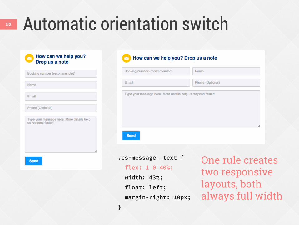
Automatic orientation switch
.cs-message__text {
flex: 1 0 40%;
width: 43%;
float: left;
margin-right: 10px;
}
One rule creates two responsive layouts, both always full width
52
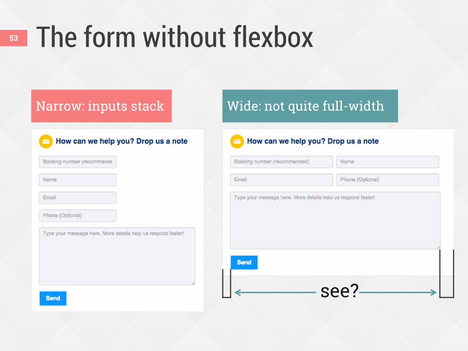
The form without flexbox
Narrow: inputs stack Wide: not quite full-width
see?
53
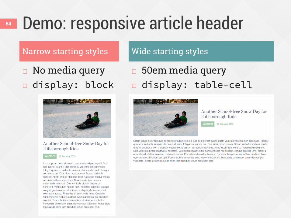
Demo: responsive article header
No media query display: block
50em media query display: table-cell
54
Narrow starting styles Wide starting styles
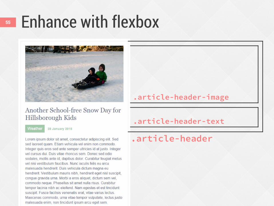
Enhance with flexbox 55
.article-header
.article-header-image
.article-header-text
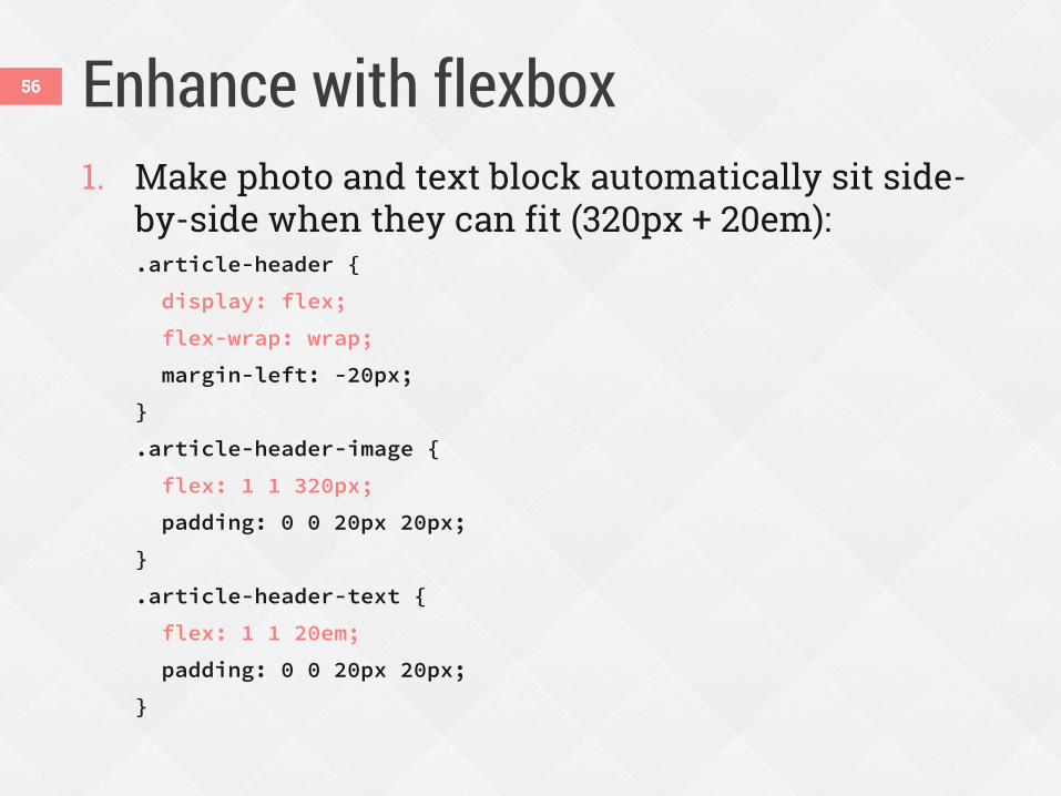
Enhance with flexbox 56
1. Make photo and text block automatically sit side-by-side when they can fit (320px + 20em): .article-header {
display: flex;
flex-wrap: wrap;
margin-left: -20px;
}
.article-header-image {
flex: 1 1 320px;
padding: 0 0 20px 20px;
}
.article-header-text {
flex: 1 1 20em;
padding: 0 0 20px 20px;
}
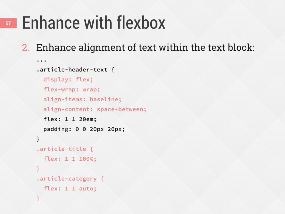
Enhance with flexbox 57
2. Enhance alignment of text within the text block: ...
.article-header-text {
display: flex;
flex-wrap: wrap;
align-items: baseline;
align-content: space-between;
flex: 1 1 20em;
padding: 0 0 20px 20px;
}
.article-title {
flex: 1 1 100%;
}
.article-category {
flex: 1 1 auto;
}
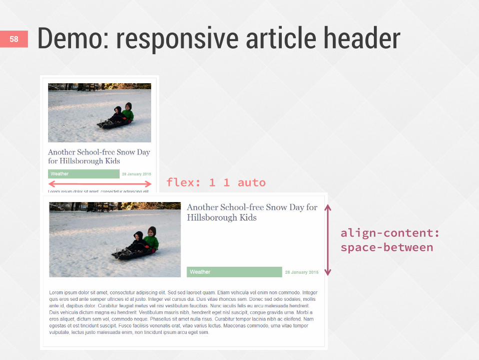
Demo: responsive article header 58
flex: 1 1 auto
align-content: space-between
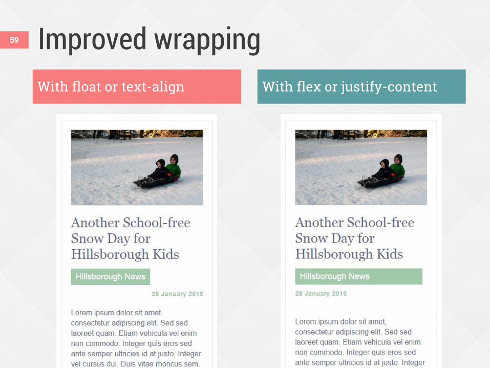
Improved wrapping 59
With float or text-align With flex or justify-content
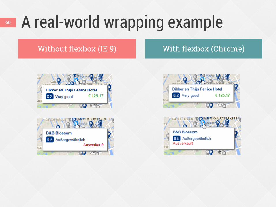
A real-world wrapping example Without flexbox (IE 9) With flexbox (Chrome)
60
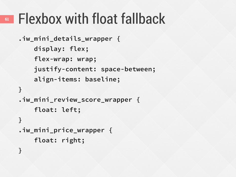
Flexbox with float fallback .iw_mini_details_wrapper {
display: flex;
flex-wrap: wrap;
justify-content: space-between;
align-items: baseline;
}
.iw_mini_review_score_wrapper {
float: left;
}
.iw_mini_price_wrapper {
float: right;
}
61
Reordering content 62
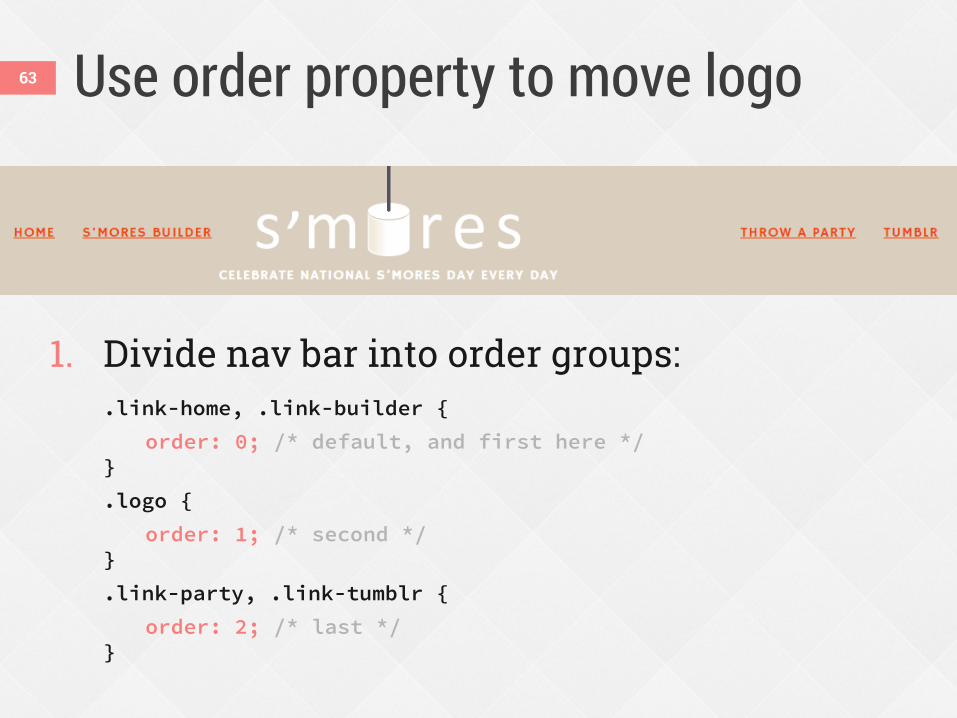
Use order property to move logo
1. Divide nav bar into order groups: .link-home, .link-builder {
order: 0; /* default, and first here */ }
.logo {
order: 1; /* second */ }
.link-party, .link-tumblr {
order: 2; /* last */ }
63
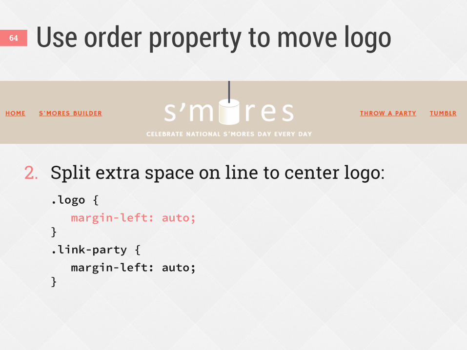
Use order property to move logo
2. Split extra space on line to center logo: .logo {
margin-left: auto; }
.link-party {
margin-left: auto; }
64
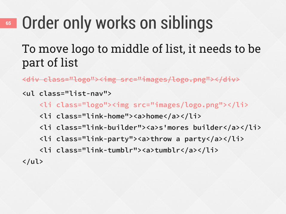
Order only works on siblings 65
To move logo to middle of list, it needs to be part of list <div class="logo"><img src="images/logo.png"></div>
<ul class="list-nav">
<li class="logo"><img src="images/logo.png"></li>
<li class="link-home"><a>home</a></li>
<li class="link-builder"><a>s'mores builder</a></li>
<li class="link-party"><a>throw a party</a></li>
<li class="link-tumblr"><a>tumblr</a></li>
</ul>
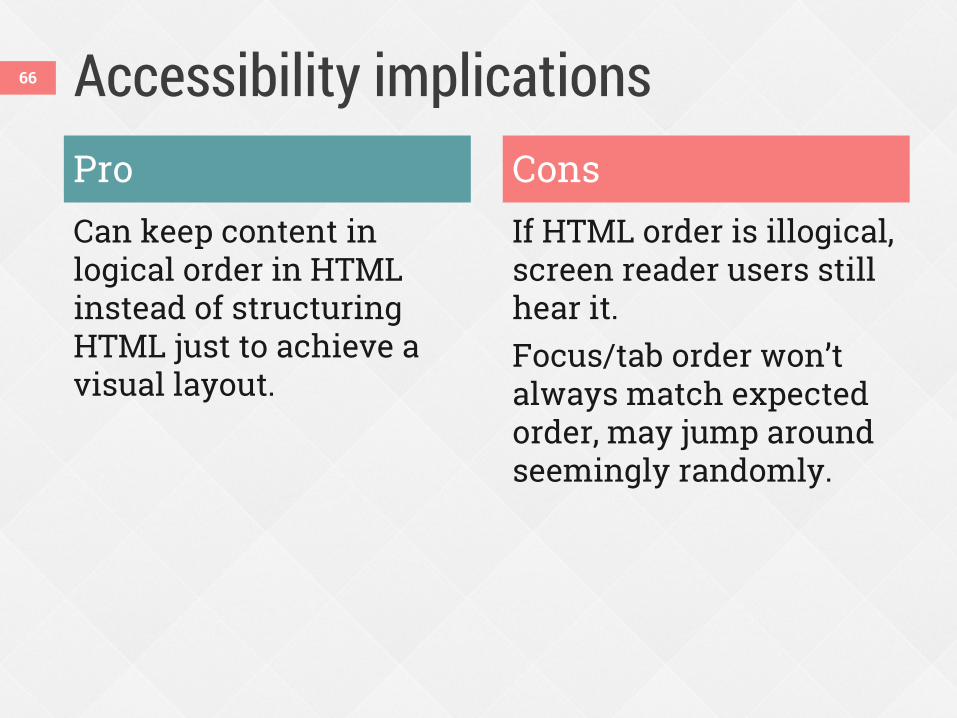
Accessibility implications Pro Can keep content in logical order in HTML instead of structuring HTML just to achieve a visual layout.
Cons If HTML order is illogical, screen reader users still hear it. Focus/tab order won’t always match expected order, may jump around seemingly randomly.
66
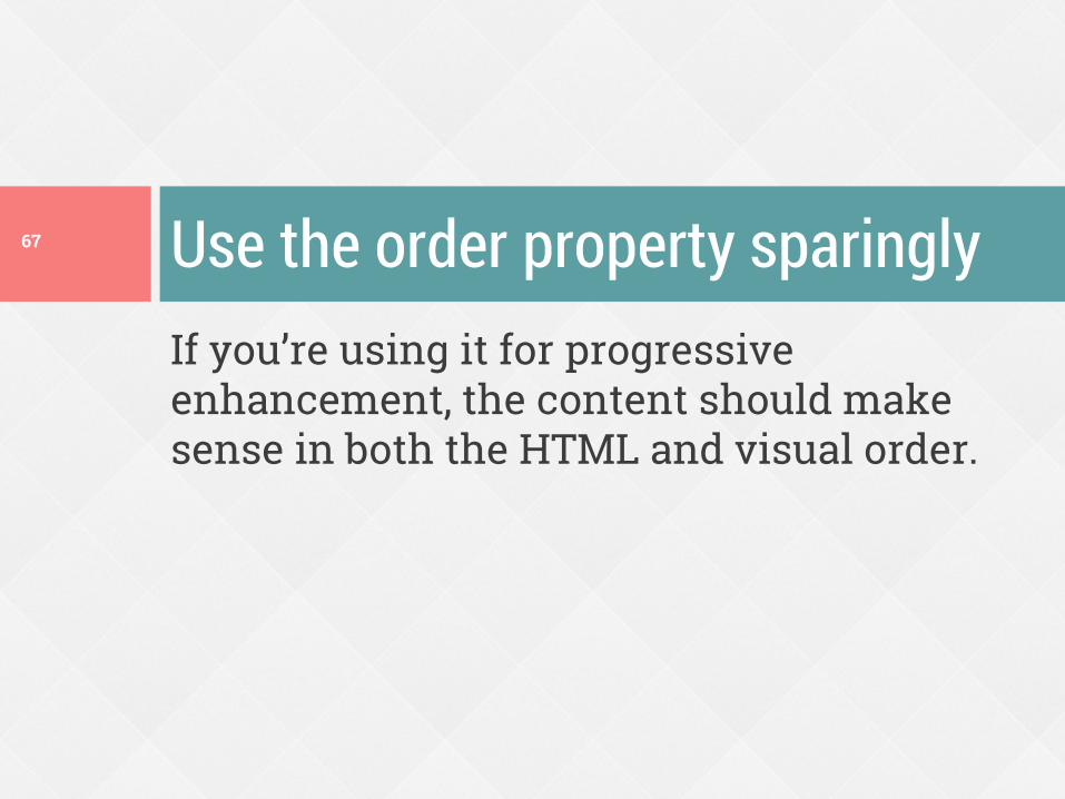
If you’re using it for progressive enhancement, the content should make sense in both the HTML and visual order.
Use the order property sparingly 67
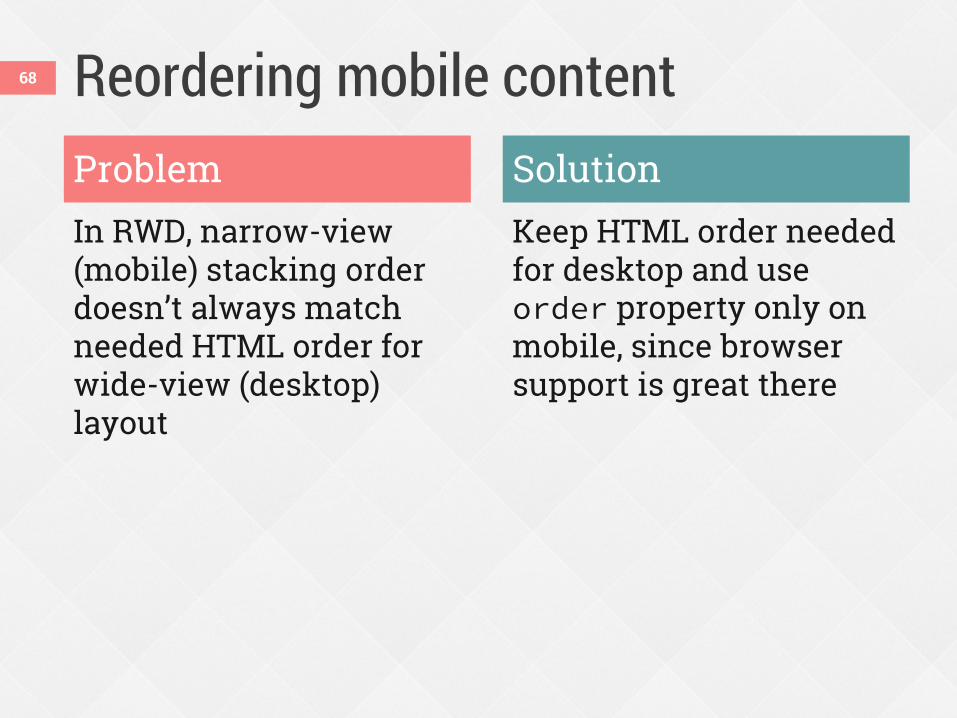
Reordering mobile content
In RWD, narrow-view (mobile) stacking order doesn’t always match needed HTML order for wide-view (desktop) layout
Keep HTML order needed for desktop and use order property only on mobile, since browser support is great there
Problem Solution
68
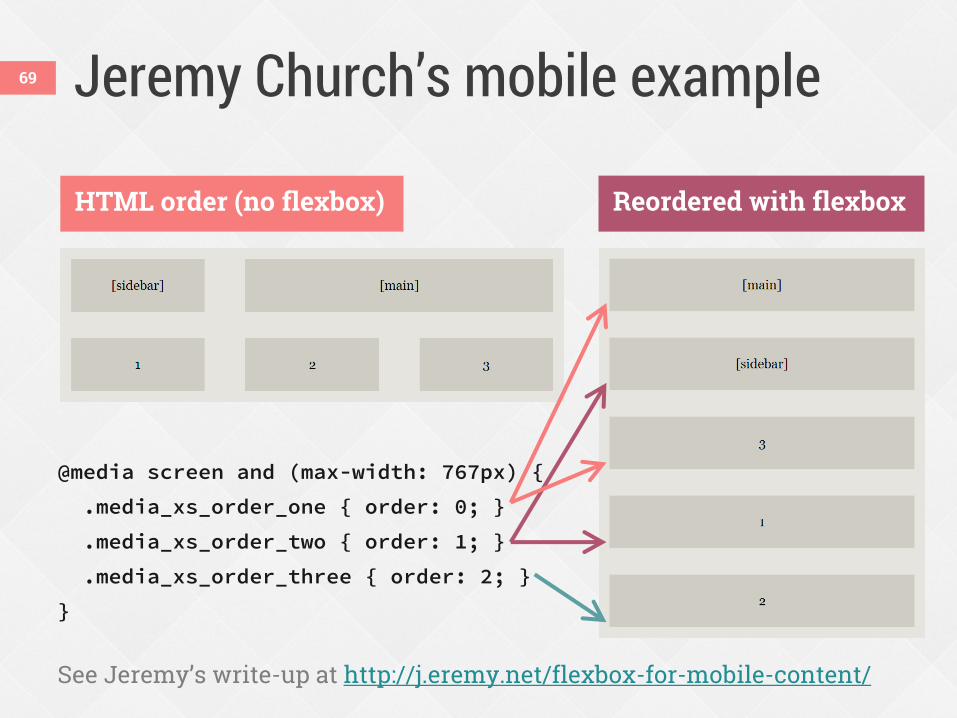
Jeremy Church’s mobile example
@media screen and (max-width: 767px) {
.media_xs_order_one { order: 0; }
.media_xs_order_two { order: 1; }
.media_xs_order_three { order: 2; }
}
See Jeremy’s write-up at http://j.eremy.net/flexbox-for-mobile-content/
HTML order (no flexbox) Reordered with flexbox
69
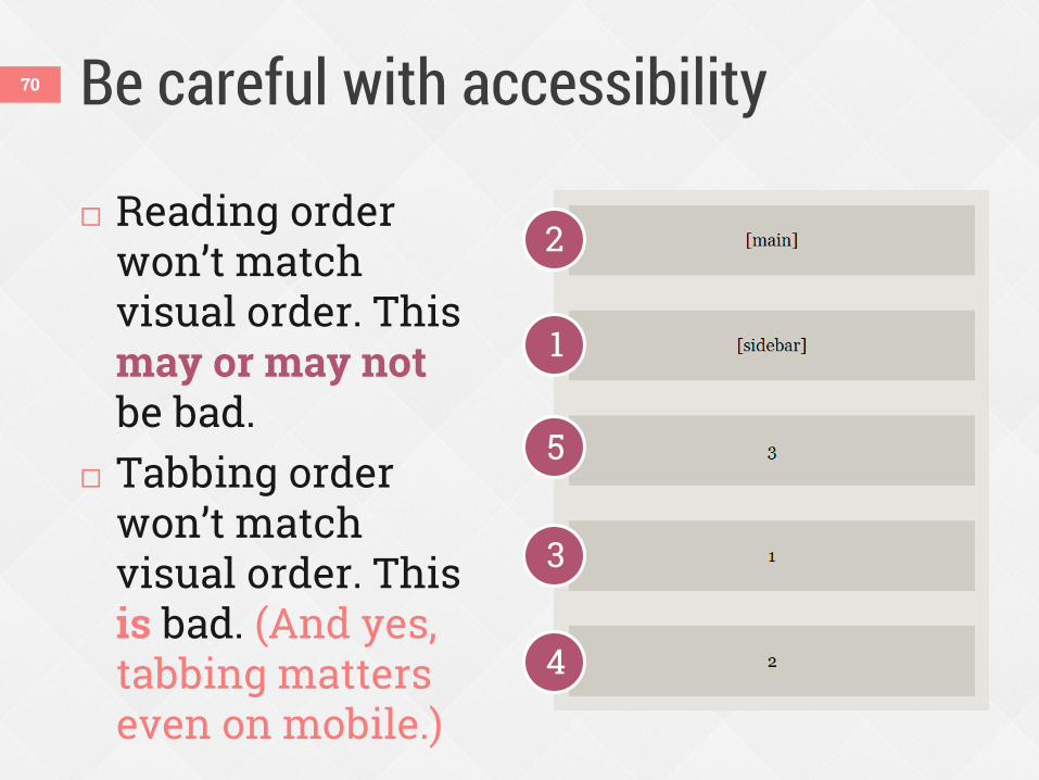
Be careful with accessibility
Reading order won’t match visual order. This may or may not be bad.
Tabbing order won’t match visual order. This is bad. (And yes, tabbing matters even on mobile.)
1
3
2
4
5
70
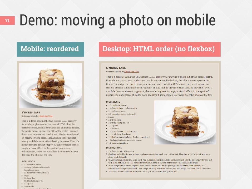
Demo: moving a photo on mobile
Desktop: HTML order (no flexbox) Mobile: reordered
71
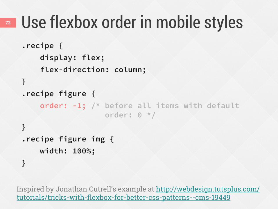
Use flexbox order in mobile styles .recipe {
display: flex;
flex-direction: column;
}
.recipe figure {
order: -1; /* before all items with default order: 0 */
}
.recipe figure img {
width: 100%;
}
Inspired by Jonathan Cutrell’s example at http://webdesign.tutsplus.com/ tutorials/tricks-with-flexbox-for-better-css-patterns--cms-19449
72
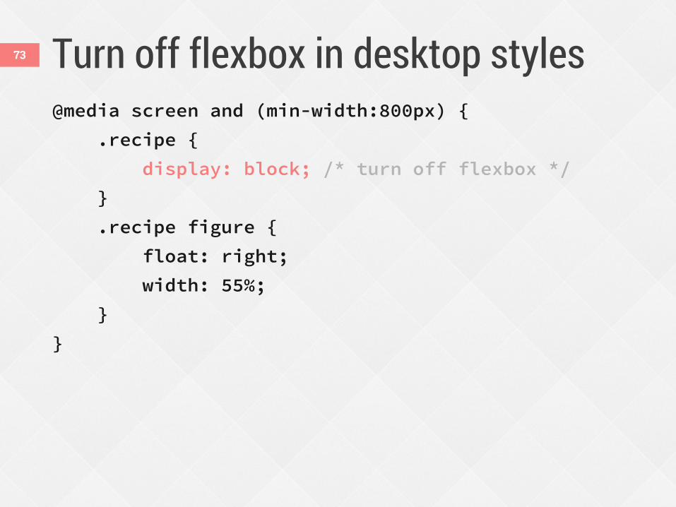
Turn off flexbox in desktop styles @media screen and (min-width:800px) {
.recipe {
display: block; /* turn off flexbox */
}
.recipe figure {
float: right;
width: 55%;
}
}
73
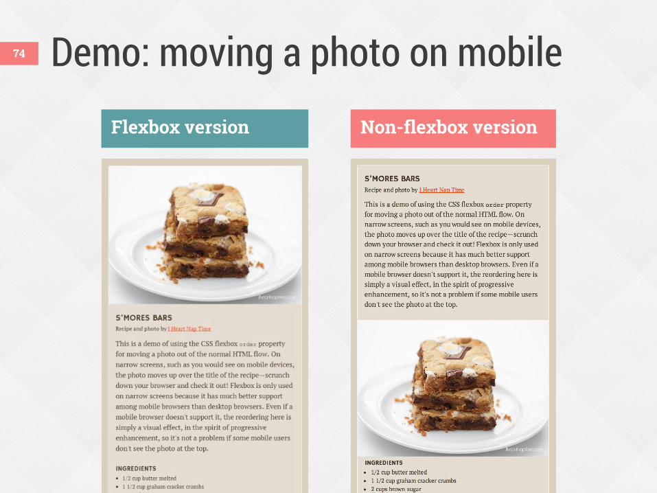
Demo: moving a photo on mobile
Flexbox version Non-flexbox version
74
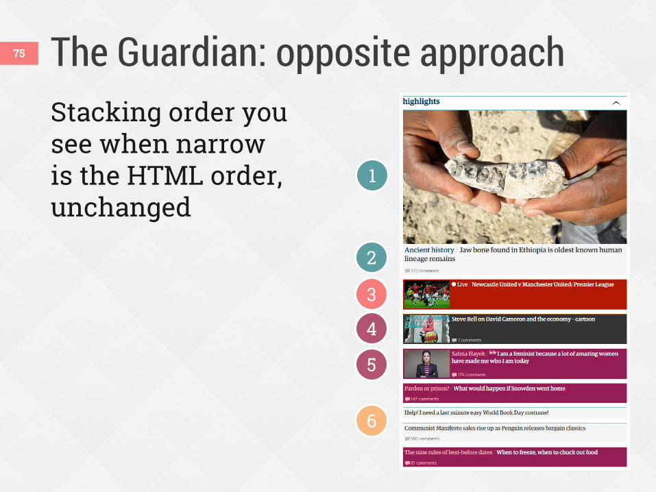
The Guardian: opposite approach 75
Stacking order you see when narrow is the HTML order, unchanged
1
2
3
4
5
6
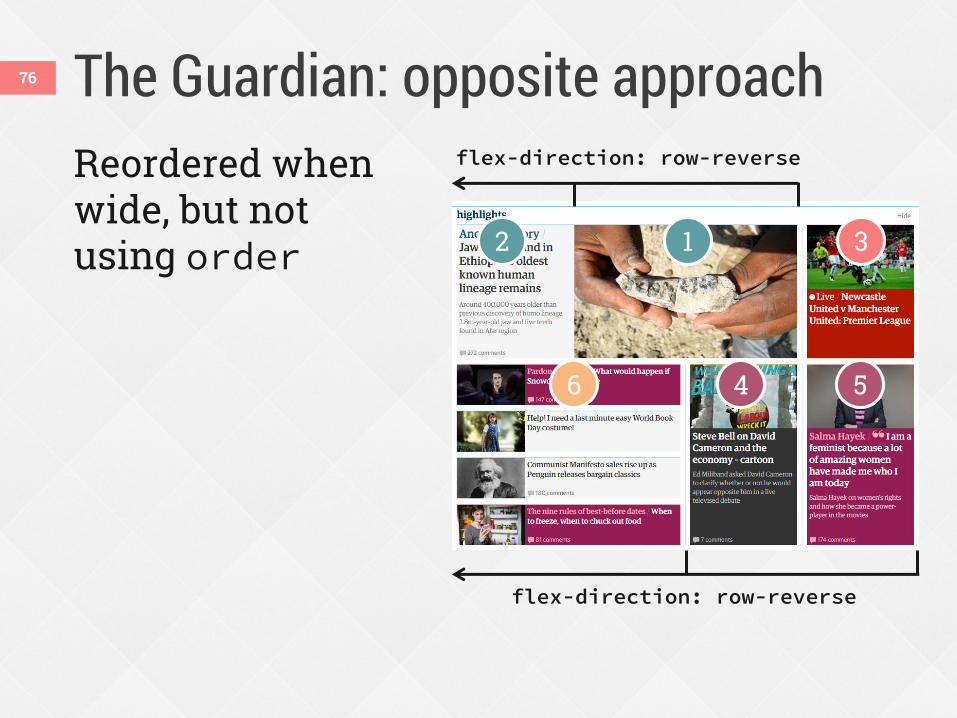
The Guardian: opposite approach 76
Reordered when wide, but not using order 1 2 3
4 5 6
flex-direction: row-reverse
flex-direction: row-reverse
Using flexbox today 77
v.10+
2009 syntax (display:box)
2011 syntax (display:flexbox)
Current syntax (display:flex)
v.10
Pick which versions you’ll use
* with -webkit- prefix
† with -ms- prefix
v.6+
*
†
* v.3+
*
v.4.4 v.11
*
v.7+
*
78
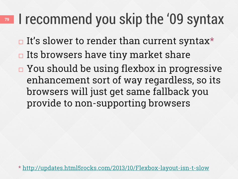
I recommend you skip the ‘09 syntax 79
It’s slower to render than current syntax* Its browsers have tiny market share You should be using flexbox in progressive
enhancement sort of way regardless, so its browsers will just get same fallback you provide to non-supporting browsers
* http://updates.html5rocks.com/2013/10/Flexbox-layout-isn-t-slow
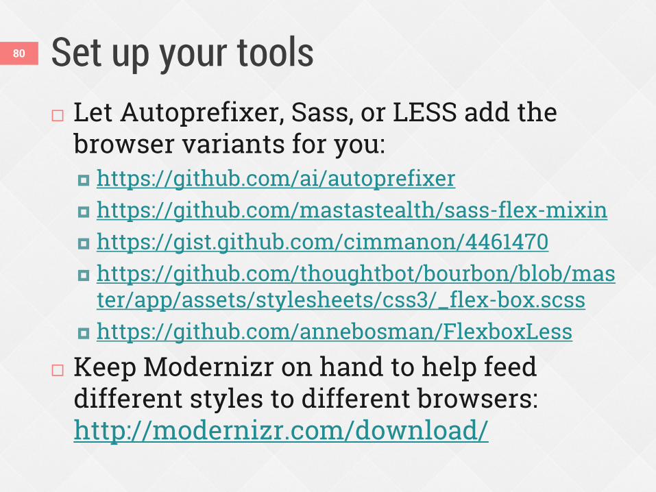
Set up your tools Let Autoprefixer, Sass, or LESS add the
browser variants for you: https://github.com/ai/autoprefixer https://github.com/mastastealth/sass-flex-mixin https://gist.github.com/cimmanon/4461470 https://github.com/thoughtbot/bourbon/blob/mas
ter/app/assets/stylesheets/css3/_flex-box.scss https://github.com/annebosman/FlexboxLess
Keep Modernizr on hand to help feed different styles to different browsers: http://modernizr.com/download/
80
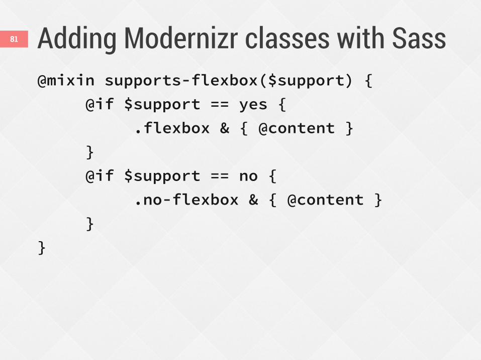
Adding Modernizr classes with Sass 81
@mixin supports-flexbox($support) {
@if $support == yes {
.flexbox & { @content }
}
@if $support == no {
.no-flexbox & { @content }
}
}
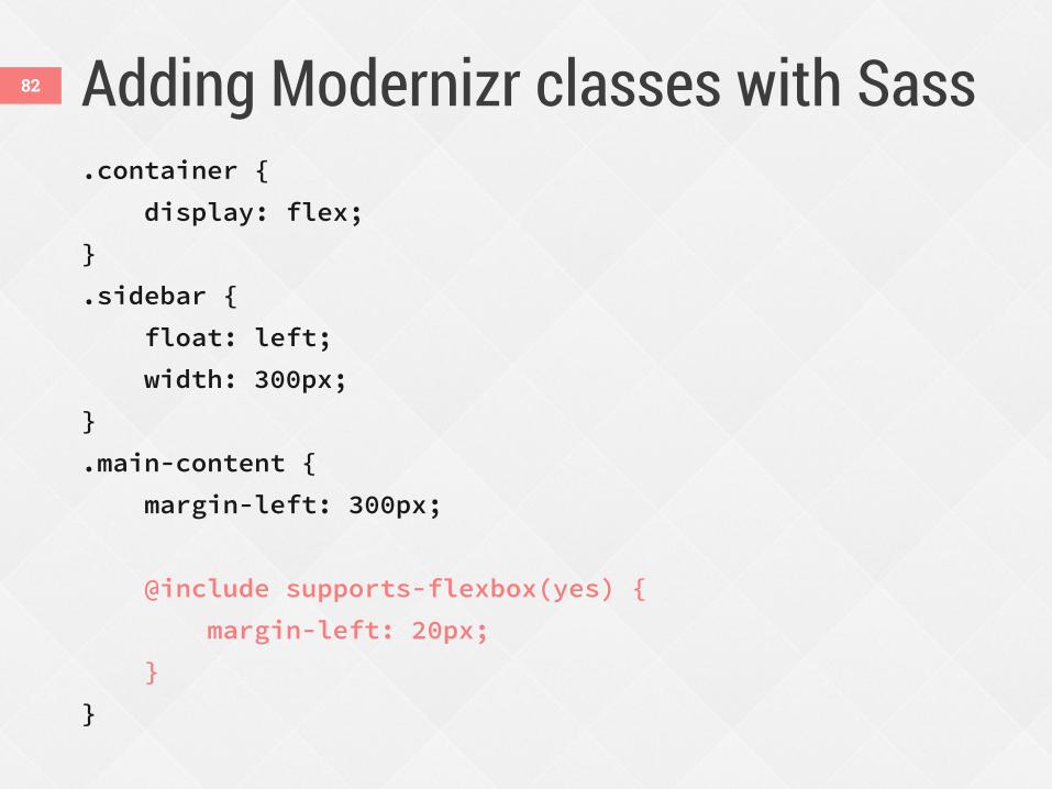
Adding Modernizr classes with Sass 82
.container {
display: flex;
}
.sidebar {
float: left;
width: 300px;
}
.main-content {
margin-left: 300px;
@include supports-flexbox(yes) {
margin-left: 20px;
}
}
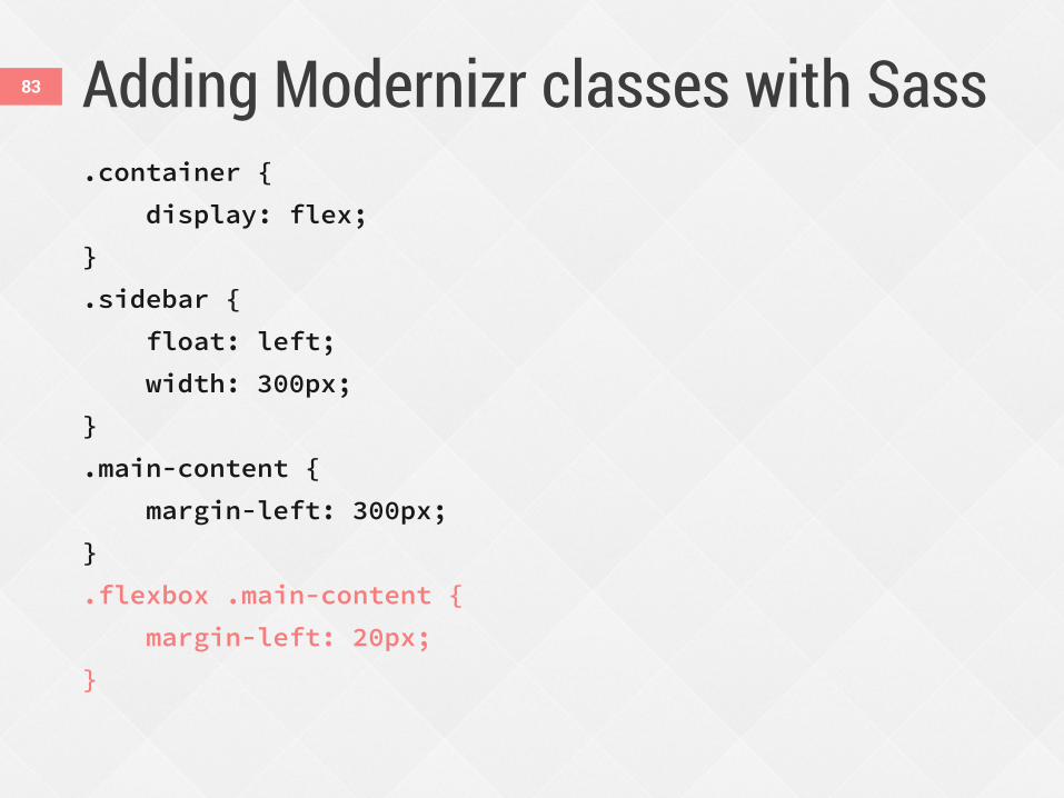
Adding Modernizr classes with Sass 83
.container {
display: flex;
}
.sidebar {
float: left;
width: 300px;
}
.main-content {
margin-left: 300px;
}
.flexbox .main-content {
margin-left: 20px;
}
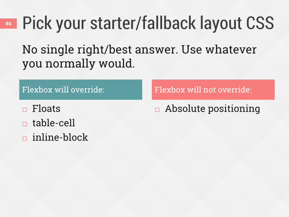
Pick your starter/fallback layout CSS
Floats table-cell inline-block
Absolute positioning
84
Flexbox will override: Flexbox will not override:
No single right/best answer. Use whatever you normally would.
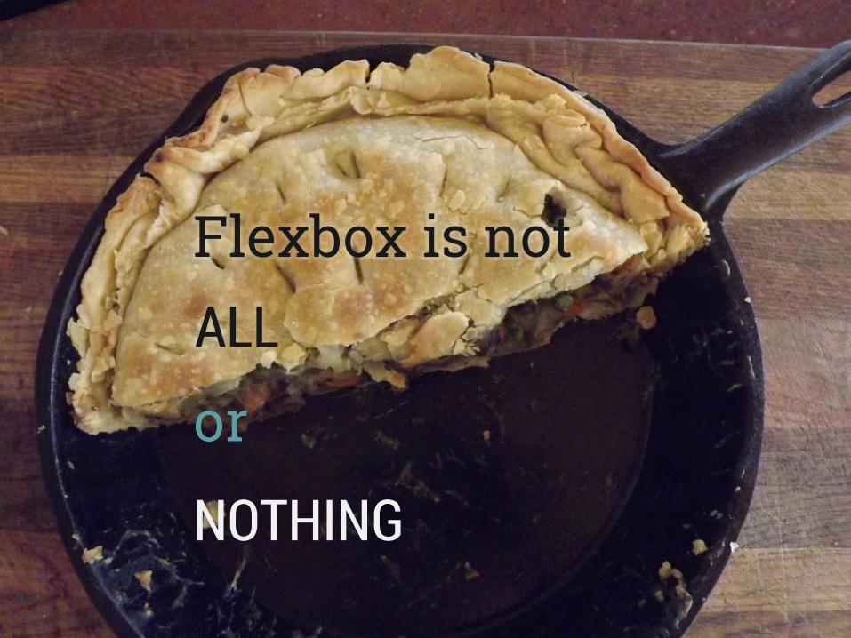
Flexbox is not ALL
or
NOTHING 85
Learn more 86
Download slides and get links at www.zomigi.com/blog/rwd-flexbox
Thanks! Zoe Mickley Gillenwater @zomigi [email protected] zomigi.com | stunningcss3.com | flexiblewebbook.com Credit: “betty crocker meets modern day medieval meat pie” photo by knitting iris on Flickr. Mmm, pie.