getting started with flexbox
TRANSCRIPT

Getting Started with Flexbox
Adrian Sandu, @adysandu12 December, 2016, DublinCSS

What is Flexbox?
The CSS Flexible Box Layout Module Level 1aims at providing a more efficient way to lay out, align and distribute space among items in a container, even when their size is unknown and/or dynamic.
“

A bit of terminology
Image source: https://scotch.io/tutorials/a-visual-guide-to-css3-flexbox-properties


How do you trigger Flexbox?
Image source: http://caniuse.com/#feat=flexbox
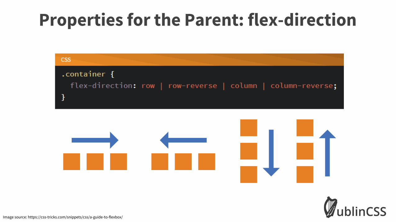
Properties for the Parent: flex-direction
Image source: https://css-tricks.com/snippets/css/a-guide-to-flexbox/

Properties for the Parent: flex-wrap
Image source: https://scotch.io/tutorials/a-visual-guide-to-css3-flexbox-properties
nowrap wrap
wrap-reverse

Properties for the Parent: flex-flow

Properties for the Parent: justify-content
Image source: https://scotch.io/tutorials/a-visual-guide-to-css3-flexbox-properties
flex-endflex-start center
space-between space-around

Properties for the Parent: align-items
Image source: https://scotch.io/tutorials/a-visual-guide-to-css3-flexbox-properties
flex-endflex-start center
baseline stretch

Properties for the Parent: align-content
Image source: https://scotch.io/tutorials/a-visual-guide-to-css3-flexbox-properties
flex-endflex-start center
space-between stretchspace-around

Properties for the Children: order
Image source: https://scotch.io/tutorials/a-visual-guide-to-css3-flexbox-properties

Properties for the Children: flex-grow
Image source: https://scotch.io/tutorials/a-visual-guide-to-css3-flexbox-properties

Properties for the Children: flex-shrink
Image source: https://scotch.io/tutorials/a-visual-guide-to-css3-flexbox-properties

Properties for the Children: flex-basis
Image source: https://scotch.io/tutorials/a-visual-guide-to-css3-flexbox-properties

Properties for the Children: flex
Image source: https://scotch.io/tutorials/a-visual-guide-to-css3-flexbox-properties

Properties for the Children: align-self
Image source: https://scotch.io/tutorials/a-visual-guide-to-css3-flexbox-properties

Flexbox in the wild – some examples

Questions?