draft contents magazine process
TRANSCRIPT
THE PROCESS FOR MY DRAFT MAGAZINE
CONTENTS PAGE In this PowerPoint, I am going to be demonstrating my decisions in the development of my draft magazine contents page to show the creative
process and thought gone into this magazine.
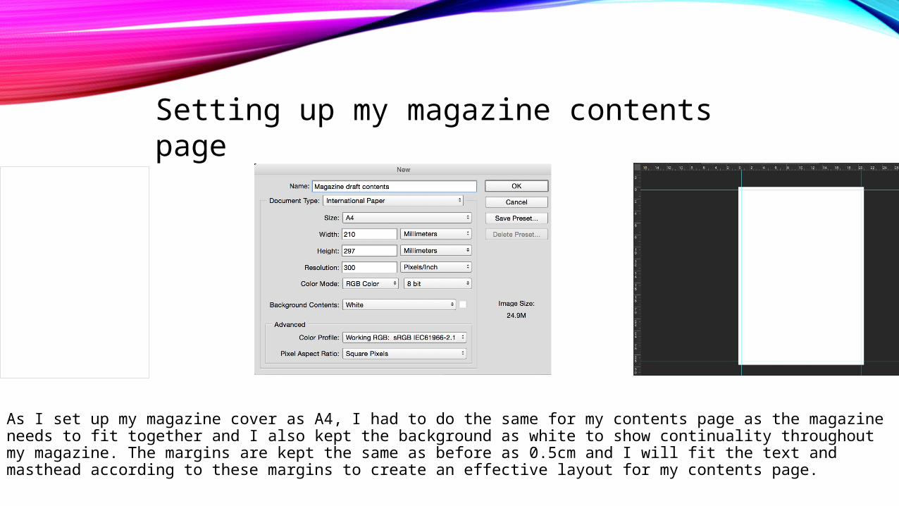
As I set up my magazine cover as A4, I had to do the same for my contents page as the magazine needs to fit together and I also kept the background as white to show continuality throughout my magazine. The margins are kept the same as before as 0.5cm and I will fit the text and masthead according to these margins to create an effective layout for my contents page.
Setting up my magazine contents page
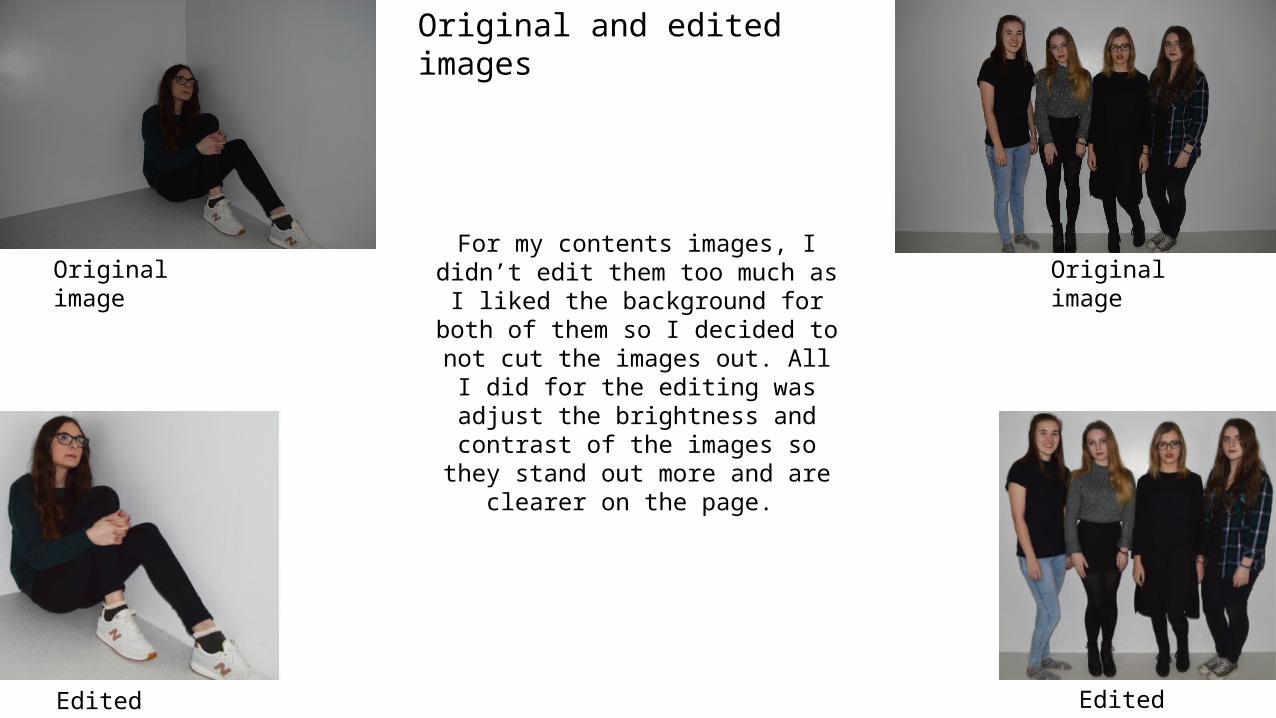
For my contents images, I didn’t edit them too much as I liked the background for both of them so I
decided to not cut the images out. All I did for the editing was adjust the brightness and contrast of the
images so they stand out more and are clearer on the page.
Original image
Original image
Edited image Edited image
Original and edited images
LAYOUT OF IMAGES
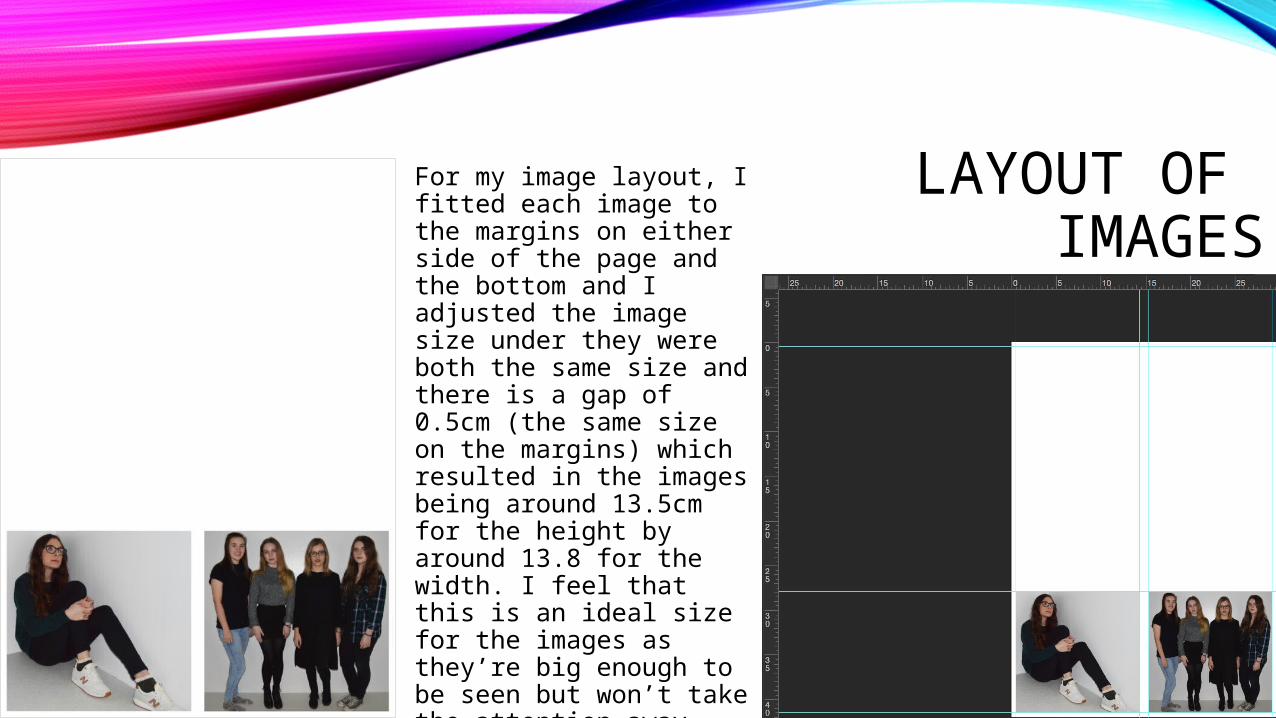
For my image layout, I fitted each image to the margins on either side of the page and the bottom and I adjusted the image size under they were both the same size and there is a gap of 0.5cm (the same size on the margins) which resulted in the images being around 13.5cm for the height by around 13.8 for the width. I feel that this is an ideal size for the images as they’re big enough to be seen but won’t take the attention away from the text and it leaves enough room to fit the text in.

CONTENTS TITLE
For my contents title, looking back at my reserch and planning on fonts I decided that the Arual font would suit my magazine which I found on: http://www.dafont.com. I feel that the font is sharp and effective and it suits the style of magazine that I am looking for and I feel it will suit the style of my magazine. OI chose to have the text in black as I feel the black contrasting on white works better than a coloured font would due to the sharp and defined style of the font.
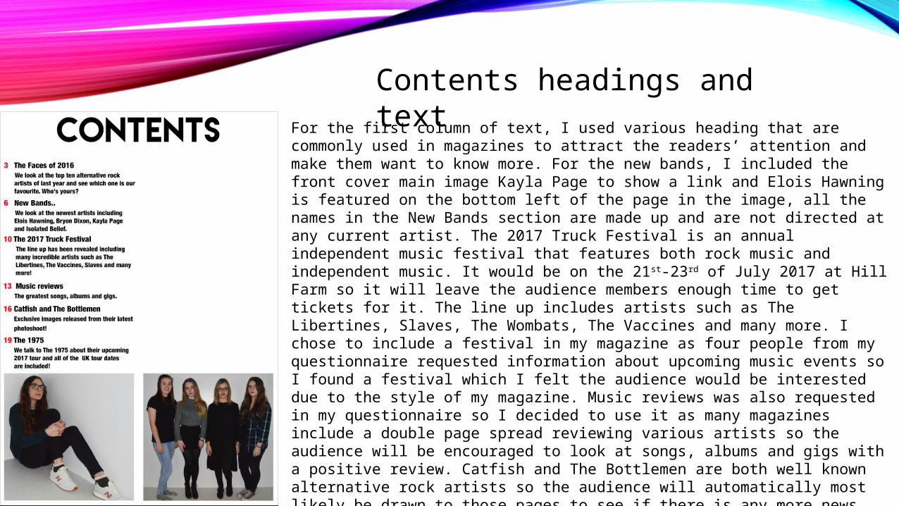
Contents headings and textFor the first column of text, I used various heading that are commonly used in magazines to attract the readers’ attention and make them want to know more. For the new bands, I included the front cover main image Kayla Page to show a link and Elois Hawning is featured on the bottom left of the page in the image, all the names in the New Bands section are made up and are not directed at any current artist. The 2017 Truck Festival is an annual independent music festival that features both rock music and independent music. It would be on the 21st-23rd of July 2017 at Hill Farm so it will leave the audience members enough time to get tickets for it. The line up includes artists such as The Libertines, Slaves, The Wombats, The Vaccines and many more. I chose to include a festival in my magazine as four people from my questionnaire requested information about upcoming music events so I found a festival which I felt the audience would be interested due to the style of my magazine. Music reviews was also requested in my questionnaire so I decided to use it as many magazines include a double page spread reviewing various artists so the audience will be encouraged to look at songs, albums and gigs with a positive review. Catfish and The Bottlemen are both well known alternative rock artists so the audience will automatically most likely be drawn to those pages to see if there is any more news about them. Catfish and The Bottlemen was also requested on my questionnaire and I feel that by listening to exactly what my audience want, they will be more likely to buy the magazine as it will include things that they are interested in.

Contents headings and textFor the next set of headings, I included information about albums and gigs as this is what my target audience requested in my questionnaire so by including things the majority of the audience will look for, they will be more likely to buy the magazine. Rag’n’Bone Man and Blink 182 are well known artists that readers of the magazine would be interested in and they are also featured on the front cover so if members of the audience are interested in these artists, they will be likely to see what the magazine has to say about them. Fireside is featured as this is what my double page spread is about so it is an important feature of the magazine so the audience need to know where to find it. They are also featured in a image so the audience will recognize their faces. I have done the page numbers to 30 as I feel this is generally the size magazine for a magazine priced £3.99 as it provides a variety of content without the magazine being long so the magazine is boring. This aspect is vital in this magazine as the double page spread of Fireside is towards the end of the magazine so it will leave a lasting impression on the audience and as the magazine isn’t too long, the majority of the audience should see it. I did the numbers in red as I feel it carries on the black white and red theme from my cover page and it works well with the layout of the page. The font for this text was Helvetica Neue Condensed black in size 24 for the numbers and main heading then size 20 for the subheadings. Each different text is its own individual layer, the layer will include the number, heading and subheading.

IMAGE PAGE NUMBERS
I decided to add page numbers to the images as I feel this is clearer for the audience and clearly directs them to the page. I originally tried the page numbers without a background but I felt they didn’t stand out and looked very bland. With the red background, it shows a sense on continuality on the page as the page numbers are also red. It stands out and is very effective so I am going to keep it as a red background.

CONTENTS PAGE NUMBER
I chose to have the page number as 5 as generally on magazines the first few pages include advertisements or posters so it’s rare the contents page is at the very front of the magazine. I chose to have a black background and a white number as it stands out well and I feel it works well with the style of the magazine. It is also a common method having a black box with a white number on many music magazines so my magazine will fit the style of magazine.
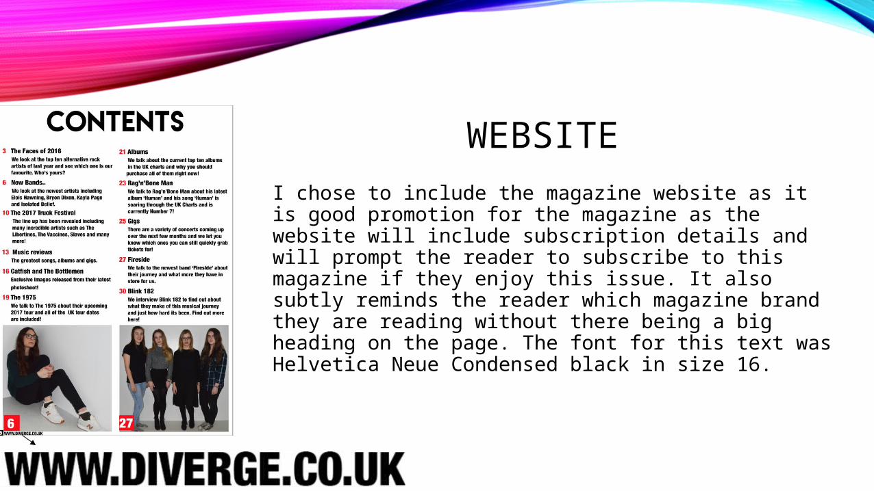
WEBSITE
I chose to include the magazine website as it is good promotion for the magazine as the website will include subscription details and will prompt the reader to subscribe to this magazine if they enjoy this issue. It also subtly reminds the reader which magazine brand they are reading without there being a big heading on the page. The font for this text was Helvetica Neue Condensed black in size 16.
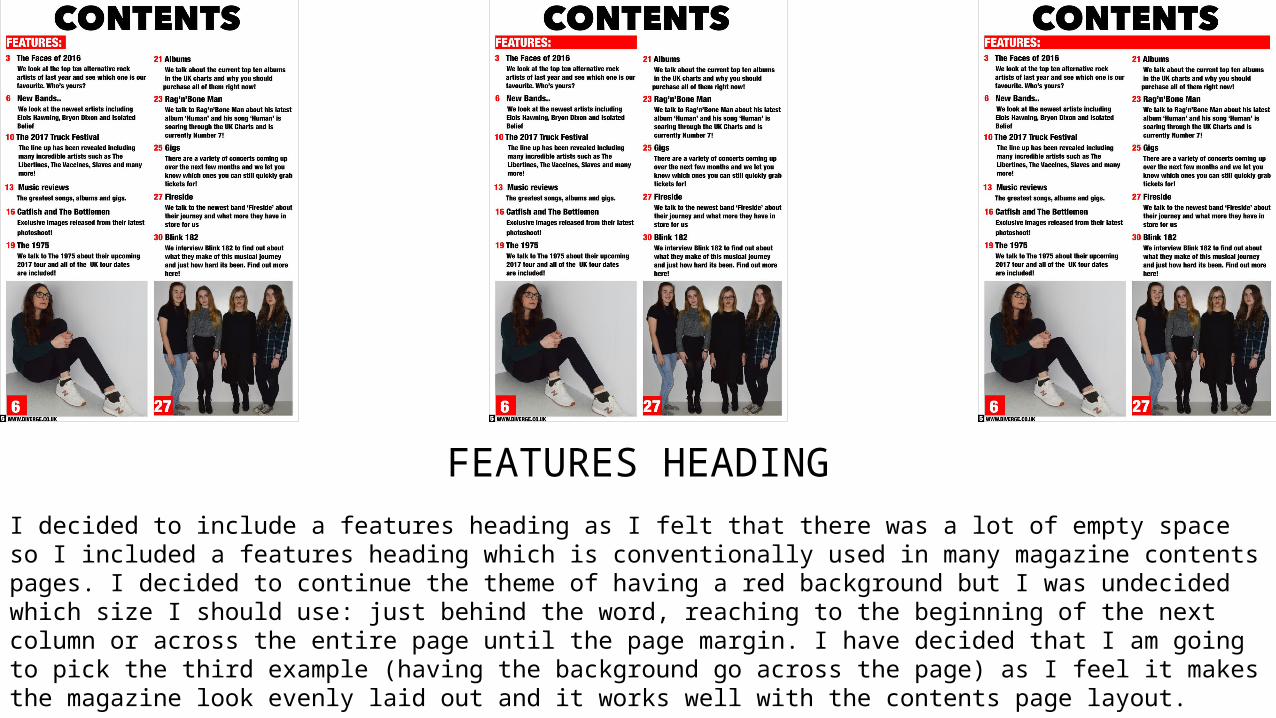
FEATURES HEADINGI decided to include a features heading as I felt that there was a lot of empty space so I included a features heading which is conventionally used in many magazine contents pages. I decided to continue the theme of having a red background but I was undecided which size I should use: just behind the word, reaching to the beginning of the next column or across the entire page until the page margin. I have decided that I am going to pick the third example (having the background go across the page) as I feel it makes the magazine look evenly laid out and it works well with the contents page layout.

THE OUTCOME
Overall, I am happy with the outcome of my magazine contents but I do feel I am going to try different variations of layouts for my final magazine as I don’t feel it currently connotes music magazine as the layout is quite dull. I also feel I need to re take my images and I have realized that although my magazine is aimed at both genders, I currently have no males featured on my magazine so I may replace the image on the left so the magazine is more appealing to boys. Also looking at my band image, I feel I need to co-ordinate the clothing better to make the image seem more suited for alternative rock. I am next going to look at my teacher feedback and look at different ideas of how I can improve my contents page in preparation for my final design.