dr. type
DESCRIPTION
Type has no beauty on the inside so the outside better be damn perfect. The doctor will see you now...TRANSCRIPT

“Type has no beauty on the inside so the outside better be damn perfect.
The doctor will see you now.”
Dr. Type


A Surgically-Enhanced Guide to Typography
Dr. Type
Kristen YoungmanAcademy of Art University
San Francisco, CA

Copyright © 2010 by Kristen Youngman All rights reserved.
Content and research gathered from the following sources: The Mac is Not a Typewriter, Robin Williams The Elements of Typographic Style, Robert Bringhurst The Complete Manual of Typography, Frank Romano

For My Parents
who always taught me to love beyond the surface and feel what’s right in your heart


THE GUTS
Type AnatomyIdentifying Type
Rising Heights
How Type is Measured
Shaving Serifs
Sheering Sans
Keyboard RegimenDash Injections
Accent Addiction
Instant Character Poppers
Resuscitating SpaceUppercase vs. Lowercase
Kern Out the Fat
Stitching Up Leading

WARNING:
Failure to use good typography may result
in dizziness, nausea or even death.

SECTION 1 Type Anatomy
• Identifying Type
• Rising Heights
• How Type is Measured
• Shaving Serifs
• Sheering Sans

Counter The partially or fully enclosed space within a character.
Indentifying Type
Like features on a face, each part of a letter contributes to its overall appearance. Small counters may be considered undesirable as beedy eyes because it may be difficult to read on smaller type. But when line space is tight, smaller counters help.
Ascenders and descenders are as distinguishing as someone’s nose. Small, short lengths are like tight noses—popular because they allow other features to be noticed and don’t stick out. Yet others consider big noses and tall letters a sign of success.
12
Dr. Type: TYPE ANATOMY

Ascender The part of a lowercase character (b, d, f, h, k, l, t) that extends above the x-height.
Descender The part of a character (g, j, p, q, y, and J) that descends below the baseline.
1 2
3 4
5 6
7 8
9 10
11 12
13 14
15 16
17 18
19 20
21 22
23 24
25 26
27 28
29 30
31 32
33 34

Rising Heights
When choosing and identifying typefaces, diagnose the Cap Height and X-height. Cap height shows how tall a typeface reaches from the baseline (the invisible line letters sit on). It also acts as a ceiling for top-aligned characters such as footnotes.
X-height is the distance from the baseline to the mean line and is used as a gauge because it has both a flat top and bottom. A more generous x-height helps with legibility so type with larger x-heights are preferred for text set for the computer screen.
14
Dr. Type: TYPE ANATOMY

X-height The height of lowercase letters, specifically the lowercase x, not including ascenders and descenders.
Cap Height The height of capital letters from the baseline to the top of caps, most accurately measured on a character with a flat bottom (E, H, I, etc.).
1 2
3 4
5 6
7 8
9 10
11 12
13 14
15 16
17 18
19 20
21 22
23 24
25 26
27 28
29 30
31 32
33 34
1 2 3 4 5 6 7 8 9 10 11 12 13 14 15 16 17 18 19 20 21 22 23 24 25 26 27 28 29 30 31 32 33 34
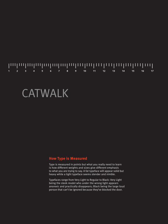
How Type is Measured
Type is measured in points but what you really need to learn is how different weights and sizes give different emphasis to what you are trying to say. A fat typeface will appear solid but heavy while a light typeface seems slender and nimble.
Typefaces range from Very Light to Regular to Black: Very Light being the sleek model who under the wrong light appears anorexic and practically disappears; Black being the large loud person that can’t be ignored because they’ve blocked the door.
CATWALK

1 2 3 4 5 6 7 8 9 10 11 12 13 14 15 16 17 18 19 20 21 22 23 24 25 26 27 28 29 30 31 32 33 34
WIDELOAD

Shaving Serifs
Serifs are the marks at the end of strokes. When figuring out which typeface is best cut out for the job at hand consider the function of the text. Many studies have shown serif type is more readable in extended text than sans serif.
A suggestion for this readability conclusion is that serifs act as a horizontal guide that leads the reader’s eye along the line of text. Serif can also handle more words per line (about ten to twelve) so it is the preferred choice for setting main body copy.
18
Dr. Type: TYPE ANATOMY

Bracketed Serif
Unbracketed Serif
Serif The projections extending off the main strokes of the characters of serif typefaces. Serifs come in two styles: bracketed and unbracketed. Brackets are the supportive curves which connect the serif to the stroke. Unbracketed serifs (aka. slab serifs) are attached sharply, and usually at 90 degree angles.
1 2
3 4
5 6
7 8
9 10
11 12
13 14
15 16
17 18
19 20
21 22
23 24
25 26
27 28
29 30
31 32
33 34

Sheering Sans
Sans serif typefaces have no marks at the end of each stroke and are commonly used for display or headline text because they have been shown to be more legible. Legibility has to do with character recognition instead of reading large blocks of text.
When using sans serif in text, slice the line to a shorter length with no more than seven to eight words per line. Avoid manipulating the type style in ways that would make it less readable (few uses of bold, italic, outlined or shadowed).
20
Dr. Type: TYPE ANATOMY

Sans Serif A typeface that does not have the small features called “serifs” at the end of strokes. The term comes from the Latin word “sine”, via the French word sans, meaning “without.”
1 2
3 4
5 6
7 8
9 10
11 12
13 14
15 16
17 18
19 20
21 22
23 24
25 26
27 28
29 30
31 32
33 34

WARNING:
Failure to use good typography may result
in dizziness, nausea or even death.
HIGHLY ADDICTIVE SUBSTANCESOnce exposed to the proper use of characters discontinued use proves difficult.
SECTION 2 Keyboard Regimen
• Dash Injections
• Instant Character Poppers
• Accent Addiction

Dash Injections
Like a face without Botox, misplaced dashes are unsightly and will give the wrong impression. Here are some tips for how to type and correctly use dashes. Injecting the right line makes your text mean the right thing and is easy on the eye.
If you have the bad habit of using a double hyphen to indicate a dash these injections will cure you of having to do so. That habit must be eradicated. It is a typewriter convention from when there were no em and en dashes available. There’s no excuse on a mac.
Dr. Type: KEYBOARD REGIMEN
24

To T
ype
a H
yphe
n
Bet
wee
n th
e 0
and
+ at
the
top
-rig
ht o
f the
key
boar
d
Hyphen -Strictly for hyphenating words or to break a word at the end of a line. It’s commonly administered in words like mother-in-law and phone numbers.
1 2
3 4
5 6
7 8
9 10
11 12
13 14
15 16
17 18
19 20
21 22
23 24
25 26
27 28
29 30
31 32
33 34

To Type an En Dash Option Hyphen
To Type an Em Dash Shift Option Hyphen
Dr. Type: KEYBOARD REGIMEN
26

Em Dash — Twice as long as the en dash—it’s about the size of a capital letter M. Often used in place of parentheses, to indicate an abrupt change in thought, or administered when a period is too strong and a comma too weak.
En Dash – Approximately the width of a capital letter N in that particular font and size. It is used between words that indicate a duration, such as time or months or years. Administer it where you might otherwise use the word “to.”
1 2
3 4
5 6
7 8
9 10
11 12
13 14
15 16
17 18
19 20
21 22
23 24
25 26
27 28
29 30
31 32
33 34

“ OPTION [ ” OPTION SHIFT [ ‘ OPTION ]
’ OPTION
SHIFT ] — OPTION
SHIFT HYPHEN
– OPTION HYPHEN
OPENING DOUBLE QUOTE CLOSING DOUBLE QUOTE OPENING SINGLE QUOTE
CLOSING SINGLE QUOTE EN DASH EM DASH
… OPTION ; • OPTION 8
fi OPTION
SHIFT 5 ⁄ OPTION
SHIFT 1OPTION SHIFT 6
ELLIPSIS BULLET
LIGATURE OF f AND i LIGATURE OF f AND l FRACTION BAR
® OPTION r
¢ £€ OPTION SHIFT 2
TRADEMARK REGISTRATION MARK
CENTS EURO POUNDS
¡ OPTION 1 ¿ OPTION SHIFT ?
ç Ç OPTION SHIFT C
INVERTED EXCLAMATION POINT INVERTED QUESTION MARK
© OPTION g
COPYRIGHT
° OPTION SHIFT 8
DEGREE SYMBOL
™ OPTION 2
OPTION 4 OPTION 3
OPTION C
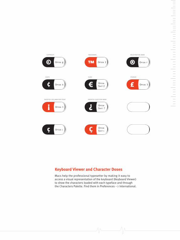
Instant Character Poppers
An essential part of healthy typography is using the appropriate punctuation marks and characters where necessary. That can be difficult to do if you do not know how to type them. Here they are in pill form for instant relief. Repeat as often as needed.
Dr. Type: KEYBOARD REGIMEN
28
“ OPTION [ ” OPTION SHIFT [ ‘ OPTION ]
’ OPTION
SHIFT ] — OPTION
SHIFT HYPHEN
– OPTION HYPHEN
OPENING DOUBLE QUOTE CLOSING DOUBLE QUOTE OPENING SINGLE QUOTE
CLOSING SINGLE QUOTE EN DASH EM DASH
… OPTION ; • OPTION 8
fi OPTION
SHIFT 5 ⁄ OPTION
SHIFT 1OPTION SHIFT 6
ELLIPSIS BULLET
LIGATURE OF f AND i LIGATURE OF f AND l FRACTION BAR
® OPTION r
¢ £€ OPTION SHIFT 2
TRADEMARK REGISTRATION MARK
CENTS EURO POUNDS
¡ OPTION 1 ¿ OPTION SHIFT ?
ç Ç OPTION SHIFT C
INVERTED EXCLAMATION POINT INVERTED QUESTION MARK
© OPTION g
COPYRIGHT
° OPTION SHIFT 8
DEGREE SYMBOL
™ OPTION 2
OPTION 4 OPTION 3
OPTION C
Keyboard Viewer and Character Doses
Macs help the professional typesetter by making it easy to access a visual representation of the keyboard (Keyboard Viewer)to show the characters loaded with each typeface and through the Characters Palette. Find them in Preferences > International.
1 2
3 4
5 6
7 8
9 10
11 12
13 14
15 16
17 18
19 20
21 22
23 24
25 26
27 28
29 30
31 32
33 34

Accent Addiction
The accent marks seem elusive at first because they are hidden on the Option keyboard. But once you start using them you’ll never go back. They make your text sexier, more cultured, well-spoken and most importantly spelled correctly.
The trick is to first find out which key supplies the accent mark. Typically it’s the character with which the accent mark is most likely to be used. Don’t be a bum, everyone is doing it. Hit Option E and then E again for a taste, the first one is free.

OPTION e
OPT
ION ~
OPTION u
OPTION n
OPTIO
N i
To Type an AccentFirst hold down the Option key and hit the accent character; it looks like nothing happened but the accent mark is now loaded, ready for use. Next, type the character you want under that accent mark; they will then appear together.

WARNING:
Failure to use good typography may result
in dizziness, nausea or even death.
HIGHLY ADDICTIVE SUBSTANCE:Once exposed to the proper use of characters discontinued use proves difficult.
CONSULT A DESIGNER if you experience discomfort or pain from bad typography. To alleviate, discontinue reading until corrections can be made.

SECTION 3 Resuscitating Space
• Uppercase vs Lowercase
• Kern Out the Fat
• Stitching Up Leading

Uppercase vs. Lowercase
Using all caps can look great but many studies have shown that they are harder to read because your eye reads groups of letters faster than each letter alone. Like trying to figure out if a flat-chested person is male or female, a busty woman is obvious.
Other things to consider when choosing all caps for the sake of the design: They take up more space compared to achieving the same emphasis by bolding or increasing the size of lowercase. Some typefaces look terrible set in all caps, like cursive italics.
34
Dr. Type: RESUSCITATING SPACE

To see how powerful the edges can be see if you can read the following phrase made strictly of shapes.
What’s up doc?
We recognize words not only by their letter groups but also by their shape, (aka. their edge or “coastline”).
When a word is written in all caps we have to read it letter by letter instead of by groups which takes longer.
1 2
3 4
5 6
7 8
9 10
11 12
13 14
15 16
17 18
19 20
21 22
23 24
25 26
27 28
29 30
31 32
33 34

Kern Out the Fat
The process of adjusting the spacing between characters to achieve a visually consisent, pleasing result is kerning. Like Lipo, removing extra space between letters makes the shape the of word appear balanced and fit together better overall.
Some spaces appear larger as the computer distributes the same space between round or angled letters. These are target areas for undergoing the kerning procedure. The secret to kerning is that it must be performed to be visually pleasing to the eye.
36
Dr. Type: RESUSCITATING SPACE
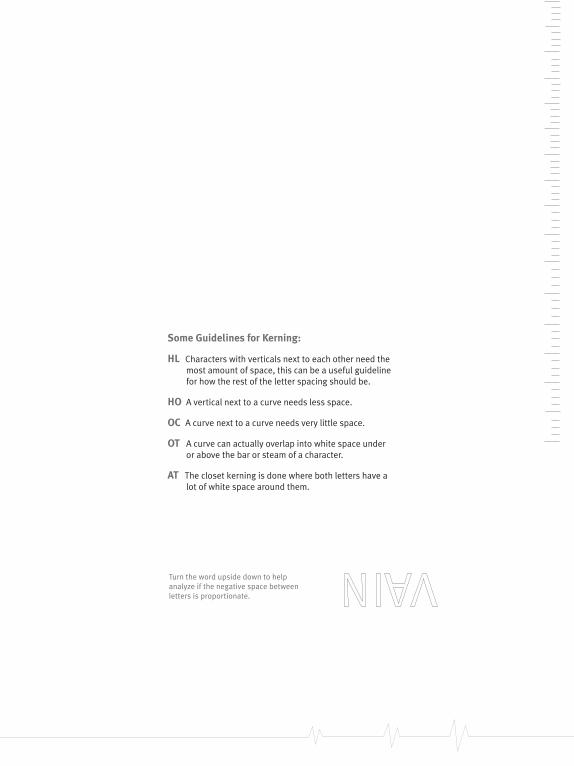
Turn the word upside down to help analyze if the negative space between letters is proportionate.
Some Guidelines for Kerning:
HL Characters with verticals next to each other need the most amount of space, this can be a useful guideline for how the rest of the letter spacing should be.
HO A vertical next to a curve needs less space.
OC A curve next to a curve needs very little space.
OT A curve can actually overlap into white space under or above the bar or steam of a character.
AT The closet kerning is done where both letters have a lot of white space around them.
1 2
3 4
5 6
7 8
9 10
11 12
13 14
15 16
17 18
19 20
21 22
23 24
25 26
27 28
29 30
31 32
33 34

Stitching Up Leading
The space between baselines of type is what holds a paragraph together like stitches sealing a wound. Called leading (rhymes with heading), it’s from hand-set type days when thin strips of lead were inserted to create space between each line of text.
No one wants visual scaring when looking at a block of text so consider this: Proper leading is barely noticeable, holding the text together nicely. Leading that is too loose can feel like each line of type will break away. Too tight leading just looks messy.
38
Dr. Type: RESUSCITATING SPACE

I’m a Barbie girl in the Barbie worldLife in plastic, it’s fantasticYou can brush my hair, undress me everywhereImagination, life is your creation
I’m a blonde single girl in the fantasy worldDress me up, take your time, I’m your dollieYou’re my doll, rock and roll, feel the glamour and painKiss me here, touch me there, hanky-panky
The greater the leading the lighter the body of text appears visually, but be careful your text doesn’t come apart.
6pt/7.2 (20% is auto-leading)
(negative leading can lead to ascenders and descenders crashing into each other)
I’m a Barbie girl in the Barbie world
Life in plastic, it’s fantastic
You can brush my hair, undress me everywhere
Imagination, life is your creation
I’m a blonde single girl in the fantasy world
Dress me up, take your time, I’m your dollie
You’re my doll, rock and roll, feel the glamour and pain
Kiss me here, touch me there, hanky-panky
8pt/18pt
6pt/5pt
1 2
3 4
5 6
7 8
9 10
11 12
13 14
15 16
17 18
19 20
21 22
23 24
25 26
27 28
29 30
31 32
33 34

Colophon:
This book is set in Meta Plus and designed
in Adobe InDesign. All illustrations are
originals by Kristen Youngman, executed in
Adobe Illustrator. Published on Julia Press. Bound by Herring & Robinson Bookbinders.
Academy of Art University San Francisco, CA 94105


“Type has no beauty on the inside so the outside better be damn perfect.
The doctor will see you now.”
Dr. Type