digipak analysis for five video's
TRANSCRIPT

This digipak is quite humble compared to other artists, however the centre square with the spotlight is a very eye catching image. This square is also a trademark symbol for their band a lot of the time. It has been present at concerts and music videos sometimes.
With the text, as it is the only writing on the front, it is very noticeable and makes it clear who the band is – the font is also very unique and now relates back to the band itself
However they have not included a picture of the singer or band on the front. This is similar to ‘Two Door Cinema Club’ as they both fall under the indie genre.
Once again, the name of the band is at the top of the page in the same font, because very iconic. However the rest of the font on this is more simplistic, it is quite basic but the band does not need anything to jump out at their audience on the back.
They have social media links on the back along with the name of their record label and distributer. Above all of this information there is the names of the songs that are featured on the CD.
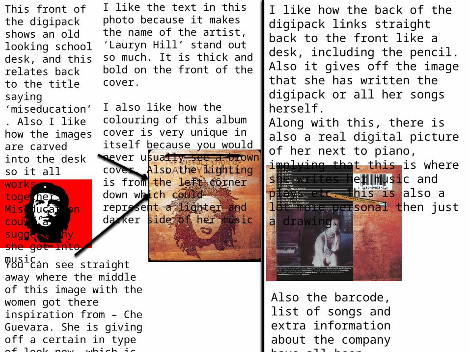
You can see straight away where the middle of this image with the women got there inspiration from – Che Guevara. She is giving off a certain in type of look now, which is powerful and someone too look up too.
This front of the digipack shows an old looking school desk, and this relates back to the title saying ‘miseducation’. Also I like how the images are carved into the desk so it all works together. Miseducation could also suggest why she got into music.
I like the text in this photo because it makes the name of the artist, ‘Lauryn Hill’ stand out so much. It is thick and bold on the front of the cover.
I also like how the colouring of this album cover is very unique in itself because you would never usually see a brown cover. Also the lighting is from the left corner down which could represent a lighter and darker side of her music
I like how the back of the digipack links straight back to the front like a desk, including the pencil. Also it gives off the image that she has written the digipack or all her songs herself. Along with this, there is also a real digital picture of her next to piano, implying that this is where she writes her music and plays etc. This is also a lot more personal then just a drawing.
Also the barcode, list of songs and extra information about the company have all been included on the back.

I love the front of this digipack because it gives off a hip hop/dancing vibe which relates back to the music. Also the colour scheme of this digipack could interpret quite an angelic look, along with this her makeup isn’t very striking and her outfit is quite simple.
Along with this, there is a contrast in the font, because the name is very clear and readable. This would stand out in a shop, but also the name of the album is quite different, also quite similar to fancy angelic writing again.
They have also included on the front that this is an ‘exclusive’ addition because this will lure fans into buying the album.
I like how the back is a bit different to the front, her outside and body language look a lot more sexual and seductive. The black colour gives off a more wicked vibe instead of angelic. Also her facial expression is a lot more serious then before when she is smiling.
They include all the information of copy right, barcode, and all of the songs. This is usually the information they have on digipacks. They also have got all the songs on the back in a list, and also highlighted the new track on the album. Along with this, I really like the colour scheme of this, how the extra track on the front links up to the information on the back.
She is definitely seen as a sex icon in this, and it kind of links back to her music.

The band are not present on this digipak which is quite unusual for a album cover but however this is very eye-catching and unique. This is why I think it was such an effective front page of the digipak.
I also think the font is quite successful because they have used matching font for the title of the band and name of the album. I like this consistency which hasn’t been used in a lot of album covers recently. Also the ‘O’s make the eyes more captivating and is direct to the audience as they are looking towards the viewers.
The filter on this is very atmospheric and highlights the cats eyes the most as it is black and white and makes the writing stand out the most because it is so dark. The green is very illuminance as well so makes the centre of the picture very noticable.
It represents a instagram photo however I think. Even though I have complimented the font I don’t think it stands out as much as another cover.
I also like this because it is a very simple and background back-ground instead of being a busy complex image.

This is a very interesting front of a digipak because the company has made sure that the two letters present for the name of the album stand out very easily because they are multi-coloured and the background is grey. It kind of gives the impression that it is a spaceship.
They have made it stand out a lot by splashing paint and using numerous colours. This was a very popular technique at the time.
The back has a similar theme to the front with all the splashes of paint and colours. I really think this consistency works because it makes sure all the album works together. Also because it has track playlist on the back the front could link up like it is a link into the world of Coldplay.
The font is very original and would be linked with this album. I like all the symbols at the bottom of the digipak as well. This is actually the record label for the company.
This digipak is actually a cut down version of the pack because I couldn’t find the bigger version but it would have a barcode and copyright information.