detection and visualization of vortex rings during … · detection and visualization of vortex...
TRANSCRIPT

Detection and Visualization of
Vortex Rings during Cloud Formation
Thomas Drake
BSc (Ind) Computer Science
2015/2016

The candidate confirms that the following have been submitted.
Items Format Recipient(s) and Date
Deliverable 1 Report SSO (11/05/2016)
Deliverable 2 Software Application code Emailed to supervisor and
assessor (11/05/2016)
Type of project: Exploratory Software (ESw)
The candidate confirms that the work submitted is their own and the appropriate credit has been given
where reference has been made to the work of others.
I understand that failure to attribute material which is obtained from another source may be
considered as plagiarism.
Signed:

Thomas Drake
i
Summary
This report details an investigation into basic atmospheric science, scientific visualization techniques,
and the development of an application aimed at detecting vortex rings within cloud simulations. The
aim of the application is to provide greater insight into cloud simulation data for a researcher within the
school of earth and environment.

Thomas Drake
ii
Acknowledgements
I would like to thank my supervisor, Dr Hamish Carr, for proposing this project as a sufficient challenge,
which it definitely has been. His continued assistance with the background knowledge on scientific
visualization and his advice on the writing of this report has helped make the project what it is.
I would like to extent my gratitude to Steven Böing for his assistance with the background
knowledge on atmospheric dynamics and especially for providing the data in use by this project.
I would also like to thank my assessor, Dr Marc de Kamps, for his feedback during the progress
meeting and on this report.

Thomas Drake
iii
Contents
Introduction 1
1.1 Problem Overview .......................................................................................................................... 1
1.2 Aim ................................................................................................................................................. 1
1.3 Objectives ....................................................................................................................................... 2
1.4 Requirements .................................................................................................................................. 2
1.5 Deliverables .................................................................................................................................... 2
1.6 Project Scope .................................................................................................................................. 3
Project Methodology 4
2.1 Schedule and Planning .................................................................................................................... 4
2.2 Development Process ...................................................................................................................... 5
2.3 Programming Language .................................................................................................................. 5
2.4 Report Structure .............................................................................................................................. 6
Background Research 7
3.1 Introduction..................................................................................................................................... 7
3.2 Fluid Dynamics of Moist Convection............................................................................................. 7
3.3 Detecting Vortex Rings .................................................................................................................. 8
3.4 Visualization Techniques ................................................................................................................ 9
Analysis and Design 19
4.1 User Requirements ........................................................................................................................ 19
4.2 Choosing a Set of Methods ........................................................................................................... 19
4.3 System Requirements ................................................................................................................... 20
4.4 Project Analysis ............................................................................................................................ 21
4.5 G.U.I Design ................................................................................................................................. 23
4.6 System Specifications ................................................................................................................... 24

Thomas Drake
iv
Implementation 25
5.1 Framework .................................................................................................................................... 25
5.2 Reading the Data ........................................................................................................................... 26
5.3 Structuring the Data ...................................................................................................................... 28
5.4 Vortex Ring Detection .................................................................................................................. 29
5.5 Visualizing an Idealized Vortex Ring ........................................................................................... 30
5.6 Visualizing Multiple Vortex Rings ............................................................................................... 31
5.7 Optimising the Application........................................................................................................... 31
5.8 Vortex Ring Evolution .................................................................................................................. 32
Project Evaluation 33
6.1 Planning and Project Methodology .............................................................................................. 33
6.2 Objectives and Requirements ....................................................................................................... 34
6.3 Application Evaluation ................................................................................................................. 35
6.4 Personal Reflection ....................................................................................................................... 36
Conclusion 43
7.1 Summary ....................................................................................................................................... 43
7.2 Aims, Objectives and Requirements ............................................................................................. 43
7.3 Extension Work ............................................................................................................................ 44
Bibliography 46
External Materials 49
A.1 Datasets ......................................................................................................................................... 49
A.2 Visualization Framework .............................................................................................................. 49
Ethical Issues 50
B.1 Identifiable Issues ......................................................................................................................... 50
Project Schedule 51
C.1 Gantt Chart.................................................................................................................................... 51
C.2 Amended Gantt Chart ................................................................................................................... 52

Thomas Drake
v
Software 53
D.1 Application Deliverable ................................................................................................................ 53
D.2 CMake, VTK and Qt 4.8.x ............................................................................................................ 53
D.3 GLEW ........................................................................................................................................... 53
D.4 NetCDF4 ....................................................................................................................................... 53
Visualization Output 55
E.1 Application Screenshots ............................................................................................................... 55
Thomas Drake
1
Chapter 1
Introduction
1.1 Problem Overview
In the field of meteorology, climate change is a topic of ever increasing importance. The effects of
climate change has strong impacts on a vast number of categories including agriculture, ecosystems,
and increases in severe weather patterns [27][32][15]. It is therefore of utmost importance to be able to
understand and predict this global phenomenon with accuracy. Understanding the formation of clouds
and how they behave will play a key role in this pursuit [6].
One of the lesser known characteristics of cloud formation is vortex rings and their impact on a
cloud’s lifecycle. Vortex rings are observed via radar systems as a basic element of convection arising
from turbulent flows and updrafts [9]. A visualization application will be built with the aim of providing
greater insight into this process.
1.2 Aim
This project will compare different visualization techniques and determine which one is most suitable
for the given problem. By implementing the different techniques it will be possible to identify the
appropriate method with feedback from Steven Böing; an expert in the field. The final outcome of the
project is to have an interactive visualization tool capable of analysing the datasets provided and
displaying any vortex rings.
Because the deliverable software is intended to be used visually, speed and efficiency must be
considered at all times. The tool will be continually evaluated through the development process to
ensure it meets all of the required criteria to be considered effective in aiding the understanding of cloud
formation.
Thomas Drake
2
1.3 Objectives
The following is a list of objectives to be done in order:
1. Determine a suitable set of visualization tools.
2. Determine a suitable detection algorithm for finding vortex rings.
3. Detect and visualize the vortex ring from the idealized vortex data.
4. Visualize larger and broader data sets provided from MONC.
5. Visualize these data sets over a variable number of time steps.
1.4 Requirements
The requirements for the project are as follows:
1. Produce a literature review on the current techniques for visualization, detailing their strengths
and weaknesses in terms of speed and efficiency for the given problem.
2. Produce a literature review on methods of detecting vortex rings, focusing on their applicability
for the given data and its properties.
3. Implement different methods of visualization techniques along with the methods for detecting
vortex rings.
4. Evaluate which combination of visualization and vortex ring detection techniques produces the
most insightful results.
5. Create a final tool using the chosen methods to visualize the data over time.
An extension is available given that all of the previous requirements are met:
1. Have the tool automatically detect the vortex rings in the dataset and track them over several
time steps.
1.5 Deliverables
On completion of the project the following will be delivered:
1. The project report - This will detail the process for meeting the requirements along with an
evaluation and conclusion for further improvements to the project.
2. Code base - This will include the commented source code for the project along with
documentation on how to compile and run the software.

Thomas Drake
3
1.6 Project Scope
Steven Böing, a researcher in the School of Earth and Environment at the University of Leeds, is
currently working on the fluid dynamics of moist convection with the aid of the MONC (Met Office
NERC Cloud model) framework provided by The Met Office. This framework is capable of producing
very high resolution cloud simulations (~2 to 50 meters) improving upon the current framework in use;
the Met Office’s LEM (Large Eddy Model) [31]. The data which MONC produces will be fundamental
in further understanding how clouds form and evolve in ways currently unachievable with the LEM.
This project will focus on detecting and visualizing vortex rings from data sets produced by the
MONC framework. Details of how the data is generated will not be covered, however the science behind
it will be discussed briefly. The methods used for analysing and visualizing the data will be explored.

Thomas Drake
4
Chapter 2
Project Methodology
2.1 Schedule and Planning
The schedule for this project was determined within the first two weeks commencing 25/01/2016. The
original Gantt chart for the schedule can be seen in figure C.1 in Appendix C. The project had been
divided into five milestones.
1. Planning and Literature Review – The bulk of the background research on the subject will be
done here as well as planning the next four milestones.
2. Toolkit Research – There are several options available for visualization projects, this will allow
time to familiarize with some of them before deciding which is most appropriate.
3. Detection Algorithm Suitability – This will provide the basis of the software development
milestone. Several detection methods will be implemented and analysed before being
incorporated into the final product.
4. Software Development – The majority of the code base will be developed during this milestone.
5. Report Write-up – The project report and student symposium preparation will take place across
the final six weeks to allow ample time for multiple drafts.
Several of the milestones detailed relied upon the completion of the preceding milestone before
starting. This could have possibly caused an issue with the schedule, if certain milestones were not met
on time. An amendment to the schedule was required once the second objective had begun. It became
clear that the second and third objective were closely linked; therefore they were run in parallel, instead
of sequentially. The updated Gantt chart can be seen in figure C.2 in Appendix C.

Thomas Drake
5
2.2 Development Process
This project uses an iterative and incremental development process as it lends itself well to an
exploratory software project. Proceeding each iteration it allowed for new research to be done into the
implementation of another visualization or detection method. Continual feedback was available in the
form of weekly meetings. The figure below shows how the lifecycle of each iteration works.
Figure 2.1: Iterative development model.[2]
The software was developed over six iterations with each iteration lasting a week and producing a
different deliverable feature set. The first four iterations were used to test different methods of
visualization and vortex ring detection; the last two being used to expand the functionality of the final
product. The first objective was part of the initial planning stage and objectives two to five were
addressed during the iterative cycle.
2.3 Programming Language
The available tool kits for visualization have dictated which programming languages could be used in
this project. The primary language in use by most frameworks is C++. Some frameworks provide
interpreted interface layers for Java, Python, Tcl/Tk, and other high-level languages. It is important to
note that these interface layers work by calling procedures from a natively compiled library. There are
several features of these high-level languages that are of interest:
Simple memory management i.e. garbage collector.
Quick and easy debugging.
Platform independent binaries.
Decreased development time (dependant on developer’s knowledge).

Thomas Drake
6
However there are several disadvantages to be conscious of when using a high-level language over a
middle-level language, such as C++, in the context of visualization frameworks:
The inability to create custom modules.
An increased overhead in terms of memory footprint.
A reduction in performance for most cases.
The inability to create custom modules was the limiting factor on choice of language. As this project is
specific in its requirements, custom modules were required to be developed and integrated into the
chosen framework. The developer has a greater experience with Java than C++, however as
performance is critical and new modules will be needed, this project uses the C++ programing language.
In addition to C++, Python was required for creating the idealized vortex ring data. Python was not
used directly in the visualization application itself due to the constraints already detailed; however a
good understanding was advantageous in discerning how the idealized data is created.
2.4 Report Structure
Chapter 3 will cover the background research for this project. It will start with a short introduction
followed by the science behind how clouds form in the atmosphere and some basic fluid dynamics. The
next sections will introduce several methods of detecting vortex rings and provide an in depth review
of different visualization techniques.
Chapter 4 will detail: the requirements of the application, a discussion on which detection and
visualization methods will be utilized, the system requirements, an analysis of current methods being
used, initial designs for the user interface, and the system specifications.
Chapter 5 will focus solely on the implementation of features discussed in chapter 4.
Chapter 6 will evaluate the project itself beginning with the application and if it fulfilled its
requirements. Performance and parameter sensitivity will be evaluated after this with a final discussion
on improvements.
Chapter 7 is the final chapter, concluding the project and offering potential extension work.

Thomas Drake
7
Chapter 3
Background Research
3.1 Introduction
Scientific visualization is a subset of computer graphics in which data is analysed and presented
visually, as a means of gaining insight into a particular problem. The data sets which are analysed can
be sourced from many different scientific disciplines, in the case of this report it is firmly based in
atmospheric dynamics. The next section will give an overview of the science behind the problem as it
had a large influence on the direction of the research into the different detection techniques. The
subsequent sections will detail the different detection and visualization techniques.
3.2 Fluid Dynamics of Moist Convection
Convection is a process of energy transfer in a fluid. There are several types of convection. Free
convection occurs when there are differences in density within the fluid. This causes motion as less
dense air rises and denser air is forced downwards to take its place. Forced convection occurs when
motion is induced by a mechanical force such as deflections from hills or other large obstructions [1].
In general clouds form as the result of warm, moist air rising up through a decreasing temperature
gradient. Warmer air has the ability to hold more water vapour; as the air rises, its ability to hold water
vapour decreases. As the air becomes more and more saturated, the water vapour starts to condense into
visible water droplets or ice crystals resulting in cloud formation [21]. During cloud formation the rising
of warm air produces motion in the cloud, also known as updrafts. These updrafts will continue to rise
into cooler air until they cannot anymore due to the loss of heat. Once the top of the updraft has cooled
it will be forced outwards and down as a downdraft. When a fluid is forced to flow back on itself the
fluid begins to rotate around a central axis creating a vortex. When this occurs axisymmetrically in three
dimensions a vortex ring forms. A vortex ring is where the axis line forms a ring resulting in a torus
shaped vortex. Vortex rings occur frequently in cloud updrafts, however, little is known about their role
in the lifecycle of clouds.

Thomas Drake
8
3.3 Detecting Vortex Rings
Before being able to detect vortex rings the definition of a vortex should be made clear. Defining
unambiguously what a vortex is can be a difficult task on its own. Vortices can be described as regions
of high vorticity. The vorticity is defined as the curl of the velocity field or more precisely for three
dimensions in Cartesian coordinates:
�⃗⃗� ≡ ∇ × 𝑣 = (𝜕𝑣𝑧
𝜕𝑦−
𝜕𝑣𝑦
𝜕𝑧 ,𝜕𝑣𝑥
𝜕𝑧−
𝜕𝑣𝑧
𝜕𝑥 ,𝜕𝑣𝑦
𝜕𝑥−
𝜕𝑣𝑥
𝜕𝑦)
Where �⃗⃗� is the vorticity pseudovector, ∇ × is the curl operator and 𝑣 the velocity field. This
equation calculates the local rotation of a velocity field. However even though vortices have high
vorticity, it is not always true that a region of high vorticity contains vortices. For example vorticity
may be high in shear flows where particles move in parallel but still rotate due to a varying flow speed
across the particle [13].
Shear flows occur in the atmosphere and are known as wind shear. Wind shear is a change in wind
velocity in the vertical direction. Causes of wind shear include: wind coming into contact with a large
obstruction such as a hill, when two fronts (air masses of different temperatures) meet or in severe
weather conditions [11]. The magnitude of the vorticity |𝜔| has widely been used to represent vortex
cores but is only regarded as successful in flows without shearing [5]. However it will make a good
foundation to build on as the project progresses and allow comparisons between different methods.
Another common definition is one which requires closed particle paths around a central point but
again this can be ambiguous. Under a simple Galilean transformation, a transformation of the reference
frame of the particle, such as a constant speed translation the path may become open whilst still
containing a vortex. This method lends itself well to streamlines and streaklines (discussed in the next
section) given there is little to no cross wind in the data set. It may also be possible to negate this effect
if it is constant throughout the fluid.
A stronger definition of vorticity is available in the form of the Q-criterion proposed by Hunt, Wray
& Moin [16]. This criterion is similar to that of the vorticity magnitude but is resistant against Galilean
transformations. The Q-criterion is constructed using the decomposing of the velocity gradient (∇𝒗)
into its symmetric (𝑺) and anti-symmetric (𝛀) components:
∇𝒗 = 𝑺 + 𝛀
𝑺 = 1
2[∇𝒗 + (∇𝒗)𝑻]
𝛀 = 1
2[∇𝒗 − (∇𝒗)𝑻]

Thomas Drake
9
The tensor 𝑺 is known as the rate of strain tensor and describes how a fluid deforms around a certain
point. 𝛀 is the spin tensor and describes the rotational motion of particles in the fluid. The Q-criterion
states that the Euclidean norm of the spin tensor should dominate the Euclidean norm of the rate of
strain tensor [12]:
𝑄 =1
2[|𝛀|2 − |𝑺|2]
Therefore 𝑄 > 0 defines the positions where vortices occur. 𝑄 can be described as “a local measure of
excess rotation-rate relative to strain-rate” [7]. In other words, if the rate at which a particle rotates
within the fluid exceeds that which it would from a shear or another type of Galilean transformation
then a vortex is present.
Chong, Perry & Cantwell provide another definition, the ∆-criterion, such that the complex
eigenvalues of the velocity gradient locate vortex cores [8]. To find the eigenvalues of the velocity
gradient the characteristic equation needs to be solved:
𝜆3 + 𝑃𝜆2 + 𝑄𝜆 + 𝑅 = 0
𝑃 = −∇ ∙ 𝒗
𝑄 =1
2[|𝛀|2 − |𝑺|2]
𝑅 = −𝐷𝑒𝑡(∇𝒗)
P, Q and R are the three invariants of the velocity gradient. A simple solution exists to the characteristic
equation when assuming the flow is incompressible (P = 0):
∆= (𝑅
2)2
+ (𝑄
3)3
When setting ∆ > 0 the velocity gradient is assumed to have complex eigenvalues. By also including
the determinant of the velocity gradient it can be seen that the ∆-criterion is less restrictive than the Q-
criterion. The ∆-criterion also provides solutions for compressible Newtonian fluids when P is non zero.
3.4 Visualization Techniques
This section will cover the different methods for visualizing vector and scalar fields, as those are the
ones present in the given data sets. Vector field visualization will be useful for the velocity field,
whereas the scalar field visualization will be useful for the vorticity magnitude and criterion values
described in the previous section. The following is inspired by the work done by Alexandru c. Telea in
his book “Data visualization principles and practice” [29].

Thomas Drake
10
3.4.1 Colour Mapping
Colour mapping is the most popular technique for scalar visualization. Colour mapping maps each value
in the scalar data to a particular colour. Colour mapping can be done in a number of ways, the methods
this project will focus on are colour look-up tables and colour transfer functions. Colour legends are
required with colour maps to show the user which colour represents which value. It is important to be
able to create a good colour map for visualizations to be effective.
There are a number of factors which should be considered when choosing a particular colour map
mostly revolving around how humans perceive colours. When a large variety of users will be using a
particular colour map it is important to note that not all users will be able to distinguish between colours
the same. Approximately 10 percent of all men have some form of colour blindness usually affecting
red and green colour perception. If possible this combination of colours should be avoided when a large
number of users will be using the application. Another issue can be where values vary rapidly in a small
area. This can cause the colours, which are mapped, to be perceived as a single colour made up of a
blend of each of them.
Colour maps should have the following properties to be considered an effective general purpose
colour map as outlined in [18][19]:
The colours used should follow a perceivable ordering.
The colours should show the distance between the values they represent.
The colour map should be able to represent continuous scales.
The map should be usable by users with vision deficiencies such as colour blindness.
Several types of colour maps will be discussed later in this section which attempt to tackle these issues.
Colour tables work by creating a table of N colours and then mapping each of the scalar values to
a colour. This is done by taking the minimum and maximum values in the scalar data and uniformly
dividing it into N ranges. Each range is then assigned to a particular colour in the map. It can be difficult
to apply this method to a time dependant scalar field, as the minimum and maximum scalar values
across all defined time steps may not be known before run time. It may also have a negative impact
using the absolute maximum and minimum values, as details may go unnoticed when the range on a
single time step is relatively small. Look-up tables are good when the individual colours do not need
changing at run time.
Colour transfer functions are functions that calculate a colour analytically from the scalar dataset.
For example in the case of RGB colours, each component (red, green and blue) will have a function
which performs the mapping. These functions take the scalar value at each point in the data and apply
the function to give a value for that colour channel. These colours are then be combined to give the

Thomas Drake
11
overall colour of a particular point. Colour transfer functions are useful for when the colour mapping
function changes dynamically.
(a)
(b)
(c)
(d)
(e)
Figure 3.1: A set of different types of colour maps.
a) Rainbow, b) Greyscale, c) Two-Hue, d) Heat, e) Diverging
Rainbow colour maps (3.2 (a)) use a rainbow spectrum as their colour scheme. A rainbow colour
map may not be effective to display a linear scale as it is difficult for a human to interpolate the colours
and their meaning. There is no clear visual definition of which colour represents which value without
constantly checking the colour legend [30]. However, a rainbow spectrum may work well for
temperature, as the human brain associates blue colours with cold moving through to red being
perceived as a warm. Rainbow colour maps can also pose a challenge for users with colour blindness
to interpret [19].
Greyscale colour maps (3.2 (b)) use the range of colours between black and white covering all
shades of grey between. Greyscale colour maps are used heavily in the medical visualization field. They
are very effective as the human eye is most sensitive to changes in luminance[23]. However, it can be
difficult to compare the colour of two points separated by some distance when set against different
background colours [22]. The perception of brightness depends on the surrounding area which is an
effect known as simultaneous contrast [28]. Shading on a three dimensional surface can also be a
problem as it can interfere with the actual colouring.
Two-hue colour maps (3.2 (c)) are similar to greyscale colour maps; however, instead of
interpolating black to white across a grey scale, two colours are used. Interpolation is done between the
two colours to create the colour map. Colour ordering is simple to perceive given the luminance of each
colour is different, from dark colour to light colour. Given the chosen colours are visually distinct the
advantage of this method over that of the rainbow colour map, is that it is easier to perceive a linear
ordering of the values. However, it can be more difficult to interpret a range of values between the two
colours than it is to distinguishing individual colours, like that in a rainbow colour map. They also suffer
from similar problems to that of the greyscale colour map when used on a three dimensional surface
with shading; the shading can affect the perceived colour.

Thomas Drake
12
Heat maps (3.2 (d)) are colour maps based on the perception of a temperature as a range of colours;
the range being black, red, orange, yellow and white. Heat maps can be interpreted easily with the black
colours correspond to low values, orange around the mid-point values, and white showing the higher
values. The advantage of this is that, by its nature it uses a range of luminance, dark to light, as well as
using a range of colours. The luminance provides an intuitive way of ordering the values while the
different colours allow for easier interpretation of the data.
Diverging colour maps (3.2 (e)) are similar to the two-hue colour map using two colours of similar
luminance, however a third colour is introduced. This third colour is placed at the mid-point between
the two colours and instead of interpolating between the two colours interpolation occurs between each
colour and the mid-point colour. This type of colour map is effective at showing the deviation of the
data from an average value at the mid-point colour and also distinguishing the difference between pairs
of values.
A few problems to be aware of whilst using colour maps are the interpolation of colours and colour
banding. Values may only be defined at certain points on a grid or mesh and interpolation is needed to
fill the gap between these points to create a continuous colour gradient. A colour is assigned to a value
using a colour map, however, if colour interpolation is used to fill the gap between two points the wrong
colour can be produced. For example if a rainbow colour map is in use and two neighbouring points
have the colours blue and red, the wrong colour will be interpolated. The colour map states the
intermediate colour should be green, however using interpolation the colour displayed would be purple,
the average of blue and red. This can be a large problem where data varies rapidly across a data set.
Colour interpolation is one of the most common methods in use as it is usually a core feature of the
underlying graphics API. An alternative to this is to create a texture and then apply that to a mesh. To
generate the texture, interpolation is done between the scalar values and the colour for each pixel is
looked up from the colour map. This prevents the wrong colour being displayed. This may not be
practical as it uses a texture whereas a different texture may need to be used instead.
Colour banding can occur when using a colour look-up table. If an insufficient number of colours
are used then banding can occur. A clear boundary between the colours can be observed with too few
colours. Information is lost visually when banding occurs, as a range of scalar values occupy a single
colour. A solution is to simply increase the number of colours used. Banding can also occur when large
areas have only small variations in the scalar values, again more colours are the way to avoid banding.
An example of colour banding is provided in figure 3.2.

Thomas Drake
13
Figure 3.2: An example of colour banding [26].
The use of a colour map lends itself well to a two dimensional scalar field or slices through a volume;
visualization becomes more complex when extending this to three dimensions. This extension will be
discussed in the section titled “Volumetric Visualization”.
3.4.2 Contours
Another technique involves the use of contours. A contour line or isoline is a collection of all the points
within the data set of a particular value. Contours are much more effective at showing particular values
in a data set than that of using colours. Contours are always closed unless they cross a boundary on the
data set, they can also never intersect. With contours, a clear border can be seen at set values, rather
than trying to distinguish between similar colours. Contours are widely used in cartography to display
the elevation of land on a two dimensional map. Hill tops can be easily seen on such a map by
identifying contours with no other contours contained within them. Colour maps and contour lines are
not mutually exclusive techniques and can be used together i.e. overlaying contours on top of a colour
mapped image. Contours can also be used to give a general sense of the variance of the data. By plotting
multiple contours, with values differing by some equal division, it is possible to see how spaced these
contours are. If some contours are close and others are far the variance in the data may be high.
To compute contours given a particular function is usually not too difficult, as you can set the
function to equal the iso-value and solve the equation. However, this is not often the case as the data
provided is usually a discrete and sampled data set. A simple way to calculate contours in this case is
to check each neighbouring pairs of points and determine if the iso-value lies between them. If so, the
location can be obtained by linear interpolation between the points. Once the points have been
calculated they need to be joined together to form the contour. This is done by checking each cell in the
grid with generated points. If the cell only has two points then these points can simply be joined
together. However, if more points are present it is difficult to determine which pairs of points are to be
joined. If four points are present in a single cell there are exactly two possible combinations in which
the points can be joined. By obtaining extra information it may be possible to determine which is correct,
however, it is not always possible so a solution must be postulated. It becomes non-trivial to join all of
Thomas Drake
14
the points across the cells correctly. The visualization can look very different to its true representation
if this occurs regularly across a given data set.
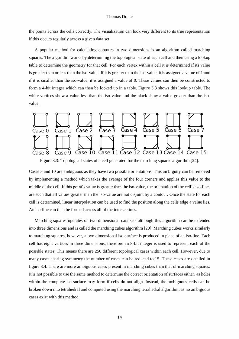
A popular method for calculating contours in two dimensions is an algorithm called marching
squares. The algorithm works by determining the topological state of each cell and then using a lookup
table to determine the geometry for that cell. For each vertex within a cell it is determined if its value
is greater than or less than the iso-value. If it is greater than the iso-value, it is assigned a value of 1 and
if it is smaller than the iso-value, it is assigned a value of 0. These values can then be constructed to
form a 4-bit integer which can then be looked up in a table. Figure 3.3 shows this lookup table. The
white vertices show a value less than the iso-value and the black show a value greater than the iso-
value.
Figure 3.3: Topological states of a cell generated for the marching squares algorithm [24].
Cases 5 and 10 are ambiguous as they have two possible orientations. This ambiguity can be removed
by implementing a method which takes the average of the four corners and applies this value to the
middle of the cell. If this point’s value is greater than the iso-value, the orientation of the cell’s iso-lines
are such that all values greater than the iso-value are not disjoint by a contour. Once the state for each
cell is determined, linear interpolation can be used to find the position along the cells edge a value lies.
An iso-line can then be formed across all of the intersections.
Marching squares operates on two dimensional data sets although this algorithm can be extended
into three dimensions and is called the marching cubes algorithm [20]. Marching cubes works similarly
to marching squares, however, a two dimensional iso-surface is produced in place of an iso-line. Each
cell has eight vertices in three dimensions, therefore an 8-bit integer is used to represent each of the
possible states. This means there are 256 different topological cases within each cell. However, due to
many cases sharing symmetry the number of cases can be reduced to 15. These cases are detailed in
figure 3.4. There are more ambiguous cases present in marching cubes than that of marching squares.
It is not possible to use the same method to determine the correct orientation of surfaces either, as holes
within the complete iso-surface may form if cells do not align. Instead, the ambiguous cells can be
broken down into tetrahedral and computed using the marching tetrahedral algorithm, as no ambiguous
cases exist with this method.

Thomas Drake
15
Figure 3.4: Topological states of three dimensional cells
generated for the marching cubes algorithm [17].
3.4.3 Volumetric Visualization
Volumetric visualizations attempt to visualize a whole three dimensional scalar volume rather than just
a subset of the data. The idea behind volumetric visualization is producing a two dimensional image
which represents the scalar volume of the underlying dataset. This is done by a computer graphics
technique called ray tracing. Ray tracing in volume rendering works by tracing a path through each
pixel in an image plane which intersects with a scalar volume. A function is applied to determine the
colour of each pixel based upon the scalar values the ray passes through [25]. These functions are named
transfer functions and are identical to colour transfer functions, although they also include an opacity
function.
The maximum intensity projection function (MIP) works by selecting the maximum scalar value
along each ray and mapping it to the corresponding pixel in the image via the chosen transfer function.
The MIP ray function is useful for displaying high-intensity structures. Volumetric renderings using the
MIP function for ray tracing are poor at displaying depth information as the position along the ray is
not considered when choosing maximum a value. This can result in features at different depths being
brought to the foreground. A solution is to take multiple images from different angles and animate them.
The average intensity function is similar in functionality to the MIP function, however, instead of
a maximum value chosen along a ray, the average is calculated.
The distance to value function is used to calculate the distance along a ray to the first point where
the scalar value is at least some chosen value. This function is useful in detailing the minimum depth at
which the fixed scalar value occurs.

Thomas Drake
16
The iso-surface function is used to construct iso-surfaces for a given scalar value. If the chosen iso-
value is found along the ray, the pixel in the image is assigned the colour corresponding to the iso-value.
It should be noted that volumetric shading is required otherwise the resulting image will look flat and
visualizing the depth of the image will be difficult.
3.4.4 Vector Glyphs
Vector glyphs work by assigning a symbol, i.e. a glyph, at every sample point within the vector field.
These glyphs can have a variety of properties which can be manipulated to represent multiple properties
within the vector field, for example colour can be used to represent magnitude, angle can depict
direction, and width of the glyph can represent something such as pressure [14]. There are two different
types of glyphs typically used in visualization: line glyphs and arrow glyphs.
Line glyphs are represented by, as their name suggests, a line. They are used to represent position,
direction, and magnitude for each vector in a vector field. This type of plot works well in two
dimensions, as it is generally quite easy to distinguish between the different objects and pick out
features. However, when extending to three dimensions certain problems must be addressed. One of the
major problems is occlusion which limits the view of the internal structure of the fluid flow.
Determining the direction of flow is not possible with the use of lines glyphs which can be a problem
if knowing the direction of flow is critical. Some solutions exist to the occlusion problem. One solution
involves randomly sampling the entire dataset to reduce the total number of glyphs displayed. This
allows a user to view more of the internal structure but at the cost of resolution as some features may
be removed due to the sampling process. Another solution is to only display glyphs with certain
properties. Occlusion may still be a problem in this case unless the user can vary the values in real time
to view these structures in succession, however this may pose a technical challenge for large datasets.
Altering the transparency of each of the glyphs is another technique that allows the user to see through
the structure whilst also being able to see the structure at varying depths. There is a simple solution to
show the direction of flow which is discussed next.
Arrow glyphs are similar to line glyphs except these are represented by arrows i.e. lines with a visible
direction. As the screen space is a limited resource in a visualization application, adding arrow heads to
each line can pose some problems due to the extra space taken by the arrow head. Occlusion can be
much worse than that of line glyphs but similar solutions can be used in this case.
3.4.5 Stream Objects
Stream objects work by attempting to visualize the trajectory of a particle through a vector field. There
are two types of vector field which will be discussed in terms of visualizing them with stream objects:
time independent and time dependant vector fields. A time independent vector field is a vector field that
does not change with time i.e. it is constant; a time dependant vector field is one that does. Time

Thomas Drake
17
independent vector fields will be represented by the function 𝒗(𝒙) where 𝒗 is the velocity field function
and 𝒙 is a position. Time dependant vector fields will be represented by 𝒗(𝒙, t) where t is time.
Streamlines are the first type of stream object for discussion and are only applicable on time
independent vector fields. Streamlines are generated by taking an initial position known as the seed and
tracing a curved path through the vector field. This curved path is defined such that it is tangent to the
vector field at all points along the streamline. This can be represented by the ordinary differential
equation:
𝑑𝒙(τ)
𝑑τ= 𝒗(𝒙(τ))
Where τ represents the distance along the curve. This equation can then be integrated over τ to give the
equation:
𝒙(τ) = 𝒙(0) + ∫ 𝒗(𝒙(s))dsτ
0
This equation can then be solved to give a streamlines of a defined length from an initial position.
Pathlines are similar to streamlines except that they operate on time dependant vector fields. It is
possible to produce streamlines from pathlines by fixing the value of t. Pathlines use the same ordinary
differential equation as streamlines except it introduces the time variable t:
𝑑𝒙(t)
𝑑t= 𝒗(𝒙(t), t)
Streaklines are another visualization technique and are an extension of pathlines. Take an initial
point in the vector field and produce a pathline at regular intervals from that point. This creates a set of
pathlines with varying paths as the vector field changes. A streakline is produce by taking the final point
along each of these pathlines and joining them to produce a curve. This new curve which is the streakline
gives insight into how the vector field changes over time.
Stream tubes are similar to streamlines but the line is replaced with a tube. The tube is created by
placing an orthogonal circle centred at each point along the streamline and joining them together to
form a tube. Stream tubes can be used to represent extra information on top of that of streamlines, due
to the addition of an extra dimension, stream tubes are effectively a two dimensional surface wrapped
around a streamline. The thickness of the tubes can be used to represent scalar information such as
pressure. Stream tubes have a surface which can be coloured or textured to provide even more visual
information for the given data set. However as the number of dimensions increase the number of
problems does also. If the stream tubes are too thick they may intersect or completely engulf other
stream tubes; if the stream tubes are too small they may not be visible.

Thomas Drake
18
Stream ribbons are another technique based on streamlines. Stream ribbons are produced by
generating two streamlines with seeds relatively close to each other and joining each pair of points along
those streamlines. This has the effect of creating a single surface through the vector field similar to that
of a ribbon, hence the name stream ribbons. Some features are immediately identifiable when using
stream ribbons such as high divergence and vorticity. If a velocity field has regions of high divergences
then the stream ribbon will rapidly grow in width at points along it. High vorticity causes the stream
ribbon to twist. In terms of visualizing vortex rings with stream ribbons it is unlikely that this twisting
will be observed, it is more likely that a stream ribbon will coil up as it is caught by the vortex ring.
Stream surfaces are similar to stream ribbons but instead of using two points they use a large set of
seeds. These points usually lay along some defined curve and are spaced at regular intervals. A surface
is then created across all of the streamlines to produce a two dimensional surface. A stream surface is
tangent to the vector field at all points and therefore the flow cannot cross the surface. Stream surfaces
can be used to identify disjoint regions within a flow, sections within the flow that do not interact and
are separated by some boundary. Regions with high divergence can pose a problem whilst using stream
surfaces, as they will cause large sections of the surface to have poor resolution. If two streamlines pass
a region of high divergence they will increase in distance rapidly and the resulting surface will likely
miss features in between. In this case the streamlines can be disconnected to cause a tear in the surface.
Alternatively, new streamline points can be added on the initial curve between the two streamline seeds
to increase resolution at the cost of extra computation.

Thomas Drake
19
Chapter 4
Analysis and Design
4.1 User Requirements
The user requirements for this project are simple. The application needs to be able to do the following:
Load the given file format.
Produce a three dimensional model of the vortex rings.
Interact with the model for rotation, translation and scale.
Manipulate the model via user controls.
4.2 Choosing a Set of Methods
Before determining a set of system requirements it is important to decide which set of methods to use
in terms of detecting vortex rings and visualization. This project will focus primarily on the Q-criterion
as the method for detecting vortex rings, as it is a stronger definition of a vortex. For an application of
this type only a handful of visualization methods are available: iso-surfaces, streamlines, and volume
rendering.
In the case of streamlines it may prove difficult to implement efficiently. The main issue will be
determining an appropriate set of seed points for the streamlines. Streamlines are generally very
resource intensive thus determining a good set of seeds would be vital. Points with a relatively high Q-
criterion value could be used as seeds although there is likely to be a lot of areas that are defined as
vortices but not vortex rings. This will lead to excessive calculations wasting CPU time. However, if a
set of appropriate seeds could be determined initially, such as finding points close to these vortex rings,
then more efficient methods can be used instead. Streamlines are better suited for visualizing the flow
of a fluid rather than specifically picking out previously undetected features. This leaves iso-surfaces
and volume rendering.

Thomas Drake
20
Both iso-surfaces and volume rendering are good candidates for visualizing vortex rings via the Q-
criterion. Due to time constraints only one method will be used and improved upon. This project will
use iso-surfaces as it is believed that this method has the best chance for covering all of the requirements,
as well as the extension requirement of automatic detection.
4.3 System Requirements
Based upon the user requirements and discussion on choosing detection and visualization methods we
can begin to identify the systems required functionality. To meet the user’s requirements the application
needs to be able to do the following:
Read the NetCDF4 file format.
Load multiple file at once to be analysed in sequence.
Calculate the Q-criterion value at each point a velocity vector is defined in each time step.
Perform statistical analysis on the Q-criterion in an attempt to find an optimal value.
Display an iso-surface on screen for a given Q-criterion value.
Rotate the three dimensional model via mouse click and drag.
Zoom in and out on the model with the mouse scroll wheel.
Translate the model by clicking the scroll wheel button and dragging.
Provide a list to the user of the currently loaded time steps.
Allow the user to select the current time step to visualize via a slider.
Restrict the minimum volume of a closed surface to be displayed via user input.
Pre-process the NetCDF files to heavily reduce the file size.
NetCDF4 is the file format produced by MONC for the cloud simulations and by the Python script
for the idealized vortex ring. The specifics of the format will be introduced within the implementation
chapter. Being able to load multiple files at once will allow the user to browse multiple time steps.
Through the selection of a folder and loading all files with the correct file extension solves this problem.
The chosen method for finding vortex rings within the dataset is the Q-criterion. To calculate this
value will require the vorticity. This will need to be calculated via numerical methods. The components
of vorticity can then be used to calculate the Q-criterion with the formula given in the previous section.
According to the Q-criterion a vortex is defined where the value of the Q-criterion is greater than zero.
As there is no particular value that defines a vortex or vortex ring, this will need to be provided by the
user as an input parameter. In an attempt to simplify this input parameter, statistical analysis will be
performed. By quantizing the Q-criterion and building a cumulative histogram the user only needs to
provide a percentile value between 0.0 and 100.0, instead of a value between 0.0 and an undefined upper
bound. Once a particular value is selected it is then possible to build an iso-surface through the dataset
using the marching cubes algorithm.

Thomas Drake
21
As an iso-surface produces a closed surface by its nature, it is possible to calculate the volume
contained within this surface. Vortex rings are expected to be relatively large compared to other regions
of high vorticity. Depending on the value of the Q-criterion used, will depend on how many of these
closed surfaces are created. Being able to restrict if a closed surface is displayed or not based upon its
volume will be useful in picking out these large regions of activity. This will be useful if a large number
of regions are present and occlusion becomes a problem. This should be controllable via the user in real
time.
Currently the files produced by MONC have a file size on the order of 500MB for each time step.
Simulations are run off site on a large distributed system. These data files then need to be transferred
across the internet for analysis. The calculation for the Q-criterion and iso-surfaces can be done
alongside the cloud simulation to produce much smaller file sizes. These files should only contain the
polygonal and volumetric data about the iso-surfaces which can then be reconstructed in a visualization
application on site. The development of a command line application which takes a single MONC data
file and outputs a reduced file for a given Q-criterion is required. This application only needs to take
the input of a single file as MONC produces files in a sequential order. Files can then be processed one
at a time as they are made available by the simulation. The reduced files then need to be loaded within
the visualization application. The other requirements mentioned are simple user interface interactions.
4.4 Project Analysis
A better understanding of the current methods used to analyse the simulation data is required before
designing an appropriate user interface. Currently two programs are in use: Ncview and VisIt. Ncview
is a visual browser for NetCDF files. It is intended to be used as a quick visualization aid, as it does no
particular analysis of the dataset and only displays variables as two dimensional slices through the
volume. It is also possible to view time steps across multiple files. VisIt is a much larger program and
is standard within the scientific visualization field. Many of the methods discussed in section 3 are
available within VisIt for analysing data: contour plots, iso-surfaces, streamlines etc.
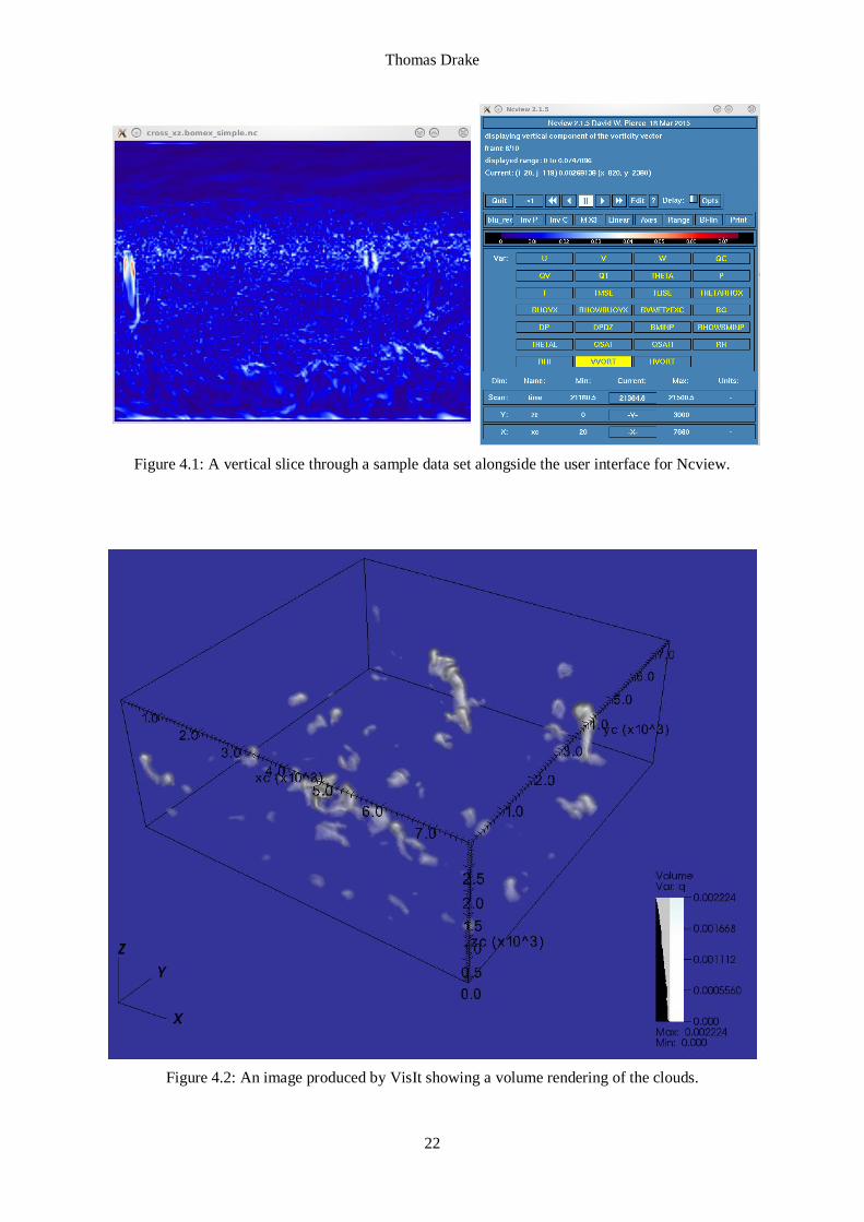
Ncview is currently used to visualize the magnitude of the vorticity within the vector field. By
analysing slices through the volume it is possible to see the structure of these vortex rings. However
these slices have to be selected manually by specifying a particular y value. To be able to identify the
vortex rings in a dataset with this method would require the manual analysis of each slice. This would
be extremely time consuming especially over several time steps. Figure 4.1 shows an example of one
of these slices through the dataset. On the left hand side the structure of a vortex ring can be seen in red.
The red colour represents regions of highest vorticity. A problem with this occurs if other vortices
within the slice are weaker, as they may not contain any red and may be missed visually.
Thomas Drake
22
Figure 4.1: A vertical slice through a sample data set alongside the user interface for Ncview.
Figure 4.2: An image produced by VisIt showing a volume rendering of the clouds.

Thomas Drake
23
The second method uses VisIt. VisIt, in this case, is used to visualize the cloud boundaries by
creating a volume rendering for values of the variable “q” greater than or equal to zero. Using this
method the clouds can be visualized, however, it provides little insight to their internal structure in terms
of vortex rings. Figure 4.2 shows the structure of the clouds within the data set rendered via VisIt. The
user interface for VisIt is not shown although due to its ability to visualize such a wide variety of data
and in multiple ways it is much more complex than that of Ncview.
4.5 G.U.I Design
A graphical user interface should be simple and intuitive to use. The layout of the screen should be well
ordered and provide a consistent experience for the user. Working through the user requirements and
how to introduce them into a user interface will help shape the application. Firstly the user needs to load
their data into the user interface, this can be taken care of via the file load option common on most
windowed applications. The analysis of the data itself will be performed in the background and does
not need to be presented to the user. A three dimensional model will be needed, which is likely to take
up most of the screen real estate to give the user the most insightful visualization. Interaction with this
model can be done as part of the modelling window via mouse movement, buttons, and the scroll wheel.
A section of the application will be required for user controls that can be divided into sub sections to
group common user controls.
Figure 4.3: Initial design of the graphical user interface.
Panel 1 is the rendering area. The model of the vortex rings will be displayed here and interaction
via the mouse will be available. If the user clicks and drags the mouse then the model will be rotated in
the direction of mouse movement. If the user scrolls the scroll wheel the model will zoom in and out

Thomas Drake
24
and if the user clicks the scroll wheel the model can be translated horizontally or vertically. Panel 2 will
be used for the user controls. This panel will be used to display a file load option followed by a list of
the currently loaded files. An input box will be used to set the minimum volume threshold for the regions
within the visualization. A slider will also be available for browsing time steps.
4.6 System Specifications
No specific system specifications have been given, other than the graphical application should run on
either a desktop or a laptop computer. A laptop generally has less available resources than that of a
desktop and therefore system requirements should be set based on that. This project will use an industry
standard framework for visualization called VTK (Visualization Toolkit) to reduce development time.
Details of the framework are given in the implementation chapter.
A mid-ranged laptop purchased within the last four years is a reasonable assumption to make. A
third generation Intel i3 processor or better is likely present in such a computer with around 4GB of
RAM. Almost all CPUs come with integrated graphics with reasonable specifications and support at
least OpenGL 4 [3] (VTK 7.0.0+ requires OpenGL 3.2 for some features [10]). Video memory should
not be an issue as it is shared with main system memory, however, this will reduce the amount of RAM
available for the application.
Any operating system can be used as long as the libraries for compilation are available. Effort may
be needed to adapt build instructions for a variety of operating systems. This project will assume
CentOS 7.0 or similar is in use for development, compilation, and execution. A range of libraries are
required for the C++ compilation to be successful. These include:
CMake 2.8+
VTK 7.0.0+ (version 6.3.0 is likely to work but this project uses 7.x)
Qt 4.8.x
Latest version of GLEW (currently 1.13.0)
Native libraries for NetCDF4 (the C++ interface header is provided under VTK).
Python requires the NumPy and NetCDF4-python packages (given the native libraries for NetCDF4 are
present), all of the dependencies should be resolved and installed along with it if using the pip package
manager. Web addresses and instructions are available in appendix D. The development machine
requires approximately 3GB available of persistent storage for downloading, compiling and installing
all the libraries.

Thomas Drake
25
Chapter 5
Implementation
5.1 Framework
This project uses VTK (Visualization Toolkit) for the underlying visualization framework. VTK is
written in C++ with the source code freely available online. VTK is cross-platform and runs on Linux,
Windows, Mac and UNIX platforms [4]. VTK is available in Java, Python and Tcl/Tk, however these
languages are available only as interpreted interface layers which interact with the C++ library. Some
custom classes will be required which will interact directly with the VTK pipeline therefore C++ will
be used as this is not available in the interfaced languages.
The VTK pipeline is responsible for taking a data source and transforming it into graphical data
which can then be presented visually to a user. The pipeline is described in the following diagram.
Figure 5.1: The VTK pipeline.
A source is responsible for providing data for the pipeline. This can either be by loading data from
a file or generating it from a set of input parameters. For this project data will be loaded from a set of
provided files.
Filters are one of the most important parts of the pipeline as their job is to receive data from sources
or other filters and modify it. This modified data can then be used in another filter or passed on to a
mapper. Filters are an optional component of the pipeline given the source component is able to read
the data into an appropriate. This project will use several filters to reduce the dataset’s size and analyse
certain properties of it.

Thomas Drake
26
The VTK pipeline is broken into two parts: data processing and rendering. Mappers are responsible
for bridging the gap between the data processing and rendering by mapping data objects to graphics
primitives. Mappers take data from sources or filters.
Actors receive data from a mapper and are used to represent an entity in a rendering scene. The actor
manages the properties of the entity such as its colour and texture. The set of properties will determined
how the entity is displayed in the renderer.
At the end of the pipeline are the renderers and windows. For an actor to be displayed on the screen
it must be added to the renderer of a window. The renderer will then render the entity on screen within
the window.
It is important to know how the data propagates along this pipeline. Data will only be made available
if it is called for. For example a filter may be connected to a source component but will not receive data
unless explicitly called for an update. Usually when the render window is displayed it will call an update
from the renderer which then propagates down the pipeline to the source. Data will then be fed back up
the pipeline and displayed on screen. Updates can be called manually at any stage in the pipeline to
force an update if required before the renderer calls the update chain. If data is modified at some point
on the pipeline such as a filters parameters are changed then the modified function is used and is
followed by an update to allow changes to be available when the renderer next updates.
5.2 Reading the Data
Being able to read and process the given NetCDF4 files is an important task as this is the only file
format currently available, it will also be the most efficient method as it is the output format of MONC.
Functionality to read these files is available via a number of interfaces provided by the Unidata
community, the creators of the format. This project will focus mainly on the Python and C++ interfaces.
Before discussing the different interfaces for NetCDF4 and how they work it must be made clear
how the data is defined. NetCDF4 is primarily used for storing array type data and is therefore tailored
for that purpose. The format stores a variety of information but we will focus only on two here: variables
and dimensions. Variables are used to define data at particular points within a grid of a defined shape.
The shape of the grid is determined by its dimensions, for example a 3D Cartesian grid is defined with
the x, y and z dimensions. The grid is not limited to only three dimensions. The dimensions themselves
are defined as single dimensional arrays containing the points at which that dimension is defined. For
example the x, y and z dimensions may only be defined between 0.0 and 1.0 (inclusive) in increments
of 0.1 steps. This gives 11 elements in each dimension, however a variable with dimensions of x, y and
z will have a total of 1331 variables defined (11x11x11), one at each combination of dimension points.
It is important to note that dimensions do not have to have regular spacing.

Thomas Drake
27
Using the Python library for reading and writing NetCDF4 files is relatively simple. To read a file
the Dataset class is used. Only the file name is required to initialize an instance of the class for reading.
Once a variable has been assigned to this instance the NetCDF4 variables and dimensions can be
accessed as dictionaries. The values for both variables and dimensions are accessed through the
Dataset’s “variables” instance variable. Even though there is a “dimensions” instance variable the actual
values for the dimensions are stored in “variables”, the “dimensions” instance variable just describes
the dimensions in terms of its name and size. For example:
nc_file = Dataset('filename.nc')
u = nc_file.variables['u'][:]
v = nc_file.variables['v'][:]
w = nc_file.variables['w'][:]
x = nc_file.variables['x'][:]
y = nc_file.variables['y'][:]
z = nc_file.variables['z'][:]
Elements can now be accessed from the Variable instances like a regular multidimensional array as they
are analogous to the NumPy array objects. In this example u, v and w are velocity components and have
the dimensions x, y and z and therefore will be three dimensional arrays and can be accessed as such.
For writing files in Python to a NetCDF4 file the Dataset class is used again. It must be initialized
with the file name and the ‘w’ mode for writing. Dimensions are created using the Dataset’s
“createDimension” method which requires a label and size. To create a variable uses the
“createVariable” method. This requires the variable name, its data type such as float64, and a tuple of
the names of its dimensions. As with reading dimensional data a “variable” must be created to hold the
values of each dimension and set with “createVariable”. This sets up the structure for the NetCDF4 file,
data must then be inserted to each of the variables and dimensions.
nc_file = Dataset('filename.nc', 'w')
nc_file.createDimension('x',len(x))
nc_x = nc_file.createVariable('x', 'float64', ('x',))
nc_x[:] = x
nc_u=nc_file.createVariable('u', 'float64',('x','y','z'))
nc_u[:,:,:] = u
Variables would also need creating for the y and z dimensions in a similar way. “x” is an array
containing the dimension points and u is a three dimensional array with the u component of a velocity.
Using the C++ library in this project requires the use of two classes. The NcFile class is used to load
a file given a file name as a parameter. The NcVar class stores variables returned by NcFile functions.
To retrieve an NcVar from the NcFile use the “get_var()” function with the name of the variable passed

Thomas Drake
28
as a parameter. To access the values contained within an NcVar, requires the copying of data into a new
array. To create this array the size must be known. For a variable with a single dimension, the size can
be calculated by calling the “num_vals()” function of the NcVar instance. Once the array is created,
data can be copied using the NcVar’s “get()” function passing the array to copy into and the number of
elements to copy as parameters. The data for that variable will now be present in the new array and can
be manipulated as required. In the case that a variable has multiple dimensions the size of each
dimension must be calculated. Instead of using the “num_vals()” function use the “get_dim(i)->size()”
function where i is the index of the dimension. For a three dimensional variable this function will need
to be called three times for x, y and z. Once the size of each dimension is known, the data can be copied
into an array using the “get()” function by passing the array to copy into and the size of each dimension
separately as parameters. This will convert a three dimensional array into a one dimensional array,
however, the index ordering will be preserved.
There are two different types of NetCDF4 files supplied i.e. ones with different dimensions and
variables defined. One type contains all of the variables produced by MONC and the original defined
dimensions. The other is pre-processed to provide the staggered dimensions, a transposed velocity field,
and a reduced set of variables.
The pre-processed files have six dimensions xc, xe, yc, ye, zc, ze and three variables u, v and w. The
dimensions xc, yc and zc represent the central coordinate of each cell in the grid. xe represents the x
coordinate of the right face of the cell, ye the top face and ze the back face. The variable u has
dimensions zc, yc, xe positioning it in the centre of the right face, v has dimensions zc, ye, xc putting it
in the centre of the top face and w has ze, yc, xc putting it at the centre of the back face.
The original data files have the dimensions x_size, y_size and z_size. The coordinate data for these
dimensions are stored in the variables x, y and z. The components of velocity are u, v and w. The
velocity is still based on a staggered grid even though their dimensions are x_size, y_size, z_size. It is
assumed the user of these files knows this information. There are other dimensions and variables but
are beyond the scope of this project.
5.3 Structuring the Data
It will be important to have some kind of data structure to hold the velocity field data. A suitable solution
is to use one of the grid structures available in VTK. The one chosen in this project is the
vtkRectilinearGrid. The vtkRectilinearGrid is a three dimensional regular grid, however it can have
variable spacing along its coordinate directions. This can result in cells of different sizes. This will be
useful in the case where the datasets vary in their vertical resolution.
VTK provides a NetCDF4 reader but it is not sufficient for the data set provided by MONC as its
output is not a rectilinear grid and the staggered dimensions are not accounted for. VTK provides a set

Thomas Drake
29
of third party libraries one of which is the NetCDF4 library. This can be used to read the file and then
pick out each variables as required. The initial step is to load the coordinate system and apply it to an
instance of a vtkRectlinearGrid. This requires extracting each of the x, y and z variables as a one
dimensional array and storing it in a vtkDoubleArray, VTK’s storage object for arrays of tuples
containing doubles. Because the x, y and z dimensions are staggered we need to interpolate each one to
the centre of the cell. This is done by looping over each coordinate in each dimension and taking the
mid-point between the current and previous coordinate. This works for all points apart from the first
one as there is no previous coordinate, a special case must be applied for the first element. Once the
coordinates are centred they can be applied to the grid using the rectilinear grids
SetXCoordinate(vtkDataArray *), SetYCoordinate(vtkDataArray *) and SetZCoordinate(vtkDataArray
*) functions. In the case of using the pre-processed files this interpolation step is not needed and instead
the xc, yc and zc dimensions can be used directly.
When loading the velocity field the initial step will be to load the three dimensional data with indices
[x][y][z] into a one dimensional array with the same ordering. This is simple to do using the NcVar
class provided by the NetCDF4 library. The velocity field must then be transposed by shifting the
indexing from [x][y][z] to [z][y][x] but on this one dimensional array.
The velocity data supplied is on a staggered grid which means the u, v and w components of velocity
are not calculated at the same points. For the given datasets this was not a problem and it could be
assumed that each of these components were positioned at the centre of the cell without any further
computation. However, if interpolation is required to get a value at the centre then VTK provides
vtkProbeFilter which can be used to interpolate one grid onto another. Start by creating a new rectilinear
grid and applying just a single component of velocity as the data set. Run the probe filter from this grid
onto the original rectilinear grid to obtain the interpolated velocities. Repeat this for each of the velocity
components and finally recombine each of them to get an accurate velocity vector. There is a large draw
back to this method which is the speed of computation. In some initial testing it took approximately six
minutes just for interpolation with the probe filter on a moderately sized dataset.
Once each component is loaded, transposed and interpolated (if needed) they can be collected
together into three component tuples stored in a vtkDoubleArray. The double array should be named
for later use e.g. “Velocity”. The array should then be added to the rectilinear grid by calling the grids
GetPointData()->SetVectors(velocityArray) function.
5.4 Vortex Ring Detection
Vortex ring detection will be done by calculating q-criterion value at each point within the
data set. This can be done by using the vtkGradientFilter. The vtkGradientFilter estimates
the gradient of a field in a data set, in this case the velocity field of the vtkRectilinearGrid. The

Thomas Drake
30
gradient filter needs to be aware of which field to use and can be set using the
SetInputScalars(vtkDataObject::FIELD_ASSOCIATION_POINTS, "Velocity") function. The filter is
also able to also compute the q-criterion by setting a flag by calling SetComputeQCriterion(1). This
creates a new data array in the rectilinear grid called “Q-criterion”.
After calculating the gradient and Q-criterion a custom filter can be used to perform statistical
analysis on the Q-criterion with the aim of using a single parameter to determine where vortex rings
occur in the data. In the case of this project a filter was created to initially quantize the Q-criterion
values, ignoring any values less than 0, and then calculate the cumulative frequency of those quantized
values. The current number of quantities in use is 1000. This allowed the use of a percentage parameter
between 0.0 and 100.0 to pick a Q-criterion value from the data set. The idea behind this was that vortex
rings would have a relatively high Q-criterion value compared to the rest of the data.
Once the data has passed through the Q-criterion filter iso-surfaces can be calculated. The usual way
to calculate iso-surfaces in VTK is the use the vtkMarchingCubes algorithm. This proved to be a
problem because the marching cubes algorithm does not accept a vtkRectilinearGrid as its input dataset.
Instead the vtkContourFilter must be used. The vtkContourFilter can take 1D, 2D or 3D data sets and
generate iso-points, iso-lines or iso-surfaces respectively. In this case it will generate an iso-surface
from the rectilinear grid. A number of iso-surfaces can be generated with the contour filter by setting
the number of surfaces to create with SetNumberOfContours(). Iso-values are then set for each contour
using SetValue(int i, double value) where i is the index of the iso-surface and value is the iso-value for
that surface. In this project we only create a single iso-surface based on the Q-criterion. The contour
filter must be told which scalar field to calculate iso-surfaces from. This is done with the function
SetInputArrayToProcess(0, 0, 0, vtkDataObject::FIELD_ASSOCIATION_POINTS, "Q-criterion").
5.5 Visualizing an Idealized Vortex Ring
The first step to visualizing the MONC data sets is to first visualize the idealized case. The idealized
vortex ring is produced by a Python script and written to disk in NetCDF4 format. This however outputs
data in the pre-process form previously discussed so no transposing or dimensional interpolation of the
data is required. Values for the Q-criterion can now be picked by using a percentage as a parameter to
the Q-criterion filter and then applying that value to the contour filter. The pipeline needs completing
before a visual output is created. This involves linking the output of the contour filter to a
vtkPolyDataMapper then to a vtkActor and finally adding the actor to a vtkRenderer. The renderer can
then be displayed in a vtkRenderWindow to display the iso-surface at the chosen value.

Thomas Drake
31
5.6 Visualizing Multiple Vortex Rings
The MONC framework is capable of producing much larger data sets than that of the idealized vortex
ring. The same methodology discussed for the idealized case is still valid for these datasets, however,
the calculations cannot be done in real time and can take several minutes to process. Improving the
efficiency of the application is discussed in the next section.
5.7 Optimising the Application
During the analysis stage it was decided that splitting the application into two executables would be the
most efficient method. One application will be used for pre-processing the data and the other for
visualizing the pre-processed files. This was done specifically to solve the problem detailed in the
previous section. All of the functionality prior to the mapping stage of the pipeline can be moved to a
separate pre-processing application. The pre-processing application should take a netCDF4 file as its
first parameter, an output file name as its second, and a percentile value for the Q-criterion. An
additional filter is required called vtkPolyDataConnectivityFilter which is used to extract individual
closed surfaces from the iso-surface data. This allows the use of vtkMassProperties to estimate the
volume of a closed surface for filtering in the visualization application. The pre-processor then takes
the polygonal data, generated from the individual closed surfaces (regions), along with their volume
and converts it into JSON which can then be written to a file. The following details the format of the
JSON files.
{
"timestep": 57000,
"grid":{ "x":[x1, x2, ..., xn],
"y":[y1, y2, ..., yn],
"z":[z1, z2, ..., zn] },
"points":[ [px1, py1, pz1],
[px2, py2, pz2]],
"regions":[{
"volume": volume,
"faces":[ [f11, f12, f13],
[f21, f22, f23]]
}]
}
The “timestep” variable represents the current time step of the simulation in seconds. The “grid”
variable has three sub arrays named x, y and z. These are the coordinates of the x, y and z dimensions
from the original data set. The “points” variable is an array of every point contained in the
vtkPolyDataConnectivityFilter that can be referenced from each region, to rebuild its polygonal surface.

Thomas Drake
32
The “region” variable contains a list of each region. Within each region contains its volume and the
indices of the points which make up each face.
The visualization application requires the addition of an input box to allow the user to set the volume
threshold. When this value is set, any region with a volume less than the threshold should not be
displayed. The visualization application will need to be able to parse the new JSON files. Once the files
are parsed, the polygonal data can be reconstructed into vtkPolyData objects with each region being
assigned to its own vtkActor.
5.8 Vortex Ring Evolution
One of the main requirements of the project is to be able to visualize vortex rings over a series of time
steps. For this, the pre-processing application needs no changes and only small changes need making
to the visualization application. The user interface of the visualization application needs to be able to
load all of the JSON files within a selected folder. A slider will be required for the user to change which
time step is currently displayed on screen. The JSON files are relatively small and therefore can all be
loaded into memory and each region can be stored within its own vtkActor. A vtkActorCollection can
be used to keep track of each of the actors in a single time step. The collection for each time step can
then be stored in a standard vector and as the user manipulates the user controls, the currently rendered
collection will change based on the time step. This then has the effect of animating the time steps via
the user controls.

Thomas Drake
33
Chapter 6
Project Evaluation
6.1 Planning and Project Methodology
Planning for this project began within the first two weeks of its inception. Due to the nature of the
problem, this project is exploratory as it could not be determined if the requirements could be met before
starting. Planning for this type of project therefore had to be done after sufficient background research
had been done. Once the objectives and requirements had been detailed, it was then possible to build a
schedule based upon the background knowledge acquired. An amendment to the schedule was needed
shortly after the second objective began. This would have been foreseeable given prior experience,
however, as this was the author’s first venture into the field of scientific visualization, changes were
expected. Another change to the plan not detailed in the amended Gantt chart was the removal of a
second project report draft. Finishing an initial draft within three weeks was an ambitious task for the
author, instead, the first draft took around five weeks to complete. To help compensate for this, reviews
of individual sections were performed throughout the writing process. The final review was used to
correct punctuation and grammar, and reorganise some sections.
The use of an iterative and incremental development process has worked well for this particular type
of project. From the research it was initially determined that streamlines would provide a good basis for
implementation. After implementing streamline functionality for the idealized vortex ring within the
first iteration, further work was then done on detecting the vortex ring itself in the next. Once the
transition had been made to use the data produced by MONC, it became clear that streamlines would
not be an efficient way of finding vortex rings in a much larger size dataset. The vortex ring’s core was
clearly visible in the idealized case, however, due to the low resolution of individual vortex rings within
MONC’s datasets, finding them proved difficult. Using the iterative approach allowed for exploration
of new techniques and further research.

Thomas Drake
34
6.2 Objectives and Requirements
All of the objectives were complete and all of the requirements met. It was determined that the VTK
framework would be used in this project; it is standard within the industry and provided the most
flexibility for creating a custom interface and set of modules. Details of the framework are given in
section 5.
Two detection methods were trialled to find vortex rings. Implementation was done for both the
vorticity magnitude and the Q-criterion. Using both methods it was possible to visually detect the vortex
rings within the datasets, however, using the Q-criterion gave better visual results as less noise within
the dataset was displayed. It would have been desirable to implement another detection method such as
the ∆-criterion but it was not feasible within the given time scale.
Visualizing the idealized vortex ring was relatively simple compared to visualizing the data
produced by the MONC framework. Many of the problems did not exist with such a small dataset such
as resource bottlenecks. Also, the structure of the idealized vortex ring and its surrounding velocity field
was perfectly uniform, meaning it was much easier to find a clear boundary around the vortex ring. This
was not possible with the tested methods in the given simulation data.
After visualizing the ideal case the project moved to visualize more relevant datasets. The real
challenge with this was producing visualizations quickly and in real time. It became apparent the
majority of the calculations would need to be done before prior to using the visualization application.
The program was split into two applications. The pre-processor was used to perform all of the
calculations needed and output its data to a file which the visualization application could parse.
Performance runs are detailed in the next section showing why it was done this way.
The final objective was to show multiple time steps within the application. This was relatively simple
once the pre-processed files were available. Each of the files could be loaded, parsed, and their
polygonal data stored in memory. As the data was available in memory the visualization could be
swapped quickly between time steps without any visual lag. The memory foot print was small so many
more time steps could be loaded at once and visualized concurrently. The actual memory usage was
dependant on the number of regions to be visualized, however, with an appropriate input parameter
each time step occupied on the order of a few megabytes of memory.
The requirements for the project state that a suitable literature review was performed to analyse
different visualization techniques and vortex ring detection methods. The background research section
of this report is dedicated to these requirements. The implementation of several techniques was done to
determine the correct combination for this particular type of data. The implementation of the final
choices are detailed within section 5. An evaluation as to which set of techniques to use was made in
section 4. The final visualization tool is complete and available as a separate deliverable. The extension

Thomas Drake
35
requirement was not met due to time constraints. The extra requirement alone is likely to be complex
enough to warrant its own project or at minimum be a major part of one.
6.3 Application Evaluation
Overall the pre-processing and visualization applications fulfil their purposes well. Screenshots of the
final visualization application can be seen in appendix E. After a discussion with Steven Böing he has
confirmed the visualization represents the vortex rings accurately. This alone is one of the most
important parts of the evaluation, being an acceptable application for use as a research aid.
The most important aspect of the pre-processing application is that it runs within an acceptable time
frame. In figure 6.1 it can be seen how the input parameter for the percentage threshold effects the
compute time. The lower the threshold the more regions are produced. This relationship is not linear
and increases exponentially meaning a significant amount of compute time is required for lower values
of the parameter. Anything less than 98% is expected to take over an hour per time step. This is outside
of an acceptable range. The benefits of such a value are likely negligible if any. The processing time
compared to the number of regions can be seen in figure 6.3. The relationship is similar to that of figure
6.1 and is further reinforced by the direct relationship shown in figure 6.2. An almost linear relationship
exists between the number of regions produced and the Q-criterion threshold.
From these sets of charts it can be determined that an input parameter value of 99.7% will execute
in approximately one minute and will produce approximately 700 regions. This is within acceptable
parameters. It is important to note that these performance runs were performed on an Intel Xeon E5-
1620 V2 processor on a single thread. Different CPU models will produce different results. On a 4 core
desktop PC a full set of time steps could be processed in less than an hour. However, the intention would
be to run this application alongside the MONC framework on a large distributed system with hundreds
of cores. Although, if the pre-processing of files can be done concurrently with the MONC simulations,
the processing time only needs to take less than or equal time than MONC does to produce a single time
step. This way only a single core needs to be dedicated to pre-processing the files.
Figure 6.4 shows how sensitive the percentage threshold can be. As the graph shows, the majority
of positive Q-criterion values are relatively small, less than 0.0002, compared to the maximum Q-
criterion value of approximately 0.0045. To capture the vortex rings requires a relatively high value and
therefore a high percentage value. This kind of distribution is typical across all time steps.
For the visualization application memory usage was the main concern. CPU usage was consistent
between each of the time steps and only consumed a small portion of cycles once the JSON files had
been parsed, however, the more time steps loaded at once increased memory consumption. Figure 6.5
compares the applications memory consumption to the number of regions within a data set. It should
be noted that not all of the regions were displayed and were restricted by a particular volume threshold

Thomas Drake
36
which can be seen in the graphs legend. This had a major impact on the memory consumption. From
the chart it is clear that if a sufficient volume threshold is used the memory consumption is minimal. In
this instance ten time steps were loaded into memory and used less than 200MB of system memory
with a volume threshold of 1000000m3. Extrapolating this means a full set of 100 time steps could be
loaded into memory on a standard laptop computer. A high set threshold would reduce the memory
consumption even further. It is acceptable to use a relatively large value for the volume threshold as can
be seen in figure 6.6. Most of the regions have a small volume whereas only a small portion have a high
volume. It is usually these regions which are of interest. Figures 6.7 and 6.8 show comparisons between
different Q-criterion thresholds and volume thresholds. The best results can be seen when the Q-
criterion threshold is set to 99.5% with a volume threshold of 1000000m3. These sets of values for this
particular dataset capture the large vortex ring structures as well as the smaller ones forming near the
centre. Further time steps of these sets of values can be seen in appendix E. This data can be used to
determine thresholds for other data sets. Finding a Q-criterion percentage threshold which produces
around 1000 regions or less seems to produce the best results.
There are improvements which could be made to the application. One of which is the additional
option to visualize other variables from the dataset, for example applying a colour map to the iso-
surfaces detailing variables such as pressure. This would likely require the production of iso-surfaces
of multiple values within a single time step so the user could see how those variables varied around a
vortex ring. Automatic detection would also be a useful feature, however, this was already detailed
early as being a large task on its own.
6.4 Personal Reflection
During my time working on this project I have developed several new skills mainly revolving around
independent research. It was initially a challenge to cover the amount of material required on an
unfamiliar set of scientific disciplines. A basic understanding of atmospheric dynamics and fluid
mechanics was required to help analyse the data sets provided and understand the motivations behind
such a problem. The majority of my research time was spent learning the different visualization
techniques. As the project progressed I was able to learn new concepts faster, building upon what I had
already learnt. Choosing the correct sources of information became a valuable skill.
My technical skill have also improved. The main language used in this project is C++ which was
generally a language I was not too familiar with. My knowledge did not extend past that which was
acquired in the third year computer graphics module, however, after using the VTK framework it has
improved significantly. A lot of the framework’s documentation was lacking certain details which could
only be found by analysing the code itself. I have learnt how to write efficient code which manages its
own memory.

Thomas Drake
37
If I was to repeat the project from scratch I would likely start the report as early as possible as this
has proven to be the biggest challenge. Creating a good planning and scoping document was crucial in
producing a good basis for the report, however, in my case this document was lacking some details,
particularly on the different detection methods. The literature on the Q-criterion was found quite late
into the project, luckily the implementation was already within the VTK framework. Also if I had asked
my supervisor at the start of the project for guidance on the correct visualization literature, the learning
curve may not have been as steep. During the project some choices made would eventually lead to a
dead end such as that with streamlines. However, repeating the project without this knowledge already
would likely result in a similar path.
Overall I have enjoyed the experience of such a project. The final results have been pleasing and
will hopefully be used to aid other scientific work either as a prototype application or as its intended
purpose of visualizing vortex rings. The project has been a good challenge and has tested my skills both
as a developer and a scientist.

Thomas Drake
38
Figure 6.1: The time in seconds it takes for the connectivity filter to process all of the
regions at a given percentage threshold.
Figure 6.2: A comparison between the Q-criterion threshold and the number of regions produced.
0
200
400
600
800
1000
1200
1400
1600
1800
98.4 98.6 98.8 99 99.2 99.4 99.6 99.8 100
Pro
cess
ing
tim
e (s
)
Q-criterion percentage threshold
98.4
98.6
98.8
99
99.2
99.4
99.6
99.8
100
0 1000 2000 3000 4000 5000 6000
Q-c
rite
rio
n p
erce
nta
ge t
hre
sho
ld
Number of Regions

Thomas Drake
39
Figure 6.3: The processing time taken compared to the number of regions
to be extracted from the connectivity filter.
Figure 6.4: A cumulative frequency graph showing the running total
of quantized Q-criterion values
0
200
400
600
800
1000
1200
1400
1600
1800
0 1000 2000 3000 4000 5000 6000
Pro
cess
ing
tim
e (s
)
Number of Regions
0
500000
1000000
1500000
2000000
2500000
0 0.0005 0.001 0.0015 0.002 0.0025 0.003 0.0035 0.004 0.0045 0.005
Cu
mu
lati
ve f
req
uen
cy
Q-criterion

Thomas Drake
40
Figure 6.5: A graph detailing the memory usage of the visualization application compared to the
number of regions found. Two different volume thresholds are shown.
Figure 6.6: A scatter plot showing the distribution of region volumes in a single time step.
0
200
400
600
800
1000
1200
1400
0 1000 2000 3000 4000 5000 6000
Mem
ory
Usa
ge (
MB
)
Number of Regions
1000000 m³ 32000 m³
0
5000000
10000000
15000000
20000000
25000000
30000000
35000000
40000000
45000000
0 200 400 600 800 1000 1200 1400
Vo
lum
e (m
³)
Region

Thomas Drake
41
Figure 6.7: Visual comparison of parameter sensitivity within the data set with a volume threshold of 32000 m3.
Top left: 98.5%. Top right: 99.0%. Bottom left: 99.5%, Bottom right: 99.8%.

Thomas Drake
42
Figure 6.8: Visual comparison of parameter sensitivity within the data set with a volume threshold of 1000000 m3.
Top left: 98.5%. Top right: 99.0%. Bottom left: 99.5%, Bottom right: 99.8%.

Thomas Drake
43
Chapter 7
Conclusion
7.1 Summary
Overall it has been shown that it is possible to visualize vortex rings and how they evolve within a cloud
over a given time scale.
Through the implementing and comparison of different visualization methods it would seem that
iso-surfaces give a faster and more consistent visualization than that of streamlines. Iso-surfaces are
relatively quick to calculate and are simple to pick a value for. Streamlines require more variables to be
set such as the integration length and the maximum number of steps. Iso-surfaces have the advantage
that they work well for low resolution vortex rings whereas streamlines would require a very small
integration length to give meaningful results and as such would require more compute time.
7.2 Aims, Objectives and Requirements
This project has achieved all of its aims, objectives and requirements apart from the extended
requirement of automatic detection.
The project has successfully evaluated a selection of different visualization and vortex ring detection
methods. There are several other methods still to be compared for both visualization and detecting
vortex rings. The visualization application is both efficient with resources and runs quickly on modest
hardware. However, the pre-processing application runs slower than hoped, this is due to sub-optimal
algorithms which could have been optimised; this was not done due to time constraints.
Determining a set of visualization tools was performed early as the implementation depended upon
which one was chosen. The choices were between ParaView, VisIt, and VTK. ParaView is built on top
of VTK and provides a user interface. It was determined that building an application with VTK instead
of extending the functionality of ParaView or VisIt was the best choice, as it would allow for greater
flexibility in terms of the pipeline and user interface.

Thomas Drake
44
Research was done into many different types of vortex detection algorithms but only one was used
in the final application due to time constraints. This method is available within the VTK framework and
did not need implementing separately.
While visualizing the idealized vortex ring, both the streamline and iso-surface techniques could be
used to identify the vortex ring. The data set was small enough that the calculations could be updated
in real time.
Visualizing the larger datasets from MONC proved to be much more challenging. The speed at
which the algorithms ran was not fast enough for real time visualization which is one of the
requirements. So instead the program was split into two separate applications. One of them was
designed to be run online alongside the simulation software, processing the files as they were produced
and outputting a much smaller file. This had the added benefit that these files would be much faster to
transfer across the internet. The visualization application could then load these processed files and
display the iso-surface which was calculated online.
The last objective was predominantly an extension of the previous. This just required multiple files
to be loaded at once and moved between. All of the files can be loaded into memory at once due to the
small file size. This allows the visualization application to responsive and have no stuttering between
changing time steps.
7.3 Extension Work
Even though all of the main requirements were met, the extended requirement was not achieved within
the time frame of the project. This would have been a major task to undertake, as it is likely it would
have required the investigation of more complex visualization techniques, such as analysing the
topology of the different criterions.
Another possible extension is to parallelize parts of the code for running on much larger datasets.
For example it would be possible to split the grid into sub-grids and divide the work load. In the case
of iso-surfaces each cell is calculated independently and therefore is easily parallelizable. This would
be required for datasets in the region of 4000x4000x1000 which is approximately three orders of
magnitude larger than the dataset this project uses. As the full processing time of a single file used in
this project is on the order of several minutes per file of this size is likely to take several days to process.
It is likely that a single machine would not have enough memory to hold all of the data which is essential
when speed is a factor. On a single machine it would need offloading to persistent storage which is
much slower than that of main memory.
The implementation of more detection methods is likely to be of a benefit such as the ∆-criterion.
This would be a small task compared to the previous extensions listed. This would likely require the

Thomas Drake
45
implementation of a single filter to apply the correct calculations to the velocity field and add an extra
scalar field to the grid’s dataset.
Some of the algorithms that VTK provides run sub-optimally for this application as they are used
for general purpose rather than specific cases. For example the vtkPolyDataConnectivityFilter class
which was used for extracting individual closed surfaces appeared to run in O(n2) time whereas it should
be possible in O(n) time using a breadth first search. Time simply was not available to make this
optimisation.

Thomas Drake
46
Bibliography
[1] Anon 2012. Convection - AMS Glossary. [Accessed 9 May 2016]. Available from:
http://glossary.ametsoc.org/wiki/Convection.
[2] Anon 2014. Iterative development model. Wikimedia Commons. [Online],p.1. Available from:
https://commons.wikimedia.org/wiki/File:Iterative_development_model.svg.
[3] Anon 2016. Supported APIs and Features for Intel® Graphics Drivers. [Accessed 22 April 2016].
Available from: http://www.intel.com/content/www/us/en/support/graphics-
drivers/000005524.html.
[4] Anon n.d. VTK - The Visualization Toolkit. [Accessed 2 May 2016]. Available from:
http://www.vtk.org/.
[5] Bisset, D., Antonia, R. and Britz, D. 1990. Structure of large-scale vorticity in a turbulent far
wake. Journal of Fluid Mechanics. [Online]. 218,pp.463–482. Available from:
http://journals.cambridge.org/abstract_S0022112090001070.
[6] Bony, S., Stevens, B., Frierson, D.M.W., Jakob, C., Kageyama, M., Pincus, R., Shepherd, T.G.,
Sherwood, S.C., Siebesma, A.P., Sobel, A.H., Watanabe, M. and Webb, M.J. 2015. Clouds,
circulation and climate sensitivity. Nature Geoscience. [Online]. 8(4),pp.261–268. Available
from: http://dx.doi.org/10.1038/ngeo2398.
[7] Chakraborty, P., Balachandar, S. and Adrian, R.J. 2007. Kinematics of local vortex identification
criteria. Journal of Visualization. 10(2),pp.137–140.
[8] Chong, M.S., Perry, A.E. and Cantwell, B.J. 1990. A general classification of three-dimensional
flow fields. Physics of Fluids. 2,pp.765–777.
[9] Damiani, R., Vali, G. and Haimov, S. 2006. The Structure of Thermals in Cumulus from Airborne
Dual-Doppler Radar Observations. Journal of the Atmospheric Sciences. 63(5),pp.1432–1450.
[10] DeMarle, D., Boeckel, B. and Atkins, C. 2016. VTK 7.0.0. [Accessed 22 April 2016]. Available
from: https://blog.kitware.com/vtk-7-0-0/.
[11] Federal Aviation Administration 2008. Wind Shear.

Thomas Drake
47
[12] Green, M. a., Rowley, C.W. and Haller, G. 2007. Detection of Lagrangian coherent structures in
three-dimensional turbulence. Journal of Fluid Mechanics. 572,p.111.
[13] Haller, G. 2005. An objective definition of a vortex. Journal of Fluid Mechanics. 525,pp.1–26.
[14] Hong, L., Mao, X. and Kaufman, A. 1995. Interactive visualization of mixed scalar and vector
fields. … of the 6th conference on Visualization’95. [Online],pp.240–247. Available from:
http://dl.acm.org/citation.cfm?id=833879.
[15] Huber, D.G. and Gulledge, J. 2011. Extreme Weather and Climate Change Understanding the
Link, Managing the Risk. Science (New York, N.Y.). [Online]. (December),pp.1–13. Available
from: http://www.pewclimate.org/publications/extreme-weather-and-climate-change.
[16] Hunt, J.C.R., Wray, A.A. and Moin, P. 1988. Eddies, Streams, and Convergence Zones in
Turbulent Flows. Proceedings of the 1988 Summer Program.,pp.193–208.
[17] Jmtrivial n.d. Marching Cubes. Available from:
https://commons.wikimedia.org/w/index.php?curid=1282165.
[18] Levkowitz, H. and Herman, G.T. 1992. Color Scales for Image Data. IEEE Computer Graphics
and Applications. 12(1),pp.72–80.
[19] Light, A. and Bartlein, P. 2004. The End of the Rainbow? Color Schemes for Improved Data
Graphics. American Geophysical Union. 85,pp.385–391.
[20] Lorensen, W.E. and Cline, H.E. 1987. Marching cubes: A high resolution 3D surface
construction algorithm. ACM SIGGRAPH Computer Graphics. 21(4),pp.163–169.
[21] Met Office 2013. What are clouds and how do they form? Available from:
http://www.metoffice.gov.uk/learning/clouds/what-are-clouds.
[22] Moreland, K. 2009. Diverging Color Maps for Scientific Visualization In: Proceedings of the 5th
International Symposium on Visual Computing [Online]., pp. 92–103. Available from:
http://link.springer.com/10.1007/978-3-642-10520-3_9.
[23] Mullen, K.T. 1985. The contrast sensitivity of human colour vision to red-green and blue-yellow
chromatic gratings. The Journal of Physiology. [Online]. 359(1),pp.381–400. Available from:
http://doi.wiley.com/10.1113/jphysiol.1985.sp015591.
[24] Nicoguaro at en.wikipedia n.d. Marching Squares. Available from:
https://commons.wikimedia.org/w/index.php?curid=39714681.
[25] Parker, S., Parker, M., Livnat, Y., Sloan, P.P., Hansen, C. and Shirley, P. 1999. Interactive ray
tracing for volume visualization. IEEE Transactions on Visualization and Computer Graphics.

Thomas Drake
48
5(3),pp.238–250.
[26] Phlake at en.wikipedia n.d. Colour Banding. Available from:
https://commons.wikimedia.org/w/index.php?curid=17879341.
[27] Rosenzweig, C., Elliott, J., Deryng, D., Ruane, A.C., Müller, C., Arneth, A., Boote, K.J.,
Folberth, C., Glotter, M., Khabarov, N., Neumann, K., Piontek, F., Pugh, T. a M., Schmid, E.,
Stehfest, E., Yang, H. and Jones, J.W. 2014. Assessing agricultural risks of climate change in the
21st century in a global gridded crop model intercomparison. Proceedings of the National
Academy of Sciences of the United States of America. [Online]. 111(9),pp.3268–73. Available
from:
http://www.pubmedcentral.nih.gov/articlerender.fcgi?artid=3948251&tool=pmcentrez&renderty
pe=abstract.
[28] Stone, M.C. 2005. Representing Colors as Three Numbers. IEEE Computer Graphics and
Applications. 25(August),pp.78–85.
[29] Telea, A.C. 2008. Data Visualization: Principles and Practice. CRC Press, p.188-196,203-205.
[30] Ware, C. 2004. INFORMATION VISUALIZATION Perception for Design [Online]. Available
from:
http://books.google.com/books?hl=en&lr=&id=qFmS95vf6H8C&oi=fnd&pg=PP1&dq=Informa
tion+Visualization+perception+for+design&ots=U-
azW39Qjj&sig=Tspzjx0qv_ztN8mVdTG2pSvLKs4http://books.google.com/books?hl=en&lr=&
id=qFmS95vf6H8C&oi=fnd&pg=PP1&dq=Information+Vi.
[31] Weiland, M. 2014. Development of a Met Office NERC cloud model (MONC). Available from:
http://gtr.rcuk.ac.uk/project/F1023ACF-76FF-4AD4-8E22-BA4A74451AD0.
[32] Yin, Y., Tang, Q., Wang, L. and Liu, X. 2016. Risk and contributing factors of ecosystem shifts
over naturally vegetated land under climate change in China. Scientific Reports. [Online].
6(February),p.20905. Available from: http://www.nature.com/articles/srep20905.

Thomas Drake
49
Appendix A
External Materials
A.1 Datasets
This data set for the idealized vortex ring was created using a Python script written by Steven Böing, a
research fellow at the University of Leeds. Steven also provided several data files from MONC.
A.2 Visualization Framework
The Visualization Toolkit (VTK) is provided as an open-source project by Kitware and is freely
available from the VTK website: http://www.vtk.org

Thomas Drake
50
Appendix B
Ethical Issues
B.1 Identifiable Issues
There are no identifiable ethical issues involved with this project.

Thomas Drake
51
Appendix C
Project Schedule
C.1 Gantt Chart
Figure C.1: Gantt chart of the project schedule.

Thomas Drake
52
C.2 Amended Gantt Chart
Figure C.2: Amended Gantt chart of the project schedule.

Thomas Drake
53
Appendix D
Software
D.1 Application Deliverable
Instructions and source code available by email. Contact [email protected].
D.2 CMake, VTK and Qt 4.8.x
Instructions for:
Downloading, compiling and installing CMake under a user’s home directory.
Cloning the current version of the git repository for VTK.
Configuring VTK with CMake
Downloading and compiling version 4.8.x of Qt.
Building VTK.
Available at: http://www.vtk.org/Wiki/VTK/Configure_and_Build
Class information found at: http://www.vtk.org/doc/release/7.0/html/ (Current git repository is on
version 7.1.0 but the 7.0 documentation is applicable.)
D.3 GLEW
Download and installation instructions available at: http://glew.sourceforge.net/
D.4 NetCDF4
The library may be available in your operating systems software repository so check their first before
manually compiling the code from source.
Download and installation instructions available at:
http://www.unidata.ucar.edu/software/netcdf/docs/getting_and_building_netcdf.html

Thomas Drake
54
Class information for the C++ interface found at:
https://www.unidata.ucar.edu/software/netcdf/netcdf-4/newdocs/netcdf-cxx/index.html
Class information for the Python interface found at: https://netcdf4-
python.googlecode.com/svn/trunk/docs/netCDF4-module.html
NetCDF4 python instructions: http://unidata.github.io/netcdf4-python/

Thomas Drake
55
Appendix E
Visualization Output
E.1 Application Screenshots

Thomas Drake
56

Thomas Drake
57

Thomas Drake
58
A series of screenshots showing the evolution of iso-surfaces across 1000 seconds. Each image is
shown at intervals of 100 seconds. The Q-criterion threshold parameter used is set to 99.5% with a
volume threshold of 1000000m3.