designing tweetmag for ipad
TRANSCRIPT

Designing TweetMagI x DA TO R O N TO | M O N DAY, J A N U A RY 1 7, 2 0 1 1
I want to touch on the process and the learnings of developing TweetMag so hopefully you can take something practical away at the end of this presentation.

Before we beginGEOFF TEEHAN / [email protected] / @GTEEHAN / TweetMagApp.com
Thanks to the IxDA for having me here to talk. You can get in touch with me here.

D E S I G N I N G TW E E T M A G | G E O F F T E E H A N | T E E H A N + LAX | I x DA TO R O N TO
The idea behind it
A little background:We used to use RSS for news - but we rarely discovered content outside the feeds we followed.Then Twitter came along and we found ourselves using it to discover content along side our RSS readers. Was a great place to discover new things.

D E S I G N I N G TW E E T M A G | G E O F F T E E H A N | T E E H A N + LAX | I x DA TO R O N TO
With RSS I was required to find sources of interest. I was the editorial team.With Twitter I create the editorial team from people I follow.The problem is that Twitter is terrible for consuming content...Short URLs and Status updates get in the way.

D E S I G N I N G TW E E T M A G | G E O F F T E E H A N | T E E H A N + LAX | I x DA TO R O N TO
There’s great content behind those links, it’s just a bit of a commitment to use.

D E S I G N I N G TW E E T M A G | G E O F F T E E H A N | T E E H A N + LAX | I x DA TO R O N TO
This formed the basis for TweetMag.The idea was to ditch the status updates and focus on bringing the content from the links forward.the iPad was a natural fit. It’s great at lean-back, content consumption experiences.

D E S I G N I N G TW E E T M A G | G E O F F T E E H A N | T E E H A N + LAX | I x DA TO R O N TO
Time to market
Time to market was a key factor in creating this product. We understood that this was a product and not a project. As a result it required a good deal more focus. I had moved off client work to take this on with a developer.We resorted to conversations, whiteboard sketches and simultaneous design/build. I have very little to share in terms of documentation...

D E S I G N I N G TW E E T M A G | G E O F F T E E H A N | T E E H A N + LAX | I x DA TO R O N TO
Version 1
Pretty soon we found ourselves with a version 1 product for internal testing.

D E S I G N I N G TW E E T M A G | G E O F F T E E H A N | T E E H A N + LAX | I x DA TO R O N TO
Version 1.Meh
We called it 1.meh because most of the people at Teehan+Lax who saw it had that very reaction. Here’s why.

D E S I G N I N G TW E E T M A G | G E O F F T E E H A N | T E E H A N + LAX | I x DA TO R O N TO
Visually it was simple - There wasn’t much to the interface, it used a mixture of standard and custom UI elements.Standard fonts. One column grid. Very little hierarchy.

D E S I G N I N G TW E E T M A G | G E O F F T E E H A N | T E E H A N + LAX | I x DA TO R O N TO
It was functional. It didn’t overwhelm the user with features or extraneous design elements.

D E S I G N I N G TW E E T M A G | G E O F F T E E H A N | T E E H A N + LAX | I x DA TO R O N TO
The content was great - it corrected the signal to noise issue that we had with Twitter as a content tool. But... it was bland and blog-like.

D E S I G N I N G TW E E T M A G | G E O F F T E E H A N | T E E H A N + LAX | I x DA TO R O N TO
It was also pretty slow. We didn’t have time for server-side solutions, we needed the device to do all the data crunching. We had to design interactive loading screens to compensate. Overall it was feeling pretty horrible. Time to market meant we made tradeoffs at the expense of the UX.

D E S I G N I N G TW E E T M A G | G E O F F T E E H A N | T E E H A N + LAX | I x DA TO R O N TO
We weren’t happy with what came out the other side. The UX lacked any sense of style or personality.We justified the striped down design by telling ourselves it put more focus on the content.
In any case, we weren’t prepared to release it in it current state. - That’s a hard thing to do.

D E S I G N I N G TW E E T M A G | G E O F F T E E H A N | T E E H A N + LAX | I x DA TO R O N TO
The question quickly became, do we ditch this altogether, or do we revisit it with a focus put on the UX.
D E S I G N I N G TW E E T M A G | G E O F F T E E H A N | T E E H A N + LAX | I x DA TO R O N TO
BOOM.
We decided to reset things and start with a blank slate.

We were still pleased with the idea that tye first build/design captured.However, the next time we unveiled this it couldn’t be perceived as bland or boring...or as I like to say...

BEIGE VOLVO
We couldn’t release another ”beige Volvo”.Sure, it’s functional, but it has no personality.

D E S I G N I N G TW E E T M A G | G E O F F T E E H A N | T E E H A N + LAX | I x DA TO R O N TO
We reset with a focus on putting some personality into the UX.We started with content from real articles. We needed to better understand what we were dealing with.Real content allowed us to read understand a number of things:how much abstract was appropriate?How short (or long) did headlines get?Will we need to truncate?What image sizes and ratios were we working with?
D E S I G N I N G TW E E T M A G | G E O F F T E E H A N | T E E H A N + LAX | I x DA TO R O N TO
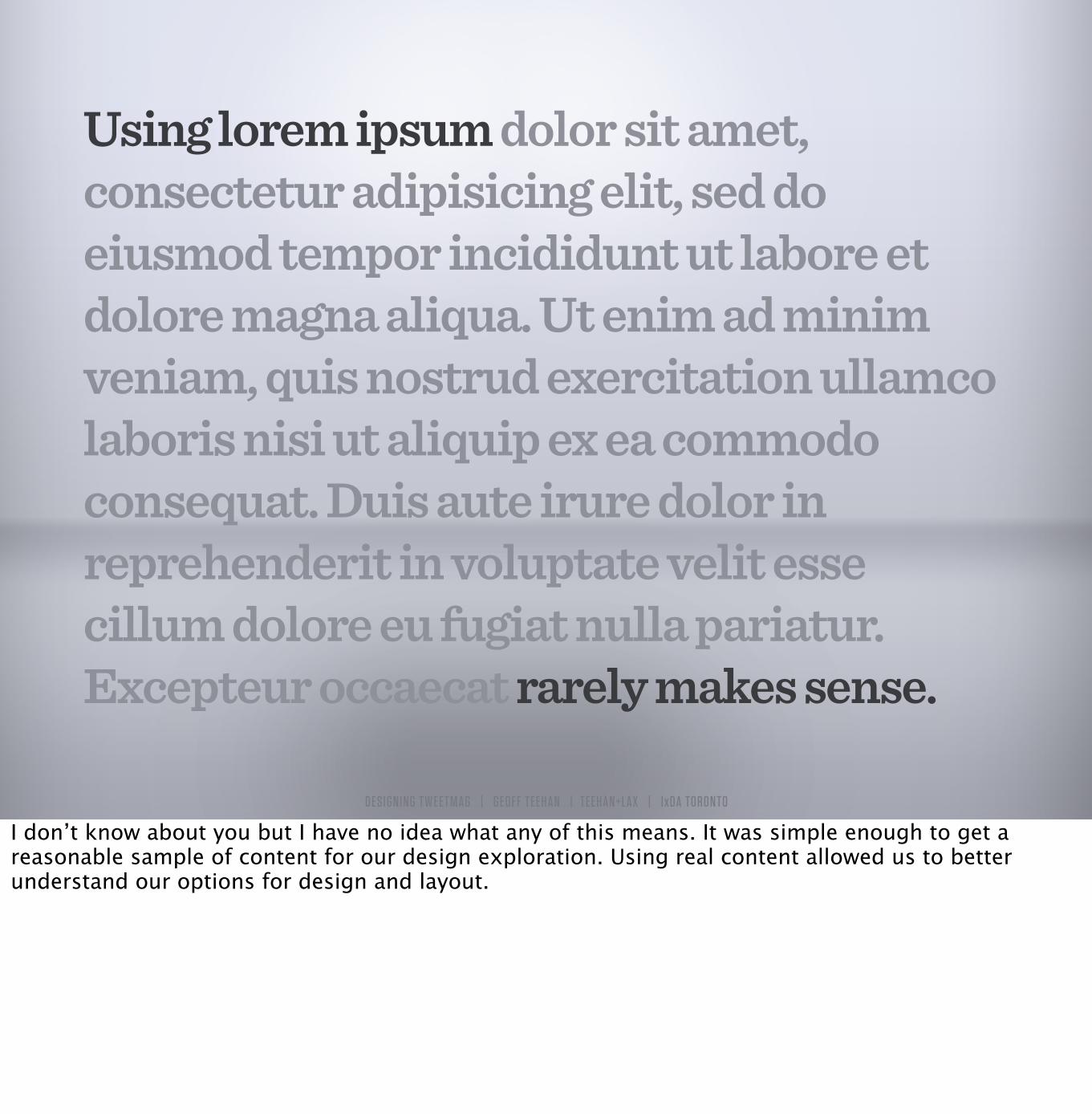
Using lorem ipsum dolor sit amet, consectetur adipisicing elit, sed do eiusmod tempor incididunt ut labore et dolore magna aliqua. Ut enim ad minim veniam, quis nostrud exercitation ullamco laboris nisi ut aliquip ex ea commodo consequat. Duis aute irure dolor in reprehenderit in voluptate velit esse cillum dolore eu fugiat nulla pariatur. Excepteur occaecat rarely makes sense.
I don’t know about you but I have no idea what any of this means. It was simple enough to get a reasonable sample of content for our design exploration. Using real content allowed us to better understand our options for design and layout.

D E S I G N I N G TW E E T M A G | G E O F F T E E H A N | T E E H A N + LAX | I x DA TO R O N TO
We started sketching out ideas that would allow us to give some hierarchy to the design. After a day or two of exploration we settled on an approach.

D E S I G N I N G TW E E T M A G | G E O F F T E E H A N | T E E H A N + LAX | I x DA TO R O N TO
We designing and built a prototype (in JS) to explore things like content awareness:Panels came in 3 sizes. They had an awareness of headline length, abstract availability, abstract length, image/video dimensions and ratios.Additionally, we wanted the panels and rows to be aware of what was around them. We built out a rules based engine that made smart layout decisions to keep things in order, but eliminated a monotonous, repetitive layout. This couldn’t have been realized with Lorem ipsum

We had a viable solution for an appropriate layout but the
design still lacked personality.
With the layout engine well underway we needed to explore visual ways to inject life into this product. Because we’re dealing with the written word we leaned heavily on typography to create visual interest rather than over designing an interface.

Academy Engraved LETAmerican TypewriterApple Color EmojiAppleGothicArialArial HebrewArial Rounded MT BoldBangla Sangam MNBaskervilleBodoni 72Bodoni 72 OldstyleBodoni 72 SmallcapsBodoni OrnamentsBradley HandChalkboard SEChalkdusterCochinCopperplateCourierCourier NewDB LCD Temp!वनागरी स)गम एम.एन.
DidotFuturaGeeza ProGeorgiaGill Sansग,जराती स)गम एम.एन.
ਗ"ਰਮ"ਖੀ MNHeiti JHeiti KHeiti SCHeiti TCHelveticaHelvetica NeueHiragino Kaku Gothic ProNHiragino Min ProNHoefler TextKailasaKannada Sangam MNMalayalam Sangam MNMarker FeltOptimaOriya Sangam MNPalatinoPapyrusParty LETSinhala Sangam MNSnell RoundhandTamil Sangam MNTelugu Sangam MNThonburiTimes New RomanTrebuchet MSVerdanaZapf DingbatsZapfino
D E S I G N I N G TW E E T M A G | G E O F F T E E H A N | T E E H A N + LAX | I x DA TO R O N TO
57 font options
We quickly hit roadblocks.Fonts are limited: 57 Families on iPad (it’s worse on iPhone).Custom was the only way, but existing solutions for embedding custom fonts lacked control over letter and line spacing - something that experimentation quickly proved we needed. In the end we had to build our own typesetting engine that enabled us to use custom fonts with control - this is a presentation unto itself.

D E S I G N I N G TW E E T M A G | G E O F F T E E H A N | T E E H A N + LAX | I x DA TO R O N TO
TUNGSTENSentinel&
We experimented a great deal with typography and eventually landing on a couple of faces by H&FJ.

D E S I G N I N G TW E E T M A G | G E O F F T E E H A N | T E E H A N + LAX | I x DA TO R O N TO
Here are some example panels illustrating the typography.

D E S I G N I N G TW E E T M A G | G E O F F T E E H A N | T E E H A N + LAX | I x DA TO R O N TO
Skip forward a couple of months and we made it to our next build. Much had been done on the backend at this point too since speed was (and continues to be) an issue - the next release should further address the speed issue.
Here is what came out when the focus turned to the UX.

D E S I G N I N G TW E E T M A G | G E O F F T E E H A N | T E E H A N + LAX | I x DA TO R O N TO
We had given the UX life by way of layout and typography. We kept visual overhead light. The Interface stayed simple and even became more consistent. We were designing for goals and tasks rather than timelines.

D E S I G N I N G TW E E T M A G | G E O F F T E E H A N | T E E H A N + LAX | I x DA TO R O N TO
(SORRY, TOO BIG TO EMBED ON SLIDESHARE)
View the video at:tweetmagapp.com
Quick video that explains what it is.

D E S I G N I N G TW E E T M A G | G E O F F T E E H A N | T E E H A N + LAX | I x DA TO R O N TO
Questions we kept in mind
WHAT IS THE GOAL?
WHAT IS THE PRIMARY TASK?
WHAT IS THE MINIMUM?
T H E S E A R E G O O D F O R A N Y P R OJ E CT
We were still working working fast, loose and collaboratively but there were a few things we kept asking ourselves.

D E S I G N I N G TW E E T M A G | G E O F F T E E H A N | T E E H A N + LAX | I x DA TO R O N TO
Questions we kept in mind
WHAT IS THE GOAL?
WHAT IS THE PRIMARY TASK?
WHAT IS THE MINIMUM?
T H E S E A R E G O O D F O R A N Y P R OJ E CT
Create a new way to discover and
consume content
Reading Articles
Discover feeds, read full articles,
share
- Create a new way to discover and consume content- Reading Articles- Discover Feeds, Read Full Articles, Share

D E S I G N I N G TW E E T M A G | G E O F F T E E H A N | T E E H A N + LAX | I x DA TO R O N TO
Managing Complexity
ARTICLESHEADLINE
ABSTRACTIMAGES/VIDEOS
SOURCEAUTHOR
DATERELATED
TWEETSTWEETUSER
AVATARTIME STAMP
LINKSHASH TAGS
RTs
All of those questions were really about managing complexity. From a content perspective alone, we had a lot of elements to deal with. Those three questions really helped keep things balanced, simple and focused.

D E S I G N I N G TW E E T M A G | G E O F F T E E H A N | T E E H A N + LAX | I x DA TO R O N TO
Controls needn’t always be buttons
Managing complexity in the design meant designing ways to access content and utility without using things like buttons.

D E S I G N I N G TW E E T M A G | G E O F F T E E H A N | T E E H A N + LAX | I x DA TO R O N TO
Controls needn’t always be buttons
CONTENT AS CONTROL
Content as control

D E S I G N I N G TW E E T M A G | G E O F F T E E H A N | T E E H A N + LAX | I x DA TO R O N TO
Controls needn’t always be buttons
CONTENT AS CONTROL
Tapping an article or mag made a ton more sense then explicit UI elements.

D E S I G N I N G TW E E T M A G | G E O F F T E E H A N | T E E H A N + LAX | I x DA TO R O N TO
Controls needn’t always be buttons
GESTURES
Gestures also allowed for simple access to secondary information without the use explicit interface elements.We often think of gestures as keyboard shortcuts.

D E S I G N I N G TW E E T M A G | G E O F F T E E H A N | T E E H A N + LAX | I x DA TO R O N TO
Controls needn’t always be buttons
GESTURES
To ease the learning curve we built multiple gestures into the same action. For example, to flip the panel you can swipe left, swipe right or double-tap.

D E S I G N I N G TW E E T M A G | G E O F F T E E H A N | T E E H A N + LAX | I x DA TO R O N TO
GESTURES
We used another gesture to invoke the rack. Some of these are learned through hints. Pulling down from any screen reveals this. You’ll occasionally see the rack begin to reveal itself when scrolling to the top. After 1 or 2 times you’ve learned the shortcut without much effort.

D E S I G N I N G TW E E T M A G | G E O F F T E E H A N | T E E H A N + LAX | I x DA TO R O N TO
OPTIMIZING ONSCREEN ELEMENTS
Putting all of these options on this screen would have been overwhelming...All grey “pills” reveal exploratory content. The popover element was a consistent, pre-built element that made perfect sense to use.

D E S I G N I N G TW E E T M A G | G E O F F T E E H A N | T E E H A N + LAX | I x DA TO R O N TO
OPTIMIZING ONSCREEN ELEMENTS
Combining like tasks using popovers eliminated the need to jam multiple actions into the UI by default. The iPad has a good deal of real-estate - it’s often tempting to fill it - resist!

D E S I G N I N G TW E E T M A G | G E O F F T E E H A N | T E E H A N + LAX | I x DA TO R O N TO
Custom vs Standard
bit.ly/appleHIG
Every app needs some level of customization. Apps that don’t push aesthetics or interactions are less likely to gain traction.Just need to be careful that you’re not needlessly designing custom elements that needn’t be custom.
iOS Human Interface Guidelines are full of great info:- Ideal hit areas"- understanding gestures and interactions- common interface components

D E S I G N I N G TW E E T M A G | G E O F F T E E H A N | T E E H A N + LAX | I x DA TO R O N TO
vs
iPhone vs iPadDesigning for iPad (or tablets) is not the same as designing for iPhone (or mobile)It's tempting to fill the space. Another way to think of it is this:The iPad requires designers to show restraint. The iPhone forces restraint.

D E S I G N I N G TW E E T M A G | G E O F F T E E H A N | T E E H A N + LAX | I x DA TO R O N TO
Tools that can help you

D E S I G N I N G TW E E T M A G | G E O F F T E E H A N | T E E H A N + LAX | I x DA TO R O N TO
GET THIS: bit.ly/LiveViewTool
Retina...Designing for high density screens.You can’t just design at 100% on your computer and expect everything to be right.You need to design it on the actual device...Liveview Screencast is the best tool for this.

D E S I G N I N G TW E E T M A G | G E O F F T E E H A N | T E E H A N + LAX | I x DA TO R O N TO
ipad/iphone gui templates.On August 17 I search for something similar but nothing existed so we created them. Aug 19, 2008 we uploaded our first PSD.Since then those pages have been visited about 5.3 million times. Traffic to our blog has increased: 2350%
Get them here: http://www.teehanlax.com/blog

D E S I G N I N G TW E E T M A G | G E O F F T E E H A N | T E E H A N + LAX | I x DA TO R O N TO
DOWNLOADS AT: TEEHANLAX.COM/BLOG
All fully editable.

D E S I G N I N G TW E E T M A G | G E O F F T E E H A N | T E E H A N + LAX | I x DA TO R O N TO
Thanks/Contct Info
GEOFF TEEHAN / TEEHAN+LAX / @GTEEHAN / TweetMagApp.comThank you