designing manufacturing dashboards on the basis of a key ... · the survey includes economic and...
TRANSCRIPT

This is an electronic reprint of the original article.This reprint may differ from the original in pagination and typographic detail.
Powered by TCPDF (www.tcpdf.org)
This material is protected by copyright and other intellectual property rights, and duplication or sale of all or part of any of the repository collections is not permitted, except that material may be duplicated by you for your research use or educational purposes in electronic or print form. You must obtain permission for any other use. Electronic or print copies may not be offered, whether for sale or otherwise to anyone who is not an authorised user.
Tokola, Henri; Niemi, Esko; Gröger, Christoph; Järvenpää, Eeva
Designing manufacturing dashboards on the basis of a Key Performance Indicatorsurvey
Published in:49th CIRP Conference on Manufacturing Systems (CIRP-CMS 2016)
DOI:10.1016/j.procir.2016.11.107
Published: 01/01/2016
Document VersionPublisher's PDF, also known as Version of record
Please cite the original version:Tokola, H., Niemi, E., Gröger, C., & Järvenpää, E. (2016). Designing manufacturing dashboards on the basis ofa Key Performance Indicator survey. In 49th CIRP Conference on Manufacturing Systems (CIRP-CMS 2016):Factories of the Future in the Digital Environment (pp. 619-624). (Procedia CIRP; Vol. 57). Elsevier B.V.. DOI:10.1016/j.procir.2016.11.107

Procedia CIRP 57 ( 2016 ) 619 – 624
Available online at www.sciencedirect.com
2212-8271 © 2016 Published by Elsevier B.V. This is an open access article under the CC BY-NC-ND license (http://creativecommons.org/licenses/by-nc-nd/4.0/).Peer-review under responsibility of the scientific committee of the 49th CIRP Conference on Manufacturing Systemsdoi: 10.1016/j.procir.2016.11.107
ScienceDirect
49th CIRP Conference on Manufacturing Systems (CIRP-CMS 2016)
Designing manufacturing dashboards on the basis of a Key Performance Indicator survey
Henri Tokolaa,*, Christoph Grögerb, Eeva Järvenpääc, Esko Niemia a Department of Engineering Design and Production, Aalto University School of Engineering, Puumiehenkuja 3, Espoo, 02150, Finland
b Graduate School of Excellence advanced Manufacturing Engineering (GSaME), University of Stuttgart, Stuttgart, 70569, Germany c Department of Mechanical Engineering and Industrial Systems, Tampere University of Technology, Korkeakoulunkatu 6, Tampere, 33720,
Finland
* Corresponding author. Tel.: +35850-4331091. E-mail address: [email protected]
Abstract
Target-oriented and real-time information provisioning across all hierarchy levels, from shop floor to top floor, is an important success factory for manufacturing companies to facilitate agile and efficient manufacturing. In general, dashboards – in terms of digital single-screen displays – address this challenge and support intuitive monitoring and visualisation of business performance information. Yet, existing dashboard research mainly focus on IT issues and lack a systematic study of the dashboard content. To address this gap, in this paper, we design three representative dashboards for manufacturing companies based on a comprehensive survey that focuses on suitable key performance indicators for different manufacturing target groups. The paper consists of three parts. First, the paper provides a literature review about design principles of dashboards. Second, it publishes the results of a survey of manufacturing companies on preferred key performance indicators (KPIs) for dashboards and the use of dashboards. Third, using the results obtained from the survey, three representative manufacturing dashboards are designed: an operational dashboard for workers, a tactical dashboard for managers and a strategy dashboard for executives. The results underline that different KPIs are preferred for dashboards on different hierarchy levels and that mobile usage of dashboards, especially on tablet pcs, is favoured. © 2015 The Authors. Published by Elsevier B.V. Peer-review under responsibility of Scientific committee of the 49th CIRP Conference on Manufacturing Systems (CIRP-CMS 2016).
Keywords: Dashboards; Key Performance Indicators (KPIs); Scorecard
© 2016 Published by Elsevier B.V. This is an open access article under the CC BY-NC-ND license (http://creativecommons.org/licenses/by-nc-nd/4.0/).Peer-review under responsibility of the scientifi c committee of the 49th CIRP Conference on Manufacturing Systems
620 Henri Tokola et al. / Procedia CIRP 57 ( 2016 ) 619 – 624
1. Introduction
Target-oriented and real-time information provisioning across all hierarchy levels, from shop floor to top floor, is an important success factory for manufacturing companies to facilitate agile and efficient manufacturing [1]. A dashboard is a single-screen display that shows this important information about a company so that the whole situation, for example, in a factory or on a production line, can be quickly understood [2]. Dashboards are likely to become more common as digitalisation replaces Excel-based production control (see e.g. [3]) with more sophisticated manufacturing execution systems which typically contain some kind of dashboard. The low and still-decreasing costs of equipment such as smartphones, large screens and tablets is another factor that favours the use of dashboards. The lean paradigm, which is often used in manufacturing, also favours the use of visualisations to get the whole picture of what is happening in the factory quickly. This picture can be shown as a dashboard.
Dashboards are not a new thing and therefore it is not a surprise that they appear in the scientific literature. There are several different approaches to designing dashboards. Nadoveza and Kiritsis recently presented an idea of how the relevant information is anticipated by capturing the contexts of different users [4]. Similarly, Mazumdar et al. describe how the visualisation of dashboards is based on features such as user preferences, usage history, the current task, the scale of datasets and types of data [5]. Kapp et al. describe a concept where a dashboard called the “factory cockpit” is used together with simulation to anticipate potential challenges [6]. The study of Shamsuzzoha et al. focuses on SMEs and how they can form virtual factories and benefit from common dashboards [7].
It is not clear what information should be contained in dashboards. In the literature, it is said that different users and companies want to have different information. However, this is the all knowledge that seems to be appear about the information contents of dashboards. Thus, it is important to extend this knowledge and find out what kind of information is wanted by persons in different positions of the company.
Our paper describes a survey which focuses on what the important KPIs that should be used in production dashboards are. The survey includes economic and technical KPIs from the sales, costs, quality and production perspectives. In the era of sustainable manufacturing, indicators other than economic and technical ones have also become relevant. Therefore environmental and social, employee-related, indicators were also included in the survey. A similar survey exists of the use
of dashboards in sales [8], but according to our knowledge, few papers have surveyed what the most important manufacturing KPIs in dashboards are, as is done in this paper. The only mention of a manufacturing-related survey that was found was a paper by Gröger et al., where they state that they conducted an exploratory survey to find out relevant information for dashboards [9]. However, they do not give more details of their interviews. This paper also uses the results of a survey to design representative dashboards. Related dashboards were constructed by Gröger et al. [9, 10]. However, they do not have any systematic survey in their planning, as is the case here.
The paper is organised as follows. A literature review about designing dashboards is conducted in Section 2. Section 3 contains the results of the key performance indicator survey. The results of the survey are used to design representative dashboards that are shown in Section 4. Section 5 collects the key managerial insights from the previous sections and Section 6 concludes the paper.
2. Designing principles of dashboards
Dashboard design is different from other visualisation systems. It should be just a single-screen display and thus it should not have e.g. scrollbars or multiple windows [2]. It should also mainly be a static display, so that it does not have any distracting functionalities. The position of the information on the screen is important [2]. The top left and centre should contain the most important information.
An extensive dashboard design review was conducted by Yigitbasioglu and Velcu [11]. They discussed the way information appears on the dashboard and found out several interesting features, such as the following. Tabular information about data is superior to graphs [12]. However, e.g. sales forecasts are better in graphical form [13]. Graphs also reduce the information overload when compared to e.g. tabular information [14].
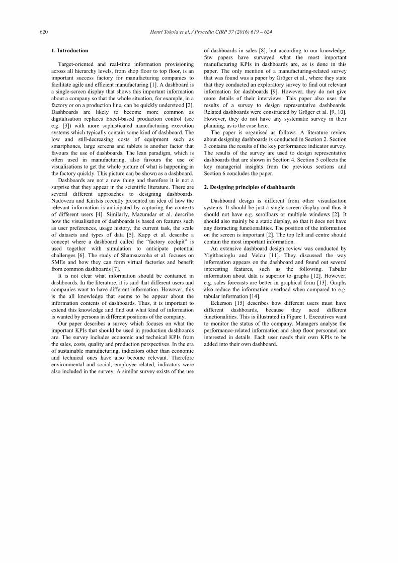
Eckerson [15] describes how different users must have different dashboards, because they need different functionalities. This is illustrated in Figure 1. Executives want to monitor the status of the company. Managers analyse the performance-related information and shop floor personnel are interested in details. Each user needs their own KPIs to be added into their own dashboard.

621 Henri Tokola et al. / Procedia CIRP 57 ( 2016 ) 619 – 624
Fig. 1. Different users in a company need different functionalities and different dashboards [13].
A scorecard is one way to find out the KPIs which should be collected from the company [16]. This, however, is only valid for managers who want to see the strategic KPIs of the company. With this limitation in mind, next, in Section 3, the importance of a high number of manufacturing KPIs is evaluated using a survey. The aim is to find out how different users need different KPIs. We could not find this kind of information from the literature. One reason for this might be that every company needs its own customised KPIs.
3. Survey on manufacturing dashboards
An exploratory survey was conducted in order to gain insights into how users want to see manufacturing dashboards, which key performance indicators (KPIs) should be shown on manufacturing dashboards and what is the preferred type of usage. The survey got 11 responses from people from various positions in five different Finnish manufacturing companies. The companies were from the machining industry and they included OEMs and subcontractors. Table 1 shows the questions in the survey. Question 1 was about the employee type, for which Figure 2 shows the statistics for the responses.
Table 1: Questions in the survey. No Question Options
1 What is your position in the company?
Worker/Foreman/ Development engineer/Production manager/CEO
2 What is a good general time period for the data that is shown on dashboards?
Second/Minute/ Hour/Day/Week/ Month/Year
3 What equipment do you want to use to view the dashboard?
Big screen/Tablet/ Laptop/PC/ Smartphone
4 How important are the following key performance indicators (KPIs)?
5 different sales-related KPIs, rate from 1 to 5
5 How important are the following KPIs?
15 different costs-related KPIs, rate from 1 to 5
6 How important are the following KPIs?
12 different quality-related KPIs, rate from 1 to 5
7 How important are the following KPIs?
35 different production-related KPIs, rate from 1 to 5
8 How important are the following KPIs?
15 different worker-related KPIs, rate from 1 to 5
9 How important are the following KPIs?
17 different environment-related KPIs, rate from 1 to 5
Fig. 2. Employee type counts of survey respondents.
General information about the use of dashboards was collected in the survey. In Question 2, the respondents were asked about the time period they want to see on the dashboard. The results of that are shown in Figure 3. The respondents were also asked about the equipment they want to use to see the dashboard (Question 3). These results are shown in Figure 4. In both of these questions, the respondents were able to choose multiple answers.
The survey included 99 KPIs that the respondents were asked to rate according to their importance (1 to 5, where 1 is not important and 5 is very important). The KPIs were from six different areas: sales (Question 4), costs (Question 5), quality (Question 6), production (Question 7), workers (Question 8) and the environment (Question 9). The average importance of the KPIs in these areas is shown in Figure 5.
Fig. 3. Time period of KPI data.
Fig. 4. Equipment.

622 Henri Tokola et al. / Procedia CIRP 57 ( 2016 ) 619 – 624
Fig. 5. Average interest in different KPI areas (between 1-5).
The most important KPIs from all areas were collected in Table 2, which also shows the time frames where the KPIs should be used. On each time scale, there are several KPIs that
Table 2: Interest in KPIs on different time scales. X denotes that the
average interest is above or equal to 4.0 for the respondents who selected the
corresponding time period. KPI Average
Interest (between 1-5)
Min-Hour
Day-Week
Month-Year
Delivery reliability (Production)
4.8 X X X
Delivery punctuality (Production)
4.7 X X X
Production lead time (Production)
4.5 X
Order to delivery lead time (Production)
4.2 X X
Resource utilisation rate (Production)
4.2 X X
Overall equipment effectiveness index (Production)
4.2 X X
Reclamations (Quality)
4.1 X X
Capacity utilisation rate (Production)
4.1 X
Factory productivity (Production)
4.1 X X
Quality of items produced (Quality)
4.0 X X
Amount of products that are of good quality (Quality)
4.0 X
Suppliers’ quality (Quality)
4.0 X
Quantity produced (Production)
4.0 X
System/line/ workstation efficiency
4.0 X X X
(Production)
are important on that time scale but not in others. These are omitted from the table if the average interest is below 4.0. On a minute-hour time scale, important KPIs include cycle time, the production queue, setup time, efficiency of production flow, and inventory levels. On a day-week scale, all the important KPIs appear in the table. On a month-year scale, other important KPIs are job motivation and satisfaction, absenteeism, labour productivity, production line productivity, warranty costs, value of inventory and turnover of inventory. On a month-year scale sales data was more important than on the other scales.
Next, the results of the survey are used to design three representative manufacturing dashboards in Section 4.
4. Representative manufacturing dashboards
Using the results obtained from the survey, three representative manufacturing dashboards are designed: an operational dashboard for workers, a tactical dashboard for managers and a strategy dashboard for executives. The dashboards were prototypically implemented using the Dashing framework [17]. Using the Dashing framework it is easy to construct a dashboard by selecting from the ready-made components or by implementing own components using technologies such as SCSS, JavaScript and CoffeeScript. The dashboards were designed in such a way that they can be viewed on mobile devices such as tablets. The actual data for the dashboards is still randomly generated, but in the future the data should be collected from actual production and machines. The type of data included into the dashboards is based on the results of the survey that was described in Section 3. The most important KPIs were included in each dashboard, and duplicate information on different dashboards was avoided. The information was added to the dashboard where it would be the most natural.
The first dashboard is the operational dashboard for workers (Figure 6), which shows the status of the factory floor and job queue. The time period is minutes to an hour. Although the survey showed that all kinds of information are also important in near-real time, the design of the operational dashboard focused on the status of the machines and job queue, as in the survey they were what was most wanted in the case of the minute-hour time scale. The colours are used to show the status of the machines quickly. Small icons are used to show the status of jobs in the job queue. All this allows the user to quickly see the current efficiency of the shop floor.
The second dashboard is the tactical dashboard for production managers (Figure 7), which shows utilisation details, the OEE of the most important machines, the production lead time for jobs, delivery reliability, line efficiency and reclamations. The time period of the dashboard is a day to a week. The information shown was again selected because it was important for the selected time frame in the survey. The idea of the dashboard is to contain lots of information, so that the user can also find out the details. Utilisation and OEE data are shown in tabular form.

623 Henri Tokola et al. / Procedia CIRP 57 ( 2016 ) 619 – 624
The third dashboard is the strategy dashboard for executives (Figure 8), which shows the forecast of on-time delivery, workers, lead time from an order, total productivity of lines, demand information, manufacturing costs and inventories. The time period of the dashboard is a month to a year. The dashboard is based on the information that is typically inserted into a balanced scorecard [16]. Again, similarly to the tactical dashboard, the purpose is to have lots of information on a single screen. The difference from other dashboards is that now there are employee-related KPIs, sales data, costs and inventory details. Several details are shown in tabular form.
5. Managerial insights
This section discusses the previous parts of the paper and finds out relevant insights that were raised when the dashboards were designed and implemented.
Section 2 discussed the dashboard design principles. Tabular data and graphs should be used to display data. It appeared that the KPIs that should be shown on the dashboards have not been studied in the literature with a focus on manufacturing companies. An exception is the scorecard, which can be used to choose strategy KPIs. Small icons are used to show the statuses of the tabular values so that the importance of the values can be perceived quickly.
Fig. 6. Operational dashboard for workers.
Fig. 7: Tactical dashboard for production managers
Fig. 8. Strategy dashboard for executives.
Our survey in Section 3 gives us several key insights. First, as shown in Figure 2, a day was often the most desired time period for a dashboard. Second, as shown in Figure 3, a tablet was, interestingly, the most popular way to use the dashboard (73% of the respondents). As shown in Table 2, workers from different positions want to see the same KPIs, such as delivery reliability and line/workstation efficiency.
Results of the survey are not simple to use for the designing of dashboards. The results of the survey were not simple to use in the designing of the dashboards. It was not possible to implement all the interesting KPIs in the dashboards. It also seems that similar information is needed by different actors on different levels of the companydifferent actors on different levels of the company need similar information. The actual presentation of the data might be different though, as shown in the examples in Section 4.
Although the data is still fictitious, it still took several weeks to implement and fine-tune the dashboard. It will also takes a long time to actually implement the functionality to get the data from the shop floor to the dashboards. The currently common practice of planning production with a combination of ERP and various Excel spreadsheets does not support reliable and real-time data collection to the dashboards [3]. Thus, a dashboard might be an expensive investment in practice. However, existing data warehouse that integrates ERP and MES data significantly eases theimplementation of dashboard [18]. ERPs are generally able to handle the information needed for a strategic dashboard, while MES is needed for tactical and operational dashboards. Some of the ERP and MES systems already provide dashboards as their basic functionality.
6. Conclusion and future work
This paper studies the design of manufacturing dashboards. The paper is based on a survey in which manufacturing companies were asked about the KPIs they want to see in their dashboards and about their and about their preferred type of dashboard usage. The results of the survey were used in the designing of representative dashboards: an operational dashboard for workers, a tactical dashboard for managers and a strategy dashboard for executives. The most important findings are:
• most of the respondents of the survey want to use mobile dashboards on tablets;

624 Henri Tokola et al. / Procedia CIRP 57 ( 2016 ) 619 – 624
• reliability and punctuality of delivery are the most important manufacturing KPIs, and they are wanted by all workers, regardless of their positions;
• it is tedious to implement dashboards from scratch without an existing ERP and MES system or a manufacturing data warehouse.
In our future work, we plan to refine our prototypical dashboard implementation e.g. by inserting drill-in capability, bullet graphs and some kinds of figures into the dashboards in the near future. It is also planned to implement an integrated manufacturing data warehouse for data provisioning.
Acknowledgements
This research was carried out as part of the Finnish Metals and Engineering Competence Cluster (FIMECC)’s MANU programme in the LeanMES project.
References
[1] Bracht, U., Hackenberg, W. & Bierwirth, T. (2011), A monitoring approach for the operative CKD logistics, Werkstattstechnik, 101(3), 122–127.
[2] Few, Stephen. Information dashboard design. O'Reilly, 2006. [3] Järvenpää, E., Lanz, M., Tokola, H., Salonen, T. & Koho, M. (2015).
Production planning and control in Finnish manufacturing companies – Current state and challenges. In the Proceedings of 25th International Conference on Flexible Automation and Intelligent Manufacturing, FAIM2015.
[4] Nadoveza, D., & Kiritsis, D. (2013, June). Concept for Context-Aware Manufacturing Dashboard Applications. In Manufacturing Modelling, Management, and Control (Vol. 7, No. 1, pp. 204-209).
[5] Mazumdar, S., Varga, A., Lanfranchi, V., Petrelli, D., & Ciravegna, F. (2012, January). A knowledge dashboard for manufacturing industries. In The Semantic Web: ESWC 2011 Workshops (pp. 112-124). Springer Berlin Heidelberg.
[6] Kapp, R., Weimer, T., & Westkämper, E. (2006). Factory Cockpit: A Factoy Simulator for the Entire Factory Life Cycle, 39th CIRP Int. In Seminar on Manufacturing Systems, Proceedings (pp. 203-208).
[7] Shamsuzzoha, A., Hao, Y., Helo, P., & Khadem, M. K. (2014). Dashboard User Interface for Measuring Performance Metrics: Concept from Virtual Factory Approach. In Proceedings of the 2014 International Conference on Industrial Engineering and Operations Management.
[8] Velcu-Laitinen, O., & Yigitbasioglu, O. M. (2012). The use of dashboards in performance management: evidence from sales managers. The International Journal of Digital Accounting Research, 12(18), 39-58.
[9] Gröger, C., Hillmann, M., Hahn, F., Mitschang, B., & Westkämper, E. (2013). The Operational Process Dashboard for Manufacturing. Procedia CIRP, 7, 205-210.
[10] Gröger, C., & Stach, C. (2014, March). The mobile manufacturing dashboard. In Pervasive Computing and Communications Workshops (PERCOM Workshops), 2014 IEEE International Conference on (pp. 138-140). IEEE.
[11] Yigitbasioglu, O. M., & Velcu, O. (2012). A review of dashboards in performance management: Implications for design and research. International Journal of Accounting Information Systems, 13(1), 41-59.
[12] Dilla, W. N., & Steinbart, P. J. (2005). The effects of alternative supplementary display formats on balanced scorecard judgments. International Journal of Accounting Information Systems, 6(3), 159-176.
[13] Hasbun A. (2009). An Empirical Investigation: Do Animated Graphs Improve the Quality of Sales Forecasting Decisions in Comparison to Tables? Master’s Thesis, Hanken School of Economics.
[14] Diamond, L., & Lerch, F. J. (1992). Fading frames: Data presentation and framing effects. Decision Sciences, 23(5), 1050.
[15] Eckerson, W. W. (2010). Performance dashboards: measuring, monitoring, and managing your business. John Wiley & Sons.
[16] Kaplan, R. S., & Norton, D. P. (1995). Putting the balanced scorecard to work. Performance measurement, management, and appraisal sourcebook, 66.
[17] Dashing – The exceptionally handsome dashboard framework. http://dashing.io/
[18] Gröger, Christoph; Schwarz, Holger; Mitschang, Bernhard: The Manufacturing Knowledge Repository. Consolidating Knowledge to Enable Holistic Process Knowledge Management in Manufacturing. In: Proceedings of the 16th International Conference on Enterprise Information Systems (ICEIS), Lisbon, Portugal. SciTePress,