designing for a multi-platform digital product
TRANSCRIPT

Kyle McConnell@kylefoundry

Kyle McConnellCreative Director
@kylefoundry @bellycard

Designing for a Multi-platform Digital Product

Kyle, what does that even mean?
Tablet iPhone Android Web

The state of Belly on my first day

iPhone
Tablet
Android

Branding a Digital Product

Logo Design Considerations
Will the logo look good as an app icon?
Will is still be legible in smaller sizes?
Is it simple enough to be instantly recognizable?

Brand Colors Considerations
• Are they eye-catching enough?
• Will one or more of them make a good button color?
• Make sure the colors are not similar to your direct competitors.
• Your main color should work well for headers, app icons, etc.

Brand Fonts Considerations
• Is it legible at smaller sizes?
• For web products:Does it come as a web font?
• Are there enough font weights to work with?
A B C D E F G H I J K L M N O P Q R S T U V W X Y Z a b c d e f g h i j k l m n o p q r s t u v w x y z 0 1 2 3 4 5 6 7 8 9 ! @ # $ % ^ & * Light Regular Medium Bold
Open Sans

Brand Copywriting Considerations
• Give your product a distinct voice.
• Keep copy as short as possible.
• Don’t let your brand voice cause user confusion by making actions unclear.

Cross-Platform Consistency

Cross-Platform Consistency
Maintain feature parody between platforms. App functionality should be identical.

Cross-Platform Consistency
Keep app icons similar and easily recognizable
iPhone Android

Cross-Platform Consistency
Keep headers, buttons, icons, etc all the same color, but do style them slightly differently to fit the styles of each platform.
iPhone Android

Stay True to the Platform

Stay True to the Platform
• Stay true to the UI (user interface) design paradigms of the platform.
• The cheapest and fastest way to build an intuitive app is to use the given UI elements per platform.
• An instantly intuitive app is more valuable than an overly customized app.

Stay True to the Platform
Put your brand spin on the app but do not introduce new unproven UI paradigms.

Stay True to the Platform
• A-B test unproven UI paradigms to gauge impact on the user experience.
• Branding an interaction is good, as long as it tests better than the baseline and is intuitive and enjoyable.

Stay True to the Platform
• Do not port an iOS app directly over to Android and vice versa.
• Native apps are more intuitive.
• This causes bad user juju. Especially Android users.
• Your app might come across feeling cheap.
iPhone Android
NOOOOO :(

Why Does This All Matter?

Why it All Matters
• Using provided UI elements makes your app instantly intuitive.
• Consistent user experience(aka happy users!).
• Brand recognition.
• For early stage startups: Grab investor attention!

First Steps Towards Consistency
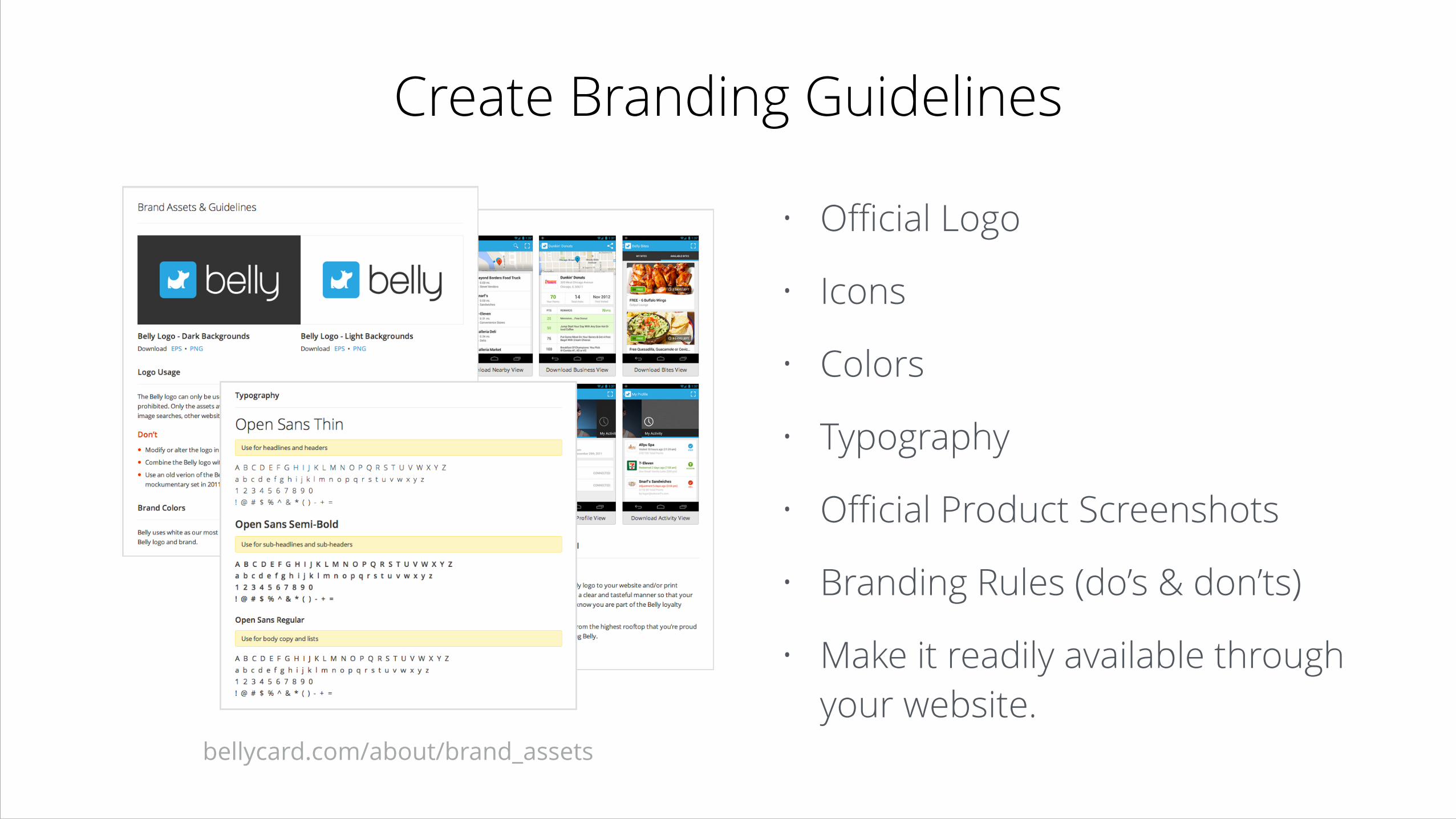
Create Branding Guidelines
• Official Logo
• Icons
• Colors
• Typography
• Official Product Screenshots
• Branding Rules (do’s & don’ts)
• Make it readily available through your website.
bellycard.com/about/brand_assets
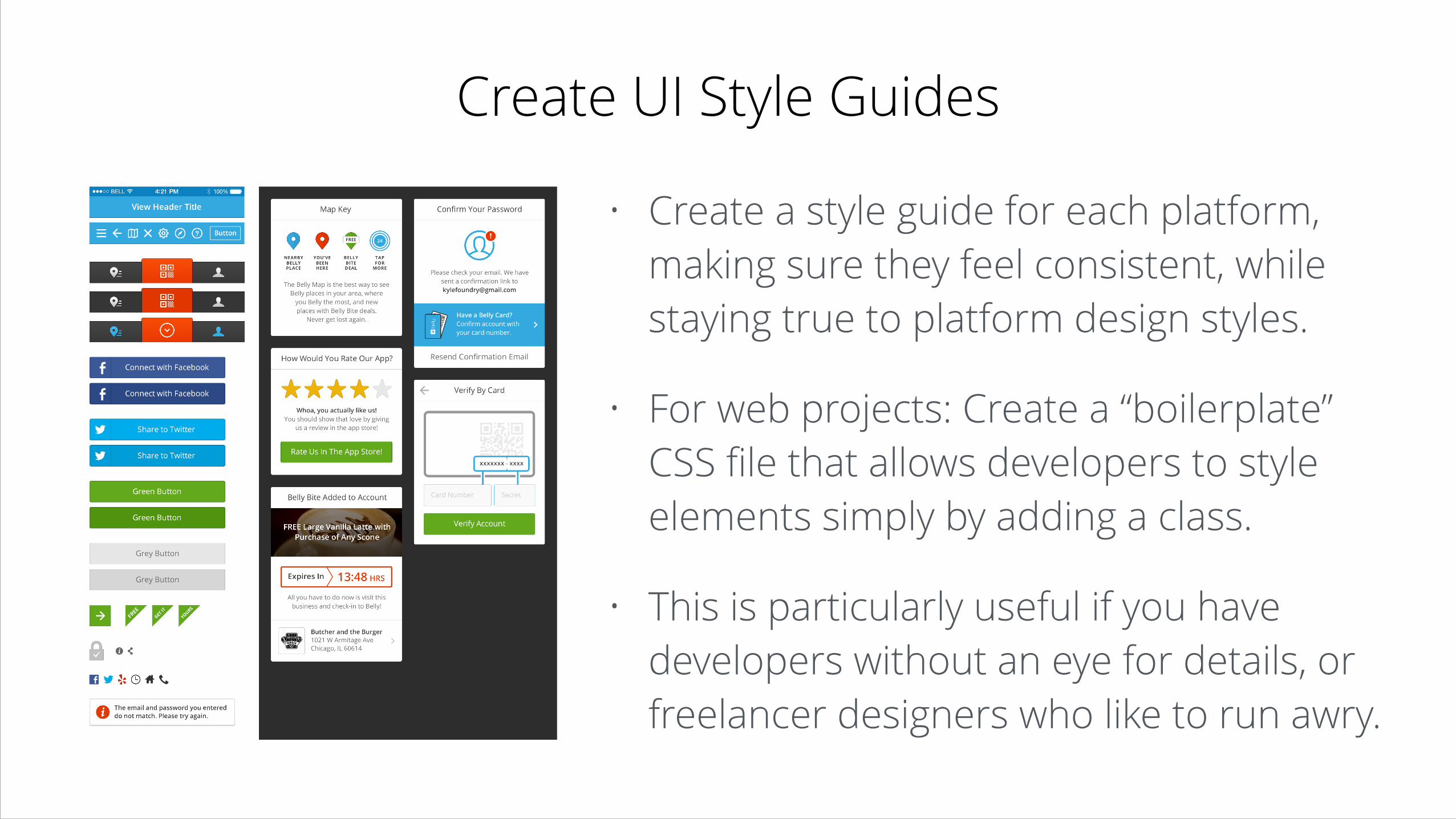
Create UI Style Guides
• Create a style guide for each platform, making sure they feel consistent, while staying true to platform design styles.
• For web projects: Create a “boilerplate” CSS file that allows developers to style elements simply by adding a class.
• This is particularly useful if you have developers without an eye for details, or freelancer designers who like to run awry.

So Let’s Review…
• Think about what will work well in an app when creating your branding.
• Platform specific UI elements are supplied for a reason, so use them. :)
• Whatever you do, don’t port an app design between platforms!
• Don’t over-design your app or create unfamiliar interactions.
• Test, test, and test again when it comes to new interaction paradigms.
• Create branding and UI guidelines (especially if you work with freelancers).

Questions?