de stijl - fidmdigitalarts.com...
TRANSCRIPT

De StijlBy, Nicole Mercado

Fromtheoutbreakofnewartmovementsthatfollowedthe Impressionists’ revolutionary new perception of painting,Cubism arose in the early twentieth century as an importantandinfluentialnewdirection.IntheNetherlands,too,therewasinterest in this “new art.”However, because theNetherlandsremainedneutral inWorldWar I,Dutchartistswerenot ableto leave the country after 1914 and were isolated from theinternational art world. During that period, painterTheo vanDoesburg started looking for other artists to start a journal/magazine and artmovement influencedby someof the ideasofDada,whichwaslaterfoundedinthelatesummerof1917and called De Stijl, Dutch for “The Style”, also known asneo-plasticism,which took its name fromaDutchmagazine.
The De Stijl Movement, sought to express a newutopian idealof spiritualharmonyandorder.Theyadvocatedpureabstractionanduniversalitybyareductiontotheessentialsof formandcolor; they simplifiedvisual compositions to theverticalandhorizontaldirections,andusedonlyprimarycolorsalongwithblackandwhite.Mondrianhimselfsetsforththeselimitations in his essay ‘Neo-Plasticism in PictorialArt’. Hewrites, “... this new plastic idea will ignore the particularsof appearance, that is to say, natural form and color. On thecontrary,itshouldfinditsexpressionintheabstractionofformand color, that is to say, in the straight line and the clearlydefinedprimarycolor.”DeStijlwasnotlimitedjusttopainting;italsoincludedarchitecture,stagesetsandfurnituredesign.I
One
finditveryfascinatingthataworkofartcanbeverybeautifulwith the use of just primary colors, simple shapes such assquares and rectangles andonlyvertical andhorizontal lines.
ThemovementspreadthroughoutEuropeandAmerica,themovementoriginatedformtheNetherlands,forgenerationstheNetherlandshadbeenbuiltupwithindustryandmechanicalstructures. Precision and accuracywere a part of the culture,straight linesandrightanglescouldbeseeneverywhere.TheDeStijl carried quite an influence into the artworld and thedesign of architectural workings. Despite a fairly fleetingexposure,theDeStijlgroupcouldpossiblybeconsideredthemostimportantcontributionmadebytheNetherlandstowardsthe development ofmodern art.TheDe StijlmovementwasfoundedbyTheoVanDoesburgandwasjoinedbyagroupofartists and architects, which include painters: PietMondrian,BartAnthonyVanderLeck,andVilmosHuszar.Thearchitects:Gerrit Rietveld, Jacobus Johannes Pieter Oud, and others.Workinginabstractgeometricstyle.AccordingtoMeggs“DeStijl sought universal laws of equilibrium and harmony forart,whichcould thenbeaprototype foranewsocialorder”.
TheoVanDoesburgaka(Mr.Diagonal)aDutchartist,practicing in painting, writing and poetry, architecture andfounderoftheDeStijlmovementappliedDeStijlprinciplestoarchitecture,sculptureandtypography.Heeditedandpublished
Two
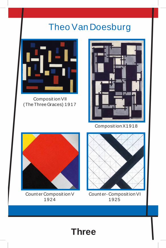
Theo Van Doesburg
Three
Composition VII (The Three Graces) 1917
Composition X 1918
Counter Composition V 1924
Counter- Composition VI 1925

Contra-Composition XVI 1925
Simultaneous Counter-Composition
1929
Arithmetic Composition 1930
Four

the journal De Stijl from 1917 untilhis death in 1931, primarily with hisown limited resources.Healso taughtfor a short period at theBauhaus andcollaboratedonnumerousarchitecturalprojects.TheDe Stijl journal advocated the absorption of pureart by applied art though architectural, product andgraphicdesign.AccordingtoDarwent“VanDoesburgproclaimed diagonals to be better than horizontalsand verticals, which he saw as classicizing, old-fashionedandworstofallbasedonthehumanbody”.His aesthetic of typography and architectural formcanbeseenonhisbookcoverthathedesignedwithcollaborationwithHungarianArtistLaszloMoholy-Nagy.Thereisastructuredcomposition,thepieceisformed with common red, yellow and blue shapesdivided by strong black horizontal and verticallines covered inwhite text.The piece is absolutelyamazing.Thesimplicityofitiswhatmakesthepieceso interesting. Another amazing piece that I verymuch liked was the Counter Composition V. Thepiece is verypowerful because the shapesused arepositioned in adiagonal structuremaking thepiecefeellikeitisthereismovement.Themainfocalpoint
Five
Six
is the red square in themiddlewhichwas thefirst thing thatmyeyeisdrawntoandI’msureoncepeoplelookatthispiece,thesimplicityandpowerfulnessofitwillcapturetheviewer’sattentionalsoasitdidmine.TherearealsonumerousamountsofotherpaintingsthathehaspaintedthatIwasfascinatedbysuchastheArithmeticComposition,CompositionXandmanymore.Hisinfluencewaswidespreadandheisnowregardedasoneofthemost importantabstractpaintersof theearly20thcentury.
Piet Mondrian also another artist of the De Stijlmovement;hewasaDutchpainterandanimportantcontributortomovement.Despitebeingwellknown,Mondrian’spaintingsexhibitedcomplexitysimplicity.Hispaintingswerebestknowntoconsistof rectangular formsof red,yellow,blue, separatedbythick,black,rectilinearlines,whichbecametheresultofastylisticevolutionthatoccurredoverthecourseofnearlythirtyyears,whichcontinuedbeyondthatpointtotheendofhislife.Heevolvedanon-representationalform,whichhetermedNeo-Plasticism,astyleofabstractpainting,usingonlyverticalandhorizontal lines and rectangular shapes in black, white, gray,andprimarycolors.AccordingtoChilvers“Heclaimedthatartshouldbe‘denaturized’,bywhichhemeantthatitmustbepurelyabstract,withnorepresentationalrelationtothenaturalworld.Tothisendhelimitedtheelementsofpictorialdesigntothestraight

Piet Mondrian
Composition in lines (Black and White) 1916- early 1917
Composition in Red, Blue, and Yellow
1937-42
New York City I 1941-42
Broadway Boogie Woogie 1942-43
Seven
Eight
lineandtherectangle(therightanglesinastrictlyhorizontal-vertical relation to the frame) and to theprimary colors—blue,red,andyellow—togetherwithblack,white,andgrey.Inthiswayhethoughtthatonemightescapetheparticularandachieveexpressionofan idealofuniversalharmony”.BeforeMondrian had joined in theDe Stijlmovement heoriginally painted traditional landscapes, symbolic styleinfluenced by Van Gogh paintings expressing nature andlatermoved cubism toward a pure, geometric abstraction.Hisworkwaslaterevolvedtoapuregeometricabstractionthatheiswellknowntodayfor.AccordingtoPietMindrain.orgMondriansays“Iconstructlinesandcolorcombinationsonaflatsurface,inordertoexpressgeneralbeautywiththeutmostawareness.Nature(or,thatwhichIsee)inspiresme,putsme,aswithanypainter,inanemotionalstatesothatanurgecomesabouttomakesomething,butIwanttocomeascloseaspossible to the truthandabstract everything from

Nine
that, until I reach the foundation (still just an externalfoundation!) of things… I believe it is possible that,through horizontal and vertical lines constructed withawareness,butnotwithcalculation,ledbyhighintuition,andbroughttoharmonyandrhythm,thesebasicformsof beauty, supplemented if necessary by other directlinesorcurves,canbecomeaworkofart,asstrongasitistrue”.Mondrian’sarttomeismyfavoritetypeofart;Ilovehowhehasusedsimpleshapestocomposeapiece.Therearesomanydifferentwayshehaspositionedtheyellow,blueandredrectanglesalongwiththeblacklinestocreateavarietyofpieces.Withinhiscollectionsomepieceshavemanylinesandmanycoloredrectanglesandother simply just have one square. My favorite piecethathehas created isTheBroadwayBoogie, abright,lively painting reflecting upbeatmusic.This piece hasnoblacklinesvisible,whichisrarebecausemostofhisotherpaintingscontainthem.Thisworkofartisuniqueanddifferentbecauseallthelinesareyellowandtherearesmall tinycoloredsquaresallover thepiece.Theyareinsidetheyellowlines;alsotherearesquareswithinsquares.Iabsolutelyloveitandwouldliketoownthispiece along with many other works of art I like thathehascreated.Mondrianhadaprofound influenceon

Ten
subsequentartandisnowseenasoneof the greatest of all modern artists.
BartAnthonyVanderLeckalsoanotherartistoftheDeStijlmovement;hewasaDutchpainter, designer, andceramicist.AfterhavingmetMondrianandvanDoesburghisstylebecamecompletelyabstract,asdidMondrian’s.ButafterdisagreementswithMondrianhisabstract style became based on representational images,which could be seen on the layout of the Batavier Lineposters.Thetwopostersaresodifferentfromthecommonred,blueandyellowrectanglecoloredschemeI’musedtoseeing.Ononeposterthereisnocolorusedatall,theonlythingthatkeepsthisworkofartasaDeStijlartpieceistheblackhorizontallinesthatarestructuredtoholdtheimagesonthepiece.TheotherpicturehascolorbutthecolorschemeisverydifferentfromthenormalDeStijlcolors,liketheotherpiece,theonlythingthatkeepsthisworkofartasaDeStijlartpieceistheblackhorizontallinesthatarestructuredtoholdtheimagesonthepiecebutinthispieceverticalblacklinesareused.HealsodesignedtheDeStijljournallogobyhavingthelettersconstructedfromanopengridofsquaresandrectanglesthatcanbeseenonthecoveroftheDeStijl.
Inhisstudieshecontinuedtorenderhissubjectsinblocksofeven,primarycolorsagainstawhitebackground,

Bart Anthony Van der Leck
Eleven
Layout for a Batavier Line Poster
1915-16
Batavier Line Poster 1916
Compositie 18 no. 1
1918
Composition with one grey stripe 1958
Composition 1918

Twelve
buthewould subsequently reduce the imagesby applyingmoreandmorewhiteovertheedges,‘paintingthemaway’,untilall that remainedweregeometricalshapessetagainstawhitebackground.LikeMondrian,hestoppedgivinghisworks titles.He only signed, dated and - for some time -numberedthemontheback.Hispaintingslookedratherlike
tangrampuzzles,withthefundamentaldifferencethatVanderLeek’sblocksofcolorwereneverallowedtotouch, let alone overlap, one another.His paintingsusually had a white background against which hehadimagesthatweresettomergeintoafairlywidewhite frame. In some cases, he painted a series ofunconnectedsquaresorrectanglesonthebordersofthe scene,which joined up in the observer’smind.Neverwasthisframetobeclosed,heevenpreferrednot to have black lines printed around illustrationsofhiswork,becausehefeltitwoulddisconnectthepainting from its surroundings. According to Vander Leek’s rather metaphysical theory, ‘open’, orunconnected,shapessetagainstawhitebackgroundgave the work itself an ‘openness’ and allowed itssurroundings tokeep influencing it. Inotherwords,that‘openness’preventedthepaintingfrombecomingstultified and ultimately futile. Initially it was

Thirteen
possible,with a little determination, to identify the originalobjects,buttheygrewincreasinglyindistinctinthecourseof1917,asVanderLeekbecamemorefocusedonthestructureofhiscompositions.Hedistributedhisblocksofcoloroverthepictureplaneaccordingtoanimaginaryschemeofhorizontal,verticalanddiagonallines,withrotationplayinganincreasingrole. Van der Leek’s paintings no longer had anything todo with his original starting points in the visible world.
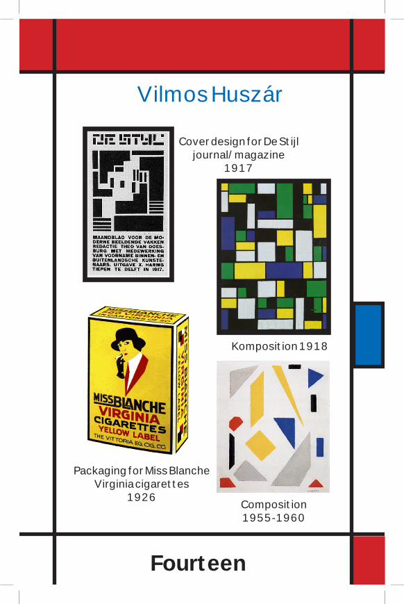
Vilmos Huszár also another artist of the De Stijlmovement; was a Hungarian painter and designer. Hedesigned the cover for the first issue. In 1918 he designedinteriorcolorschemesforthebedroomofBruynzeelhouseinVoorburg.From1920to1921hecollaboratedwithPietZwartonfurnituredesigns.Heleft theDeStijlgroupin1923andcollaborated with Gerrit Rietveld on an exhibition interiorfor the Greater Berlin Art Exhibition. From 1925, Huszárconcentrated on graphic design and painting. In 1926 hecreatedacompletevisualidentityforMissBlancheVirginiacigarettes,whichincludedpackaging,advertising,andpoint-of-saledisplays.Theconceptdrewontheimageryassociatedwiththe“NewWomen”,orFlappers,thatwereemerginginthe1920s.TheFlapperswereperceivedasyoung,single,urban,andemployed,with independent ideasandacertaindisdainfor authority and social norms. The smoking of cigaretteswascloselyassociatedwith thisnewlyfoundindependence.
Hisworks of art are a bit different from the normal
Fourteen
Vilmos Huszár
Cover design for De Stijl journal/magazine
1917
Komposition 1918
Packaging for Miss Blanche Virginia cigarettes
1926 Composition 1955-1960

Fifteen
De Stijl art pieces. For example in his painting titledKomposition, he has used different colors, not the averageyellow,redandblue,heswitchedouttheredandaddedgreen.The piece looks completely different from all the otherDeStijlpiecesbecausethewholecolorschemehaschangedfromabrightwarmcolorschemetoadarkcoolcolorschemebutin his painting tiled Composition he has used the De Stijlcolorschemebut theonlythingdifferentabout thispieceisthat the shapes aren’t the average squares, they have beendistortedinawaythatsomelookliketriangleswhichisn’tabadthingatall,Ilikeitbecauseitisdifferent.AlsoHuszarcombinedhisblackandwhitecompositionwithtypeandVanDoesburg’slogotocreatearectangleinthecenterofthepage.
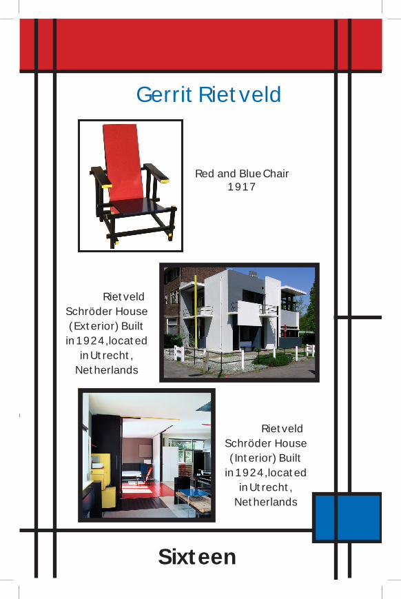
Gerrit Rietveld also another artist of the De Stijlmovement; was a Dutch furniture designer and architect.RietveldisfamousforhisRedandBluechair,builtin1917isoneofmyabsolutefavorites.ThischairembodieseverythingabouttheDeStijlmovement,theuseofcolorsisspotonandtheusedofshapesonthebackrestandseatonthechairarejustsimplyperfect.Thechairinawaylookslikea3Deffect.Thechairwasdesigned for theRietveldSchröderHouse,whichis aUNESCOWorldHeritage Site. In 1918, he started hisown furniture factory, and changed the chair’s colors afterbecominginfluencedbythe‘DeStijl’movement,ofwhichhebecameamemberin1919,thesameyearinwhichhebecamean architect. He designed his first building, the Rietveld
Sixteen
Gerrit Rietveld
Red and Blue Chair1917
Rietveld Schröder House
(Exterior) Built in 1924,located
in Utrecht, Netherlands
Rietveld Schröder House
(Interior) Built in 1924,located
in Utrecht, Netherlands
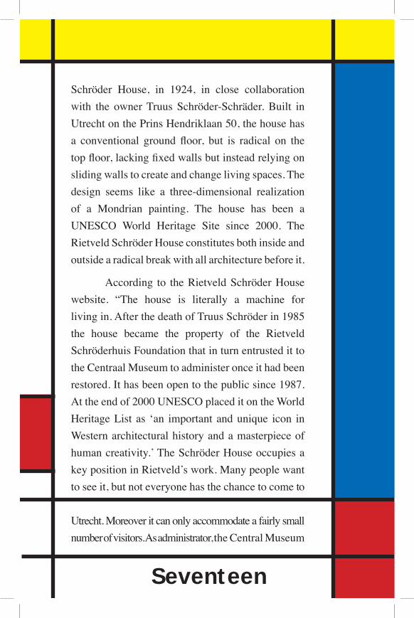
Schröder House, in 1924, in close collaborationwith the ownerTruus Schröder-Schräder.Built inUtrechtonthePrinsHendriklaan50,thehousehasa conventional ground floor, but is radical on thetopfloor,lackingfixedwallsbutinsteadrelyingonslidingwallstocreateandchangelivingspaces.Thedesign seems like a three-dimensional realizationof a Mondrian painting. The house has been aUNESCO World Heritage Site since 2000. TheRietveldSchröderHouseconstitutesbothinsideandoutsidearadicalbreakwithallarchitecturebeforeit.
According to theRietveldSchröderHousewebsite. “The house is literally a machine forlivingin.AfterthedeathofTruusSchröderin1985the house became the property of the RietveldSchröderhuisFoundationthatinturnentrustedittotheCentraalMuseumtoadministeronceithadbeenrestored.Ithasbeenopentothepublicsince1987.Attheendof2000UNESCOplaceditontheWorldHeritageList as ‘an important andunique icon inWesternarchitecturalhistoryandamasterpieceofhumancreativity.’TheSchröderHouseoccupiesakeypositioninRietveld’swork.Manypeoplewanttoseeit,butnoteveryonehasthechancetocometo
Utrecht.Moreoveritcanonlyaccommodateafairlysmallnumberofvisitors.Asadministrator,theCentralMuseum
Seventeen
Eighteen
in Utrecht has therefore decided to make the houseavailableonline”.Initially,Rietveldwantedtoconstructthehouseoutofconcrete.Itturnedoutthatitwouldbetooexpensive todothatonsuchasmallbuilding.Thefoundationsandthebalconiesweretheonlypartsofthebuildingthatweremadeoutofconcrete.Thewallsweremadeofbrickandplaster.Thewindowframesanddoorsweremadefromwoodaswellasthefloors,whichweresupported bywooden beams.To support the building,steel girders with wire mesh were used. The facadesareacollageofplanesandlineswhosecomponentsarepurposely detached from, and seem to glide past, oneanother.Thisenabledtheprovisionofseveralbalconies.LikeRietveld’sRedandBlueChair,eachcomponenthasitsown form,positionandcolor.Colorswherechosenastostrengthentheplasticityofthefacadessurfacesinwhiteandshadesofgrey,blackwindowanddoorframes,andanumberoflinearelementsinprimarycolors.Thereis littledistinctionbetween interiorandexterior space.The rectilinear lines and planes flow from outside toinside,withthesamecolorpaletteandsurfaces.Eventhewindowsarehingedsothatcanonlyopen90degreestothewall,preservingstrictdesignstandardsaboutintersectingplanes,andfurtherblurringthedelineationofinsideandout.
AnotherartistoftheDeStijlmovementwasJacobusJohannes Pieter Oud, a Dutch architect. Oudwas one
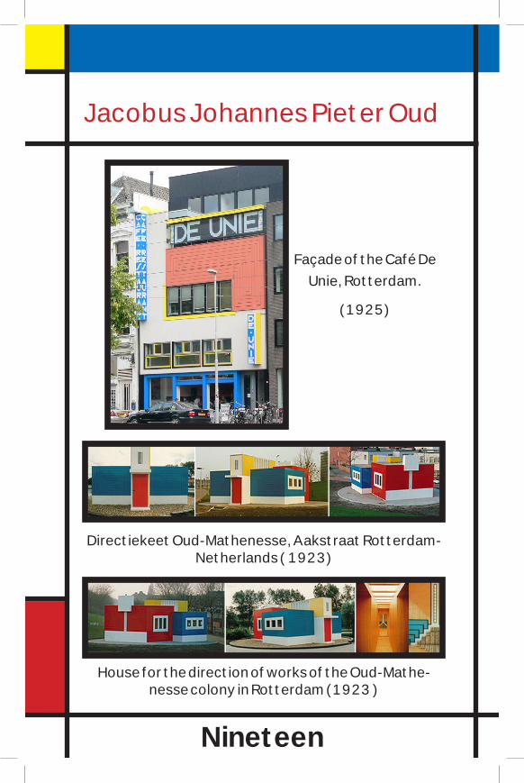
Nineteen
Jacobus Johannes Pieter Oud
House for the direction of works of the Oud-Mathe-nesse colony in Rotterdam (1923 )
Directiekeet Oud-Mathenesse, Aakstraat Rotterdam-Netherlands ( 1923)
Façade of the Café De Unie, Rotterdam.
(1925)

Twenty
of a number of Dutch architects who attempted to reconcilestrict,rational,‘scientific’cost-effectiveconstructiontechniqueagainstthepsychologicalneedsandaestheticexpectationsoftheusers.Hisownanswerwastopractice‘poeticfunctionalism’.In1927,hewasoneofthefifteenarchitectswhocontributedtotheinfluentialmodernistWeissenhofEstateexhibition.InAmericaOudisperhapsbestknownforbeinglaudedandadoptedbythemainstreammodernistmovement, then summarily kicked outonstylisticgrounds.Asof1932,hewasconsideredoneofthefourgreatestmodernarchitectsalongwithLudwigMiesvanderRohe,WalterGropiusandLeCorbusier,andwasprominentlyfeatured in Philip Johnson’s International Style exhibition.In 1925 Oud designed the Façade of the Café De Unie,Rotterdam,he successfullydesigneda asymmetrical structureprotecting De Stijl’s vision of order on an environmentalscale while designing this building he resolved problems ofsignage,andidentification.Architecturalandgraphicformsofcontrastingcolorandscaleareorderedintoharmoniousbalance.
The De Stijl movement started off as a publishedjournal/magazine and now it has become a well know artmovement. De Stijl paintings convey elements of natureexpressedabstractly.Ican’timaginelimitingmyselfasanartistto just two or three colors.Or imagine painting only squares

and straight lines, it sounds crazy but, agroup of Dutch artists in the early 20thcentury,theydidjustthatandtheoutcomeof their designs have becomewell knowal around the world. TheDe Stijl artistssoughttopreservetheprimacyofaestheticprinciples as agents of social reform intheir own right.As a result, compositionand balance played a huge part in theirwork,making theDeStijl artmovementfairlyinfluentialinthenextfewdecadesofmodern design and modern architecture.
Twenty One

WorksCited
Chilvers, Ian. “Neo-Plasticism.” Web.
Darwent, Charles. “Van Doesburg & the International Avant-
Garde, Tate Modern, London.” The Independent | News
| UK and Worldwide News | Newspaper. Web. <http://
www.independent.co.uk/arts-entertainment/art/reviews/
van-doesburg--the-international-avantgarde-tate-
modern-london-1891448.html>.
Meggs, Philip B. A History of Graphic Design. New York:
John Wiley & Sons, 1998. Print.
“Netherlands 1914 - 1919.” Piet Mondrian | Pietmondrian |
Mondrian. Web. <http://www.pietmondrian.org/about-
piet-mondrian.php#top>.
“Rietveld Schröder House.” Web. “Tate | Glossary | Neo-Plasticism.” Tate: British and
International Modern and Contemporary Art. Web. <http://www.tate.org.uk/collections/glossary/definition.jsp?entryId=191>.
Twenty Two