css 3 learning document
TRANSCRIPT

1
Cascading Style Sheets 3
2
Contents CSS3 Modules .......................................................................................................................................... 5
CSS3 Selectors ......................................................................................................................................... 5
element1~element2 ........................................................................................................................... 5
[attribute^=value] ............................................................................................................................... 5
[attribute$=value] ............................................................................................................................... 6
[attribute*=value] ............................................................................................................................... 6
:first-of-type ........................................................................................................................................ 6
:last-of-type ......................................................................................................................................... 7
:only-of-type ....................................................................................................................................... 7
:only-child............................................................................................................................................ 7
:nth-child(n) ........................................................................................................................................ 7
:nth-last-child(n) ................................................................................................................................. 8
:nth-of-type(n) .................................................................................................................................... 8
:nth-last-of-type(n) ......................................................................................................................... 9
:last-child ............................................................................................................................................. 9
:root .................................................................................................................................................... 9
:empty ............................................................................................................................................... 10
:target................................................................................................................................................ 10
:enabled ............................................................................................................................................ 10
:disabled ............................................................................................................................................ 10
:checked ............................................................................................................................................ 11
:not(selector) .................................................................................................................................... 11
::selection .......................................................................................................................................... 11
CSS3 Borders ......................................................................................................................................... 12
CSS3 Rounded Corners ...................................................................................................................... 12
CSS3 Box Shadow .............................................................................................................................. 12
CSS3 Border Image ............................................................................................................................ 12
CSS3 Backgrounds ................................................................................................................................. 13
CSS3 The background-size Property ................................................................................................. 13
CSS3 The background-origin Property .............................................................................................. 14
CSS3 Multiple Background Images.................................................................................................... 14
CSS3 Text Effects ................................................................................................................................... 15
CSS3 Text Shadow ............................................................................................................................. 15
3
CSS3 Word Wrapping ........................................................................................................................ 15
CSS3 text-overflow ............................................................................................................................ 16
Other CSS3 Text Effects ..................................................................................................................... 16
CSS3 Fonts ............................................................................................................................................. 17
The CSS3 @font-face Rule ................................................................................................................ 17
Using The Font You Want ............................................................................................................. 17
Using Bold Text ............................................................................................................................. 18
CSS3 Font Descriptors ................................................................................................................... 18
CSS3 2D Transforms .............................................................................................................................. 19
The translate() Method ..................................................................................................................... 19
The rotate() Method ......................................................................................................................... 20
The scale() Method ........................................................................................................................... 20
The skew() Method ........................................................................................................................... 21
The matrix() Method ......................................................................................................................... 22
CSS3 transform Property .................................................................................................................. 22
CSS3 transform-origin Property ........................................................................................................ 23
CSS3 3D Transforms .............................................................................................................................. 24
The rotateX() Method ....................................................................................................................... 24
The rotateY() Method ....................................................................................................................... 24
CSS3 backface-visibility Property ...................................................................................................... 24
CSS3 Transitions .................................................................................................................................... 25
Multiple changes ............................................................................................................................... 26
Transition Properties ........................................................................................................................ 26
CSS3 Animations ................................................................................................................................... 27
CSS3 @keyframes Rule ..................................................................................................................... 27
CSS3 animation ................................................................................................................................. 28
What are Animations in CSS3? .......................................................................................................... 28
CSS3 Multiple Columns ......................................................................................................................... 30
CSS3 Create Multiple Columns ......................................................................................................... 30
CSS3 Specify the Gap Between Columns .......................................................................................... 31
CSS3 Column Rules ............................................................................................................................ 31
CSS3 User Interface ............................................................................................................................... 31
CSS3 Resizing ..................................................................................................................................... 31
CSS3 Box Sizing .................................................................................................................................. 32

4
CSS3 Outline Offset ........................................................................................................................... 32
Other User-interface Properties ....................................................................................................... 33

5
CSS3 Modules CSS 3 is divided into several separate documents called "modules". Each module adds new
capabilities or extends features defined in CSS 2, over preserving backward compatibility.
Some of the most important CSS3 modules are:
Selectors
Box Model
Backgrounds and Borders
Text Effects
2D/3D Transformations
Animations
Multiple Column Layout
User Interface
CSS3 Selectors In CSS, selectors are patterns used to select the element(s) you want to style.
element1~element2
Eg: p~ul
Selects every <ul> element that are preceded by a <p> element
Definition and Usage:The element1~element2 selector matches occurrences of element2 that are
preceded by element1.
Both elements must have the same parent, but element2 does not have to be immediately preceded
by element1.
Browser Support
The element1~element2 selector is supported in all major browsers.
Note: For this selector to work in IE8 and earlier, a <!DOCTYPE> must be declared.
[attribute^=value]
Eg: a[src^="https"]
Selects every <a> element whose src attribute value begins with "https"
Definition and Usage: The [attribute^=value] selector matches every element whose attribute value
begins with a specified value.
Browser Support

6
The [attribute^=value] selector is supported in all major browsers.
Note: For this selector to work in IE8 and earlier, a <!DOCTYPE> must be declared.
[attribute$=value]
Eg: a[src$=".pdf"]
Selects every <a> element whose src attribute value ends with ".pdf"
Definition and Usage: The [attribute$=value] selector matches every element whose attribute value
ends with a specified value.
Browser Support
The [attribute$=value] selector is supported in all major browsers.
Note: For this selector to work in IE8 and earlier, a <!DOCTYPE> must be declared.
[attribute*=value]
Eg: a[src*="w3schools"]
Selects every <a> element whose src attribute value contains the substring "w3schools"
Definition and Usage: The [attribute*=value] selector matches every element whose attribute value
containing a specified value.
Browser Support
The [attribute*=value] selector is supported in all major browsers.
Note: For this selector to work in IE8 and earlier, a <!DOCTYPE> must be declared.
:first-of-type
Eg: p:first-of-type
Selects every <p> element that is the first <p> element of its parent
Definition and Usage: The :first-of-type selector matches every element that is the first child, of a
particular type, of its parent.
Tip: This is the same as :nth-of-type(1).
Browser Support
The :first-of-type selector is supported in all major browsers, except IE8 and earlier.

7
:last-of-type
Eg: p:last-of-type
Selects every <p> element that is the last <p> element of its parent
Definition and Usage: The :last-of-type selector matches every element that is the last child, of a
particular type, of its parent.
Tip: This is the same as :nth-last-of-type(1).
Browser Support
The :last-of-type selector is supported in all major browsers, except IE8 and earlier.
:only-of-type
Eg: p:only-of-type
Selects every <p> element that is the only <p> element of its parent
Definition and Usage: The :only-of-type selector matches every element that is the only child of its
type, of its parent.
Browser Support
The :only-of-type selector is supported in all major browsers, except IE8 and earlier.
:only-child
Eg: p:only-child
Selects every <p> element that is the only child of its parent
Definition and Usage: The :only-child selector matches every element that is the only child of its
parent.
Browser Support
The :only-child selector is supported in all major browsers, except IE8 and earlier.
:nth-child(n)
Eg: p:nth-child(2)
Selects every <p> element that is the second child of its parent

8
Definition and Usage: The :nth-child(n) selector matches every element that is the nth child,
regardless of type, of its parent.
n can be a number, a keyword, or a formula.
Tip: Look at the :nth-of-type() selector to select the element that is the nth child, of a particular type,
of its parent.
Browser Support
The :nth-child() selector is supported in all major browsers, except IE8 and earlier.
:nth-last-child(n)
Eg: p:nth-last-child(2)
Selects every <p> element that is the second child of its parent, counting from the last child
Definition and Usage: The :nth-last-child(n) selector matches every element that is the nth child,
regardless of type, of its parent, counting from the last child.
n can be a number, a keyword, or a formula.
Tip: Look at the :nth-last-of-type() selector to select the element that is the nth child, of a specified
type, of its parent, counting from the last child.
Browser Support
The :nth-last-child() selector is supported in all major browsers, except IE8 and earlier.
:nth-of-type(n)
Eg: p:nth-of-type(2)
Selects every <p> element that is the second <p> element of its parent
Definition and Usage: The :nth-of-type(n) selector matches every element that is the nth child, of a
particular type, of its parent.
n can be a number, a keyword, or a formula.
Tip: Look at the :nth-child() selector to select the element that is the nth child, regardless of type, of
its parent.
Browser Support
The :nth-of-type() selector is supported in all major browsers, except IE8 and earlier.

9
:nth-last-of-type(n)
Eg: p:nth-last-of-type(2)
Selects every <p> element that is the second <p> element of its parent, counting from the last child
Definition and Usage: The :nth-last-of-type(n) selector matches every element that is the nth child,
of a particular type, of its parent, counting from the last child.
n can be a number, a keyword, or a formula.
Tip: Look at the :nth-last-child() selector to select the element that is the nth child, regardless of
type, of its parent, counting from the last child.
Browser Support
The :nth-last-of-type() selector is supported in all major browsers, except IE8 and earlier.
:last-child
Eg: p:last-child
Selects every <p> element that is the last child of its parent
Definition and Usage: The :last-child selector matches every element that is the last child of its
parent.
Tip: p:last-child is equal to p:nth-last-child(1).
Browser Support
The :last-child selector is supported in all of the major browsers.
Note: The :last-child selector is not supported in IE8 and earlier versions.
:root
Eg: :root
Selects the document’s root element
Definition and Usage: The :root selector matches the document’s root element.
In HTML, the root element is always the html element.
Browser Support
The :root selector is supported in all major browsers, except IE8 and earlier.

10
:empty
Eg: p:empty
Selects every <p> element that has no children (including text nodes)
Definition and Usage: The :empty selector matches every element that has no children (including
text nodes).
Browser Support
The :empty selector is supported in all major browsers, except IE8 and earlier.
:target
Eg: #news:target
Selects the current active #news element (clicked on a URL containing that anchor name)
Definition and Usage: URLs with an # followed by an anchor name, link to a certain element within a
document. The element being linked to is the target element.
The :target selector can be used to style the current active target element.
Browser Support
The :target selector is supported in all major browsers, except Internet Explorer.
:enabled
Eg: input:enabled
Selects every enabled <input> element
Definition and Usage: The :enabled selector matches every enabled element (mostly used on form
elements).
Browser Support
The :enabled selector is supported in all major browsers, except IE8 and earlier.
:disabled
Eg: input:disabled
Selects every disabled <input> element
Definition and Usage: The :disabled selector matches every disabled element (mostly used on form
elements).

11
Browser Support
The :disabled selector is supported in all major browsers, except IE8 and earlier.
:checked
Eg: input:checked
Selects every checked <input> element
Definition and Usage: The :checked selector matches every checked input element (only for radio
buttons or checkboxes).
Browser Support
The :checked selector is only supported in Opera.
:not(selector)
Eg :not(p)
Selects every element that is not a <p> element
Definition and Usage: The :not(selector) selector matches every element that is NOT the specified
element/selector.
Browser Support
The :not selector is supported in all major browsers.
Note: IE8 and earlier do not support the :not selector.
::selection
Eg: ::selection
Selects the portion of an element that is selected by a user 3
Definition and Usage: The ::selection selector matches the portion of an element that is selected by
a user.
Only a few CSS properties can be applied to ::selection: color, background, cursor, and outline.
Browser Support
The ::selection selector is supported in IE9+, Opera, Google Chrome and Safari.
Firefox supports an alternative, the ::-moz-selection.

12
CSS3 Borders With CSS3, you can create rounded borders, add shadow to boxes, and use an image as a border -
without using a design program, like Photoshop.
CSS3 Rounded Corners
Adding rounded corners in CSS2 was tricky. We had to use different images for each corner.
In CSS3, the border-radius property is used to create rounded corners
Eg: Add rounded corners to a div element:
div
{
border:2px solid;
border-radius:25px;
-moz-border-radius:25px; /* Old Firefox */
}
CSS3 Box Shadow
In CSS3, the box-shadow property is used to add shadow to boxes:
Eg: Add a box-shadow to a div element:
div
{
box-shadow: 10px 10px 5px #888888;
}
CSS3 Border Image
With the CSS3 border-image property you can use an image to create a border:
Eg: Use an image to create a border around a div element:
div
{

13
border-image:url(border.png) 30 30 round;
-moz-border-image:url(border.png) 30 30 round; /* Old Firefox */
-webkit-border-image:url(border.png) 30 30 round; /* Safari and Chrome */
-o-border-image:url(border.png) 30 30 round; /* Opera */
}
Browser Support
Internet Explorer 9 supports border-radius and box-shadow.
Firefox supports all of the new border properties.
Chrome and Safari support border-radius and box-shadow, but require the prefix -webkit- for
border-image.
Opera supports border-radius and box-shadow, but requires the prefix -o- for border-image.
CSS3 Backgrounds CSS3 contains several new background properties, which allow greater control of the background
element.
CSS3 The background-size Property
The background-size property specifies the size of the background image.
Before CSS3, the background image size was determined by the actual size of the image. In CSS3 it is
possible to specify the size of the background image, which allows us to re-use background images in
different contexts.
You can specify the size in pixels or in percentages. If you specify the size as a percentage, the size is
relative to the width and height of the parent element.
Eg: Resize a background image:
div
{
background:url(img_flwr.gif);
-moz-background-size:80px 60px; /* Old Firefox */
background-size:80px 60px;
14
background-repeat:no-repeat;
}
Eg: Stretch the background image to completely fill the content area:
div
{
background:url(img_flwr.gif);
-moz-background-size:100% 100%; /* Old Firefox */
background-size:100% 100%;
background-repeat:no-repeat;
}
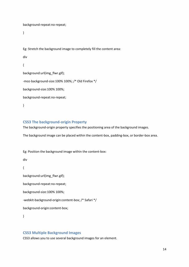
CSS3 The background-origin Property
The background-origin property specifies the positioning area of the background images.
The background image can be placed within the content-box, padding-box, or border-box area.
Eg: Position the background image within the content-box:
div
{
background:url(img_flwr.gif);
background-repeat:no-repeat;
background-size:100% 100%;
-webkit-background-origin:content-box; /* Safari */
background-origin:content-box;
}
CSS3 Multiple Background Images
CSS3 allows you to use several background images for an element.

15
Eg: Set two background images for the body element:
body
{
background-image:url(img_flwr.gif),url(img_tree.gif);
}
Browser Support
Firefox 3.6 and earlier does not support the background-origin property, and requires the prefix -
moz- to support the background-size property.
Safari 4 requires the prefix -webkit- to support the new background properties.
Internet Explorer 9, Firefox 4, Chrome, Safari 5 and Opera support the new background properties.
CSS3 Text Effects CSS3 contains several new text features.
CSS3 Text Shadow
In CSS3, the text-shadow property applies shadow to text.
You specify the horizontal shadow, the vertical shadow, the blur distance, and the color of the
shadow:
Eg: Add a shadow to a header:
h1
{
text-shadow: 5px 5px5px #FF0000;
}
CSS3 Word Wrapping
If a word is too long to fit within an area, it expands outside:
In CSS3, the word-wrap property allows you to force the text to wrap - even if it means splitting it in
the middle of a word:
Eg: Allow long words to be able to break and wrap onto the next line:

16
p {word-wrap:break-word;}
Browser Support
Internet Explorer does not yet support the text-shadow property.
Firefox, Chrome, Safari, and Opera support the text-shadow property.
All major browsers support the word-wrap property.
CSS3 text-overflow
Eg: Use of the text-overflow property:
div.test
{
text-overflow:ellipsis;
}
Definition and Usage: The text-overflow property specifies what should happen when text overflows
the containing element.
clip -> Clips the text
ellipsis -> Render an ellipsis ("...") to represent clipped text
string -> Render the given string to represent clipped text
Browser Support
The text-overflow property is supported in all major browsers.
Other CSS3 Text Effects
Property Description
hanging-punctuation Specifies whether a punctuation character may be placed outside the line box
punctuation-trim Specifies whether a punctuation character should be trimmed
text-align-last Describes how the last line of a block or a line right before a forced line break is aligned when text-align is "justify"
text-emphasis Applies emphasis marks, and the foreground color of the emphasis marks, to the element's text
text-justify Specifies the justification method used when text-align is "justify"
text-outline Specifies a text outline
text-wrap Specifies line breaking rules for text

17
word-break Specifies line breaking rules for non-CJK scripts
CSS3 Fonts
The CSS3 @font-face Rule
Before CSS3, web designers had to use fonts that were already installed on the user's computer.
With CSS3, web designers can use whatever font he/she likes.
When you have found/bought the font you wish to use, include the font file on your web server, and
it will be automatically downloaded to the user when needed.
Your "own" fonts are defined in the CSS3 @font-face rule.
Using The Font You Want
In the new @font-face rule you must first define a name for the font (e.g. myFirstFont), and then
point to the font file.
To use the font for an HTML element, refer to the name of the font (myFirstFont) through the font-
family property:
Eg:
<style>
@font-face
{
font-family: myFirstFont;
src: url('Sansation_Light.ttf'),
url('Sansation_Light.eot'); /* IE9+ */
}
div
{
font-family:myFirstFont;
}
</style>

18
Using Bold Text
You must add another @font-face rule containing descriptors for bold text:
Eg
@font-face
{
font-family: myFirstFont;
src: url('Sansation_Bold.ttf'),
url('Sansation_Bold.eot'); /* IE9+ */
font-weight:bold;
}
The file "Sansation_Bold.ttf" is another font file, that contains the bold characters for the Sansation
font.
Browsers will use this whenever a piece of text with the font-family "myFirstFont" should render as
bold.
This way you can have many @font-face rules for the same font.
CSS3 Font Descriptors
The following table lists all the font descriptors that can be defined inside the @font-face rule:
Descriptor Values Description
font-family name Required. Defines a name for the font
src URL Required. Defines the URL of the font file
font-stretch
normal condensed ultra-condensed extra-condensed semi-condensed expanded semi-expanded extra-expanded ultra-expanded
Optional. Defines how the font should be stretched. Default is "normal"
font-style normal italic oblique
Optional. Defines how the font should be styled. Default is "normal"

19
font-weight
normal bold 100 200 300 400 500 600 700 800 900
Optional. Defines the boldness of the font. Default is "normal"
unicode-range unicode-range Optional. Defines the range of UNICODE characters the font supports. Default is "U+0-10FFFF"
Browser Support
Firefox, Chrome, Safari, and Opera support fonts of type .ttf (True Type Fonts) and .otf (OpenType
Fonts).
Internet Explorer 9+ supports the new @font-face rule, but it only supports fonts of type .eot
(Embedded OpenType).
Note: Internet Explorer 8 and earlier versions, do not support the new @font-face rule.
CSS3 2D Transforms With CSS3 transform, we can move, scale, turn, spin, and stretch elements.
A transform is an effect that lets an element change shape, size and position.
The translate() Method
With the translate() method, the element moves from its current position, depending on the
parameters given for the left (X-axis) and the top (Y-axis) position:
Eg:
div
{
transform: translate(50px,100px);
-ms-transform: translate(50px,100px); /* IE 9 */
-webkit-transform: translate(50px,100px); /* Safari and Chrome */
-o-transform: translate(50px,100px); /* Opera */

20
-moz-transform: translate(50px,100px); /* Firefox */
}
The value translate(50px,100px) moves the element 50 pixels from the left, and 100 pixels from the
top.
translateX(n) -> Defines a 2D translation, moving the element along the X-axis
translateY(n) -> Defines a 2D translation, moving the element along the Y-axis
The rotate() Method
With the rotate() method, the element rotates clockwise at a given degree. Negative values are
allowed and rotates the element counter-clockwise.
Eg:
div
{
transform: rotate(30deg);
-ms-transform: rotate(30deg); /* IE 9 */
-webkit-transform: rotate(30deg); /* Safari and Chrome */
-o-transform: rotate(30deg); /* Opera */
-moz-transform: rotate(30deg); /* Firefox */
}
The value rotate(30deg) rotates the element clockwise 30 degrees.
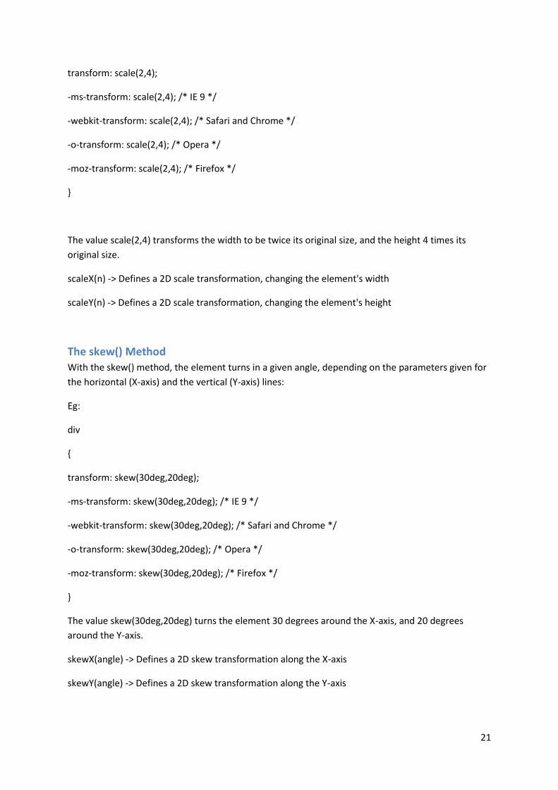
The scale() Method
With the scale() method, the element increases or decreases the size, depending on the parameters
given for the width (X-axis) and the height (Y-axis):
Eg:
div
{
21
transform: scale(2,4);
-ms-transform: scale(2,4); /* IE 9 */
-webkit-transform: scale(2,4); /* Safari and Chrome */
-o-transform: scale(2,4); /* Opera */
-moz-transform: scale(2,4); /* Firefox */
}
The value scale(2,4) transforms the width to be twice its original size, and the height 4 times its
original size.
scaleX(n) -> Defines a 2D scale transformation, changing the element's width
scaleY(n) -> Defines a 2D scale transformation, changing the element's height
The skew() Method
With the skew() method, the element turns in a given angle, depending on the parameters given for
the horizontal (X-axis) and the vertical (Y-axis) lines:
Eg:
div
{
transform: skew(30deg,20deg);
-ms-transform: skew(30deg,20deg); /* IE 9 */
-webkit-transform: skew(30deg,20deg); /* Safari and Chrome */
-o-transform: skew(30deg,20deg); /* Opera */
-moz-transform: skew(30deg,20deg); /* Firefox */
}
The value skew(30deg,20deg) turns the element 30 degrees around the X-axis, and 20 degrees
around the Y-axis.
skewX(angle) -> Defines a 2D skew transformation along the X-axis
skewY(angle) -> Defines a 2D skew transformation along the Y-axis

22
The matrix() Method
The matrix() method combines all of the 2D transform methods into one.
The matrix method take six parameters, containing mathematic functions, which allows you to:
rotate, scale, move (translate), and skew elements.
Eg: How to rotate a div element 30 degrees, using the matrix method:
div
{
transform:matrix(0.866,0.5,-0.5,0.866,0,0);
-ms-transform:matrix(0.866,0.5,-0.5,0.866,0,0); /* IE 9 */
-moz-transform:matrix(0.866,0.5,-0.5,0.866,0,0); /* Firefox */
-webkit-transform:matrix(0.866,0.5,-0.5,0.866,0,0); /* Safari and Chrome */
-o-transform:matrix(0.866,0.5,-0.5,0.866,0,0); /* Opera */
}
CSS3 transform Property
Eg: Rotate a div element:
div
{
transform:rotate(7deg);
-ms-transform:rotate(7deg); /* IE 9 */
-moz-transform:rotate(7deg); /* Firefox */
-webkit-transform:rotate(7deg); /* Safari and Chrome */
-o-transform:rotate(7deg); /* Opera */
}
Definition and Usage: The transform property applies a 2D or 3D transformation to an element. This
property allows you to rotate, scale, move, skew, etc., elements.

23
CSS3 transform-origin Property
Eg: Set a rotated element's base placement:
div
{
transform: rotate(45deg);
transform-origin:20% 40%;
-ms-transform: rotate(45deg); /* IE 9 */
-ms-transform-origin:20% 40%; /* IE 9 */
-webkit-transform: rotate(45deg); /* Safari and Chrome */
-webkit-transform-origin:20% 40%; /* Safari and Chrome */
-moz-transform: rotate(45deg); /* Firefox */
-moz-transform-origin:20% 40%; /* Firefox */
-o-transform: rotate(45deg); /* Opera */
-o-transform-origin:20% 40%; /* Opera */
}
Definition and Usage: The transform-origin property allows you to change the position on
transformed elements.
2D transformed element can change the x- and y-axis of the element. 3D transformed element can
also change the z-axis of the element.
Note: This property must be used together with the transform property.
Browser Support
The transform property is not supported in any browser.
Internet Explorer supports an alternative, the -ms-transform property (2D transforms only).
Firefox supports an alternative, the -moz-transform property (2D transforms only).
Opera supports an alternative, the -o-transform property (2D transforms only).
Safari and Chrome support an alternative, the -webkit-transform property (3D and 2D transforms).

24
CSS3 3D Transforms CSS3 allows you to format your elements using 3D transforms.
The rotateX() Method
With the rotateX() method, the element rotates around its X-axis at a given degree.
Eg:
div
{
transform: rotateX(120deg);
-webkit-transform: rotateX(120deg); /* Safari and Chrome */
-moz-transform: rotateX(120deg); /* Firefox */
}
The rotateY() Method
With the rotateY() method, the element rotates around its Y-axis at a given degree.
Eg:
div
{
transform: rotateY(130deg);
-webkit-transform: rotateY(130deg); /* Safari and Chrome */
-moz-transform: rotateY(130deg); /* Firefox */
}
Browser Support
Internet Explorer and Opera does not yet support 3D transforms (They support only 2D transforms).
Firefox requires the prefix -moz-.
Chrome and Safari requires the prefix -webkit-.
CSS3 backface-visibility Property
Eg: Hide the backside of a rotated div element:

25
div
{
backface-visibility:hidden;
-webkit-backface-visibility:hidden; /* Chrome and Safari */
-moz-backface-visibility:hidden; /* Firefox */
}
Browser Support
The backface-visibility property is currently supported in Firefox, Chrome and Safari.
Definition and Usage: The backface-visibility property defines whether or not an element should be
visible when not facing the screen.
This property is useful when an element is rotated, and you do not want to see its backside.
Syntax
backface-visibility: visible|hidden;
Other transform properties:
Property Description
Transform Applies a 2D or 3D transformation to an element
transform-origin Allows you to change the position on transformed elements
transform-style Specifies how nested elements are rendered in 3D space
Perspective Specifies the perspective on how 3D elements are viewed
perspective-origin Specifies the bottom position of 3D elements
CSS3 Transitions With CSS3, we can add an effect when changing from one style to another, without using Flash
animations or JavaScripts.
Eg: Transition effect on the width property, duration: 2 seconds:
div
{
transition: width 2s;

26
-moz-transition: width 2s; /* Firefox 4 */
-webkit-transition: width 2s; /* Safari and Chrome */
-o-transition: width 2s; /* Opera */
}
Note: If the duration is not specified, the transition will have no effect, because default value is 0.
Multiple changes
To add a transitional effect for more than one style, add more properties, separated by commas:
Eg: Add effects on the width, height, and the transformation:
div
{
transition: width 2s, height 2s, transform 2s;
-moz-transition: width 2s, height 2s, -moz-transform 2s;
-webkit-transition: width 2s, height 2s, -webkit-transform 2s;
-o-transition: width 2s, height 2s,-o-transform 2s;
}
Browser Support
Internet Explorer does not yet support the transition property.
Firefox 4 requires the prefix -moz-.
Chrome and Safari requires the prefix -webkit-.
Opera requires the prefix -o-.
Transition Properties
The following table lists all the transition properties:
Property Description
transition A shorthand property for setting the four transition properties into
a single property

27
transition-property Specifies the name of the CSS property to which the transition is
applied
transition-duration Defines the length of time that a transition takes. Default 0
transition-timing-function Describes how the speed during a transition will be calculated.
Default "ease"
transition-delay Defines when the transition will start. Default 0
CSS3 Animations With CSS3, we can create animations, which can replace animated images, Flash animations, and
JavaScripts in many web pages.
CSS3 @keyframes Rule
To create animations in CSS3, you will have to learn about the @keyframes rule.
The @keyframes rule is where the animation is created. Specify a CSS style inside the @keyframes
rule and the animation will gradually change from the current style to the new style.
Eg
@keyframes myfirst
{
from {background: red;}
to {background: yellow;}
}
@-moz-keyframes myfirst /* Firefox */
{
from {background: red;}
to {background: yellow;}
}
@-webkit-keyframes myfirst /* Safari and Chrome */
{
from {background: red;}
to {background: yellow;}

28
}
@-o-keyframes myfirst /* Opera */
{
from {background: red;}
to {background: yellow;}
}
CSS3 animation
When the animation is created in the @keyframe, bind it to a selector, otherwise the animation will
have no effect.
Bind the animation to a selector by specifying at least these two CSS3 animation properties:
Specify the name of the animation
Specify the duration of the animation
Eg: Binding the "myfirst" animation to a div element, duration: 5 seconds:
div
{
animation: myfirst 5s;
-moz-animation: myfirst 5s; /* Firefox */
-webkit-animation: myfirst 5s; /* Safari and Chrome */
-o-animation: myfirst 5s; /* Opera */
}
Note: You must define the name and the duration of the animation. If duration is omitted, the
animation will not run, because the default value is 0.
What are Animations in CSS3?
An animation is an effect that lets an element gradually change from one style to another.
You can change as many styles you want, as many times you want.

29
Specify when the change will happen in percent, or the keywords "from" and "to", which is the same
as 0% and 100%.
0% is the beginning of the animation, 100% is when the animation is complete.
For best browser support, you should always define both the 0% and the 100% selectors.
Eg: Change the background color and position:
@keyframes myfirst
{
0% {background: red; left:0px; top:0px;}
25% {background: yellow; left:200px; top:0px;}
50% {background: blue; left:200px; top:200px;}
75% {background: green; left:0px; top:200px;}
100% {background: red; left:0px; top:0px;}
}
@-moz-keyframes myfirst /* Firefox */
{
0% {background: red; left:0px; top:0px;}
25% {background: yellow; left:200px; top:0px;}
50% {background: blue; left:200px; top:200px;}
75% {background: green; left:0px; top:200px;}
100% {background: red; left:0px; top:0px;}
}
@-webkit-keyframes myfirst /* Safari and Chrome */
{
0% {background: red; left:0px; top:0px;}
25% {background: yellow; left:200px; top:0px;}
50% {background: blue; left:200px; top:200px;}
75% {background: green; left:0px; top:200px;}

30
100% {background: red; left:0px; top:0px;}
}
@-o-keyframes myfirst /* Opera */
{
0% {background: red; left:0px; top:0px;}
25% {background: yellow; left:200px; top:0px;}
50% {background: blue; left:200px; top:200px;}
75% {background: green; left:0px; top:200px;}
100% {background: red; left:0px; top:0px;}
}
Browser Support
Internet Explorer does not yet support the @keyframes rule or the animation property.
Firefox requires the prefix -moz-, Chrome and Safari require the prefix -webkit-, and Opera require
the prefix -o-.
CSS3 Multiple Columns With CSS3, you can create multiple columns for laying out text - like in newspapers!
CSS3 Create Multiple Columns
The column-count property specifies the number of columns an element should be divided into:
Eg: Divide the text in a div element into three columns:
div
{
-moz-column-count:3; /* Firefox */
-webkit-column-count:3; /* Safari and Chrome */
column-count:3;
}

31
CSS3 Specify the Gap Between Columns
The column-gap property specifies the gap between the columns:
Eg: Specify a 40 pixels gap between the columns:
div
{
-moz-column-gap:40px; /* Firefox */
-webkit-column-gap:40px; /* Safari and Chrome */
column-gap:40px;
}
CSS3 Column Rules
The column-rule property sets the width, style, and color of the rule between columns.
Eg: Specify the width, style and color of the rule between columns:
div
{
-moz-column-rule:3px outset #ff00ff; /* Firefox */
-webkit-column-rule:3px outset #ff00ff; /* Safari and Chrome */
column-rule:3px outset #ff00ff;
}
Browser Support
Internet Explorer does not yet support the multiple columns properties.
Firefox requires the prefix -moz-.
Chrome and Safari require the prefix -webkit-.
CSS3 User Interface In CSS3, some of the new user interface features are resizing elements, box sizing, and outlining.
CSS3 Resizing
In CSS3, the resize property specifies whether or not an element should be resizable by the user.
32
Eg: Specify that a div element should be resizable by the user:
div
{
resize:both;
overflow:auto;
}
CSS3 Box Sizing
The box-sizing property allows you to define certain elements to fit an area in a certain way:
Eg: Specify two bordered boxes side by side:
div
{
box-sizing:border-box;
-moz-box-sizing:border-box; /* Firefox */
-webkit-box-sizing:border-box; /* Safari */
width:50%;
float:left;
}
CSS3 Outline Offset
The outline-offset property offsets an outline, and draws it beyond the border edge.
Outlines differ from borders in two ways:
Outlines do not take up space
Outlines may be non-rectangular
Eg: Specify an outline 15px outside the border edge:
div
{

33
border:2px solid black;
outline:2px solid red;
outline-offset:15px;
}
Browser Support
The resize property is supported in Firefox 4+, Chrome, and Safari.
The box-sizing is supported in Internet Explorer, Chrome, and Opera. Firefox requires the prefix -
moz-. Safari requires the prefix -webkit-.
The outline property is supported in all major browsers, except Internet Explorer.
Other User-interface Properties
Property Description CSS
Appearance Allows you to make an element look like a standard user interface
element 3
Icon Provides the author the ability to style an element with an iconic
equivalent 3
nav-down Specifies where to navigate when using the arrow-down
navigation key 3
nav-index Specifies the tabbing order for an element 3
nav-left Specifies where to navigate when using the arrow-left navigation
key 3
nav-right Specifies where to navigate when using the arrow-right navigation
key 3
nav-up Specifies where to navigate when using the arrow-up navigation
key 3