cs305, hci in software development usability goals, principles, guidelines (introduction, part 2)...
TRANSCRIPT

CS305, HCI in Software Development
Usability Goals, Principles, Guidelines
(Introduction, Part 2)
Fall 2008

Activity (Mini-Homework)
• Do this on your own on in pairs• Go find two examples of problems in the GUIs of
software apps or the UI of a interactive device (not Web pages)– Problem must illustrate a violation of one of the
design principles or usability guidelines– Describe the problems in these terms
• “Post” on Collab wiki page before class next Fri.

Reminder….
• users should be involved through the development of the project
• specific usability and user experience goals need to be identified, clearly documented and agreed at the beginning of the project
• iteration is needed through the core activities

Towards More Usable Systems
• Seems like we need the following:– Goals we want to achieve– Principles on how to achieve these– Lists of do’s and don’ts– Theories that underlie principles, lists– Methods for measuring and evaluating

Usability Goals
• Here’s one set (from the ID textbook)– Effective to use– Efficient to use– Safe to use– Have good utility– Easy to learn– Easy to remember how to use
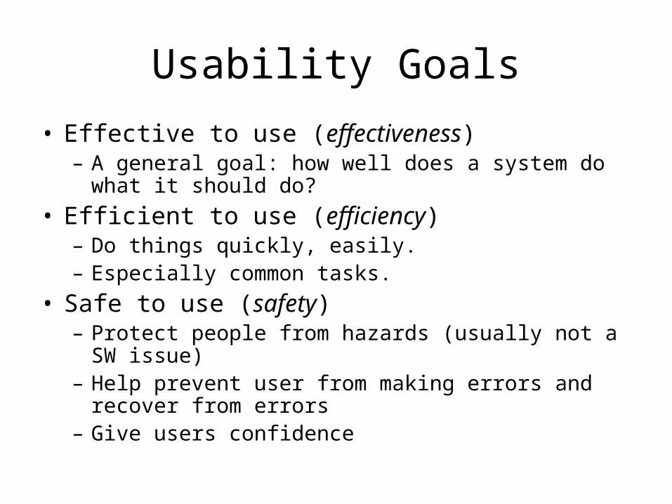
Usability Goals
• Effective to use (effectiveness)– A general goal: how well does a system do what it
should do?
• Efficient to use (efficiency)– Do things quickly, easily.– Especially common tasks.
• Safe to use (safety)– Protect people from hazards (usually not a SW issue)– Help prevent user from making errors and recover
from errors– Give users confidence

Usability Goals (2)
• Have good utility– Has the right kind of functionality– Supports users in accomplishing tasks
• Easy to learn (learnability)– Includes how easy it is to learn advanced
features. (If hard, who bothers?)
• Easy to remember how to use (memorability)– Many systems used infrequently

How to Measure Usability?
• We want to achieve these goals, but how do we know?
• Develop measurable criteria based on previous goals. Examples:– Time to learn– Speed of performance– Rate of errors over by users– Retention over time– Subjective satisfaction

User experience goals
– Satisfying - rewarding– Fun - support creativity– Enjoyable - emotionally fulfilling– Entertaining …and more– Helpful– Motivating– Aesthetically pleasing

Usability and user experience goals
• How do usability goals differ from user experience goals?– How easy is it to measure usability versus
user experience goals?
• Are there trade-offs between the two kinds of goals?– e.g. can a product be both fun and safe?


Reminder of where we are
1. Usability Goals• Some measures
2. User Experience Goals
3. Design Principles– First two were higher level (goals)– Now talking about guidance for how to
achieve goals4. Guidelines (guidance as lists)

Design principles
• Generalizable abstractions for thinking about different aspects of design
• The do’s and don’ts of interaction design– But at a high level. (Compare to guidelines later.)
• What to provide and what not to provide at the interface
• Derived from a mix of theory-based knowledge, experience and common-sense

Higher-level Principles
• Now, we’ll talk about the following:– Visibility– Feedback– Constraints– Mapping– Consistency– Affordances
• Ideas well-known (e.g. from Norman’s Design of Everyday Things)

Activity (Mini-Homework)
• Do this on your own on in pairs• Go find two examples of problems in the GUIs of
software apps or the UI of a interactive device (not Web pages)– Problem must illustrate a violation of one of the
design principles or usability guidelines– Describe the problems in these terms
• “Post” on Collab wiki page before class next Fri.

Visibility• This is a control panel for an
elevator. • How does it work?• Push a button for the floor you want?
• Nothing happens. Push any other button? Still nothing. What do you need to do?
It is not visible as to what to do!From: www.baddesigns.com

Visibility
How would you make this action more visible?
• make the card reader more obvious• provide an auditory message, that says what to
do (which language?)• provide a big label next to the card reader that
flashes when someone enters• make relevant parts visible• make what has to be done obvious
…you need to insert your room card in the slot by the buttons to get the elevator to work!

Feedback
• Sending information back to the user about what has been done
• Includes sound, highlighting, animation and combinations of these
– e.g. when screen button clicked on provides sound or red highlight feedback:
“ccclichhk”

Constraints
• Restricting the possible actions that can be performed
• Helps prevent user from selecting incorrect options
• Three main types (Norman, 1999)– physical– cultural – logical
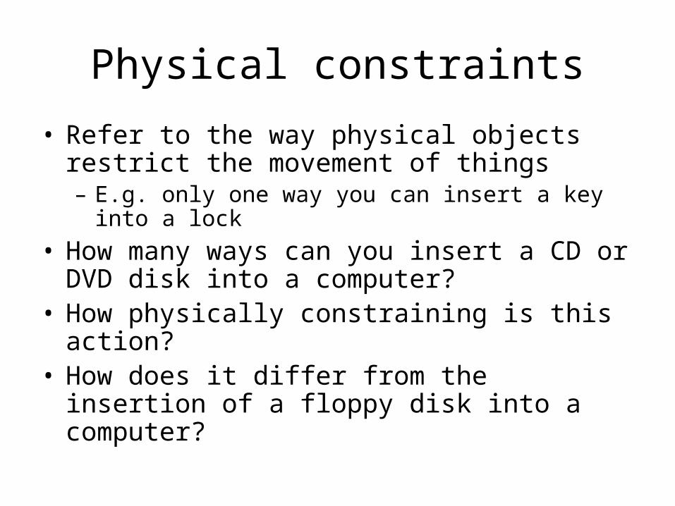
Physical constraints
• Refer to the way physical objects restrict the movement of things– E.g. only one way you can insert a key into a lock
• How many ways can you insert a CD or DVD disk into a computer?
• How physically constraining is this action?• How does it differ from the insertion of a floppy
disk into a computer?

Logical constraints
• Exploits people’s everyday common sense reasoning about the way the world works
• An example is the logical relationship between physical layout of a device and the way it works– See next slide for an illustration

Logical or ambiguous design?
• Where do you plug the mouse?
• Where do you plug the keyboard?
• top or bottom connector?
• Do the color coded icons help?
From: www.baddesigns.com

More Logically ConstrainedProvides direct adjacent
mapping between icon and connector
Provides color coding to associate the connectors with the labels
From: www.baddesigns.com
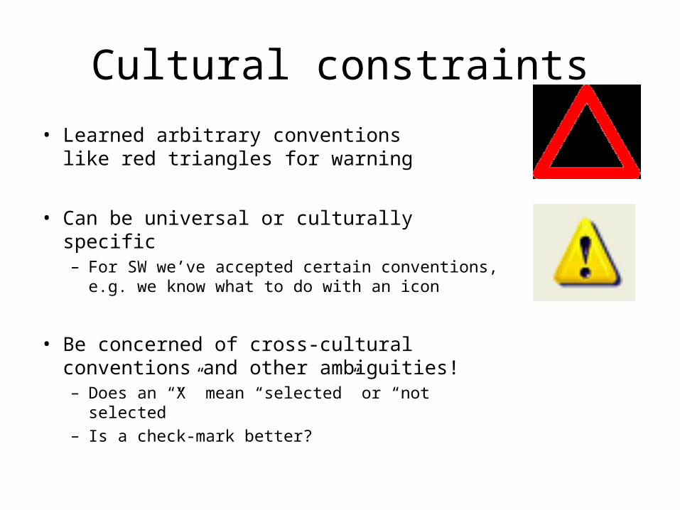
Cultural constraints
• Learned arbitrary conventions like red triangles for warning
• Can be universal or culturally specific– For SW we’ve accepted certain conventions,
e.g. we know what to do with an icon
• Be concerned of cross-cultural conventions and other ambiguities!– Does an “X” mean “selected” or “not selected”– Is a check-mark better?

Which are universal and which are culturally-specific?
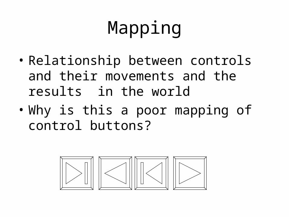
Mapping
• Relationship between controls and their movements and the results in the world
• Why is this a poor mapping of control buttons?

Mapping
• Why is this a better mapping?
• The control buttons are mapped better onto the sequence of actions of fast rewind, rewind, play and fast forward– Is this a logical mapping (in most people’s minds)?– Is there a mapping that makes more sense?

Mappings in the Kitchen
– Which controls go with which rings (burners)?
A B C D
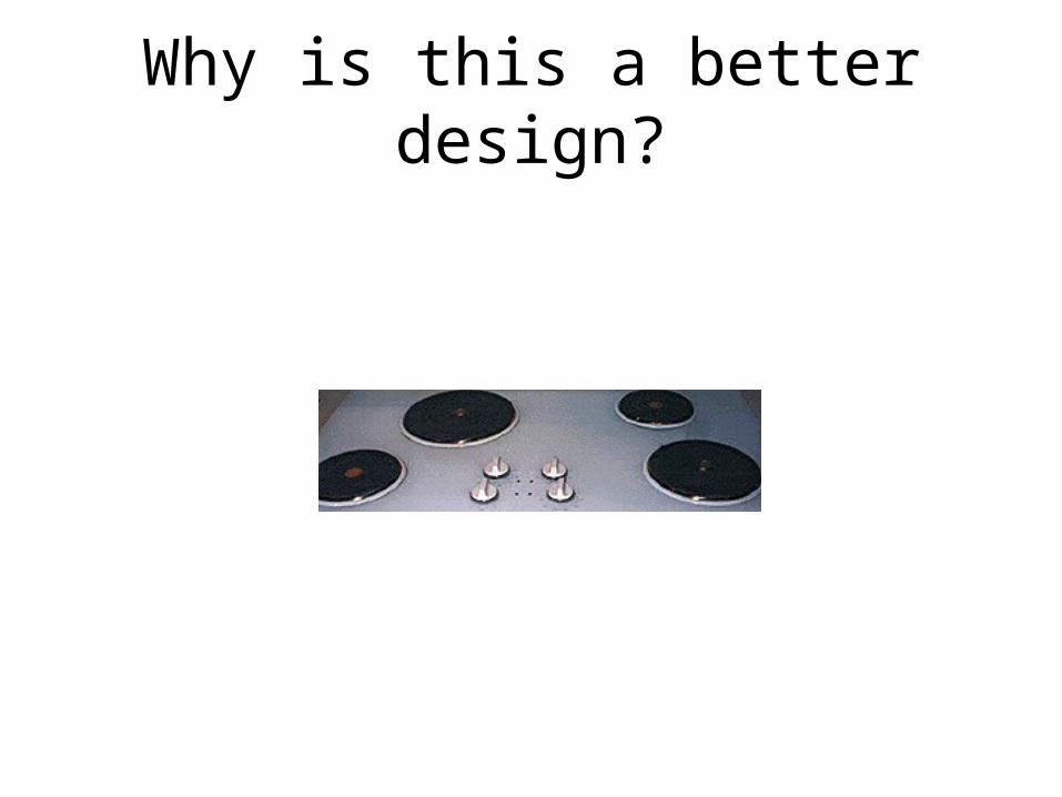
Why is this a better design?

Consistency• Design interfaces to have similar operations and
use similar elements for similar tasks• For example:
– always use ctrl key plus first initial of the command for an operation – ctrl+C, ctrl+S, ctrl+O
• Main benefit is consistent interfaces are easier to learn and use
• But… didn’t a wise man say this? Consistency is the hobgoblin of little minds. – A foolish consistency is the hobgoblin of little minds
(adored by little statesmen and philosophers and divines)

When consistency breaks down
• What happens if there is more than one command starting with the same letter?– e.g. save, spelling, select, style
• Have to find other initials or combinations of keys, thereby breaking the consistency rule– E.g. ctrl+S, ctrl+Sp, ctrl+shift+L
• Is this desirable? Does it defeat the purpose?– It may increase learning burden on user– It may make them more prone to errors– But it may still benefit frequent or experienced users

Internal and external consistency
• Internal consistency refers to designing operations to behave the same within an application– Difficult to achieve with complex interfaces
• External consistency refers to designing operations, interfaces, etc., to be the same across applications and devices– Very rarely the case, based on different designer’s
preference– Most successful in product families (e.g MS Office)– Op. Sys. vendors may define style guidelines

Keypad numbers layout
• A case of external inconsistency
1 2 3
4 5 6
7 8 9
7 8 9
1 2 3
4 5 6
0 0
(a) phones, remote controls (b) calculators, computer keypads

Affordances: to give a clue
• Refers to an attribute of an object that allows people to know how to use it– E.g. a mouse button invites pushing, a door handle
affords pulling
• Norman (1988) used the term to discuss the design of everyday objects
• Since then has been popularized in interaction design to discuss how to design interface objects– E.g. scrollbars to afford moving up and down, icons to
afford clicking on
What does ‘affordance’ have to offer interaction design?
• Notion of affordance is often over-used!http://www.jnd.org/dn.mss/affordances-and.html
• Interfaces are virtual and do not have affordances like physical objects
• Norman argues it does not make sense to talk about interfaces in terms of ‘real’ affordances
• Instead interfaces are better conceptualised as ‘perceived’ affordances– Learned conventions of arbitrary mappings between
action and effect at the interface– Some mappings are better than others

Activity 1.3
– Physical affordances: How do the following physical objects afford? Are
they obvious?
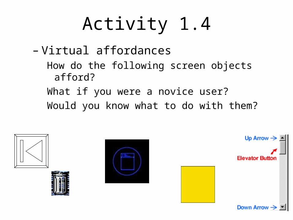
Activity 1.4– Virtual affordances
How do the following screen objects afford?
What if you were a novice user?
Would you know what to do with them?
Activity 1.5: Physical and Perceived Affordances
• Take a cell phone, digital camera, or PDA– Have laptop? Open a fancy SW app: Outlook,
Eclipse, etc?
• In a small group– Identify any physical affordances the device has– Identify any perceived or visual affordances the
software user interface has
• Write these down, be prepared to share or turn in
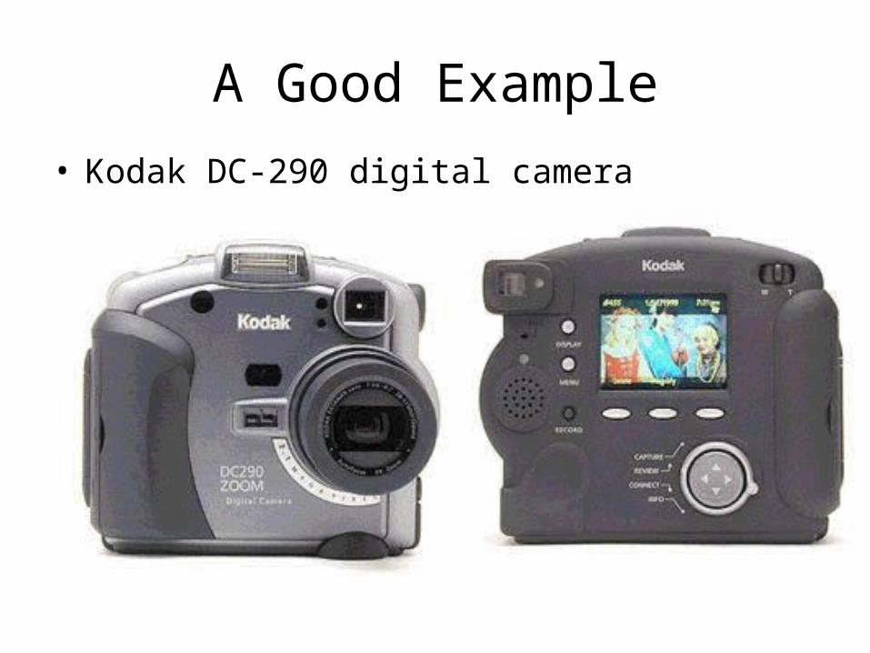
A Good Example
• Kodak DC-290 digital camera
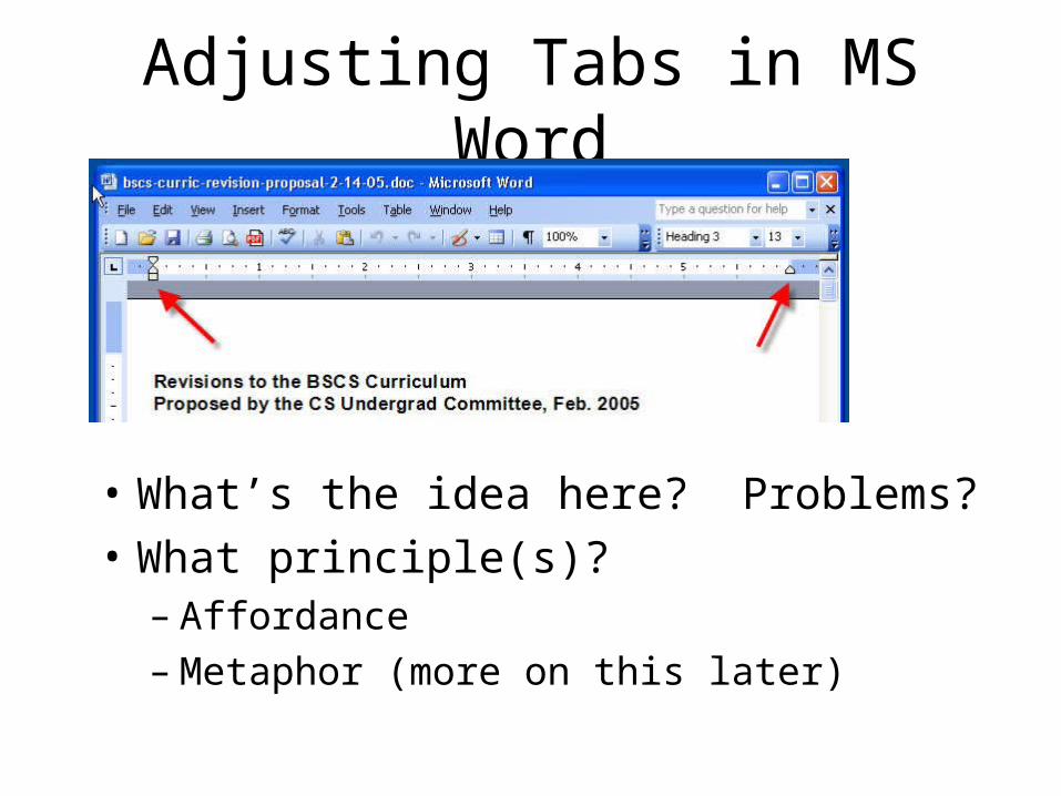
Adjusting Tabs in MS Word
• What’s the idea here? Problems?
• What principle(s)?– Affordance– Metaphor (more on this later)

Web Links
• What are the conventions that help you recognize a link?
• Would you are argue this is an affordance?– A perceived affordance – convention of a mapping
between action and effect– Does it “afford” clicking on it?
• Examples of problems with this?– Let’s look at: http://www.cs.virginia.edu


Overview (Reminder)
1. Usability Goals
2. User Experience Goals
3. Design Principles
4. Guidelines– Still talking about guidance for how to
achieve goals– These are more prescriptive (do’s & don’ts)
Guidelines
• What do we mean by “guidelines”?– Tell me!
• Are guidelines enough? Lead to problems?– Too specific, incomplete. Don’t generalize to
all situations– But… Capture experience and best practices
• Many examples of guidelines…

Nature of Guidelines
• Similar to design principles, except more prescriptive
• Used mainly as the basis for evaluating systems
• Provide a framework for heuristic evaluation– We’ll talk about particular approach to
evaluation this later

Jakob Nielsen Says…
• Jakob Nielsen: a leading figure in usability– Member of the Nielsen Norman Group
• Donald Norman• Bruce "Tog" Tognazzini
– http://www.useit.com/– Alertbox: regular “column”– Wikipedia:
http://en.wikipedia.org/wiki/Jakob_Nielsen_(usability_consultant)
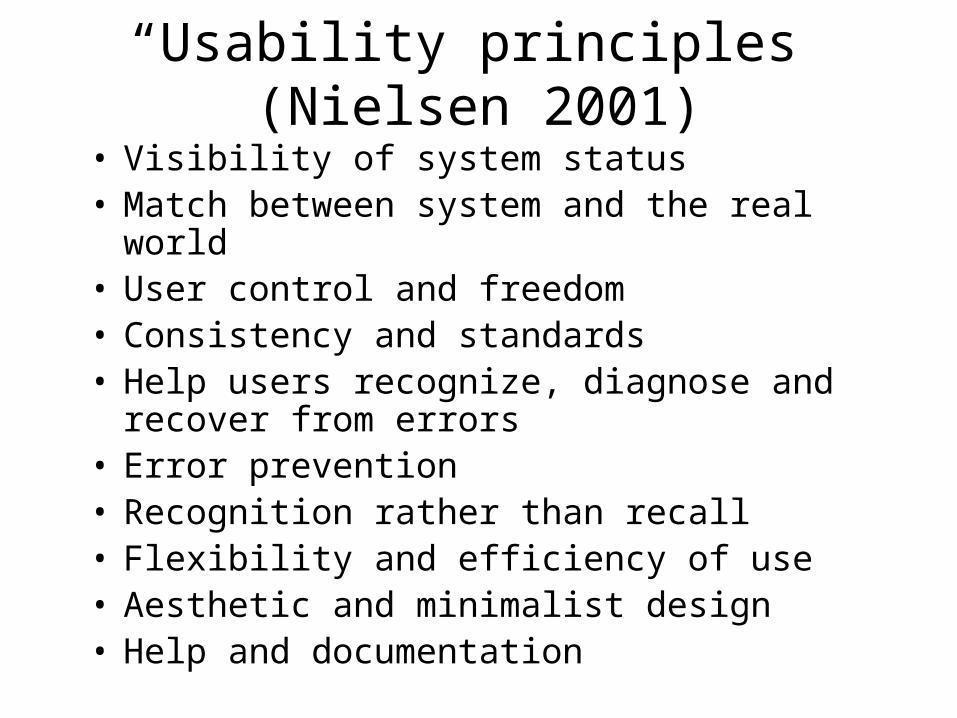
“Usability principles” (Nielsen 2001)
• Visibility of system status• Match between system and the real world• User control and freedom• Consistency and standards• Help users recognize, diagnose and recover
from errors• Error prevention• Recognition rather than recall• Flexibility and efficiency of use• Aesthetic and minimalist design• Help and documentation

Read More about Nielsen’s List(s)
• Nielsen’s site has more on the previous listhttp://www.useit.com/papers/heuristic/heuristic_list.html
• Heuristics: more general “guidelines”– We’ll see this term again– Heuristic evaluation
• Activity 1.7 for you to do:– Find one list of similar usability principles (i.e
heuristics, prescriptive guidelines, do’s/don’ts) for Web page design
– Write it down – we’ll collect these

Shneiderman’s Eight Golden Rules
1. Strive for consistency2. Cater to universal usability3. Offer informative feedback4. Design dialogs to yield closure5. Prevent errors6. Permit easy reversal of actions7. Support internal locus of control8. Reduce short-term memory load.

More Specific Guideline Examples from DTUI
• Shneiderman’s text (DTUI) gives some more detailed examples– National Cancer Institute, p. 62– W3C, Accessibility, p. 62– Display organization, p. 63– Control rooms, p. 63– Others in Section 2.2
• Ask yourself: what principle(s) underlie each guideline?

Ex. 1: National Cancer Institute
• 388 guidelines for informative web pages, such as:– Reduce user’s workload– Do not display unsolicited windows or graphics– Standardize task sequences– Ensure embedded links are descriptive– Use unique and descriptive headings– Develop pages that print properly– Use thumbnail images to preview large images
Ex. 2a, Organizing Data Display
• From Smith and Mozier (1986).• Data display: 5 high-level goals
– Consistency of data display– Efficient information assimilation by the user– Minimal memory load on the user– Compatibility of data display with data entry– Flexibility for user control of data display
• Data entry: 5 similar high-level goals, but also:– Minimal input actions by user

Ex. 2b, More Specific than 2a
• Lockheed (1981) on control rooms– Be consistent in labeling, graphics, formatting– Standardize abbreviations– Present data only if it assists the operator– Present data graphically where appropriate
instead of numbers and text– Rely on monochromatic displays with good
spacing and arrangement, saving color for when it helps
– Involve users in development of displays


Activity (Mini-Homework)
• Do this on your own on in pairs• Go find two examples of problems in the GUIs of
software apps or the UI of a interactive device (not Web pages)– Problem must illustrate a violation of one of the
design principles or usability guidelines– Describe the problems in these terms
• “Post” on Collab wiki page before class next Fri.