creating confidence intervals in excel
DESCRIPTION
IntervalConfidenceProbabilityStatisticsTRANSCRIPT
Creating Confidence Intervals/Error Bars in Microsoft Excel 2007
Below is a brief description of how to graph confidence intervals in Microsoft excel. I used a small table as an example to demonstrate how to plot confidence limits for each data point.
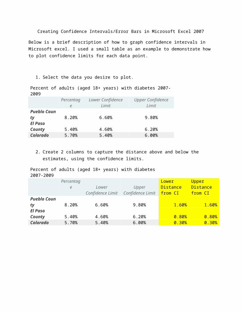
1. Select the data you desire to plot.
Percent of adults (aged 18+ years) with diabetes 2007-2009 Percentage Lower Confidence Limit Upper Confidence LimitPueblo County 8.20% 6.60% 9.80%El Paso County 5.40% 4.60% 6.20%Colorado 5.70% 5.40% 6.00%
2. Create 2 columns to capture the distance above and below the estimates, using the confidence limits.
Percent of adults (aged 18+ years) with diabetes 2007-2009
Percentage
Lower Confidence Limit
Upper Confidence Limit
Lower Distance from CI
Upper Distance from CI
Pueblo County 8.20% 6.60% 9.80% 1.60% 1.60%El Paso County 5.40% 4.60% 6.20% 0.80% 0.80%Colorado 5.70% 5.40% 6.00% 0.30% 0.30%

3. First create a scatter plot of the estimate points only. In the example, I created a scatter plot of the “Percentage” field data points for Pueblo, El Paso and Colorado.

4. Click on any one of the data points so that they are all selected.

5. At the top of your excel spreadsheet, select the “Layout” tab and then click on the “Error Bars” drop down menu.
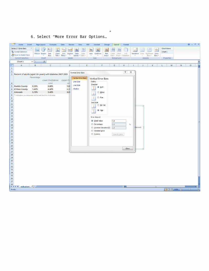
6. Select “More Error Bar Options…”

7. Before selecting anything else, make sure both the scatter plot and the Formatting Error Bars boxes are not covering your table where the desired fields are displayed. (Once you move onto the next steps, you aren’t able to move the boxes around so you can select desired fields)
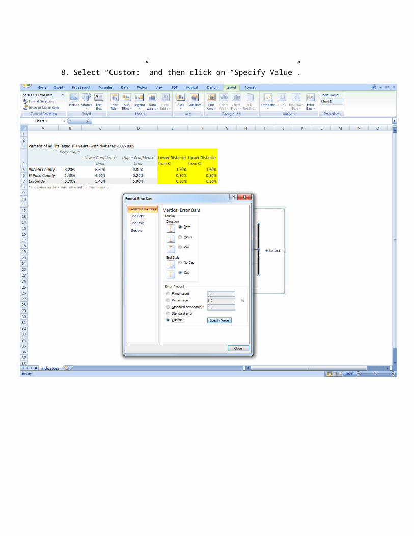
8. Select “Custom:” and then click on “Specify Value”.
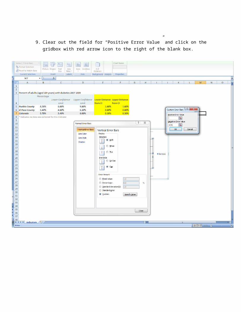
9. Clear out the field for “Positive Error Value” and click on the gridbox with red arrow icon to the right of the blank box.
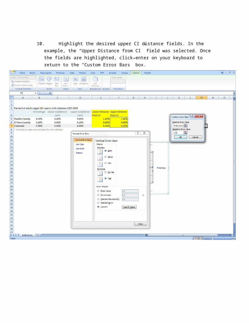
10. Highlight the desired upper CI distance fields. In the example, the “Upper Distance from CI” field was selected. Once the fields are highlighted, click enter on your keyboard to return to the “Custom Error Bars” box.

11. Clear out the “Negative Error Value” field and again click on the icon to the right of the blank box.
12. Next, select the desired lower CI distance fields. In the example, the “Lower Distance from CI” field was selected. Once the fields are highlighted, click enter on your keyboard to return to the “Custom Error Bars” box.
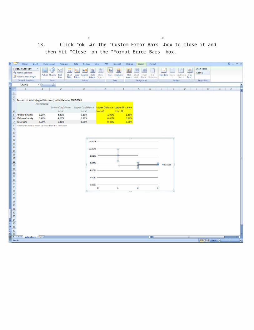
13. Click “ok” in the “Custom Error Bars” box to close it and then hit “Close” on the “Format Error Bars” box.

14. Lastly, to remove the horizontal bars, click on the horizontal bars and hit the “Delete” key on your keyboard. Now the plot should appear like this: