context booklet, circus
DESCRIPTION
Context Booklet, circusTRANSCRIPT


blank page
Designed by Rebecca Liggins2011©
“We didn’t reinvent the circus. We repackaged it in a much more modern way.”
Guy Laliberte
4

5
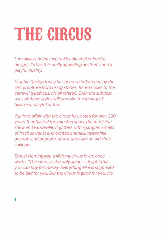
I am always being inspired by big bold colourful design, it’s has this really appealing aesthetic and a playful quality.
Graphic Design today has been so influenced by the circus culture from using stripes, to red noses to the carnival typefaces, it’s all related. Even the subtlest uses of these styles still provoke the feeling of bizarre or playful or fun.
Our love affair with the circus has lasted for over 200 years. It outlasted the minstrel show, the medicine show and vaudeville. It glitters with spangles, smells of fresh sawdust and excited animals, tastes like peanuts and popcorn, and sounds like an old-time calliope.
Ernest Hemingway, a lifelong circus lover, once wrote, “The circus is the only ageless delight that you can buy for money. Everything else is supposed to be bad for you. But the circus is good for you. It’s
6
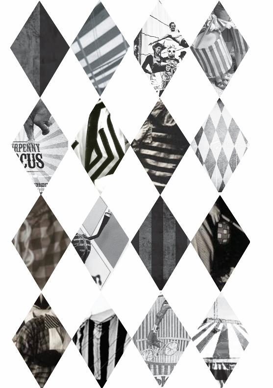
THE CIRCUS
the only spectacle I know that, while you watch it, gives the quality of a truly happy dream.”
During its heyday, the circus was the largest show-biz industry the world had ever seen. From the mid-1800s to mid-1900s, traveling circuses performed for audiences of up to 14,000 per show and crisscrossed the country on 20,000 miles of railroad in one season alone. The spectacle of death-defying daredevils and strapping super-heroes gripped the audiences imagination, outshining theater, comedy, and minstrel shows of the day, and ultimately paving the way for film and television. The circus offered viewers the dream of adventure and reinvention.
The modern concept of a circus is a circular arena surrounded by tiers of seats, for the exhibition of equestrian, acrobatic and other performances seems to have existed us since the late 18th century. and a clown to fill time between his own demonstrations, he created a modern circus
7
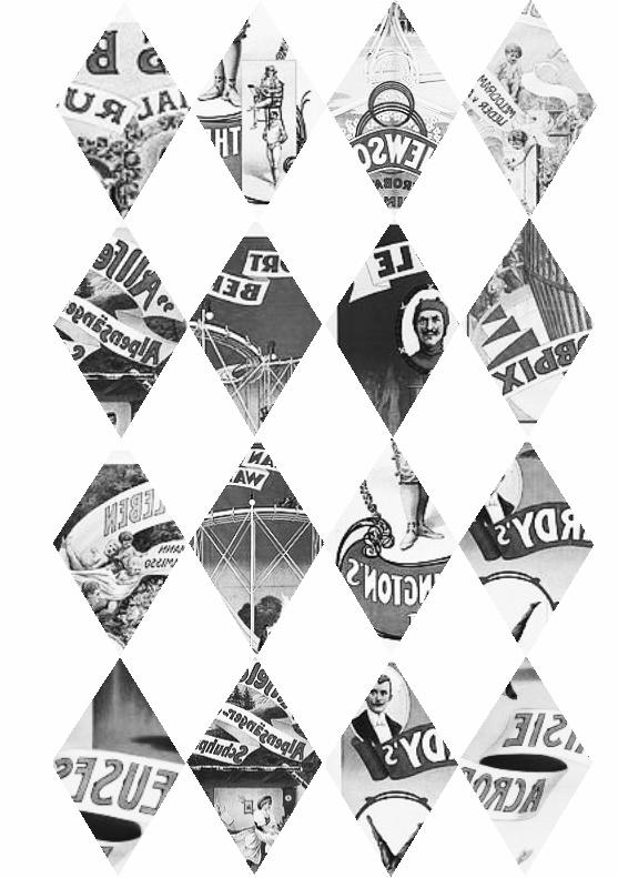
Characters at the circus are the main attraction; we love the fire-eaters, clowns, acrobatics, jugglers and the freaks. It’s the same today as it ever was, we love to be entertained by these acts, but these over the top characters are now transformed into iconic imagery for Graphic Design.
A moustache reflects characters of the circus men, red noses indicate a clown and using ‘freaks’ to lure the audiences curiosity, but in general using characteristics from the circus will give design a sense of bizarre fun and playful extravaganza.
CHARACTERS

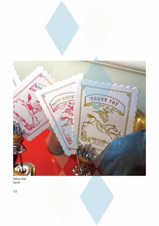
Yellow Owl Cards
12
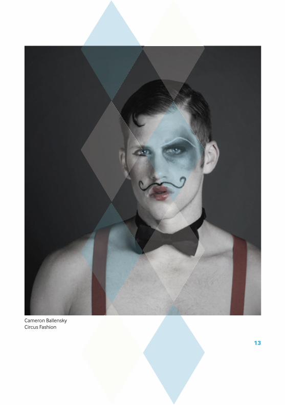
Cameron BallenskyCircus Fashion
13
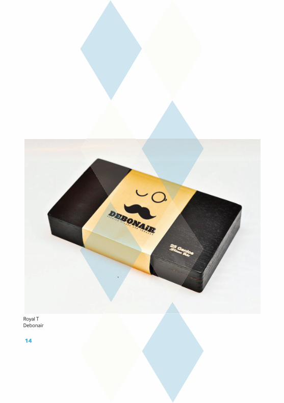
Royal TDebonair
14
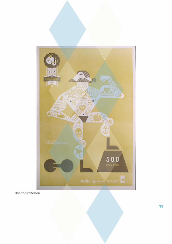
Dan Christoff erson
15
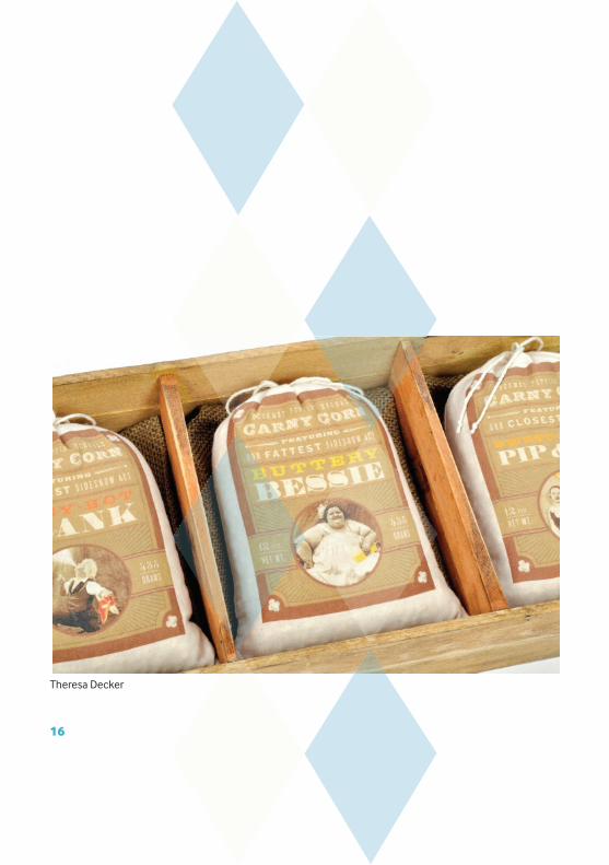
Theresa Decker
16
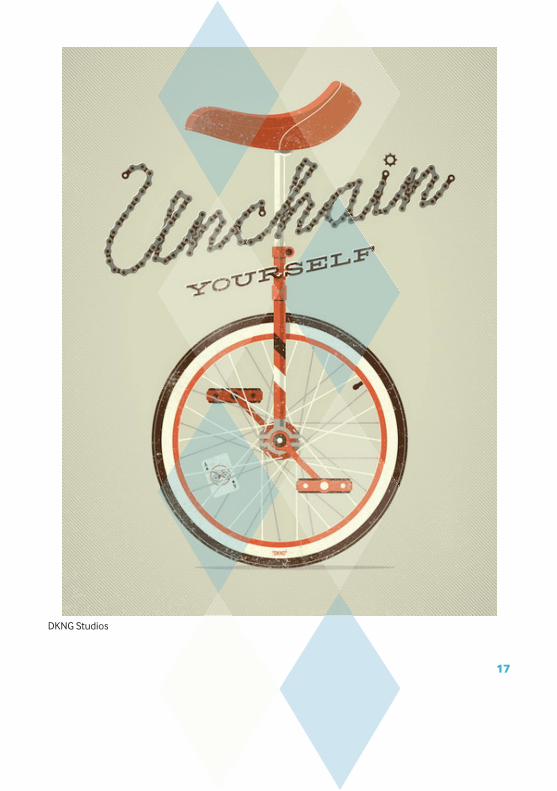
DKNG Studios
17
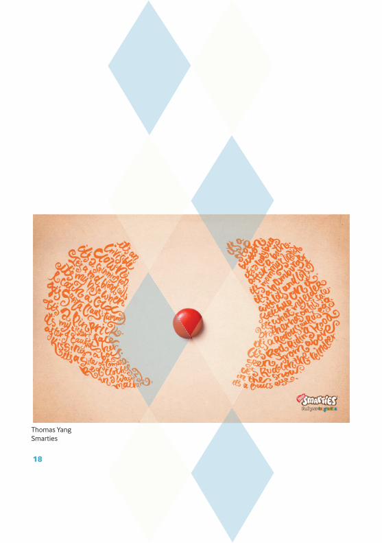
Thomas YangSmarties
18

Sayles
19
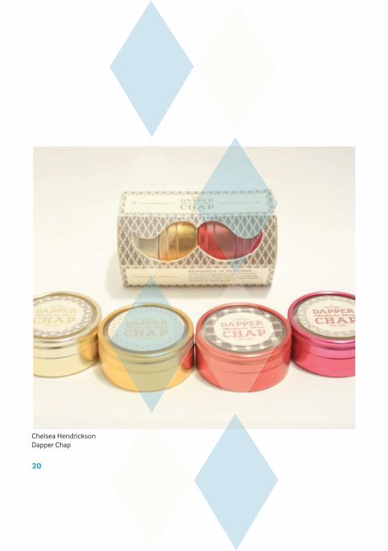
Chelsea HendricksonDapper Chap
20
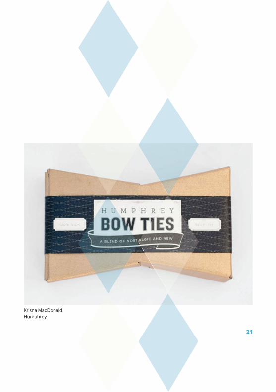
Krisna MacDonaldHumphrey
21

Manifesto DesignCurious Nature
22

Scodiolo CreativeMadame Scodiolo
23
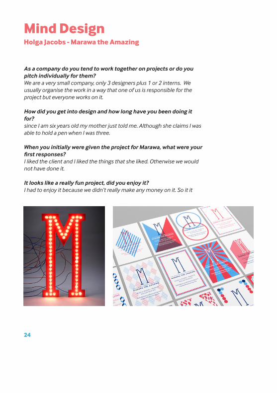
Mind Design Holga Jacobs - Marawa the Amazing
As a company do you tend to work together on projects or do you pitch individually for them?We are a very small company, only 3 designers plus 1 or 2 interns. We usually organise the work in a way that one of us is responsible for the project but everyone works on it.
How did you get into design and how long have you been doing it for?since I am six years old my mother just told me. Although she claims I was able to hold a pen when I was three.
When you initially were given the project for Marawa, what were your first responses?I liked the client and I liked the things that she liked. Otherwise we would not have done it.
It looks like a really fun project, did you enjoy it?I had to enjoy it because we didn’t really make any money on it. So it it
24

wouldn’t have been fun there would have been no point in it.Whats the best think about the British Circus?No Idea, I don’t really go to the circus. I am interested in Punk rock, cy-cling and furniture design.
Was the design direction of this lead more by yourselves or did the client have a strong idea of what they wanted? The client (Marawa) liked leopard prints and I liked art -deco at the time. I think the design direction was more lead by us but we usually work for clients that we ‘click’ with.
If you had to be an act at a circus, what would you be?I could only be a clown.
25
Characters at the circus are the main attraction; we love the fire-eaters, clowns, acrobatics, jugglers and the freaks. It’s the same today as it ever was, we love to be entertained by these acts, but these over the top characters are now transformed into iconic imagery for Graphic Design.
A moustache reflects characters of the circus men, red noses indicate a clown and using ‘freaks’ to lure the audiences curiosity, but in general using characteristics from the circus will give design a sense of bizarre fun and playful extravaganza.
BANNERS


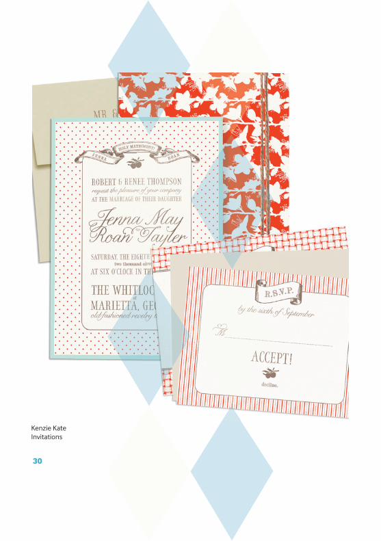
Kenzie KateInvitations
30

Alice PattulloPatullos Marmalade
31
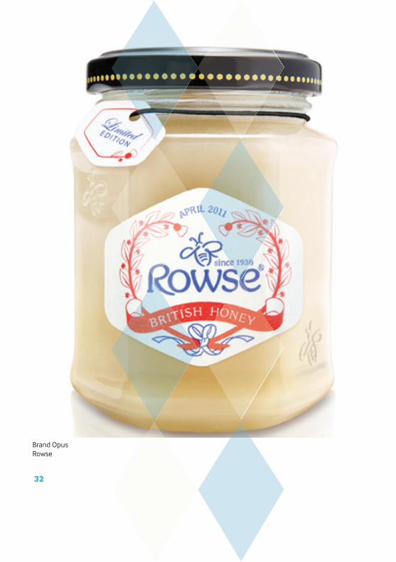
Brand OpusRowse
32
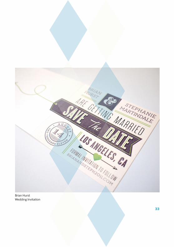
Brian HurstWedding Invitation
33
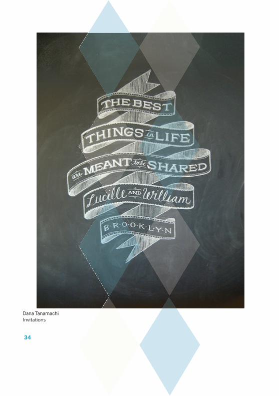
Dana TanamachiInvitations
34
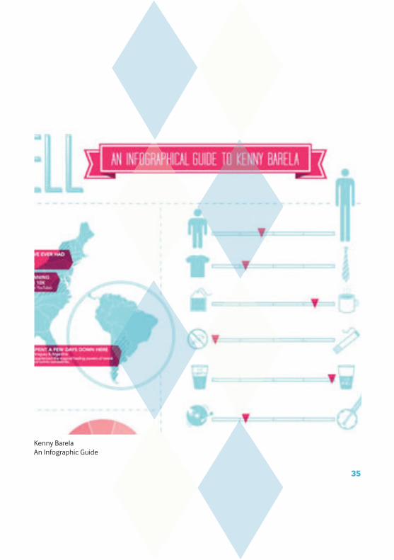
Kenny BarelaAn Infographic Guide
35
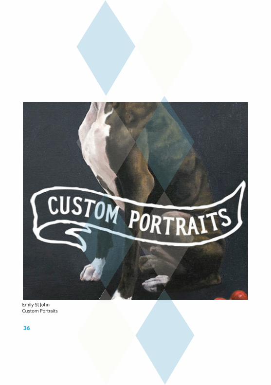
Emily St JohnCustom Portraits
36

Kyle Poff Savory Collection
37
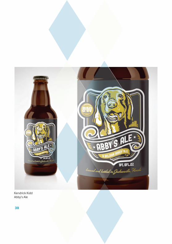
Kendrick KiddAbby’s Ale
38

I Love DustLove Your Bike
39

Luke ElliottFeel Good Drinks
40
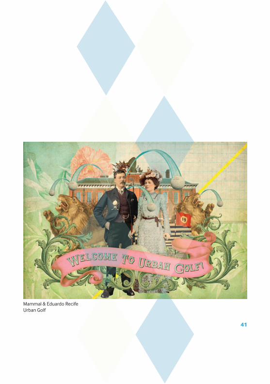
Mammal & Eduardo Recife Urban Golf
41

Matt ChasePostal Service
42

Beautiful PaperBirthday Invitation
43
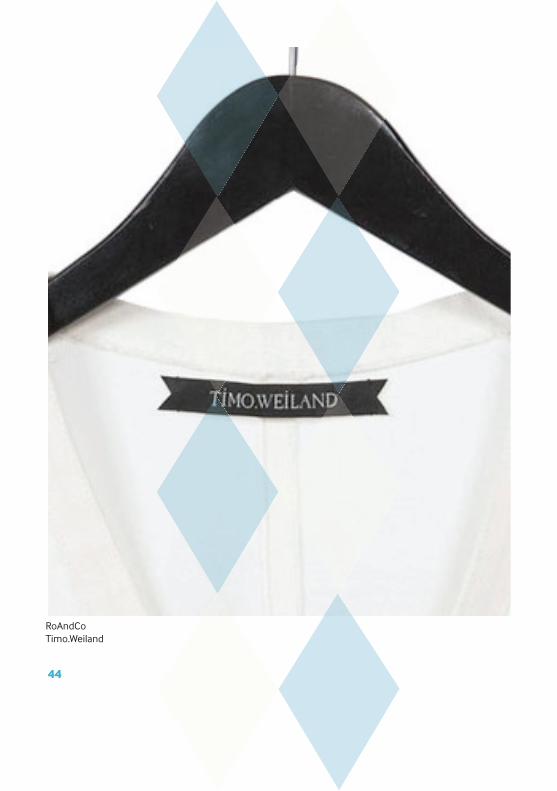
RoAndCoTimo.Weiland
44

Rocket Science AgencyDevil’s Weed
45

Small Talk StudioGift Card
46
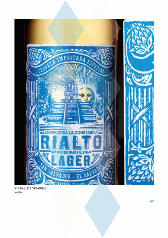
STRANGER & STRANGERRialto
47
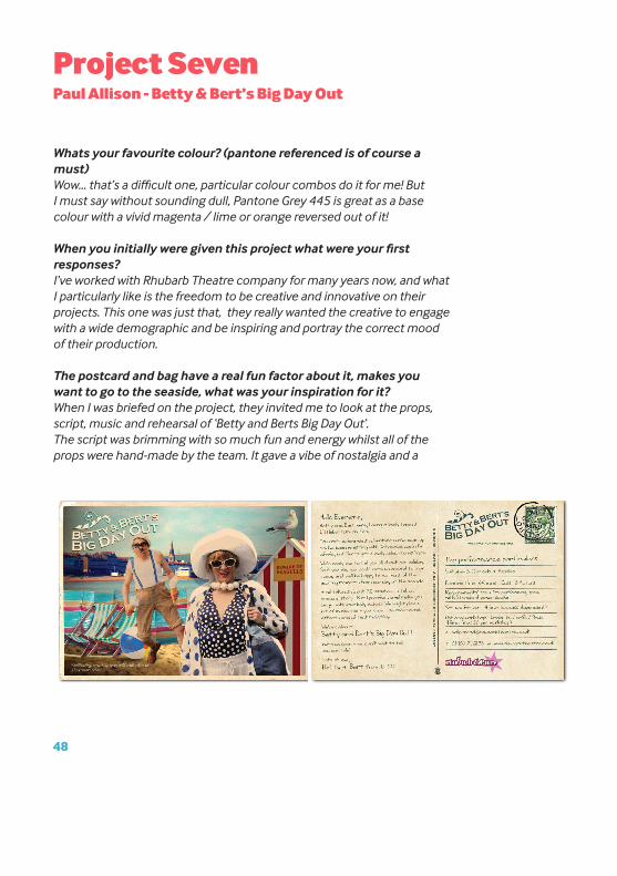
Project SevenPaul Allison - Betty & Bert’s Big Day Out
Whats your favourite colour? (pantone referenced is of course a must)Wow... that’s a difficult one, particular colour combos do it for me! But I must say without sounding dull, Pantone Grey 445 is great as a base colour with a vivid magenta / lime or orange reversed out of it!
When you initially were given this project what were your first responses?I’ve worked with Rhubarb Theatre company for many years now, and what I particularly like is the freedom to be creative and innovative on their projects. This one was just that, they really wanted the creative to engage with a wide demographic and be inspiring and portray the correct mood of their production.
The postcard and bag have a real fun factor about it, makes you want to go to the seaside, what was your inspiration for it?When I was briefed on the project, they invited me to look at the props, script, music and rehearsal of ‘Betty and Berts Big Day Out’.The script was brimming with so much fun and energy whilst all of the props were hand-made by the team. It gave a vibe of nostalgia and a
48

1950’s (ish) family day out at the seaside! This inspired me with the vintage theme and sepia toned photography / manipulation. The striped beach huts, rock and deck chairs inspired the sweet bags to house the postcard - this quirky gimmick created interest and people wanted to look inside....!
The colours, patterns and type have a strong circus feel to it, was this something lead more by client or designers?When I researched the project, looking at vintage posters circa 1950, I found that the typography and colour pallette that was typical of this time did have a certain circus, ornate qualities and did inspire the creative. The look and feel was led by the designer but closely working with the client who felt the direction taken was aspirational of fitting with their production.
If you had to be an act at a circus, what would you be?Tightrope walker ( also Great Stone Roses track called Tightrope - check it out!)
49

Characters at the circus are the main attraction; we love the fire-eaters, clowns, acrobatics, jugglers and the freaks. It’s the same today as it ever was, we love to be entertained by these acts, but these over the top characters are now transformed into iconic imagery for Graphic Design.
A moustache reflects characters of the circus men, red noses indicate a clown and using ‘freaks’ to lure the audiences curiosity, but in general using characteristics from the circus will give design a sense of bizarre fun and playful extravaganza.
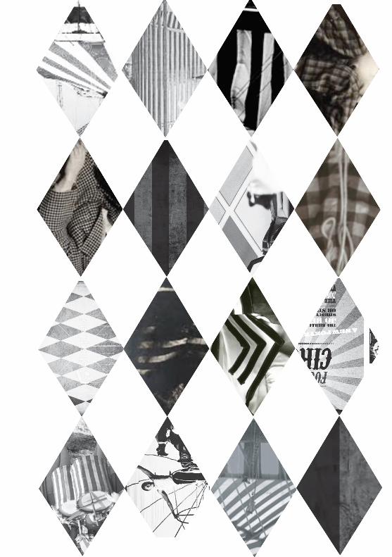
PATTERNS

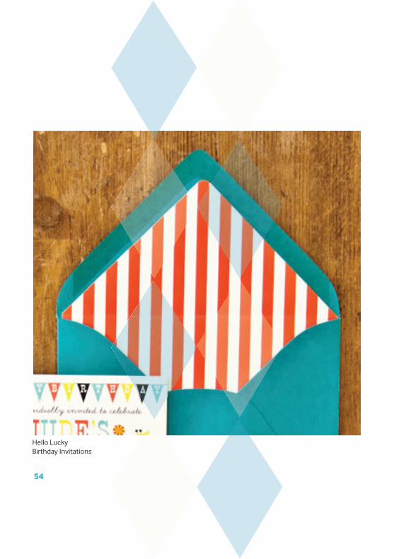
Hello LuckyBirthday Invitations
54
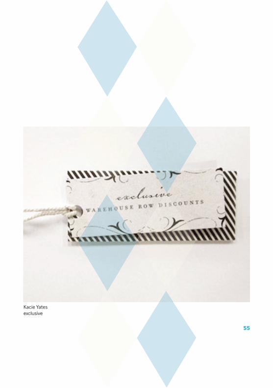
Kacie Yatesexclusive
55

Brooke ReynoldsBirthday Invitations
56
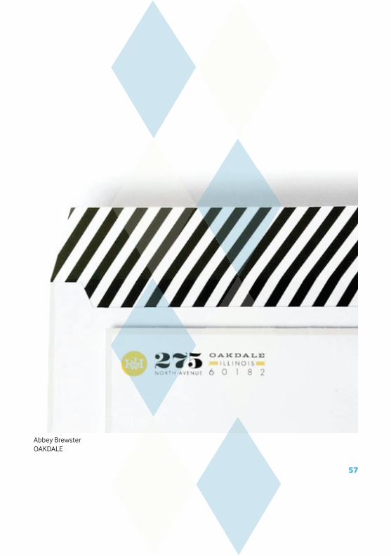
Abbey BrewsterOAKDALE
57
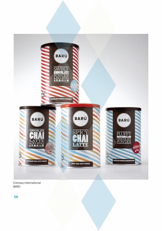
Creneau internationalBARU
58

Darden StudioDarden Studio
59

Kacie YatesDrew Lewis
60
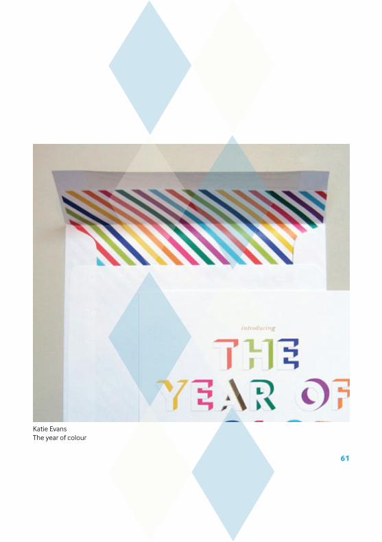
Katie EvansThe year of colour
61
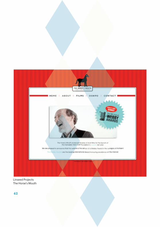
Linseed ProjectsThe Horse’s Mouth
62

Studio BombaMitchell Dent
63
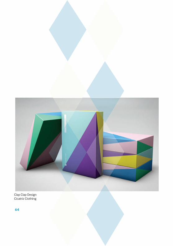
Clap Clap DesignCicatriz Clothing
64
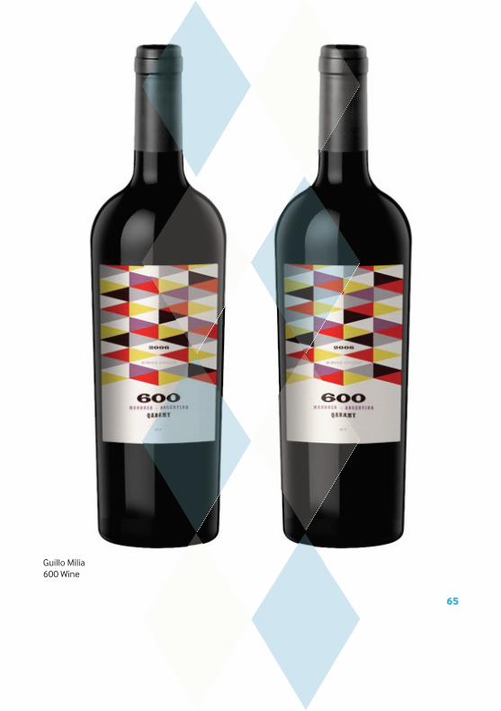
Guillo Milia600 Wine
65
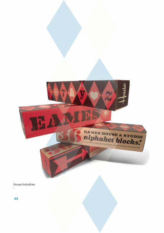
House Industries-
66
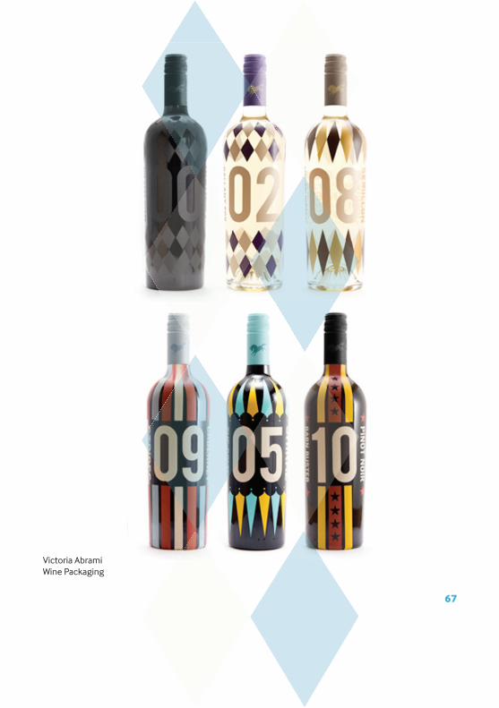
Victoria AbramiWine Packaging
67
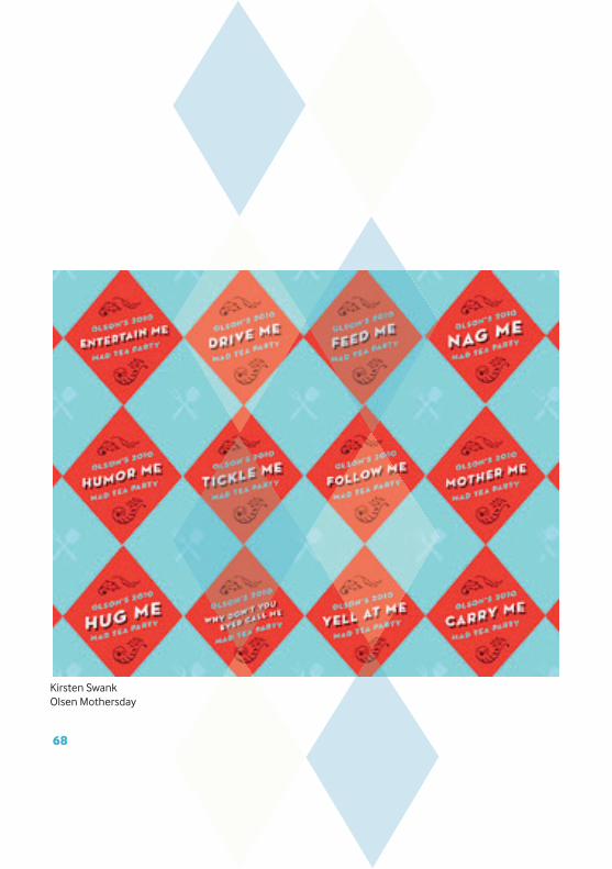
Kirsten SwankOlsen Mothersday
68
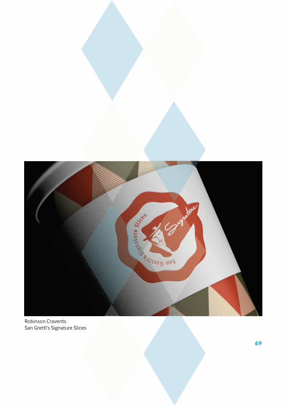
Robinson Cravents San Grettl’s Signature Slices
69
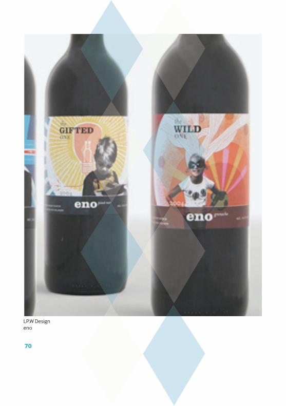
LP.W Designeno
70

Robinsson CraventsXnilo
71
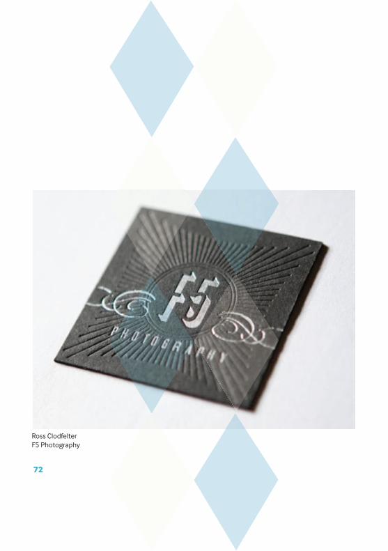
Ross ClodfelterF5 Photography
72
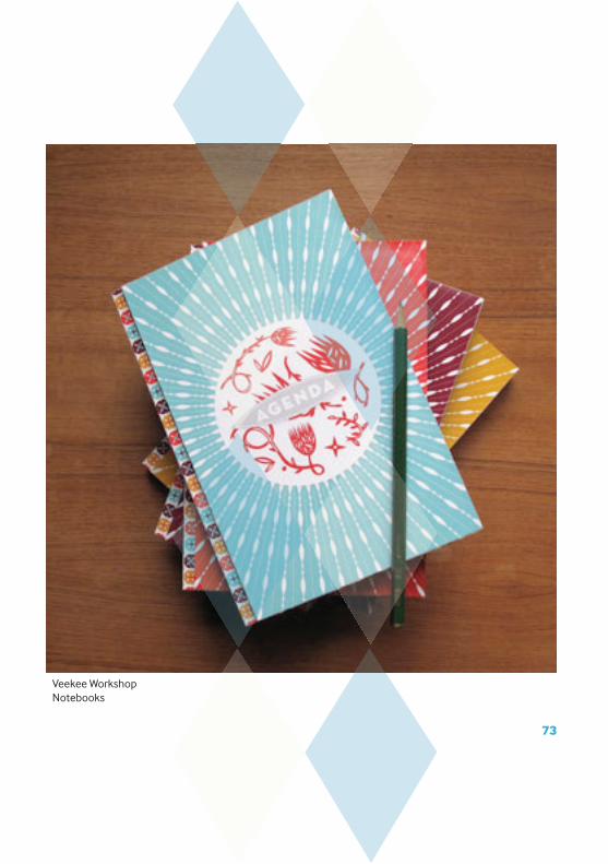
Veekee WorkshopNotebooks
73
bwa DesignPaul Thomas
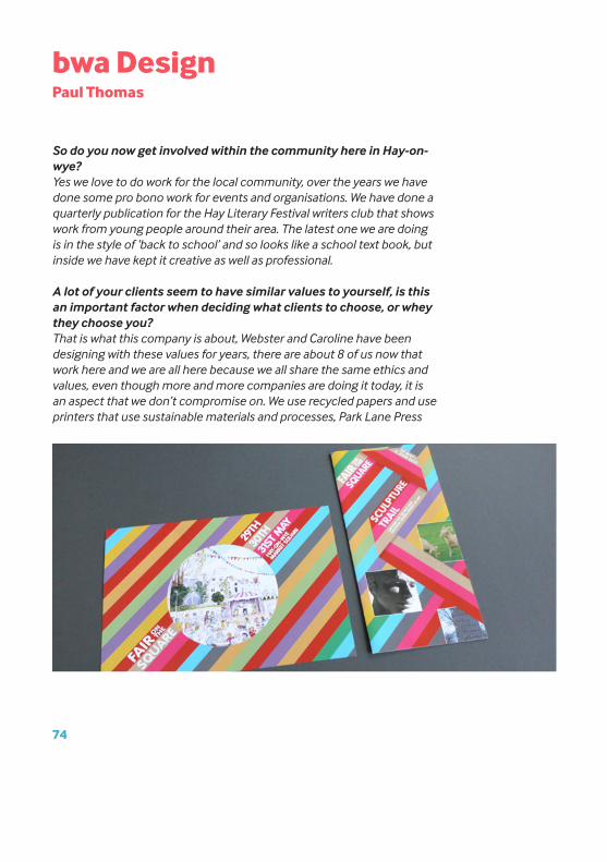
So do you now get involved within the community here in Hay-on-wye?Yes we love to do work for the local community, over the years we have done some pro bono work for events and organisations. We have done a quarterly publication for the Hay Literary Festival writers club that shows work from young people around their area. The latest one we are doing is in the style of ‘back to school’ and so looks like a school text book, but inside we have kept it creative as well as professional.
A lot of your clients seem to have similar values to yourself, is this an important factor when deciding what clients to choose, or whey they choose you?That is what this company is about, Webster and Caroline have been designing with these values for years, there are about 8 of us now that work here and we are all here because we all share the same ethics and values, even though more and more companies are doing it today, it is an aspect that we don’t compromise on. We use recycled papers and use printers that use sustainable materials and processes, Park Lane Press
74
are our favourite. All our suppliers have to fit with our values, we had a guy from GSM papers who came to show us their new range, and ever though they really do have some beautiful papers, we just cant justify using them.
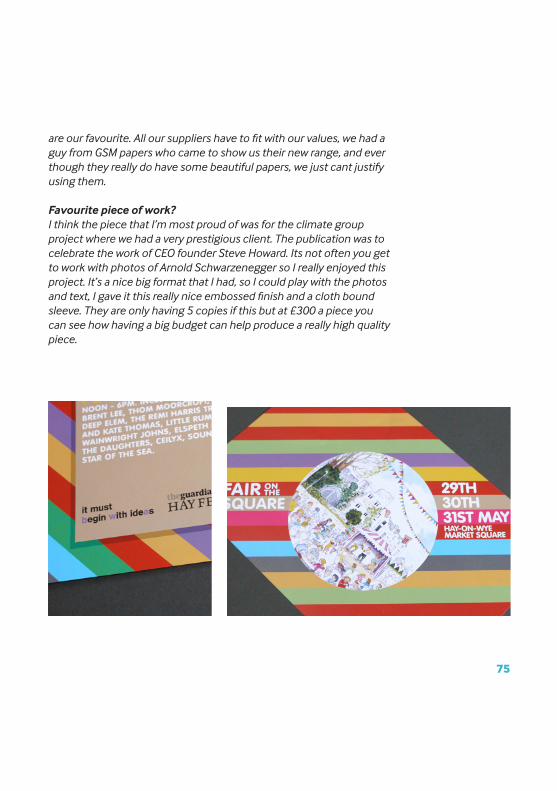
Favourite piece of work?I think the piece that I’m most proud of was for the climate group project where we had a very prestigious client. The publication was to celebrate the work of CEO founder Steve Howard. Its not often you get to work with photos of Arnold Schwarzenegger so I really enjoyed this project. It’s a nice big format that I had, so I could play with the photos and text, I gave it this really nice embossed finish and a cloth bound sleeve. They are only having 5 copies if this but at £300 a piece you can see how having a big budget can help produce a really high quality piece.
75
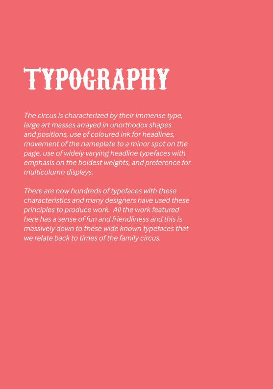
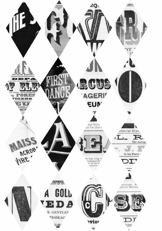
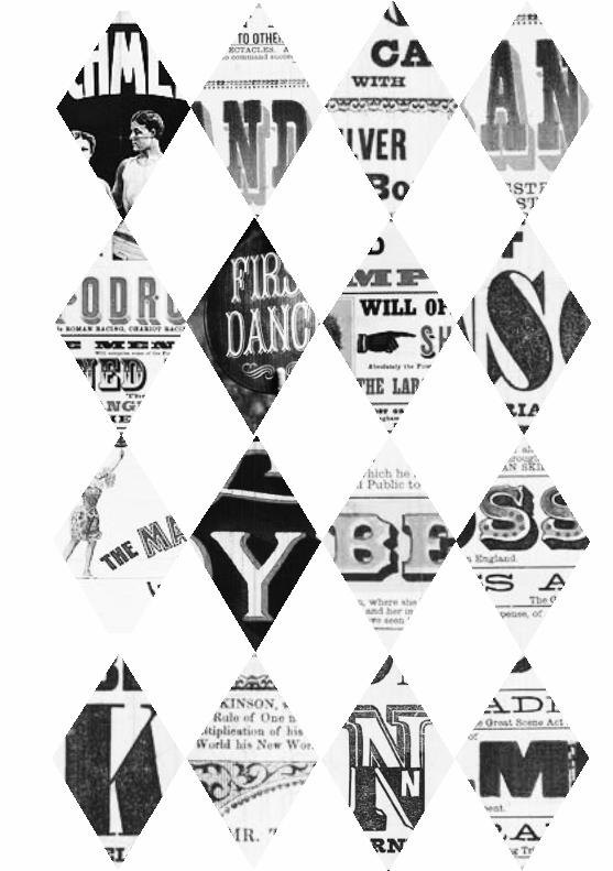
The circus is characterized by their immense type, large art masses arrayed in unorthodox shapes and positions, use of coloured ink for headlines, movement of the nameplate to a minor spot on the page, use of widely varying headline typefaces with emphasis on the boldest weights, and preference for multicolumn displays.
There are now hundreds of typefaces with these characteristics and many designers have used these principles to produce work. All the work featured here has a sense of fun and friendliness and this is massively down to these wide known typefaces that we relate back to times of the family circus.
TYPOGRAPHY


Matt ChasePostal Service
80
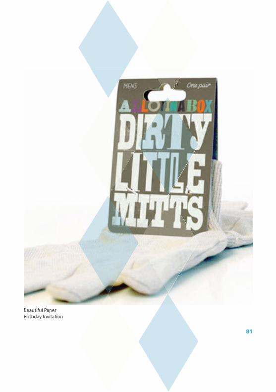
Beautiful PaperBirthday Invitation
81
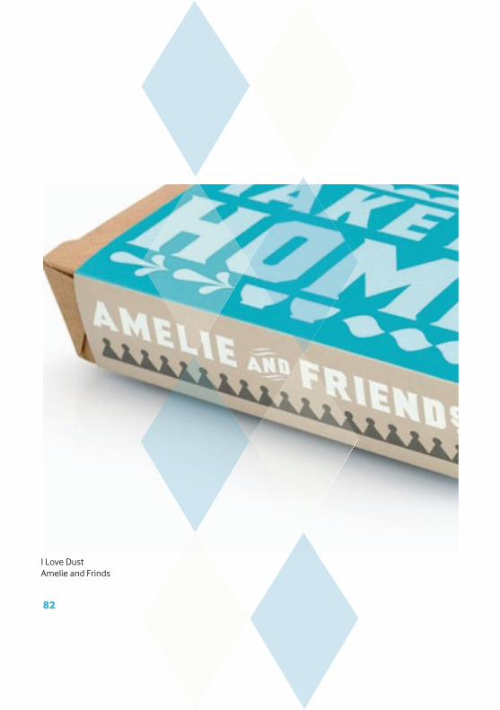
I Love DustAmelie and Frinds
82
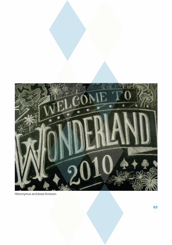
Hieronymus and Jesse Arneson
83
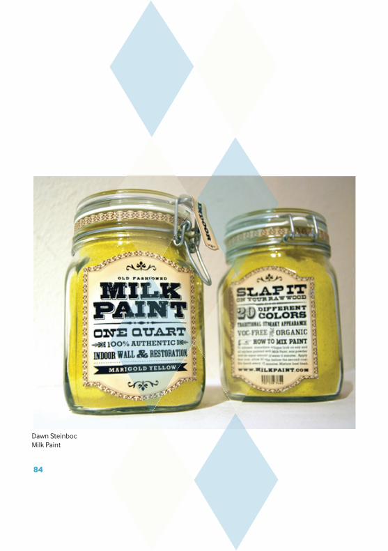
Dawn SteinbocMilk Paint
84
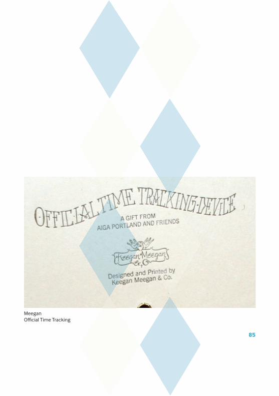
MeeganOffi cial Time Tracking
85

EsraweCielito Querido Cafe
86
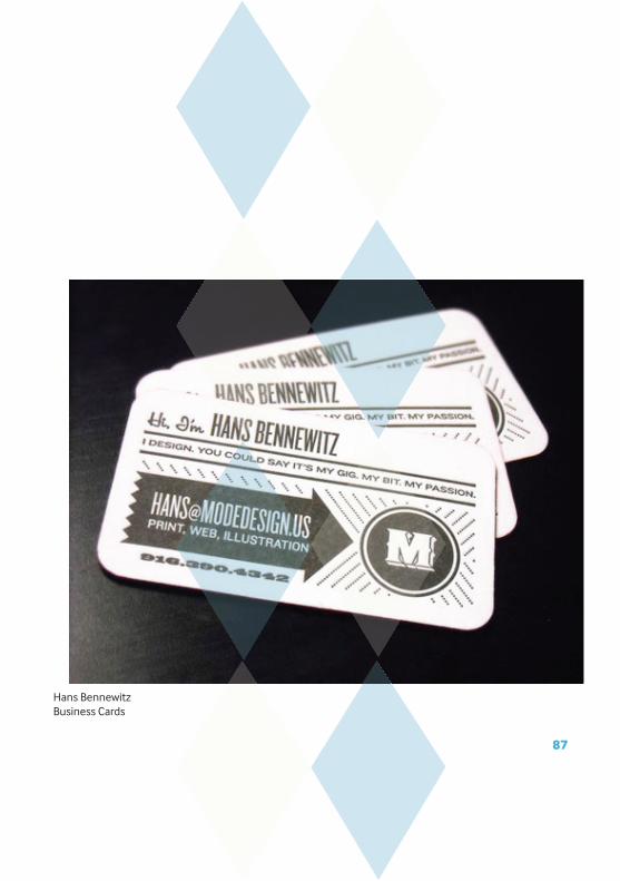
Hans BennewitzBusiness Cards
87

Cream Fields
88
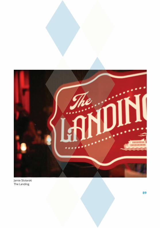
Jamie StolarskiThe Landing
89

Jonny WanTypeface
90
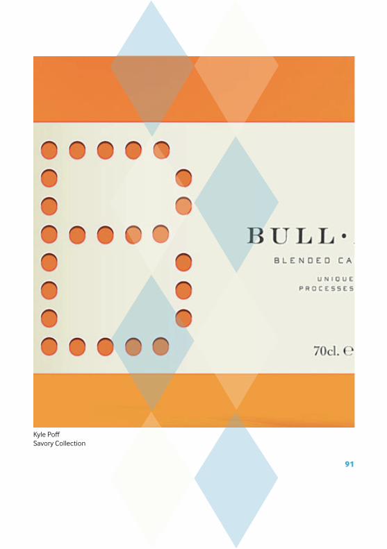
Kyle Poff Savory Collection
91

Mike Smith Sweetest
92
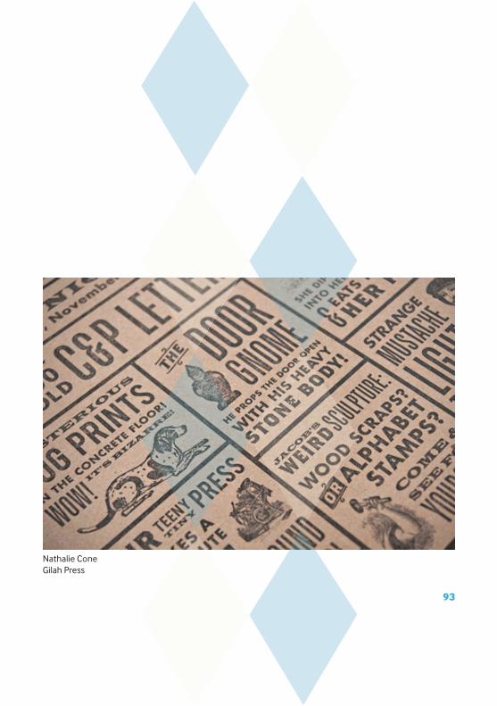
Nathalie ConeGilah Press
93

Oliver MundayMuseum of unnatural history
94
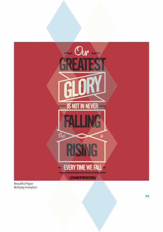
Beautiful PaperBirthday Invitation
95
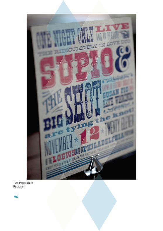
Two Paper DollsRelaunch
96

UnknownWedding Invitation
97
98
REFERENCES
www.circusmuseum.nl
99
100
Designed by Rebecca Liggins
101

3rd last page

2rd last page