composition a composition is an arrangement of elements, to achieve a unified whole. q
TRANSCRIPT

COMPOSITIONA COMPOSITION is an arrangement of elements, to achieve a unified whole.
Q
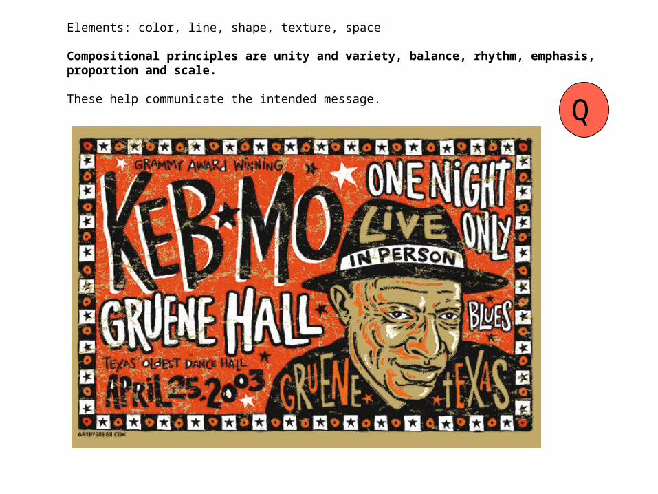
Elements: color, line, shape, texture, space
Compositional principles are unity and variety, balance, rhythm, emphasis, proportion and scale.
These help communicate the intended message.
Q

Unity and Variety
Unity - denotes wholeness, harmony
Elements that have similar characteristics provide unity as well as theme.
This can be achieved by repetition of line, color, texture, shape, size…
Variety - provides interest
the essence of variety is contrast
Q

Balance
symmetrical: weight and size the same at both ends of a central axisasymmetrical: sizes and amounts may differ, weights equal
Symmetry Asymmetry
Q
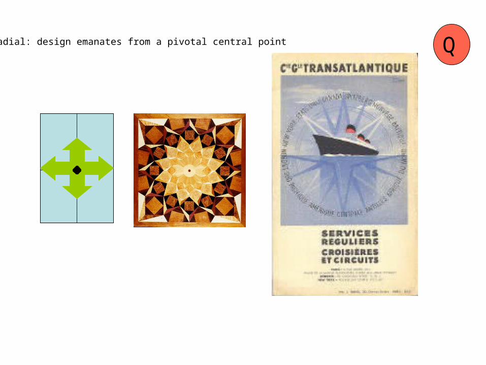
radial: design emanates from a pivotal central point Q

Rhythm use of repetitive elements, measurementcreates visual movement - references measure in soundmeter, being a perceived underlying structure
Q

Emphasis focal point, dominant or attention getting part of the design
often dramatic - use of elements to direct the eye to important areaisolation, contrast used to make this occur
Q

Photo by David Blumenkrantz
unity and variety, balance, rhythm, emphasis, proportion and scale

PROPORTION
Proportion refers to the relative size and scale of the various elements in a design - the relationship between objects, or parts, of a whole.
In dog shows, the proportions of the animal are critical to success.
The parts of a chair are proportional in terms of function and aesthetics. We recognize bodies and faces via proportions.
The proportions of the framing below alter the way we see the image.
Q

The GOLDEN SECTION and THE FIBONACCI NUMBERS: :The ancient Greeks studied mathematics and felt that it was the controlling force of the universe. From mathematics they derived what they considered to be the ideal proportion - the golden mean or golden section - for harmonious effect.
If we create a set of squares inside the golden rectangle, always adhering to the same proportions, and then inscribe a spiral through these, we get the identical pattern as found in nature for such things as the spiral of a nautilus shell, a cat's claw, a pine cone, flowers, etc.
The golden section has been used extensively in architecture, painting, and sculpture.
Q


The ratio of 3:5 (or 5:3) is special to professional designers. Photographers and artists have long noted that viewers seem to prefer pictures which are proportioned using this ratio.
A rectangle whose width is greater than its height is called a "landscape" orientation, and is viewed as pastoral and calming.
A rectangle whose height is greater than its width has a "portrait" orientation, and is considered to attract more attention, but not be as soothing, as a landscape.
Another special ratio is 2:3.5 for smaller shapes. This is the ratio of most business cards. This size, and multiples of it, seem very comfortable and familiar. That being said, an unusual size might stand out, but not fit into the size of a wallet pocket…
Q

A Simple Approach to Good Composition - Rule of Thirds
1. The most natural and pleasing size ground or format size upon which to compose a picture is a Golden Rectangle,
2. Divide the rectangle into thirds. This will aid in locating the "sweet spots" in which to place the center of interest.
Don't divide the picture into 4 equal quarters. This is boring, and can lead to producing four pictures in one painting. Avoid placing the center of interest in the dead center of the support.
Any object that is dead center commands the viewer's attention. It is too powerfully-placed to ignore, overshadowing other elements needed to understand the picture.
If you want your viewer to ignore all other parts of your composition, then place your center of interest smack in the middle, like a bulls’ eye. The important thing is that you know the reasons for object placement in your images. Knowing why you do something and what effect it will have leads to good composition.
Q
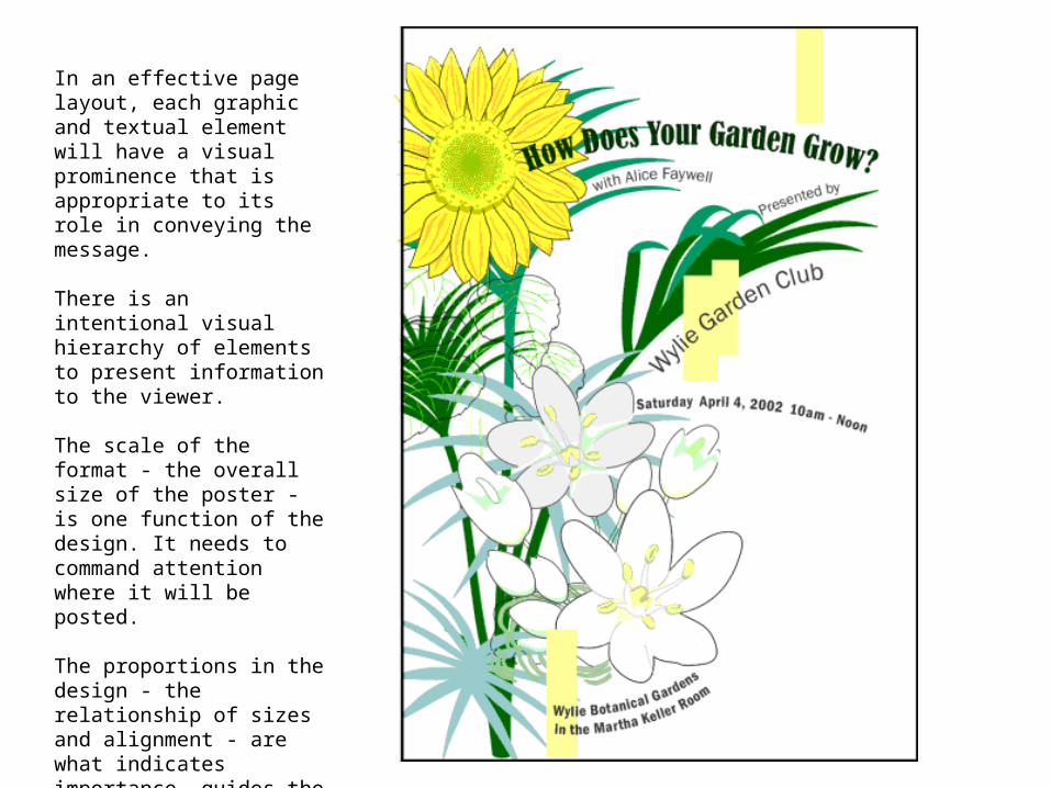
In an effective page layout, each graphic and textual element will have a visual prominence that is appropriate to its role in conveying the message.
There is an intentional visual hierarchy of elements to present information to the viewer.
The scale of the format - the overall size of the poster - is one function of the design. It needs to command attention where it will be posted.
The proportions in the design - the relationship of sizes and alignment - are what indicates importance, guides the eye, enhances movement and provides unity.

In this celebrity portrait, Robert Frank intentionally
subverted the traditional depth of field effect, creating a feeling of isolation rather than
adulation for the subject.
The proportion of the front figure makes her
feel close to us, yet unconnected due to the
blurry quality of this part.

Some basic design compositional hints:
1. Designate your focal point. Ask yourself, "Where do I want the viewer's attention to be drawn first?" Then you can choose your supplementary, supporting photographs, if appropriate.
2. Consider the whole page - figure and ground.
3. Consider effective proportions. You might apply the "Rule of Thirds." Think of your page as a grid, divided into thirds horizontally and vertically. Place your focal point on one of the convergences of these lines.
4. Maintain balance . Choose symmetry or asymmetry as a strategy. Consider both the size and complexity of your page elements as you distribute them in your layout.
5. Use repetition. Repeat shapes, textures, sizes, colors, or other attributes to achieve rhythm, unity and theme.
Q

Photo by Lewis Hine
Center of Interest and Focal PointHow does this composition enhance the message about the working conditions and youth at end of the 1800s?