colour theory looking at design & its use in accessibility issues group members: rashik rashik...
Post on 21-Dec-2015
216 views
TRANSCRIPT

Colour Theory Looking at Colour Theory Looking at Design & its use in Design & its use in Accessibility Issues Accessibility Issues
Group Members:Group Members:
•RashikRashik
•AndyAndy
•LeeLee
•PaulPaul
•Gareth Gareth
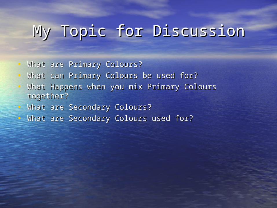
My Topic for DiscussionMy Topic for Discussion
• What are Primary Colours?What are Primary Colours?
• What can Primary Colours be used for?What can Primary Colours be used for?
• What Happens when you mix Primary Colours together?What Happens when you mix Primary Colours together?
• What are Secondary Colours?What are Secondary Colours?
• What are Secondary Colours used for?What are Secondary Colours used for?
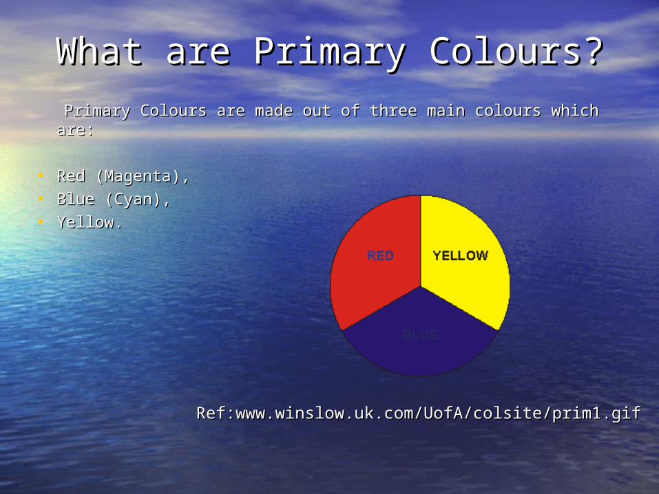
What are Primary Colours?What are Primary Colours?
Primary Colours are made out of three main colours which Primary Colours are made out of three main colours which are:are:
• Red (Magenta), Red (Magenta),
• Blue (Cyan),Blue (Cyan),
• Yellow.Yellow.
Ref:www.winslow.uk.com/UofA/colsite/prim1.gifRef:www.winslow.uk.com/UofA/colsite/prim1.gif
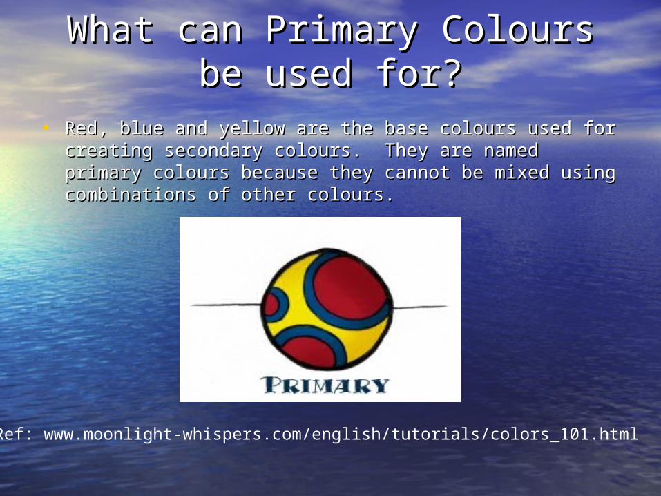
What can Primary Colours be What can Primary Colours be used for?used for?
• Red, blue and yellow are the base colours used for creating Red, blue and yellow are the base colours used for creating secondary colours. They are named primary colours secondary colours. They are named primary colours because they cannot be mixed using combinations of other because they cannot be mixed using combinations of other colours. colours.
Ref: www.moonlight-whispers.com/english/tutorials/colors_101.html

What Happens when you mix What Happens when you mix Primary Colours together?Primary Colours together?
• When you mix the three of the primary colours together the When you mix the three of the primary colours together the out come you get is the colour Black.out come you get is the colour Black.
• When you mix an equal amount of Red and Yellow the out When you mix an equal amount of Red and Yellow the out come you get is the colour orange. come you get is the colour orange.
• When you mix an equal amount of Yellow and Blue the out When you mix an equal amount of Yellow and Blue the out come you get is the colour green.come you get is the colour green.
• When you mix an equal amount of Blue and Red the out When you mix an equal amount of Blue and Red the out come you get is the colour Purple.come you get is the colour Purple.
Orange Equal parts of Red and Yellow
Green Equal parts of Yellow and Blue
Purple Equal parts of Blue and Red
Ref: www.beadville.com/information/tutorials/Basic%20Color/basics.htm

What are Secondary Colours?What are Secondary Colours?
• Secondary Colours are an out come of mixing primary Secondary Colours are an out come of mixing primary colours together.colours together.
• Secondary Colours consume of three main colours: Secondary Colours consume of three main colours:
Orange, Green and Purple.Orange, Green and Purple.
Orange Equal parts of Red and Yellow
Green Equal parts of Yellow and Blue
Purple Equal parts of Blue and Red
Ref: www.beadville.com/information/tutorials/Basic%20Color/basics.htm

What are Secondary Colours What are Secondary Colours used for?used for?
• Painters and artist use secondary colours by mixing the Painters and artist use secondary colours by mixing the three main primary colours. three main primary colours.
Ref: www.webthang.co.uk/Tuts/tuts_graphics/graphics1/1159_Sample_files/image004.jpg
Accessibility and UsabilityAccessibility and Usability
• Hue, Saturation and LightHue, Saturation and Light
• Colour deficienciesColour deficiencies
• UsabilityUsability
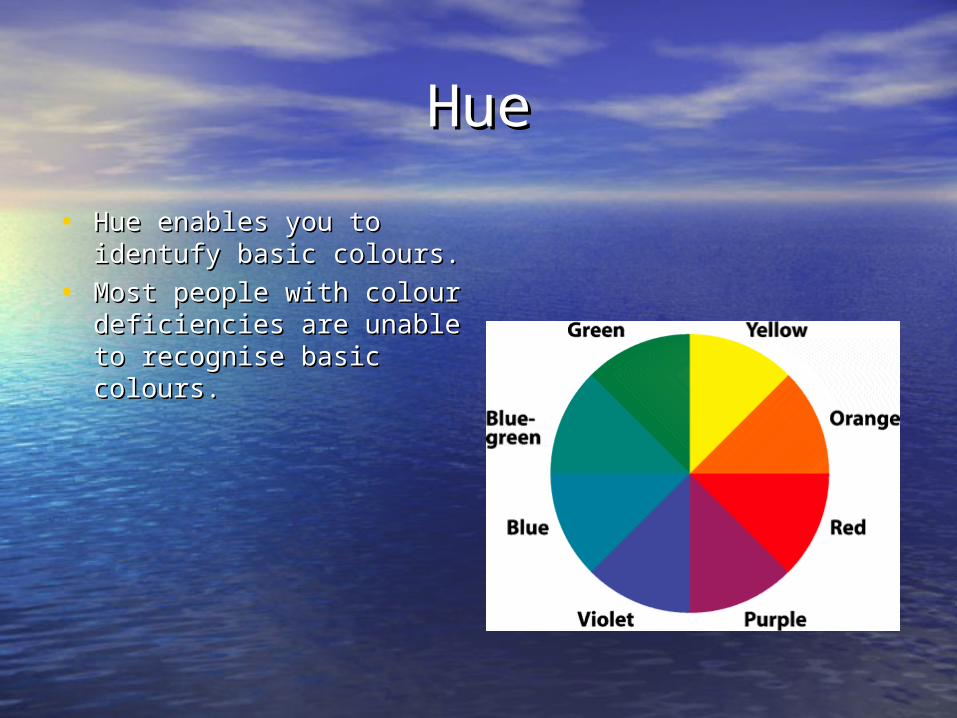
HueHue
• Hue enables you to Hue enables you to identufy basic colours.identufy basic colours.
• Most people with colour Most people with colour deficiencies are unable to deficiencies are unable to recognise basic colours.recognise basic colours.
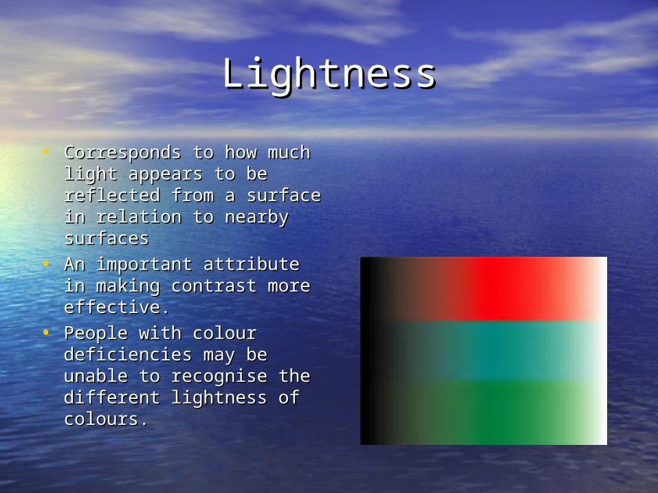
LightnessLightness
• Corresponds to how much Corresponds to how much light appears to be light appears to be reflected from a surface in reflected from a surface in relation to nearby surfacesrelation to nearby surfaces
• An important attribute in An important attribute in making contrast more making contrast more effective.effective.
• People with colour People with colour deficiencies may be unable deficiencies may be unable to recognise the different to recognise the different lightness of colours.lightness of colours.

SaturationSaturation
• The degree of colour The degree of colour intensity associated with intensity associated with colour’s perceptual colour’s perceptual difference from a white, difference from a white, black or grey of equal black or grey of equal lightness.lightness.
• It is difficult for people with It is difficult for people with colour deficiencies to colour deficiencies to distinguish between distinguish between different saturations of different saturations of colour.colour.

Colour deficienciesColour deficiencies
• Colour deficiencies and partial sight result in changes in Colour deficiencies and partial sight result in changes in perception, which reduces the effectiveness of certain perception, which reduces the effectiveness of certain colour combinations.colour combinations.
• Colours that people with normal vision may see can be Colours that people with normal vision may see can be significantly different from what people with colour significantly different from what people with colour deficiencies may see.deficiencies may see.

Three rules for making Three rules for making effective colour choices are:effective colour choices are:
• 1. Exaggerate the 1. Exaggerate the differences between the differences between the lightness of the lightness of the foreground and foreground and background colours.background colours.
• Avoid using colours of Avoid using colours of similar lightness.similar lightness.
• Visual accessibility will be Visual accessibility will be increased if you make increased if you make light colours lighter and light colours lighter and dark colours darker.dark colours darker.

• 2. When choosing two colours 2. When choosing two colours avoid picking two light avoid picking two light colours or two dark colours.colours or two dark colours.
• Avoid picking light colours Avoid picking light colours from the bottom half of the from the bottom half of the circle against dark colours of circle against dark colours of the top half.the top half.
• For the best effect choose For the best effect choose dark colours from the bottom dark colours from the bottom half of the circle against light half of the circle against light colours from the top half of colours from the top half of the circle.the circle.
• People with colour People with colour deficiencies may not be able deficiencies may not be able to distinguish the lightness of to distinguish the lightness of colours in the bottom half of colours in the bottom half of the circle.the circle.
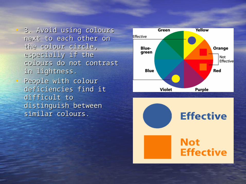
• 3. Avoid using colours next 3. Avoid using colours next to each other on the colour to each other on the colour circle, especially if the circle, especially if the colours do not contrast in colours do not contrast in lightness.lightness.
• People with colour People with colour deficiencies find it difficult deficiencies find it difficult to distinguish between to distinguish between similar colours.similar colours.

UsabilityUsability
• Users have come to associate specific colours with certain Users have come to associate specific colours with certain emotions.emotions.
• Some colours have the same effects on people from all Some colours have the same effects on people from all cultures, such as:cultures, such as:
• RED RED – associated with danger, passion and excitement.– associated with danger, passion and excitement.
• YELLOW YELLOW ANDAND BLACK BLACK – suggest danger.– suggest danger.
• Other colours have different meanings in different cultures. Other colours have different meanings in different cultures. In western Europe white is regarded as the colour of purity, In western Europe white is regarded as the colour of purity, cleanliness and innocence. Whereas in China, white is seen cleanliness and innocence. Whereas in China, white is seen as an unlucky colour.as an unlucky colour.

• Users have also come to Users have also come to associate specific colours associate specific colours with certain actions.with certain actions.
• HyperlinksHyperlinks
• If you change certain If you change certain colours that people have colours that people have come to recognise, you come to recognise, you compromise the usability of compromise the usability of the web page.the web page.

• Visually impaired users may Visually impaired users may not be able to distinguish not be able to distinguish certain colours.certain colours.
• Screen tips - describes Screen tips - describes images and links etc.images and links etc.
• Asterisks - highlights key Asterisks - highlights key information.information.
• People who are colour blind People who are colour blind will not be able to recognise will not be able to recognise that the stop sign is green, that the stop sign is green, so will not understand the so will not understand the purpose of the image.purpose of the image.

• Text needs to be clear and easily readable for most users.Text needs to be clear and easily readable for most users.
• So using a readable font style, a legible font size and So using a readable font style, a legible font size and contrasting colours will improve usability.contrasting colours will improve usability.

Web designs using colourWeb designs using colour
• Why colours are used in design.Why colours are used in design.
• How colours enhance web design.How colours enhance web design.
Why colours are used in designWhy colours are used in design
• Colour communicates.Colour communicates.
• Makes a website more attractive to view and enhances its Makes a website more attractive to view and enhances its popularity.popularity.
• Corporate colours used within websites are used to identify Corporate colours used within websites are used to identify them to the public or clients.them to the public or clients.
• Plain white background with black text isn’t ‘cool’.Plain white background with black text isn’t ‘cool’.

Colour Communicates Colour Communicates
• Colour is everywhere, and thus we recognise significant Colour is everywhere, and thus we recognise significant colours more than others.colours more than others.
• Colours trigger pleasant memories or encounters.Colours trigger pleasant memories or encounters.
• Red is warm, blue is cool, green is fresh (grassy meadows).Red is warm, blue is cool, green is fresh (grassy meadows).

How colours enhance websitesHow colours enhance websites
• Effective use of colour in the design of websites has grown Effective use of colour in the design of websites has grown with time and now we are seeing more and more websites with time and now we are seeing more and more websites trying to encapsulate their target audience with the correct trying to encapsulate their target audience with the correct use of colour.use of colour.
• Text based sites don’t have the appeal that a colourful Text based sites don’t have the appeal that a colourful display has on the eye eg test based sites can cause the display has on the eye eg test based sites can cause the user to strain more to read and understand, whereas user to strain more to read and understand, whereas colours are recognised internally by ourselves to the point colours are recognised internally by ourselves to the point where we are attracted to certain sites more than others where we are attracted to certain sites more than others due to their colour.due to their colour.

Get ready for some colour!Get ready for some colour!
• www.motiongraphiks.comwww.motiongraphiks.com
• www.allmediastudios.comwww.allmediastudios.com
• www.disney.co.ukwww.disney.co.uk
• Using colourUsing colour
• Colour combinationsColour combinations
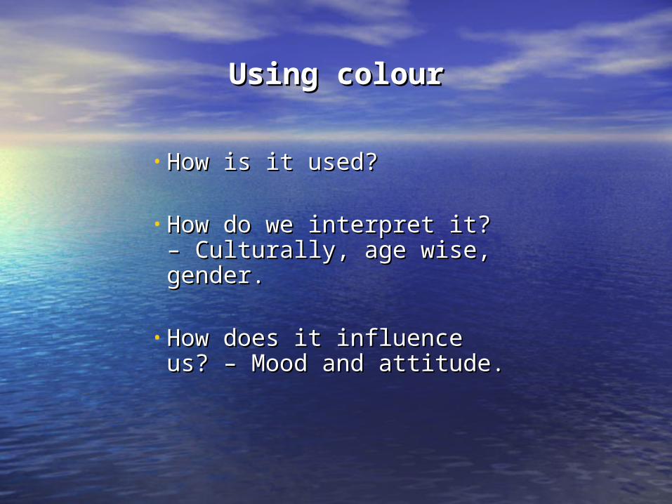
Using colourUsing colour
• How is it used?How is it used?
• How do we interpret it? – How do we interpret it? – Culturally, age wise, gender.Culturally, age wise, gender.
• How does it influence us? – How does it influence us? – Mood and attitude.Mood and attitude.

Colour in our livesColour in our lives
Colour is an integral part of our Colour is an integral part of our every day lives.every day lives.
The colours we see during the The colours we see during the day play a big part in day play a big part in determining how we feel, and determining how we feel, and how we communicate with how we communicate with those around us. those around us.

How does colour effect us?How does colour effect us?
The different colours used have hidden meanings:-The different colours used have hidden meanings:-
• Sun flower yellow may reinforce the warmth and Sun flower yellow may reinforce the warmth and cheerfulness of a tropical resort’s site or destroy a cheerfulness of a tropical resort’s site or destroy a law firm’s site by suggesting cowardice.law firm’s site by suggesting cowardice.
• Red is the colour of fire and blood not associated Red is the colour of fire and blood not associated with serenity or dependability.with serenity or dependability.
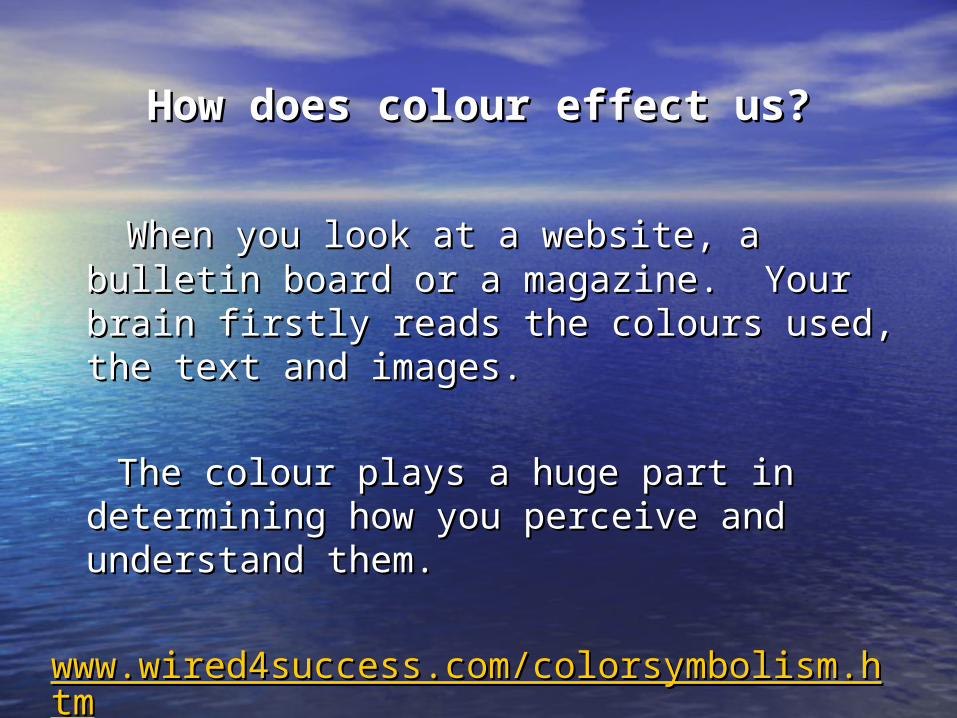
How does colour effect us?How does colour effect us?
When you look at a website, a bulletin board or a When you look at a website, a bulletin board or a magazine. Your brain firstly reads the colours magazine. Your brain firstly reads the colours used, the text and images. used, the text and images.
The colour plays a huge part in determining how The colour plays a huge part in determining how you perceive and understand them.you perceive and understand them.
www.wired4success.com/colorsymbolism.htmwww.wired4success.com/colorsymbolism.htm

Colour combinationsColour combinations
• Use 3 – 5 colour different colours, when planning Use 3 – 5 colour different colours, when planning your website.your website.
• Background colour – whiteBackground colour – white
• Body text colour – black or blueBody text colour – black or blue
• Dominant contrast colour – blue or black. headings Dominant contrast colour – blue or black. headings borders, deep or soft colours depending on the borders, deep or soft colours depending on the theme of the website.theme of the website.
www.kestrel-designs.com/articles/colors_websafe.html

Colour combinationsColour combinations
• Use the colours to draw the eyes towards where Use the colours to draw the eyes towards where you want them. Give them a direction using you want them. Give them a direction using different tones.different tones.
• Remember the “Signal detection” theory. Don’t Remember the “Signal detection” theory. Don’t overload the website with different colours. overload the website with different colours.
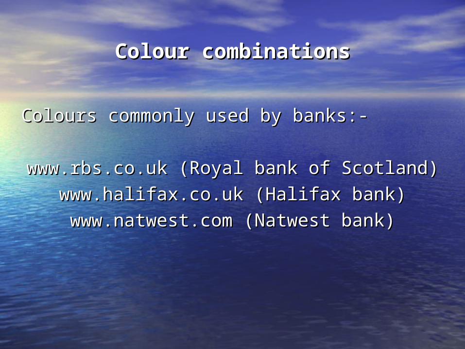
Colour combinationsColour combinations
Colours commonly used by banks:-Colours commonly used by banks:-
www.rbs.co.uk (Royal bank of Scotland)www.rbs.co.uk (Royal bank of Scotland)
www.halifax.co.uk (Halifax bank)www.halifax.co.uk (Halifax bank)
www.natwest.com (Natwest bank)www.natwest.com (Natwest bank)

ConclusionConclusion
The subject of colour theory with regards to The subject of colour theory with regards to design, and it’s use in accessibility issues, is design, and it’s use in accessibility issues, is quite a large subject to cover.quite a large subject to cover.
What we’ve hoped to have done for you today is What we’ve hoped to have done for you today is give an insight into colour theory, accessibility, give an insight into colour theory, accessibility, and the use of colour in website design. and the use of colour in website design.

BibliographyBibliography
Websites:-Websites:-
www.colourmatters.comwww.colourmatters.com
www.cox-internet.comwww.cox-internet.com
www.kestrel-designs.comwww.kestrel-designs.com
www.wired4success.comwww.wired4success.com
www.rbs.co.ukwww.rbs.co.uk
www.halifax.co.ukwww.halifax.co.uk
www.natwest.comwww.natwest.com
Book – Colour by Edith Anderson FeinserBook – Colour by Edith Anderson Feinser

BibliographyBibliography
• www.colormatters.comwww.colormatters.com
• www.benefit-from-it.comwww.benefit-from-it.com
• www.mcu.org.ukwww.mcu.org.uk
• www.lighthouse.orgwww.lighthouse.org
• www.lois.co.ukwww.lois.co.uk
• www.disney.co.ukwww.disney.co.uk
• www.motiongraphiks.comwww.motiongraphiks.com
• www.allmediastudios.comwww.allmediastudios.com
• www.coolhomepages.comwww.coolhomepages.com
• www.sitepoint.comwww.sitepoint.com