cmsc434 week 11 | lecture 21| nov 12, 2013 visual design ...€¦ · sean adams designer, author,...
TRANSCRIPT
Human Computer Interaction Laboratory
@jonfroehlich Assistant Professor Computer Science
CMSC434 Introduction to Human-Computer Interaction
Week 11 | Lecture 21| Nov 12, 2013
Visual Design: Color

Hall of Fame Hall of Shame

Submitted by CMSC434 student Danny Michaelis

Submitted by CMSC434 student Anne Johnson

Today
1. Schedule
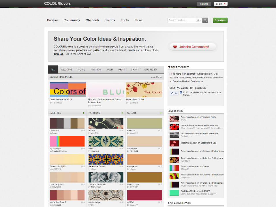
2. Grid inspiration
3. Color
4. In-class TA06 work; prep for Design Critique


Next Reading Response will be posted by the end of today.
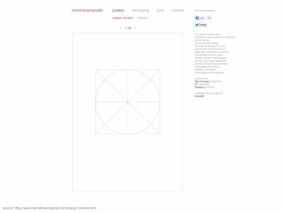
source: http://www.michalkrasnopolski.com/classic-movies.html
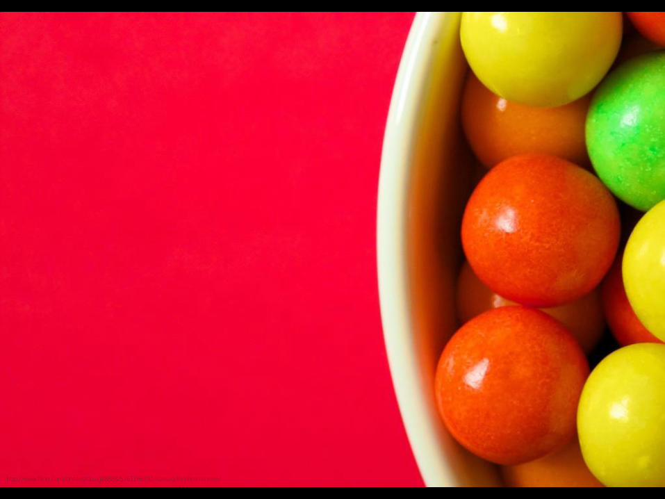
http://www.flickr.com/photos/doug88888/5761166292/sizes/o/in/photostream/
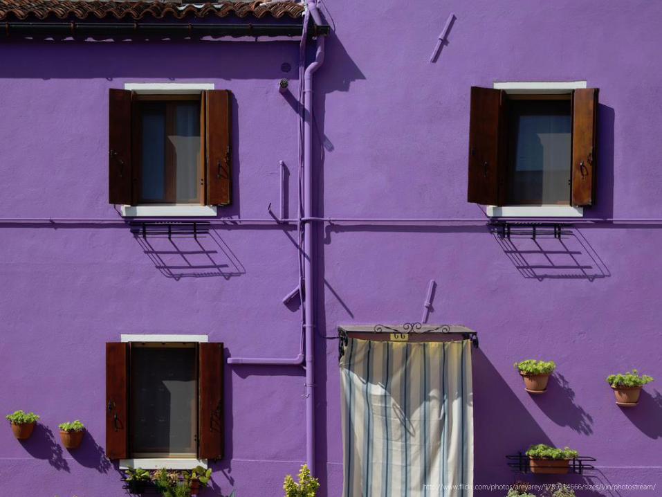
http://www.flickr.com/photos/areyarey/9789314666/sizes/l/in/photostream/

http://www.flickr.com/photos/areyarey/9590680951/sizes/h/in/photostream/
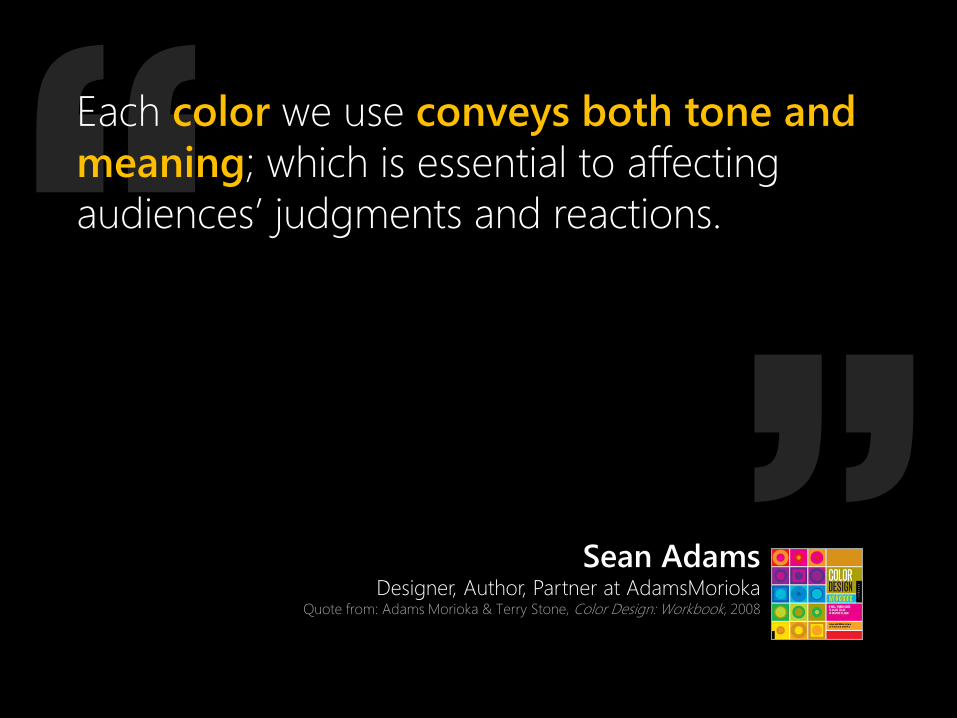
Each color we use conveys both tone and
meaning; which is essential to affecting
audiences’ judgments and reactions.
Sean Adams Designer, Author, Partner at AdamsMorioka
Quote from: Adams Morioka & Terry Stone, Color Design: Workbook, 2008
If you are expecting me to give you a clear
definition of design as I use the term, I am
afraid that I am going to disappoint you.
Smarter people have tried and failed. This is a
slippery slope on which I do not want to get
trapped.

Each color we use conveys both tone and
meaning; which is essential to affecting
audiences’ judgments and reactions. Color is
more than just a visual phenomenon—it is
uniquely emotional language and a
symbolic tool for all designers. It is not
simply a decorative afterthought and should
be leveraged to its fullest extent.
Sean Adams Designer, Author, Partner at AdamsMorioka
Quote from: Adams Morioka & Terry Stone, Color Design: Workbook, 2008
If you are expecting me to give you a clear
definition of design as I use the term, I am
afraid that I am going to disappoint you.
Smarter people have tried and failed. This is a
slippery slope on which I do not want to get
trapped.

There is more to color than a swatch in a
book, or a pull down menu choice… A strong
color palette in a visual system is one of a
designer’s most emotionally resonant
tools… Like a radioactive element, it is
extremely powerful and should be handled
very, very carefully.
Sean Adams Designer, Author, Partner at AdamsMorioka
Quote from: Adams Morioka & Terry Stone, Color Design: Workbook, 2008

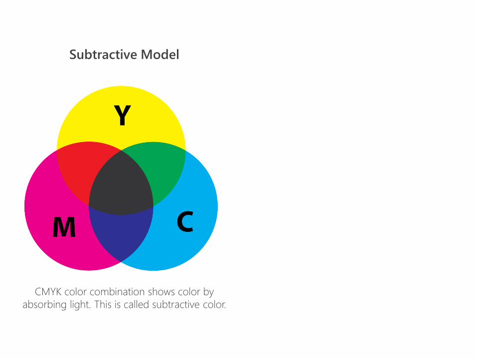
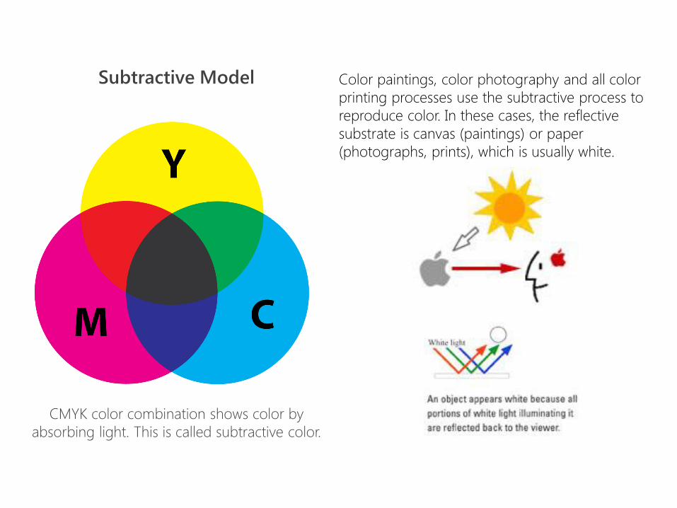
Subtractive Model
CMYK color combination shows color by
absorbing light. This is called subtractive color.

Subtractive Model
CMYK color combination shows color by
absorbing light. This is called subtractive color.
Subtractive Model
CMYK color combination shows color by
absorbing light. This is called subtractive color.
Color paintings, color photography and all color
printing processes use the subtractive process to
reproduce color. In these cases, the reflective
substrate is canvas (paintings) or paper
(photographs, prints), which is usually white.

Subtractive Model Additive Model
CMYK color combination shows color by
absorbing light. This is called subtractive color.
RGB color combination shows color by adding
light (additive color). When red, green, and
blue are combined, it creates the color white.

Additive Model
RGB color combination shows color by adding
light (additive color). When red, green, and
blue are combined, it creates the color white.
The additive color system involves light
emitted directly from a source, before an
object reflects the light.
Television and computer monitors create
color using the primary colors of light. Each
pixel on a monitor screen starts out as black.
When the red, green and blue phosphors of a
pixel are illuminated simultaneously, that pixel
becomes white. This phenomenon is called
additive color.


theory color

What is Color Theory? Color theory is a set of guiding principles
that can be used to create harmonious color
combinations based on physics, design,
visual psychology and perception research.

12 Step
Color Wheel

12 Step
Color Wheel
YELLOW #FFFF00
255,255,0
ORANGE YELLOW #FFCC00 255,204,0
ORANGE #FF9900 255,153,0
ORANGE RED
#FF6600 255,102,0
RED PURPLE #E40078 228,0,120
BLUE GREEN #0D98BA
13,152,186
BLUE #0000FF 0,0,255
BLUE PURPLE #632DE9 99,45,233
PURPLE #800080 128,0,128
RED #FF0000 255,0,0
GREEN #00FF00 0,255,0
YELLOW GREEN
#9ACD32 154,205,50

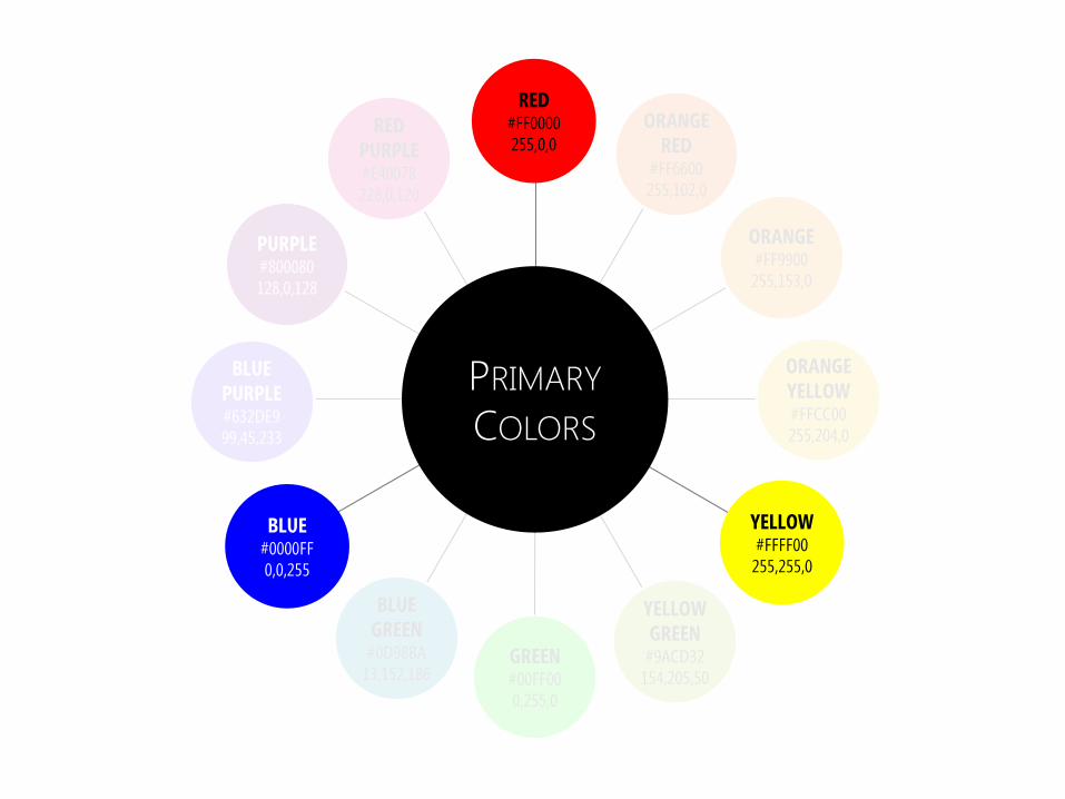
What are
the Primary
Colors?
RED #FF0000 255,0,0
GREEN #00FF00 0,255,0
YELLOW #FFFF00
255,255,0
YELLOW GREEN
#9ACD32 154,205,50
ORANGE YELLOW #FFCC00 255,204,0
ORANGE #FF9900 255,153,0
ORANGE RED
#FF6600 255,102,0
RED PURPLE #E40078 228,0,120
BLUE GREEN #0D98BA
13,152,186
BLUE #0000FF 0,0,255
BLUE PURPLE #632DE9 99,45,233
PURPLE #800080 128,0,128
GREEN #00FF00 0,255,0
PRIMARY
COLORS
YELLOW #FFFF00
255,255,0
ORANGE YELLOW #FFCC00 255,204,0
ORANGE #FF9900 255,153,0
ORANGE RED
#FF6600 255,102,0
BLUE GREEN #0D98BA
13,152,186
BLUE #0000FF 0,0,255
BLUE PURPLE #632DE9 99,45,233
PURPLE #800080 128,0,128
RED PURPLE #E40078 228,0,120
RED #FF0000 255,0,0
YELLOW GREEN
#9ACD32 154,205,50

GREEN #00FF00 0,255,0
YELLOW GREEN
#9ACD32 154,205,50
SECONDARY
COLORS
YELLOW #FFFF00
255,255,0
ORANGE YELLOW #FFCC00 255,204,0
ORANGE #FF9900 255,153,0
ORANGE RED
#FF6600 255,102,0
RED PURPLE #E40078 228,0,120
BLUE GREEN #0D98BA
13,152,186
BLUE #0000FF 0,0,255
BLUE PURPLE #632DE9 99,45,233
PURPLE #800080 128,0,128
RED #FF0000 255,0,0

PRIMARY &
SECONDARY
COLORS
YELLOW #FFFF00
255,255,0
ORANGE YELLOW #FFCC00 255,204,0
ORANGE #FF9900 255,153,0
ORANGE RED
#FF6600 255,102,0
RED PURPLE #E40078 228,0,120
BLUE GREEN #0D98BA
13,152,186
BLUE #0000FF 0,0,255
BLUE PURPLE #632DE9 99,45,233
PURPLE #800080 128,0,128
RED #FF0000 255,0,0
GREEN #00FF00 0,255,0
YELLOW GREEN
#9ACD32 154,205,50
GREEN #00FF00 0,255,0
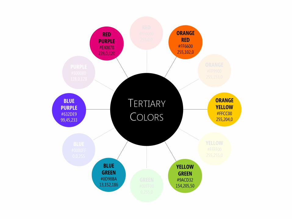
TERTIARY
COLORS
YELLOW #FFFF00
255,255,0
ORANGE YELLOW #FFCC00 255,204,0
ORANGE #FF9900 255,153,0
ORANGE RED
#FF6600 255,102,0
RED PURPLE #E40078 228,0,120
BLUE GREEN #0D98BA
13,152,186
BLUE #0000FF 0,0,255
BLUE PURPLE #632DE9 99,45,233
PURPLE #800080 128,0,128
RED #FF0000 255,0,0
YELLOW GREEN
#9ACD32 154,205,50

http://en.wikipedia.org/wiki/File:Color_star-en.svg
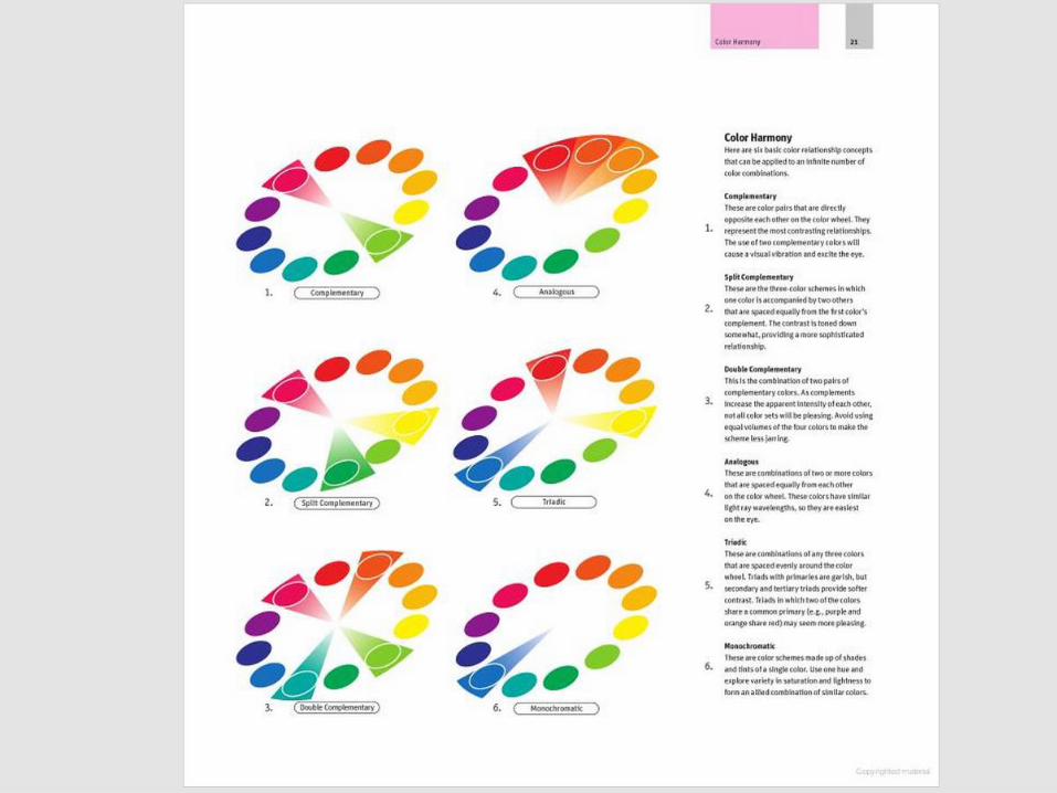
Different Visualizations of the Color Wheel Notice the different names as well

Holtzschue, Understanding Color: An Introduction for Designers, 2011, p.71
The Artist’ Spectrum
aka Color Wheel
aka Color Circle

Holtzschue, Understanding Color: An Introduction for Designers, 2011, p.71
The Artists’ Spectrum
aka Color Wheel
aka Color Circle
“The artists’ spectrum can be
expanded to any number of
hues as long as the added
colors are inserted at regular
intervals in all hue ranges”
– Linda Holzschue, p. 71

GREEN #00FF00 0,255,0
COMPLEMENTARY
COLORS
YELLOW #FFFF00 255,255,0
ORANGE YELLOW #FFCC00 255,204,0
ORANGE #FF9900 255,153,0
ORANGE RED
#FF6600 255,102,0
BLUE GREEN
#0D98BA 13,152,186
BLUE #0000FF 0,0,255
BLUE PURPLE #632DE9 99,45,233
PURPLE #800080 128,0,128
RED PURPLE #E40078 228,0,12
0
RED #FF0000 255,0,0
YELLOW GREEN
#9ACD32 154,205,50

http://www.slideshare.net/slidesthatrock/slides-that-rock-9659045


perception color

The color that one person identifies as “true red” will
be a bit different from another’s idea of “true red.”
When colors are used as symbols, their meanings
are equally mutable. A color used in one context
may have another meaning entirely—and even be
called by another name—when it appears in a
different situation.
Understanding Color: An Introduction For Designers Linda Holtzschue
p. 3, 2011
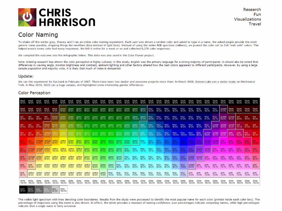

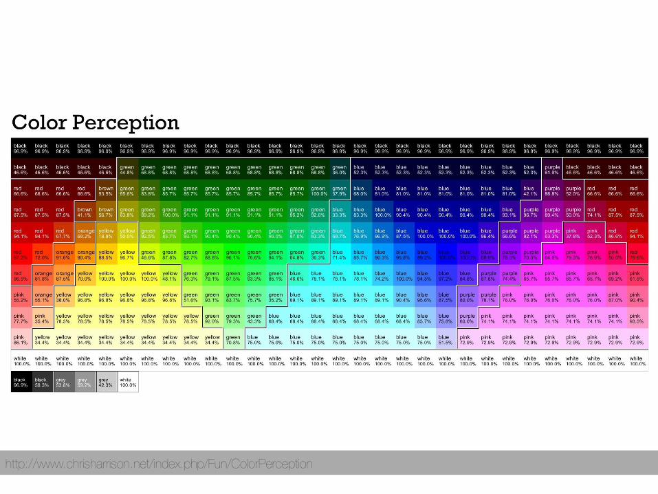
Chris Harrison’s Color Naming Experiment
Online participants shown a random color and asked to type in a name.
Participants were asked to provide the most generic name possible,
dropping things like modifiers (blue instead of light blue).
Instead of using the entire RGB spectrum (millions), the color set was pruned
to 216 "web safe" colors. This helped ensure every color had many
responses.
Collected 6,276 color responses in ~one week
http://www.chrisharrison.net/index.php/Fun/ColorPerception
http://www.chrisharrison.net/index.php/Fun/ColorPerception

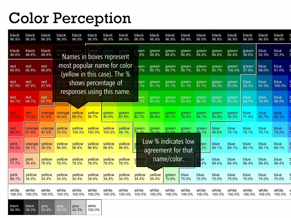
Names in boxes represent most popular name for color (yellow in this case). The %
shows percentage of responses using this name.
Low % indicates low agreement for that
name/color.
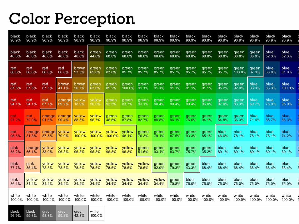

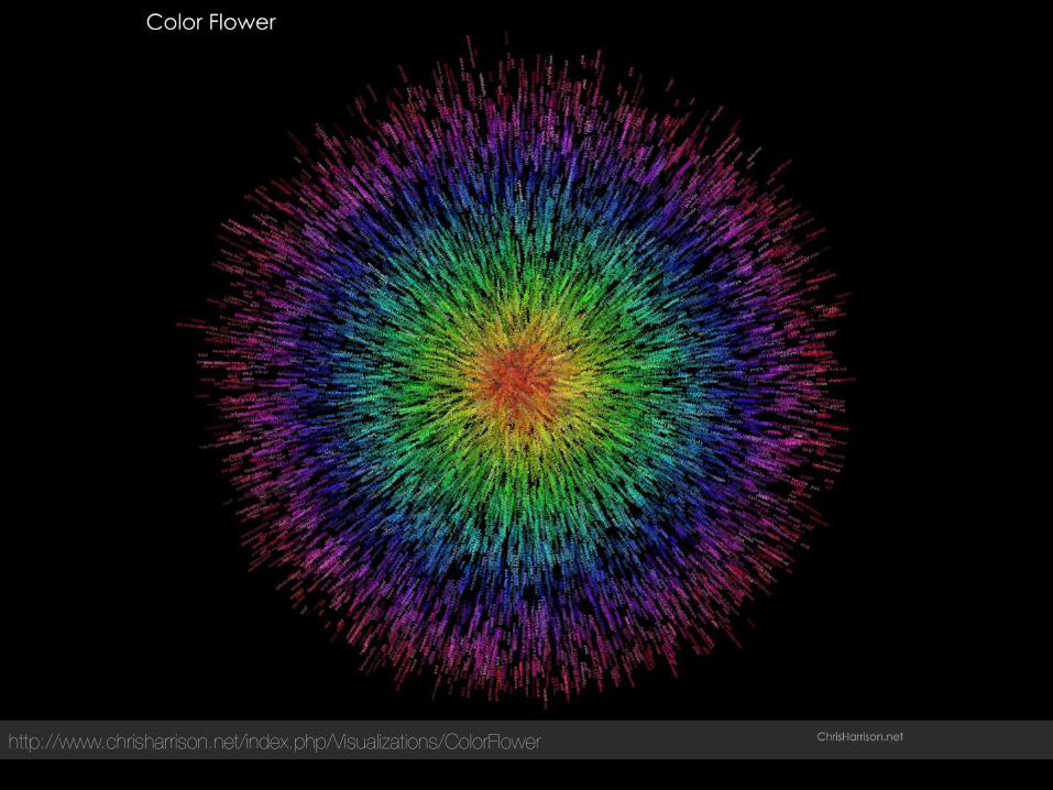
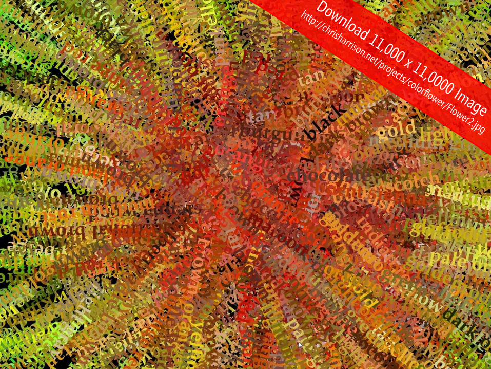
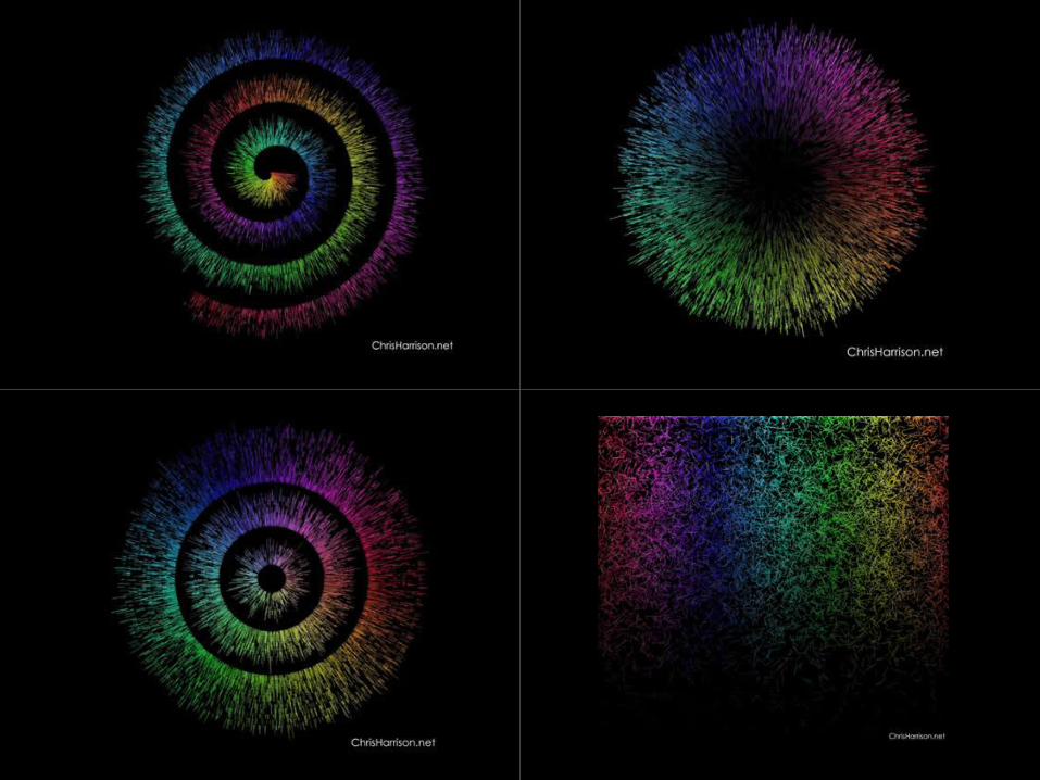
http://www.chrisharrison.net/index.php/Visualizations/ColorFlower

Another online experiment conducted by
Another online experiment conducted by

http://xkcd.com/612/

http://xkcd.com/149/

http://xkcd.com/552/

OK, fine, one more… because this one hits home…
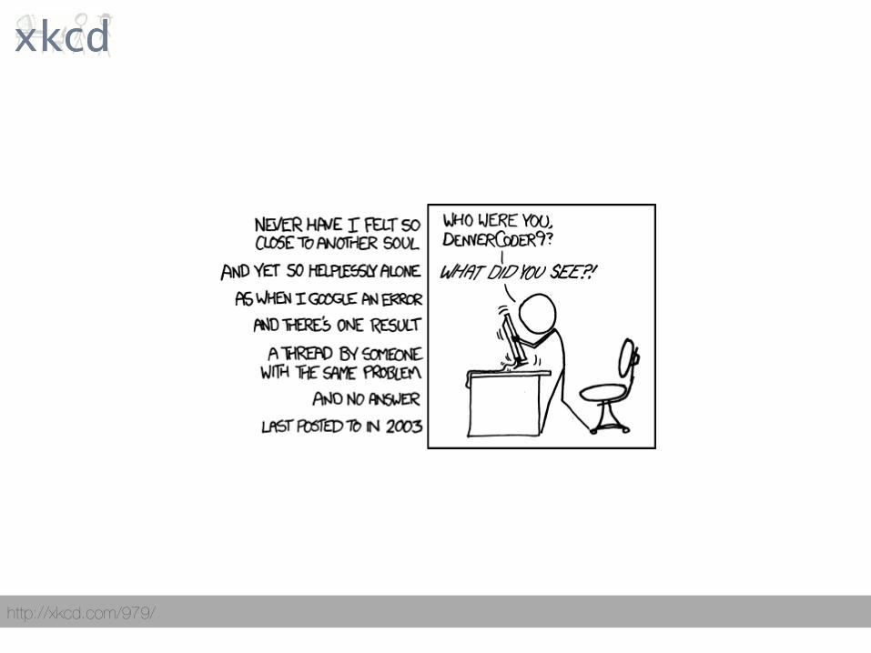
http://xkcd.com/979/

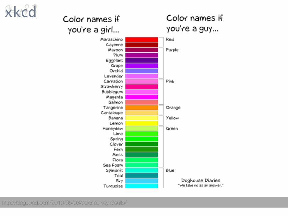
http://blog.xkcd.com/2010/05/03/color-survey-results/

http://blog.xkcd.com/2010/05/03/color-survey-results/

http://blog.xkcd.com/2010/05/03/color-survey-results/
“basically, women were
slightly more liberal with
modifiers, but otherwise
they generally agreed”
– Randall Munroe, xkcd

http://blog.xkcd.com/2010/05/03/color-survey-results/
http://blog.xkcd.com/2010/05/03/color-survey-results/
Limitations?

http://blog.xkcd.com/2010/05/03/color-survey-results/

http://blog.xkcd.com/2010/05/03/color-survey-results/

deficiencies color vision


heatmaps visualizing data with


Source: http://datavisualization.ch/showcases/tracking-syphilis-cases-in-the-u-s/

http://gazehawk.com/blog/wp-content/uploads/2011/08/wikicomparison.png

http://icdn6.digitaltrends.com/image/sportvu-nba_heatmap.jpg


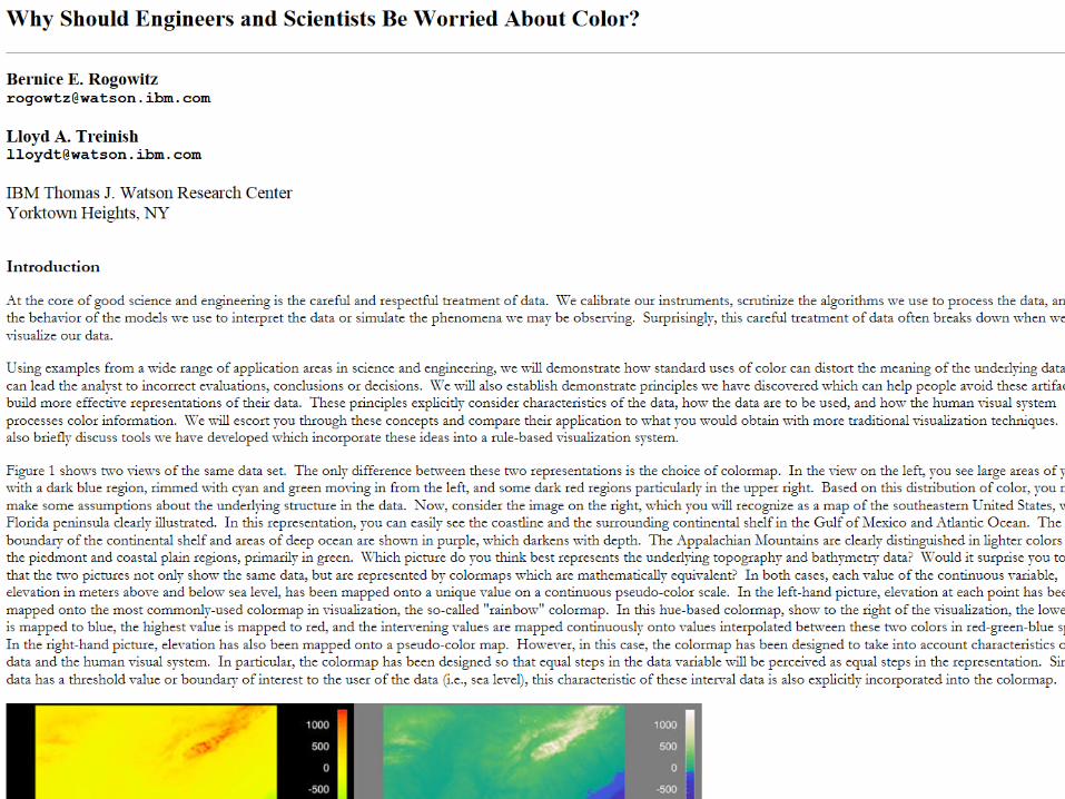
Borland & Russel, Rainbow Color Map (Still) Considered Hamrful, IEEE Computer Graphics and Applications, 2007

Research has shown that the rainbow color map is
rarely the optimal choice when displaying data
with a pseudocolor map.
Rainbow Color Map (Still) Considered Harmful David Borland & Russell M. Taylor II
p. 14, 2007

Research has shown that the rainbow color map is
rarely the optimal choice when displaying data
with a pseudocolor map. The rainbow color map
confuses viewers through its lack of perceptual
ordering, obscures data through its uncontrolled
luminance variation, and actively misleads
interpretation through the introduction of non-
data-dependent gradients.
Rainbow Color Map (Still) Considered Harmful David Borland & Russell M. Taylor II
p. 14, 2007

Despite much published research on its deficiencies,
the rainbow color map is prevalent in the
visualization community. We present survey results
showing that the rainbow color map continues to
appear in more than half of the relevant papers
in the IEEE Visualization Conference proceedings…
Rainbow Color Map (Still) Considered Harmful David Borland & Russell M. Taylor II
p. 14, 2007

Borland & Russell, Rainbow Color Map (Still) Considered Hamrful, IEEE Computer Graphics and Applications, 2007
Problem One: Perceptual Ordering

Luminance is the brightness of color
Color Design Workbook AdamsMorioka and Terry Stone
p. 237, 2008

Borland & Russell, Rainbow Color Map (Still) Considered Hamrful, IEEE Computer Graphics and Applications, 2007
Problem Two: Introduces Artifacts into Visualization
“The rainbow color map appears as if it’s separated into bands of almost constant hue, with sharp transitions between hues. Viewers perceive these sharp transitions as sharp transitions in the data, even when this is not the case (see Figure). When combined with the lack of perceptual ordering, viewers face a daunting task when trying to correctly interpret the data via the rainbow color map.”
-Borland & Russell, 2007
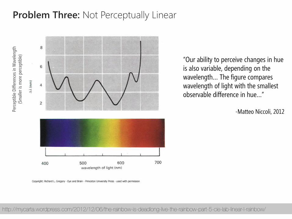
Problem Three: Not Perceptually Linear
“Our ability to perceive changes in hue is also variable, depending on the wavelength… The figure compares wavelength of light with the smallest observable difference in hue…”
-Matteo Niccoli, 2012
http://mycarta.wordpress.com/2012/12/06/the-rainbow-is-deadlong-live-the-rainbow-part-5-cie-lab-linear-l-rainbow/
Perc
eptib
le D
iffer
ence
s in
Wav
elen
gth
(Sm
alle
r is
mor
e pe
rcep
tible
)
For blue and red light, a large
change in wavelength is
required to be able to detect
a change in hue. We are most
sensitive to yellow.

http://en.wikipedia.org/wiki/Munsell_color_system
“Munsell was the first to separate hue, value, and chroma into perceptually uniform and independent dimensions, and was the first to systematically illustrate the colors in three-dimensional space”
-Wikipedia

http://mycarta.wordpress.com/2012/12/06/the-rainbow-is-deadlong-live-the-rainbow-part-5-cie-lab-linear-l-rainbow/
Problem Three: Not Perceptually Linear
http://dx.doi.org/10.1109/TVCG.2007.70561
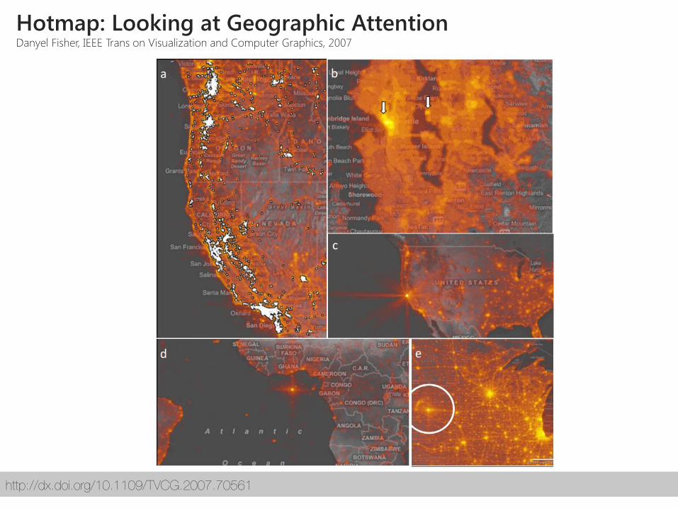
Hotmap: Looking at Geographic Attention Danyel Fisher, IEEE Trans on Visualization and Computer Graphics, 2007

http://dx.doi.org/10.1109/TVCG.2007.70561
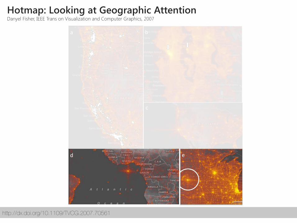
Hotmap: Looking at Geographic Attention Danyel Fisher, IEEE Trans on Visualization and Computer Graphics, 2007
http://dx.doi.org/10.1109/TVCG.2007.70561
Hotmap: Looking at Geographic Attention Danyel Fisher, IEEE Trans on Visualization and Computer Graphics, 2007

Source: unknown (unfortunately)
Realworld Heatmap Depicting Sunlight / Chrolorphyl Production
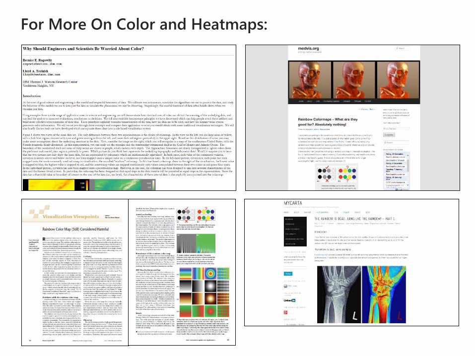
For More On Color and Heatmaps:
color grabbing/remixing


resources color