chapter using color effectively - g · pdf filesplit-complementary color harmony...
TRANSCRIPT

292 Part 4 The Inside Story Chapter 11 Using Color Effectively 293
Terms to Learncolorcolor spectrumcolor wheelprimary colorssecondary colorstertiary colorshuevaluetintshadetoneintensitycomplementpigmentwarm colorscool colorscolor harmonymonochromatic color harmonycomplementary color harmonysplit-complementary color harmonydouble-complementary color harmonyanalogous color harmonytriadic color harmonyneutral color harmoniescolor scheme
Using Color Effectively
CHAPTER11
Chapter ObjectivesAfter studying this chapter, you will be able to
• analyze the psychological impact and meaning of different colors.
• summarize how color influences human behavior.
• analyze and describe the relationships between colors on the color wheel.
• evaluate the use of color harmonies in planning interior designs.
Calico Corners—Calico Home Stores
Reading with PurposeOn a separate sheet of paper, write down the main headings from this chapter. Leave space for note-taking under each heading. As you read the chapter, write down three key points you learn from each section. Then answer the following: How does this information relate to what I already know about color?
This sample chapter is for review purposes only. Copyright © The Goodheart-Willcox Co., Inc. All rights reserved.

294 Part 4 The Inside Story
IIn the previous chapter, you learned about the elements of design—line, form, space, mass, and texture. In this chapter, you will learn about another element of design—color. Color is likely the most important element of design. Deciding what color to use is usually the first decision made when designing a room. It is one of the first things others notice about your design. Color sets the mood in a room and leaves a lasting impression with most people.
Understanding ColorColor is an element or property
of light. It can help you create certain moods in your home by communicat-ing excitement, calmness, mystery, or other sensations and emotions. When you understand the effects of color, you can use it to make your personal living space attractive and satisfying, 11-1.
The Psychology of ColorEach color has certain psychologi-
cal effects on people and can evoke certain feelings. Factors that can influ-ence peoples’ reactions to color include age, gender, culture, and life experiences.
Although there is no single specific system for identifying ways all people respond to color, some of the effects for each of the following colors may include:• Red is associated with power, danger,
fire, strength, and passion. It is bold, aggressive, exciting, and warm. It demands attention. Red can make you feel energetic. However, too much red in a room can be overpowering.
• Orange is hopeful, cheerful, warm, and less aggressive than red. It expresses courage and hospitality. It can make a room feel energetic and friendly.
• Yellow is friendly, happy, and warm. It is associated with sympathy, sunlight, prosperity, cowardice, and wisdom. Yellow rooms are cheerful, light, and airy. However, pure yellow draws attention due to its brightness, so take care when using it in large amounts.
• Green is the color of nature. Conse-quently, it is refreshing, friendly, cool, and peaceful. Additional meanings include hope, good luck, and envy. Green mixes well with other colors and looks especially good next to white.
• Blue is cool, quiet, and reserved. It is associated with tranquility, serenity, and formality. Blue can be soothing and peaceful. It can be especially pleasing when used with white. However, too much blue in a room can be depressing.
• Violet is a royal color. It is dignified and dramatic. It works well with most other colors.
• Black is sophisticated and mysterious. It is associated with wisdom, evil, and death. Small amounts of black help ground a room, or may add a timeless, classic elegance. When used in large quantities, however, black may be oppressive.
11-1The combination of colors used in this child’s room creates a cheerful space.
Photography Courtesy of Calico Corners—Calico Home Stores
Enrich
Attend a presentation by an art teacher or local artist who discusses and demonstrates the importance of color in fine art. Be prepared to ask questions. Summarize in one paragraph what you learn.
Discuss
Do you agree or disagree with this sentence from the first paragraph: Color is likely the most important element of design. Explain your opinion.
Chapter 11 Using Color Effectively 295
• White is fresh, peaceful, and pure. It is associated with youth, innocence, and faith. White can make rooms look crisper and livelier.
People feel most comfortable when colors in their surroundings reflect their personalities. For instance, outgo-ing people might choose bright red or yellow for the main color in a room. Shy people might feel awkward in a red room. Instead, they might prefer a room that features a soft blue or green.
When making color decisions for your home or the home of a client, consider the preferences of each family member. No single color will satisfy everyone. However, the color and design of the social area of the home should make all members feel as comfortable as possible. Use individual color pref-erences in personalized sleeping areas and other private work or play spaces.
The Color SpectrumThe color spectrum is the full range
of all existing colors. A beam of white light produces spectral colors as it passes through a prism. Although limit-less in number, more than 10 million colors have been identified in the color
spectrum. Each distinct color derives from a few basic colors. The rainbow in 11-2 is the ideal example in nature of how sunlight can separate into a contin-uous band of colors, or a spectrum. In the case of a rainbow, the raindrops them-selves serve as tiny prisms separating the light.
The variety of colors possible in nature is virtually limitless. Paint manu-facturers have translated the spectrum into several hundreds of different paint colors, 11-3.
Color Psychology at Work
Color is a vital tool for interior designers because it impacts how people feel. Vibrant colors, especially oranges and reds, enliven the seating areas of many fast-food restaurants. They tend to stimulate customers’ appetites.
Designers working for clients in various industries use color to achieve other goals. For example, designers of airplane interiors avoid using large expanses of fast-food reds and oranges. Their goal is not to stimulate appetites, but to create a relaxing environment for passengers. Neutrals and muted shades often work well. In hospital rooms, color is used to create spaces that do not raise anxiety or trigger depression among ill or injured people.
In residential settings, designers often use the color blue in bedrooms because it has a calming and peaceful effect.
LINK TO SOCIAL STUDIES & CULTURE
11-2The water droplets in a rainbow separate light into its many colors.
Activity
Borrow a prism from the science department. Experiment with dividing light into its component colors.
Discuss
Why do you think a person feels most comfortable when surrounded by colors that reflect his or her personality?
This sample chapter is for review purposes only. Copyright © The Goodheart-Willcox Co., Inc. All rights reserved.
296 Part 4 The Inside Story
The Color WheelColor relationships are easy to
understand when you learn a few basic principles. The standard color wheel is the tool used to best illustrate these principles. The color wheel, 11-4, is the most commonly used tool to understand the basis of all color relationships. It is made of three concentric rings: an outer, middle, and inner ring. The middle ring of the color wheel consists of three types of colors: primary, secondary, and tertiary.
Yellow, red, and blue are the primary colors. They are the basic colors and you cannot create them by mixing other colors. However, mixing, lightening, or darkening the primary colors can make all other colors.
Orange, green, and violet are the secondary colors. Mixing equal amounts of two primary colors produces these colors. Orange is a mixture of red and yellow. Green is a mixture of yellow and blue. Violet is a mixture of blue and red. Look again at the color wheel. Notice each secondary color is located halfway between the two primary colors used to make it.
The other colors in the middle ring of the color wheel—yellow-green, blue-green, blue-violet, red-violet, red-orange, and yellow-orange—are the tertiary colors, or the third level of colors. Another name for the tertiary colors is intermediate colors. The names of tertiary colors reflect the names of the two colors used to make them—an equal mixture of a primary color with a secondary color adjacent to it on the color wheel. Note that their names always have the primary color listed first. For example, blue-green is correct but not “green-blue.”
The lightest color on the color wheel is yellow and it is always at the top of the wheel for that reason. Violet is the dark-est color on the color wheel. It is directly opposite from yellow at the bottom of the wheel.
Color CharacteristicsEach color has three characteris-
tics: hue, value, and intensity. Various tools illustrate these characteristics. For example, the color wheel shows hues and some values. Separate scales, such as the color rendering index (CRI), show color values more completely as well as color intensity. You will learn more about the color rendering index in Chapter 17.
HueA hue, or color name, is the color in
its purest form, with no added black, gray, or white. It is the one characteris-tic that makes a color unique. It is what makes red different from blue and green different from yellow. It is the specific, individual nature of each color.
ValueThe value of a hue is the relative
lightness or darkness of a hue. The middle ring of the color wheel shows the normal values of hues. The normal values of some hues are lighter than the
11-3This fan of different paint colors represents a portion of the many colors that exist in nature.
Discuss
What are the dominant colors in the school’s interior and the sports teams? Why do you think these colors were chosen?
Activity
Borrow a palette of paints from the art department. Notice how they are arranged. Why do you think they are in this order? Are all palettes arranged in the same order?
Vocabulary
Define hue and value by using both terms in the same sentence.
Chapter 11 Using Color Effectively 297
normal values of others. For instance, yellow has the lightest normal value of any color in the middle ring of the wheel. As you move away from yellow on the color wheel, the normal values of hues become darker. Violet has the darkest normal value.
Adding white to a hue makes its lighter. The addition of white to a hue produces a tint. For instance, pink is a tint of red. Adding white to red creates pink. Adding white to blue creates baby blue, a tint of blue. Peach is a tint of orange. Lavender is a tint of violet. The innermost ring of the color wheel shows the tints. Lighter tints require the addi-tion of more white.
You can make the value of a hue darker by adding black. The addition of black to a hue produces a shade. For
instance, burgundy is a shade of red. Adding black to red creates this shade. Navy blue is a shade of blue and is created by adding black to blue. Darker shades require the addition of more black. The outer ring of the color wheel shows the shades. Refer again to the color wheel to identify the normal value of hues, tints, and shades.
Adding gray softens the value of a hue, which produces a tone. Rose is a tone of red. Wedgwood blue is a tone of blue, created by adding gray to blue. Note that adding light gray to a hue causes confusion with a tint. Likewise, adding dark gray to a hue can cause confusion with a shade. However, there is a difference. Medium grays, of course, are the easiest to recognize as tones when mixed with hues.
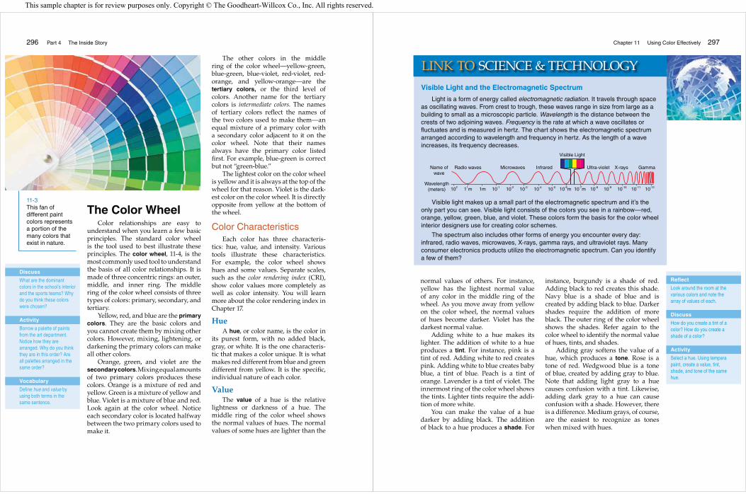
Visible Light and the Electromagnetic Spectrum
Light is a form of energy called electromagnetic radiation. It travels through space as oscillating waves. From crest to trough, these waves range in size from large as a building to small as a microscopic particle. Wavelength is the distance between the crests of two adjoining waves. Frequency is the rate at which a wave oscillates or fluctuates and is measured in hertz. The chart shows the electromagnetic spectrum arranged according to wavelength and frequency in hertz. As the length of a wave increases, its frequency decreases.
Visible light makes up a small part of the electromagnetic spectrum and it’s the only part you can see. Visible light consists of the colors you see in a rainbow—red, orange, yellow, green, blue, and violet. These colors form the basis for the color wheel interior designers use for creating color schemes.
The spectrum also includes other forms of energy you encounter every day: infrared, radio waves, microwaves, X-rays, gamma rays, and ultraviolet rays. Many consumer electronics products utilize the electromagnetic spectrum. Can you identify a few of them?
LINK TO SCIENCE & TECHNOLOGY
Radio wavesName ofwave
Wavelength(meters) 102 10-1 10-2 10-3 10-4 10-5 10-8 10-9 10-10 10-11 10-1210-6m 10-7m11m 1m
Microwaves Infrared
Visible Light
Ultra-violet X-rays Gamma
Reflect
Look around the room at the various colors and note the array of values of each.
Discuss
How do you create a tint of a color? How do you create a shade of a color?
Activity
Select a hue. Using tempera paint, create a value, tint, shade, and tone of the same hue.
This sample chapter is for review purposes only. Copyright © The Goodheart-Willcox Co., Inc. All rights reserved.

298 Part 4 The Inside Story
Outer ring = shades of hues
Middle ring = normal values of hues
Inner circle = tints of hues
11-4The arrangement in a color wheel provides a basis for all color relationships.
Chapter 11 Using Color Effectively 299
Figure 11-5 pictures a value scale. The left column shows the range of tints obtained by adding greater amounts of white to the blue color. The right column shows the range of shades obtained by adding greater amounts of black to the blue.
IntensityIntensity refers to the brightness or
dullness of a hue. The middle ring of the color wheel shows the normal inten-sity of each hue.
One way to dull a hue, or lower its intensity, is to add some of its comple-ment. The complement of a hue is the
hue opposite it on the color wheel. For instance, blue is the complement of orange. To lower the intensity of orange, you add varying amounts of blue, as shown in 11-6. To lower the intensity of red, you add small amounts of its complement, green. Examples of high-intensity colors include hot pink and fire-engine red. Smoky blue and rust are examples of low-intensity colors. Another way to lower the intensity of a hue is to add gray, making the color a tone.
NeutralsAlthough neutrals are not really
colors, they are usually classified as colors when discussing design. Black, white, and gray are neutrals. Black is the combination of all colors when it exists as a pigment. A pigment is a coloring agent used in paint and printed materi-als. In contrast to black, white used as a pigment has no color. Gray is a combi-nation of black and white. Brown and its tints and shades are also neutrals. Combining equal amounts of comple-mentary colors forms a brown color.
By adding a neutral color to a hue, the value of the hue changes to either a tint or a shade. This makes the hue less intense. With any of these changes, neutralization of the hue occurs. Neutralized hues blend better with other colors.
11-5Values for the color blue, ranging from tints to shades, are shown on this value scale.
11-6Adding blue to orange reduces the intensity of orange, making it a duller color.
Discuss
What impact do you think color has on attitudes? Where would you expect to see very intense colors?
Art Activity
Use tempera paints to create various intensities of a hue with its complement.
Discuss
How do you make a color less intense?
Activity
Use tempera paints to change the intensity of a hue by combining it with a neutral pigment.
This sample chapter is for review purposes only. Copyright © The Goodheart-Willcox Co., Inc. All rights reserved.

300 Part 4 The Inside Story
Warm and Cool ColorsColors can be classified as either
warm or cool. Although the actual temperature may be the same through-out an entire home, some rooms may seem cooler or warmer due to the usage of certain colors in decorating.
Warm colors include yellow, orange, red, and the colors near them on the color wheel, with red being the warm-est. They are called warm colors because they remind us of fire and the sun.
Warm colors are the advancing colors. Warm-colored objects appear closer to you. Warm-colored walls look closer together. For example, a room painted red, yellow, or orange appears smaller than its actual size.
Warm colors attract your attention. They can make you feel happy, ener-getic, and full of excitement. Research shows the color red actually stimulates the nervous system and can increase blood pressure, heartbeats, and breath-ing rate. Many advertisements use warm colors to make you notice them. Restaurants use warm colors to increase your appetite. Locker rooms use them to generate excitement. Warm colors in homes make household members feel lively and cheerful. An overuse of warm colors, however, may make people feel nervous or tense, especially if they are full-intensity colors.
Cool colors are opposite the warm colors on the color wheel. These include blue, green, violet, and the colors near them. They are cool colors because they remind people of water, grass, and trees.
Cool colors are receding colors. They make objects seem smaller and walls seem farther away than they really are. Decorating a small room in cool colors can make it appear larger than actuality.
Cool colors are quiet and rest-ful. Hospitals often use them to help patients relax and feel calm. They are also popular for bedrooms. With over-use, however, cool colors may make people feel depressed.
Warm and cool colors create differ-ent moods that make people feel differ-ently, 11-7. For example, workers in an office complained their lunchroom was always cold. When the employer changed the light blue room to orange, the complaints stopped even though the temperature never changed.
Color HarmoniesThe surest and easiest way to achieve
success when using color is to follow one of the standard color harmonies. A color harmony is a pleasing combination of colors based on their respective posi-tions on the color wheel. There are seven basic color harmonies: monochromatic,
A B
11-7By comparing these two living rooms, you can sense the warmth created by the use of yellow and red (A) and the feeling of coolness generated by the use of green and blue (B).
Discuss
If you wanted a very large room to feel cozier, what would be a good color choice for its walls? Why?
Reflect
Is there a room in your school, home, or some other place you frequent that always makes you feel cold? What color is the room? How could a possible change in color help you feel warmer?
Discuss
Study the photos of Figure 11-7. Why do you think color makes so much difference in the feel of temperature in a room?
Chapter 11 Using Color Effectively 301
complementary, split-complementary, double-complementary, analogous, tri-adic, and neutral. Established color harmonies bring colors together in combinations that are very satisfying to the eyes.
Monochromatic Color Harmony
A monochromatic color harmonyis the simplest color harmony. It uses a single hue from the standard color wheel. The hue selected for the mono-chromatic color harmony in 11-8 is green.
You can achieve variation in a mono-chromatic color harmony by chang-ing the value and/or intensity of the hue. For example, you could use light blue, gray blue, and navy blue—a tint, a tone, and a shade of the same hue. A paint fan deck will usually show five to seven values of the same hue. To add
interest to the color scheme, use accents of neutral colors. Using a monochro-matic color harmony can make a room appear larger. It can also unify the furnishings and accessories used in the space. The monochromatic color scheme is the most restful of all, because it has the least contrast or drama.
Complementary Color Harmony
Selecting two colors that are directly opposite each other on the standard color wheel creates a complementary color harmony. Complementary colors are sometimes called contrasting colors because they make each other look brighter and more intense. For exam-ple, when using blue next to orange, the blue looks bluer, and the orange looks stronger. A complementary color harmony can make a room look bright and dramatic.
Avoid GreenwashingAre “green” products always “green?” Some companies and agencies may be
less than truthful about the “green” aspects of their products and services. These companies and agencies realize that more consumers are looking for green products and are easily influenced by terms relating to green features. They may use terms that mislead consumers and professionals about the “green” features of their products. Some environmental product claims are false while others are misleading. The term for this deceptive way of doing business is greenwashing.
An example of greenwashing involves low- or zero-volatile organic compound (VOC) paints. Because they are less toxic to humans and the environment, these paints are catching on quickly with consumers. Several reliable paint suppliers produce these paints. Other companies are putting “green” on the labels, but their paint may actually be neither low- or zero-VOCs products.
Before buying any green products, check a number of Web sites that provide information on the validity of products that indicate green features. A few of the Web sites include the following:
www.greenbiz.comwww.edcmag.comwww.greenguard.org
GREEN CHOICES
Discuss
Have you ever bought a product advertised as “green,” only to find out that it wasn’t really “green”? If this happened to you now, what would be your response?
Reflect
What color combinations do you wear most often? Why?
Enrich
Attend a presentation by a paint manufacturer’s representative who discusses the importance of selecting colors for interiors. Be prepared to ask questions. Summarize what you learn.
This sample chapter is for review purposes only. Copyright © The Goodheart-Willcox Co., Inc. All rights reserved.

302 Part 4 The Inside Story
Although such a sharp contrast is fine for some rooms, most rooms are more comfortable with less contrast. Varying the values and intensities of the colors can do this along with vary-ing the amounts of the colors, 11-9. The more one color dominates the other, the less noticeable the contrast.
Split-Complementary Color Harmony
Using one hue with the two hues adjacent to its complement creates a split-complementary color harmony. For example, if you choose the blue hue first, you would look directly across the color wheel to find orange, its complement. You would then select the colors on both sides of orange to establish your split-comple-mentary color harmony. The resulting color harmony uses blue, yellow-orange, and red-orange, 11-10. With this color selection, blue will likely be the domi-nant color, while yellow-orange and red-orange provide lively contrast.
Double-Complementary Color Harmony
Selecting two colors and their comple-ments from the standard color wheel creates a double-complementary color harmony. In this way, you use four colors to create the color harmony. One exam-ple of a double-complementary color harmony results from pairing red and green with violet and yellow, 11-11. As long as each pair is composed of comple-mentary colors, you may use any combi-nation of pairs.
Analogous Color HarmonySelecting related hues from the stan-
dard color wheel creates an analogous color harmony. These are hues that are next to each other on the color wheel. In an analogous color harmony, usually three to five hues are used. Since they are related, they blend together well. One color seems to merge into another. Even when the colors in an analogous
A
B
11-8Green is the basis for this monochromatic color harmony.
Photography Courtesy of Kohler
Discuss
What could be done in the room in Figure 11-8 to create a complementary color harmony?
Reflect
Is a monochromatic color harmony pleasing to you? If you were choosing a monochromatic color harmony for a room, on what hue would you base it?
Activity
Create a brochure showing all of the color harmonies by using magazine pictures or fabric swatches as examples.
Chapter 11 Using Color Effectively 303
color harmony are all warm, the room will be more restful than one that uses colors from both sides of the color wheel. Figure 11-12 shows an example of an analogous color harmony.
An analogous color harmony will look best if you choose one color as the dominant color and use smaller amounts of the others to add interest and variety. You may also want to use a tiny amount of an unrelated color as an accent.
Triadic Color HarmonyA triadic color harmony uses any
three colors that are equally distant from each other on the standard color wheel. The triadic color harmony will follow a pattern of using every fourth color on the color wheel. For example, yellow, blue, and red—the primary colors—form a triadic color harmony, 11-13. The secondary colors—green, orange, and violet—also create a triadic color harmony. The two other possible color combinations are: yellow-orange, red-violet, and blue-green; or red-orange, blue-violet, and yellow-green. Design-ers use great care and skill to achieve pleasing triadic harmonies. Changing values and intensities can lessen the sharp contrasts.
A
B
11-9Shades of green and red are used in this contemporary bedroom to create a complementary color harmony.
11-10A split-complementary color harmony uses a main color with the colors on both sides of its complement.
Discuss
How does the complementary color harmony of the room in Figure 11-9 prevent a feeling of sharp contrast?
Activity
Research how businesses decide what colors to use in their interior spaces. Use the keyword color analysis to search the Internet. Write an essay on the guidelines you find.
Reflect
Picture the uniforms of sports teams that you follow. What are the color harmonies of their uniforms?
This sample chapter is for review purposes only. Copyright © The Goodheart-Willcox Co., Inc. All rights reserved.

304 Part 4 The Inside Story
Neutral Color HarmonyAlthough black and white are not
hues on the standard color wheel, they are the basis for neutral color harmonies. Combinations of black, white, and gray create neutral color harmonies. Brown, tan, and beige can also be used. Some-times adding small amounts of other colors to neutral color schemes gives the room more interest, 11-14.
Using Color Harmonies
Now that you have learned about color and the color harmonies, you can begin to use this information to create interior design color schemes for a home. A color scheme is the combi-nation of colors selected for the design
A
B
11-11A double-complementary color harmony is made of two sets of complementary color schemes.
11-12An analogous color harmony using yellow, yellow-orange, orange, red-orange, and red, gives this room a vibrant appearance.
Reflect
Try to imagine a family room decorated in a double-complementary color harmony such as pictured in Figure 11-11. How would it feel? Why are many family rooms decorated in monochromatic, analogous, or neutral color harmonies?
Activity
On one day, ask students to bring examples of a single color harmony to class. (Examples may consist of the outfits they wear or an item they bring, such as scarves or pictures.) On the next day, students display their items as the class identifies the color harmonies represented.
Discuss
In your opinion, what are some advantages and disadvantages of neutral color harmonies in a home?
Chapter 11 Using Color Effectively 305
The Anatomy of Color
Objects absorb and reflect light. The color that you see depends on the wavelength and frequency of the reflected waves. Red has the longest wavelength; violet has the shortest.
Humans have trichromatic color vision. The key part of the eye responsible for color vision is the retina. This area, at the back of the eye, contains millions of light-sensitive nerve cells called rod and cone cells. Rod cells enable you to see in low light. Cone cells enable you to see color and detail.
The tri in trichromatic refers to the three types of cone cells. Each type is sensitive to waves of a different part of the visible light spectrum. “Blue cone cells” react to the shorter waves on the blue end of the color spectrum. “Red cone cells” react to longer waves on the red end of the spectrum. “Green cone cells” react to medium-length waves in the green spectrum.
When light enters the eyes and hits the retina, it stimulates the cone cells and sends electronic impulses to the brain. The signals from the cone cells are transmitted to the brain. In a complex process that researchers are still trying to understand, the human brain collects and processes this and other information to produce a color image.
LINK TO SCIENCE & TECHNOLOGY
A
B
11-13Triadic color harmonies are often used in children’s bedrooms.
CorneaRetina
Optic Nerve
Iris
Aqueoushumor
Lens
Discuss
Does color in clothing set a mood in the same way it does when used in interior design?
Discuss
When people do not have adequate funds to completely color-harmonize their homes, what might they do to change an unharmonious interior into a “pulled together” look?
Activity
Create a checklist to use as a reference when choosing colors for a room.
This sample chapter is for review purposes only. Copyright © The Goodheart-Willcox Co., Inc. All rights reserved.

306 Part 4 The Inside Story
of a room or house. When designing a room, choose colors that you like seeing together. The chosen colors probably look good together because they conform to an established color harmony.
A well-planned color scheme will use color harmonies to blend and unify the design of the home as you transition from one room to another. It will also consider the function of the room. As you will see, even if you love red, it may be a poor choice for a bedroom because of its intensity. By following important guide-lines, you can create a color scheme that will enhance the near environment and increase the enjoyment of a home, 11-15.
Choosing the Right ColorsThe color harmonies you choose for
the color scheme of a home depend on several factors. They include what mood
or style a person wants, the lifestyle of the family members, the function or the way the occupants will use the room, the items in the room, and the room’s location.
Moods and StylesYou can create a variety of moods
in a room through the use of color. For example, you may want a room to feel restful, or you may want it to appear exciting. Choosing cool colors that have similar values will create a restful mood in the room, such as in 11-16. Choosing warm colors with contrasting values will make the room feel exciting.
You can also choose colors that will create a certain style in a room. Different styles, such as southwestern or country, often suggest the use of specific colors. You can use these colors in different color harmonies to achieve the style you want.
In a southwestern-style room, for example, you may choose warm desert colors, such as rust, sunset orange, brick, and sand. In a country-style room, you may choose low-intensity shades of reds, blues, oranges, and yellows.
LifestylesSome people have active lifestyles
while others lead quieter lives. The colors you choose depend on the lifestyles of household members. For instance, with small children, give consideration to darker colors and shades that do not show dirt easily. In contrast, a house-hold of adults may choose lighter colors for the walls and upholstery because upkeep is less of a concern.
The colors you choose for each room also depend upon how they are used. Primary and secondary colors of normal intensity are fine for a child’s room, such as in 11-17. If you use the same hues in an adult’s bedroom, however, softer tints or tones at lower intensity levels are preferable.
11-14Combinations of black, gray, and white create neutral color schemes. Small splashes of accent colors can add interest.
11-15Colors found in nature were the inspiration for the earthy color scheme in this bedroom.
Reflect
Think about your family lifestyle. How does it affect the colors used in your home? How do younger siblings or older grandparents impact color choices?
Chapter 11 Using Color Effectively 307
Function of the RoomWhile teens may sleep, study, and
socialize in their bedrooms, most adults use their bedrooms for rest and relax-ation. In this case, cooler colors and less drama are more conducive to good sleep. A den or family room where everyone meets and socializes is often more appro-priate in warm colors. For a writer or an accountant that works alone from home, the home office may be best in cool colors. In contrast, a salesperson who talks on the phone most of the day may perform best in warm colors. When choosing colors and color schemes, give thought-ful attention to colors that support the function and purpose of a room.
Items in the RoomAnother way to choose color harmonies
is to consider the usage of all items in the room plan. For instance, plans for a room may include an area rug, couch, or favorite picture. To create a color scheme around any of these items, you need to select one color used in the object. This color becomes
the base, or main color. After choosing the base color, use your knowledge of color harmonies, values, and intensities to pick colors to go with it, 11-18.
You also need to consider the type of lighting used in the room. The colors you select must work well during both day and night. This means you must view the intended colors during daylight hours in natural light and at night under the influence of artificial light. Always make your final color selections in the actual room and under
11-16By using a CADD program, you can test how a paint color will look in a room to see the warmth or coolness it creates.
Courtesy of Software by Chief Architect
11-17The use of primary and secondary colors in this child’s room give the room a feeling of fun and excitement.
Photography Courtesy of JELD-WEN Windows and Doors
Discuss
After studying the CADD image of Figure 11-16, what do you think was the inspiration piece from which all colors were selected?
Enrich
Take a virtual tour of a reputable furniture company to view the furniture groupings and color harmonies used in them. Print three room examples and identify the color harmonies for the class.
This sample chapter is for review purposes only. Copyright © The Goodheart-Willcox Co., Inc. All rights reserved.

308 Part 4 The Inside Story
the lighting conditions where you will use them. Many people experience disasters after selecting a paint color in a retail store under lighting that differs from the actual lighting in their space.
Most homes have some combination of natural, incandescent, and fluorescent lighting. However, some homes now are
using the newer and more energy effi-cient lighting such as compact fluores-cent lighting (CFL), light-emitting diodes (LED), and fiber optic lighting. Incan-descent lighting can bring dullness to some colors and fluorescent lighting can completely distort color. Incandescent lighting generally makes colors appear warmer. Fluorescent lighting makes colors appear warmer or cooler depend-ing on the color of the lightbulb or tube. In general, most fluorescent lighting will make colors appear cooler compared to incandescent lighting. Halogen lighting renders the truest presentation of colors. Compact florescent lighting affects colors in various ways depending on the color rating of the bulb. The chart, 11-19, shows the impact of various lighting types on colors. You will learn more about types of lighting in Chapter 17.
Location of the RoomThe direction the room faces—north,
south, east, or west—must be taken into consideration when choosing the base color and color harmony. If a bedroom is located on the north side of a house, the subdued light of the northern expo-sure may make colors appear cooler. To make the room appear warmer, choose
11-18A neutral base color and harmony in this room provide a backdrop for the existing art collection.
11-19Colors change when viewed under different types of artificial light.
Color and Artificial Lighting
Type of Artificial Lighting
Yellow Orange Red Blue Green
Standard Incandescent
Warms Strengthens Enriches Dulls Darkens
Tungsten-Halogen Incandescent
Warms Strengthens Enriches Dulls slightly
Darkens slightly
Deluxe Cool-White Fluorescent
Enriches and intensifies
Close to true hue
Warms Enriches Brightens
Deluxe Warm-White Fluorescent
Brightens Strengthens Enriches Darkens and enriches
Enriches
Cool-White, Bright-White CFL
Enriches and intensifies
Close to true hue
Warms Enriches Brightens
Warm-White, Soft-White CFL
Warms Strengthens Enriches Dulls Darkens
Reflect
What direction does your room face at home? Do warm or cool colors predominate? What color would you prefer for your room?
Discuss
Determine the type of lighting present in your classroom after studying the chart in Figure 11-19. How does the lighting impact the room colors?
Enrich
Visit a library to review books on using color in interior design. Do any recommend a color selection process other than using the system of color harmonies? Report your findings.
Chapter 11 Using Color Effectively 309
a color harmony that uses warm colors. A southern exposure receives the most sunlight and generally makes colors appear bright and warm. Sometimes cool colors are preferred for rooms with southern exposures, 11-20.
You cannot assume, however, the quality of light entering a room from a specific direction is always the same. The light entering a bedroom with a north-ern exposure will change significantly, for example, if it reflects off a bright white house next door. Also, a room with a southern exposure will not be sunny if a covered porch overhangs the windows and doors. Even the light that filters through trees outside a window can change the quality of sunlight enter-ing the room. Consequently, the best rule of thumb is to view a color sample in the actual room at different times of day and night to examine all lighting factors.
When considering location, you also need to think about the colors used in adjoining rooms. The new colors you choose should blend with those used in adjoining rooms. In general, color should not change abruptly from room to room. Instead it should make a gradual transi-tion from one space to another.
If the location of a dining room is next to the living room, you can use the same base color in both rooms. You might use an analogous color harmony with yellow as the base color of the color scheme in both rooms. In the living room, consider selecting yellow as the dominant color with the other analogous hues play-ing secondary roles. Then use the same analogous color harmony in the dining room but expand the harmony from three to five hues and add interest by changing the tints or shades of the hues selected. You might also choose to have yellow play a less-dominant role in the dining room than it did in the living room. Introducing a color in the split- complementary color harmony with yellow as an accent will add excitement
to the room. Since yellow is the base color of all the harmonies in both rooms, it provides a smooth transition.
There is an exception to the rule of blending colors in adjoining rooms. In homes using contemporary design, the walls of adjoining rooms may intention-ally have different, bold colors. Devote special care, however, to applying the basic rules of color harmonies so the abrupt transitions result in good design.
Using Color CorrectlyAs you work with color, the following
guidelines will help you use color well:• Applying colors to large areas makes
them appear to gain intensity. Because of this, a color you select from a paint chip may appear too intense or dark when painted on all four walls of a room. At other times, a paint chip that appears soft and easy on the eye will fade to nothing when you apply it to the four walls of a room. It is advisable to paint a large swatch of the color on the wall or piece of foam board to help visualize how a paint color will appear on a wall.
• Using contrasting colors draws atten-tion. For example, a white sofa against a dark wall will draw more attention than a white sofa against a white wall,
11-20Because this bedroom has a southern exposure, the designer chose cool colors to decorate the room. These colors keep this room looking serene, light, and airy.
Reflect
Study the natural lighting in a room at home. Is it direct, filtered, or reflected? What lighting type is used most often?
Vocabulary
Describe what a smooth transition means in reference to the color schemes of several adjoining rooms.
Discuss
Have you been in public buildings that use abrupt color changes to send a special message or convey a certain feeling? Name some examples and give your opinions for the use of abrupt color changes.
This sample chapter is for review purposes only. Copyright © The Goodheart-Willcox Co., Inc. All rights reserved.

310 Part 4 The Inside Story
11-21. While you may want to avoid a totally neutral room, remember too many strong contrasts in a room can be confusing and tiring.
• Color harmonies are easier on the eye when one color, the base color, dominates. The dominant color should cover about two-thirds of the room area. When you use equal amounts of two or more colors in a room, your color selections can become a distraction and appear cluttered as each color competes for attention.
• When choosing colors for large areas, such as walls and floors, select low-intensity colors. If you use high-intensity colors in large amounts, they can become overpowering. Instead, use high-intensity colors in small amounts as accent colors in accessories or small pieces of furniture.
• Heavily textured surfaces make colors appear dark. This is because the light strikes the surface at different angles, making the item appear to have greater depth, 11-22. When trying to match
fabrics, it is important to have samples of the fabrics you are matching. For example, if you are matching drapery fabric to carpet, make sure you have samples of the carpet with you.
• If a room is very large, consider choosing colors that will make it look smaller. Shades, high-intensity colors,
11-21Color harmonies look best when your base color dominates the room.
11-22The cabinetry and wicker seating use the same green color, but the chair texture makes the room look darker.
Lexington Furniture Industries
Enrich
Obtain a paint sample of a favorite hue from a paint store or home improvement store. Examine the color in at least three locations: near full sunlight, in a dark corner or hallway, and under fluorescent lighting. How does the hue change under various lighting conditions? Is it your favorite in all lighting?
Discuss
How does color help to create a focal point in the room shown in Figure 11-22?
Activity
Using the guidelines in the text, create a checklist that would help people use color correctly.
Activity
Review several Web sites, such as those of paint manufacturers and interior design magazines, to identify the current color trends for housing. Report your findings to the class.
Chapter 11 Using Color Effectively 311
and warm hues that have advancing qualities make a room appear smaller.
• If a room is small, color can make the room appear larger. Tints, low-intensity colors, a monochromatic or analogous color scheme, or cool
hues that have receding qualities make a room look larger.
Choosing the right colors, creating color harmonies, and following the color guidelines is important, 11-23. This will help you make color work well for you, your home, or your customer.
11-23Using the color guidelines to choose the right colors and create pleasing color harmonies is important for you or a client.
Photography Courtesy of Calico Corners—Calico Home Stores
Discuss
If a home’s interior uses color in a way that reflects the members’ preferences and lifestyles, should the occupants be concerned about incorporating color trends?
Enrich
Research the colors associated with housing interiors and exteriors during a specific period in U.S. history. Describe the colors used inside and outside a fashionable home.
Note
For researching color schemes, have students explore www.housebeautiful.com.
Note
For researching color trends, have students explore www.benjaminmoore.com.
This sample chapter is for review purposes only. Copyright © The Goodheart-Willcox Co., Inc. All rights reserved.

312 Part 4 The Inside Story
Color DesignerIf you share some of the following interests, you may want to consider a career as a color designer.
Talents and Skills: Do you like to experiment with the colors of your clothing and accessories? Do you realize that color plays an important role by having a positive or negative impact on emotions? Do you enjoy being in spaces where the colors give you a sense of peace? Have you found enjoyment working with colors and paint throughout your education? Skill requirements for a color specialist include: an excellent eye for color; thorough understanding of color psychology, the color wheel, and how to use different color harmonies; and the ability to organize details and research information. In addition, excellent speaking, writing, and listening skills are needed to
communicate with a client.
Career Snapshot: Color designers work with manufacturers and interior designers. They provide many different design services as well as marketing. A color designer must have a strong combination of the two. They consult manufacturers about colors that will work best for trends in new furniture, paint, wall coverings, fabrics, rugs, and other accessories. For example, a color designer may work for a textile firm and may recommend yarn colors that will be the most popular and marketable. Color designers must be able to recognize very subtle differences in colors. They must stay current in their research to predicting color trends.
Education/Training: A bachelor’s or a master’s degree is preferred. Courses include color theory, psychology of color, art, art history, interior design, and computer programs.
Licensing/Examinations: No license required.
Professional Associations: The Color Marketing Group (CMG) (www.colormarketing.org/), The American Society of Interior Designers (ASID) (www.asid.org), the International Interior Design Association (IIDA) (www.iida.org), the Inter-Society Color Council (ISCC) (www.iscc.org)
Job Outlook: The many career possibilities for a color designer in interior design will grow faster than average through 2018. Color designers may work for a large firm that specializes in color design, an interior designer specializing in color design, or an individual company as a consultant. Some choose freelance work for projects of interest.
CAREER FOCUS
Photography Courtesy of the Color Marketing Group
Reflect
In your career journal, respond to the following question: Would you be interested in a career as a color designer? Why or why not?
SummaryColor is one of the most important elements of design. It can create and communicate
different moods. Color has it own physiological and psychological effects on people.The basis of all color relationships is the color wheel. Colors in the middle ring
of the color wheel are primary, secondary, or intermediate colors. Color has three characteristics—hue, value and intensity. The cool colors are located on one side of the wheel, and the warm colors are on the other.
When colors are used together in a pleasing manner, color harmonies are created. They may be monochromatic, complementary, split-complementary, double-complementary, analogous, triadic, or neutral. Neutral colors are black, white, gray, tan, beige, and brown.
When choosing a color harmony for a personal color scheme, first choose the right colors for a home and the lifestyle of the occupants. Then following certain guidelines will coordinate the colors you select into good design.
Review the Facts 1. What factors influence the psychological impact color has on people?
2. Summarize the feelings each of the following colors evokes in people: red, green, and violet.
3. Name the secondary colors. What primary colors, in what proportions, are used to make each?
4. Which color name is listed first in the name of a tertiary color?
5. Contrast value and intensity of color.
6. What are the differences between a tint, shade, and tone?
7. Summarize how to neutralize a hue.
8. Name two warm colors and two cool colors.
9. Identify an example of each of the seven color harmonies.
10. What factors influence the way color harmonies are used in planning an interior design?
11. Summarize the guidelines for using color correctly in a room design.
Think Critically 12. Draw conclusions. No two people perceive color in exactly the same way and
indeed some people are unable to distinguish between certain colors at all. How could these behaviors pose an obstacle to an interior designer’s presentation to a committee in charge of finalizing selections for new corporate offices? Draw conclusions about what techniques the designer could use to overcome objections.
13. Identify alternatives. Assume you are working with two clients who want to redesign the master bedroom in their home. The room has a northern exposure with little natural lighting. One client prefers warm, intense hues while the other prefers cool hues. In addition to sleeping, your clients also use the room for reading. What color alternatives would you suggest that both clients will find pleasing? How can lighting impact your color choices?
Answer Key
1. age, gender, culture, and life experiences
2. Red conveys power, danger, strength, excitement, and boldness. Green conveys nature, peace, friendliness, and coolness. Violet conveys royalty, dignity, and drama.
3. orange—equal amounts of yellow and red; green—equal amounts of yellow and blue; violet—equal amounts of red and blue
4. primary color
5. Value is the lightness or darkness. Intensity is the brightness or dullness.
6. Adding white to a hue makes it lighter, which produces a tint. Adding black makes the value darker, which produces a shade. Adding gray softens the value, which produces a tone.
Chapter 11 Using Color Effectively 313
This sample chapter is for review purposes only. Copyright © The Goodheart-Willcox Co., Inc. All rights reserved.

Community Links 14. Model home tour. Visit a model home and observe the use of color. Record
your observations. Did the colors match your preferences? Did the colors reflect current trends? How were colors used to create mood in various rooms? Identify several psychological impacts the colors may have on some people. Summarize your findings in a brief report to the class.
15. Analyze color. Analyze the color scheme of your bedroom or other room in your home, or in the home of someone you know. Which of the colors used is your favorite? How long has this room had this appearance? What color scheme was used before? If you could redecorate next week, what colors would you select? What do you think your color preferences reveal about your personality? Take one or more pictures of this room with a digital camera to place in an electronic presentation. Include examples and colors you might want to use in the future. Share your electronic presentation with the class.
16. Color comparison. Locate a home or business in the community whose exterior has a pleasing combination of colors. Identify the colors used and how they were used. Also, identify a building’s exterior that represents the opposite of pleasing to you. What colors are used? Which colors would you change if you had the job of updating the look of the building on a budget?
Academic Connections 17. Social studies. Search the Internet for current color trends in residential design.
What cultural influences, elements of nature, or other factors inspire the new color trends? How strongly does culture influence color? Which of the new color trends do you find most appealing? Share your findings during a small group discussion.
18. Science. Use Internet or print resources to investigate how light reflectance value (LRV) can influence an interior designer’s choice of colors for a room design. How might LRV influence the aesthetics and function of a room design? Write a summary of your findings to share with the class.
Technology Applications 19. Analyze color harmonies. Use a digital camera to take pictures of 10 rooms
that display good interior design. (Perhaps some are in your home or in historical homes that you have visited.) For each room, identify the type of color harmony that predominates. Also, analyze possible reasons for the color harmonies selected, given the purpose of each room. Using presentation software, combine your photographs and explanations to share with the class.
20. Computer design project. Using CADD or another popular interior-design software program, create two small rooms of the same dimensions. Cover the walls of one room with light, dull, cool colors. Cover the walls of the other room with dark, bright, warm colors. Analyze which room looks larger and which looks smaller. Why? Print a copy of the room colors for each room. Write a brief report summarizing your analysis.
7. by adding white, gray, or black
8. (List two warm colors:) yellow, orange, red, or other colors near them on the color wheel; (List two cool colors:) blue, green, violet, or other colors near them on the color wheel
9. (Student response. See pages 298–302 of the text.)
10. moods and styles, lifestyles, function of the room, items in the room, location of the room
11. (See pages 309–311 of the text.)
314 Part 4 The Inside Story Chapter 11 Using Color Effectively 315
Design Practice 21. Color consulting. Imagine you are a professional color consultant who has
been hired to help select the room colors for a new community center in your neighborhood. Based on your knowledge of the psychological effect color has on people, what colors would you use in each of the following spaces? Why?
• children’s recreation room
• reading room for older adults
• hospitality room with a snack bar
• small nature museum room
• drama room for theatrical rehearsals
22. Portfolio. Continue the storyboard for the elements of design you started in Chapter 10. Add color as a design element and provide samples of all color harmonies, labeling the colors used. Keep a copy of your storyboard in your portfolio.
Leading the Way with ColorDo you find the psychology of color fascinating? Are your interested in the
impact of color on overall room design? If you are, consider joining forces with a community organization, such as Rebuilding Together®. Such groups repair and modify homes for people with limited incomes, including older adults, people with disabilities, and veterans. For an FCCLA Community Service project, consult a leader in the organization about working with one or more clients to create a functional and aesthetically pleasing color palette for a room or entire home.
Use the FCCLA Planning Process and the Community Service Project Sheet to plan, carry out, and evaluate your project. See your adviser for information as needed.
This sample chapter is for review purposes only. Copyright © The Goodheart-Willcox Co., Inc. All rights reserved.