chapter 35 control charting alternatives
TRANSCRIPT

6/7/2013
1
Chapter 35
Control Charting Alternatives
Introduction
• This chapter discusses the three-way control chart, the
cumulative sum (CUSUM) control chart, and the zone chart.
• The three-way (or Shewhart) control chart is useful for
tracking both within- and between-part variability.
• CUSUM charts can detect small process shifts faster than
Shewhart control charts.
• A zone chart is a hybrid between an 𝑥 or 𝑋 chart and a
CUSUM chart.

6/7/2013
2
35.1 S4/IEE Application Examples:
Three-way Control Chart
• Manufacturing 30,000-foot-level metric: An S4/IEE project
was to improve the process capability/performance metrics
for the diameter of a plastic part from an injection-molding
machine. A three-way control chart could track over time
not only the part-to-part variability but within part variability
over the three positions within the length of the part.
• Transaction 30,000-foot-level metric: An S4/IEE project was
to improve the process capability/performance metrics for
the duration of phone calls received within a call center. A
three-way control chart could track over time within-person
and between-person variability by randomly selecting three
calls for five people for each subgroup.
35.2 Three-way Control Chart (Monitoring Within- and Between-Part Variability)
• Consider that a part is sampled once every hour, where five
readings are made at specific locations within the part. Not
only can there be hour-to-hour part variability, but the
measurements at the five locations within a part can be
consistently different in all parts. One particular location, for
example, might consistently produce either the largest or
smallest measurement.
• For this situation the within-sample standard deviation no
longer estimates random error. Instead this standard
deviation is estimating both random error and location effect.
6/7/2013
3
35.2 Three-way Control Chart (Monitoring Within- and Between-Part Variability)
• The result from this is an inflated standard deviation, which
causes control limits that are too wide, and the plot position
of most points are very close to the centerline.
• An XmR-R(between/within) chart can solve this problem
through the creation of three separate evaluations of
process variation.
• The first two charts are an individuals chart and a moving-
range chart of the mean from each sample. Moving ranges
between the consecutive means are used to determine the
control limits. The distribution of the sample means will be
related to random error.
35.2 Three-way Control Chart (Monitoring Within- and Between-Part Variability)
• The moving range will estimate the standard deviation of the
sample means, which is similar to estimating the random
error component alone.
• Using only the between-sample component of variation,
these two charts in conjunction track both process location
and process variation.
• The third chart is an R chart of the original measurements.
This chart tracks the within-sample component of variation.
• The combination of the three charts provides a method of
assessing the stability of process location. between-sample
component of variation, and within-sample component of
variation.

6/7/2013
4
35.3 Example 35.1:
Three-way Control Chart
Roll Number
Position 1 2 3 4 5 6 7 8 9 10 11 12 13 14 15
Near side 269 274 268 280 288 278 306 303 306 283 279 285 274 265 269
Middle 306 275 291 277 288 288 284 292 292 303 300 279 278 278 276
Far side 279 302 308 306 298 313 308 307 307 297 299 293 297 282 286
• Plastic film is coated onto paper. A set of three samples is taken at the end of each roll. The coating weight for each of
these samples is shown in Table 35.1 (Wheeler 1995a).
35.3 Example 35.1:
Three-way Control Chart
Minitab: Stat
Control Charts
Variable Charts
for Subgroups I-MR-R/S
(between/within)

6/7/2013
5
35.3 Example 35.1:
Three-way Control Chart
• The individuals chart for subgroup means shows roll-to-roll coating weights to be out of control. Something in this process
allows film thickness to vary excessively.
• The sawtooth pattern on the moving-range chart suggests that
larger changes in film thickness have a tendency to occur
every other roll.
• The sample-range chart indicates stability between rolls, but the magnitude of this positional variation is larger than the
average moving range between rolls (an opportunity for
improvement).
35.4 Cumulative Sum (CUSUM) Chart
• CUSUM charts can detect small process shifts faster than
Shewhart control charts.
• The form of a CUSUM chart can be “v mask” or “decision
intervals.”
• The following scenario is for the consideration where smaller
numbers are better (single-sided case). For a double-sided
situation, two single-sided intervals are run concurrently.
• The three parameters considered in CUSUM analyses are
𝑛, 𝑘, and ℎ, where 𝑛 is the sample size of the subgroup, 𝑘 is
the reference value, and ℎ is the decision interval.
• The two parameters h and k are often referred to as the
“CUSUM plan.”
6/7/2013
6
35.4 Cumulative Sum (CUSUM) Chart
• Consider a situation where it is desirable for a process to
operate at a target value 𝜇. [an acceptable quality level
(AQL)] with desired protection against an upper shift of the
mean to a reject quality level (RQL).
• The chart is obtained by plotting 𝑠𝑚 the CUSUM value for
the 𝑚th subgroup:
𝑠𝑚 = (𝑥 𝑖 − 𝑘)
𝑚
𝑖=1
where 𝑥𝑖 is the average of the 𝑖th subgroup of a total 𝑚
subgroup and 𝑘 is the reference value, which is usually
chosen to be halfway between the AQL and RQL values.
35.4 Cumulative Sum (CUSUM) Chart
• This equation is written in a one-sided form in which only
high numbers can cause problems. The process is assumed
to be in control, and no chart even needed if the values for
𝑥 𝑖 are less than 𝑘.
• However, whenever 𝑠𝑚 exceeds ℎ, the process should be
investigated to determine if a problem exists.
• Note that for a two-sided decision interval, two single-sided
intervals are examined concurrently (one for the upper limit
and one for the lower limit).

6/7/2013
7
35.4 Cumulative Sum (CUSUM) Chart
• CUSUM usually tests the process to a quantifiable shift in
the process mean or directly to acceptable/rejectable limits.
• When samples are taken frequently and tested against a
criterion, there are two types of sampling problems.
• First, when the threshold for detecting problems is large,
small process shifts can take a long time to detect.
• Second, when many samples are taken, false alarms will
eventually occur because of chance.
• The design of a CUSUM chart addresses these problems
directly using average run length (ARL) as a design input,
where 𝐿𝑟, is the ARL at the reject quality level (RQL) and 𝐿𝑎 is the ARL at the accept quality level (AQL).
35.4 Cumulative Sum (CUSUM) Chart
• 𝐿𝑟 and 𝐿𝑎 are selected by considering:
• High frequency of sampling: 𝐿𝑟 should usually be higher for a high-
volume process that is checked hourly than for a process that is
checked monthly.
• Low frequency of sampling: 𝐿𝑎 should usually be lower for a sampling
plan that has infrequent sampling than that which has frequent
sampling.
• Other process charting: 𝐿𝑟 should usually be higher when a product
has many process control charts that have frequent test intervals
because the overall chance of false alarms can increase
dramatically.
• Importance of specification: 𝐿𝑎 should usually be lower when the
specification limit is important for product safety and reliability.

6/7/2013
8
35.4 Cumulative Sum (CUSUM) Chart
• The final input requirement to the design of a CUSUM chart
is the process standard deviation (𝜎). A preproduction
experiment is a possible source for this information.
• Note that after the CUSUM test is begun, it may be
necessary to readjust the sampling plan because of an
erroneous assumption or an improvement, with time, of the
parameter of concern.
35.4 Cumulative Sum (CUSUM) Chart
• The nomogram can now be used
to design the sampling plan.
• By placing a ruler across the
nomogram corresponding to 𝐿𝑟 and 𝐿𝑎, values for the following
can be determined:
|𝜇 − 𝑘|𝑛
𝜎
ℎ 𝑛
𝜎

6/7/2013
9
35.4 Cumulative Sum (CUSUM) Chart
• At RQL, 𝜇 − 𝑘 is a known parameter; 𝑛 can be determined
from the first equation.
• With this 𝑛 value, the second equation can then be used to
yield the value of ℎ.
• The data are then plotted with the control limit ℎ using the
equation presented above:
𝑠𝑚 = (𝑥 𝑖 − 𝑘)
𝑚
𝑖=1
35.5 Example 35.2: CUSUM Chart
• An earlier example described a preproduction DOE of the
settle-out time of a selection motor. In this experiment it was
determined that an algorithm change was important, along with an inexpensive reduction in a motor adjustment tolerance. As a
result of this work and other analyses, it was determined that there would be no functional problems unless the motors
experienced a settle-out time greater than 8 msec. A CUSUM
control charting scheme was desired to monitor the production
process to assess this criterion on a continuing basis.

6/7/2013
10
35.5 Example 35.2: CUSUM Chart
• If we consider the 8-msec tolerance to be a single-sided 3 upper limit, we need to subtract the expected 3 variability from
8 to get an upper mean limit for our CUSUM chart. Given an expected production 3 value of 2, the upper accepted mean
criterion could be assigned a value of 6. However, because of
the importance of this machine criterion and previous test
results, the designers decided to set the upper AQL at 5 and the RQL at 4. The value for 𝑘 is then determined to be 4.5,
which is the midpoint between these extremes.
35.5 Example 35.2: CUSUM Chart
• Given 𝐿𝑟 of 3 and 𝐿𝑎 of 800,
𝜇 − 𝑘𝑛
𝜎= 1.11
5.0 − 4.5𝑛
2/3= 1.11,
𝑛 = 2.19 ≅ 3
ℎ 𝑛
𝜎= 2.3
ℎ 3
2/3= 2.3, ℎ = 0.89

6/7/2013
11
35.5 Example 35.2: CUSUM Chart
• ln summary, the overall design is as follows. The inputs were an RQL of 4.0 with an associated 𝐿𝑟 of 3, an AQL of 4.0 with an
associated 𝐿𝑎 of 800, and a process standard deviation of 2/3. Rational subgroup samples of size 3 should be taken where a
change in the process is declared whenever the cumulative
sum above 4.5 exceeds 0.89—that is, whenever
𝑠𝑚 = (𝑥 𝑖 − 4.5)
𝑚
𝑖=1
> 0.89
35.5 Example 35.2: CUSUM Chart
• A typical conceptual plot of the CUSUM chart is
• In time, enough data can be collected to yield a more precise
estimate for , which can be used to adjust the preceding
procedural computations.
• In addition, it may be appropriate to adjust the 𝑘 value to the mean
of the sample that is being
assessed, which can yield an
earlier indicator to determine when a process change is
occurring.

6/7/2013
12
35.5 Example 35.2: CUSUM Chart
• Other supplemental tests can be useful when the process is stable to understand the data better and to yield earlier problem
detection.
• For example, a probability plot of data by lots could be used to
assess visually whether there appears to be a percentage of
population differences that can be detrimental. lf no differences are noted, one probability plot might be made of all collected
data over time to determine the percentage of population as a
function of a control parameter.
35.6 Example 35.3:
CUSUM Chart of Bearing Diameter
• The data (Wheeler l995b; Hunter 1995) are
the bearing diameters of 50 camshafts
collected over time. The data is analyzed using CUSUM techniques.
• Target = 50, ℎ = 4.0, 𝑘 = 0.5
Dia. 1 50 2 51 3 50.5 4 49 5 50 6 43 7 42 8 45 9 47
10 49 11 46 12 50 13 52 14 52.5 15 51 16 52 17 50
Dia. 18 49 19 54 20 51 21 52 22 46 23 42 24 43 25 45 26 46 27 42 28 44 29 43 30 46 31 42 32 43 33 42 34 45
Dia.
35 49
36 50
37 51
38 52
39 54
40 51
41 49
42 50
43 49.5
44 51
45 50
46 52
47 50
48 48
49 49.5
50 49

6/7/2013
13
35.6 Example 35.3:
CUSUM Chart of Bearing Diameter
Minitab:
Stat
Control Charts
Time-Weighted Charts CUSUM
35.6 Example 35.3:
CUSUM Chart of Bearing Diameter
• This chart tracks the cumulative sums of the deviations of each
sample value from the target value.
• The two one-sided CUSUM chart shown uses the upper
CUSUM to detect upward shifts in the process, while the lower
CUSUM detects downward shifts.
• The UCL and LCL determine out-of-control conditions.
• This chart is based on individual observations; however, plots
can be based on subgroup mean.
• For an in-control/predictable process, the CUSUM chart is good at detecting small shifts from the target.

6/7/2013
14
35.6 Example 35.3:
CUSUM Chart of Bearing Diameter
• With this plot we note:
• Two one-sided CUSUMs, where the upper CUSUM is to detect upward shifts in the level of the process and the lower
CUSUM is for detecting downward shifts.
• ℎ is the number of standard deviations between the centerline and control limits for the one-sided CUSUM.
• 𝑘 is the allowable “stack” in the process.
• Constant magnitude region when the slope is the same.
• Process has shifted at slope change, steeper slope indicates
larger change.
35.7 Zone Chart
• A zone chart is a hybrid between an 𝑥 or 𝑋 chart and a
CUSUM chart.
• In this chart the cumulative score is plotted, based on 1, 2,
and 3 sampling standard deviation zones from the centerline.
• An advantage of zone charts over 𝑥 and 𝑋 charts is its
simplicity.
• A point is out of control simply, by default, if its score is
greater than or equal to 8.
• With zone charts there is no need to recognize patterns
associated with nonrandom behavior as on a Shewhart chart.
• The zone chart methodology is equivalent to using four of the
standard tests for special causes 𝑥 or X chart.
6/7/2013
15
35.8 Example 35.4: Zone Chart
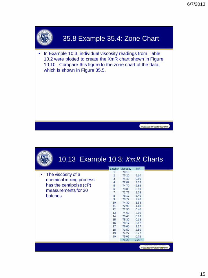
• In Example 10.3, individual viscosity readings from Table
10.2 were plotted to create the XmR chart shown in Figure
10.10. Compare this figure to the zone chart of the data,
which is shown in Figure 35.5.
10.13 Example 10.3: 𝑋𝑚𝑅 Charts
• The viscosity of a
chemical mixing process
has the centipoise (cP) measurements for 20
batches.
Batch # Viscosity MR 1 70.10 2 75.20 5.10 3 74.40 0.80 4 72.07 2.33 5 74.70 2.63 6 73.80 0.90 7 72.77 1.03 8 78.17 5.40 9 70.77 7.40 10 74.30 3.53 11 72.90 1.40 12 72.50 0.40 13 74.60 2.10 14 75.43 0.83 15 75.30 0.13 16 78.17 2.87 17 76.00 2.17 18 73.50 2.50 19 74.27 0.77 20 75.05 0.78
74.20 2.267

6/7/2013
16
Fig 10.10 𝑋𝑚𝑅 control charts
35.8 Example 35.4: Zone Chart
Minitab: Stat
Control Charts
Variable Charts
for Subgroups Zone Chart

6/7/2013
17
35.8 Example 35.4: Zone Chart
• Weights are assigned to each zone, which typically equate to
0, 2, 4, and 8.
• Each circle contains the cumulative score for each subgroup
or observation.
• The cumulative score is set to zero when the next plotted
point crosses over the centerline.
• Weights for points on the same size of the centerline are
added.
• With the above-noted weights, the cumulative score of 8
indicates an out-of-control process.
35.9 S4/IEE Assessment
Additional considerations for Shewhart versus CUSUM chart
selection are the following:
• When choosing a control chart strategy using Shewhart
techniques, variable sample sizes can be difficult to manage
when calculating control limits, while this is not a concern with
CUSUM techniques.
• Shewhart charts handle a number of nonconfomnng items via p
charts, while CUSUM can consider this a continuous variable
(e.g., number of “good” samples selected before a “bad” sample is found).
• CUSUM charting does not use many rules to define an out-of-
control condition. while, in the case of Shewhart charting it can lead to an increase in false alarms (Yashchin 1989).