chapter 2 – answer keyvisualizations of data
TRANSCRIPT

Chapter2–VisualizationsofData AnswerKey
CK-12AdvancedProbabilityandStatisticsConcepts 1
2.1 Histograms
Answers
1.
Number of Plastic Beverage Bottles per Week
Tally Frequency
1 || 2 2 |||| | 6
3 ||| 3 4 || 2 5 ||| 3 6 |||| || 7
7 |||| | 6
8 | 1
The number of students who replied “2” was 6. Thirty minus twenty-four is 6.
2. There is not enough information given to determine the answer.
Chapter2–VisualizationsofData AnswerKey
CK-12AdvancedProbabilityandStatisticsConcepts 2
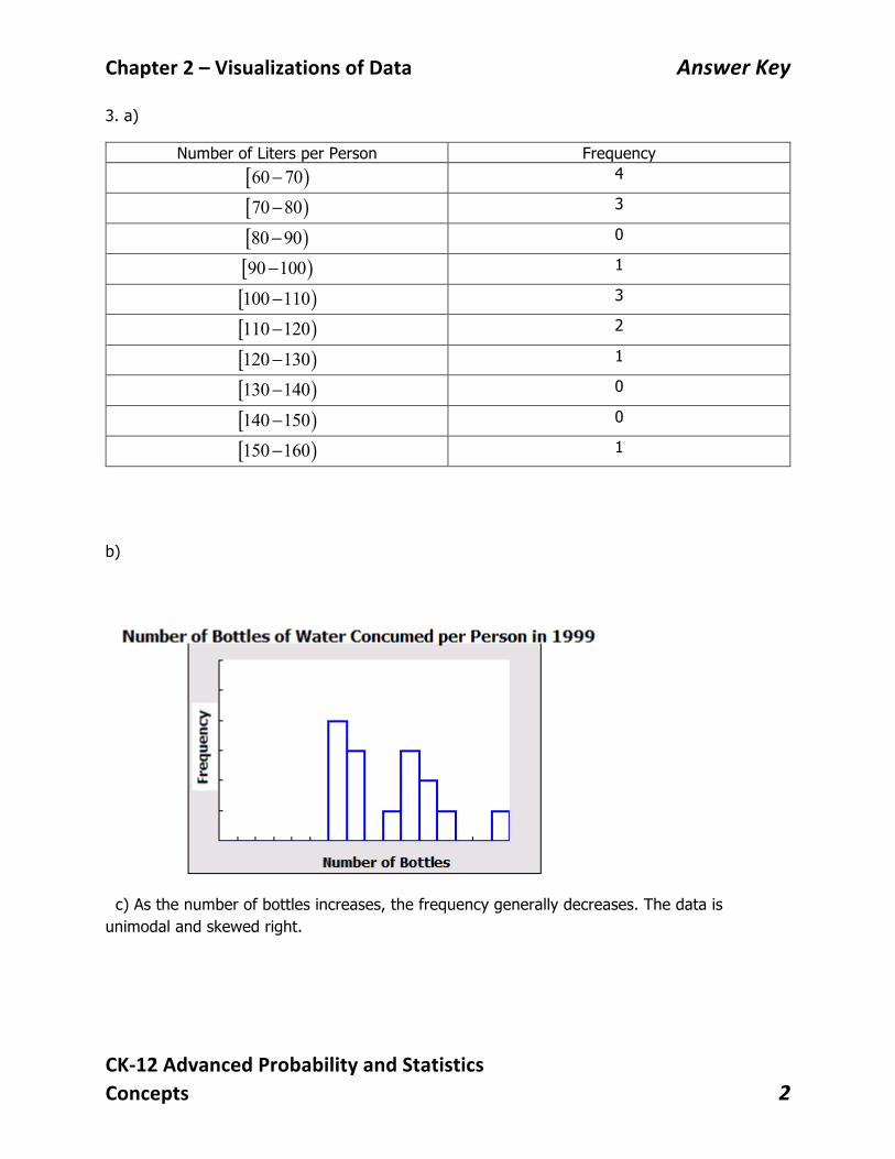
3. a)
Number of Liters per Person Frequency [ )60 70− 4
[ )70 80− 3
[ )80 90− 0
[ )90 100− 1
[ )100 110− 3
[ )110 120− 2
[ )120 130− 1
[ )130 140− 0
[ )140 150− 0
[ )150 160− 1
b)
c) As the number of bottles increases, the frequency generally decreases. The data is unimodal and skewed right.

Chapter2–VisualizationsofData AnswerKey
CK-12AdvancedProbabilityandStatisticsConcepts 3
4. a)
Class Frequency Relative frequency (%)
Cumulative frequency
Relative cumulative frequency (%)
0-25 7 50 7 50 25-50 1 7.1 8 57.1 50-75 3 21.4 11 78.6 75-100 1 7.1 12 85.7 100-125 1 7.1 13 92.9 125-150 0 0 13 92.9 150-175 0 0 13 92.9 175-200 0 0 13 92.9 200-225 1 7.1 14 100
b)
c)
0102030405060
Rela
tive
Freq
uenc
y (%
BTU
)
Class
Relative Frequency
60
50
40
30
20
10
10
20
100 50 50 100 150 200 250
Relative Frequency (% BTUs)
BTUs
Chapter2–VisualizationsofData AnswerKey
CK-12AdvancedProbabilityandStatisticsConcepts 4
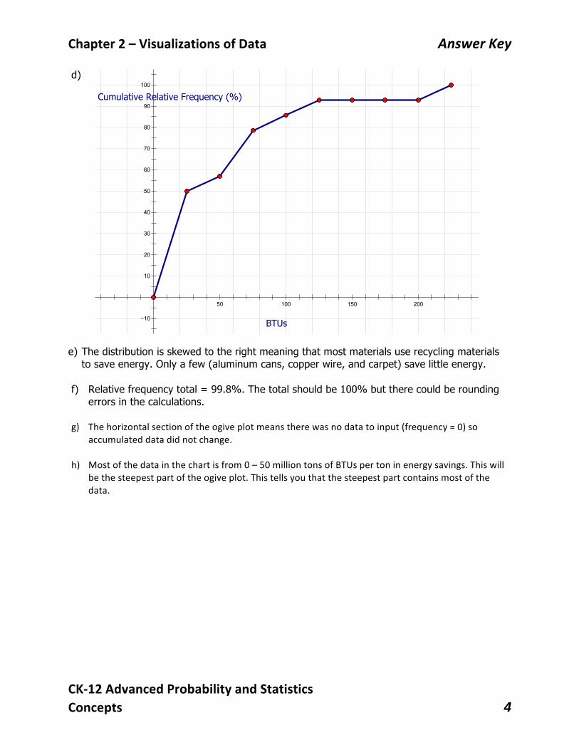
d) e) The distribution is skewed to the right meaning that most materials use recycling materials
to save energy. Only a few (aluminum cans, copper wire, and carpet) save little energy. f) Relative frequency total = 99.8%. The total should be 100% but there could be rounding
errors in the calculations. g) Thehorizontalsectionoftheogiveplotmeanstherewasnodatatoinput(frequency=0)so
accumulateddatadidnotchange.h) Mostofthedatainthechartisfrom0–50milliontonsofBTUspertoninenergysavings.Thiswill
bethesteepestpartoftheogiveplot.Thistellsyouthatthesteepestpartcontainsmostofthedata.
100
90
80
70
60
50
40
30
20
10
10
50 100 150 200 250
Cumulative Relative Frequency (%)
BTUs
Chapter2–VisualizationsofData AnswerKey
CK-12AdvancedProbabilityandStatisticsConcepts 5
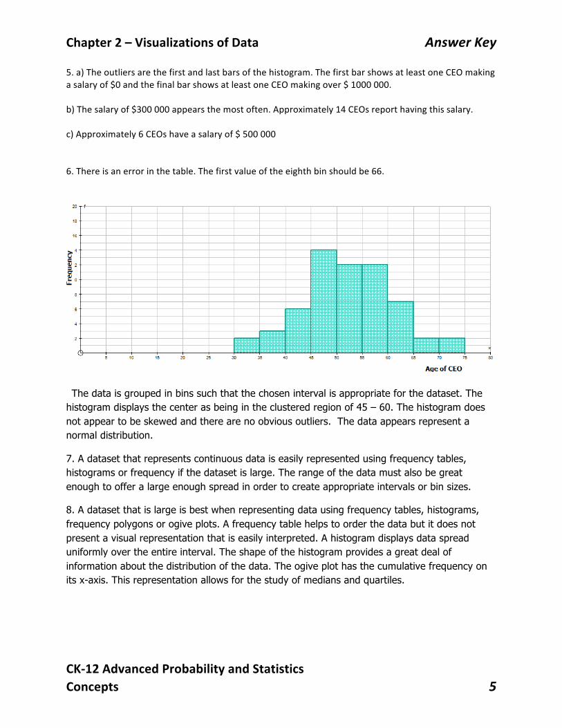
5.a)Theoutliersarethefirstandlastbarsofthehistogram.ThefirstbarshowsatleastoneCEOmakingasalaryof$0andthefinalbarshowsatleastoneCEOmakingover$1000000.b)Thesalaryof$300000appearsthemostoften.Approximately14CEOsreporthavingthissalary.c)Approximately6CEOshaveasalaryof$5000006.Thereisanerrorinthetable.Thefirstvalueoftheeighthbinshouldbe66.
The data is grouped in bins such that the chosen interval is appropriate for the dataset. The histogram displays the center as being in the clustered region of 45 – 60. The histogram does not appear to be skewed and there are no obvious outliers. The data appears represent a normal distribution.
7. A dataset that represents continuous data is easily represented using frequency tables, histograms or frequency if the dataset is large. The range of the data must also be great enough to offer a large enough spread in order to create appropriate intervals or bin sizes.
8. A dataset that is large is best when representing data using frequency tables, histograms, frequency polygons or ogive plots. A frequency table helps to order the data but it does not present a visual representation that is easily interpreted. A histogram displays data spread uniformly over the entire interval. The shape of the histogram provides a great deal of information about the distribution of the data. The ogive plot has the cumulative frequency on its x-axis. This representation allows for the study of medians and quartiles.

Chapter2–VisualizationsofData AnswerKey
CK-12AdvancedProbabilityandStatisticsConcepts 6
9. When the distribution’s shape is much skewed or has extreme outliers, the mean will be pulled towards the skewed end making it not very representative of the normal center of the dataset. When the distribution displays a positive skew, the mean is greater than the median. When the distribution has a negative skew, the mean is less than the median. In a normal distribution, the mean is the center of the distribution.
10. Determine the range of the data. (maximum value – the minimum value). Decide how many classes you wish to display on your graph. (usually 7 – 10 bins provide a visual display of the distribution. When you have decided, divide the range by the number of bins to determine the number of values in each class.

Chapter2–VisualizationsofData AnswerKey
CK-12AdvancedProbabilityandStatisticsConcepts 7
2.2 Displaying Categorical Variables
Answers
1.
2.
Material Kilograms Approx. % of Total Weight Plastics 6.21 23 Lead 1.71 6.33 Aluminum 3.83 14.18 Iron 5.54 20.52 Copper 2.12 7.85 Tin 0.27 1 Zinc 0.60 2.22 Nickel 0.23 0.85 Barium 0.05 0.185 Other Elements and chemicals
6.44 23.85
01234567
Wei
ght (
kg)
Material
Weight of Materials in a Typical Desktop Computer

Chapter2–VisualizationsofData AnswerKey
CK-12AdvancedProbabilityandStatisticsConcepts 8
3.
4. Answers will vary. Bar graphs are easier to analyze here because there are so many categories.
5.
6.
7.
Grade # Students Approximate % of Total Grade A 14 48.28 B 7 24.14 C 4 13.79 D 3 10.34 F 1 3.45
02468
10121416
A B C D F
Grad
e
Grade
Grades for Statistics Class
Percentage of Materials in a Typical Desktop Computer
Plastics
Lead
Aluminum
Iron
Copper
Tin
Zinc
Approximate Percentage of Total Grade
A

Chapter2–VisualizationsofData AnswerKey
CK-12AdvancedProbabilityandStatisticsConcepts 9
8. Answers will vary. Although bar graphs are easier to analyze, the relatively few categories make the pie chart easy to analyze as well.
9.
0102030405060708090
Med
ian
Inco
me
(Tho
usan
ds)
Highest Level of Education
Income of Persons age 25+ versus Highest Level of Education
Chapter2–VisualizationsofData AnswerKey
CK-12AdvancedProbabilityandStatisticsConcepts 10
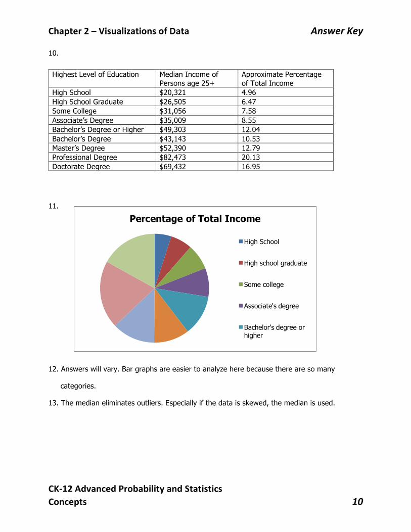
10.
11.
12. Answers will vary. Bar graphs are easier to analyze here because there are so many
categories.
13. The median eliminates outliers. Especially if the data is skewed, the median is used.
Highest Level of Education Median Income of Persons age 25+
Approximate Percentage of Total Income
High School $20,321 4.96 High School Graduate $26,505 6.47 Some College $31,056 7.58 Associate’s Degree $35,009 8.55 Bachelor’s Degree or Higher $49,303 12.04 Bachelor’s Degree $43,143 10.53 Master’s Degree $52,390 12.79 Professional Degree $82,473 20.13 Doctorate Degree $69,432 16.95
Percentage of Total Income
High School
High school graduate
Some college
Associate's degree
Bachelor's degree or higher

Chapter2–VisualizationsofData AnswerKey
CK-12AdvancedProbabilityandStatisticsConcepts 11
2.3 Displaying Univariate Data
Answers
1. Dot plot:
2. The distribution is uniform. The center of the data is approximately 25 with data somewhat
evenly spread from 5 through to 48.
3. Stem-and-leaf plot:
0 5 5
1 1 2 2 3 4 5 9 9
2 0 1 3 5 5 6 6 7 8 8 9
3 0 2 3 3 4 5 6 9
4 0 1 2 2 5 8
4. 27
5. The distribution is left skewed with no outliers.
6. The distribution is left skewed with one outlier.
7. The distribution is symmetric with no apparent outliers.
8. The distribution is right skewed with no apparent outliers.
9. The first data set is symmetric with no apparent outliers. The second data set is symmetric
with no apparent outliers. The third data set is bimodal. The fourth data set is evenly
distributed.
10 20 30 40 Percentage

Chapter2–VisualizationsofData AnswerKey
CK-12AdvancedProbabilityandStatisticsConcepts 12
10. The first data set is centered on 52 with a large peak at 52. The second data set is
centered on 52 with a peak at 52. The third data set is centered at 52 but has peaks at
25 and 85. The fourth data set has no center, all peaks are even.
11. The first dot plot has the smallest standard deviation.
12. The third dot plot has the largest standard deviation.
13. Dot plots are useful with small data sets that use categorical data. When the data
describes qualitative observations, measures of spread or shape are not used. These
characteristics to describe dot plots are used when the categories are numerical.
14. a) Stem-and-leaf plot
3 2 3 6 7 8
4 0 1 3 3 4 4 5 5 5 5 6 6 7 7 7 8 8 8 8 9
5 0 0 0 0 0 0 1 1 2 3 3 3 5 5 5 6 6 6 6 7 7 8 8 9
6 0 1 1 1 2 2 3 9 9
7 0 4
b) Dot Plot
c) The data set is symmetric.
d) Outliers could include 32, 33, and 74.
14
13
12
11
10
9
8
7
6
5
4
3
2
1
1
2
10 20 30 40 50 60 70 80 90
Ages of CEOs
Chapter2–VisualizationsofData AnswerKey
CK-12AdvancedProbabilityandStatisticsConcepts 13
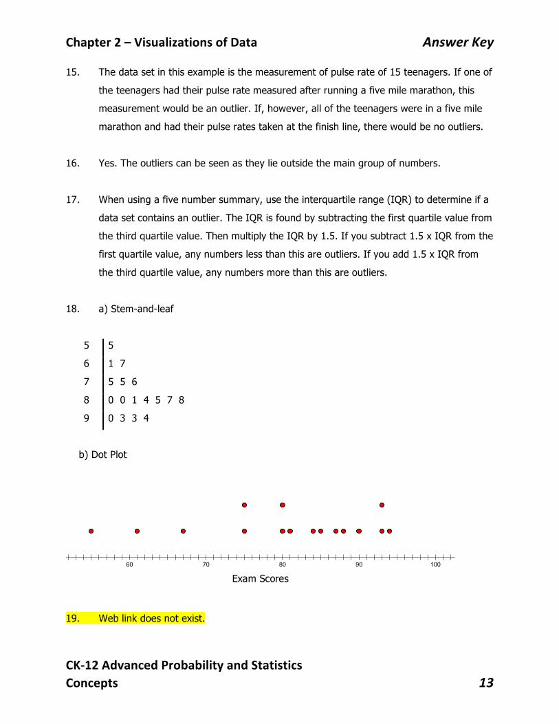
15. The data set in this example is the measurement of pulse rate of 15 teenagers. If one of
the teenagers had their pulse rate measured after running a five mile marathon, this
measurement would be an outlier. If, however, all of the teenagers were in a five mile
marathon and had their pulse rates taken at the finish line, there would be no outliers.
16. Yes. The outliers can be seen as they lie outside the main group of numbers.
17. When using a five number summary, use the interquartile range (IQR) to determine if a
data set contains an outlier. The IQR is found by subtracting the first quartile value from
the third quartile value. Then multiply the IQR by 1.5. If you subtract 1.5 x IQR from the
first quartile value, any numbers less than this are outliers. If you add 1.5 x IQR from
the third quartile value, any numbers more than this are outliers.
18. a) Stem-and-leaf
5 5
6 1 7
7 5 5 6
8 0 0 1 4 5 7 8
9 0 3 3 4
b) Dot Plot
19. Web link does not exist.
12
11
10
9
8
7
6
5
4
3
2
1
1
2
3
10 20 30 40 50 60 70 80 90 100
Exam Scores

Chapter2–VisualizationsofData AnswerKey
CK-12AdvancedProbabilityandStatisticsConcepts 14
2.4 Displaying Bivariate Data
Answers
1. The independent variable is the explanatory variable and the dependent variable is the response variable. Therefore comparing the municipal waste to each state would have the explanatory variable as the state name and the response variable as the amount of waste. If comparing the percentage of each state in the union versus the amount of waste, the percentage would be the explanatory variable and the response variable would be the amount of waste.
2. 13 386 000 tons
3.
4. The direction is positive but there is a weak correlation between the two variables.
5. There is a decrease in the recycling rate of plastic bottles made from PET and an increase in the recycling rate of HDPE.
05000100001500020000250003000035000400004500050000
0 10 20 30 40 50 60
Amt o
f Was
ter (
thou
sand
tons
)
Percentage of State in Union
Percentage of State in Union vs Amount of Municipal Waste

Chapter2–VisualizationsofData AnswerKey
CK-12AdvancedProbabilityandStatisticsConcepts 15
6. The total change in PET recycling went from about 33% to about 22%, so from about 10-12% from the years 1995 to 2001.
7. One explanation was that there was an increase in the use of HDPE in recycling containers and this type of recycled material is used more often in the production of plastic lumber, tables, roadside curbs, benches, truck cargo liners, trash receptacles, stationery (e.g. rulers) and other durable plastic products.
8. This change was the most rapid from the middle of 1995 to the middle of 1996.
9. Dot plots allow for the interpretation of shape, center, and spread but are only used for small sets of data. Stem and leaf plots are useful for seeing the shape of the distribution of data. Both of these plots are used for univariate data sets to determine if the data is symmetric or skewed, to see any gaps and spot outliers. A scatter plot is useful for determining trends in data and the correlation between the explanatory and response variables. Scatter plots are used for bivariate data sets to see the general relationship between the variables.
10. Median and IQR can be used to describe any set of data but are particularly useful for skewed data. When data is skewed or has extreme outliers, the mean is pulled toward the skewed end. This makes the mean not representative of the middle

Chapter2–VisualizationsofData AnswerKey
CK-12AdvancedProbabilityandStatisticsConcepts 16
2.5 Box-and- Whisker Plots
Answers
1.
Min X Lower Quartile Median Upper Quartile Max X 35 53 67.5 75.5 95
2. 3 1
75.5 5322.5
IQR Q QIQRIQR
= −= −=
1 1.553 1.5(22.5) 19.5Q IQR− ∗
− = 3 1.5
75.5 1.5(22.5) 109.25Q IQR+ ∗
+ =
There are no data values less than 19.5 and none greater than 109.25. Therefore, there are no outliers.
3. The third quarter of the data is more densely concentrated in a smaller area. 50% of the data is between 53 and 75.5. The data is very close to being symmetric although the data does skew slightly to the left.
4. The median of the data is 67.5. The mean should be pulled left in the direction of the skewness and thus be smaller than the median. The mean of the data is 65.7.
5.
Min X Lower Quartile Median Upper Quartile Max X 0 72 82 89 105
6. 3 1
89 7217
IQR Q QIQRIQR
= −= −=
1 1.572 1.5(17) 46.5Q IQR− ∗
− = 3 1.589 1.5(17) 114.5Q IQR+ ∗
+ =
There are three data values 0, 4, and 46 that are less than 46.5. These values are outliers for this data set. There are no data values greater than 114.5.
7. The data in the lower 25% are widely spread compared to the other sections of the graph. 50% of the data is between 72 and 89. The data is moderately symmetric although it does skew to the left.
Chapter2–VisualizationsofData AnswerKey
CK-12AdvancedProbabilityandStatisticsConcepts 17
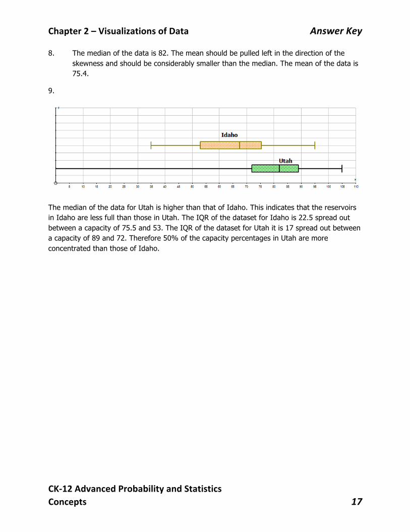
8. The median of the data is 82. The mean should be pulled left in the direction of the skewness and should be considerably smaller than the median. The mean of the data is 75.4.
9.
The median of the data for Utah is higher than that of Idaho. This indicates that the reservoirs in Idaho are less full than those in Utah. The IQR of the dataset for Idaho is 22.5 spread out between a capacity of 75.5 and 53. The IQR of the dataset for Utah it is 17 spread out between a capacity of 89 and 72. Therefore 50% of the capacity percentages in Utah are more concentrated than those of Idaho.

Chapter2–VisualizationsofData AnswerKey
CK-12AdvancedProbabilityandStatisticsConcepts 18
2.6 Effects on Box-and-Whisker Plots
Answers
1.
Min X Lower Quartile Median Upper Quartile Max X 3.12 3.22 3.282 3.393 3.528
2. 3 1
3.393 3.220.173
IQR Q QIQRIQR
= −= −=
1 1.53.22 1.5(0.173) 2.9605Q IQR− ∗
− = 3 1.5
3.393 1.5(0.173) 3.6525Q IQR+ ∗
+ =
There are no outliers since there are no data values less than 2.9605 and none greater than 3.6525.
3.
4.
Min X Lower Quartile Median Upper Quartile Max X .8242 .8506 .8670 .8963 .9320
The center and the measures of spread for the given dataset will decrease by a factor of 1/3.7854 or 0.2642. The boxplots for both datasets will have the same shape but the plot for US gallons will be stretched out more.
Chapter2–VisualizationsofData AnswerKey
CK-12AdvancedProbabilityandStatisticsConcepts 19
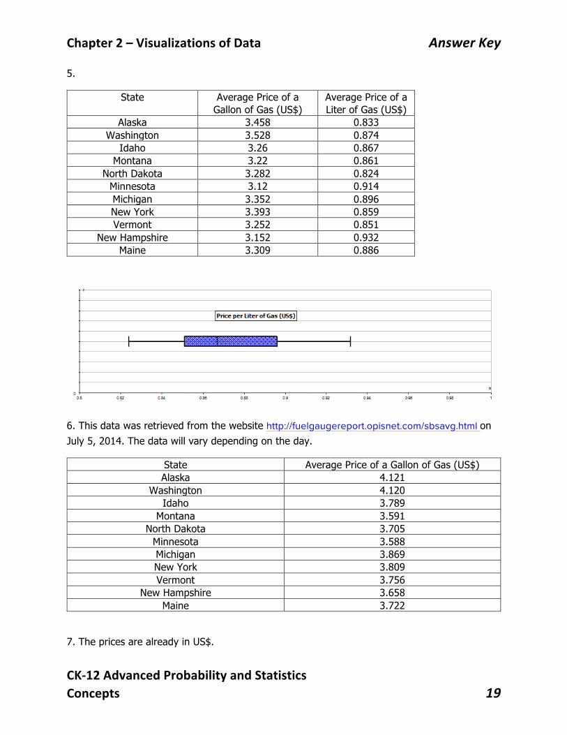
5.
State Average Price of a Gallon of Gas (US$)
Average Price of a Liter of Gas (US$)
Alaska 3.458 0.833 Washington 3.528 0.874
Idaho 3.26 0.867 Montana 3.22 0.861
North Dakota 3.282 0.824 Minnesota 3.12 0.914 Michigan 3.352 0.896 New York 3.393 0.859 Vermont 3.252 0.851
New Hampshire 3.152 0.932 Maine 3.309 0.886
6. This data was retrieved from the website http://fuelgaugereport.opisnet.com/sbsavg.html on July 5, 2014. The data will vary depending on the day.
State Average Price of a Gallon of Gas (US$) Alaska 4.121
Washington 4.120 Idaho 3.789
Montana 3.591 North Dakota 3.705
Minnesota 3.588 Michigan 3.869 New York 3.809 Vermont 3.756
New Hampshire 3.658 Maine 3.722
7. The prices are already in US$.
Chapter2–VisualizationsofData AnswerKey
CK-12AdvancedProbabilityandStatisticsConcepts 20
8. A dot plot and a stem-and-leaf plot are used when the dataset consists of a small number of values. A histogram and a box-and-whisker plot are used when the dataset is large.
9. Histograms and Box-and-Whisker Plots
10. The center of the distribution would change by the same scale factor. Calculations like the range, the IQR and the standard deviation will change proportionally by the same scale factor. The five-number summary would also change proportionally.
11. e
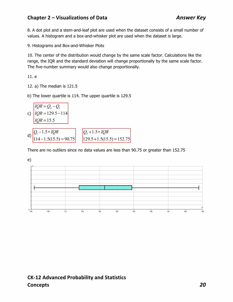
12. a) The median is 121.5
b) The lower quartile is 114. The upper quartile is 129.5
c) 3 1
129.5 11415.5
IQR Q QIQRIQR
= −= −=
d) 1 1.5114 1.5(15.5) 90.75Q IQR− ∗
− = 3 1.5129.5 1.5(15.5) 152.75Q IQR+ ∗
+ =
There are no outliers since no data values are less than 90.75 or greater than 152.75
e)