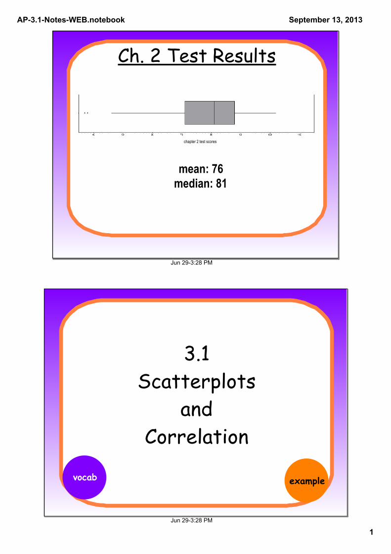
ch. 2 test results
TRANSCRIPT
AP3.1NotesWEB.notebook
1
September 13, 2013
Jun 293:28 PM
Ch. 2 Test Results
chapter 2 test scores
mean: 76median: 81
Jun 293:28 PM
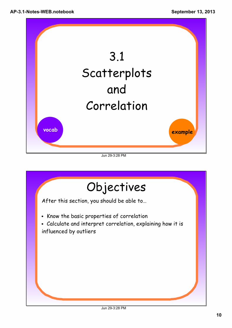
3.1 Scatterplots
and Correlation
vocab example

AP3.1NotesWEB.notebook
2
September 13, 2013
Jun 293:28 PM
ObjectivesAfter this section, you should be able to…
• Identify explanatory and response variables in situations where one variable helps explain or influences the other• Make a scatterplot to display the relationship between two quantitative variables• Describe the direction, form, and strength of the overall pattern of a scatterplot• Recognize outliers in a scatterplot
Jun 293:28 PM
Why do we study relationships between two
variables?
we already know we can plot data, find numerical summaries, look for overall patterns, describe data
to make predictions, explain phenomena

AP3.1NotesWEB.notebook
3
September 13, 2013
Jun 293:28 PM
Response Variablemeasures the outcome of a study
-may help explain or influence changes in a response
-can help predict changes in the response variable
Explanatory Variable
Jun 293:28 PM
Practice ExampleIdentify the explanatory and response variables
amount of rain ; weed growth
resting pulse rate ; amount of daily exercise
percent cloud cover ; chances of percipitation
response explanatory
explanatory response
explanatory response

AP3.1NotesWEB.notebook
4
September 13, 2013
Jun 293:28 PM
What about...Identify the explanatory and response variables
number of fans at the game ; performance of the team
Jun 293:28 PM
Scatterplotdisplays relationship between two QUANTITATIVE variables measured on the same individual
eXplanatory variable
resp
onse
var
iabl
eva
riab
le n
ame
variable name
*choose "nice" values*don't have to start at (0,0)

AP3.1NotesWEB.notebook
5
September 13, 2013
Jun 293:28 PM
Scatterplot
fully label graph
including full labels is more important than plottingevery single point exactly accurately
APTIP
Jun 293:28 PM
Track and FieldThe table below shows data for 13 students in a statistics class. Each member of the class ran a 40-yard sprint and then did a long jump (with a running start). Make a scatterplot of the relationship between sprint time (in seconds) and long jump (in inches).

AP3.1NotesWEB.notebook
6
September 13, 2013
Jun 293:28 PM
Track and FieldThe table below shows data for 13 students in a statistics class. Each member of the class ran a 40-yard sprint and then did a long jump (with a running start). Make a scatterplot of the relationship between sprint time (in seconds) and long jump (in inches).
Jun 293:28 PM
Track and FieldThe table below shows data for 13 students in a statistics class. Each member of the class ran a 40-yard sprint and then did a long jump (with a running start). Make a scatterplot of the relationship between sprint time (in seconds) and long jump (in inches).
make in calculator!

AP3.1NotesWEB.notebook
7
September 13, 2013
Jun 293:28 PM
Describing Scatterplots
Use D.O.F.S.
Direction: overall positive or negativeOutliers: do there appear to be any?Form: overall linear, non-linear, clustered?Strength: how closely do the points follow the form?
Jun 293:28 PM
Track and FieldDescribe the scatterplot

AP3.1NotesWEB.notebook
8
September 13, 2013
Jun 293:28 PM
McDonaldsThe following scatterplot shows the amount of carbs (in grams) and amount of fat(in grams) of beef sandwiches from McDonalds. Describe the relationship between carbs and fat.
Jun 293:28 PM
Does a strong association between two variables indicate a cause-and-effect
relationship?
*association does not imply causation
ex/ ice cream sales and drowning deaths

AP3.1NotesWEB.notebook
9
September 13, 2013
Jun 293:28 PM
Homework
3.1 (Day 1) Assignment
`
Jun 293:28 PM
Bellwork`
The scatterplot shown displays the interval between consecutive eruptions of Old Faithful against the duration of the previous eruption. Describe the relationship shown in the scatterplot.
AP3.1NotesWEB.notebook
10
September 13, 2013
Jun 293:28 PM
3.1 Scatterplots
and Correlation
vocab example
Jun 293:28 PM
ObjectivesAfter this section, you should be able to…
• Know the basic properties of correlation• Calculate and interpret correlation, explaining how it is influenced by outliers

AP3.1NotesWEB.notebook
11
September 13, 2013
Jun 293:28 PM
Similar or Different?
direction?form?
direction?form?
Jun 293:28 PM
Correlation (r)
measures the direction and strength of the LINEAR relationship between two quantitative variables
-1 -.5 0 .5 1strong mod. weak mod. strong

AP3.1NotesWEB.notebook
12
September 13, 2013
Jun 293:28 PM
Correlation
Jun 293:28 PM
Correlation Characteristics-1 ≤ r ≤ 1
r < 0 means negative association
r > 0 means positive association

AP3.1NotesWEB.notebook
13
September 13, 2013
Jun 293:28 PM
Correlation Competition!
Guess the correlation!
Jun 293:28 PM
Can you determine the form of a relationship using only
correlation?
Demo
AP3.1NotesWEB.notebook
14
September 13, 2013
Jun 293:28 PM
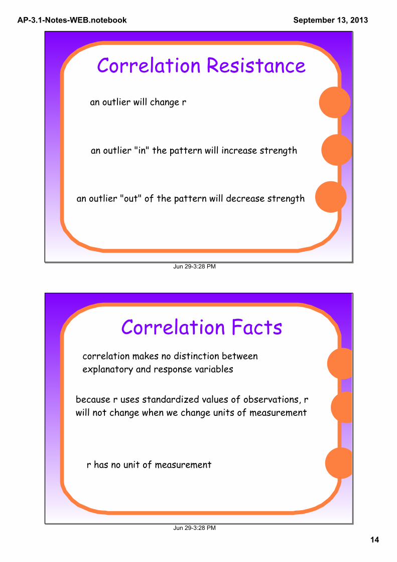
Correlation Resistancean outlier will change r
an outlier "in" the pattern will increase strength
an outlier "out" of the pattern will decrease strength
Jun 293:28 PM
Correlation Factscorrelation makes no distinction between explanatory and response variables
because r uses standardized values of observations, r will not change when we change units of measurement
r has no unit of measurement

AP3.1NotesWEB.notebook
15
September 13, 2013
Jun 293:28 PM
Ticket Out!
Draw a scatterplot with a WEAK
correlation, give an estimation of what r =
Draw a scatterplot with a STRONG
correlation, give an estimation of what r =
Jun 293:28 PM
Homework
3.1 (Day 2) Assignment

AP3.1NotesWEB.notebook
16
September 13, 2013
Jun 293:28 PM
BellworkThe figure below plots the average brain weight in grams versus average body weight in kilograms for 96 species of mammals. There are many small mammals whose points are at the lower left overlap.
(a) The correlation between body weight and brain weight is r = 0.86. Explain what this value means.
(b) What effect would removing the hippo have on the correlation?