bringing data to life. spreadsheets are boring! (clickz live singapore 2014)
TRANSCRIPT
Bringing Data to LifeDavid Sanderson!Founder and CEO, Nugit3 December, 2014


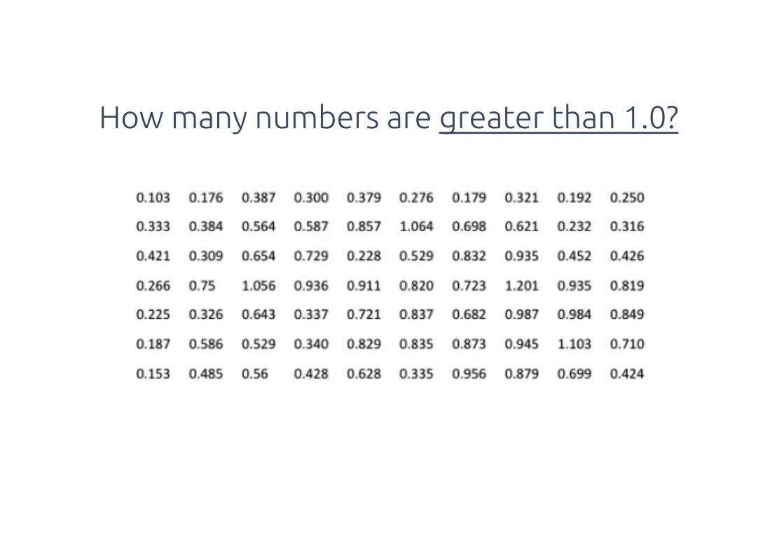
How many numbers are greater than 1.0?

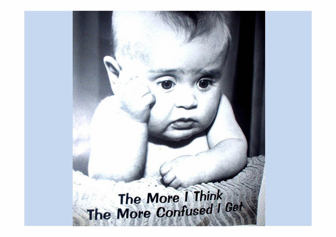
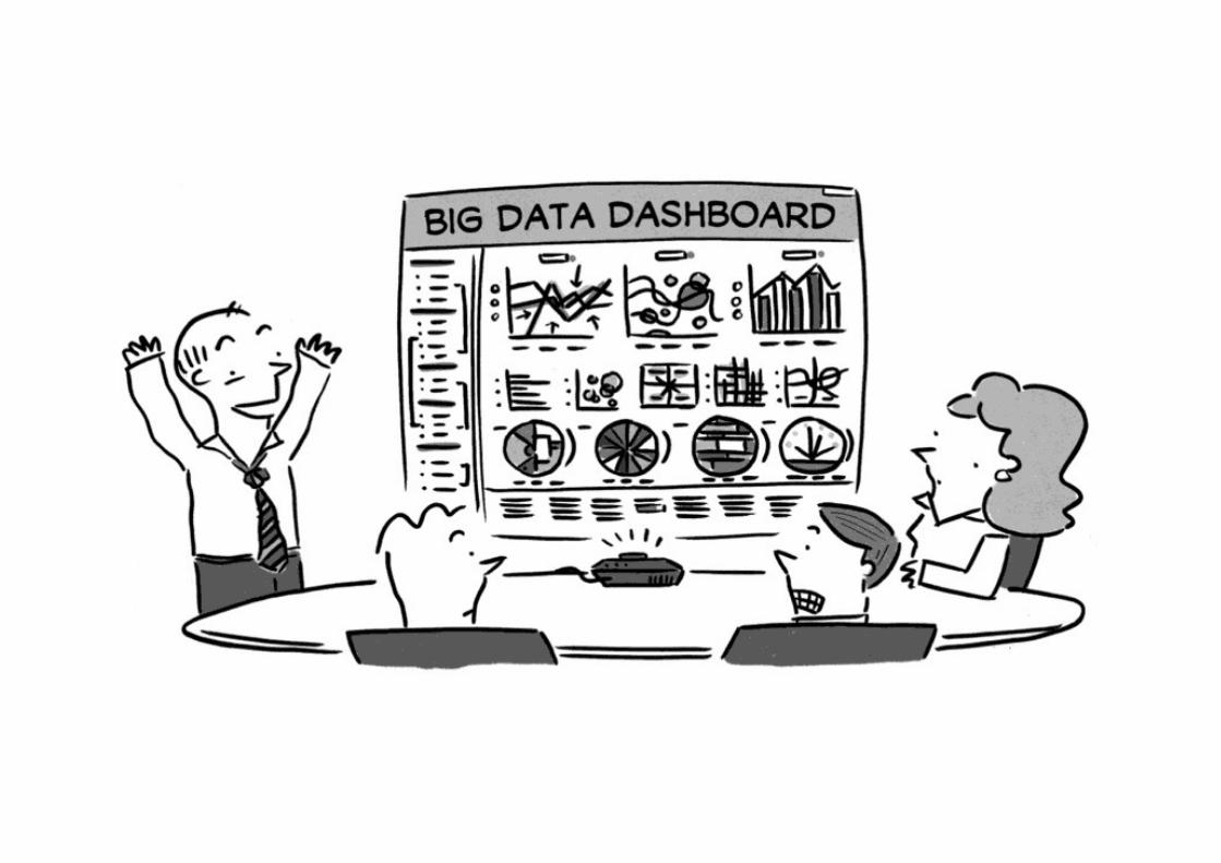
The consequences of confusion
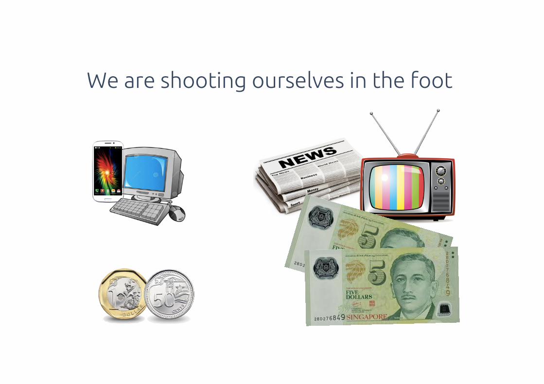
We are shooting ourselves in the foot

Flu! & Pu! Brevity
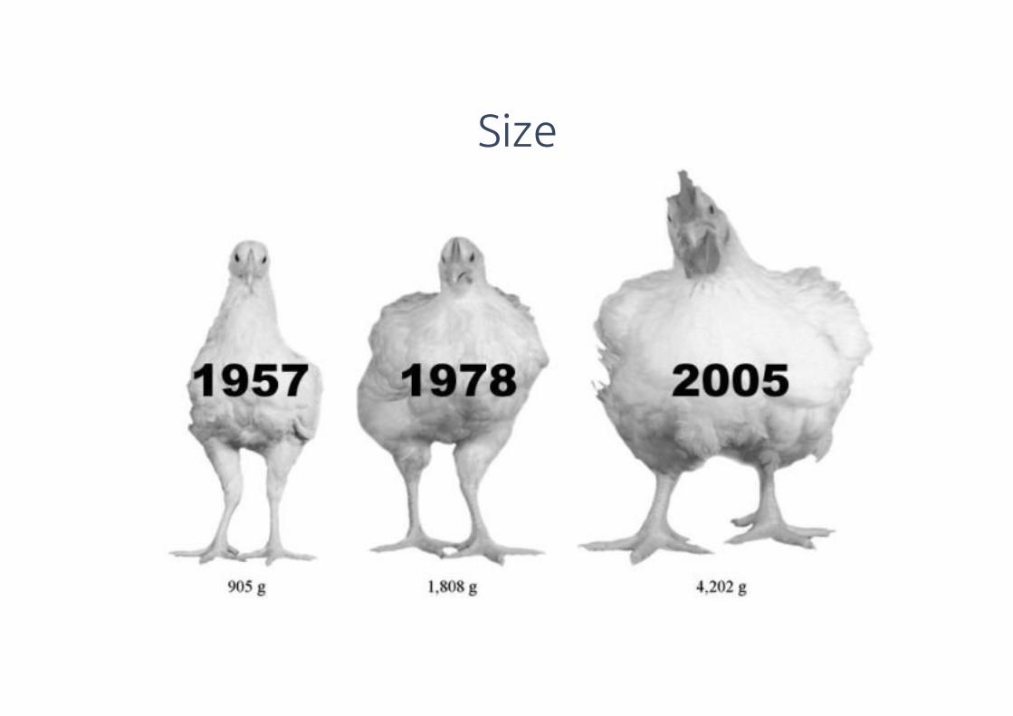
Size
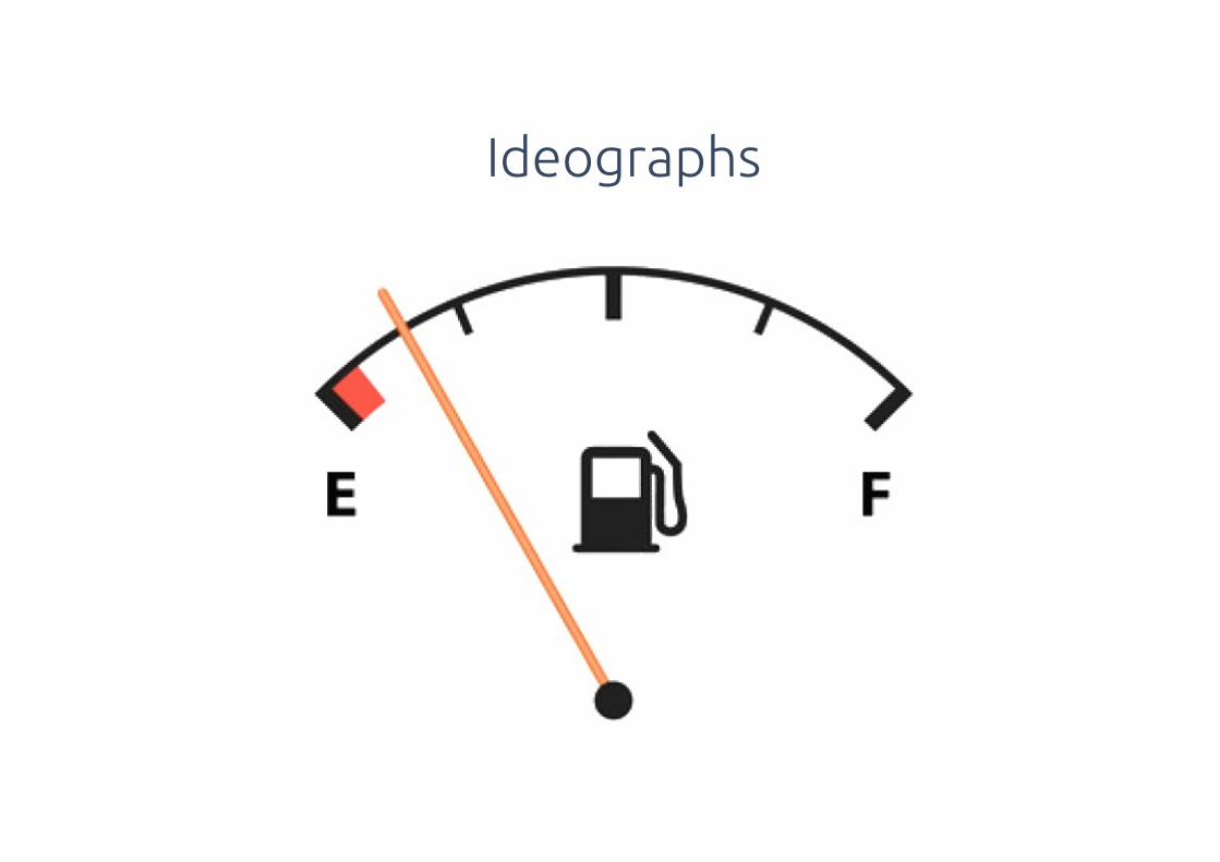
Ideographs
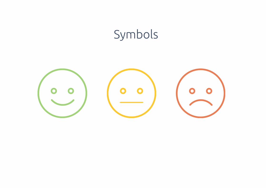
Symbols
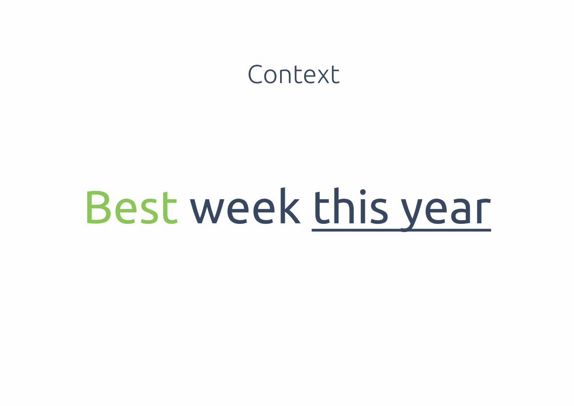
Best week this year
Context

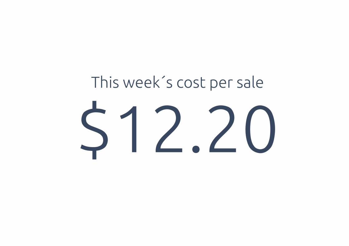
$12.20This week´s cost per sale
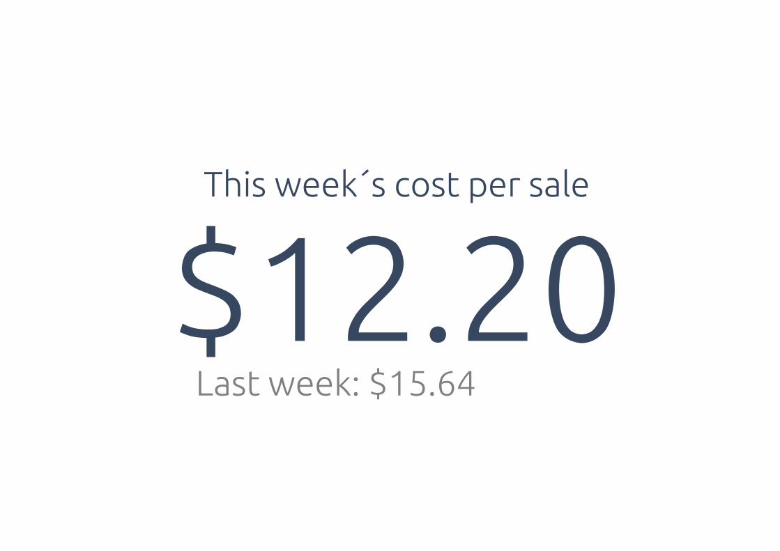
$12.20This week´s cost per sale
Last week: $15.64
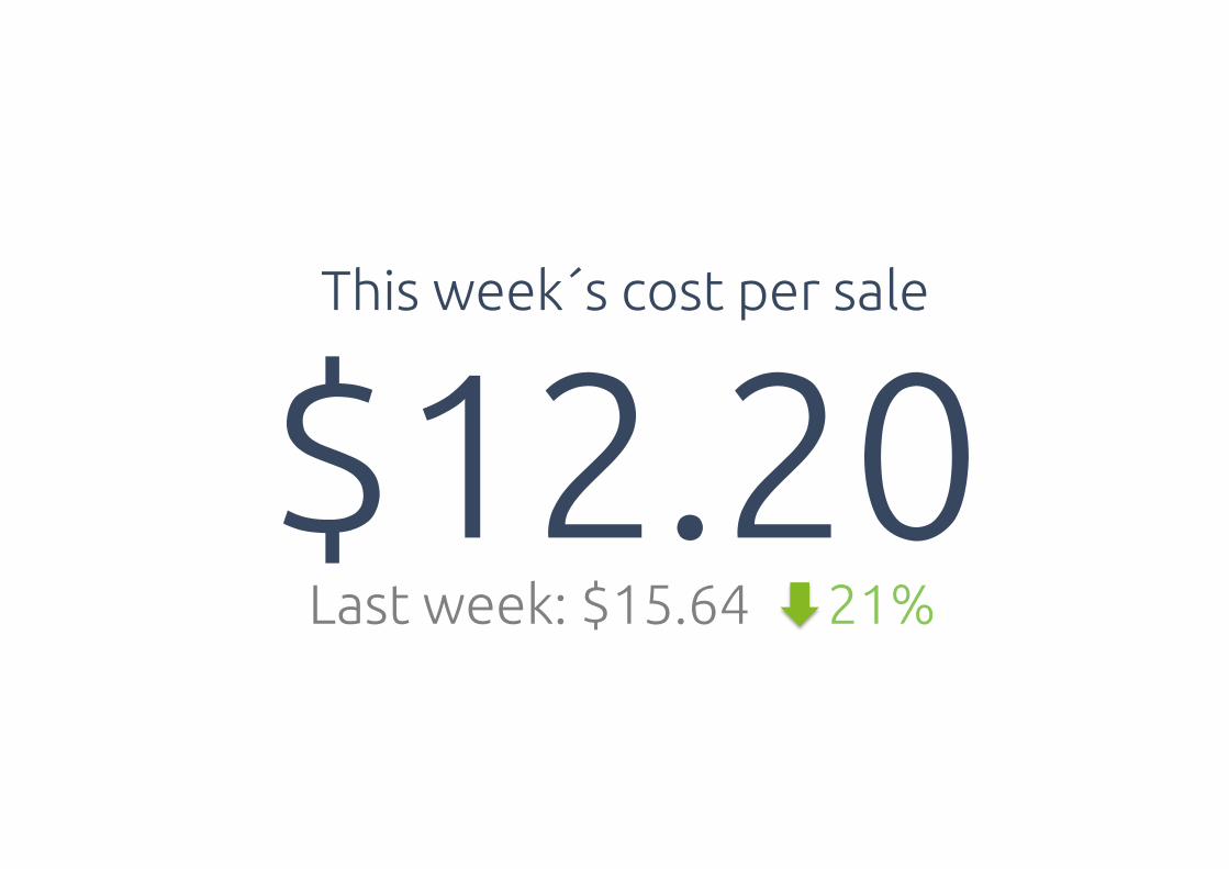
$12.20Last week: $15.64 21%
This week´s cost per sale
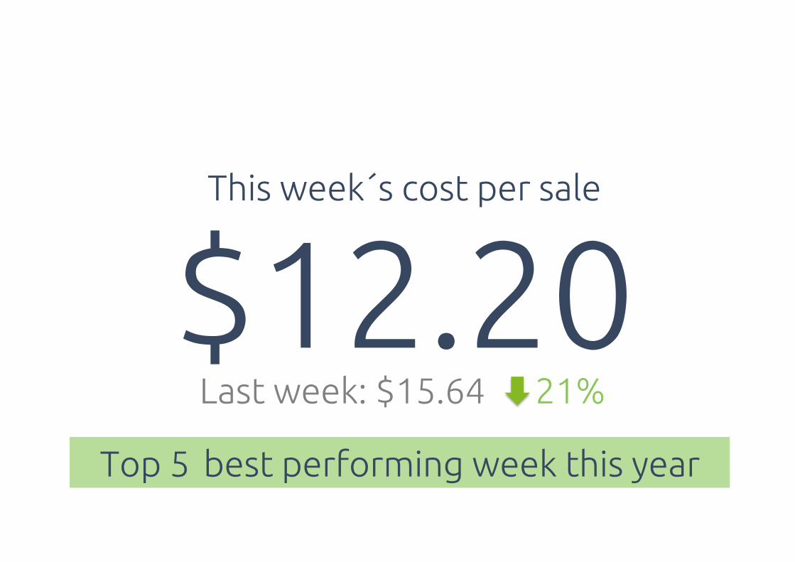
$12.20Top 5 best performing week this year
Last week: $15.64 21%
This week´s cost per sale
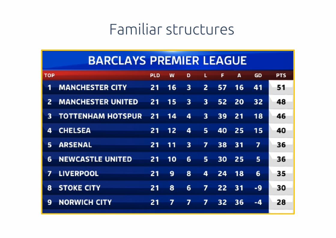
Familiar structures

Advertising AdWords
$0.74 Cost Per Click $1.20
1,032 Visits 1,443
65% Bounce Rate 42%
2.4 Avg. Page Views 5.3
157 Checkouts 244
42 Online Sales 85
$18 Cost Per Sale 20
Performance Advertising August 2014
Facebook Google

Celebrate little wins
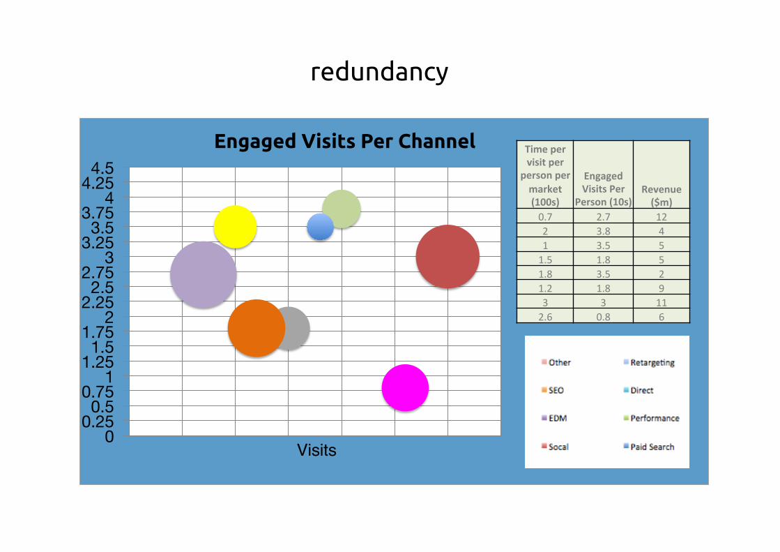
redundancy
0 0.25 0.5
0.75 1
1.25 1.5
1.75 2
2.25 2.5
2.75 3
3.25 3.5
3.75 4
4.25 4.5
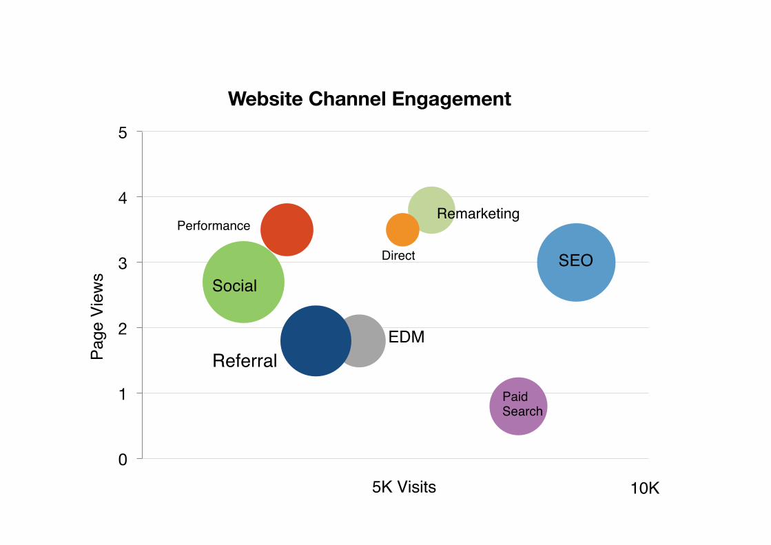
Engaged Visits Per Channel Time%per%visit%per%
person%per%market%(100s)%
Engaged%Visits%Per%
Person%(10s)%Revenue%($m)%
0.7! 2.7! 12!2! 3.8! 4!1! 3.5! 5!1.5! 1.8! 5!1.8! 3.5! 2!1.2! 1.8! 9!3! 3! 11!2.6! 0.8! 6!
Visits
0
1
2
3
4
5
Website Channel Engagement
SEO
Paid Search
Direct
Remarketing
Social
Referral
Performance
10K5K Visits
Page
Vie
ws
EDM
New York City Bar Charts
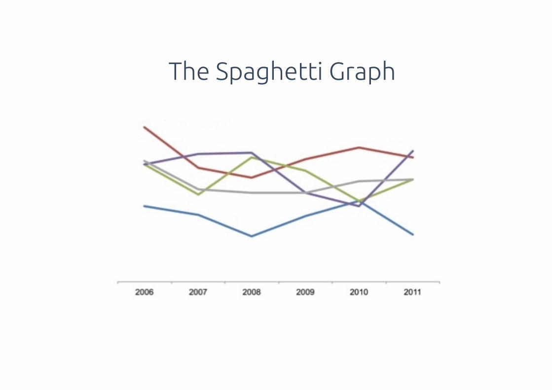
The Spaghetti Graph
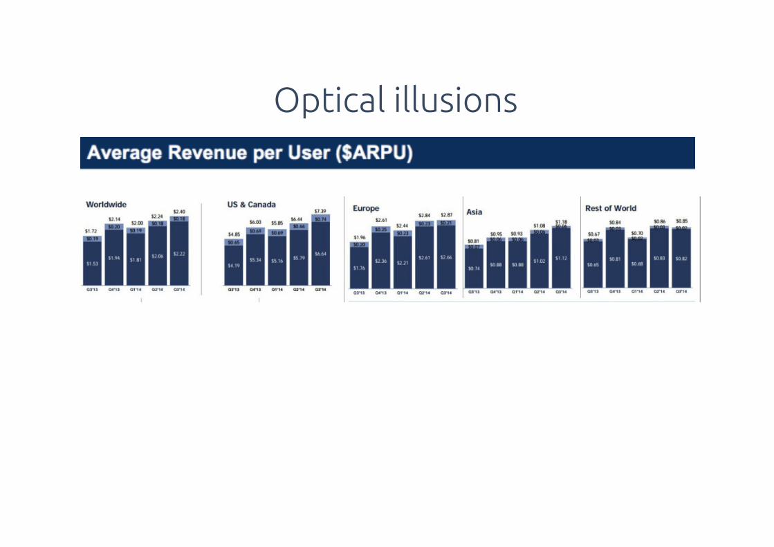
Optical illusions
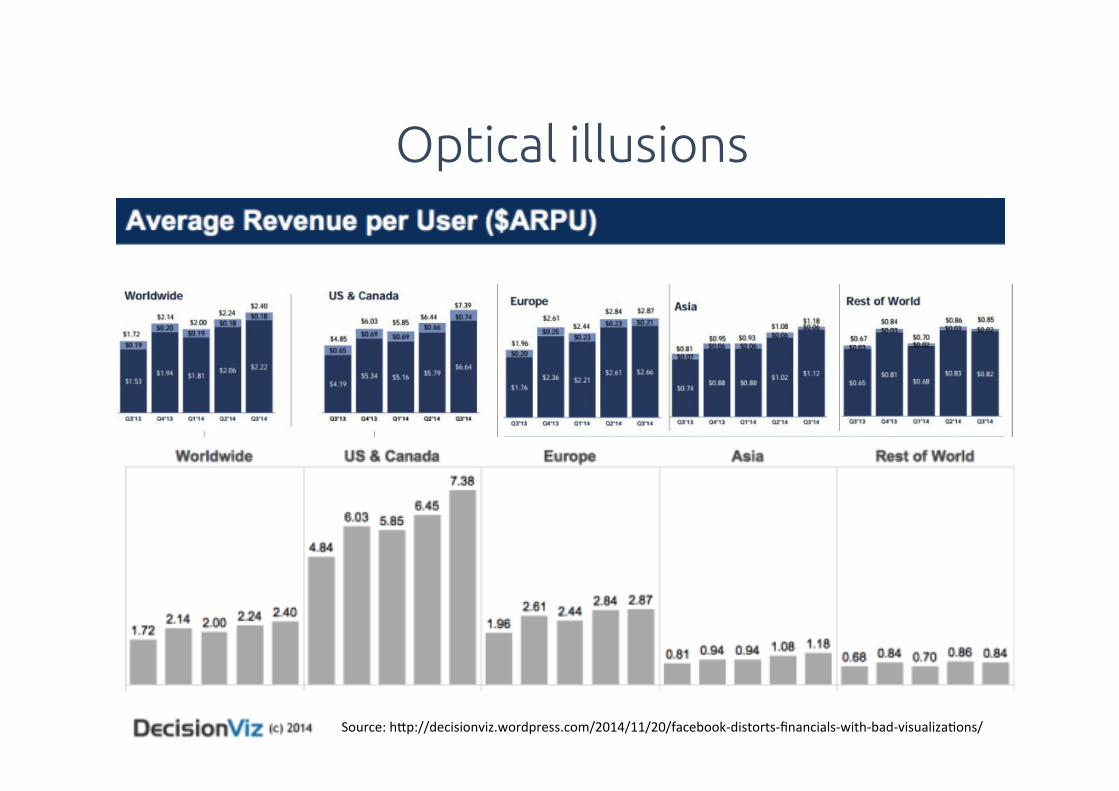
Source:!h5p://decisionviz.wordpress.com/2014/11/20/facebookDdistortsDfinancialsDwithDbadDvisualizaHons/!
Optical illusions
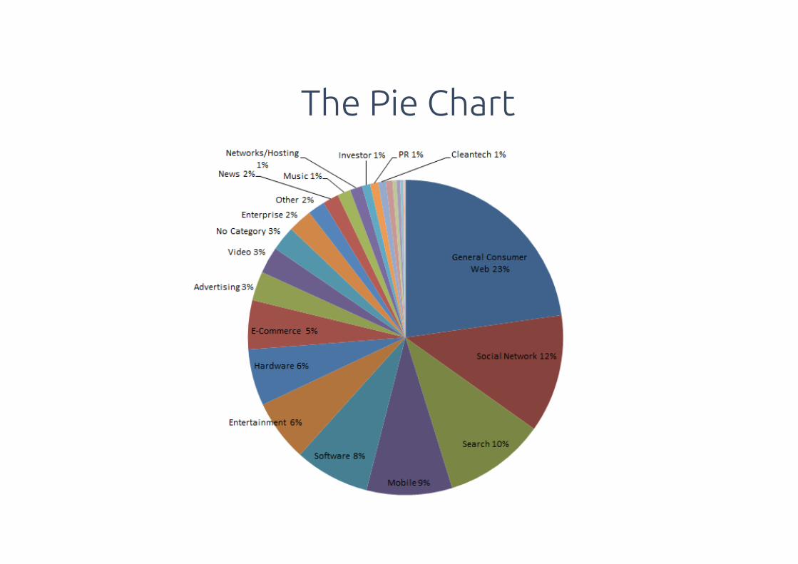
The Pie Chart
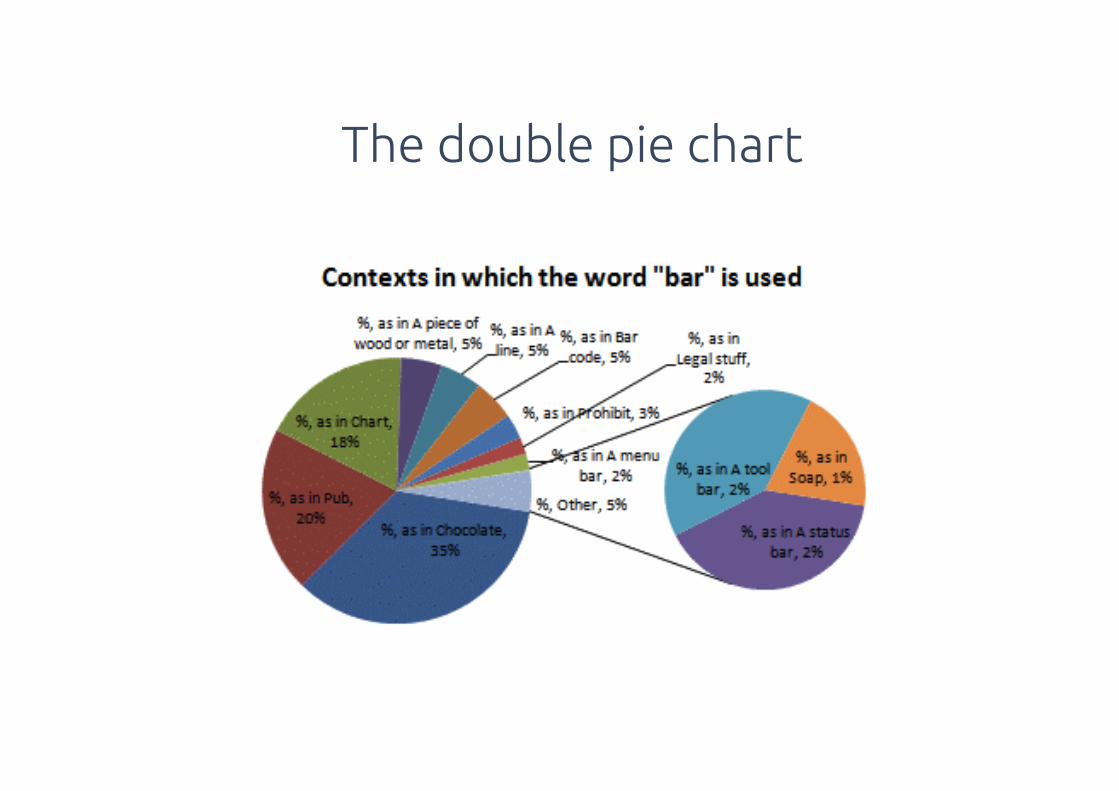
The double pie chart
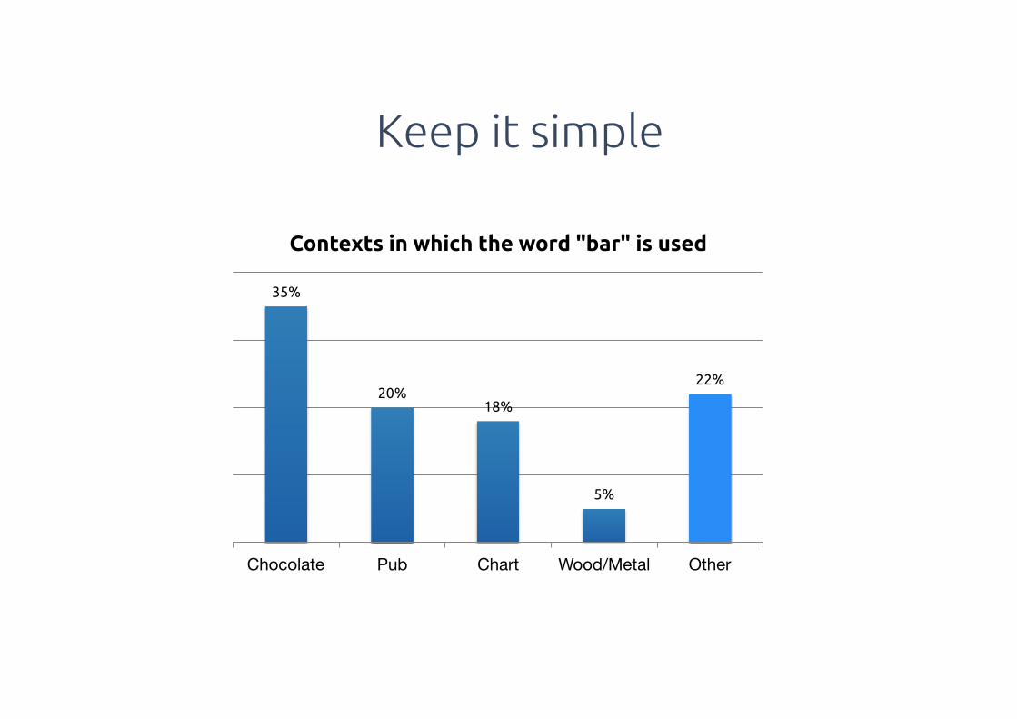
Keep it simple
35%
20%18%
5%
22%
Chocolate Pub Chart Wood/Metal Other
Contexts in which the word "bar" is used
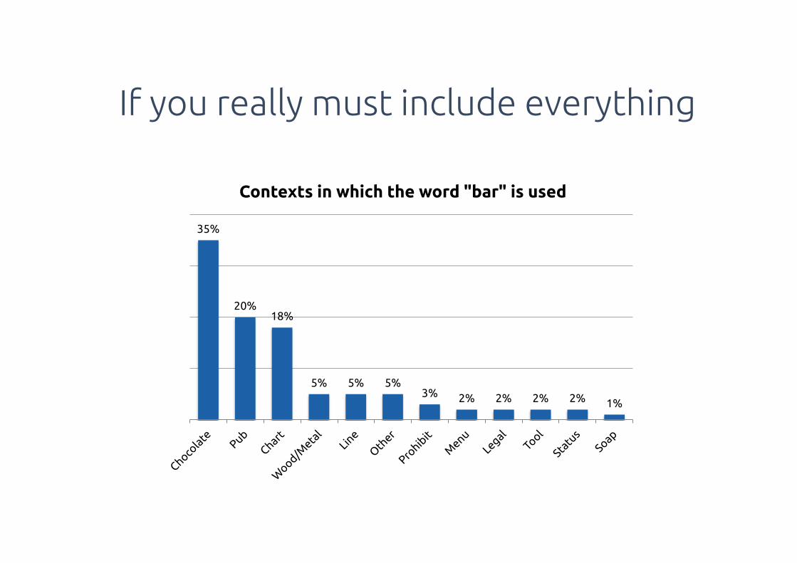
If you really must include everything
35%
20%18%
5% 5% 5%3% 2% 2% 2% 2% 1%
Contexts in which the word "bar" is used

There’s simple ways to do it
35%
20%
18%
5%
5%
5%
3%
2%
2%
2%
2%
1%
Chocolate
Pub
Chart
Wood/Metal
Line
Other
Prohibit
Menu
Legal
Tool
Status
Soap
Contexts in which the word "bar" is used
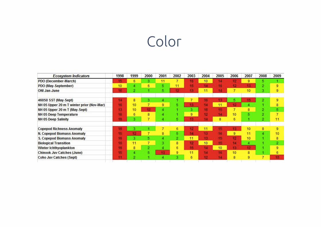
Color
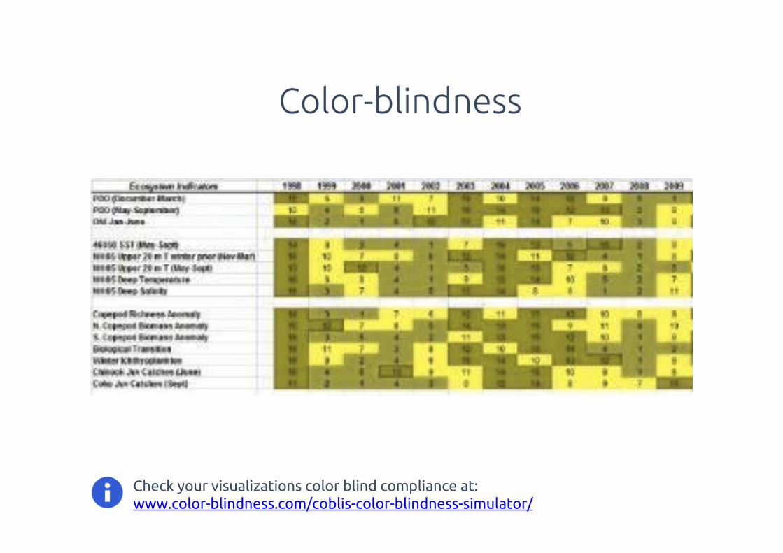
Check your visualizations color blind compliance at: www.color-blindness.com/coblis-color-blindness-simulator/
Color-blindness
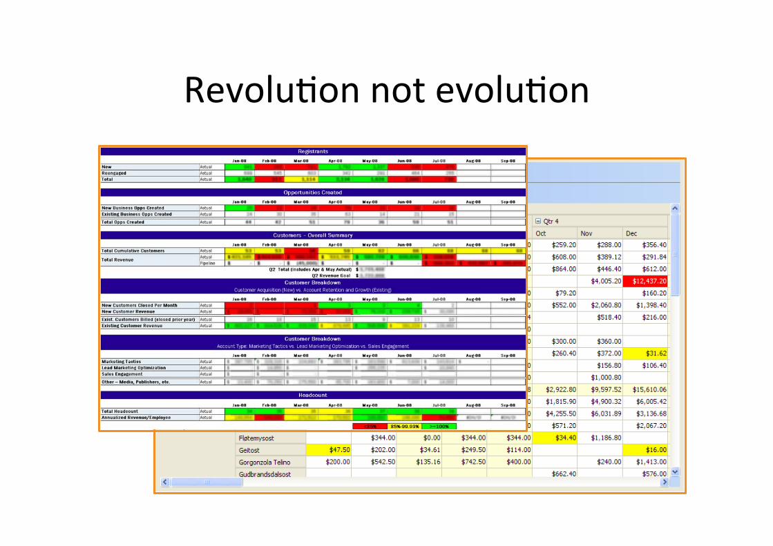
RevoluHon!not!evoluHon!

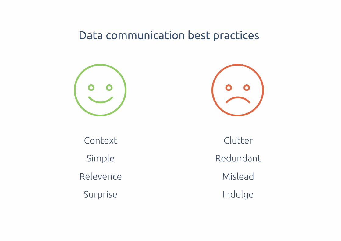
Context
Simple
Relevence
Surprise
Clutter
Redundant
Mislead
Indulge
Data communication best practices
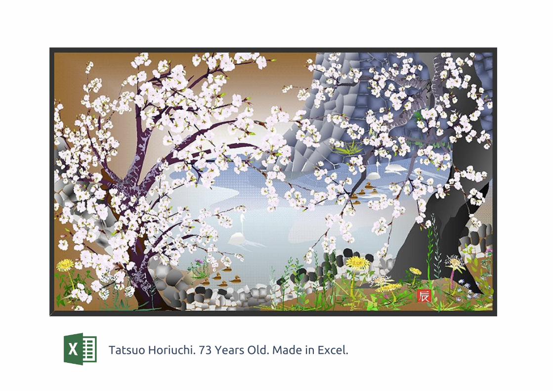
Tatsuo Horiuchi. 73 Years Old. Made in Excel.
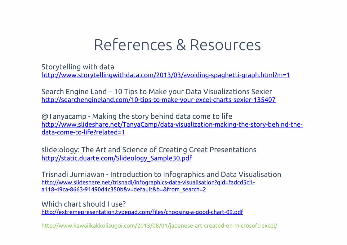
Storytelling with data http://www.storytellingwithdata.com/2013/03/avoiding-spaghetti-graph.html?m=1
Search Engine Land – 10 Tips to Make your Data Visualizations Sexierhttp://searchengineland.com/10-tips-to-make-your-excel-charts-sexier-135407
@Tanyacamp - Making the story behind data come to life http://www.slideshare.net/TanyaCamp/data-visualization-making-the-story-behind-the-data-come-to-life?related=1
slide:ology: The Art and Science of Creating Great Presentationshttp://static.duarte.com/Slideology_Sample30.pdf
Trisnadi Jurniawan - Introduction to Infographics and Data Visualisationhttp://www.slideshare.net/trisnadi/infographics-data-visualisation?qid=fadcd5d1-a118-49ca-8663-91490d4c350b&v=default&b=&from_search=2
Which chart should I use? http://extremepresentation.typepad.com/!les/choosing-a-good-chart-09.pdf
http://www.kawaiikakkoiisugoi.com/2013/08/01/japanese-art-created-on-microsoft-excel/
References & Resources