brian hunter graphic design portfolio
DESCRIPTION
Thanks fo looking!TRANSCRIPT
This is the first printable page in your book and will print on the right side.
These instructions should not appear in your exported pdf.
You’ll need to export your finished document in PDF/X-3:2002 format. Simply use the downloaded PDF Export Preset (with no modifications) to ensure your file is exported correctly. You’ll need to upload a PDF for the pages and at least one cover type.
Remember, all books must be an even number of pages. The first page will be on the right side as you open the cover and the last page will be on the left side as you close the book. Hardcover books include an end sheet on both the front and back of the inside pages for binding purposes.
Please note, all critical text and art should appear within this gray area. Any content outside this area may be unevenly trimmed or hidden by the gutter when the book is bound. If you would like your artwork to extend to the very edge of your finished book then pull your artwork edge to the red bleed line.
Be sure to review your exported PDF in an outside program (like Adobe Reader) to ensure it appears correctly and without these instructions.
Further info can be found at:www.blurb.com/pdf_to_book/resources
Book Size: Large Square

2 • BRIAN HUNTER'S GRAPHIC DESIGN PORTFOLIO [email protected] • 3
TABLE OF CONTENTS
CHAPTER 01
CHAPTER 02
CHAPTER 03
CHAPTER 04
IDENTITY:Logos / Titling / Branding pg. 10
INTRODUCTION:Resume / About Me pg. 6
PRINT:Posters / Magazine spreads pg. 27
PACKAGE DESIGN:DVDs / Food packaging pg. 37
4 • BRIAN HUNTER'S GRAPHIC DESIGN PORTFOLIO [email protected] • 5
CHAPTER 01 INTRODUCTION:Resume / About Me pg. 6

6 • BRIAN HUNTER'S GRAPHIC DESIGN PORTFOLIO [email protected] • 7
BRIAN HUNTERMy world is cultivated by a passion and drive that is achieved by creating unique concepts and executing a clear visual communcation through graphic design. The principles of reason, function, and appeal reflect a style that directly correlates with my unique character and personality.
ABOUT ME - INTRODUCTION INTRODUCTION - RESUME

8 • BRIAN HUNTER'S GRAPHIC DESIGN PORTFOLIO [email protected] • 9
IDENTITY - CHAPTER 2 CHAPTER 2 - IDENTITY
CHAPTER 02 IDENTITY:Logos / Titling / Branding pg. 10
10 • BRIAN HUNTER'S GRAPHIC DESIGN PORTFOLIO [email protected] • 11
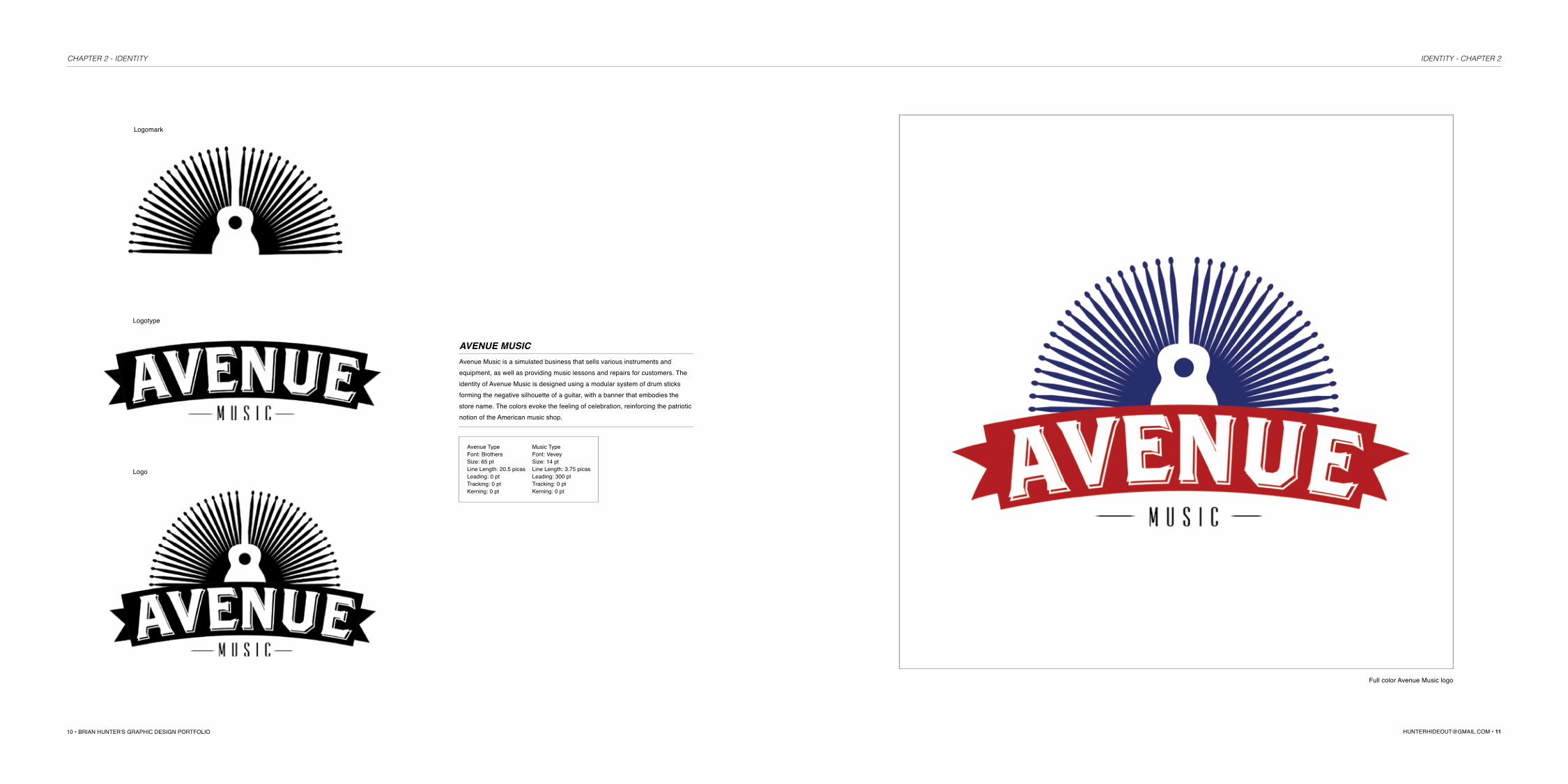
Logomark
Logotype
Logo
AVENUE MUSICAvenue Music is a simulated business that sells various instruments and equipment, as well as providing music lessons and repairs for customers. The identity of Avenue Music is designed using a modular system of drum sticks forming the negative silhouette of a guitar, with a banner that embodies the store name. The colors evoke the feeling of celebration, reinforcing the patriotic notion of the American music shop.
Avenue TypeFont: BrothersSize: 65 ptLine Length: 20.5 picasLeading: 0 ptTracking: 0 ptKerning: 0 pt
Music TypeFont: VeveySize: 14 ptLine Length: 3.75 picasLeading: 300 ptTracking: 0 ptKerning: 0 pt
Full color Avenue Music logo
IDENTITY - CHAPTER 2 CHAPTER 2 - IDENTITY

12 • BRIAN HUNTER'S GRAPHIC DESIGN PORTFOLIO [email protected] • 13
Avenue Music logo branded on store front Avenue Music employee t-shirt
IDENTITY - CHAPTER 2 CHAPTER 2 - IDENTITY

14 • BRIAN HUNTER'S GRAPHIC DESIGN PORTFOLIO [email protected] • 15
Secondary logos designed by using the method of combining symbol / icon/ and indexical list with formal stylistic techniques.
Font: Myriad Pro Bold; Myriad RegularSize: 38 pt; 38 ptLine Length: 10 picas; 8.5 picasLeading: 0 pt; 0 ptTracking: 0 pt; 0 ptKerning: 0 pt; 0 pt
Font: GenevaSize: 68 pt; 24 ptLine Length: 17.5 picas; 6.5 picasLeading: 81.64 pt; 28.93 ptTracking: -50 pt; 100 ptKerning: 0 pt; 0 pt
Font: Gill Sans Size: 28 ptLine Length: 16 picasLeading: 0 ptTracking: 0 ptKerning: 0 pt
Font: Helvetica Neue MediumSize: 28 ptLine Length: 17 picasLeading: 0 ptTracking: 25 ptKerning: 0 pt
Font: Gill SansSize: 24 ptLine Length: 13.5 picasLeading: 0 ptTracking: 0 ptKerning: 0 pt
Font: Helvetica Neue BoldSize: 30 ptLine Length: 17.5 picasLeading: 0 ptTracking: 25 ptKerning: 0 pt
Font: Gill Sans Bold; Gill Sans LightSize: 42 pt; 36 ptLine Length: 15.5 picas; 15.5 picasLeading: 31.85 ptTracking: 0 pt; 625 ptKerning: 0 pt; 0 pt
Font: Helevtica Light; Helvetica BoldSize: 55 pt; 20 ptLine Length: 14 picas; 8.5 picasLeading: 300 pt; 200 ptTracking: -50 pt; Kerning: 0 pt; 0 pt
Font: Baskerville; Baskerville BoldSize: 130.65 pt; 26.72 ptLine Length: 13 picas; 8.5 picasLeading: 35.63 pt; 35.63 ptTracking: 0 pt; 200 ptKerning: 0 pt; 0 pt
Font: Bee-ThreeSize: 130.65 pt; 26.72 ptLine Length: 13 picas; 8.5 picasLeading: 300 pt; 200 ptTracking: 35.63 ptKerning: 0 pt; 0 pt
Font: Helvetica NeueSize: 60 ptLine Length: 11 picasLeading: 0 ptTracking: 360 ptKerning: 0 pt
Font: Arial Rounded MT BoldSize: 39 ptLine Length: 13 picasLeading: 32 ptTracking: -10 ptKerning: 0 pt; 0 pt
Font: Myriad Pro SemiboldSize: 18 ptLine Length: 12.5 picasLeading: 0 ptTracking: 150 ptKerning: 0 pt
Font: HealdineTwoSize: 130.65 pt; 26.72 ptLine Length: 13 picas; 8.5 picasLeading: 300 pt; 200 ptTracking: 35.63 ptKerning: 0 pt; 0 pt
Font: Helevetica Neue Bold; LightSize: 34 pt; 34 ptLine Length: 10 picas; 7.5 picasLeading: 34.2 pt; 34.2 ptTracking: 25 pt; 25 ptKerning: 0 pt; 0 pt
Font: Bee-ThreeSize: 130.65 pt; 26.72 ptLine Length: 13 picas; 8.5 picasLeading: 300 pt; 200 ptTracking: 35.63 ptKerning: 0 pt; 0 pt
IDENTITY - CHAPTER 2 CHAPTER 2 - IDENTITY

16 • BRIAN HUNTER'S GRAPHIC DESIGN PORTFOLIO [email protected] • 17
Logomark
Logotype
Logo
PUNO (People United as One)PUNO's mission is to deliver uniquely designed products which serve a dual
purpose; products that not only satisfy a basic need, but also contribute to the needs of the less fortunate through donations to charity with each purchase.
The floral logo is designed with women in mind, and is rendered using a modu-lar system of three sets of flower petals. The combination of vivid green and
pink hues symbolizes PUNO’s strive for growth and freshness.
Puno TypeFont: Helvetica Neue
Size: 26 ptLine Length:picas
Leading: 26 ptTracking: 20 pt
Kerning: 0 pt
PUNO's women's t-shirt
IDENTITY - CHAPTER 2 CHAPTER 2 - IDENTITY

18 • BRIAN HUNTER'S GRAPHIC DESIGN PORTFOLIO [email protected] • 19
Logomark
Logotype
Logo
11
11
PUNOThis logomark for PUNO is targeted towards males. The repetition of four rectangles creates a frame around the title. A basic square shape is repeated to form the word PUNO, and the number "1" is substituted for the descender of the lowercase 'p.' The color green represents new growth, and red for energy and stimulation, which together form an energizing logo.
Font: Helvetica NeueSize: 26 ptLine Length:picasLeading: 26 ptTracking: 20 ptKerning: 0 pt
PUNO male's t-shirt
IDENTITY - CHAPTER 2 CHAPTER 2 - IDENTITY

20 • BRIAN HUNTER'S GRAPHIC DESIGN PORTFOLIO [email protected] • 21
Font: Helvetica Neue LightSize: 100 pt
Font: Berthold Akzidenz Grotesk Light CondensedSize: 69 pt
Font: Helvetica Neue LightSize: 100 pt
Font: Berthold Akzidenz Grotesk CondensedSize: 36 pt
Font: Berthold Akzidenz Grotesk, Berthold Akzidenz Grotesk Light Condensed Size: 73 pt, 12 pt
Font: Berthold Akzidenz Grotesk Light Condensed Size: 80 pt
Font: Chalkduster Size: 43 pt
Designed with no type
Font: Gill Sans, Gill Sans Light Size: 56 pt, 13 pt
Font: Brothers, BrothersSize: 75 pt, 14 ptDesigned with no type
Font: Futura MediumSize: 62 pt
Font: Helvetica Neue Medium, Helvetica NeueLight Size: 52 pt, 13 pt
Font: Bee-Three, Bee-ThreeSize: 52 pt, 25 pt
Font: Helvetica Neue Medium Size: 54 pt
Secondary logos designed by using the method of combining symbol / icon/ and indexical list with formal stylistic techniques.
IDENTITY - CHAPTER 2 CHAPTER 2 - IDENTITY
22 • BRIAN HUNTER'S GRAPHIC DESIGN PORTFOLIO [email protected] • 23
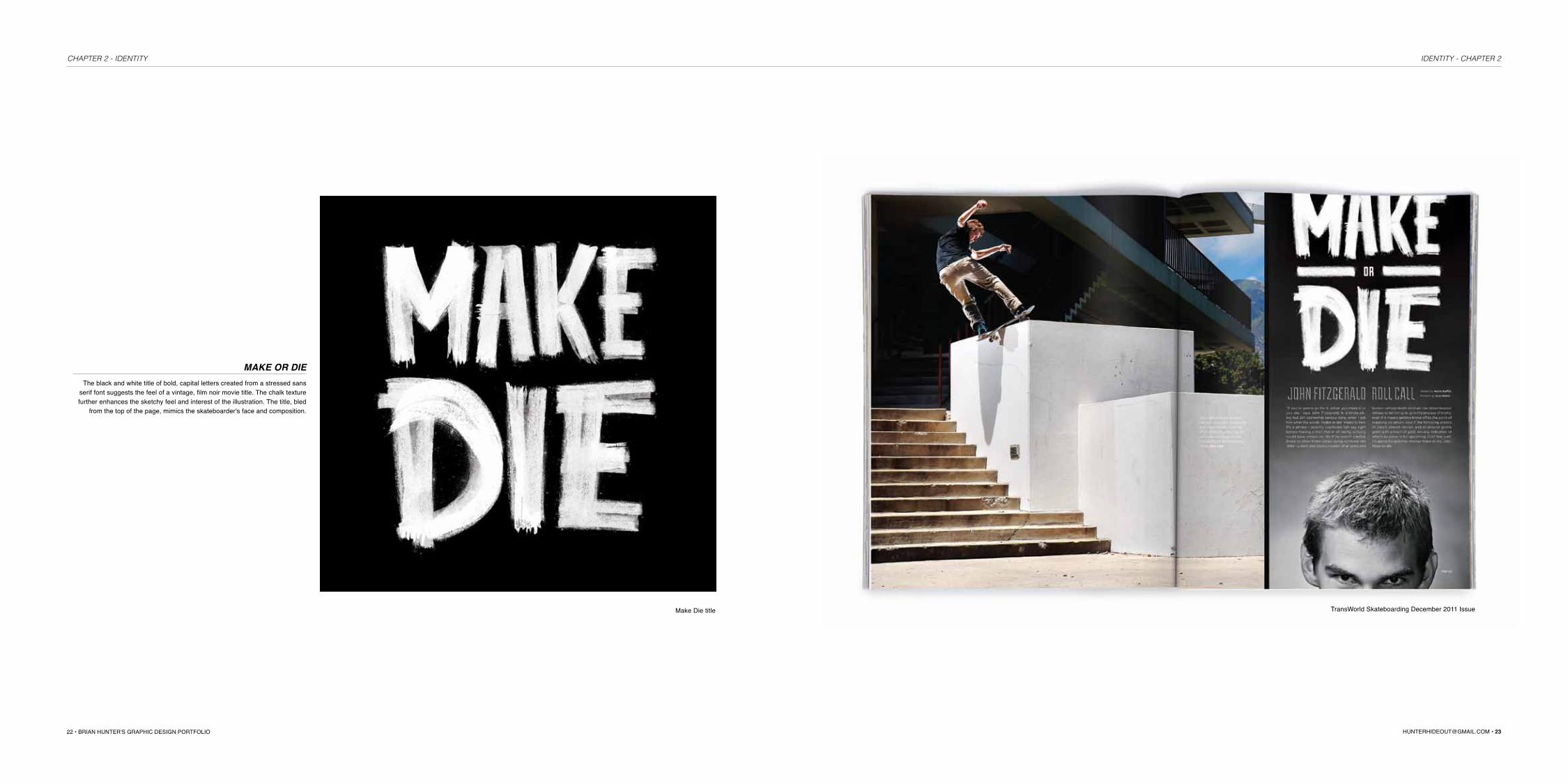
Make Die title TransWorld Skateboarding December 2011 Issue
MAKE OR DIEThe black and white title of bold, capital letters created from a stressed sans
serif font suggests the feel of a vintage, film noir movie title. The chalk texture further enhances the sketchy feel and interest of the illustration. The title, bled
from the top of the page, mimics the skateboarder's face and composition.
IDENTITY - CHAPTER 2 CHAPTER 2 - IDENTITY

24 • BRIAN HUNTER'S GRAPHIC DESIGN PORTFOLIO [email protected] • 25
DWNTWNThese T-shirts were designed for DWNTWN, a skateboarding shop located in Southern California. After researching various clothing brands, current and upcoming color trends and styles, I developed designs with the following categories: pop culture reference, illustration, photographic and brand-centric. Black, white, grey, and red were integrated into the designs based on the company's top selling styles.
IDENTITY - CHAPTER 2 CHAPTER 2 - IDENTITY
26 • BRIAN HUNTER'S GRAPHIC DESIGN PORTFOLIO [email protected] • 27
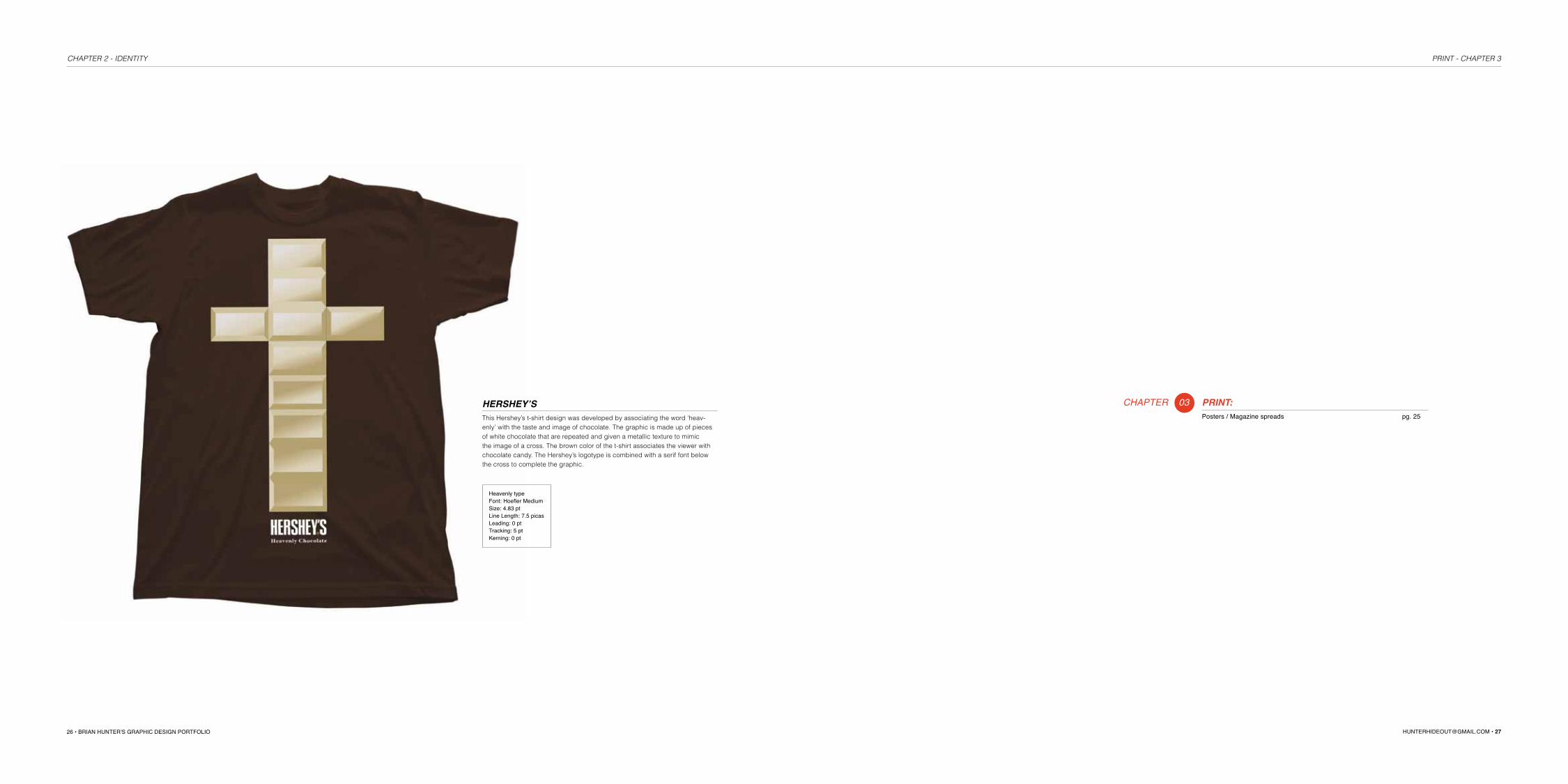
HERSHEY’SThis Hershey’s t-shirt design was developed by associating the word ‘heav-enly’ with the taste and image of chocolate. The graphic is made up of pieces of white chocolate that are repeated and given a metallic texture to mimic the image of a cross. The brown color of the t-shirt associates the viewer with chocolate candy. The Hershey’s logotype is combined with a serif font below the cross to complete the graphic.
Heavenly typeFont: Hoefler MediumSize: 4.83 ptLine Length: 7.5 picasLeading: 0 ptTracking: 5 ptKerning: 0 pt
CHAPTER 03 PRINT:Posters / Magazine spreads pg. 25
PRINT - CHAPTER 3CHAPTER 2 - IDENTITY
28 • BRIAN HUNTER'S GRAPHIC DESIGN PORTFOLIO [email protected] • 29
HeaderFont: Helvetica NeueCondensed BoldSize: 68 ptLine Length: 20 picasLeading: 20 ptTracking: 38 ptKerning: 0 pt
SubheadFont: Helvetica NeueMediumSize: 12 ptLine Length: 28 picasLeading: 14 ptTracking: 100 ptKerning: 0 pt
InfoFont: Helvetica NeueMediumSize: 7 ptLine Length: 11 picasLeading: 0 ptTracking: 25 ptKerning: 0 pt
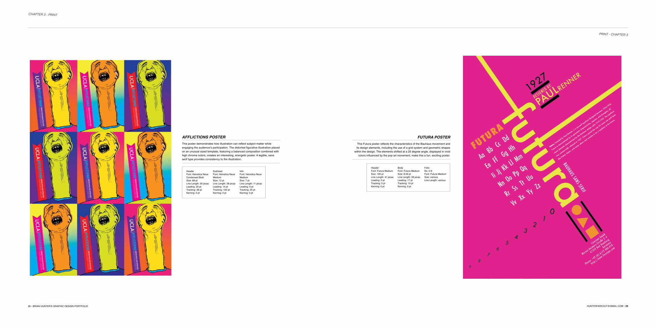
AFFLICTIONS POSTERThis poster demonstrates how illustration can reflect subject matter while engaging the audience's participation. The distorted figurative illustration placed on an unusual sized template, featuring a balanced composition combined with high chroma colors, creates an interesting, energetic poster. A legible, sans serif type provides consistency to the illustration.
HeaderFont: Futura MediumSize: 195 ptLine Length: 41 picasLeading: 0 ptTracking: 5 ptKerning: 0 pt
BodyFont: Futura MediumSize: 8.59 ptLine Length: 28 picasLeading: 17 ptTracking: 10 ptKerning: 0 pt
FolioNo: 0-9Font: Futura MediumSize: variousLine Length: various
FUTURA POSTERThis Futura poster reflects the characteristics of the Bauhaus movement and its design elements, including the use of a grid system and geometric shapes
within the design. The elements shifted at a 25 degree angle, displayed in vivid colors influenced by the pop art movement, make this a fun, exciting poster.
PRINT - CHAPTER 3
CHAPTER 3 - PRINT

30 • BRIAN HUNTER'S GRAPHIC DESIGN PORTFOLIO [email protected] • 31
KLIMT EXHIBITION POSTERThis poster is inspired by Gustav Klimt's painting titled 'Adele Bloch-Bauer II.' Klimt's trademarks including the use of gold and earth-tone colors, mixing floral, organic, and geometric patterns, and female subject matter is a direct reflection of his Gold Phase period of painting. A white, bold typeface in a centered com-position is a nice juxtaposition to the busy patterns and imagery of the poster.
Header, SubheadFont: Poplar Std BlackSize: 125, 105, 75, 55 pt Line Length: 57 picasLeading: 90 ptTracking: 25 ptKerning: 0 pt
THE ZEROS INTERVIEW This two page spread interviews and documents the reunion of the 1970's Los
Angeles / San Diego punk band, The Zeros. The spread uses a foundational two-column layout. Black and white photography, combined with a sans serif
text and an unexpected pop of color, reflects the band's simple music style.
HeaderFont: Helvetica NeueMediumSize: 16 ptLine Length: 45 picasLeading: 21 ptTracking: 25 ptKerning: 0 pt
BodyFont: Helvetica Neue Light & BoldSize: 8.5 ptLine Length: 22 picasLeading: 11 ptTracking: 10 ptKerning: 0 pt
FolioNo: 33, 34, 35 Font: Minion ProSize: 6 ptLine Length: 0.5 picas
PRINT - CHAPTER 3CHAPTER 3 - PRINT

32 • BRIAN HUNTER'S GRAPHIC DESIGN PORTFOLIO [email protected] • 33
PRODUCT GUIDE SPREAD TransWorld's Skateboarding Magazine provides an annual market preview of skate-boarding products, trends, and information. The provided template displays products
and descriptions in a clear format, and can be edited as inventory changes.
HeaderFont: Akzidenz-GroteskBoldSize: 10 pt
SubheadFont: Akzidenz-Grotesk MediumSize: 8.5 pt
PRINT - CHAPTER 3CHAPTER 3 - PRINT

34 • BRIAN HUNTER'S GRAPHIC DESIGN PORTFOLIO [email protected] • 35
Billboard display
SMALL PARTS : COMEDY SERIESSmall Parts is a fabricated comedy series following the lives of two struggling actors, who have aspirations of making it big but fall short. The advertisement
is bold and simple to draw the viewer's immediate attention, and information is limited for maximum impact.
HeadlineFont: Headline OneSize: 105 ptLeading: 27 ptLine space: 38 picasTracking: 25 ptKerning: 0 pt
SubheadFont: Nelvetica Neue BoldSize: 45 ptLeading: 42 ptLine space: 25 picasTracking: 25 ptKerning: 0 pt
Building display Bus shelter display
PRINT - CHAPTER 3CHAPTER 3 - PRINT

36 • BRIAN HUNTER'S GRAPHIC DESIGN PORTFOLIO [email protected] • 37
CSUF Kiosk PosterCalifornia State University Fullerton's October kiosk events poster is a typo-graphical schedule for the college's visual arts, theatre and dance depart-ments. A yellow and turqoiuse background is intended to catch the viewer's eye to the information. The content, rotated at various angles, gives the poster
movement from top to bottom.
CHAPTER 04 PACKAGE DESIGN:DVDs / Food packaging pg. 35
PACKAGE - CHAPTER 4CHAPTER 3 - PRINT

38 • BRIAN HUNTER'S GRAPHIC DESIGN PORTFOLIO [email protected] • 39
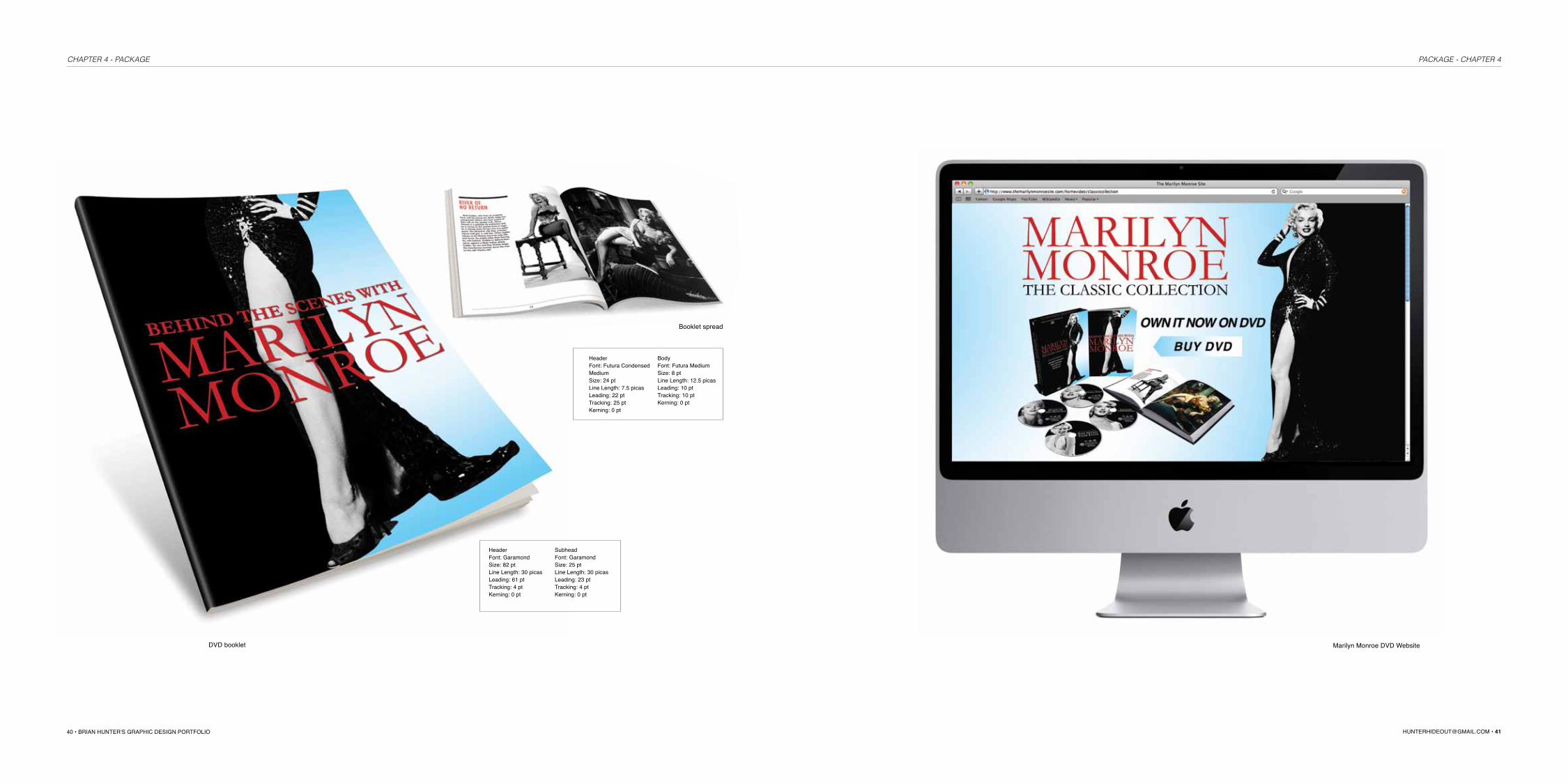
MARILYN MONROE DVD BOX SETThe Marilyn Monroe DVD Box Set combines the sophistication and iconic imag-ery of the 1950s with a bold color palette. The high contrast profile set against a patriotic color scheme reinforces the celebration of an American icon and memorable era. The layout is balanced through the use of text and imagery.
HeaderFont: GaramondSize: 45 ptLine Length: 16.5 picasLeading: 32 ptTracking: 4 ptKerning: 0 pt
SubheadFont: Garamond Size: 15.5 ptLine Length: 16.5 picasLeading: 36 ptTracking: 4 ptKerning: 0 pt
SubheadFont: Futura Condensed Medium Size: 12 ptLine Length: 10 picasLeading: 18 ptTracking: 25 ptKerning: 0 pt
Marilyn Monroe 4-disc set
PACKAGE - CHAPTER 4CHAPTER 4 - PRINT
40 • BRIAN HUNTER'S GRAPHIC DESIGN PORTFOLIO [email protected] • 41
DVD booklet
Booklet spread
HeaderFont: Futura Condensed MediumSize: 24 ptLine Length: 7.5 picasLeading: 22 ptTracking: 25 ptKerning: 0 pt
HeaderFont: GaramondSize: 82 ptLine Length: 30 picasLeading: 61 ptTracking: 4 ptKerning: 0 pt
BodyFont: Futura Medium Size: 8 ptLine Length: 12.5 picasLeading: 10 ptTracking: 10 ptKerning: 0 pt
SubheadFont: Garamond Size: 25 ptLine Length: 30 picasLeading: 23 ptTracking: 4 ptKerning: 0 pt
Marilyn Monroe DVD Website
PACKAGE - CHAPTER 4CHAPTER 4 - PACKAGE
42 • BRIAN HUNTER'S GRAPHIC DESIGN PORTFOLIO [email protected] • 43
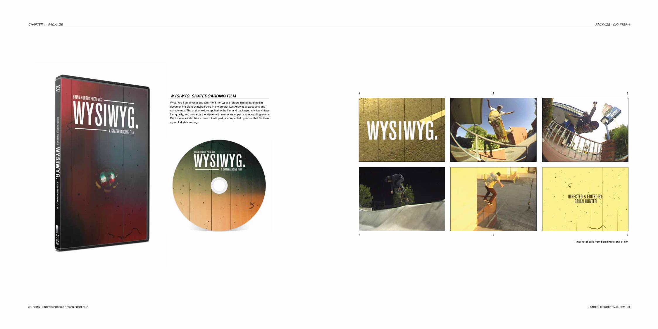
WYSIWYG. SKATEBOARDING FILMWhat You See Is What You Get (WYSIWYG) is a feature skateboarding film documenting eight skateboarders in the greater Los Angeles area streets and schoolyards. The grainy texture applied to the film and packaging mimics vintage film quality, and connects the viewer with memories of past skateboarding events. Each skateboarder has a three minute part, accompanied by music that fits there style of skateboarding.
Timeline of stills from begining to end of film
1
4
2
5
3
6
PACKAGE - CHAPTER 4CHAPTER 4 - PACKAGE

44 • BRIAN HUNTER'S GRAPHIC DESIGN PORTFOLIO [email protected] • 45
CHIP'S CHIPSThe Chip's Chips design direction is executed through a play on the word 'chip', represented through a playful, interactive package. 'Chip' is the brand's character logo, as well as the product being offered. The top of the can is lifted to reveal the character's smile and teeth, which the consumer tears the seal to enjoy the chips inside. The color scheme of the cans are determined by the various chip flavors offered.
1. Orginal, Sour Cream, and Sea Salt flavored canned chips4. Remove chips from mouth and enjoy
2. Chips are revealed by lifting top of can
5. Product
3. Seal is torn
PACKAGE - CHAPTER 4CHAPTER 4 - PACKAGE

46 • BRIAN HUNTER'S GRAPHIC DESIGN PORTFOLIO [email protected] • 47
HUMANITEAHumanitea, a launching business, envisioned a hip and modern package, but also a brand dedicated to the product's history. After researching the history of tea, I designed patterns for each origin of tea including China, Japan, United Kingdom, India, and Portugal. A seed shape is incorporated into each pattern that unifies the tea set, and a vibrant color scheme modernizes the packaging.
PACKAGE - CHAPTER 4CHAPTER 4 - PACKAGE

48 • BRIAN HUNTER'S GRAPHIC DESIGN PORTFOLIO [email protected] • 49
DEVO Album ArtworkThe DEVO cover artwork was designed using a methodical approach of combining two unexpected objects, Charles Darwin and a white dove. Using a birds eye view, and an asymmetrical, cropped composition creates an unusual and surreal design. A close up of the bird, choking out the song titles, is repeated on the back cover.
PACKAGE - CHAPTER 4CHAPTER 4 - PACKAGE

50 • BRIAN HUNTER'S GRAPHIC DESIGN PORTFOLIO [email protected] • 51
AND SkateboardsAND skateboards is a fabricated skateboard deck company; these designs feature two techniques: photography and illustration. The "and" is hand drawn as a special character to create the logo. The graphic on the left creates a paradoxical image of a skateboard mimicking a dragster car, whereas the graphic on the right depicts an unoperable skateboard referencing a car propped on cinder blocks.
WEB - CHAPTER 5CHAPTER 4 - PACKAGE
CONTENT SPECIFICATIONS
RUNNING HEADERSFont: Helvetica Light Italic
Size: 8 pt
RUNNING FOOTERSFont: Helvetica, Helvetica Bold
Size: 6 pt
PROJECT DESCRIPTIONFont: Helvetica Bold Italic, Helvetica
Size: 10 pt, 7 pt
PHOTO CAPTIONSFont: Helvetica
Size: 6 pt
FOLIOFont: Helvetica Bold
Size: 6 pt
LINE STROKESize: 0.25 pt
