breakpoints made simple (well simpler) using scss
TRANSCRIPT
BREAKPOINTS MADESIMPLE (WELL SIMPLER)USING SCSS
@dkeeghan
#melbcss
BREAKPOINTS MADE SIMPLE
(WELL SIMPLER) USING SCSS
@dkeeghan
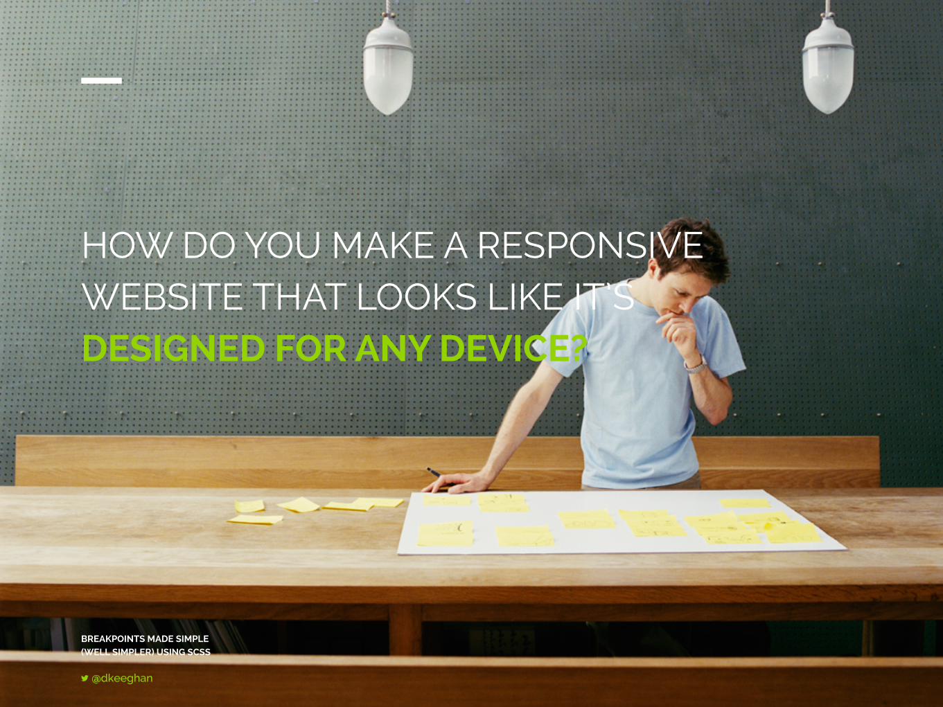
HOW DO YOU MAKE A RESPONSIVE WEBSITE THAT LOOKS LIKE IT’SDESIGNED FOR ANY DEVICE?

BREAKPOINTS MADE SIMPLE
(WELL SIMPLER) USING SCSS
@dkeeghan
CSS only• Copy paste media queries
• Only 3 breakpoints to keep it simple
• Media queries kept separate - same module in 3x places
Responsive for everyone• Respond.js - makes media queries work for IE8*
• Everything in percentages
STARTING OUT
BREAKPOINTS MADE SIMPLE
(WELL SIMPLER) USING SCSS
@dkeeghan
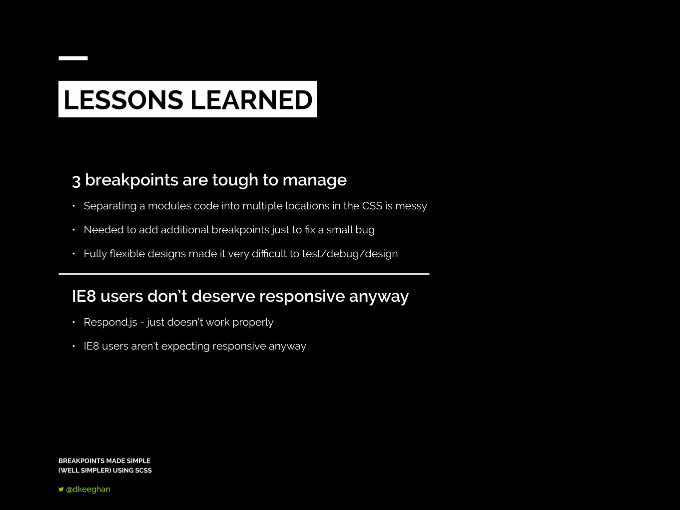
3 breakpoints are tough to manage• Separating a modules code into multiple locations in the CSS is messy
• Needed to add additional breakpoints just to fix a small bug
• Fully flexible designs made it very difficult to test/debug/design
IE8 users don’t deserve responsive anyway• Respond.js - just doesn’t work properly
• IE8 users aren’t expecting responsive anyway
LESSONS LEARNED
BREAKPOINTS MADE SIMPLE
(WELL SIMPLER) USING SCSS
@dkeeghan
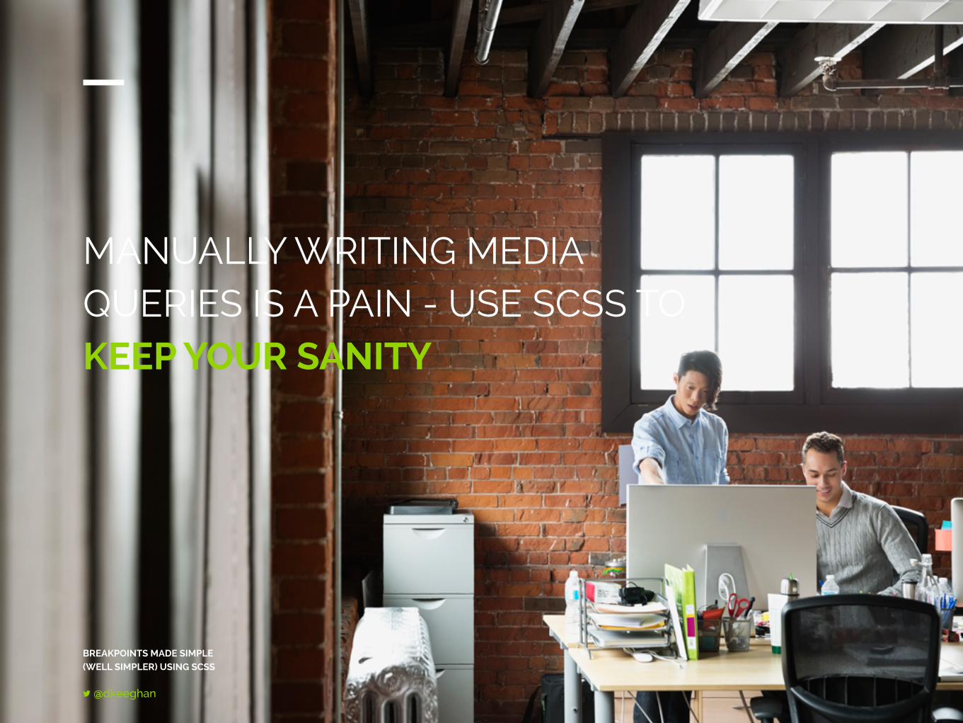
MANUALLY WRITING MEDIA QUERIES IS A PAIN - USE SCSS TO KEEP YOUR SANITY
BREAKPOINTS MADE SIMPLE
(WELL SIMPLER) USING SCSS
@dkeeghan
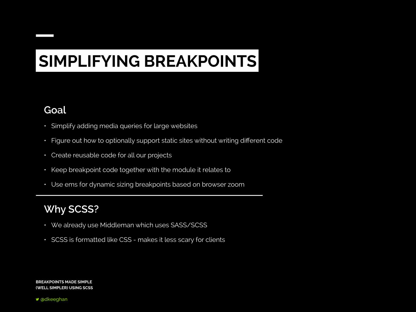
Goal• Simplify adding media queries for large websites
• Figure out how to optionally support static sites without writing different code
• Create reusable code for all our projects
• Keep breakpoint code together with the module it relates to
• Use ems for dynamic sizing breakpoints based on browser zoom
Why SCSS?• We already use Middleman which uses SASS/SCSS
• SCSS is formatted like CSS - makes it less scary for clients
SIMPLIFYING BREAKPOINTS

BREAKPOINTS MADE SIMPLE
(WELL SIMPLER) USING SCSS
@dkeeghan
Pros• Inspired by http://css-tricks.com/naming-media-
queries/
• Each media query has a name
• Keep code per module, instead of per breakpoint
• IE Conditional to serve two separate CSS files
• Override the breakpoint mixin for a static stylesheet.
It contains no media queries and ignores unneeded
breakpoints
VERSION 0.0.1
Cons• Mixin code split across multiple files
• You have to add new IF statements per media query
across two files
BREAKPOINTS MADE SIMPLE
(WELL SIMPLER) USING SCSS
@dkeeghan
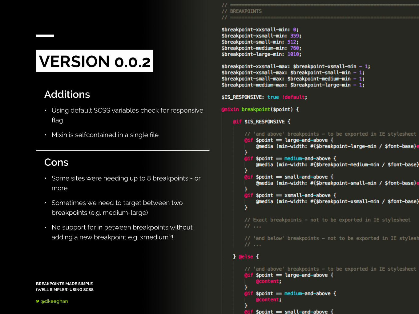
Additions• Using default SCSS variables check for responsive
flag
• Mixin is selfcontained in a single file
VERSION 0.0.2
Cons• Some sites were needing up to 8 breakpoints - or
more
• Sometimes we need to target between two
breakpoints (e.g. medium-large)
• No support for in between breakpoints without
adding a new breakpoint e.g. xmedium?!
BREAKPOINTS MADE SIMPLE
(WELL SIMPLER) USING SCSS
@dkeeghan
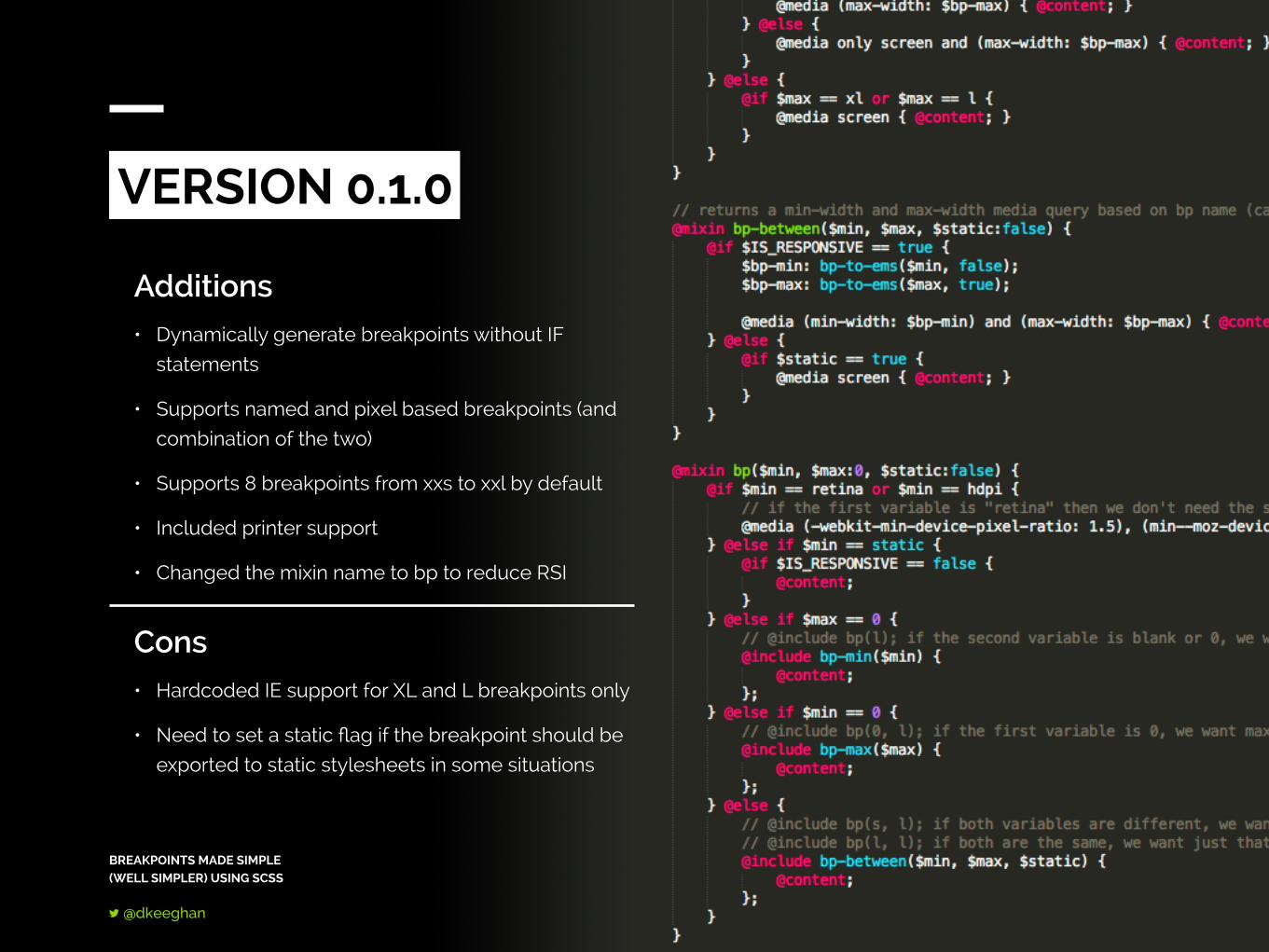
Additions• Dynamically generate breakpoints without IF
statements
• Supports named and pixel based breakpoints (and
combination of the two)
• Supports 8 breakpoints from xxs to xxl by default
• Included printer support
• Changed the mixin name to bp to reduce RSI
VERSION 0.1.0
Cons• Hardcoded IE support for XL and L breakpoints only
• Need to set a static flag if the breakpoint should be
exported to static stylesheets in some situations
BREAKPOINTS MADE SIMPLE
(WELL SIMPLER) USING SCSS
@dkeeghan
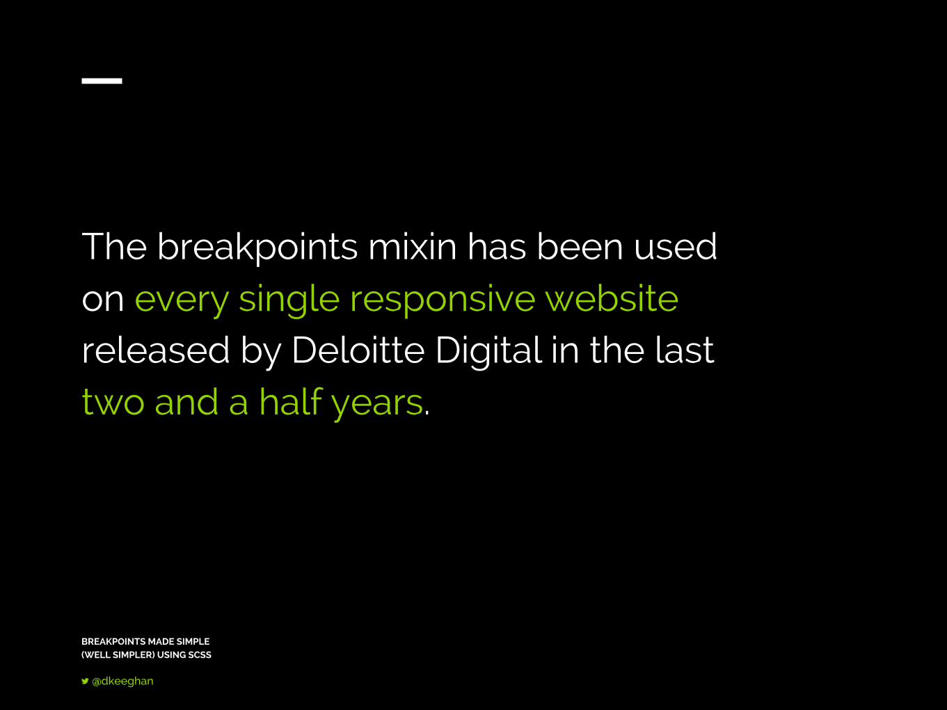
The breakpoints mixin has been used on every single responsive website released by Deloitte Digital in the last two and a half years.
BREAKPOINTS MADE SIMPLE
(WELL SIMPLER) USING SCSS
@dkeeghan
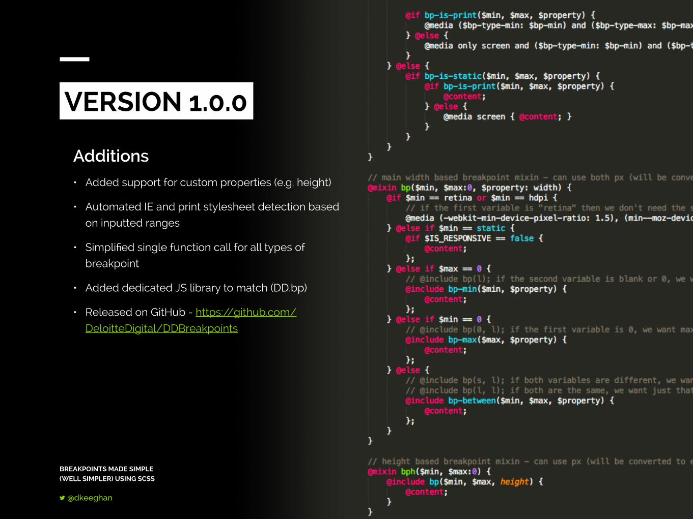
Additions• Added support for custom properties (e.g. height)
• Automated IE and print stylesheet detection based
on inputted ranges
• Simplified single function call for all types of
breakpoint
• Added dedicated JS library to match (DD.bp)
• Released on GitHub - https://github.com/
DeloitteDigital/DDBreakpoints
VERSION 1.0.0
BREAKPOINTS MADE SIMPLE
(WELL SIMPLER) USING SCSS
@dkeeghan
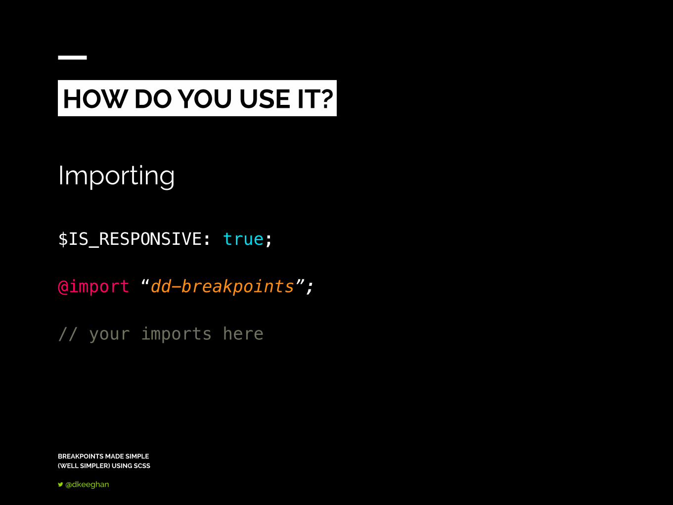
Importing
$IS_RESPONSIVE: true;
@import “dd-breakpoints”;
// your imports here
HOW DO YOU USE IT?
BREAKPOINTS MADE SIMPLE
(WELL SIMPLER) USING SCSS
@dkeeghan
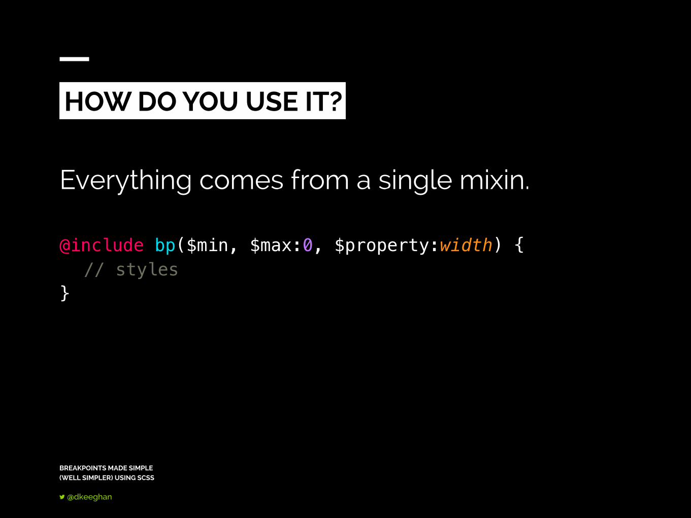
Everything comes from a single mixin.
@include bp($min, $max:0, $property:width) { // styles}
HOW DO YOU USE IT?

BREAKPOINTS MADE SIMPLE
(WELL SIMPLER) USING SCSS
@dkeeghan
.module { // base styles
@include bp(m) { // medium styles }
@include bp(l) { // large styles }
@include bp(xl) { // extra large styles // not included in the static sheet }}
MOBILE FIRST
BREAKPOINTS MADE SIMPLE
(WELL SIMPLER) USING SCSS
@dkeeghan
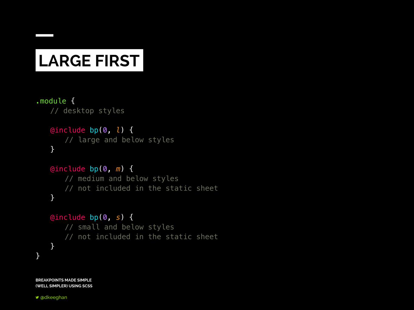
.module { // desktop styles
@include bp(0, l) { // large and below styles }
@include bp(0, m) { // medium and below styles // not included in the static sheet }
@include bp(0, s) { // small and below styles // not included in the static sheet }}
LARGE FIRST
BREAKPOINTS MADE SIMPLE
(WELL SIMPLER) USING SCSS
@dkeeghan
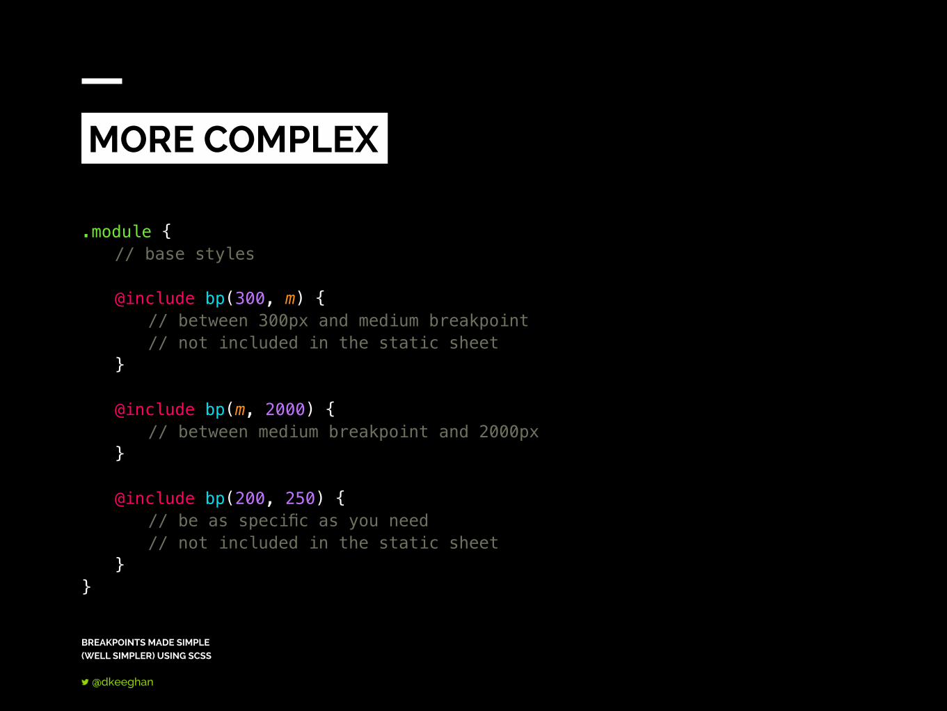
.module { // base styles
@include bp(300, m) { // between 300px and medium breakpoint // not included in the static sheet }
@include bp(m, 2000) { // between medium breakpoint and 2000px }
@include bp(200, 250) { // be as specific as you need // not included in the static sheet }}
MORE COMPLEX

BREAKPOINTS MADE SIMPLE
(WELL SIMPLER) USING SCSS
@dkeeghan
.module { // base styles
@include bp(0, 500, height) { // between 0 and 500px high // height breakpoints are never included in the static sheet }
@include bph(0, 500) { // exactly the same as above - shortcut }
@include bp(0, 500, depth) { // Responsive 3D interfaces in the future??? }}
NON-WIDTH BREAKPOINTS
BREAKPOINTS MADE SIMPLE
(WELL SIMPLER) USING SCSS
@dkeeghan
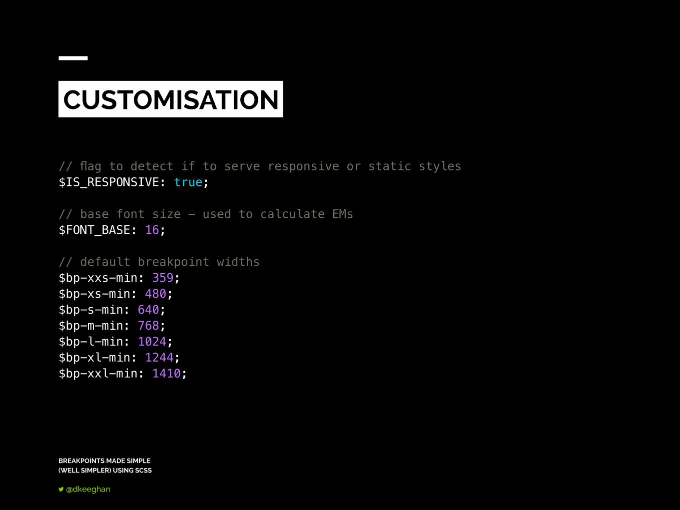
// flag to detect if to serve responsive or static styles$IS_RESPONSIVE: true;
// base font size - used to calculate EMs$FONT_BASE: 16;
// default breakpoint widths$bp-xxs-min: 359;$bp-xs-min: 480;$bp-s-min: 640;$bp-m-min: 768;$bp-l-min: 1024;$bp-xl-min: 1244;$bp-xxl-min: 1410;
CUSTOMISATION

BREAKPOINTS MADE SIMPLE
(WELL SIMPLER) USING SCSS
@dkeeghan
// list of breakpoint names matched to px widths$bp-list-min: xxs $bp-xxs-min, xs $bp-xs-min, s $bp-s-min //...;$bp-list-max: xxs $bp-xxs-max, xs $bp-xs-max, s $bp-s-max //...;
// customised - max numbers are the next breakpoints min minus 1px$bp-list-min: small 359, medium 768, large 1024, xlarge 1244;$bp-list-max: small 767, medium 1023, large 1243;
CUSTOMISATION

BREAKPOINTS MADE SIMPLE
(WELL SIMPLER) USING SCSS
@dkeeghan
// breakpoint range for static stylesheets// if the breakpoint is outside of this range - don’t include the CSS$bp-static-min: 0;$bp-static-max: $bp-xl-max;
// breakpoint range for print stylesheets// if the breakpoint is outside of this range - use “@media only screen”$bp-print-min: 0;$bp-print-max: 550; // printed A4 is around 550px wide
CUSTOMISATION
BREAKPOINTS MADE SIMPLE
(WELL SIMPLER) USING SCSS
@dkeeghan
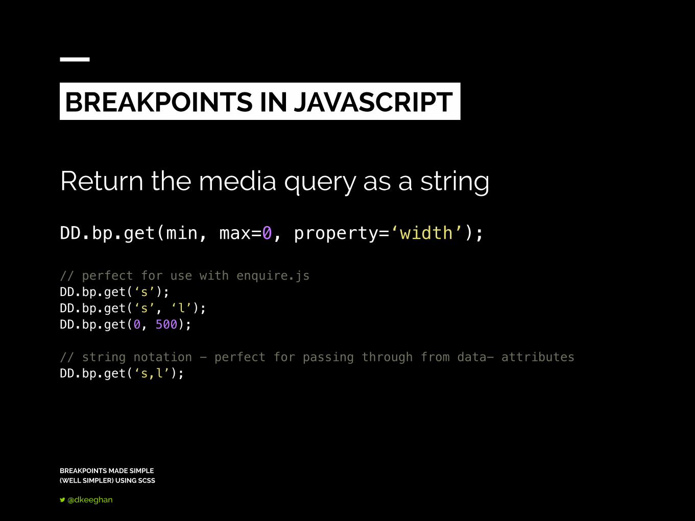
Return the media query as a string
DD.bp.get(min, max=0, property=‘width’);
// perfect for use with enquire.jsDD.bp.get(‘s’);DD.bp.get(‘s’, ‘l’);DD.bp.get(0, 500);
// string notation - perfect for passing through from data- attributesDD.bp.get(‘s,l’);
BREAKPOINTS IN JAVASCRIPT

BREAKPOINTS MADE SIMPLE
(WELL SIMPLER) USING SCSS
@dkeeghan
Returns boolean if the page size matches
DD.bp.is(min, max=0, property=‘width’);
// uses window.matchMedia().matches// need a polyfill for IE8DD.bp.is(‘s’);DD.bp.is(‘s’, ‘l’);DD.bp.is(0, 500);
// string notation - perfect for passing through from data- attributesDD.bp.is(‘s,l’);
BREAKPOINTS IN JAVASCRIPT
BREAKPOINTS MADE SIMPLE
(WELL SIMPLER) USING SCSS
@dkeeghan
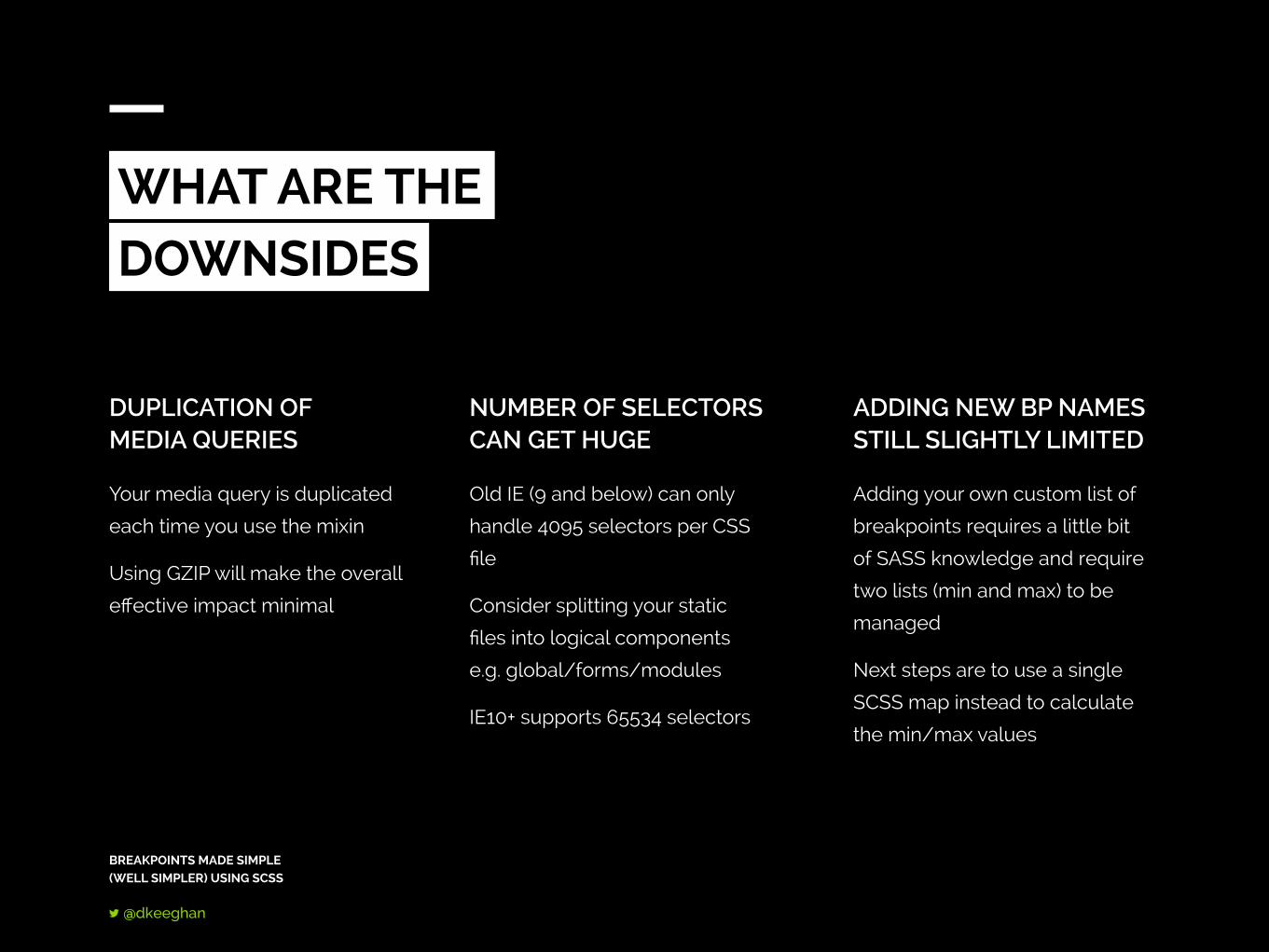
WHAT ARE THE
DOWNSIDES
DUPLICATION OF MEDIA QUERIES
NUMBER OF SELECTORS CAN GET HUGE
ADDING NEW BP NAMES STILL SLIGHTLY LIMITED
Your media query is duplicated
each time you use the mixin
Using GZIP will make the overall
effective impact minimal
Old IE (9 and below) can only
handle 4095 selectors per CSS
file
Consider splitting your static
files into logical components
e.g. global/forms/modules
IE10+ supports 65534 selectors
Adding your own custom list of
breakpoints requires a little bit
of SASS knowledge and require
two lists (min and max) to be
managed
Next steps are to use a single
SCSS map instead to calculate
the min/max values

BREAKPOINTS MADE SIMPLE
(WELL SIMPLER) USING SCSS
@dkeeghan

BREAKPOINTS MADE SIMPLE
(WELL SIMPLER) USING SCSS
@dkeeghan

BREAKPOINTS MADE SIMPLE
(WELL SIMPLER) USING SCSS
@dkeeghan

BREAKPOINTS MADE SIMPLE
(WELL SIMPLER) USING SCSS
@dkeeghan

BREAKPOINTS MADE SIMPLE
(WELL SIMPLER) USING SCSS
@dkeeghan

BREAKPOINTS MADE SIMPLE
(WELL SIMPLER) USING SCSS
@dkeeghan

BREAKPOINTS MADE SIMPLE
(WELL SIMPLER) USING SCSS
@dkeeghan
KEY TAKEAWAYS
• SCSS can help make managing media queries much easier
• Serve multiple CSS files - one to IE8, the other to everyone else
• DDBreakpoints is now on GitHub - https://github.com/DeloitteDigital/DDBreakpoints