best practices for a successful research presentation
TRANSCRIPT

Best Practices for a Successful
Research Presentation
Paul McDaniel
Ph.D. Candidate in Geography & Urban Regional Analysis
Department of Geography and Earth Sciences
UNC Charlotte
7 December 2010

Pre-Presentation Video
• Video:
• “Life After Death by PowerPoint 2010”
• http://www.youtube.com/watch?v=KbSPPFYxx3o
• [note to reviewers of presentation draft: the above video
is something that Kashif and Liz were thinking about
possibly showing at the beginning of the workshop]
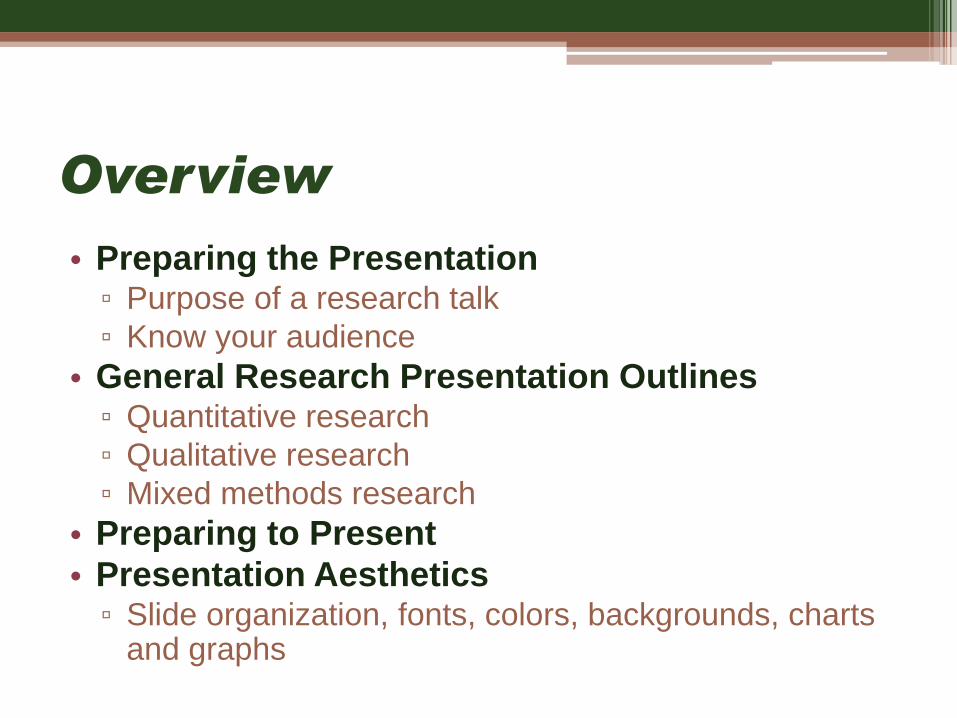
Overview
• Preparing the Presentation▫ Purpose of a research talk
▫ Know your audience
• General Research Presentation Outlines▫ Quantitative research
▫ Qualitative research
▫ Mixed methods research
• Preparing to Present
• Presentation Aesthetics▫ Slide organization, fonts, colors, backgrounds, charts
and graphs

Preparing the Presentation

The purpose of a research
talk……is not to:
• Impress the audience.
• Tell them all you know about a
subject.
• Present every little detail of
your work.
…is to:
• Give the audience a sense of
what your idea/work is.
• Get feedback on your work.
• Make the audience want to
learn more about your work or
read your paper.

Know your audience
• Who might be there?▫ Scientists/scholars expert in
your field▫ Scientists/scholars, but not
expert in your field▫ Graduate Students▫ Undergraduate Students▫ Non experts▫ Community Members▫ Who knows?
• Most likely a mix so have something for all.

Know your audience
• Keep in mind:
▫ They can read
▫ They might be tired or hungry
▫ They may be thinking “Why should I listen?”
▫ If not captivated:
Non-experts will tune out earlier in the presentation
Experts may tune out a few minutes later
• What can you do?

What can you do?
• Early motivation: at the
beginning of your talk
motivate your research
with easy to understand
examples.
• Results: State your results
early and in simple terms.
• Visuals: Illustrate your
idea with images and
diagrams.

Leave your audience with these
thoughts:
• “I understood what the problem was and why it
was important.”
• “I have an idea of what her solution was and
how it was different/better than others.”
• “He knows the literature and we might
collaborate on this particular aspect of his
research.”
• “I find this research/subject interesting and want
to read and learn more about it.”
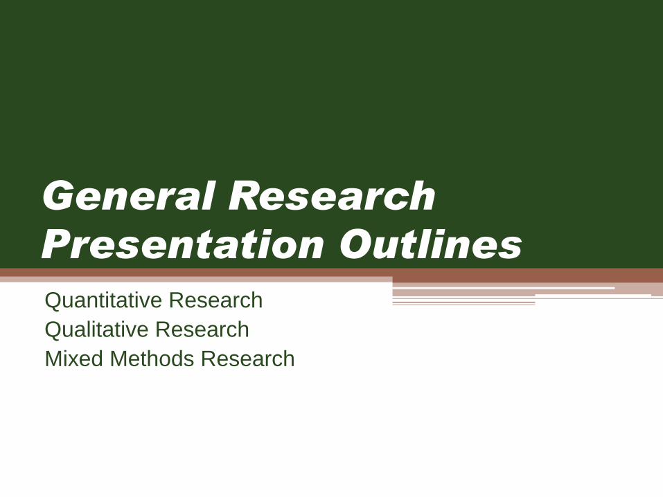
General Research
Presentation Outlines
Quantitative Research
Qualitative Research
Mixed Methods Research
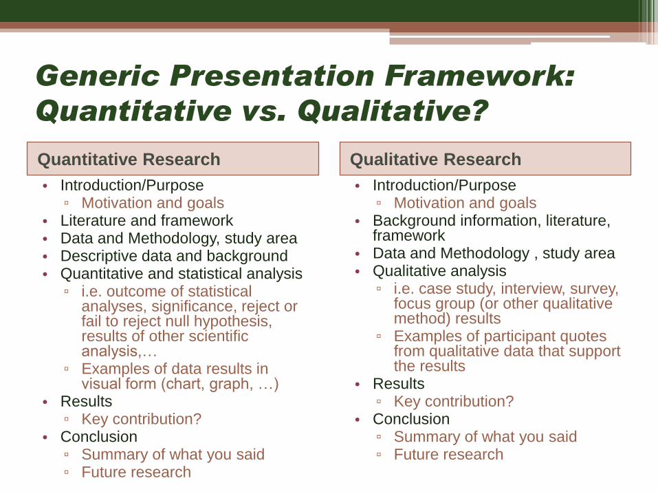
Generic Presentation Framework:
Quantitative vs. Qualitative?
Quantitative Research Qualitative Research
• Introduction/Purpose ▫ Motivation and goals
• Literature and framework• Data and Methodology, study area• Descriptive data and background• Quantitative and statistical analysis
▫ i.e. outcome of statistical analyses, significance, reject or fail to reject null hypothesis, results of other scientific analysis,…
▫ Examples of data results in visual form (chart, graph, …)
• Results▫ Key contribution?
• Conclusion▫ Summary of what you said▫ Future research
• Introduction/Purpose▫ Motivation and goals
• Background information, literature, framework
• Data and Methodology , study area• Qualitative analysis
▫ i.e. case study, interview, survey, focus group (or other qualitative method) results
▫ Examples of participant quotes from qualitative data that support the results
• Results▫ Key contribution?
• Conclusion▫ Summary of what you said▫ Future research
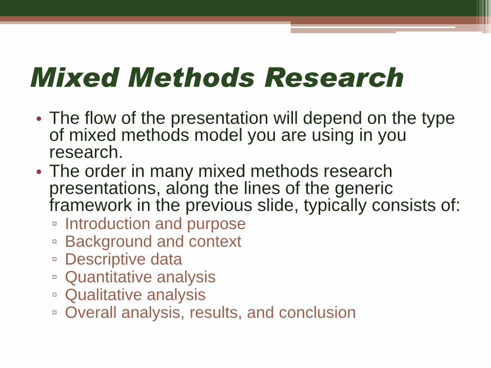
Mixed Methods Research
• The flow of the presentation will depend on the type of mixed methods model you are using in you research.
• The order in many mixed methods research presentations, along the lines of the generic framework in the previous slide, typically consists of:▫ Introduction and purpose▫ Background and context▫ Descriptive data▫ Quantitative analysis▫ Qualitative analysis▫ Overall analysis, results, and conclusion
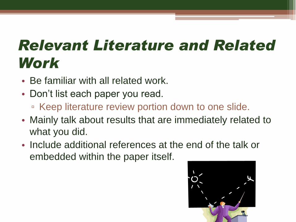
Relevant Literature and Related
Work• Be familiar with all related work.
• Don’t list each paper you read.
▫ Keep literature review portion down to one slide.
• Mainly talk about results that are immediately related to
what you did.
• Include additional references at the end of the talk or
embedded within the paper itself.

Technical details: in or out?
• A fine line…depends on your audience.▫ If you have a general audience you may need
to explain how something technical or statistical works.
• Present specific aspects that show the heart of your work.
• Leave the rest out. If you were convincing they will read your paper.
• Don’t fill up your slides with tons of equations or lengthy quotations that need explaining.
• Prepare back-up slides to answer common or anticipated questions.▫ Leave them at the end of the presentation▫ Might include more detailed equations or
lengthier quotations, or additional data.

Acknowledgements
• Acknowledge co-authors (title slide).
• At end of presentation, acknowledge:
▫ those who helped/assisted you.
▫ funding sources (if applicable).

Preparing to Present

Preparing to Present
• Prepare the slides well in advance.
• Show the presentation to friends and colleagues
for their suggestions and feedback.
• As with any draft, when you think you are
finished, set it aside for a day and then go back
and look at the presentation again.
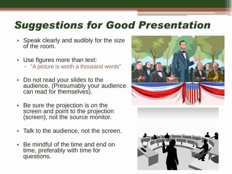
Suggestions for Good Presentation
• Speak clearly and audibly for the size of the room.
• Use figures more than text:▫ “A picture is worth a thousand words”
• Do not read your slides to the audience. (Presumably your audience can read for themselves).
• Be sure the projection is on the screen and point to the projection (screen), not the source monitor.
• Talk to the audience, not the screen.
• Be mindful of the time and end on time, preferably with time for questions.

Bad Presentations tend to…
• …include too many slides for the time length.
• …not leave time for questions.
• …contain over-animated slides.
• …be read by presenter word for word.
• Practice your presentation with friends/colleagues/critics for feedback, and
have them:
▫ comment on the aesthetics of the presentation
▫ ask potential tough audience questions
To counteract these tendencies:

Delivering the Presentation Talk
• Dress and act professionally. ▫ If you do not appear or act professional or
respectful, why would people think you are professional about your research?
• Be confident and enthusiastic! ▫ If you aren’t excited about your chosen research
topic why should the audience be?
• Make eye contact with the audience.
• Identify a few “nodders” in the audience and speak to them.

Handling Questions
• Different types of questions/comments – handle
accordingly:
▫ Need clarification
▫ Suggest something helpful
▫ Want to engage in research dialog
▫ Show that he/she knows more than you
• Anticipate questions as you prepare.

How can I get better at
presenting?
• Practice every opportunity you can
• Observe others:
▫ Incorporate good presentation ideas and
components you see from other presentations into
your own.
▫ Notice all the things that turned you off of a
presentation and remember not to make the same
mistakes in your own.
• Seek comments from friends and mentors.

Presentation Aesthetics
• Slide Organization
• Fonts
• Colors
• Backgrounds
• Charts, Graphs, Images

Presentation Slide Aesthetics
• Less is more. Fill in with narration not words.
• Use animation sparingly or not at all.
• Use color to emphasize some points but limit to 2
or 3 that complement one another.
• Be consistent in the choice and use of color, font
size/type, backgrounds, etc.
• Use slide “real estate” appropriately
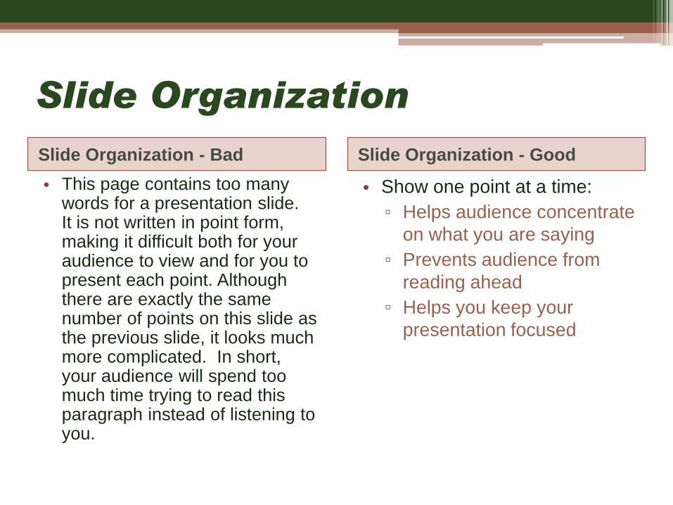
Slide Organization
Slide Organization - Bad Slide Organization - Good
• This page contains too many words for a presentation slide. It is not written in point form, making it difficult both for your audience to view and for you to present each point. Although there are exactly the same number of points on this slide as the previous slide, it looks much more complicated. In short, your audience will spend too much time trying to read this paragraph instead of listening to you.
• Show one point at a time:
▫ Helps audience concentrate
on what you are saying
▫ Prevents audience from
reading ahead
▫ Helps you keep your
presentation focused

Slide Animation
• Use sparingly. Don’t over-animate.
• Don’t have words, sentences and pictures flying
around the screen.
▫ Distracts audience away from the purpose of your
presentation.
• Slide transitions should be instantaneous or at
least very quick.
▫ Slow slide transitions cut down on your overall
time to actually present your research.

Fonts
Font - Bad Font - Good• If you use a small font, your audience won’t be able to read what you have written.
• CAPITALIZE ONLY WHEN NECESSARY. IT IS DIFFICULT TO READ AND YOU DON’T NEED TO SHOUT AT YOUR AUDIENCE VIA TEXT.
• Don’t use a complicated font.
• Serif fonts such as Times New Roman may not show up as well on presentation screens and may be harder to read from further away.
• don’t type a txt msg. lol
• Use a decent font size.
• Use different size fonts
for main points and
secondary points.▫ this font is 20-point, the
main point font is 24-point,
and the title font is 40-point
• Use a standard sans-serif
font like Arial.
• Be consistent.

Color
Color - Bad Color - Good
• Using a font color that does not contrast with the background color is hard to read
• Too much decoration is and .
• Using a different color for each point is unnecessary
Same for secondary points
• Trying to be colorful can also be bad
• Use font color that contrasts
sharply with the background.
• Use color to reinforce the logic
of your structure.
Ex: darker title and slightly
different subtext
• Use color or bold or italics or
ALL three to emphasize a
point
But only use this
occasionally
• Be consistent.

Background – Bad
• Avoid backgrounds that are distracting or difficult
to read from
• Always be consistent with the background that
you use
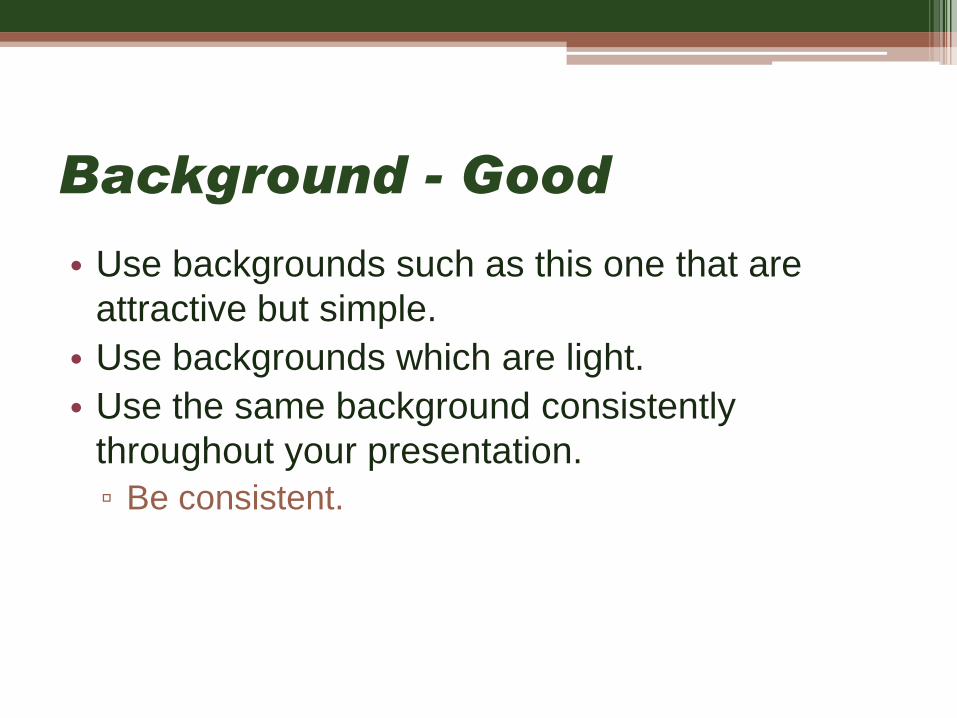
Background - Good
• Use backgrounds such as this one that are
attractive but simple.
• Use backgrounds which are light.
• Use the same background consistently
throughout your presentation.
▫ Be consistent.

Charts vs. Graphs ?
Graphs are usually better…Good Graphs Bad Graphs
• When presenting quantitative data/results:
▫ Graphs help to graphically visualize data better than charts or words.
▫ Data in graphs are easier to comprehend & retain than raw data or a chart of only numbers.
▫ Trends are easier to visualize in graph form.
• Contain a title, legend, x- and y-axis labels.
• Minor gridlines are
unnecessary
• Font too small
• Colors are illogical
• Title and labels are missing
• Legend is unclear
• Shading is distracting
• No data source listed (if
appropriate)
• No sample size (if appropriate)

Use charts sparingly and only
when absolutely necessary
Raw Number Charts = Boring
Population in Mecklenburg County, North Carolina
1990 2000 2008
Growth Rate (%):
1990-2008
Total 511,433 695,454 890,515 74.12
White 364,651 445,356 537,441 47.39
Black 134,468 192,666 259,772 93.18
Asian 8,461 20,819 35,167 315.64
Hispanic 6,693 44,871 96,214 1,337.53
Foreign Born 17,875 68,349 117,421 556.90
Foreign Born,
Naturalized Citizen6,740 19,810 35,021 419.60
Foreign Born, Not a
Citizen11,135 48,539 82,400 640.01
Source: U.S. Bureau of the Census, American Community Survey

If you do use charts, you may want to
first present the chart, and then
highlight specific components of the
chart for emphasis:
Population in Mecklenburg County, North Carolina
1990 2000 2008
Growth Rate (%):
1990-2008
Total 511,433 695,454 890,515 74.12
White 364,651 445,356 537,441 47.39
Black 134,468 192,666 259,772 93.18
Asian 8,461 20,819 35,167 315.64
Hispanic 6,693 44,871 96,214 1,337.53
Foreign Born 17,875 68,349 117,421 556.90
Foreign Born,
Naturalized Citizen6,740 19,810 35,021 419.60
Foreign Born, Not a
Citizen11,135 48,539 82,400 640.01
Source: U.S. Bureau of the Census, American Community Survey

Graph – Good example
0
10
20
30
40
50
60
70
80
White Black Asian Hispanic Foreign Born Foreign Born,
Naturalized Citizen
Foreign Born, Not a
Citizen
Pe
rce
nt
of
To
tal P
op
ula
tio
n
Percent of Total Population in Mecklenburg County, North Carolina, 1990, 2000,and 2008
1990
2000
2008

Graph – Bad example
0
10
20
30
40
50
60
70
80
Perc
en
t o
f To
tal P
op
ula
tio
n
Percent of Total Population in Mecklenburg County, North Carolina, 1990, 2000,and 2008
1990
2000
2008

Images and Pictures
• Depending on your data, audience, or type of
presentation, other visual aids in addition to graphs may
better convey an idea than a list of text bullet points.
▫ Photographs
▫ Maps
▫ …

Hispanic 1990
Census Tracts
N = 111
Hispanic 2000
Census Tracts
N = 144
Hispanic 2000
Block Groups
N = 373
p ≤ 0.05
Univariate LISA: Hispanic Population

Acknowledgements
• 2011 Graduate Research Fair Planning
Committee
• Graduate and Professional Student Government
• Center for Graduate Life
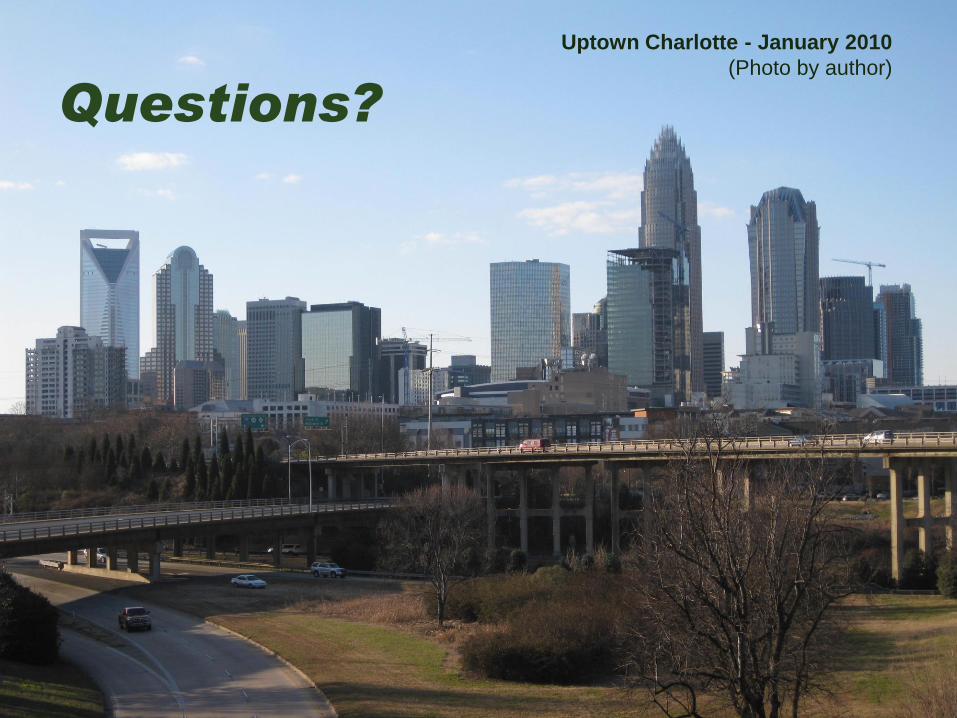
Uptown Charlotte - January 2010
(Photo by author)
Questions?