basic type typo graphy - elfit.ssru.ac.th filetypography basic design relative & absolute...
TRANSCRIPT

BASIC ABOUT
TYPO GRAPHY
TYPE

TYPOGRAPHY BASIC DESIGN Relative & Absolute measurements
Absolute measurements Inche : Millimetres : Points : Pica
3 Inches 76.2 mm 216 Points 18 Picas
1 Inches = 3 Picas 1 Picas = 12 Points A 2.5 Inches = 8 Picas = 96 Points

TYPOGRAPHY BASIC DESIGN Relative & Absolute measurements
Points Is the units of measurement used to measure the type size of a font. A Pica from one type foundry would be exactly 12 points.
TYPOGRAPHY BASIC DESIGN Relative & Absolute measurements
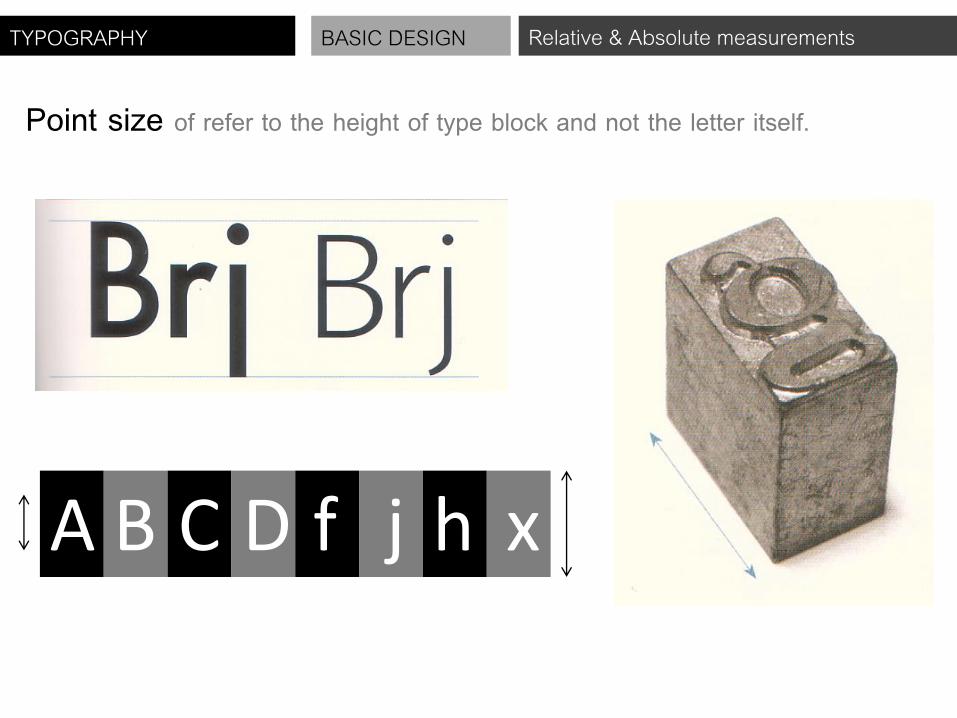
Point size of refer to the height of type block and not the letter itself.
A B C D f j h x

TYPOGRAPHY BASIC DESIGN Relative & Absolute measurements
X-height Is measurement from the baseline to the meanline. Typically, this distance Is the height of the lower-case “x”.
A B C D f j h x X-height Points

TYPOGRAPHY BASIC DESIGN Relative & Absolute measurements
X-height are not Constant.

TYPOGRAPHY BASIC DESIGN Baseline
Baseline is the imaginary line that all type sit upon with the exception of the ‘O’ and other rounded Characters that fall slightly below it.

TYPOGRAPHY BASIC DESIGN Basic Terminology
Serif / Sans serif Standard typefaces generally fall into one of two board categories : Serif / Sans serif

TYPOGRAPHY BASIC DESIGN Basic Terminology

TYPOGRAPHY BASIC DESIGN Basic Terminology
Ex. Serif

TYPOGRAPHY BASIC DESIGN Basic Terminology
Ex. Sans serif

TYPOGRAPHY BASIC DESIGN Basic Terminology
Numerals There are two classifications of numerals : Old Style (lower case), and Lining (upper case). Lining numerals are aligned to the baseline and are all equal height, Old style do not, which means difficult to read.

TYPOGRAPHY BASIC DESIGN Basic Terminology
Lining (upper case) serif numerals Old style (lower case) serif numerals
Lining (upper case) san-serif numerals Old style (lower case) san-serif numerals

TYPOGRAPHY BASIC DESIGN Basic Terminology

TYPOGRAPHY BASIC DESIGN Tracking or letters pacing
Tracking or letter spacing Amount of spacing between characters

TYPOGRAPHY BASIC DESIGN Tracking or letterspacing

TYPOGRAPHY BASIC DESIGN Tracking or letterspacing

TYPOGRAPHY BASIC DESIGN Kerning
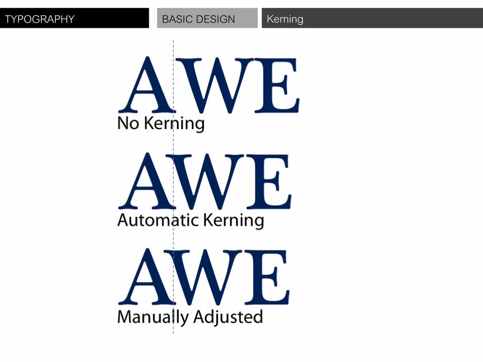
KERNING Refers to the addition and subtraction of space between letters to create a comfortable setting

TYPOGRAPHY BASIC DESIGN Kerning
KERNING
TYPOGRAPHY BASIC DESIGN Kerning

TYPOGRAPHY BASIC DESIGN Kerning

TYPOGRAPHY BASIC DESIGN Kerning

TYPOGRAPHY BASIC DESIGN Tracking or letters pacing
Tracking or letter spacing Tracking is very similar to kerning in that it is the spacing between individual characters, but tracking is the space between groups of letters rather than individual letters.

TYPOGRAPHY BASIC DESIGN Kerning

TYPOGRAPHY BASIC DESIGN Kerning
TYPOGRAPHY BASIC DESIGN Leading
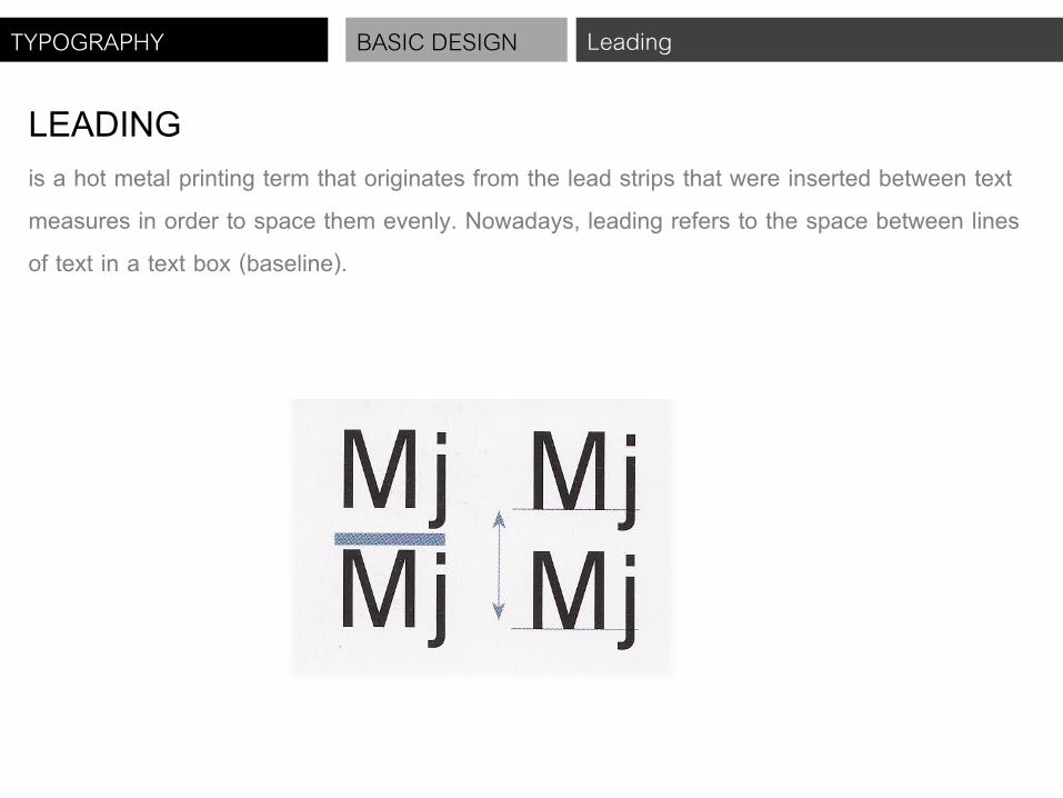
LEADING is a hot metal printing term that originates from the lead strips that were inserted between text measures in order to space them evenly. Nowadays, leading refers to the space between lines of text in a text box (baseline).

TYPOGRAPHY BASIC DESIGN Leading

TYPOGRAPHY BASIC DESIGN Leading

TYPOGRAPHY BASIC DESIGN Leading

TYPOGRAPHY BASIC DESIGN Leading

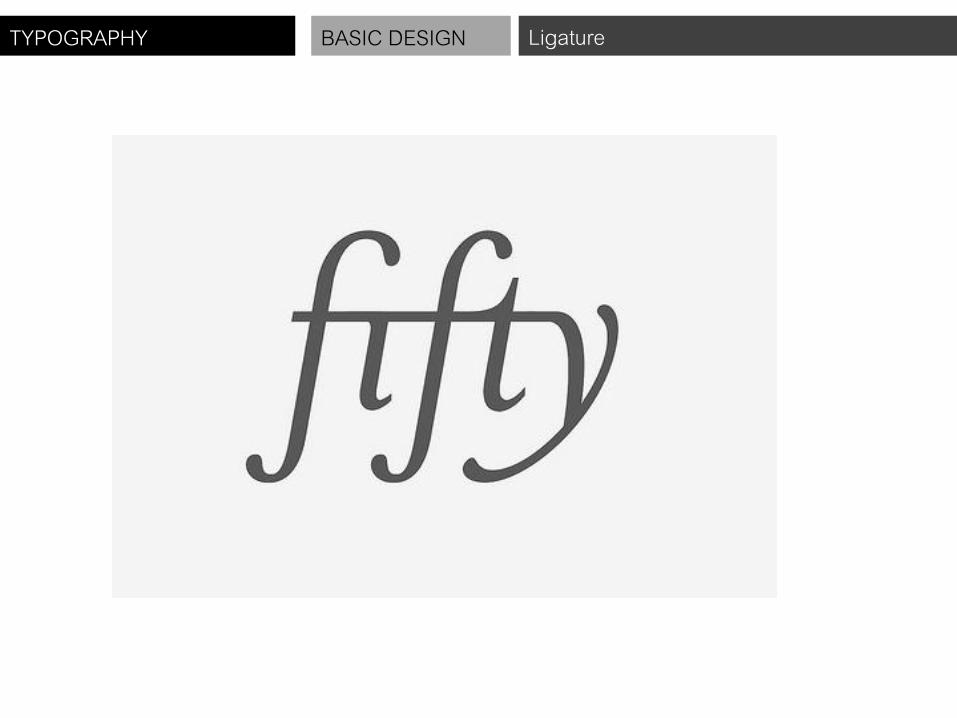
TYPOGRAPHY BASIC DESIGN Ligature
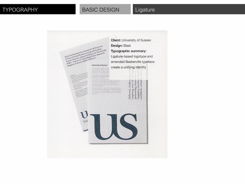
Ligature is a typographical device that join two or three separate characters together to form a single unit. They are used as a solution to the interference that certain character combinations create. Ligatures are formed either by extending the crossbar or connecting the ascenders depending upon the character involved.

TYPOGRAPHY BASIC DESIGN Ligature

TYPOGRAPHY BASIC DESIGN Ligature

TYPOGRAPHY BASIC DESIGN Ligature

TYPOGRAPHY BASIC DESIGN Ligature
TYPOGRAPHY BASIC DESIGN Ligature

TYPOGRAPHY BASIC DESIGN Ligature
TYPOGRAPHY BASIC DESIGN Ligature

TYPOGRAPHY BASIC DESIGN Majuscule & Minuscule
Majuscule and minuscule Majuscule is upper-case (Capital). : Minuscule is lower-case letters. *Not all fonts are available in both forms*

TYPOGRAPHY BASIC DESIGN Majuscule & Minuscule
Set width Is the horizontal scaling of type, and is typically expressed as a percentage. It refer to the Amount of space that each character uses.

TYPOGRAPHY BASIC DESIGN Majuscule & Minuscule

TYPOGRAPHY BASIC DESIGN Golden Section
Golden Section In the field of graphic arts the Golden Section, also known as the golden ratio. The Golden Section was thought by many ancient cultures, from the Egyptians to the Roman And the Greeks, to represent infallibly beautiful proportion.

TYPOGRAPHY BASIC DESIGN Golden Section
Construction a Golden Section
TYPOGRAPHY BASIC DESIGN Golden Section
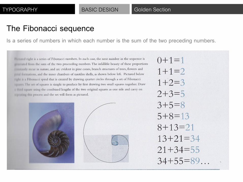
The Fibonacci sequence Is a series of numbers in which each number is the sum of the two preceding numbers.

TYPOGRAPHY BASIC DESIGN Golden Section
For example, a title could be set at 34 pt With body copy set at 21 pt size to complement the title size
This title could be set at 55 pt Now body copy set at 34 pt size

TYPOGRAPHY BASIC DESIGN Legibility & Readability
Legibility refer to the ability to distinguish one letter form from another the physical characteristic that are inherent in the design of a particular typeface.

TYPOGRAPHY BASIC DESIGN Legibility & Readability

TYPOGRAPHY BASIC DESIGN Legibility & Readability

TYPOGRAPHY BASIC DESIGN Legibility & Readability

TYPOGRAPHY BASIC DESIGN Legibility & Readability

TYPOGRAPHY BASIC DESIGN Legibility & Readability

TYPOGRAPHY BASIC DESIGN Legibility & Readability

TYPOGRAPHY BASIC DESIGN Legibility & Readability
Readability Readability concerns the properties of a piece of type or design that affect the ability to understand it.

TYPOGRAPHY BASIC DESIGN Legibility & Readability

TYPOGRAPHY BASIC DESIGN Legibility & Readability

TYPOGRAPHY BASIC DESIGN Legibility & Readability

TYPOGRAPHY BASIC DESIGN Legibility & Readability

TYPOGRAPHY BASIC DESIGN Legibility & Readability

TYPOGRAPHY BASIC DESIGN Legibility & Readability

TYPOGRAPHY BASIC DESIGN Legibility & Readability

TYPOGRAPHY BASIC DESIGN Legibility & Readability
Project Assignment ให้นักศึกษาออกแบบปก และแผ่น DVD หนังที่นักศึกษาน ามาออกแบบ FONT จากคาบที่แล้วโดยก าหนด องค์ประกอบหลักในการออกแบบดังนี้ - Font ตัวหนังสือที่นกัศกึษาออกแบบจากคาบที่แล้ว - Font อื่นๆ มาใช้ร่วมได้อีกไม่เกิน 1 Font โดยสามารถใช้เปน็ตัวใหญ ่ ตัวเล็ก หรือตัวเลขก็ได้ - ก าหนดสีให้ใช้ ขาว-ด า เท่านั้น - ชื่อหนัง - ชื่อผู้ก ากบั - ชื่อตัวแสดงห้ามเกิน 6 ชื่อ - เนื้อเรื่องยอ่ (อนญุาตให้มีหรือไม่มีก็ได้) ก าหนดการส่งงาน - วันที่ 31 ตุลาคม ตรวจแบบร่างเท่าขนาดจริงท าในกระดาษกราฟ คนละอย่างน้อย 2 แบบร่าง พร้อมกล่องและแผ่น (5คะแนน) - วันที่ 7 พฤศจิกายน น าเสนอผลงานพร้อมงานจริงท าในกระดาษขาว (10 คะแนน)