artists’ … · a triangle book by grendl löfkvist exploring influences by marie perrier-penloup...
TRANSCRIPT

Volume 14, Number 4 $8.50
ARTISTS’ BOOKSbBOOKBINDINGbPAPERCRAFTbCALLIGRAPHY

Bound & Lettered b Fall 2017 1
Volume 14, Number 4, September 2017.
Blending Winsor & Newton Calligraphy Inks by Carol DuBosch
A Modern Book of Hours by Holly V. Monroe
A Triangle Book by Grendl Löfkvist
Exploring Influences by Marie Perrier-Penloup
Long-Stitch Lettering by Anne Murray
Alphabet Books by Mary Wells
Origami Box with Tato Closure by Margaret Beech and Mary Elizabeth Nelson
Dreaming Dogs Ruling Pens
Remembering Aimee Michaels
Calligraphy & Hand Lettering Envelope Contest
New & Notable
Contributors / credits
Subscription information
3
6
14
18
20
26
30
34
36
39
40
42
48
Mary Elizabeth Nelson. Origami box with tato top. 2014. Base of gold card
stock; top of heavyweight Tyvek painted with black and red tube-acrylic paint.
Small, accordion-fold book enclosure is 90lb Arches hot press watercolor paper,
with sumi-ink wash and white writing done with a water-based, extra-fine-point
Sharpie. Text is by Ariwara no Narihira. “Origami Box with Tato Closure,” page 30.

Bound & Lettered b Fall 2017 3
insor & newton Calligraphy inks are not new inks, but I don’t believe they are well known enough. They are very much worth trying. These inks are densely pig-mented, lightfast, water-soluble, and non-waterproof when dry, which are all characteristics that I highly
value in a calligraphy ink. The inks work very well with most tools – edged pen, pointed pen, folded pen, brush, and Pilot Parallel Pen – and they even work in other calligraphy fountain pens. For Pilot Parallel Pens and other fountain pens, you need to be careful to only use the colors with the blue caps. (Winsor & Newton also makes Matte Black, White, metallic Gold, and metallic Silver calligraphy inks; these have red caps and are only for dip pen and brush.) All the colors blend easily with one another, but one pair is espe-cially interesting in this regard. Mixing the Yellow Ochre with the Dark Blue creates a most exciting palette of muted tones, whether you are using the inks full-strength or diluted. It was by serendipity that I learned the special way these Winsor & Newton Calligraphy ink colors interact. I was writing a piece (shown below) in Bone script, with an Automatic pen, using full-strength Yellow Ochre and full-strength Dark Blue on 90lb Arches watercolor paper, and the lovely colors that happened in between were a complete surprise. As you can imagine, I was excited about this seemingly magical ink combination and have since explored it often and with many tools.
When writing with full-strength color, I like to have a palette with one well each of the Yellow Ochre and the Dark Blue. At least two other wells are filled with plain (distilled) water. I will generally dip from Yellow Ochre to one water well and from Dark Blue to the other. The water helps the ink colors blend and brings out the range of hues. Sometime I will dip into one of the water wells first for more diluted color. The water gradually takes on some of the pigmenta-tion. Other times I will use a palette with already diluted color and plain water in the wells, with or without wells of full-strength color.
Blending Winsor & Newton Calligraphy Inks by Carol DuBosch
A color gradation from full-strength Dark Blue to full-strength Yellow Ochre.
The watercolor palette with Yellow Ochre and Dark Blue, both full-strength, and the diluted mixtures that naturally occur when mixing and/or diluting the two colors in your pen as you write out a text.
I was working on this piece when I discovered how mixing Yellow Ochre with Dark Blue while writing creates a palette of muted tones.

6 Bound & Lettered b Fall 2017
It was a cold December night, very close to Christmas, and I was in my studio working late, feeling the pressure of meeting deadlines for clients. An email arrived from a friend, asking me if I’d seen the ad from someone looking for a calligrapher to create a handmade book. Coming at that time of year, the idea of such a weighty project didn’t feel good. Various thoughts went through my head about such a project: I’m too busy to pursue this! There are so many fabulous calligraphers, it’s a long shot that he would choose me. I’m more of a single-sheet creator, not a book designer. This sounds like too much of a challenge. Overnight, my thinking took a different turn: Wouldn’t this be a great project to stretch my creative abilities and to stay financially afloat? What if I run out of work? (I was single again, and I was trying hard to take my part-time calligraphy studio to full-time status.) Oh, the power of positive thinking! That evening, I sent my potential client some samples of my work, starting the email with, “My good friend suggested that I contact you.”
A MODERN BOOK OF HOURSby Holly V. Monroe
His reply came the very next day: “Your good friend is about to become my good friend, because I would like you to create this book. But first, I would like you to create two other designs on vellum.” (In retrospect, I surmise that the two large projects were “tests” for the book project.) My client wanted a Book of Hours, and it would be 144 pages. Historically, a Book of Hours was a prayer book for laypersons. The name comes from the Hours of the Virgin, a set of eight daily prayers that is typically part of these volumes, which could also include Bible verses, psalms, hymns, and other prayers. These books are small in size and were produced over a period of 250 years, beginning in the late thirteenth century. In the fifteenth century, they were produced by the hundreds in scribal workshops. Though most were utilitarian productions with a minimum of decorative elements, some were lavish books – lettered on vellum, with heavy decoration and illumination, and bound in leather – commissioned by the nobility and other wealthy patrons. People often fall in love
The title page of a 144-page manuscript book on vellum being created by Holly Monroe. The client commissioned this ongoing project in 2006.
A completed interior page.

20 Bound & Lettered b Fall 2017
LONG-STITCH LETTERING
The long-stitch binding is one of my favorites due to its versatility and how well it lends itself to creative designs. Long stitch can be one of the simplest of all bindings: signatures are sewn directly to the cover with a simple running stitch that anyone who has been exposed to sewing has learned. Even though it is an easy first-binding to learn, intricate and complex patterns are also possible with this binding structure. There are two basic styles of long stitch. The older method, dating
By Anne Murray
from medieval times, involves punching individual holes into the cover spine. Another method, apparently dating from the 18th cen- tury, involves cutting slits all the way across the spine of the cover material. This latter method lends itself well to beginners. (See opposite page, bottom, for an example of this method, my first use of long stitch.) However, I currently use the hole-punch method because I enjoy creating more intricate designs. (See opposite page, top, for examples of my bindings that use this method with
Anne Murray. 2017. Lettered-spine long-stitch binding, with wraparound cover. For another view of this book, see page 23.
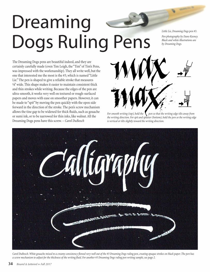
Dreaming Dogs Ruling Pens
Carol DuBosch. White gouache mixed to a creamy consistency flowed very well out of the #3 Dreaming Dogs ruling pen, creating opaque strokes on black paper. The pen has a screw mechanism to adjust for the thickness of the writing fluid. For another #3 Dreaming Dogs ruling pen writing sample, see page 2.
The Dreaming Dogs pens are beautiful indeed, and they are certainly carefully made (even Tim Leigh, the “Tim” of Tim’s Pens, was impressed with the workmanship). They all write well, but the one that interested me the most is the #3, which is named “Little Lie.” The pen is shaped to give a reliable stroke that measures 1⁄8" wide. This shape makes it easier to maintain consistent thick and thin strokes while writing. Because the edges of the pen are ultra-smooth, it works very well on textured or rough-surfaced papers and moves with ease on smoother papers. However, it can be made to “spit” by moving the pen quickly with the open side forward in the direction of the stroke. The pen’s screw mechanism allows the tine gap to be widened for thick fluids, such as gouache or sumi ink, or to be narrowed for thin inks, like walnut. All the Dreaming Dogs pens have this screw. – Carol DuBosch
Little Lie, Dreaming Dogs pen #3.
Pen photography by Dano Keeney. Black and white illustrations are by Dreaming Dogs.
For smooth writing (top), hold the pen so that the writing edge tilts away from the writing direction. For spit and splatter (bottom), hold the pen so the writing edge is vertical or tilts slightly toward the writing direction.
34 Bound & Lettered b Fall 2017

Bound & Lettered b Fall 2017 39
Contest Rules1. Entry is by physical envelope mailed to one of the entry addresses below. 2. Entry envelopes must addressed to one of the following:Seattletters, 9302 NE 135th St., Kirkland, WA 98034 (Adding “in Bellingham” to “Seattletters” is optional.)John Neal Books, 1833 Spring Garden St., Floor 1, Greensboro, NC 27403 Letter Arts Review, 1833 Spring Garden St., Floor 1, Greensboro, NC 27403Bound & Lettered, 1833 Spring Garden St., Floor 1, Greensboro, NC 27403(Spell out or abbreviate as you wish. Floor 1 could be abbreviated as FL 1.) 3. All entered envelopes must include your own calligraphy and/or hand lettering, applied by hand. 4. All entered envelopes must include a stamp or multiple stamps on the front. The decorated envelope itself can be sent through the mail, or it can be sent within another envelope addressed to: John Neal Books, Calligraphy Envelope Contest, 1833 Spring Garden St., FL 1, Greensboro, NC 27403. Each envelope entry must have your name and a return address on the back of the envelope, even if it is sent within another envelope.5. Entry envelopes mailed to Seattletters can contain conference fee pay-ments. Entry envelopes mailed to John Neal Books/Bound & Lettered/ Letter Arts Review may contain orders, subscriptions, and/or payments. If your mailed envelope is solely a contest entry, write “Entry Only” on the back of the envelope. Including one or more blank sheets of paper in the envelope may help smooth the envelope passage through the postal service. 6. #10 Business envelopes (4-1/8" x 9-1/2") are encouraged, but you may use any envelope size that mails at the one-ounce rate.7. By entering, you give permission for your envelope to be reproduced in
Calligraphy & Hand Lettering Envelope Contest
Prizes$100 Gift Certificate for envelope judged best envelope design $100 Gift Certificate for the People’s Choice winner at Seattletters$50 Gift Certificate for the envelope judged best integration of the stamp(s) in the design$50 Gift Certificate for the envelope judged best pointed pen script$50 Gift Certificate for the envelope judged best broad-edged pen calligraphy$50 Gift Certificate for the envelope judged best illustrative elementsIn addition, ten $25 honorable mention Gift Certificates will be awarded.Gift Certificates are for purchases from John Neal Books and are good toward anything in their store, catalog, or website, including subscriptions. Prizes will be announced at Seattletters in July of 2018.
promotional materials, both print and web; to be reproduced in an issue (or multiple issues) of Bound & Lettered; and to be displayed at Seattletters and other venues. 8. Deadline for receipt of entries is April 1, 2018.9. A selection of the entries will be on display at Seattletters and will be reproduced in Bound & Lettered, issue 15.3 (Summer 2018). A copy of the issue can be preordered at www.johnnealbooks.com. Everyone with an envelope reproduced in that issue of Bound & Lettered will receive a complimentary copy of the magazine. Subscribers will automatically receive a copy of this issue of the magazine.
Carol DuBosch
Jane Shibata
Heather Bloem
Cheryl Jacobsen
40 Bound & Lettered b Fall 2017
I teach calligraphy often and like having my students use the round double-ended penholder, but its surface is too smooth. Using it, I would feel my fingers slipping. I tried sanding the wooden shaft, and that helped a little. Being from Minnesota, I thought about hockey grip tape and gave it a try, and, voilà, problem solved. The tape is 1.5" wide, and a 2" strip is plenty. The tape I got sticks to itself, is mesh rather than solid, and is easily removable. It makes the holder very comfortable, facilitates twisting the pen, and is easy on older fingers. This better grip helps my students relax their fingers and hold the pen with a lighter touch, and lets them concentrate on their lettering without worrying about the pen slipping. I have also used this hockey-store tape to beef up penholders that are too skinny and to cover up the chipping on the marbled holders that I prefer to use. I like the feel so much I even use it on the beautiful wood of an offset (oblique) pen-holder that felt too slippery. – Kris MacDonald
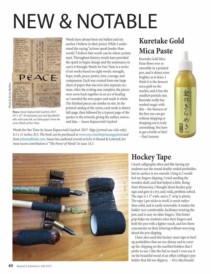
Kuretake Gold Mica Paste flows ever so smoothly in a pointed pen, and it shines even brighter as it dries. I think it is the densest mica gold on the market, and it has the smallest particle size. Kuretake really has worked magic with this – the fineness of the line you can get without skipping or dropping out is truly astonishing. You have to get a bottle of this! – Paul Antonio
NEW & NOTABLEWords have always been my ballast and my anchor. I believe in their power. While I under-stand the saying “actions speak louder than words,” I believe that words can be where actions start. Throughout history, words have provided the spark to begin change and the sustenance to carry it through. Words for Our Time is a series of art works based on eight words: strength, hope, truth, peace, justice, love, courage, and compassion. Each was created from one large sheet of paper that was torn into separate sec-tions. After the writing was complete, the pieces were sewn back together in an act of healing as I mended the torn paper and made it whole. The finished pieces are similar in size. In the printed catalog of the series, each work is shown full-page, then followed by a typeset page of the quotes in the artwork, giving the author, source, and date. – Susan Kapuscinski Gaylord
Words for Our Time by Susan Kapuscinski Gaylord. 2017. 36pp (printed one-side only). 8.5 x 11 inches. $15. The book can be purchased at www.etsy.com/shop/susangaylord and from johnnealbooks.com. Susan has authored several articles in Bound & Lettered; her most recent contribution is “The Power of Words” in issue 14.3.
Hockey Tape
Peace. Susan Kapuscinski Gaylord. 2017. 29" x 19". #6 Automatic pen and Speedball C nibs with sumi ink, on Lokta paper. From the series Words of Our Time.
Kuretake Gold Mica Paste
Phot
o by
Kev
in H
arki
ns

The Big Awesome Book of Hand & Chalk Lettering by Dina Rodriguez is well organized, addresses a wide variety of hand lettering concerns, and presents work of an experienced graphic designer who frequent- ly uses hand lettering. Rodriguez discusses materials and techniques and provides projects for both lettering on chalkboards and on paper. (I love that she includes warm-up exercises for your hands!) She comes at this from the point of view of a commercial graphic designer, and her concept of calligraphy is very limited, but fortu-nately, she doesn’t try to teach calligraphy in this book – it is really all about hand-drawn letters. There are many useful fine points included in the exemplars, and a detailed method for drawing the letters is included for each style of lettering. With the exception of a monoline script (she calls it Monoweight), all the alphabets are drawn in outline first and then filled in – which makes sense for chalkboard projects. She includes exemplars and instruction for capital alphabets that hark back to the late nineteenth century (Western, Circus, Victorian) and the early twentieth (Tattoo, an Art Deco–inspired design) that are trendy now for commercial chalkboard lettering. Others alphabets include Ribbon, Wood, Black Letter, and a varied-weight script (more like an italic typeface than Copperplate). Rodriquez writes about design (a passion of mine as a teacher) in an informed, step-by-step way, and she goes beyond what is found in many lettering books. I think the book stands up well on its own terms and is thorough in the scope of what it sets out to do. I recommend it for calligraphers wanting to explore chalk-board hand lettering as well as for those who have already started drawing letters. – Cora Pearl 2017. 208pp. 8.5"x11". Paperbound. $19.95
Bound & Lettered b Fall 2017 41
Ecoline Brush Pen I love how bright and concentrated the Ecoline liquid watercolors are (see issue 14.2), and now Ecoline has come out with brush makers with the same writing fluid! The news gets even better: I’ve found that the tip of this brush pen holds up incredibly well to my heavy hand and to prolonged use (better than other brands that I’ve used). The tip glides across the paper, making letterforms a breeze, and is flexible enough to create brush scripts with good contrast in width between the thin and thick strokes. I can use the tip to create various shapes, like flowers, and since the tip is so durable, I don’t have to worry about it becoming frayed. The biggest pro/con is how juicy these markers are. Their great ink flow creates intense color, but not necessarily a smooth ombré effect. In an attempted gradual transition from thin to thick strokes, from light to dark color, the ink can sit heavily in the thick lines and sometimes bleed through, depending on the paper. I like the bolder visual effect – it is different from that of markers that are stingier with their color. Ecoline Brush Pens are not lightfast, so they are not good for wall pieces or long-term signs, but they are a favorite for fun work, web work, work for print reproduction, and for playing in my journal. – Katie Johnson