analysis of digipak adverts
TRANSCRIPT

ANALYSIS OF DIGIPAK ADVERTS
Grace Walker

Artist name is largest text, bold lettering, bright
colourName of album,
again stands out due to contrasting colour
to background
Star reviews by media outlets to
encourage audience it is worth purchasing
Album cover pictured so
audience will know what it looks like
Large image of the artist
Website and record label in
small print at the bottom

Artist name is largest text, bold lettering,
contrasting colour to the backgroundLarge image of
the band, also the album cover
Album name in a slightly smaller font size than the artist
name
Songs included in the album so audience can recognise the name of a song and therefore
be more likely to purchase an album
based on liking a song
Large image of the artist
When the album is released
Where album is available for purchase
Artist’s website
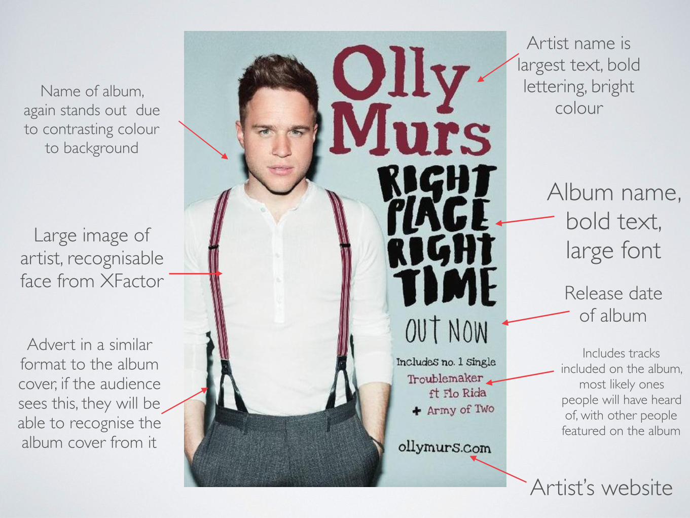
Artist name is largest text, bold lettering, bright
colourName of album,
again stands out due to contrasting colour
to background
Large image of artist, recognisable face from XFactor
Artist’s website
Album name, bold text, large fontRelease date
of album
Includes tracks included on the album,
most likely ones people will have heard of, with other people featured on the album
Advert in a similar format to the album cover, if the audience sees this, they will be able to recognise the album cover from it

From analysing digipak adverts, I have found the main things included are the artist’s name (usually largest text), the album name, a picture of the artist/album cover, the artist’s website, the release date, included songs and reviews.