alignment. step 1 - learn view the following slides to learn about how alignment can enhance design
TRANSCRIPT

Alignment

STEP 1 - LEARN• View the following slides to learn about how alignment can
enhance design.

ALL ABOUT ALIGNMENT• Readers feel frustrated when good elements are just thrown
on a page. Luckily easy problem to fix. Line stuff up.
• NO element should be placed on a spread at random. Every element should line up with at least one other element, even if those two are far apart.

UNITY• Alignment can be used to create unity within a spread. If
elements are lined up across the gutter, the spread will look like one design instead of two pages.
• Columns or grids and eyelines are methods of alignment that can unify a spread.
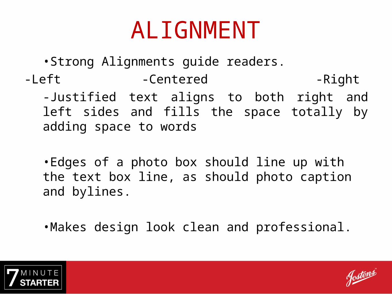
ALIGNMENT •Strong Alignments guide readers.
-Left -Centered -Right
-Justified text aligns to both right and left sides and fills the space totally by adding space to words
•Edges of a photo box should line up with the text box line, as should photo caption and bylines.
•Makes design look clean and professional.

When Alignment Doesn’t Work
Trinity High School [TX]

When Alignment Works
Trinity High School [TX]

When Alignment Works
Loudoun Valley High School [VA]

STEP 2 - PRACTICE• Project a layout from your book so the class can see it
together. Look for examples of good alignment and areas that could be improved.
• Rearrange some or all of the elements while viewing the layout as a class so that everyone can see how the layout changes.

STEP 3 - DO• Make sure the grids are visible in your design program.
• Align the elements on your spread in as many ways as possible, horizontally and vertically, and leaving an eyeline to unify the pages.

Both YearTech Online (YTO) and Adobe InDesign have grids to make alignment easier.