adobe indesign: colour and its management - kvern / blatner
TRANSCRIPT
AdobeInDesign
Colour and its Management
Olav Martin Kvern and David Blatner

This document is an excerpt taken from Chapter 10of Real World Adobe InDesign CS4
Copyright © 2009 by Olav Kvern and David Blatnerand published by Peachpit Press
Cover design by accipio (2014)

593
Color communicates, telling us things about the object bearing the color. Without color cues, we’d have a hard time guessing the ripe-ness of a fruit or distinguishing a poisonous mushroom from an edible one. And many animals would have a hard time figuring out when to mate, or with whom.
We associate colors with human emotions: we are green with envy; we’ve got the blues; we see red. Colors affect our emotions as well. Various studies suggest that we think best in a room of one color, and relax best in a room of another color.
What does all this mean? Color’s important. A rule of thumb in advertising is that a color advertisement gets several times the response of a black-and-white ad. Designers of mail-order catalogs tell us that color is often cited as the reason for buying a product—and it’s usually the reason a product is returned.
InDesign features a formidable array of features dedicated to cre-ating, editing, applying, and printing colors. In addition, InDesign’s color management can make what you see on your screen much closer to what you’ll get when you print. Before we go any further, however, we have to talk about color printing.
Color
ch
ap
te
r 10
Real_World_Adobe_InDesign_CS4b.pdf 606Real_World_Adobe_InDesign_CS4b.pdf 606 08/04/2009 05:55:51 p.m.08/04/2009 05:55:51 p.m.
594 real world adobe indesign cs4
Seeing Color, Printing Color
It’s impossible to discuss the process of creating and using colors in InDesign without first talking a little about printing and visual per-ception. The visible spectrum is the range of light wavelengths visible to the human eye. It’s the job of our scanners, monitors, printers, and printing presses to reproduce the colors we see in the visible spec-trum. Alas, they all fail miserably.
The range of color a device, color model, or printing method is capable of reproducing is referred to as its color gamut. There’s no device, apart from your eye, that’s capable of reproducing the range of light that your eye is capable of seeing. And even your eye isn’t consistent from day to day.
Spot and Process Inks
Printing presses put ink on paper one ink at a time. Some presses have more than one printing cylinder and can print several colors of ink on a sheet of paper in one pass through the press, but each print-ing cylinder carries only one color of ink.
Spot-color printing is simple: your commercial printer uses inks that exactly match the color you want (or mixes inks to get the same result), then loads the press with that ink. In spot-color printing, we sometimes use “tint builds”—screens of inks printed on top of each other—to create a new color without using another ink. In process-color printing, tint builds are where it’s at; we use overlapping screens of four inks (cyan, magenta, yellow, and black) to simulate part of the spectrum of visible color. If everything’s gone well, the dots of the different-colored inks are placed near each other in a pattern called a rosette.
Process-color printing can’t simulate all the colors our eyes can see (notably very saturated colors, or metallic and fluorescent colors), but it can print color photographic images. Spot colors can print any color you can make with pigments, but aren’t generally used to reproduce color photographic images (that’s what process color printing was designed to be good at).
Color in InDesign
Now that you know all about color perception and color printing, it’s time to get down to the process of specifying and applying colors in your InDesign publication.
Real_World_Adobe_InDesign_CS4b.pdf 607Real_World_Adobe_InDesign_CS4b.pdf 607 08/04/2009 05:55:52 p.m.08/04/2009 05:55:52 p.m.
chapter 10. color 595
Named and Unnamed Colors
InDesign has two basic methods for working with color: unnamed colors and color swatches. Both unnamed colors and color swatches can change the appearance of an object’s fill or stroke, but swatches establish a relationship between the object and the named color swatch. Change the definition of the color swatch, and the color of all of the objects you’ve applied that swatch to will change as well.
Here’s another way to look at it: unnamed colors are to color swatches as local text formatting is to a character style. You get the appearance you’re looking for, but you don’t get the link between the style (in this case, the color swatch) and the object.
Why do you need that link? Because people change their minds. The client’s corporate color may have been Pantone 327 when you started the job, but it’s now Pantone 199. You get the idea—some-thing like this has probably happened to you.
If you’ve used unnamed colors, there’s nothing to do but claw your way through the objects in your publication, selecting and chang-ing each affected object. If you’ve used named color swatches, on the other hand, making a change of this sort is a simple task: change the definition of the swatch, and you’ve changed the color applied to all of the fills and strokes formatted using the swatch.
Colors and Inks It’s worth noting that colors and inks are often two separate beasts. Sure, a spot color swatch corresponds directly to an ink you’ll use to print the publication. However, most process color swatches are made up of some or all of the four process inks (cyan, magenta, yellow, and black).
When it comes time to print, the ink list (in the Output panel of the Print dialog box) displays the inks needed to print the colors you have defined in your publication. You’ll always see the process inks (cyan, magenta, yellow, and black) in the ink list, whether you’ve defined process colors or not. If you’ve defined spot colors, you’ll see the spot inks associated with those colors in the ink list. If you want, you can simulate your spot colors with process inks using the Ink Manager (we cover the Ink Manager later in this chapter).
Color Models InDesign lets you define colors using any of three color models—CMYK, RGB, and LAB. Which color model should you use? That depends on how you plan to produce your publication.
Process colors. If you’re working with process colors, specify your color using the CMYK color model or a CMYK color-matching system, or be ready for some surprises when your publication gets printed. It’s always best to look at a printed sample of the process color (like
Real_World_Adobe_InDesign_CS4b.pdf 608Real_World_Adobe_InDesign_CS4b.pdf 608 08/04/2009 05:55:52 p.m.08/04/2009 05:55:52 p.m.
596 real world adobe indesign cs4
those in the Trumatch or Pantone Process swatch books) and enter the values given in the sample book for the color. In other words, trust what you see on paper, not what you see on your screen.
Spot colors. You can define a spot color using any color space: RGB, LAB, CMYK, or a swatch book like a Pantone color. It really doesn’t matter what the color looks like on the screen, as long as you let your output provider know what color of ink they should use. That said, if you’re going to use a spot color, it’s usually best to choose colors from swatch libraries (such as the Pantone libraries), which we cover later in this chapter.
Onscreen colors. If you’re creating a publication for on-screen distri-bution (such as a SWF or interactive PDF), use the RGB color model.
Tints. If you’re trying to create a tint of an existing color (process or spot). You can base your tint on a spot color or a process color, but you can’t base tints on another tint. You can mix tints of spot colors with a mixed ink swatch, which we discuss later in this chapter.
Color Conversion Errors. When you convert a color from one color model to another—from RGB to CMYK, for example—a certain amount of error is introduced by the process of conversion. This is largely because the color models don’t cover the same color gamut, and there is often more than one way to represent the same color in a different color space. Each time you convert the color, the round-ing error is compounded: if you convert 100C 10M 50Y 0K to RGB, you’ll get 0R 230G 128B—converting that RGB color back to CMYK will yield a color defined as 90C 0M 40Y 10K. Just remember: There’s no “round trip” in color model conversion.
InDesign’s Color Controls
InDesign’s controls for working with color are found in several panels and menus. The most important panels are the Toolbox, because it contains the Fill selector and the Stroke selector, and the Swatches panel, because it contains tools for defining, editing, and applying swatches (which can be colors, gradients, or tints) to objects.
You can also use the Color panel and the Gradient panel to create and apply unnamed colors and gradients—but, as we’ve noted earlier, you’ll be better off if you use named color swatches. If you apply a
Real_World_Adobe_InDesign_CS4b.pdf 609Real_World_Adobe_InDesign_CS4b.pdf 609 08/04/2009 05:55:52 p.m.08/04/2009 05:55:52 p.m.
chapter 10. color 597
color to an object using the Color panel, there is no swatch associated with it—it’s an unnamed color. Unnamed colors are a nightmare for output providers and co-workers because it’s hard for them to figure out what colors you used if they need to troubleshoot your file. They can also be a nightmare for you if you ever need to go back to change a color. Given that everything you can do using the Color panel can be accomplished using the Swatches panel, we recommend just leav-ing the Color panel closed.
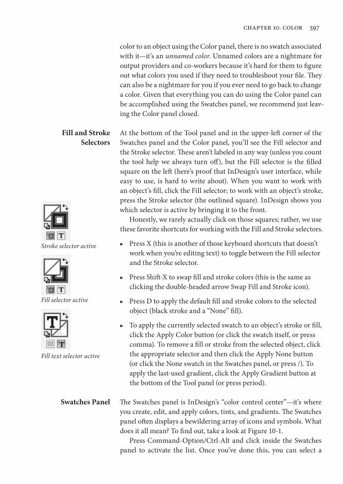
Fill and Stroke Selectors
At the bottom of the Tool panel and in the upper-left corner of the Swatches panel and the Color panel, you’ll see the Fill selector and the Stroke selector. These aren’t labeled in any way (unless you count the tool help we always turn off ), but the Fill selector is the filled square on the left (here’s proof that InDesign’s user interface, while easy to use, is hard to write about). When you want to work with an object’s fill, click the Fill selector; to work with an object’s stroke, press the Stroke selector (the outlined square). InDesign shows you which selector is active by bringing it to the front.
Honestly, we rarely actually click on those squares; rather, we use these favorite shortcuts for working with the Fill and Stroke selectors.
▶ Press X (this is another of those keyboard shortcuts that doesn’t work when you’re editing text) to toggle between the Fill selector and the Stroke selector.
▶ Press Shift-X to swap fill and stroke colors (this is the same as clicking the double-headed arrow Swap Fill and Stroke icon).
▶ Press D to apply the default fill and stroke colors to the selected object (black stroke and a “None” fill).
▶ To apply the currently selected swatch to an object’s stroke or fill, click the Apply Color button (or click the swatch itself, or press comma). To remove a fill or stroke from the selected object, click the appropriate selector and then click the Apply None button (or click the None swatch in the Swatches panel, or press /). To apply the last-used gradient, click the Apply Gradient button at the bottom of the Tool panel (or press period).
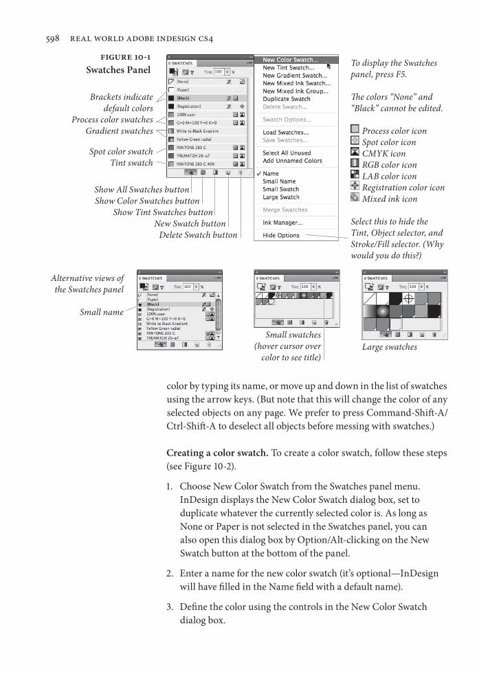
Swatches Panel The Swatches panel is InDesign’s “color control center”—it’s where you create, edit, and apply colors, tints, and gradients. The Swatches panel often displays a bewildering array of icons and symbols. What does it all mean? To find out, take a look at Figure 10-1.
Press Command-Option/Ctrl-Alt and click inside the Swatches panel to activate the list. Once you’ve done this, you can select a
Stroke selector active
Fill selector active
Fill text selector active
Real_World_Adobe_InDesign_CS4b.pdf 610Real_World_Adobe_InDesign_CS4b.pdf 610 08/04/2009 05:55:52 p.m.08/04/2009 05:55:52 p.m.
598 real world adobe indesign cs4
color by typing its name, or move up and down in the list of swatches using the arrow keys. (But note that this will change the color of any selected objects on any page. We prefer to press Command-Shift-A/Ctrl-Shift-A to deselect all objects before messing with swatches.)
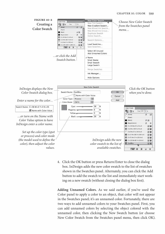
Creating a color swatch. To create a color swatch, follow these steps (see Figure 10-2).
1. Choose New Color Swatch from the Swatches panel menu. InDesign displays the New Color Swatch dialog box, set to duplicate whatever the currently selected color is. As long as None or Paper is not selected in the Swatches panel, you can also open this dialog box by Option/Alt-clicking on the New Swatch button at the bottom of the panel.
2. Enter a name for the new color swatch (it’s optional—InDesign will have filled in the Name field with a default name).
3. Define the color using the controls in the New Color Swatch dialog box.
The colors “None” and “Black” cannot be edited.
Brackets indicate default colors
Tint swatch
Delete Swatch button
Show All Swatches buttonShow Color Swatches button
Show Tint Swatches buttonNew Swatch button
Gradient swatches
Alternative views of the Swatches panel
Small name
Large swatches
RGB color icon
Spot color icon
Registration color icon
CMYK icon
LAB color icon
Figure 10-1Swatches Panel
Select this to hide the Tint, Object selector, and Stroke/Fill selector. (Why would you do this?)
Process color icon
To display the Swatches panel, press F5.
Mixed ink icon
Small swatches (hover cursor over
color to see title)
Spot color swatch
Process color swatches
Real_World_Adobe_InDesign_CS4b.pdf 611Real_World_Adobe_InDesign_CS4b.pdf 611 08/04/2009 05:55:52 p.m.08/04/2009 05:55:52 p.m.
chapter 10. color 599
4. Click the OK button or press Return/Enter to close the dialog box. InDesign adds the new color swatch to the list of swatches shown in the Swatches panel. Alternately, you can click the Add button to add the swatch to the list and immediately start work-ing on a new swatch (without closing the dialog box first).
Adding Unnamed Colors. As we said earlier, if you’ve used the Color panel to apply a color to an object, that color will not appear in the Swatches panel; it’s an unnamed color. Fortunately, there are two ways to add unnamed colors to your Swatches panel. First, you can add unnamed colors by selecting the object colored with the unnamed color, then clicking the New Swatch button (or choose New Color Swatch from the Swatches panel menu, then click OK).
Figure 10-2Creating a
Color Swatch
Choose New Color Swatch from the Swatches panel menu…
InDesign displays the New Color Swatch dialog box.
Set up the color type (spot or process) and color mode
(the model used to define the color), then adjust the color
values.
InDesign adds the new color swatch to the list of
available swatches.
…or turn on the Name with Color Value option to have
InDesign enter a color name.
Enter a name for the color…
Click the OK button when you’re done.
…or click the Add Swatch button.
Real_World_Adobe_InDesign_CS4b.pdf 612Real_World_Adobe_InDesign_CS4b.pdf 612 08/04/2009 05:55:52 p.m.08/04/2009 05:55:52 p.m.
600 real world adobe indesign cs4
InDesign adds the color applied to the object to the list of colors in the Swatches panel.
If you’ve created more than one unnamed color, or you’re work-ing with a document in which someone else applied unnamed colors, you can add all these colors to the Swatches panel at once by selecting
Add Unnamed Colors from the panel’s menu.
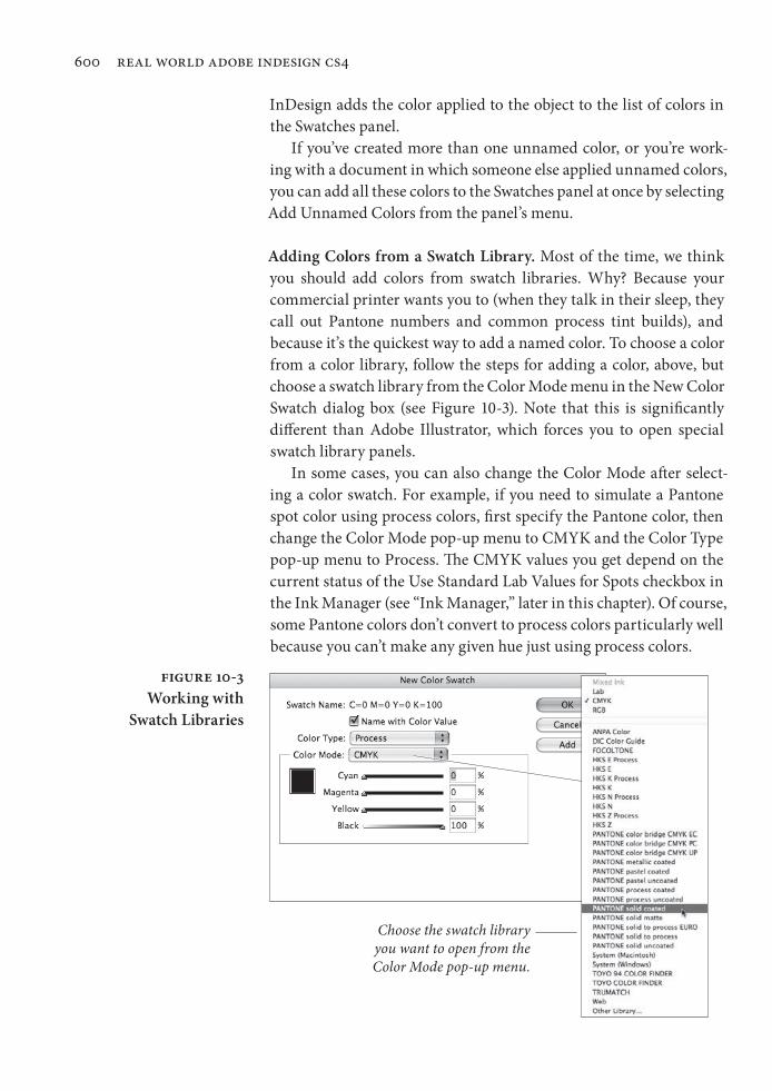
Adding Colors from a Swatch Library. Most of the time, we think you should add colors from swatch libraries. Why? Because your commercial printer wants you to (when they talk in their sleep, they call out Pantone numbers and common process tint builds), and because it’s the quickest way to add a named color. To choose a color from a color library, follow the steps for adding a color, above, but choose a swatch library from the Color Mode menu in the New Color Swatch dialog box (see Figure 10-3). Note that this is significantly different than Adobe Illustrator, which forces you to open special swatch library panels.
In some cases, you can also change the Color Mode after select-ing a color swatch. For example, if you need to simulate a Pantone spot color using process colors, first specify the Pantone color, then change the Color Mode pop-up menu to CMYK and the Color Type pop-up menu to Process. The CMYK values you get depend on the current status of the Use Standard Lab Values for Spots checkbox in the Ink Manager (see “Ink Manager,” later in this chapter). Of course, some Pantone colors don’t convert to process colors particularly well because you can’t make any given hue just using process colors.
Figure 10-3Working with
Swatch Libraries
Choose the swatch library you want to open from the Color Mode pop-up menu.
Real_World_Adobe_InDesign_CS4b.pdf 613Real_World_Adobe_InDesign_CS4b.pdf 613 08/04/2009 05:55:53 p.m.08/04/2009 05:55:53 p.m.
chapter 10. color 601
Adding Swatches from Another InDesign Publication. To add swatches stored in a different InDesign publication, choose Other Library from the Color Mode menu in the New Color Swatch dialog box. InDesign displays the Open a File dialog box. Locate and select an InDesign document, then click the Open button. InDesign dis-plays the swatches defined in that document, and you can add them to the current publication just as you’d add swatches from any swatch library. (This also works for old, pre-8.x Illustrator documents.)
You can also import color swatches from other InDesign files by choosing Load Swatches from the Swatches panel menu. Or, to save individual swatches for use in other documents or Creative Suite applications, select them in the Swatches panel and choose Save Swatches for Exchange from the panel menu. This creates an .ase file which you can load with Load Swatches.
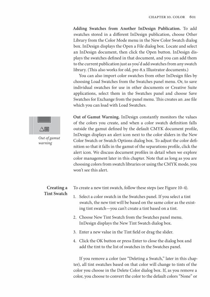
Out of Gamut Warning. InDesign constantly monitors the values of the colors you create, and when a color swatch definition falls outside the gamut defined by the default CMYK document profile, InDesign displays an alert icon next to the color sliders in the New Color Swatch or Swatch Options dialog box. To adjust the color defi-nition so that it falls in the gamut of the separations profile, click the alert icon. We discuss document profiles in detail when we explore color management later in this chapter. Note that as long as you are choosing colors from swatch libraries or using the CMYK mode, you won’t see this alert.
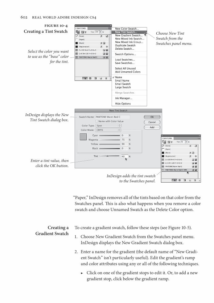
Creating a Tint Swatch
To create a new tint swatch, follow these steps (see Figure 10-4).
1. Select a color swatch in the Swatches panel. If you select a tint swatch, the new tint will be based on the same color as the exist-ing tint swatch—you can’t create a tint based on a tint.
2. Choose New Tint Swatch from the Swatches panel menu. InDesign displays the New Tint Swatch dialog box.
3. Enter a new value in the Tint field or drag the slider.
4. Click the OK button or press Enter to close the dialog box and add the tint to the list of swatches in the Swatches panel.
If you remove a color (see “Deleting a Swatch,” later in this chap-ter), all tint swatches based on that color will change to tints of the color you choose in the Delete Color dialog box. If, as you remove a color, you choose to convert the color to the default colors “None” or
Out of gamut warning
Real_World_Adobe_InDesign_CS4b.pdf 614Real_World_Adobe_InDesign_CS4b.pdf 614 08/04/2009 05:55:53 p.m.08/04/2009 05:55:53 p.m.
602 real world adobe indesign cs4
“Paper,” InDesign removes all of the tints based on that color from the Swatches panel. This is also what happens when you remove a color swatch and choose Unnamed Swatch as the Delete Color option.
Creating a Gradient Swatch
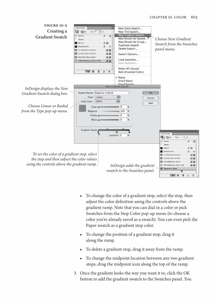
To create a gradient swatch, follow these steps (see Figure 10-5).
1. Choose New Gradient Swatch from the Swatches panel menu. InDesign displays the New Gradient Swatch dialog box.
2. Enter a name for the gradient (the default name of “New Gradi-ent Swatch” isn’t particularly useful). Edit the gradient’s ramp and color attributes using any or all of the following techniques.
▶ Click on one of the gradient stops to edit it. Or, to add a new gradient stop, click below the gradient ramp.
Figure 10-4Creating a Tint Swatch
Select the color you want to use as the “base” color
for the tint.
Choose New Tint Swatch from the Swatches panel menu.
InDesign displays the New Tint Swatch dialog box.
Enter a tint value, then click the OK button.
InDesign adds the tint swatch to the Swatches panel.
Real_World_Adobe_InDesign_CS4b.pdf 615Real_World_Adobe_InDesign_CS4b.pdf 615 08/04/2009 05:55:53 p.m.08/04/2009 05:55:53 p.m.
chapter 10. color 603
▶ To change the color of a gradient stop, select the stop, then adjust the color definition using the controls above the gradient ramp. Note that you can dial in a color or pick Swatches from the Stop Color pop-up menu (to choose a color you’re already saved as a swatch). You can even pick the Paper swatch as a gradient stop color.
▶ To change the position of a gradient stop, drag it along the ramp.
▶ To delete a gradient stop, drag it away from the ramp.
▶ To change the midpoint location between any two gradient stops, drag the midpoint icon along the top of the ramp.
3. Once the gradient looks the way you want it to, click the OK button to add the gradient swatch to the Swatches panel. You
Figure 10-5Creating a
Gradient Swatch Choose New Gradient Swatch from the Swatches panel menu.
InDesign displays the New Gradient Swatch dialog box.
To set the color of a gradient stop, select the stop and then adjust the color values
using the controls above the gradient ramp. InDesign adds the gradient swatch to the Swatches panel.
Choose Linear or Radial from the Type pop-up menu.
Real_World_Adobe_InDesign_CS4b.pdf 616Real_World_Adobe_InDesign_CS4b.pdf 616 08/04/2009 05:55:53 p.m.08/04/2009 05:55:53 p.m.
604 real world adobe indesign cs4
can then apply this gradient to any object (or even text) as easily as applying a color swatch.
You can also build a gradient swatch directly within the Gradient panel by dragging swatches from the Color or Swatches panel on top of the gradient bar (or on top of gradient stops). When you’re done with designing the blend, drag the preview swatch from the Gradient panel into the Swatches panel.
Also, once you’ve created a gradient swatch and applied it to an object on your page, you can fine-tune that object’s gradient using the Gradient panel—reversing the order of the blend, dragging the gradient stops, and so on. Most importantly, the Gradient panel is where you can adjust a blend’s angle. (Unfortunately, gradient angle can’t be built in to a gradient swatch; you have to change that manu-ally for each object or use an object style.)
Note that you cannot assign transparency (opacity) to a gradient stop, as you can in Illustrator. Instead, you must use the Gradient Feather effect. We hope this changes in the next version.
Mixed Ink Swatches If you can overlay two tints of process colors to create a third color, it stands to reason that you can do the same thing with spot colors. InDesign’s Mixed Ink Swatch feature helps considerably, because it lets you build a single color based on varying percentages of other colors in your Swatches panel. However, there are some issues you need to think about when mixing spot colors (also called “tint builds” or “multi-ink colors”).
▶ Most spot colors are made with inks that have a different con-sistency than process-color inks; the more opaque the inks, the harder it is to mix varying tints of them on a page.
▶ Some inks don’t tint well; for instance, metallic and flourescent inks lose much of their special appearance unless you use a very coarse halftone.
▶ There’s only one spot-color swatch book that shows what hap-pens when you mix colors together (the Pantone Two-Color Selector), and while it’s extensive, it certainly doesn’t show every combination of every spot color on the market. Therefore, there’s often a lot more guessing involved when you mix spot colors.
Discuss multi-ink colors with your printer before jumping in and using them. Ask them if it’ll be okay to mix two particular colors on press. Perhaps they’ll make a “draw-down” for you so you can see how the colors will look when they’re mixed together (though
Real_World_Adobe_InDesign_CS4b.pdf 617Real_World_Adobe_InDesign_CS4b.pdf 617 08/04/2009 05:55:53 p.m.08/04/2009 05:55:53 p.m.
chapter 10. color 605
this only shows you what the colors will look like when they’re over-printed at 100 percent).
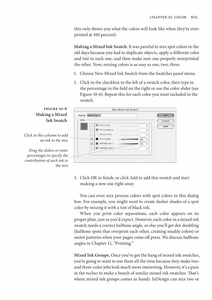
Making a Mixed Ink Swatch. It was painful to mix spot colors in the old days because you had to duplicate objects, apply a different color and tint to each one, and then make sure one properly overprinted the other. Now, mixing colors is as easy as one, two, three.
1. Choose New Mixed Ink Swatch from the Swatches panel menu.
2. Click in the checkbox to the left of a swatch color, then type in the percentage in the field on the right or use the color slider (see Figure 10-6). Repeat this for each color you want included in the swatch.
Figure 10-6Making a Mixed
Ink Swatch
Click in this column to add an ink to the mix
Drag the sliders or enter percentages to specify the
contribution of each ink to the mix
3. Click OK to finish, or click Add to add this swatch and start making a new one right away.
You can even mix process colors with spot colors in this dialog box. For example, you might want to create darker shades of a spot color by mixing it with a tint of black ink.
When you print color separations, each color appears on its proper plate, just as you’d expect. However, each color in a mixed ink swatch needs a correct halftone angle, or else you’ll get dot-doubling (halftone spots that overprint each other, creating muddy colors) or moiré patterns when your pages come off press. We discuss halftone angles in Chapter 11, “Printing.”
Mixed Ink Groups. Once you’ve got the hang of mixed ink swatches, you’re going to want to use them all the time because they make two- and three-color jobs look much more interesting. However, it’s a pain in the tuchus to make a bunch of similar mixed ink swatches. That’s where mixed ink groups comes in handy. InDesign can mix two or
Real_World_Adobe_InDesign_CS4b.pdf 618Real_World_Adobe_InDesign_CS4b.pdf 618 08/04/2009 05:55:53 p.m.08/04/2009 05:55:53 p.m.
606 real world adobe indesign cs4
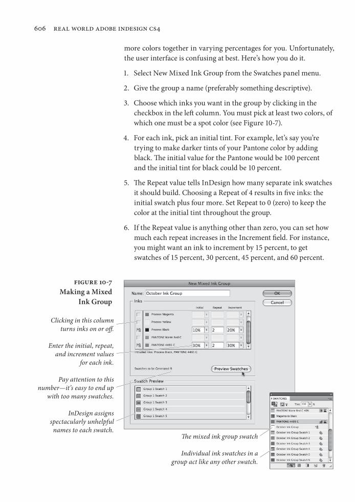
more colors together in varying percentages for you. Unfortunately, the user interface is confusing at best. Here’s how you do it.
1. Select New Mixed Ink Group from the Swatches panel menu.
2. Give the group a name (preferably something descriptive).
3. Choose which inks you want in the group by clicking in the checkbox in the left column. You must pick at least two colors, of which one must be a spot color (see Figure 10-7).
4. For each ink, pick an initial tint. For example, let’s say you’re trying to make darker tints of your Pantone color by adding black. The initial value for the Pantone would be 100 percent and the initial tint for black could be 10 percent.
5. The Repeat value tells InDesign how many separate ink swatches it should build. Choosing a Repeat of 4 results in five inks: the initial swatch plus four more. Set Repeat to 0 (zero) to keep the color at the initial tint throughout the group.
6. If the Repeat value is anything other than zero, you can set how much each repeat increases in the Increment field. For instance, you might want an ink to increment by 15 percent, to get swatches of 15 percent, 30 percent, 45 percent, and 60 percent.
Figure 10-7Making a Mixed
Ink Group
InDesign assigns spectacularly unhelpful names to each swatch.
The mixed ink group swatch
Individual ink swatches in a group act like any other swatch.
Pay attention to this number—it’s easy to end up
with too many swatches.
Clicking in this column turns inks on or off.
Enter the initial, repeat, and increment values
for each ink.
Real_World_Adobe_InDesign_CS4b.pdf 619Real_World_Adobe_InDesign_CS4b.pdf 619 08/04/2009 05:55:54 p.m.08/04/2009 05:55:54 p.m.
chapter 10. color 607
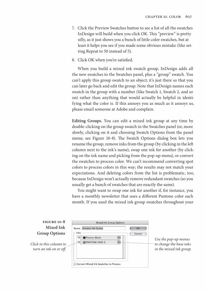
7. Click the Preview Swatches button to see a list of all the swatches InDesign will build when you click OK. This “preview” is pretty silly, as it just shows you a bunch of little color swatches, but at least it helps you see if you made some obvious mistake (like set-ting Repeat to 50 instead of 5).
8. Click OK when you’re satisfied.
When you build a mixed ink swatch group, InDesign adds all the new swatches to the Swatches panel, plus a “group” swatch. You can’t apply this group swatch to an object; it’s just there so that you can later go back and edit the group. Note that InDesign names each swatch in the group with a number (like Swatch 1, Swatch 2, and so on) rather than anything that would actually be helpful in identi-fying what the color is. If this annoys you as much as it annoys us, please email someone at Adobe and complain.
Editing Groups. You can edit a mixed ink group at any time by double-clicking on the group swatch in the Swatches panel (or, more slowly, clicking on it and choosing Swatch Options from the panel menu; see Figure 10-8). The Swatch Options dialog box lets you rename the group, remove inks from the group (by clicking in the left column next to the ink ’s name), swap one ink for another (by click-ing on the ink name and picking from the pop-up menu), or convert the swatches to process color. We can’t recommend converting spot colors to process colors in this way; the results may not match your expectations. And deleting colors from the list is problematic, too, because InDesign won’t actually remove redundant swatches (so you usually get a bunch of swatches that are exactly the same).
You might want to swap one ink for another if, for instance, you have a monthly newsletter that uses a different Pantone color each month. If you used the mixed ink group swatches throughout your
Figure 10-8Mixed Ink
Group Options
Click in this column to turn an ink on or off.
Use the pop-up menus to change the base inks in the mixed ink group.
Real_World_Adobe_InDesign_CS4b.pdf 620Real_World_Adobe_InDesign_CS4b.pdf 620 08/04/2009 05:55:54 p.m.08/04/2009 05:55:54 p.m.
608 real world adobe indesign cs4
document, you’d simply need to change the ink in the group and the whole file’s colors would change in one fell swoop.
Process Color Groups. Earlier, we noted that you must have one spot color in your mixed ink group. Fortunately, there’s always a work-around. Let’s say you just want various process-color green swatches. You could make a mixed ink group with cyan, yellow, and a spot color—but leave both the Initial and Repeat fields for the spot color set to 0 (zero). Then, after clicking OK, you could double-click on the group swatch and delete the spot color. This converts all the swatches to normal process-color color swatches. (But there’s no way to make this a group again, other than the normal Undo feature.)
Managing Swatches Once you’ve built up an armory of color, tint, gradient, and mixed ink swatches, you need to know how best to manage them.
Changing the order of the swatches in the Swatches panel. You can change the order in which colors appear in the Swatches panel by dragging them up or down in the panel. This can be handy when you’ve got a long list of colors and want to position frequently used colors near the top of the panel. (Be careful to deselect all objects before playing in this panel or you may apply colors accidentally.)
Editing a Swatch. To edit a swatch, do one of the following:
▶ Double-click the swatch in the Swatches panel. (We don’t use this shortcut because the first click applies the swatch to the fill or stroke of any object we’ve selected, or applies the swatch to the default fill or stroke if no object is selected.)
▶ Select a swatch in the Swatches panel, then choose Swatch Options from the Swatches panel menu. Again, this method applies the swatch to the selection or to the document defaults, so we tend to avoid it.
▶ Right-click (or Control-click with a one-button mouse) on a swatch and choose Swatch Options to open the swatch for edit-ing. We always use this method, as it does not apply the swatch to the selection or to the document default fill or stroke.
After any of the above actions, InDesign displays the dialog box appropriate to the type of swatch you clicked (the Edit Color Swatch, Edit Tint Swatch, or Edit Gradient Swatch dialog box). Make changes to the swatch definition, then click the OK button to close the dialog
Real_World_Adobe_InDesign_CS4b.pdf 621Real_World_Adobe_InDesign_CS4b.pdf 621 08/04/2009 05:55:54 p.m.08/04/2009 05:55:54 p.m.
chapter 10. color 609
box. InDesign updates the appearance of all the objects formatted using the swatch.
Note that if you’re looking for a different shade of the same basic CMYK color, you can hold down the Shift key while dragging one of the sliders. This moves the other sliders at the same time to achieve a lighter version of the same hue.
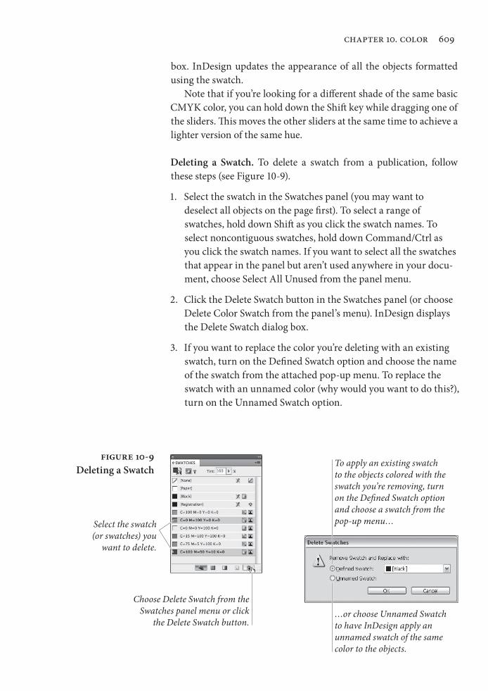
Deleting a Swatch. To delete a swatch from a publication, follow these steps (see Figure 10-9).
1. Select the swatch in the Swatches panel (you may want to de select all objects on the page first). To select a range of swatches, hold down Shift as you click the swatch names. To select noncontiguous swatches, hold down Command/Ctrl as you click the swatch names. If you want to select all the swatches that appear in the panel but aren’t used anywhere in your docu-ment, choose Select All Unused from the panel menu.
2. Click the Delete Swatch button in the Swatches panel (or choose Delete Color Swatch from the panel’s menu). InDesign displays the Delete Swatch dialog box.
3. If you want to replace the color you’re deleting with an existing swatch, turn on the Defined Swatch option and choose the name of the swatch from the attached pop-up menu. To replace the swatch with an unnamed color (why would you want to do this?), turn on the Unnamed Swatch option.
Figure 10-9Deleting a Swatch
Select the swatch (or swatches) you
want to delete.
Choose Delete Swatch from the Swatches panel menu or click
the Delete Swatch button.
To apply an existing swatch to the objects colored with the swatch you’re removing, turn on the Defined Swatch option and choose a swatch from the pop-up menu…
…or choose Unnamed Swatch to have InDesign apply an unnamed swatch of the same color to the objects.
Real_World_Adobe_InDesign_CS4b.pdf 622Real_World_Adobe_InDesign_CS4b.pdf 622 08/04/2009 05:55:54 p.m.08/04/2009 05:55:54 p.m.
610 real world adobe indesign cs4
4. Click the OK button. InDesign deletes the swatch and applies the replacement swatch (if you selected the Defined Swatch option) or an unnamed color (if you selected the Unnamed Swatch option) to all of the objects formatted using the swatch you’re deleting.
As we noted earlier, when you remove a swatch that you’ve used as a basis for tint swatches, InDesign bases the tint swatches on the color you specified (if you selected the Defined Swatch option), or just deletes the tint swatch if you choose Unnamed Swatch, Paper, or None.
Merging Swatches. The folks at Adobe threw a rather confusing little feature into InDesign called Merge Swatches. The idea is simple: Take two or more swatches in the Swatches panel, merge them together into a single swatch, and delete the others. The problem is few people ever figure out how it works.
The key is that the first swatch you select will be the one that survives, the one that the other swatches will get merged into. After clicking on one swatch (make sure nothing is selected first, or else this click will apply the color to the selected object), then Command/Ctrl-click on one or more other swatches in the panel. Finally, select Merge Swatches from the Swatches panel menu. We find this helpful only when you’ve got a lot of swatches you want to merge together; for one or two, we usually just use Delete Swatch.
Duplicating Swatches. If you want to base a swatch on an existing swatch, select the swatch in the Swatches panel and then choose Duplicate Swatch from the panel’s menu. (You can also click the New Swatch button in the Swatches panel, but that also applies the dupli-cate to any selected objects.) InDesign creates a copy of the swatch and assigns it a name (the default name is the name of the original swatch plus the word “copy”). Now, you can edit the swatch by right-clicking (or Control-clicking with a one-button mouse) on it.
The Color Panel and the Color Picker
Given that we’ve already stated that you should use the Swatches panel instead of the Color panel, you might wonder why we’re both-ering to write this section. Over the years, we’ve come to realize that our methods are not necessarily for everyone, and that some people have very different working habits from our own. For some of you,
Real_World_Adobe_InDesign_CS4b.pdf 623Real_World_Adobe_InDesign_CS4b.pdf 623 08/04/2009 05:55:54 p.m.08/04/2009 05:55:54 p.m.
chapter 10. color 611
working with the Color panel and unnamed colors might be better than the process of creating named swatches—and there’s nothing wrong with that.
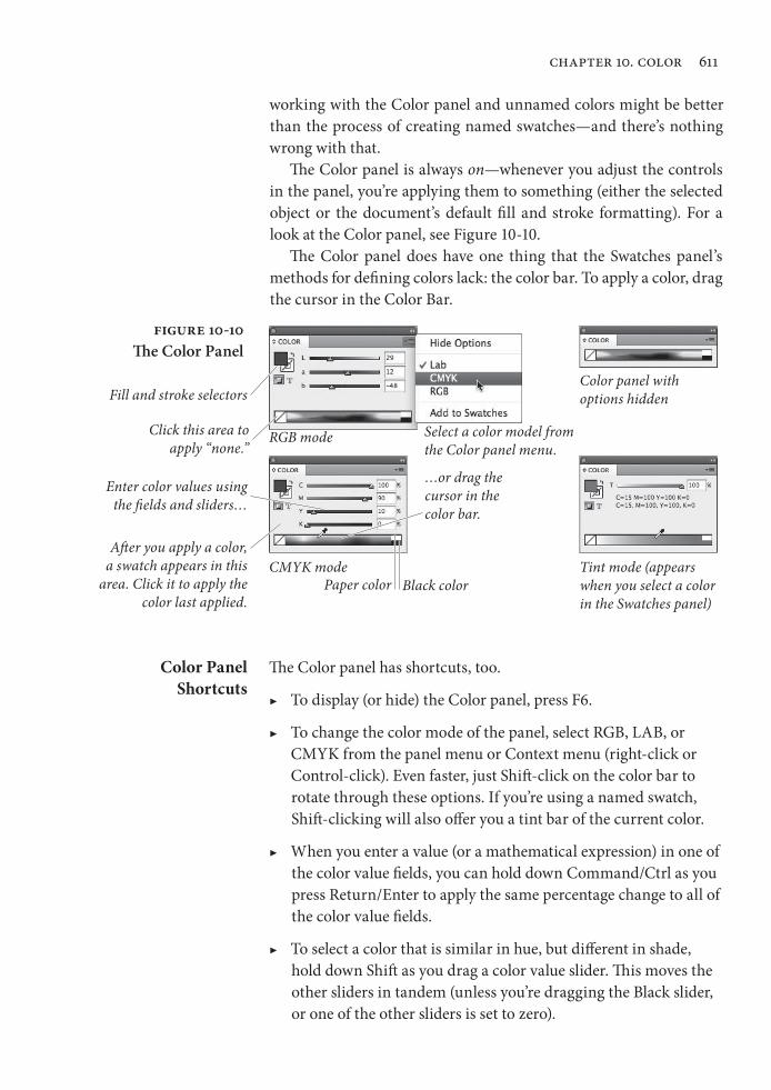
The Color panel is always on—whenever you adjust the controls in the panel, you’re applying them to something (either the selected object or the document’s default fill and stroke formatting). For a look at the Color panel, see Figure 10-10.
The Color panel does have one thing that the Swatches panel’s methods for defining colors lack: the color bar. To apply a color, drag the cursor in the Color Bar.
Figure 10-10The Color Panel
Select a color model from the Color panel menu.
Color panel with options hidden
RGB mode
CMYK mode Tint mode (appears when you select a color in the Swatches panel)
Fill and stroke selectors
Click this area to apply “none.”
Paper color Black color
Enter color values using the fields and sliders…
…or drag the cursor in the color bar.
After you apply a color, a swatch appears in this
area. Click it to apply the color last applied.
Color Panel Shortcuts
The Color panel has shortcuts, too.
▶ To display (or hide) the Color panel, press F6.
▶ To change the color mode of the panel, select RGB, LAB, or CMYK from the panel menu or Context menu (right-click or Control-click). Even faster, just Shift-click on the color bar to rotate through these options. If you’re using a named swatch, Shift-clicking will also offer you a tint bar of the current color.
▶ When you enter a value (or a mathematical expression) in one of the color value fields, you can hold down Command/Ctrl as you press Return/Enter to apply the same percentage change to all of the color value fields.
▶ To select a color that is similar in hue, but different in shade, hold down Shift as you drag a color value slider. This moves the other sliders in tandem (unless you’re dragging the Black slider, or one of the other sliders is set to zero).
Real_World_Adobe_InDesign_CS4b.pdf 624Real_World_Adobe_InDesign_CS4b.pdf 624 08/04/2009 05:55:54 p.m.08/04/2009 05:55:54 p.m.
612 real world adobe indesign cs4
Out-of-Gamut Warning. The out-of-gamut warning also appears in the Color panel, too, when a color swatch definition falls outside the gamut defined by the default CMYK document profile. To adjust the color definition so that it falls in the gamut of the separations profile, click the alert icon. (See “Color Management,” later in this chapter.) Note that as long as you are choosing colors in the CMYK mode, you won’t see this alert (because they’re all in gamut, by default). Also, note that you won’t see this icon when you’ve chosen Hide Options from the panel menu.
You can also choose an unnamed color or create a color swatch with the Color Picker dialog box (double-click on the fill or stroke icons at the bottom of the Tool panel). The Color Picker is a sad and pathetic attempt at providing a Photoshop-like feature in a page-layout pro-gram. We don’t use it. However, if you are going to use it, there is one thing you need to know: The kind of swatch you get depends on where the text cursor is flashing in the dialog box. If you want a CMYK swatch, click in one of the CMYK number fields first.
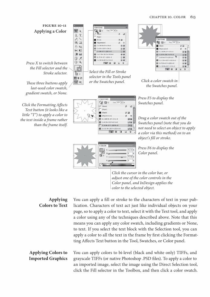
Applying Colors and Gradients
Once you’ve selected an object, you can use any (or all) of the fol-lowing techniques to apply a color, tint, or gradient to the object (see Figure 10-11).
▶ Click one of the selectors (Fill or Stroke) at the bottom of the Toolbox or in the Swatches panel, then click a color in the Swatches panel.
▶ Click the Fill selector or the Stroke selector, then click the Apply Color button, Apply Gradient button, Apply None button, swap fill and stroke icon, or the default fill and stroke icon. Or press any of the keyboard shortcuts corresponding to the buttons (comma, period, slash, Shift-X, or D, respectively).
▶ Select an object, then adjust any of the controls in the Color panel or open the Color Picker and choose from there.
▶ Drag a color swatch out of the Swatches panel and drop it on the fill or stroke of an object. You don’t have to select the object on the page first.
▶ Use the Eyedropper tool to pick a color from an existing object, then click on another object to apply that color to it.
The Color Picker
Real_World_Adobe_InDesign_CS4b.pdf 625Real_World_Adobe_InDesign_CS4b.pdf 625 08/04/2009 05:55:54 p.m.08/04/2009 05:55:54 p.m.
chapter 10. color 613
Applying Colors to Text
You can apply a fill or stroke to the characters of text in your pub-lication. Characters of text act just like individual objects on your page, so to apply a color to text, select it with the Text tool, and apply a color using any of the techniques described above. Note that this means you can apply any color swatch, including gradients or None, to text. If you select the text block with the Selection tool, you can apply a color to all the text in the frame by first clicking the Format-ting Affects Text button in the Tool, Swatches, or Color panel.
Applying Colors to Imported Graphics
You can apply colors to bi-level (black and white only) TIFFs, and grayscale TIFFs (or native Photoshop .PSD files). To apply a color to an imported image, select the image using the Direct Selection tool, click the Fill selector in the Toolbox, and then click a color swatch.
Figure 10-11Applying a Color
Select the Fill or Stroke selector in the Tools panel or the Swatches panel. Click a color swatch in
the Swatches panel.
Press X to switch between the Fill selector and the
Stroke selector.
Drag a color swatch out of the Swatches panel (note that you do not need to select an object to apply a color via this method) on to an object’s fill or stroke.
Click the cursor in the color bar, or adjust one of the color controls in the Color panel, and InDesign applies the color to the selected object.
These three buttons apply last-used color swatch,
gradient swatch, or None.
Press F6 to display the Color panel.
Press F5 to display the Swatches panel.Click the Formatting Affects
Text button (it looks like a little “T”) to apply a color to
the text inside a frame rather than the frame itself.
Real_World_Adobe_InDesign_CS4b.pdf 626Real_World_Adobe_InDesign_CS4b.pdf 626 08/04/2009 05:55:55 p.m.08/04/2009 05:55:55 p.m.
614 real world adobe indesign cs4
When you print, InDesign prints the image on the appropriate sepa-ration (for a spot color) or series of plates (for a process color).
Kuler
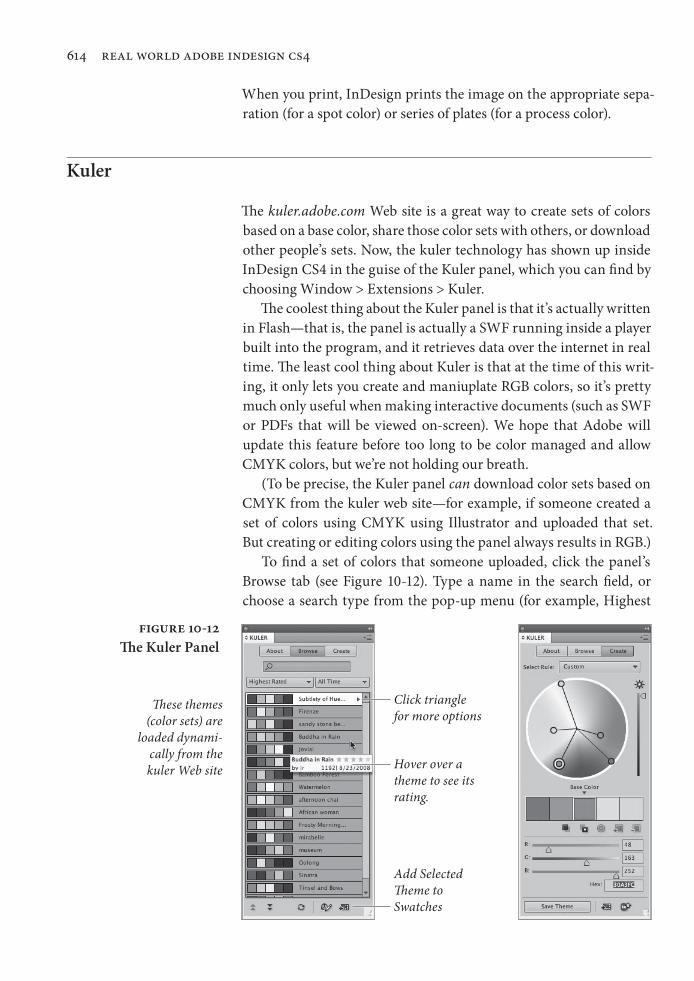
The kuler.adobe.com Web site is a great way to create sets of colors based on a base color, share those color sets with others, or download other people’s sets. Now, the kuler technology has shown up inside InDesign CS4 in the guise of the Kuler panel, which you can find by choosing Window > Extensions > Kuler.
The coolest thing about the Kuler panel is that it’s actually written in Flash—that is, the panel is actually a SWF running inside a player built into the program, and it retrieves data over the internet in real time. The least cool thing about Kuler is that at the time of this writ-ing, it only lets you create and maniuplate RGB colors, so it’s pretty much only useful when making interactive documents (such as SWF or PDFs that will be viewed on-screen). We hope that Adobe will update this feature before too long to be color managed and allow CMYK colors, but we’re not holding our breath.
(To be precise, the Kuler panel can download color sets based on CMYK from the kuler web site—for example, if someone created a set of colors using CMYK using Illustrator and uploaded that set. But creating or editing colors using the panel always results in RGB.)
To find a set of colors that someone uploaded, click the panel’s Browse tab (see Figure 10-12). Type a name in the search field, or choose a search type from the pop-up menu (for example, Highest
Figure 10-12The Kuler Panel
Add Selected Theme to Swatches
Hover over a theme to see its rating.
Click triangle for more options
These themes (color sets) are
loaded dynami-cally from the kuler Web site
Real_World_Adobe_InDesign_CS4b.pdf 627Real_World_Adobe_InDesign_CS4b.pdf 627 08/04/2009 05:55:55 p.m.08/04/2009 05:55:55 p.m.
chapter 10. color 615
Rated or Most Popular.) You can add the color set to the Swatches panel by clicking the Add Selected Theme to Swatches button.
To create your own color sets, or edit sets you have selected in the Browse tab, click the Create tab. To change the colors, drag the color circles, adjust the sliders, or choose a rule from the Select Rule pop-up menu. If you want to create a color theme around a color from your document, set it as the current fill or stroke color, then click the Add Current Fill (or Stroke) Color as Current Base Color button, just above the RGB color sliders.
Ink Manager
One of the most common complaints among prepress service pro-viders is that too many publishers don’t understand the difference between spot and process color inks, and they’re forever creating spot color inks that need to be converted to process color at print time. If you’re one of those service providers, you’re going to love the Ink Manager. And if you’re a designer, the Ink Manager still offers a couple of features that you’ll find really helpful. The Ink Manager does three things.
▶ You can tell the Ink Manager to convert spot colors to process colors at the time of output (but it won’t change the actual color swatch definitions in your document). It also gives you some control over how the colors will be converted.
▶ You can alias one spot color to another, so two (or more) differ-ent spot colors will output onto the same plate.
▶ You can tell InDesign how your inks act so that the program can trap them properly.
We’ll discuss converting and aliasing spot colors here, and hold off on the trapping features until later in this chapter.
The Ink Manager appears in four different places: the Output panel of the Print dialog box, the Swatches panel menu, the Advanced panel of the Export PDF dialog box, and the Advanced panel of the Export EPS dialog box. A change made in any one of these places affects the Ink Manager in all its locations.
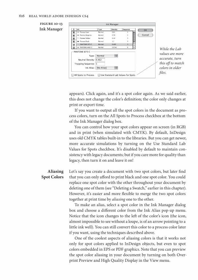
Converting Spot Colors
The Ink Manager dialog box lists the four process colors, plus every spot color in your document, whether or not they’re actually used (see Figure 10-13). When you click in the column to the left of a spot color, the color changes to a process color (the little four-color icon
Real_World_Adobe_InDesign_CS4b.pdf 628Real_World_Adobe_InDesign_CS4b.pdf 628 08/04/2009 05:55:55 p.m.08/04/2009 05:55:55 p.m.
616 real world adobe indesign cs4
appears). Click again, and it’s a spot color again. As we said earlier, this does not change the color’s definition; the color only changes at print or export time.
If you want to output all the spot colors in the document as pro-cess colors, turn on the All Spots to Process checkbox at the bottom of the Ink Manager dialog box.
You can control how your spot colors appear on screen (in RGB) and in print (when simulated with CMYK). By default, InDesign uses old CMYK tables built-in to the libraries. But you can get newer, more accurate simulations by turning on the Use Standard Lab Values for Spots checkbox. It’s disabled by default to maintain con-sistency with legacy documents; but if you care more for quality than legacy, then turn it on and leave it on!
Aliasing Spot Colors
Let’s say you create a document with two spot colors, but later find that you can only afford to print black and one spot color. You could replace one spot color with the other throughout your document by deleting one of them (see “Deleting a Swatch,” earlier in this chapter). However, it’s easier and more flexible to merge the two spot colors together at print time by aliasing one to the other.
To make an alias, select a spot color in the Ink Manager dialog box and choose a different color from the Ink Alias pop-up menu. Notice that the icon changes to the left of the color’s icon (the icon, almost impossible to see without a loupe, is of an arrow pointing to a little ink well). You can still convert this color to a process color later if you want, using the techniques described above.
One of the coolest aspects of aliasing colors is that it works not only for spot colors applied to InDesign objects, but even to spot colors embedded in EPS or PDF graphics. Note that you can preview the spot color aliasing in your document by turning on both Over-print Preview and High Quality Display in the View menu.
Figure 10-13Ink Manager
While the Lab values are more accurate, turn this off to match colors in older files.
Real_World_Adobe_InDesign_CS4b.pdf 629Real_World_Adobe_InDesign_CS4b.pdf 629 08/04/2009 05:55:55 p.m.08/04/2009 05:55:55 p.m.
chapter 10. color 617
Trapping
A “trap” is a method of overlapping abutting colored objects to com-pensate for the imperfect registration of printing presses. Because registration, even on good presses with good operators, can be off by a quarter point or more, abutting elements in your publication may not end up abutting perfectly when the publication is printed by your commercial printer. What happens then? The paper shows through where you don’t want it to.
Do we need to tell you what happens when you take your work to a press that’s badly out of register or run by turkeys? Disaster. Before this happens to you, talk with your commercial printer regarding the tolerances of their presses and/or operators. Don’t ask them if they’re turkeys—it’s considered rude.
In the “good ol’ days” printers handled all your trapping for you. Then came the “bad ol’ days” when designers had to do most of it themselves. The basic method of creating manual traps involves adding additional strokes to objects and then setting those strokes to overprint using the Attributes panel.
But in the past few years, output providers have taken to doing it all “in-RIP”—this is far, far better than you trying to do it yourself.
And, in many cases (especially with digital printing) no trapping may be required anyway. So check with your printer first.
If you find you do need to do some manual trapping, please download this file for more information: http://www.indesignsecrets.com/rwid/trapping.pdf
Color Management
When you aim at a target—and it doesn’t matter whether you’re aiming a rifle, a bow, a laser, or a camera—you have to make adjust-ments. You’ve got to consider the atmospheric conditions, the dis-tance to the target, the characteristics of the target itself. Once you know what the variables are, and how they affect what you’re trying to do, you’ve got a better chance of hitting the bullseye.
The same thing is true in color management. You need to under-stand the tools you have to work with, how they work together (or don’t), and how they combine to produce the colors you see in the printed version of your publication.
It would be nice if we could make what we see on our screen exactly match what we’ll get when we print. But we can’t, for a vari-ety of practical and physiological reasons (not to mention simple lack
Real_World_Adobe_InDesign_CS4b.pdf 630Real_World_Adobe_InDesign_CS4b.pdf 630 08/04/2009 05:55:55 p.m.08/04/2009 05:55:55 p.m.
618 real world adobe indesign cs4
of time and money). That said, we must also add that we can get very close—and we can also make the relationship between the display and the printed piece more consistent and predictable.
The “device” (a printer, scanner, monitor, or printing press) is the key. Every device renders colors in a slightly different way. To adjust color in one environment so that it matches the color as seen in another environment, color management systems refer to a file containing information on the color characteristics of a device (how it displays or prints color). This file is called a “device profile.” Device profiles for scanners and printers are usually created by the manufacturers who make the hardware, though quite a few come with InDesign. You’ve got to make monitor profiles yourself, because every monitor is different (just as several television sets from the same manufacturer can show the same image differently). The pro-cess of creating a device profile is called “characterizing” a device.
Once a device profile has been created for a device, you’ve got to maintain (or “calibrate”) the device so that it doesn’t vary from the profile. Imagesetter operators and commercial printers calibrate their equipment regularly (or should) to match industry standards.
InDesign’s color management system uses device profiles com-patible with the International Color Consortium (ICC) specification. If you’re on the Macintosh, you can also use device profiles provided by Apple with the system-level ColorSync color management system (these profiles are also ICC compatible).
For more on choosing device profiles, see “InDesign’s Color Man-agement Controls,” later in this chapter.
For More Information
Color management is an enormous subject and we can only focus on one aspect of the big picture here: How color management works in InDesign. If any terminology in this section is confusing to you (like gamut, ICC profile, color engines, and rendering intents), we encourage you to go look at two other sources for a truly in-depth look at getting consistent color Real World Photoshop (which David wrote with Bruce Fraser and Conrad Chavez) and Real World Color Management, by Bruce Fraser, Chris Murphy, and Fred Bunting.
Do You Need Color Management?
Everyone wants consistent color from original to screen to proof print to printing press, but it’s worth asking yourself whether you really need it. Managing color is not as simple as turning on a checkbox, and though it’s not as hard as flying an airplane, it can still cause a fair amount of rifling through medicine cabinets trying to ease the pain in your head. You may not need to worry a lot about managing color in InDesign if you can rely on color swatch books when pick-
Real_World_Adobe_InDesign_CS4b.pdf 631Real_World_Adobe_InDesign_CS4b.pdf 631 08/04/2009 05:55:55 p.m.08/04/2009 05:55:55 p.m.
chapter 10. color 619
ing solid colors, and if you can rely on color prepress professionals to deal with your color Photoshop images.
There are other instances when it’s not even worth trying to get InDesign to manage your color. For example, InDesign can’t manage grayscale images or spot colors. Similarly, InDesign isn’t really set up to color-manage vector art when saved as an EPS file (it can do it, but we don’t recommend it). Vector art saved as PDF or native Adobe Illustrator (.ai) files should work reasonably well.
Nevertheless, we must admit that it is particularly satisfying when you work through all the issues and achieve (as close as pos-sible) parity among your screen, inkjet printer, and final press output. Being able to rely on your screen (“soft proofing”) and desktop color printer is a great boost in efficiency, too. Plus, as the world becomes increasingly reliant on direct to plate technologies, bypassing film entirely, color management systems become increasingly important to ensure quality output. And if you want to import RGB images and let InDesign do the color separation for you at print time, you’ll get better results if color management is turned on.
Controlling Your Color-Viewing
Environment
If it’s important to you that what you see on your screen looks as much like the printed version of your publication as possible, there are a few rules you need to follow.
▶ Characterize and calibrate your monitor with a tool like the Datacolor Spyder or X-Rite’s EyeOne. If color is of critical importance to you and your publications, find a system that works with your monitor, or buy a monitor with built-in color management capabilities.
▶ Control the lighting around your monitor and keep it consistent when you’re working. The fluorescent lighting used in most of our office buildings is the worst possible lighting for viewing colors. Turn it off, if you can, and rely on incandescent or “full spectrum” lighting. Avoid glare and bright light if possible.
Why is lighting important? Basically, the temperature of the light affects what a color “objectively” looks like.
Printed Proofs and Swatches
Remember that, unlike the paper you’ll be printing on, your screen is backlit, so it displays colors very differently from what they’ll look like when printed. Therefore, any time you’re working with ink, try to refer to printed samples, rather than looking at the colors on your screen.
Real_World_Adobe_InDesign_CS4b.pdf 632Real_World_Adobe_InDesign_CS4b.pdf 632 08/04/2009 05:55:56 p.m.08/04/2009 05:55:56 p.m.

620 real world adobe indesign cs4
If you’re using uncoated paper, look at samples of the ink (spot color) or ink mix (process color) printed on uncoated stock. If you’re using coated paper, look at examples printed on coated paper. Even better, try to find an example of the ink printed on the paper stock you’re using—though these examples are much harder to find.
Pantone makes a line of swatch books showing their libraries of spot and process colors (including process color equivalents of the spot colors); they’re printed on both coated and uncoated stocks, and, although they’re kind of expensive, they’re not as expensive as pull-ing a job off of a press because you didn’t like the press check. They’re downright cheap if you consider what they must cost to print.
If you’re specifying CMYK colors, use a swatch book printed with process colors that tells you what the CMYK breakdowns are. Our favorite is the one made by Trumatch. You can also find process color books made by Pantone.
Definitely don’t assume that your color inkjet or laser printers will automatically produce an accurate simulation of what the colors in your publication are going to look like when they’re printed by your commercial printer. To do that, you’ll have to do some work—we’ll cover that in more detail later in this chapter.
InDesign’s Color Management Controls
You can control how color appears in InDesign in a number of places. For example, under the Edit menu, you’ll find Color Settings, Assign Profiles, and Convert to Profile. In the View menu, there’s the Proof Colors feature. And the Appearance of Black pane of the Preferences dialog box also lets you manage one color (black).
Application Color Settings
The choices you make in the Color Settings dialog box form the basis for how InDesign displays and prints color (see Figure 10-14). These controls all match the similarly named features in Adobe Photo shop, though the meanings are sometimes subtly different. Note that these controls adjust future documents you create, but not already-created files—not even the currently-open document.
Settings. In a valiant effort to make color management easier, Adobe has created color management “presets” that you can pick in any of the Creative Suite applications. You can pick the same setting in all the applications to get consistent color as you move files from one program to another. (You can automate this by launching Adobe Bridge and then choosing Edit > Creative Suite Color Settings.)
Real_World_Adobe_InDesign_CS4b.pdf 633Real_World_Adobe_InDesign_CS4b.pdf 633 08/04/2009 05:55:56 p.m.08/04/2009 05:55:56 p.m.
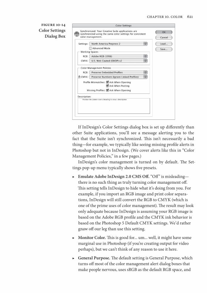
chapter 10. color 621
If InDesign’s Color Settings dialog box is set up differently than other Suite applications, you’ll see a message alerting you to the fact that the Suite isn’t synchronized. This isn’t necessarily a bad thing—for example, we typically like seeing missing profile alerts in Photoshop but not in InDesign. (We cover alerts like this in “Color Management Policies,” in a few pages.)
InDesign’s color management is turned on by default. The Set-tings pop-up menu typically shows five presets.
▶ Emulate Adobe InDesign 2.0 CMS Off. “Off ” is misleading—there is no such thing as truly turning color management off. This setting tells InDesign to hide what it’s doing from you. For example, if you import an RGB image and print color separa-tions, InDesign will still convert the RGB to CMYK (which is one of the prime uses of color management). The result may look only adequate because InDesign is assuming your RGB image is based on the Adobe RGB profile and the CMYK ink behavior is based on the Photoshop 5 Default CMYK settings. We’d rather gnaw off our leg than use this setting.
▶ Monitor Color. This is good for... um... well, it might have some marginal use in Photoshop (if you’re creating output for video perhaps), but we can’t think of any reason to use it here.
▶ General Purpose. The default setting is General Purpose, which turns off most of the color management alert dialog boxes that make people nervous, uses sRGB as the default RGB space, and
Figure 10-14Color Settings
Dialog Box
Real_World_Adobe_InDesign_CS4b.pdf 634Real_World_Adobe_InDesign_CS4b.pdf 634 08/04/2009 05:55:56 p.m.08/04/2009 05:55:56 p.m.
622 real world adobe indesign cs4
uses U.S. Web Coated SWOP for the default CMYK space (or Fogra or Japan Color in Europe or Asia). This is probably the best setting for most InDesign users.
▶ Prepress. It’s tempting to choose North American Prepress 2 (or Europe Prepress 2 or Japan Prepress 2, depending on where you’re reading this) if you’re aiming for a printing press. This uses the same CMYK default, but standardizes on the Adobe RGB model for RGB colors. While we do like this for Photoshop image editing (because it encompasses a spectrum of colors better suited for print than sRGB), it’s both unnecessary and often misleading or incorrect in InDesign.
▶ Web/Internet. If virtually all your pages are destined for the Web, you might choose the Web/Internet preset. It uses the sRGB workspace for RGB colors (it even forces non-sRGB images to convert to sRGB), but that’s appropriate for Web files.
Again, these are only defaults—not necessarily what you’ll use for your documents. If you have a custom CMYK profile for a project, you can use that for your document instead (see “Changing Docu-ment Spaces,” later in this chapter).
Note that you can also save your Color Settings dialog box setup by clicking Save. If you save it in the location that InDesign offers, you’ll find it in the Settings pop-up menu in the future. Plus, you can use that setting in all your other Creative Suite applications, too.
Working Spaces. Perhaps the most important features of the Color Settings dialog box are the two Working Spaces pop-up menus, which control InDesign’s default color profiles for RGB and CMYK colors. Remember that an RGB value doesn’t mean anything because red, green, and blue phosphors are different on different devices. Cyan, magenta, yellow, and black inks can also be radically different depending on ink manufacturer, paper stock, press conditions, and so on. So RGB and CMYK colors are all just a bunch of numbers. Profiles assign color meaning to the numbers: such-and-such CMYK value on this particular device.
The profiles you choose from the CMYK and RGB pop-up menus are the profiles InDesign will use for any swatches you create in InDesign, and for any imported graphics that did not include a color management profile (and that you have not applied a profile to using the Image Color Settings dialog box). Also, as we’ll point out in the discussion below about color policies, the default CMYK profile is also used for imported CMYK images—even those that have their
Real_World_Adobe_InDesign_CS4b.pdf 635Real_World_Adobe_InDesign_CS4b.pdf 635 08/04/2009 05:55:56 p.m.08/04/2009 05:55:56 p.m.

chapter 10. color 623
own profile—when you choose the Preserve Numbers option (which you probably will).
We generally recommend using sRGB for the RGB working space rather than something like Adobe RGB. The reason: the RGB work-ing space is applied to RGB images that have no embedded profile, and if an image has no profile, it was probably pulled off a Web site or shot with a cheap camera—in both those cases, sRGB is the safest assumption.
The choice of a CMYK working space depends entirely on your print workflow. In a perfect world, you’d have a color profile for your particular printing press or output device, with your particular paper stock, and so on. But in reality, you can typically get away with pick-ing a generic target profile. The best target profile is probably Coated GRACoL when printing on a sheetfed press, or Web Coated Stock 2006 Grade 3 Paper (or Grade 5 Paper) when printing on a Web press. (“Web” here refers to a Web press, as opposed to a sheetfed press, and has nothing to do with the World Wide Web.)
Other “middle of the road” targets include Europe ISO Fogra27 (which David erroneously pronounces fois gras) and the well-used-but-pretty-mediocre U.S. Web Coated SWOP v2.
If you’re looking for a particular profile that you know you’ve installed in the operating system correctly, but doesn’t appear here, try turning on the Advanced checkbox (see “Advanced Color Set-tings,” later in this section).
Color Management Policies. InDesign assigns the default working spaces to each new document you create while color management is on. But what should InDesign do when color management is turned on and you open a document that was created when color manage-ment was turned off (so no profile was associated with the docu-ment)? What if you open a document made by someone else who used a different working space? You can tell InDesign what to do in these cases with the Color Management Policies section of the Color Settings dialog box.
Perhaps more importantly, the Policies section also manages what happens to images that you import, which has huge implica-tions over how they appear in print.
▶ RGB. We suggest leaving the RGB pop-up menu set to its default value (Preserve Embedded Profiles) most of the time. This means InDesign will keep track of embedded profiles in RGB images and InDesign documents that contain RGB colors—very useful if you receive RGB images or files from other people.
Real_World_Adobe_InDesign_CS4b.pdf 636Real_World_Adobe_InDesign_CS4b.pdf 636 08/04/2009 05:55:56 p.m.08/04/2009 05:55:56 p.m.
624 real world adobe indesign cs4
We can’t think of any reason to set RGB to Off (which would simply ignore all profiles and stop InDesign from embedding an RGB profile in the document, causing untold horrors when it comes to getting any sort of color consistency). However, choos-ing Convert to Working Space could be useful on occassion, if you knew you had to open 50 InDesign documents that had simply been created with the wrong RGB profile. But watch out:
Any RGB colors you created in the InDesign document will look the same, but the actual RGB numbers will likely change upon conversion.
▶ CMYK. The choice for the CMYK policy is not so cut and dry. Most people will want to use Preserve Numbers (Ignore Embedded Profile), but if you’re serious about color manage-ment you may want to choose Preserve Embedded Profile. The first choice (Preserve Numbers) tells InDesign to use the current CMYK document profile as the profile for all your CMYK colors and imported CMYK images. For example, let’s say you make a 100-percent cyan in a CMYK TIFF that uses some wacky custom CMYK profile, then you import that into your InDesign document that uses the default SWOP profile. InDesign ignores the wacky profile entirely and just assumes that the image uses SWOP. You can override this (see “Applying Device Profiles to Images,” later in this chapter), but you wouldn’t want to have to do that very often.
Even though Preserve Numbers (Ignore Embedded Pro-file) sort of defeats the greater purpose of color management, it tends to be the choice we recommend—especially when all your incoming CMYK images are created with the same profile (which is often the case).
On the other hand, if you receive CMYK images that have embedded CMYK profiles from a number of sources, you’re pretty sure that the sources each used different CMYK profiles, and you need to make sure they all look good when you print or export PDF, you’ll want to use Preserve Embedded Profile. This tells InDesign to keep their appearance consistent with the originals (how they looked in Photoshop, for example), even if it means changing the CMYK numbers to accomplish that. For example, that 100-percent cyan swatch might change to 95-per-cent cyan plus 5-percent magenta.
Again, we urge people not to set the CMYK policy to Off, as it will likely only cause you heartache down the road. (If you’re
Real_World_Adobe_InDesign_CS4b.pdf 637Real_World_Adobe_InDesign_CS4b.pdf 637 08/04/2009 05:55:56 p.m.08/04/2009 05:55:56 p.m.
chapter 10. color 625
frustrated with your previous experiences with color manage-ment, choose Preserve Numbers rather than Off.)
Unless you’re obsessive about color management, we recommend turning off the two Profile Mismatch checkboxes, and leaving on the Missing Profiles checkbox in the Color Management Policies section. The mismatch warnings you get tend to be confusing, misleading, and annoying. But having a document with no profiles at all could cause even more trouble, so it’s good to be alerted in that situation.
Advanced Color Settings
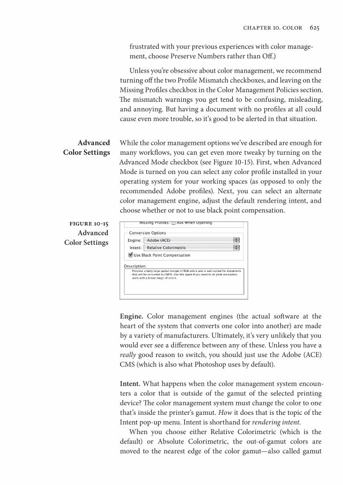
While the color management options we’ve described are enough for many workflows, you can get even more tweaky by turning on the
Advanced Mode checkbox (see Figure 10-15). First, when Advanced Mode is turned on you can select any color profile installed in your operating system for your working spaces (as opposed to only the recommended Adobe profiles). Next, you can select an alternate color management engine, adjust the default rendering intent, and choose whether or not to use black point compensation.
Figure 10-15Advanced
Color Settings
Engine. Color management engines (the actual software at the heart of the system that converts one color into another) are made by a variety of manufacturers. Ultimately, it’s very unlikely that you would ever see a difference between any of these. Unless you have a really good reason to switch, you should just use the Adobe (ACE) CMS (which is also what Photoshop uses by default).
Intent. What happens when the color management system encoun-ters a color that is outside of the gamut of the selected printing device? The color management system must change the color to one that’s inside the printer’s gamut. How it does that is the topic of the Intent pop-up menu. Intent is shorthand for rendering intent.
When you choose either Relative Colorimetric (which is the default) or Absolute Colorimetric, the out-of-gamut colors are moved to the nearest edge of the color gamut—also called gamut
Real_World_Adobe_InDesign_CS4b.pdf 638Real_World_Adobe_InDesign_CS4b.pdf 638 08/04/2009 05:55:56 p.m.08/04/2009 05:55:56 p.m.
626 real world adobe indesign cs4
clipping—which means that differences between out-of-gamut colors can disappear (very red and very, very red both become the same in-gamut CMYK red). When this happens, you’ll see an effect similar to posterization in the more saturated areas of images. The Perceptual rendering intent squeezes all the document’s colors so that out-of-gamut colors are brought into the color gamut in a way that maintains a distinction between the colors. The Saturation ren-dering intent, on the other hand, moves all colors toward the edge of the color gamut, resulting in more saturated color.
In general, Relative Colorimetric is best for solid colors and syn-thetic images (like images made in Illustrator or FreeHand), and Per-ceptual is best for scanned images. Unfortunately, InDesign uses this rendering intent both for colors built in InDesign and for imported images (unless you specifically override it, which we discuss in
“Applying Device Profiles to Images,” below). However, for most documents and images—especially those already in CMYK mode—Relative Colorimetric probably makes the most sense. On the other hand, if you use a lot of RGB images with saturated out-of-gamut colors, and you’re trying to match these colors with swatches built in InDesign, you might want to use Perceptual instead. If you want more intense color in business graphics (such as charts and graphs), you might try choosing Saturation.
Use Black Point Compensation. The Use Black Point Compensation option, when turned on, maps the black of the source profile to the black of the target profile. We usually think of black as being “ just black,” but of course black on different devices appears differently (for instance, solid black on newsprint is much more gray than solid black on glossy sheetfed stock). We generally recommend leaving this turned on, ensuring that the entire dynamic range of the output device is used.
Changing Document Spaces
By default the document working space is whatever Color Settings was set to when you first created the document. If you later change Color Settings, the application’s default working space will be differ-ent than your document’s space; that’s no big deal because InDesign always uses the document space if there is one.
What if you want to change the document working space? For example, you thought you were going to print on coated stock but later found you had to cut your budget and switch to uncoated stock? You can add or change a document’s working space profiles using the Assign Profiles and the Convert to Profile features in the Edit menu.
Real_World_Adobe_InDesign_CS4b.pdf 639Real_World_Adobe_InDesign_CS4b.pdf 639 08/04/2009 05:55:57 p.m.08/04/2009 05:55:57 p.m.
chapter 10. color 627
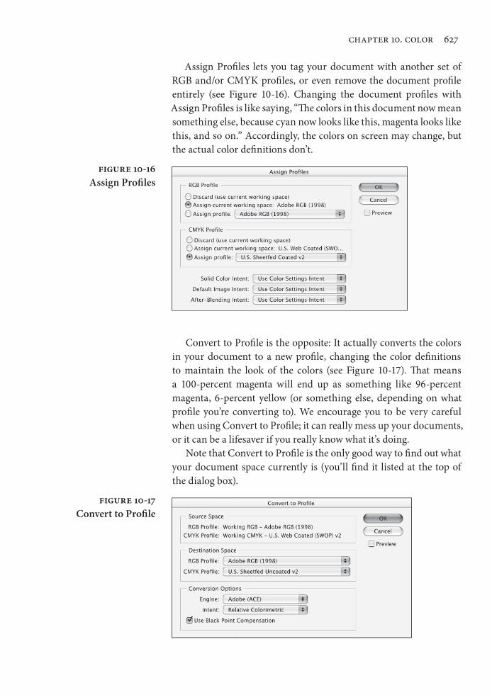
Assign Profiles lets you tag your document with another set of RGB and/or CMYK profiles, or even remove the document profile entirely (see Figure 10-16). Changing the document profiles with
Assign Profiles is like saying, “The colors in this document now mean something else, because cyan now looks like this, magenta looks like this, and so on.” Accordingly, the colors on screen may change, but the actual color definitions don’t.
Figure 10-16Assign Profiles
Figure 10-17Convert to Profile
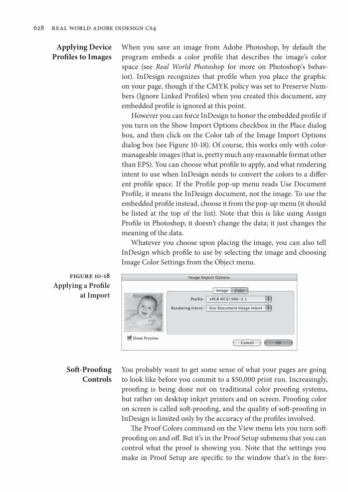
Convert to Profile is the opposite: It actually converts the colors in your document to a new profile, changing the color definitions to maintain the look of the colors (see Figure 10-17). That means a 100-percent magenta will end up as something like 96-percent magenta, 6-percent yellow (or something else, depending on what profile you’re converting to). We encourage you to be very careful when using Convert to Profile; it can really mess up your documents, or it can be a lifesaver if you really know what it’s doing.
Note that Convert to Profile is the only good way to find out what your document space currently is (you’ll find it listed at the top of the dialog box).
Real_World_Adobe_InDesign_CS4b.pdf 640Real_World_Adobe_InDesign_CS4b.pdf 640 08/04/2009 05:55:57 p.m.08/04/2009 05:55:57 p.m.
628 real world adobe indesign cs4
Applying Device Profiles to Images
When you save an image from Adobe Photoshop, by default the program embeds a color profile that describes the image’s color space (see Real World Photoshop for more on Photoshop’s behav-ior). InDesign recognizes that profile when you place the graphic on your page, though if the CMYK policy was set to Preserve Num-bers (Ignore Linked Profiles) when you created this document, any embedded profile is ignored at this point.
However you can force InDesign to honor the embedded profile if you turn on the Show Import Options checkbox in the Place dialog box, and then click on the Color tab of the Image Import Options dialog box (see Figure 10-18). Of course, this works only with color-manageable images (that is, pretty much any reasonable format other than EPS). You can choose what profile to apply, and what rendering intent to use when InDesign needs to convert the colors to a differ-ent profile space. If the Profile pop-up menu reads Use Document Profile, it means the InDesign document, not the image. To use the embedded profile instead, choose it from the pop-up menu (it should be listed at the top of the list). Note that this is like using Assign Profile in Photoshop; it doesn’t change the data; it just changes the meaning of the data.
Whatever you choose upon placing the image, you can also tell InDesign which profile to use by selecting the image and choosing Image Color Settings from the Object menu.
Figure 10-18Applying a Profile
at Import
Soft-Proofing Controls
You probably want to get some sense of what your pages are going to look like before you commit to a $50,000 print run. Increasingly, proofing is being done not on traditional color proofing systems, but rather on desktop inkjet printers and on screen. Proofing color on screen is called soft-proofing, and the quality of soft-proofing in InDesign is limited only by the accuracy of the profiles involved.
The Proof Colors command on the View menu lets you turn soft-proofing on and off. But it’s in the Proof Setup submenu that you can control what the proof is showing you. Note that the settings you make in Proof Setup are specific to the window that’s in the fore-
Real_World_Adobe_InDesign_CS4b.pdf 641Real_World_Adobe_InDesign_CS4b.pdf 641 08/04/2009 05:55:57 p.m.08/04/2009 05:55:57 p.m.
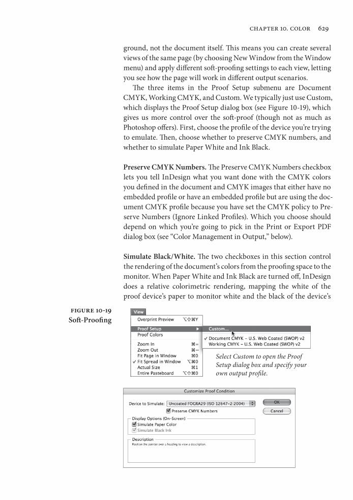
chapter 10. color 629
ground, not the document itself. This means you can create several views of the same page (by choosing New Window from the Window menu) and apply different soft-proofing settings to each view, letting you see how the page will work in different output scenarios.
The three items in the Proof Setup submenu are Document CMYK, Working CMYK, and Custom. We typically just use Custom, which displays the Proof Setup dialog box (see Figure 10-19), which gives us more control over the soft-proof (though not as much as Photoshop offers). First, choose the profile of the device you’re trying to emulate. Then, choose whether to preserve CMYK numbers, and whether to simulate Paper White and Ink Black.
Preserve CMYK Numbers. The Preserve CMYK Numbers checkbox lets you tell InDesign what you want done with the CMYK colors you defined in the document and CMYK images that either have no embedded profile or have an embedded profile but are using the doc-ument CMYK profile because you have set the CMYK policy to Pre-serve Numbers (Ignore Linked Profiles). Which you choose should depend on which you’re going to pick in the Print or Export PDF dialog box (see “Color Management in Output,” below).
Simulate Black/White. The two checkboxes in this section control the rendering of the document’s colors from the proofing space to the monitor. When Paper White and Ink Black are turned off, InDesign does a relative colorimetric rendering, mapping the white of the proof device’s paper to monitor white and the black of the device’s
Figure 10-19Soft-Proofing
Select Custom to open the Proof Setup dialog box and specify your own output profile.
Real_World_Adobe_InDesign_CS4b.pdf 642Real_World_Adobe_InDesign_CS4b.pdf 642 08/04/2009 05:55:57 p.m.08/04/2009 05:55:57 p.m.
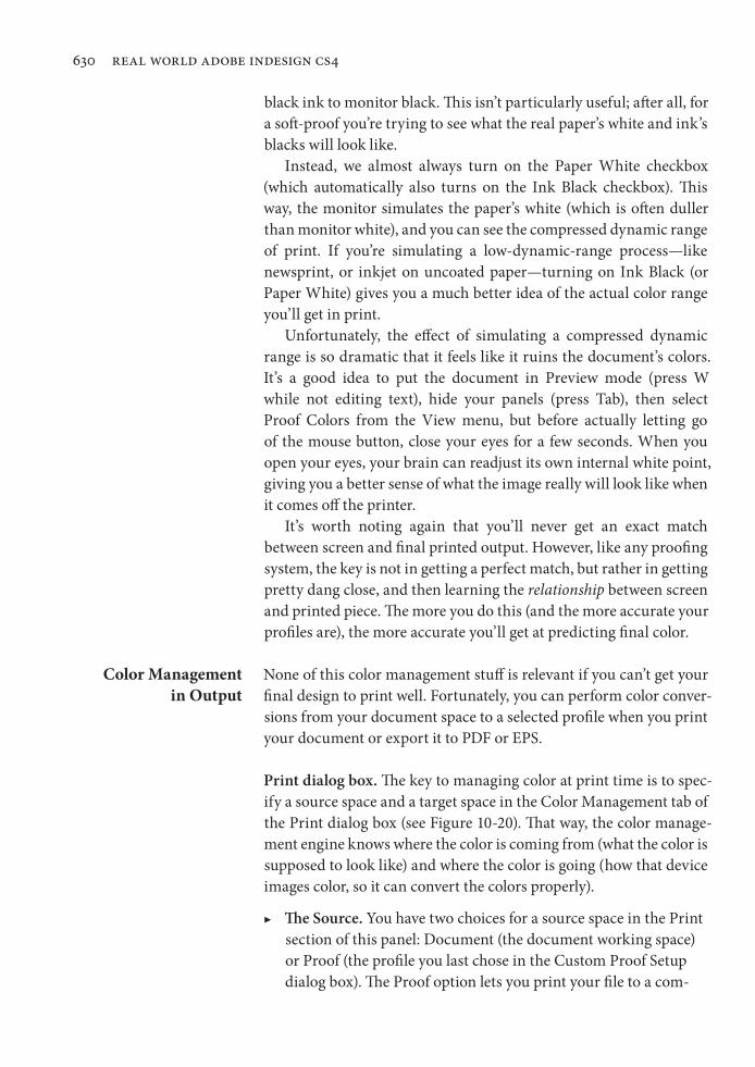
630 real world adobe indesign cs4
black ink to monitor black. This isn’t particularly useful; after all, for a soft-proof you’re trying to see what the real paper’s white and ink ’s blacks will look like.
Instead, we almost always turn on the Paper White checkbox (which automatically also turns on the Ink Black checkbox). This way, the monitor simulates the paper’s white (which is often duller than monitor white), and you can see the compressed dynamic range of print. If you’re simulating a low-dynamic-range process—like newsprint, or inkjet on uncoated paper—turning on Ink Black (or Paper White) gives you a much better idea of the actual color range you’ll get in print.
Unfortunately, the effect of simulating a compressed dynamic range is so dramatic that it feels like it ruins the document’s colors. It’s a good idea to put the document in Preview mode (press W while not editing text), hide your panels (press Tab), then select Proof Colors from the View menu, but before actually letting go of the mouse button, close your eyes for a few seconds. When you open your eyes, your brain can readjust its own internal white point, giving you a better sense of what the image really will look like when it comes off the printer.
It’s worth noting again that you’ll never get an exact match between screen and final printed output. However, like any proofing system, the key is not in getting a perfect match, but rather in getting pretty dang close, and then learning the relationship between screen and printed piece. The more you do this (and the more accurate your profiles are), the more accurate you’ll get at predicting final color.
Color Management in Output
None of this color management stuff is relevant if you can’t get your final design to print well. Fortunately, you can perform color conver-sions from your document space to a selected profile when you print your document or export it to PDF or EPS.
Print dialog box. The key to managing color at print time is to spec-ify a source space and a target space in the Color Management tab of the Print dialog box (see Figure 10-20). That way, the color manage-ment engine knows where the color is coming from (what the color is supposed to look like) and where the color is going (how that device images color, so it can convert the colors properly).
▶ The Source. You have two choices for a source space in the Print section of this panel: Document (the document working space) or Proof (the profile you last chose in the Custom Proof Setup dialog box). The Proof option lets you print your file to a com-
Real_World_Adobe_InDesign_CS4b.pdf 643Real_World_Adobe_InDesign_CS4b.pdf 643 08/04/2009 05:55:57 p.m.08/04/2009 05:55:57 p.m.
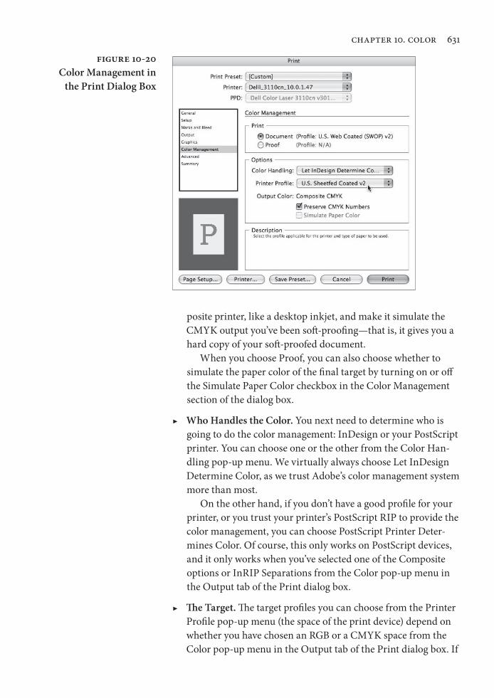
chapter 10. color 631
posite printer, like a desktop inkjet, and make it simulate the CMYK output you’ve been soft-proofing—that is, it gives you a hard copy of your soft-proofed document.
When you choose Proof, you can also choose whether to simulate the paper color of the final target by turning on or off the Simulate Paper Color checkbox in the Color Management section of the dialog box.
▶ Who Handles the Color. You next need to determine who is going to do the color management: InDesign or your PostScript printer. You can choose one or the other from the Color Han-dling pop-up menu. We virtually always choose Let InDesign Determine Color, as we trust Adobe’s color management system more than most.
On the other hand, if you don’t have a good profile for your printer, or you trust your printer’s PostScript RIP to provide the color management, you can choose PostScript Printer Deter-mines Color. Of course, this only works on PostScript devices, and it only works when you’ve selected one of the Composite options or InRIP Separations from the Color pop-up menu in the Output tab of the Print dialog box.
▶ The Target. The target profiles you can choose from the Printer Profile pop-up menu (the space of the print device) depend on whether you have chosen an RGB or a CMYK space from the Color pop-up menu in the Output tab of the Print dialog box. If
Figure 10-20Color Management in
the Print Dialog Box
Real_World_Adobe_InDesign_CS4b.pdf 644Real_World_Adobe_InDesign_CS4b.pdf 644 08/04/2009 05:55:57 p.m.08/04/2009 05:55:57 p.m.
632 real world adobe indesign cs4
you’re printing to an inkjet printer, you should probably choose Composite RGB and then pick the RGB profile for that device (or, if you don’t have a profile, often the sRGB works well).
▶ Preserve CMYK Numbers. When you print, InDesign compares your target print space to the document space and the profiles applied to or embedded in graphics; if they’re all the same, then it doesn’t do any color conversion. Whenever the profiles differ, InDesign has to decide whether to run the colors through the color management engine to maintain visual consistency of the colors. For example, if your document CMYK setting is U.S. Web Coated (SWOP) but you choose a Newsprint output profile, InDesign will obviously have to convert your RGB colors to the Newsprint CMYK space. But it may also convert your CMYK colors from their original space to Newsprint, too.
Converting from one CMYK space to another CMYK space is called cross-rendering, and it can be a blessing or a curse. It can really get you out of a last-minute jam if you don’t have time to go back and reseparate RGB images into your new CMYK space. However, there’s no way to tell InDesign to cross-render your images but not other things, so all your 100-percent black text also gets cross-rendered—resulting in four-color CMYK text—rarely what you’d expect or want.
Fortunately, you can turn on the Preserve CMYK Numbers checkbox in the Print dialog box. When this is on, InDesign won’t cross-render any of your document’s CMYK colors or CMYK images that either have no embedded profile or have an embedded profile but were imported with the Preserve Numbers (Ignore Linked Profiles) color policy enabled in the Color Set-tings dialog box. This is our best friend in the color management wars. We suggest you turn it on unless you really know what you’re doing. (If the source and target profiles are the same, it’s grayed out because colors aren’t in danger of cross-rendering.)
Don’t forget that you can have the Preserve Numbers (Ignore Linked Profiles) policy turned on and still force InDesign to cross-render a specific image by giving it a profile with the Image Color Settings dialog box that we talked about earlier. Also, don’t forget that you can change your document profile before printing with Assign Profile or Convert Profile.
Export as PDF. You can tell InDesign whether to color-manage your exported PDF files in the Output tab of the Export PDF dialog box (see Figure 10-21). You have several options here.
Real_World_Adobe_InDesign_CS4b.pdf 645Real_World_Adobe_InDesign_CS4b.pdf 645 08/04/2009 05:55:57 p.m.08/04/2009 05:55:57 p.m.

chapter 10. color 633
▶ Color Conversion. If you don’t want InDesign to convert any colors (if you want all the document and image color data left as is) then select No Color Conversion from the Color Conversion pop-up menu in the Output tab. This is what you get when you use the PDF/X3 standard because the understanding is that the color management will be handled downstream when the PDF is printed.
However, if you want InDesign color manage the file while generating the PDF, choose either Convert to Destination or Convert to Destination (Preserve Numbers). For example, if you’re exporting the PDF for primarily onscreen viewing, choose Convert to Destination from the Color Conversion pop-up menu and then choose an RGB profile from the Des-tination pop-up menu—the sRGB profile is probably the most useful, as it purports to define the “average” monitor. This forces everything into the sRGB space.
If you’re exporting for print and you want to color-manage the entire document, then choose Convert to Destination and choose your final output device in the Destination pop-up menu. However, if the Destination profile is different than your docu-ment profile, your CMYK colors will likely get cross-rendered into a different CMYK space. As we noted earlier, this is the cause of the four-color black text problem that many people had
Figure 10-21Color Management
in the Export PDF Dialog Box
Real_World_Adobe_InDesign_CS4b.pdf 646Real_World_Adobe_InDesign_CS4b.pdf 646 08/04/2009 05:55:58 p.m.08/04/2009 05:55:58 p.m.
634 real world adobe indesign cs4
in early versions. So in most circumstances, we would recom-mend the Convert to Destination (Preserve Numbers) option, which leaves document colors and untagged colors alone.
▶ Include Profiles. The Profile Inclusion Policy pop-up menu lets you choose whether or not to embed various profiles in your PDF. If you choose one of the two Convert to Destination options in the Color Conversion pop-up menu, you can choose to either not embed any profiles or to embed the destination profile. If you expect your PDF to be further color managed by some other application (even to view it properly on screen), you should definitely include your profiles. But it does make a larger PDF file, so in many cases, we just leave it out.
If the Color Conversion pop-up menu is set to leave your colors alone (again, the assumption here is that your file will be color managed later), you have three different choices in the Profile Inclusion Policy dialog box: Include All Profiles, Include Tagged Source Profiles, and Include All RGB and Tagged Source Profiles. Of course, you can also just tell InDesign not to include any profile, but we’re not sure why you’d do that.
Export as EPS. There is little color management interface in the Export EPS dialog box; when you pick RGB or CMYK from the Color pop-up menu, InDesign simply assumes your document profiles are the destination profiles, and it color-manages your document—con-verting all imported images (at least the ones that it can, like TIFF and .PSD files) to the document working space. You can avoid this by choosing Leave Unchanged from the Color pop-up menu.
The Color “Done”
As you work with commercial printing, always remember that you’re at the mercy of a series of mechanical processes that, in many ways, haven’t changed since 1900. Temperature, humidity, and ambient static electricity play large roles in the process, and the people who operate these systems are at least skilled craftspeople; at best, artists.
Ask them as many questions as they’ll answer, set your job up the way they want it, and then sit back and watch your job come off the press.
Real_World_Adobe_InDesign_CS4b.pdf 647Real_World_Adobe_InDesign_CS4b.pdf 647 08/04/2009 05:55:58 p.m.08/04/2009 05:55:58 p.m.