5 tips on how to avoid “mobilegeddon” madness
TRANSCRIPT

“Mobilegeddon” Maddness5 Tips On How To Avoid The
By: Lisa W Boyle
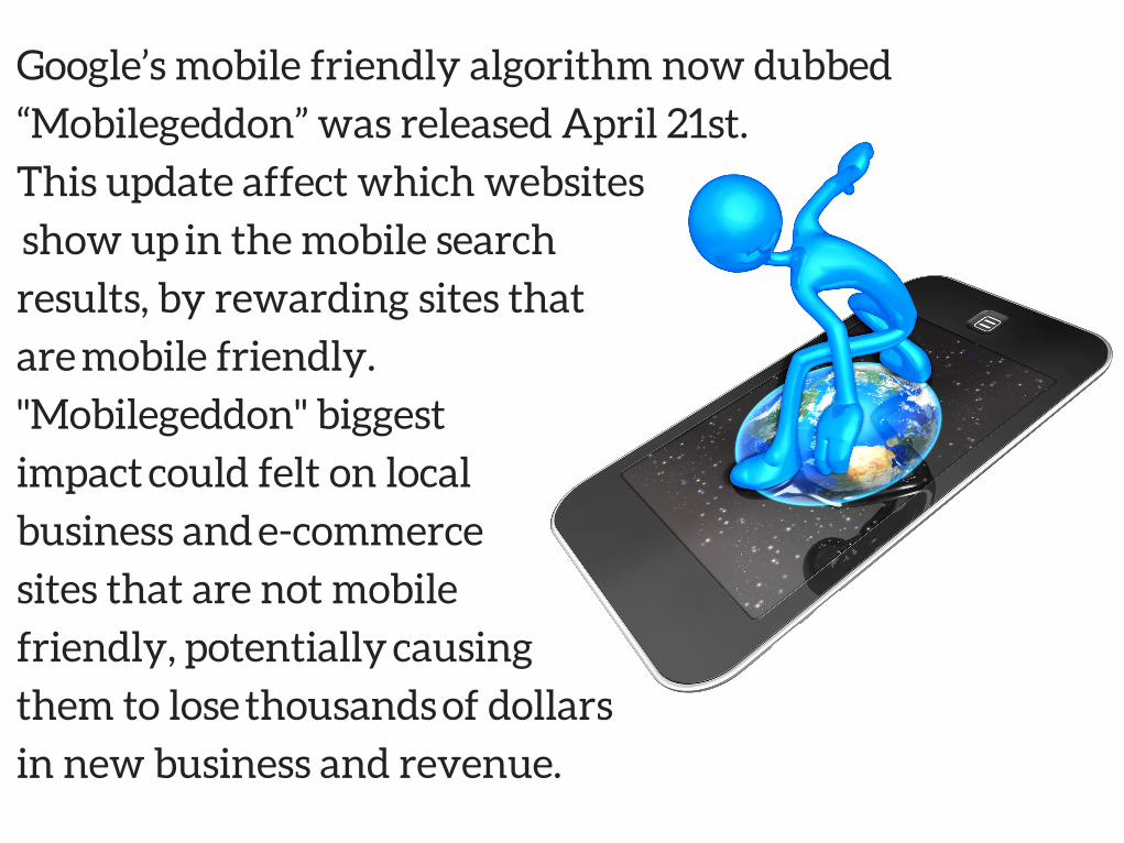
Google’s mobile friendly algorithm now dubbed
“Mobilegeddon” was released April 21st.
This update affect which websites
show up in the mobile search
results, by rewarding sites that
are mobile friendly.
"Mobilegeddon" biggest
impact could felt on local
business and e-commerce
sites that are not mobile
friendly, potentially causing
them to lose thousands of dollars
in new business and revenue.

MOBILE FRIENDLY
5
TIPS

TEST YOURWEBSITE
Check if your website is mobile friendly using Google’s mobile friendly test page.
https://www.google.com/webmasters/tools/mobile-friendly/
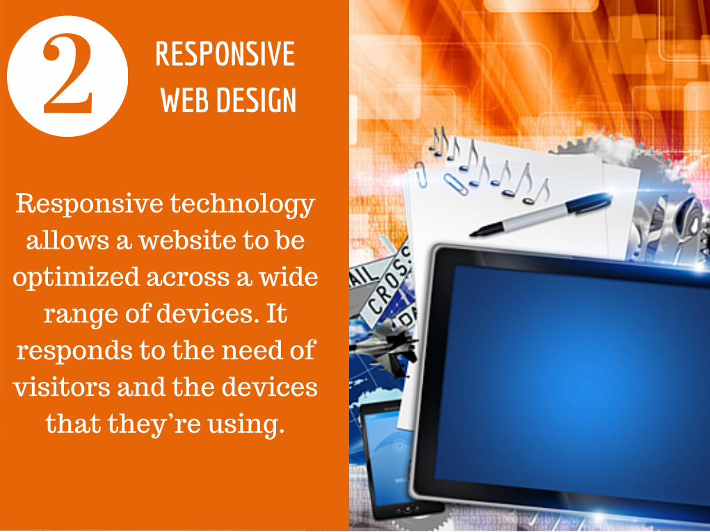
Responsive technologyallows a website to be
optimized across a widerange of devices. It
responds to the need ofvisitors and the devices
that they’re using.
RESPONSIVE WEB DESIGN
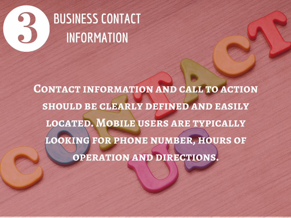
BUSINESS CONTACTINFORMATION
Contact information and call to actionshould be clearly defined and easilylocated. Mobile users are typicallylooking for phone number, hours of
operation and directions.

Home
About
Product
Contact
SIMPLIFY WEBSITE MENU
Mobile device screens aresmaller than a desktop
and users are using theirfinger to navigate not a
mouse. Provide onlyuseful information, Keepyour site uncluttered andinclude category links on
the home page to yourproducts or services.
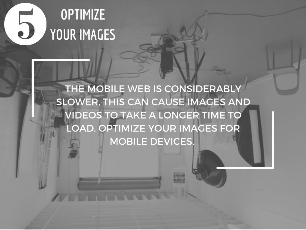
THE MOBILE WEB IS CONSIDERABLYSLOWER, THIS CAN CAUSE IMAGES ANDVIDEOS TO TAKE A LONGER TIME TOLOAD. OPTIMIZE YOUR IMAGES FOR
MOBILE DEVICES.
OPTIMIZEYOUR IMAGES

5 Tips on how to “Mobilegeddon” Madness
By: Lisa W Boyle
PARADIGM SHIFT SEO
WWW.PARADIGMSHIFTSEO.COM