3. feedback. pptx
TRANSCRIPT

Evaluation Qu3.
WHAT HAVE YOU LEARNED FROM YOUR AUDIENCE FEEDBACK?
Esme Finch

THE GROUP• Working in a pair was very
beneficial as the tasks could be evenly distributed and different skills could be used in different scenarios by each of us.
• During the planning stage we were able to get a range of ideas without being clouded by too much input. Our different perspectives helped to shape an original concept.
• Our target audience for our music video was reasonably young, ranging from 15-30 years olds interested in the pop/dance music culture. We aimed to keep within a genre of interest principally to teenage girls. They could better relate to this video as they go through the confusions of adolescent love.
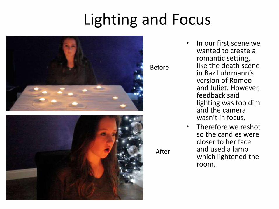
Lighting and Focus• In our first scene we
wanted to create a romantic setting, like the death scene in Baz Luhrmann’s version of Romeo and Juliet. However, feedback said lighting was too dim and the camera wasn’t in focus.
• Therefore we reshot so the candles were closer to her face and used a lamp which lightened the room.
Before
After

Construction• In Miley’s lyrics one
line is about how she feels her love is burning away, ‘it slowly turned, you let me burn and now we’re ashes on the ground’. We initially shot two burning cigarettes to metaphorically speak that her relationship is slowly dying. Feedback suggested that this scene wasn't’t visually exciting and we therefore decided to illustrate the lyrics using a burning bonfire. This created more visual impact and wasn’t so random and unattractive as the cigarette scene was.
Cigarette scene
Bonfire scene

COLOUR CORRECTION
• After showing some of our clips for review the feedback we got was that some backgrounds could be more vibrant and colourful. We shot a few of our scenes in the woods on a dark day and you could tell that in some of the footage.
• To improve in this we decided to use colour correction and use warmer colours such as pinks and reds. This helped with the dream-like surrealism of our created world.
• We felt the general mood was positively enhanced by altering the hues and saturation more richly.

Original Final
Experiments Experiments

Stabilization • When we shot
the playground scene we found it hard to balance the camera steadily whilst turning on the roundabout. In playback we saw that it was shaky, and wobbled as it spun around. Feedback told us to edit this on IMovie using the stabilization tool

Camera angles
We wanted lots of angles in the playground scene. The profiles did not create the effect we wanted which was to have them appear twirling as if they were spinning round in a chaotic whirlwind relationship, so we discarded them. The two front on close-ups worked better for us.
In the woodland scenes, we experimented with different camera heights. We used mostly low angles for when she drank the ‘love potion’ as this made her appear bigger which relates to the story of Alice in Wonderland when she drinks the potion and turns into a giant. We also felt that using low angles connected with the Miley character better as she would appear to be sitting on the ground, as if the audience were sitting with her.

LOCATION • Feedback showed us that our
filming locations weren’t diverse enough and needed more variety. We were going to film in our school ground woodlands but we decided to find a more visually stimulating location.
• We used Silvermere Golf Club because of the fairytale features in the woodland such as the carved trees, clocks nailed into the wood, and gnomes.
• As it was Spring when we filmed the setting was perfectly beautifully as the daffodils had started to bloom which made our Alice in Wonderland set even more enchanted.

Digipack Feedback• We decided to use a still from another
media project to use on the CD cover. People preferred this version of Alice, as she appears to be holding a tea cup which referenced more to the story of Alice in Wonderland.
• The woods have a perfect, enchanted setting for what we imagined a surrealistic setting to look like
• Feedback on our powder paint scene suggested that the shots we chose were the most successful in our approach and we therefore chose them for our digipack design
• People liked how the powder paint was captured In mid air with a massive burst of pink, as if a metaphor for the explosion of love. People also pointed out the vignette oval shadow around the top left picture. Being as it already had an oval feature to it we decided to use this as our digipack cd holder.
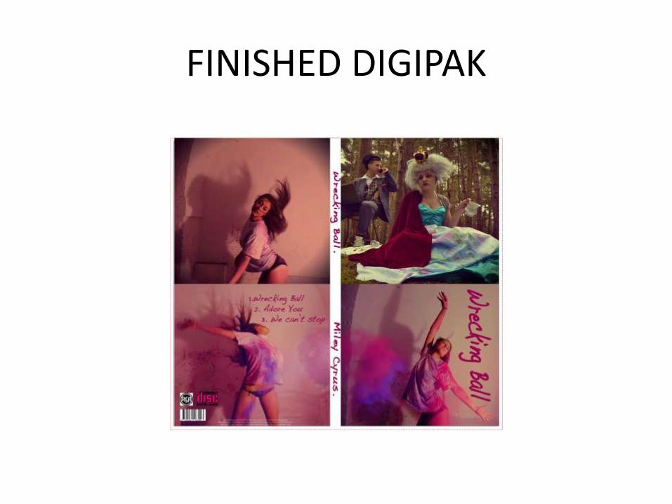
FINISHED DIGIPAK
CHOOSING OUR FONTS• For our digipack fonts we looked at informal, handwritten typefaces. We finally
chose, Handwriting Dakota Bold, as it presents a youthful and natural appearance, familiar to our target audience. It also fulfills the chaotic notions of love and the freedom of dance and colour.
• We used the same font throughout our digipack design. If we had chosen different fonts there wouldn't be a continuous theme and therefore it would not be visually pleasing to the eye.
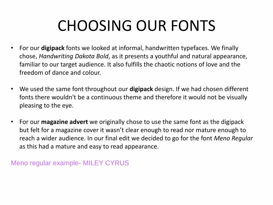
• For our magazine advert we originally chose to use the same font as the digipack but felt for a magazine cover it wasn’t clear enough to read nor mature enough to reach a wider audience. In our final edit we decided to go for the font Meno Regular as this had a mature and easy to read appearance.
Meno regular example- MILEY CYRUS

SHORTLIST OF FONTS• Handwriting
Dakota (bold) was our final chosen font. We thought it had a youthful and carefree rhythm to it. The others we felt were either medieval and too formal for our teenage audience.

MAGAZINE ADVERT • Feedback suggested there should be some type of
effect overlay as it appeared boring and not eye catching enough.
• In Photoshop we also became aware that when we uploaded the background image it would stretch and make the photograph look like a mistake in choice of format. We solved this by retaining a square format for the girl and Photo-shopped an additional area of wall as a background for the paint images.

FINAL DRAFT AND FINISHED MAGAZINE ADVERT
• In Pixclr, a photo editing website, we over-layered a splattered painting effect. This connected with our powder paint sequences in our film.
• Feedback suggested we add on logos such as the Facebook and Twitter app. To make our magazine advert look more professional we also added the RCA Records logo as this will be familiar to fans that this is Miley’s record label.