2413 modernism - spring 2018 · art-2413 modernism ... describes the style and ideology of art...
TRANSCRIPT
10/18/16
1
Graphic Design: A VERY abbreviated Western history
} Cave Paintings = visual communication } Propaganda Art of Ancient Rome } Illuminated Manuscripts } 1450s > Gutenberg’s printing press
} Start of mass communication, both good and VERY bad } Late1900s, Victorian, representational, heavy tradition } Rise of newspapers and printed publications
Graphic Design: A VERY abbreviated Western history
} Cave Paintings = visual communication } Propaganda Art of Ancient Rome } Illuminated Manuscripts } 1450s > Gutenberg’s printing press
} Start of mass communication, both good and VERY bad } Late1900s, Victorian, representational, heavy tradition } Rise of newspapers and printed publications } 1922 > W. A. Dwiggins coined the term ‘graphic design’
in a 1922 Boston newspaper article to describe the wide range of jobs he personally tackled, ‘commercial artist’ was the accepted label for the inter-related acts of drawing, spec-ing, comping and laying out.
ART-2413
Modernism
What is “Modernism”? } It is not necessarily contemporary
} It began at the end of the 19th century
} Cultural movement vs. its idealogy } Cultural movement vs. STYLE
} Modernist ART } Influenced Modernist GRAPHIC DESIGN
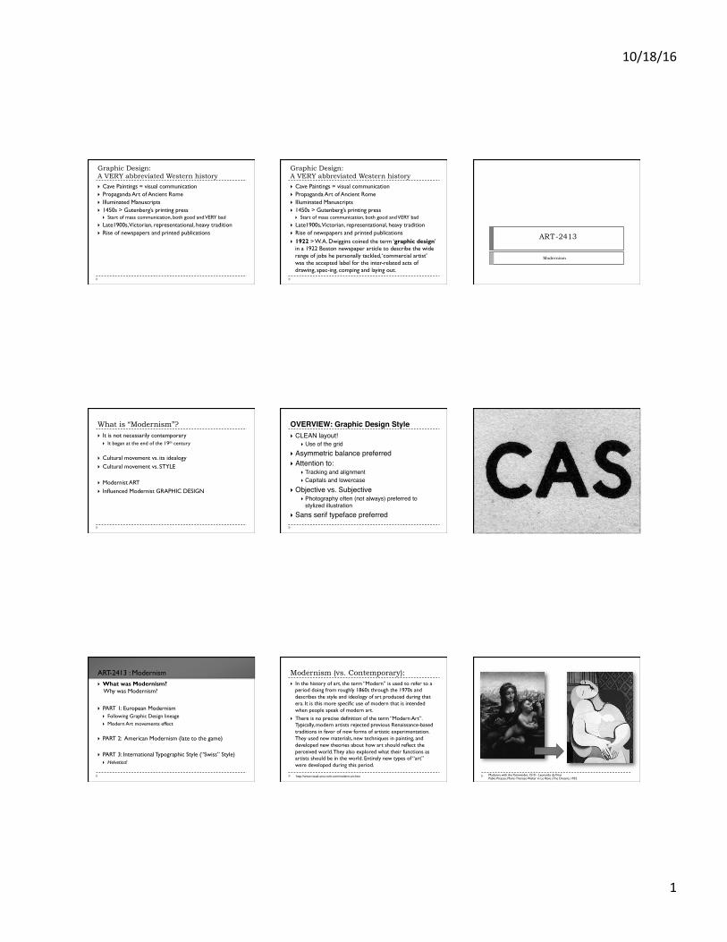
OVERVIEW: Graphic Design Style} CLEAN layout!
} Use of the grid} Asymmetric balance preferred} Attention to:
} Tracking and alignment} Capitals and lowercase
} Objective vs. Subjective} Photography often (not always) preferred to
stylized illustration} Sans serif typeface preferred
} What was Modernism? Why was Modernism?
} PART 1: European Modernism
} Following Graphic Design lineage } Modern Art movements effect
} PART 2: American Modernism (late to the game)
} PART 3: International Typographic Style (“Swiss” Style) } Helvetica!
ART-2413 : Modernism
http://www.visual-arts-cork.com/modern-art.htm
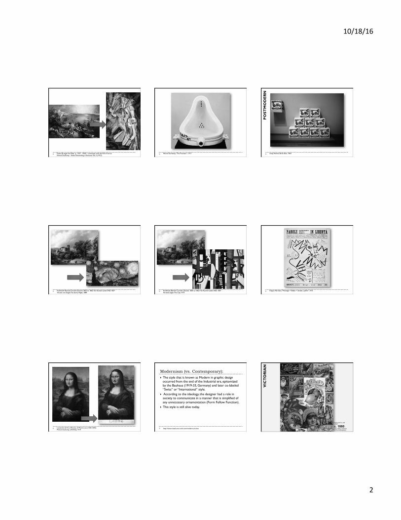
Modernism (vs. Contemporary): } In the history of art, the term “Modern” is used to refer to a
period doing from roughly 1860s through the 1970s and describes the style and ideology of art produced during that era. It is this more specific use of modern that is intended when people speak of modern art.
} There is no precise definition of the term “Modern Art”. Typically, modern artists rejected previous Renaissance-based traditions in favor of new forms of artistic experimentation. They used new materials, new techniques in painting, and developed new theories about how art should reflect the perceived world. They also explored what their functions as artists should be in the world. Entirely new types of “art” were developed during this period.
Madonna with the Yarnwinder, 1510 - Leonardo da Vinci Pablo Picasso, Marie-Thérèse Walter in Le Rêve (The Dream), 1932
10/18/16
2
Pieter Bruegel the Elder (c. 1525 - 1569) - Landscape with the Fall of Icarus; Marcel Duchamp - Nude Descending a Staircase, No. 2 (1912)
Marcel Duchamp, “The Fountain”, 1917 Andy Warhol, Brillo Box, 1964
PO
STM
OD
ER
N
Koekkoek Barend Cornelis (Dutch) 1803 to 1862 The Ruined Castle SND 1857 Vincent van Gogh, The Starry Night, 1889
Koekkoek Barend Cornelis (Dutch) 1803 to 1862 The Ruined Castle SND 1857 Fernand Léger, The City, 1919
Filippo Marinetti, "Montage + Vallate + Strade x Joffre", 1915
Leonardo da Vinci, Ritratto di Monna Lisa (1503-1505) Marcel Duchamp, LHOOQ, 1919
http://www.visual-arts-cork.com/modern-art.htm
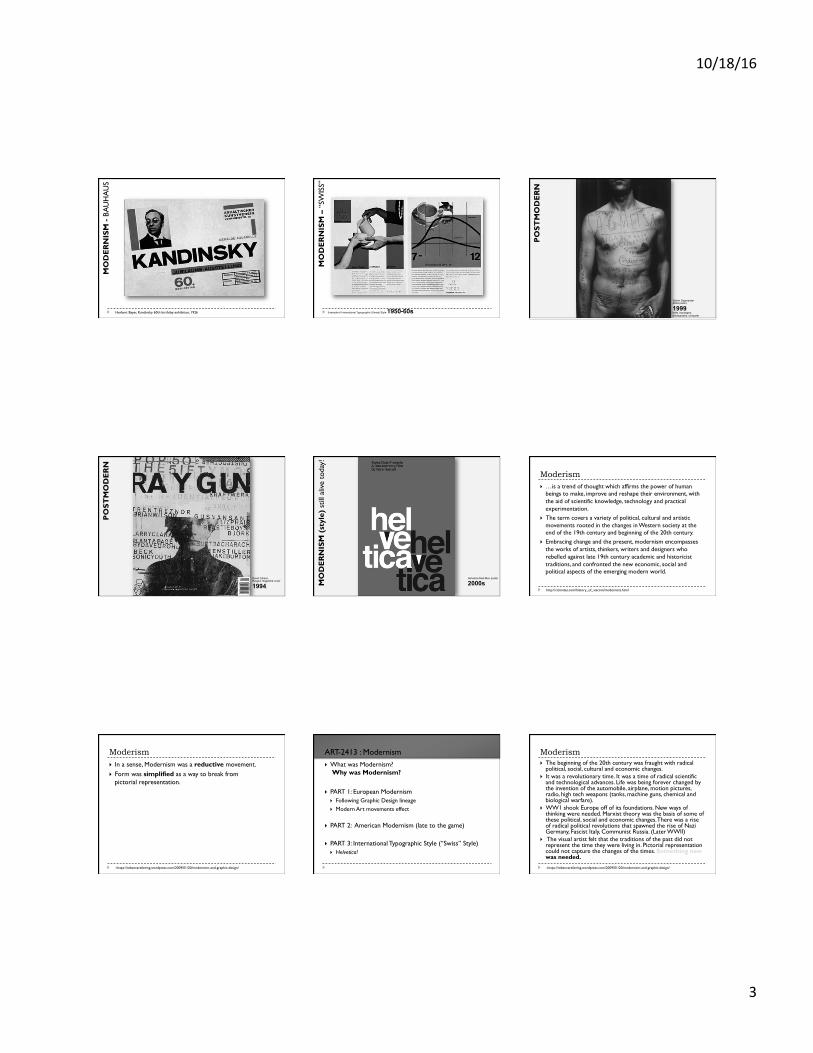
Modernism (vs. Contemporary): } The style that is known as Modern in graphic design
occurred from the end of the Industrial era, epitomized by the Bauhaus (1919-33, Germany) and later co-labeled “Swiss” or “International” style.
} According to the ideology, the designer had a role in society to communicate in a manner that is simplified of any unnecessary ornamentation (Form Follow Function).
} This style is still alive today.
Prang and Co. and others,
c. 1880 - early 1900s, collection of chromolithography
VIC
TO
RIA
N
10/18/16
3
Herbert Bayer, Kandinsky 60th birthday exhibition, 1926
MO
DE
RN
ISM
- BA
UH
AU
S
Example of International Typographic (Swiss) Style 1950-60sM
OD
ER
NIS
M –
“SW
ISS”
Stefan Sagmeister AIGA poster,
1999, knife, bandages, photography, computer
PO
STM
OD
ER
N
David Carson, Raygun magazine cover
1994,
PO
STM
OD
ER
N
Helvetica Mad Men poster
2000s MO
DE
RN
ISM
(st
yle)
stil
l aliv
e to
day!
http://citrinitas.com/history_of_viscom/modernists.html
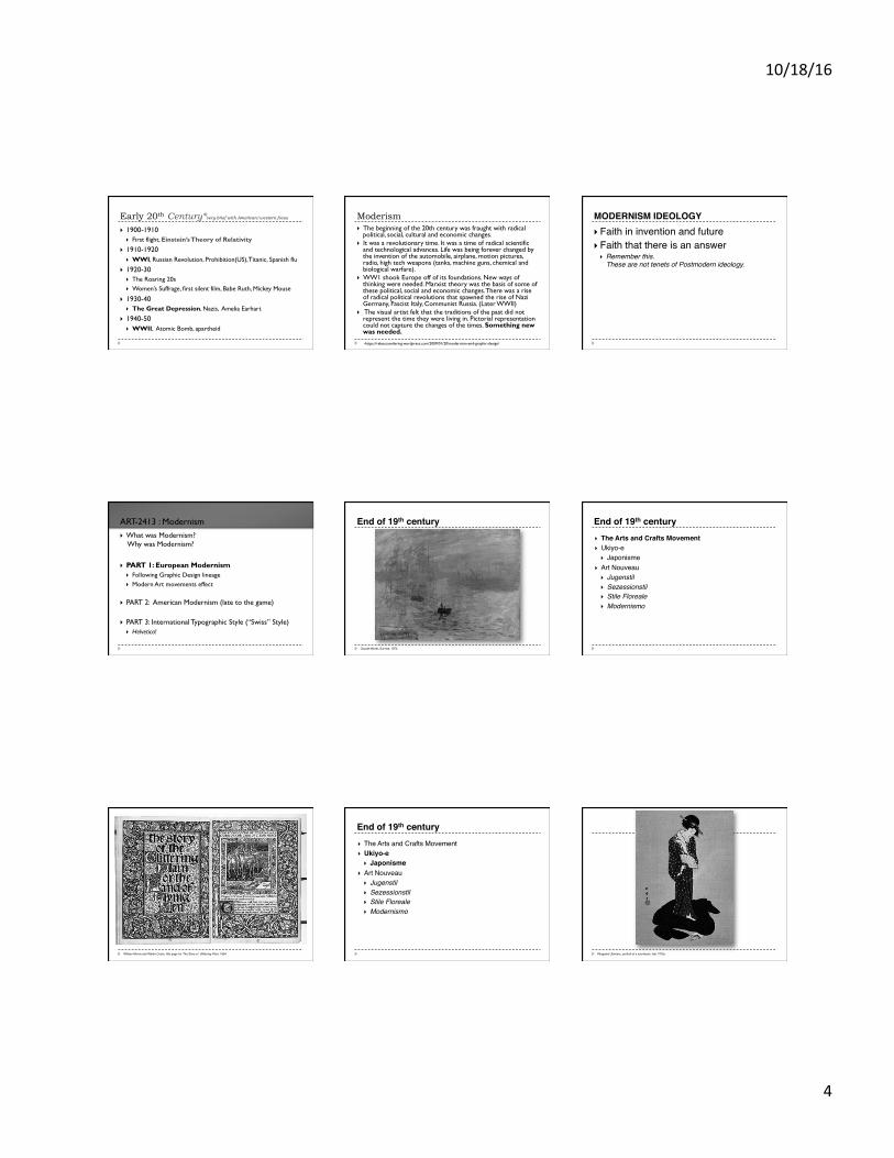
Moderism } …is a trend of thought which affirms the power of human
beings to make, improve and reshape their environment, with the aid of scientific knowledge, technology and practical experimentation.
} The term covers a variety of political, cultural and artistic movements rooted in the changes in Western society at the end of the 19th century and beginning of the 20th century.
} Embracing change and the present, modernism encompasses the works of artists, thinkers, writers and designers who rebelled against late 19th century academic and historicist traditions, and confronted the new economic, social and political aspects of the emerging modern world.
-https://rebeccareilering.wordpress.com/2009/01/20/modernism-and-graphic-design/
Moderism } In a sense, Modernism was a reductive movement. } Form was simplified as a way to break from
pictorial representation.
} What was Modernism? Why was Modernism?
} PART 1: European Modernism
} Following Graphic Design lineage } Modern Art movements effect
} PART 2: American Modernism (late to the game)
} PART 3: International Typographic Style (“Swiss” Style) } Helvetica!
ART-2413 : Modernism
-https://rebeccareilering.wordpress.com/2009/01/20/modernism-and-graphic-design/
Moderism } The beginning of the 20th century was fraught with radical
political, social, cultural and economic changes. } It was a revolutionary time. It was a time of radical scientific
and technological advances. Life was being forever changed by the invention of the automobile, airplane, motion pictures, radio, high tech weapons (tanks, machine guns, chemical and biological warfare).
} WW1 shook Europe off of its foundations. New ways of thinking were needed. Marxist theory was the basis of some of these political, social and economic changes. There was a rise of radical political revolutions that spawned the rise of Nazi Germany, Fascist Italy, Communist Russia. (Later WWII)
} The visual artist felt that the traditions of the past did not represent the time they were living in. Pictorial representation could not capture the changes of the times. Something new was needed.
10/18/16
4
Early 20th Century*very brief with American/western focus
} 1900-1910 } First flight, Einstein’s Theory of Relativity
} 1910-1920 } WWI, Russian Revolution, Prohibition(US), Titanic, Spanish flu
} 1920-30 } The Roaring 20s } Women’s Suffrage, first silent film, Babe Ruth, Mickey Mouse
} 1930-40 } The Great Depression, Nazis, Amelia Earhart
} 1940-50 } WWII, Atomic Bomb, apartheid
-https://rebeccareilering.wordpress.com/2009/01/20/modernism-and-graphic-design/
Moderism } The beginning of the 20th century was fraught with radical
political, social, cultural and economic changes. } It was a revolutionary time. It was a time of radical scientific
and technological advances. Life was being forever changed by the invention of the automobile, airplane, motion pictures, radio, high tech weapons (tanks, machine guns, chemical and biological warfare).
} WW1 shook Europe off of its foundations. New ways of thinking were needed. Marxist theory was the basis of some of these political, social and economic changes. There was a rise of radical political revolutions that spawned the rise of Nazi Germany, Fascist Italy, Communist Russia. (Later WWII)
} The visual artist felt that the traditions of the past did not represent the time they were living in. Pictorial representation could not capture the changes of the times. Something new was needed.
MODERNISM IDEOLOGY} Faith in invention and future} Faith that there is an answer
} Remember this. These are not tenets of Postmodern ideology.
} What was Modernism? Why was Modernism?
} PART 1: European Modernism
} Following Graphic Design lineage } Modern Art movements effect
} PART 2: American Modernism (late to the game)
} PART 3: International Typographic Style (“Swiss” Style) } Helvetica!
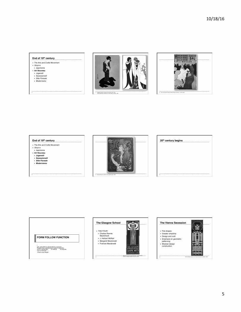
ART-2413 : Modernism End of 19th century
Claude Monet, Sunrise, 1872
} The Arts and Crafts Movement} Ukiyo-e
} Japonisme} Art Nouveau
} Jugenstil} Sezessionstil} Stile Floreale} Modernismo
End of 19th century
William Morris and Walter Crane, title page for The Story of Glittering Plain, 1894
} The Arts and Crafts Movement} Ukiyo-e
} Japonisme} Art Nouveau
} Jugenstil} Sezessionstil} Stile Floreale} Modernismo
End of 19th century
Kitagawa Utamaro, portrait of a courtesan, late 1700s
10/18/16
5
} The Arts and Crafts Movement} Ukiyo-e
} Japonisme} Art Nouveau
} Jugenstil} Sezessionstil} Stile Floreale} Modernismo
End of 19th century
Kitagawa Utamaro, portrait of a courtesan, late 1700sAubrey Beardsley, illustration for Oscar Wilde’s Salome, 1894
Henri de Toulouse-Lautrec, Moulin Rouge-La Goulue, c. 1891, poster
} The Arts and Crafts Movement} Ukiyo-e
} Japonisme} Art Nouveau
} Jugenstil} Sezessionstil} Stile Floreale} Modernismo
End of 19th century
Alphonse Mucha, poster for Job cigarette paper, 1896
20th century begins
FORM FOLLOW FUNCTION
“something in which the part is to the whole as the whole is to the part, and which is all devoted to a purpose…It seeks that completeness in idea in execution which is absolutely true to method, true to purpose, true to character…”-Frank Lloyd Wright
} THE FOUR} Charles Rennie
Mackintosh} J. Herbert McNair} Margaret Macdonald} Frances Macdonald
Margaret and Frances Macdonald with J. Herbert McNair, poster for Glasgow Institute of Fine Arts, 1895
The Glasgow School
} Flat shapes} Greater simplicity} Design and craft} Emphasis on geometric
patterning } Modular design
construction
Koloman Moser, poster for 13th Vienna Secession exhibition, 1902
The Vienna Secession
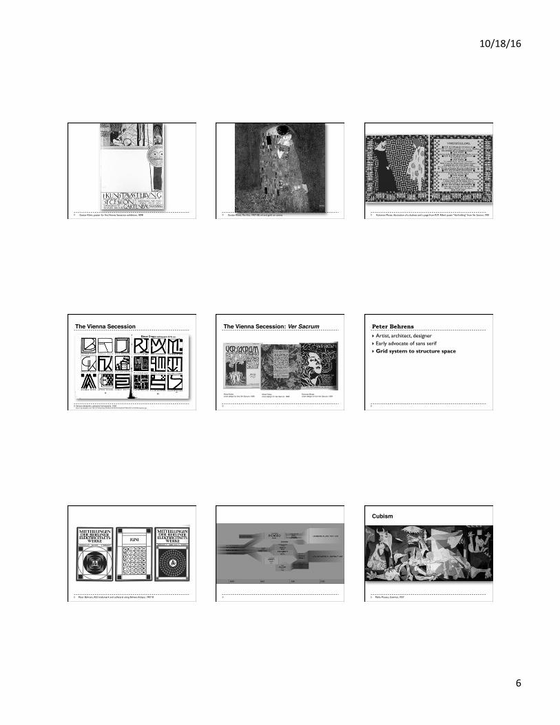
10/18/16
6
Gustav Klimt, poster for first Vienna Secession exhibition, 1898 Gustav Klimt, The Kiss, 1907-08, oil and gold on canvas Koloman Moser, illustration of a duchess and a page from R.M. Rilke’s poem “Vorfruhling” from Ver Sacrum, 1901
The Vienna Secession
Various designers, personal monograms, 1902 http://1.bp.blogspot.com/-CMLCGTkNoe0/VgoJ4mtMcrI/AAAAAAAAAqQ/bvR7M6krQDY/s1600/Monograms.jpg
The Vienna Secession: Ver Sacrum
Alfred Roller, cover design for first Ver Sacrum, 1898
Alfred Roller, cover design for Ver Sacrum, 1898
Koloman Moser, cover design for first Ver Sacrum, 1899
Peter Behrens
} Artist, architect, designer } Early advocate of sans serif } Grid system to structure space
Peter Behrens, AEG trademark and collateral using Behrens-Antiqua, 1907-8 Pablo Picasso, Guernica, 1937
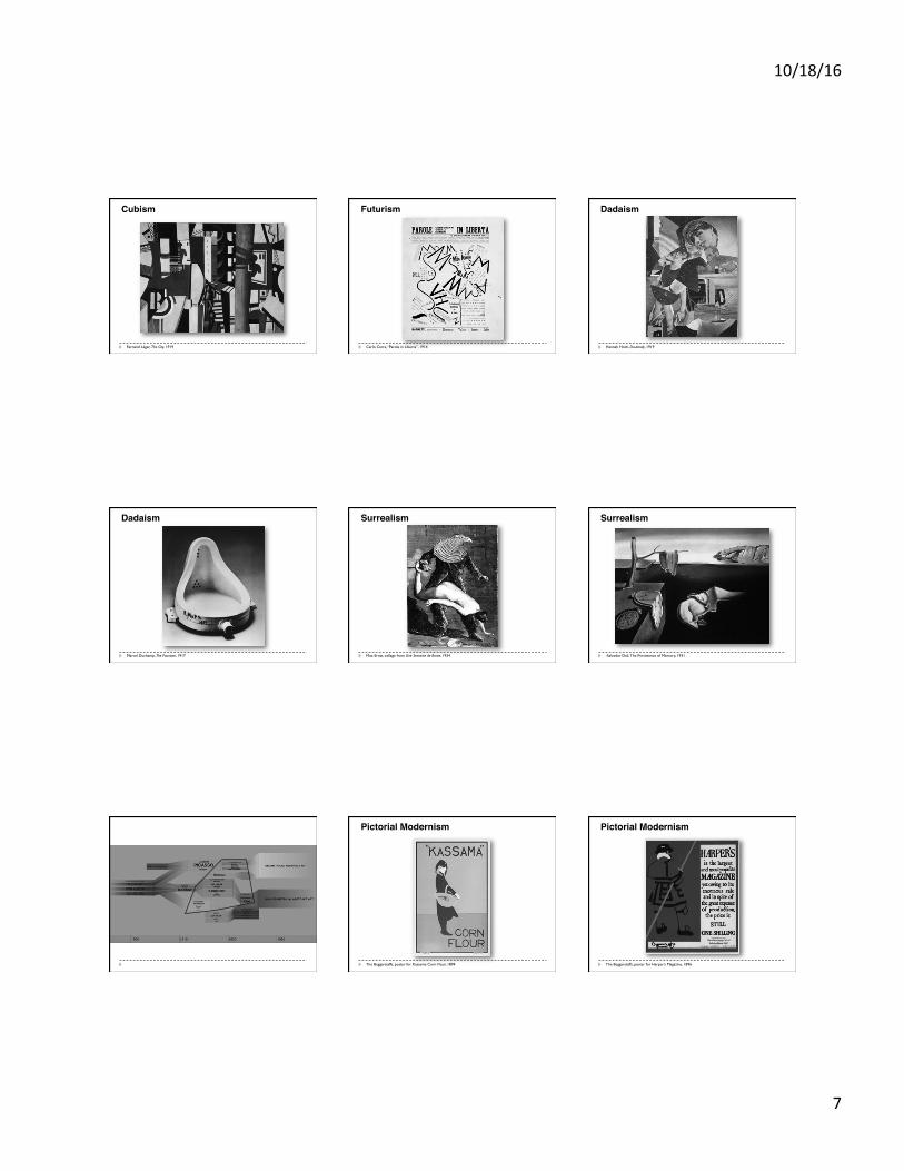
Cubism
10/18/16
7
Fernand Léger, The City, 1919
Cubism
Carlo Carra, “Parole in Liberta”, 1914
Futurism
Hannah Hoch, Da-dandy, 1919
Dadaism
Marcel Duchamp, The Fountain, 1917
Dadaism
Max Ernst, collage from Une Semaine de Bonte, 1934
Surrealism
-Salvador Dali, The Persistence of Memory, 1931
Surrealism
The Beggarstaffs, poster for Kassama Corn Flour, 1894
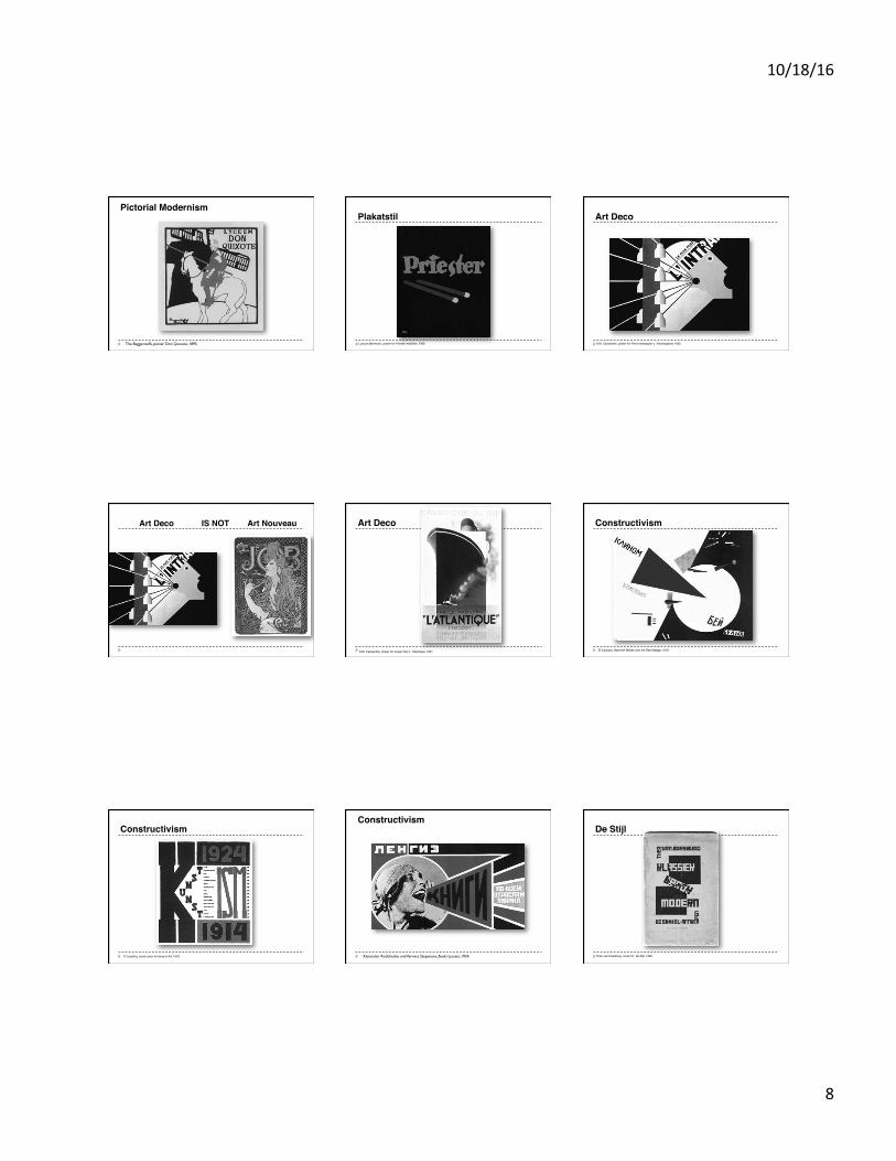
Pictorial Modernism
The Beggarstaffs, poster for Harper’s Magazine, 1896
Pictorial Modernism
10/18/16
8
The Beggarstaffs, poster Don Quixote, 1895
Pictorial ModernismPlakatstil
Lusican Bernhard, poster for Priester matches, 1905
Art Deco
A.M. Cassandre, poster for Paris newspaper L’Intransigeant, 1925
Art Deco IS NOT Art Nouveau Art Deco
A.M. Cassandre, poster for ocean liner L’Atlantique, 1931
Constructivism
El Lissitzky, Beat the Whites with the Red Wedge, 1919
Constructivism
El Lissitzky, book cover for Isms of Art, 1924 Alexander Rodchenko and Varvara Stepanova, Books! poster, 1924
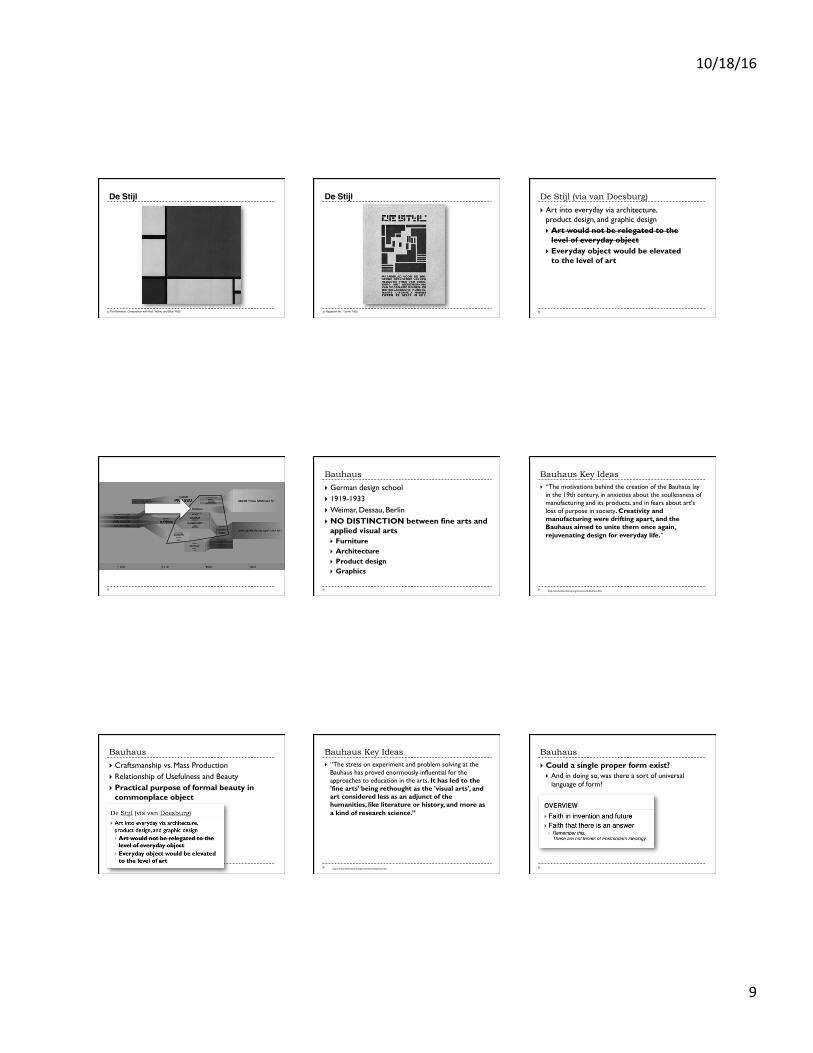
ConstructivismDe Stijl
Theo van Doesburg, cover for de Stijl, 1920
10/18/16
9
De Stijl
Piet Mondrian, Composition with Red, Yellow, and Blue, 1922
De Stijl
Magazine No. 7 cover, 1925
De Stijl (via van Doesburg)
} Art into everyday via architecture, product design, and graphic design } Art would not be relegated to the
level of everyday object } Everyday object would be elevated
to the level of art
Bauhaus
} German design school } 1919-1933 } Weimar, Dessau, Berlin } NO DISTINCTION between fine arts and
applied visual arts } Furniture } Architecture } Product design } Graphics
Bauhaus Key Ideas } “The motivations behind the creation of the Bauhaus lay
in the 19th century, in anxieties about the soullessness of manufacturing and its products, and in fears about art's loss of purpose in society. Creativity and manufacturing were drifting apart, and the Bauhaus aimed to unite them once again, rejuvenating design for everyday life.”
http://www.theartstory.org/movement-bauhaus.htm
Bauhaus
} Craftsmanship vs. Mass Production } Relationship of Usefulness and Beauty } Practical purpose of formal beauty in
commonplace object
Bauhaus Key Ideas } “The stress on experiment and problem solving at the
Bauhaus has proved enormously influential for the approaches to education in the arts. It has led to the 'fine arts' being rethought as the 'visual arts', and art considered less as an adjunct of the humanities, like literature or history, and more as a kind of research science.”
http://www.theartstory.org/movement-bauhaus.htm
Bauhaus
} Could a single proper form exist? } And in doing so, was there a sort of universal
language of form?
10/18/16
10
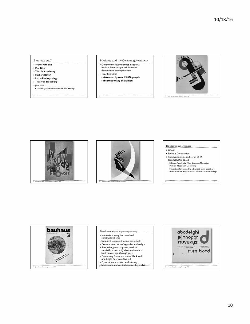
Bauhaus staff
} Walter Gropius } Paul Klee } Wassily Kandinsky } Herbert Bayer } Laszlo Moholy-Nagy } Theo von Doesburg } plus others } including influential visitors like El Lissitzky
Bauhaus and the German government
} Government let authorities insist that Bauhaus have a major exhibition to demonstrate accomplishment
} 1923 Exhibition } Attended by over 15,000 people } Internationally acclaimed
Joost Schmidt, Bauhaus Exhibition Poster, 1923
Lazlo Moholy-Nagy, proposed title page for Broom, 1923 Lazlo Moholy-Nagy, typophoto poster for tires, 1923
Bauhaus at Dessau
} School } Bauhaus Corporation } Bauhaus magazine and series of 14
Bauhausbucher books } Editors: Kandinsky, Klee, Gropius, Mondrian,
Moholy-Nagy, Van Doesburg } Important for spreading advanced ideas about art
theory and its application to architecture and design
Joost Schmidt, Bauhaus magazine cover, 1928
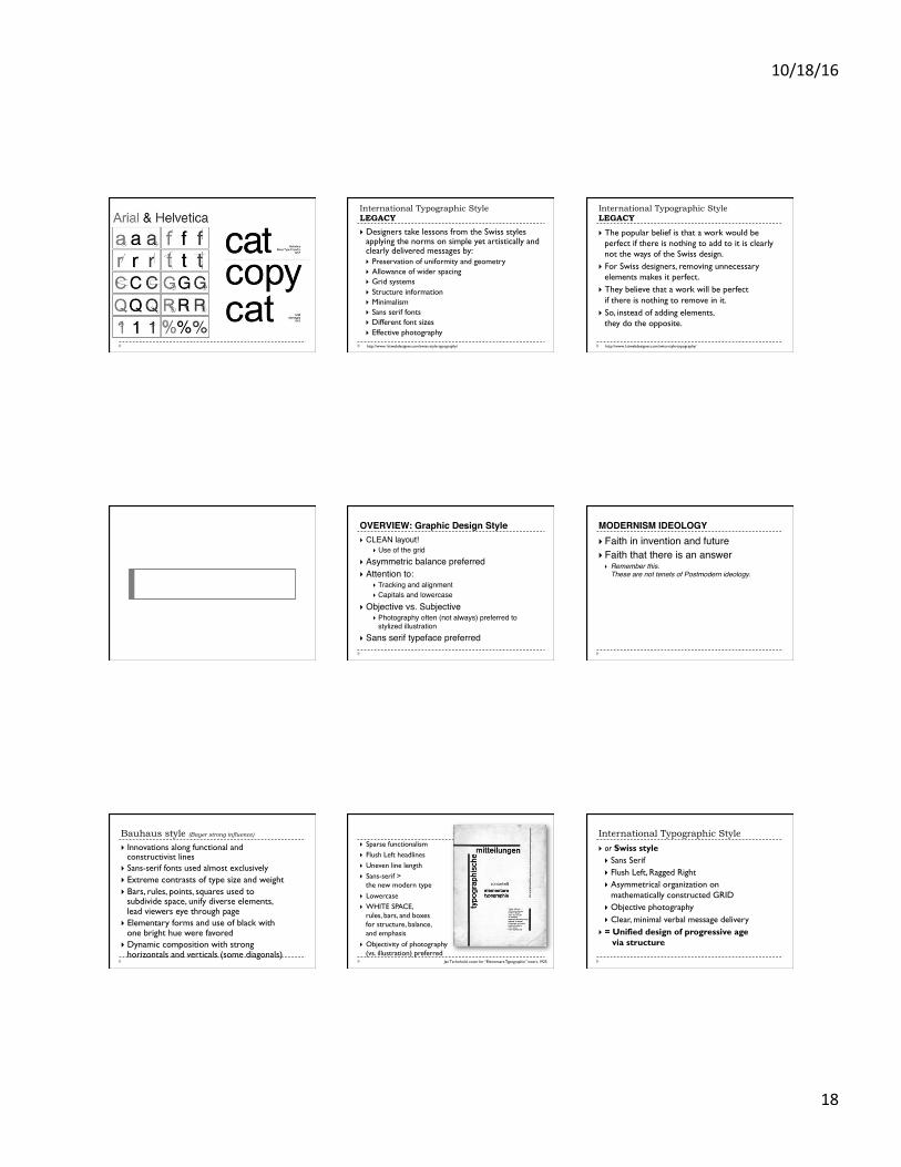
Bauhaus style (Bayer strong influence)
} Innovations along functional and constructivist lines
} Sans-serif fonts used almost exclusively } Extreme contrasts of type size and weight } Bars, rules, points, squares used to
subdivide space, unify diverse elements, lead viewers eye through page
} Elementary forms and use of black with one bright hue were favored
} Dynamic composition with strong horizontals and verticals (some diagonals)
Herbert Bayer, Universal typeface design, 1925
10/18/16
11
Herbert Bayer, Kandinsky 60th birthday exhibition, 1926
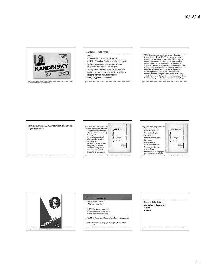
Bauhaus Final Years
} Nazis } Dominated Dessau City Council } 1932 - Cancelled Bauhaus faculty contracts
} Bauhaus attempt to operate out of empty telephone factory in Berlin-Steglitz
} 10 Aug 1933 – faculty voted to dissolve the Bauhaus with a notice that faculty available to students for consultation if needed
} Many emigrated to America
} “The Bauhaus accomplishments and influences transcend its 14-year life, 33 faculty members, and about 1,250 students. It created a viable, modern design movement spanning architecture, product design, and visual communication. A modernist approach to visual education was developed, and the faculty’s class-preparation and teaching methods made a major contribution to visual theory. In dissolving fine and applied art boundaries, the Bauhaus tried to bring art into a close relationship with life by way of design, which was seen as a vehicle for social change and cultural revitalization.” -Meggs
The New Typography: Spreading the Word
} Jan Tschichold
Jan Tschichold, cover for “Elementare Typographie” insert, 1925
} For October 1925 issue of Typographische Mitteilungen (Typographic Impartations), he designed a 24-page insert entitled Elementare Typographie.
} Explained and demonstrated asymmetric typography to printers (most still using Textura type and symmetrical layouts) and typesetters.
Jan Tschichold, cover for “Elementare Typographie” insert, 1925
} Sparse functionalism } Flush Left headlines } Uneven line length } Sans-serif >
the new modern type } Lowercase } WHITE SPACE,
rules, bars, and boxes for structure, balance, and emphasis
} Objectivity of photography (vs. illustration) preferred
Jan Tschichold, cinema poster for Die Hose (The Trousers), 1927
} What was Modernism? Why was Modernism?
} PART 1: European Modernism
} Following Graphic Design lineage } Modern Art movements effect
} PART 2: American Modernism (late to the game)
} PART 3: International Typographic Style (“Swiss” Style) } Helvetica!
ART-2413 : Modernism
} Bauhaus 1919-1933 } American Modernism } 1913 } 1930s
10/18/16
12
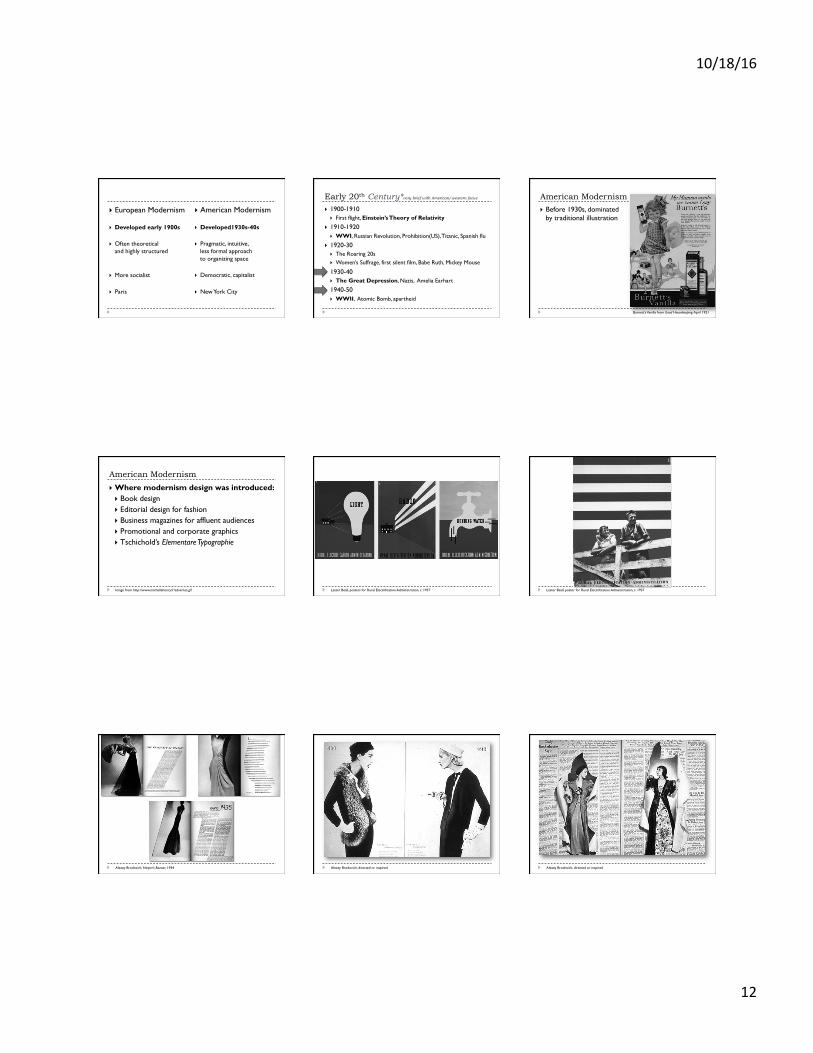
} European Modernism
} Developed early 1900s
} Often theoretical and highly structured
} More socialist
} Paris
} American Modernism
} Developed1930s-40s
} Pragmatic, intuitive, less formal approach to organizing space
} Democratic, capitalist
} New York City
Early 20th Century*very brief with American/western focus
} 1900-1910 } First flight, Einstein’s Theory of Relativity
} 1910-1920 } WWI, Russian Revolution, Prohibition(US), Titanic, Spanish flu
} 1920-30 } The Roaring 20s } Women’s Suffrage, first silent film, Babe Ruth, Mickey Mouse
} 1930-40 } The Great Depression, Nazis, Amelia Earhart
} 1940-50 } WWII, Atomic Bomb, apartheid
American Modernism
} Before 1930s, dominated by traditional illustration
Burnett’s Vanilla from Good Housekeeping, April 1921
American Modernism
} Where modernism design was introduced: } Book design } Editorial design for fashion } Business magazines for affluent audiences } Promotional and corporate graphics } Tschichold’s Elementare Typographie
Image from http://www.michellehenry.fr/advertus.gif Lester Beall, posters for Rural Electrification Administration, c. 1937 Lester Beall, poster for Rural Electrification Administration, c. 1937
Alexey Brodovich, Harper’s Bazaar, 1934 Alexey Brodovich, directed or inspired Alexey Brodovich, directed or inspired
10/18/16
13
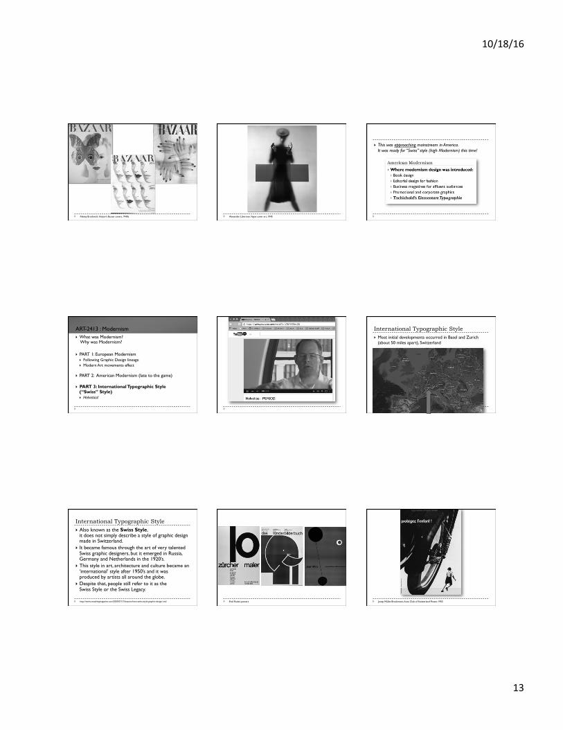
Alexey Brodovich, Harper’s Bazaar covers, 1940s Alexander Liberman, Vogue cover art, 1945
} This was approaching mainstream in America. It was ready for “Swiss” style (high Modernism) this time!
} What was Modernism? Why was Modernism?
} PART 1: European Modernism
} Following Graphic Design lineage } Modern Art movements effect
} PART 2: American Modernism (late to the game)
} PART 3: International Typographic Style
(“Swiss” Style) } Helvetica!
ART-2413 : Modernism International Typographic Style } Most initial developments occurred in Basel and Zurich
(about 50 miles apart), Switzerland
International Typographic Style } Also known as the Swiss Style,
it does not simply describe a style of graphic design made in Switzerland.
} It became famous through the art of very talented Swiss graphic designers, but it emerged in Russia, Germany and Netherlands in the 1920’s.
} This style in art, architecture and culture became an ‘international’ style after 1950’s and it was produced by artists all around the globe.
} Despite that, people still refer to it as the Swiss Style or the Swiss Legacy.
http://www.smashingmagazine.com/2009/07/17/lessons-from-swiss-style-graphic-design/ and Emil Ruder, posters Josep Müller-Brockmann, Auto Club of Switzerland Poster, 1955
10/18/16
14
Joseph Müller-Brockmann
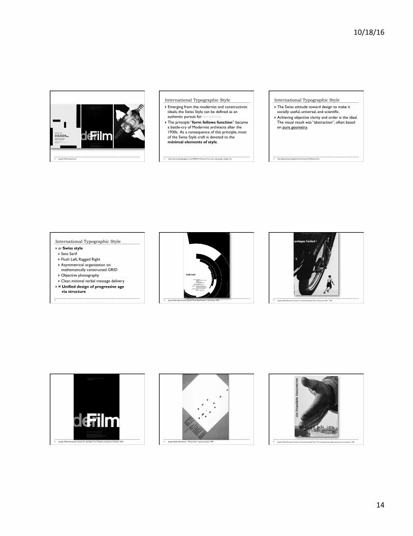
International Typographic Style
} Emerging from the modernist and constructivist ideals, the Swiss Style can be defined as an authentic pursuit for simplicity.
} The principle “form follows function” became a battle-cry of Modernist architects after the 1930s. As a consequence of this principle, most of the Swiss Style craft is devoted to the minimal elements of style.
http://www.smashingmagazine.com/2009/07/17/lessons-from-swiss-style-graphic-design/ and
International Typographic Style
} The Swiss attitude toward design to make it socially useful, universal, and scientific.
} Achieving objective clarity and order is the ideal. The visual result was “abstraction”, often based on pure geometry.
http://gds.parkland.edu/gds/!lectures/history/1950/swiss.html
International Typographic Style
} or Swiss style } Sans Serif } Flush Left, Ragged Right } Asymmetrical organization on
mathematically constructed GRID } Objective photography } Clear, minimal verbal message delivery
} = Unified design of progressive age via structure
Josep Müller-Brockmann, Zurich Town Hall Poster (1 of series), 1955 Joseph Müller-Brockman, Poster for Swiss Automobile Club “Protect the child!”, 1953
Joseph Müller-Brockman, poster for the Basel Civic Theater production of Giselle, 1959 Joseph Müller-Brockman, “Musica Viva” concert poster, 1959 Joseph Müller-Brockman, Poster for Swiss Automobile Club “The considerate hand signal protects from accidents”, 1955
10/18/16
15
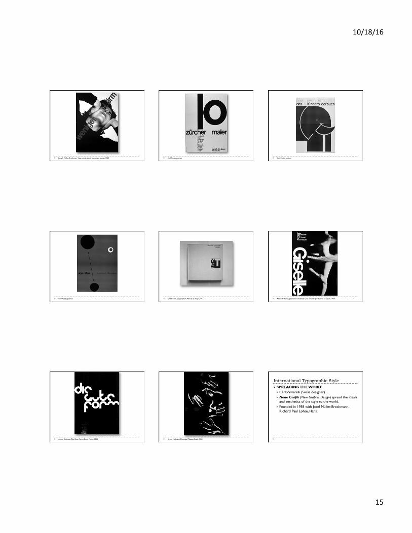
Joseph Müller-Brockman, ‘Less noise’, public awareness poster, 1960 Emil Ruder, posters Emil Ruder, posters
Emil Ruder, posters Emil Ruder, Typographie: A Manual of Design,1967 Armin Hoffman, poster for the Basel Civic Theater production of Giselle, 1959
Armin Hofmann, Die Gute Form (Good Form), 1958 Armin Hofmann, Municipal Theater Basel, 1963
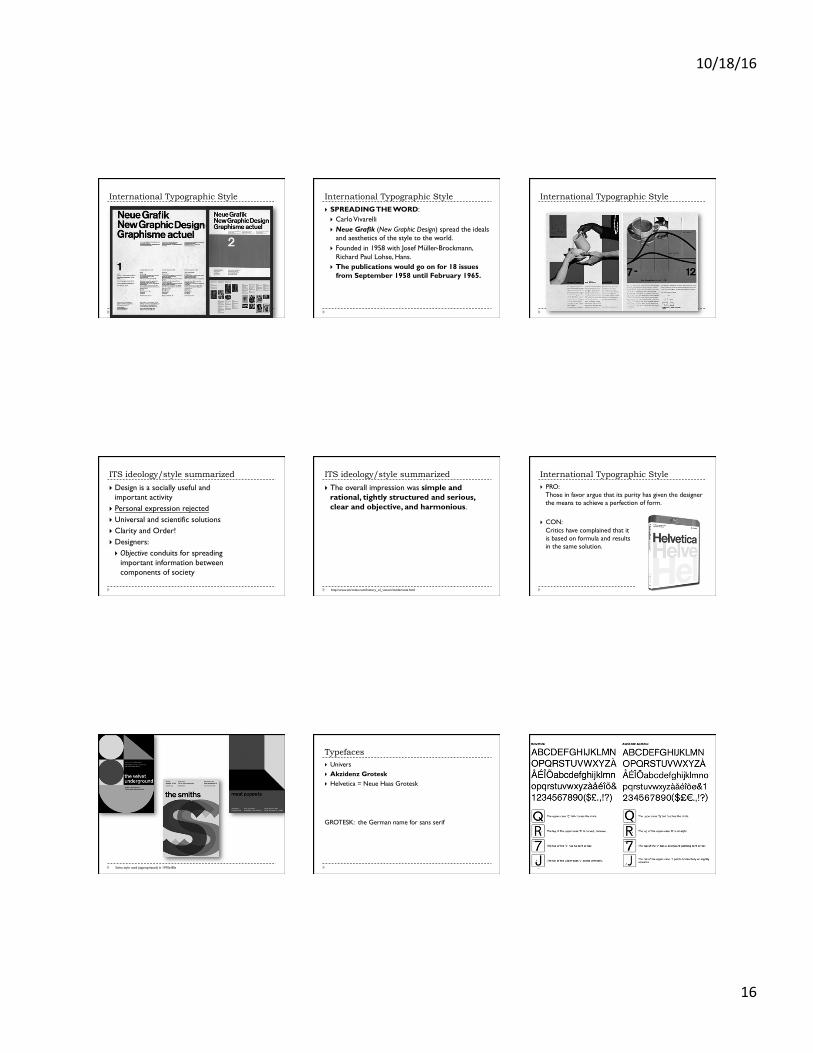
International Typographic Style
} SPREADING THE WORD: } Carlo Vivarelli (Swiss designer) } Neue Grafik (New Graphic Design) spread the ideals
and aesthetics of the style to the world. } Founded in 1958 with Josef Müller-Brockmann,
Richard Paul Lohse, Hans.
10/18/16
16
International Typographic Style International Typographic Style
} SPREADING THE WORD: } Carlo Vivarelli } Neue Grafik (New Graphic Design) spread the ideals
and aesthetics of the style to the world. } Founded in 1958 with Josef Müller-Brockmann,
Richard Paul Lohse, Hans. } The publications would go on for 18 issues
from September 1958 until February 1965.
International Typographic Style
ITS ideology/style summarized
} Design is a socially useful and important activity
} Personal expression rejected } Universal and scientific solutions } Clarity and Order! } Designers: } Objective conduits for spreading
important information between components of society
ITS ideology/style summarized
} The overall impression was simple and rational, tightly structured and serious, clear and objective, and harmonious.
http://www.citrinitas.com/history_of_viscom/modernists.html
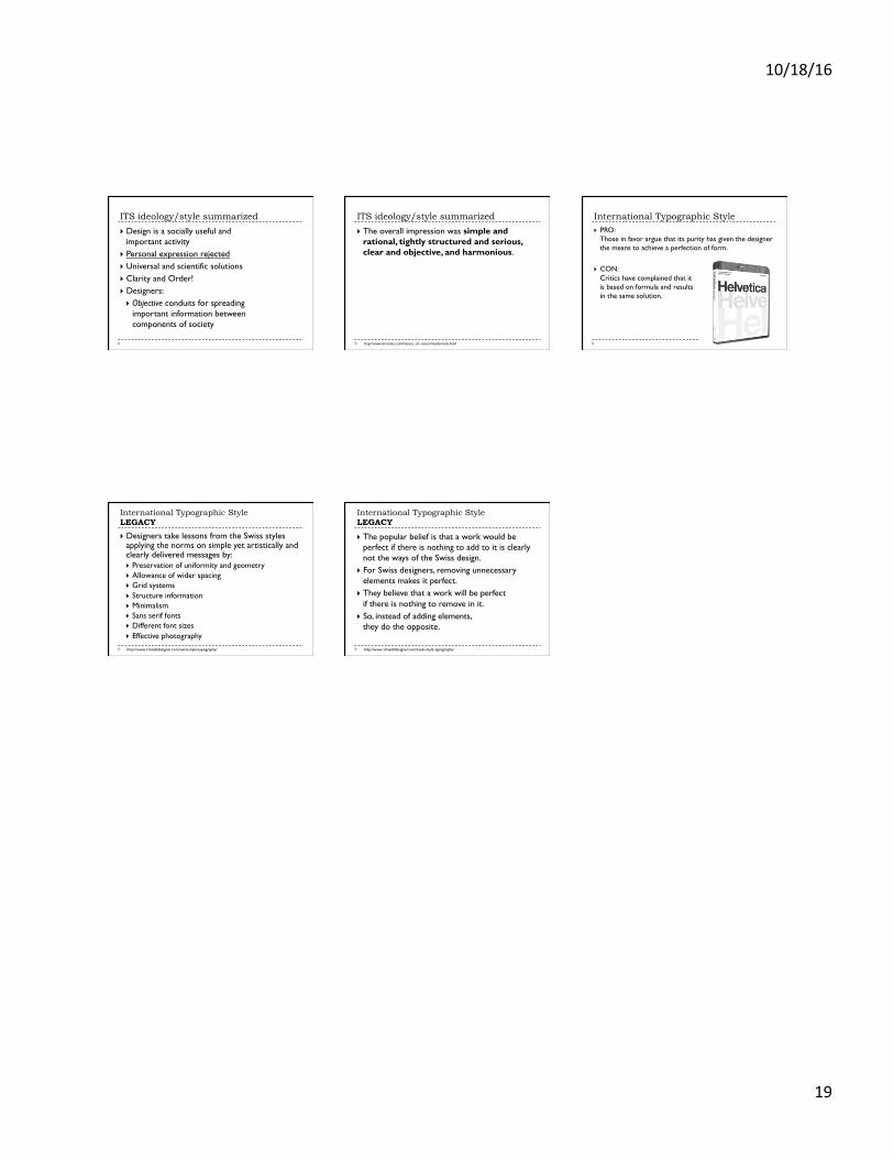
International Typographic Style } PRO:
Those in favor argue that its purity has given the designer the means to achieve a perfection of form.
} CON: Critics have complained that it is based on formula and results in the same solution.
Swiss style used (appropriated) in 1970s-80s
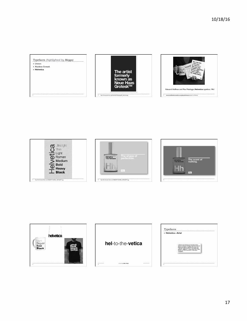
Typefaces } Univers } Akzidenz Grotesk } Helvetica = Neue Haas Grotesk
GROTESK: the German name for sans serif
10/18/16
17
Typefaces (highlighted by Meggs) } Univers } Akzidenz Grotesk } Helvetica
http://www.powerize.org/indexhibit/files/gimgs/8_helvetica.jpg www.brandflakesforbreakfast.com/giftguide/helvetica (based on Helvetica)
Edouard Hoffman and Max Miedinger, Helvetica typeface, 1961
http://farm4.static.flickr.com/3028/2971564406_4c87220477.jpg http://farm4.static.flickr.com/3028/2971564406_4c87220477.jpg
Typefaces } Helvetica ≠ Arial
10/18/16
18
International Typographic Style LEGACY
} Designers take lessons from the Swiss styles applying the norms on simple yet artistically and clearly delivered messages by: } Preservation of uniformity and geometry } Allowance of wider spacing } Grid systems } Structure information } Minimalism } Sans serif fonts } Different font sizes } Effective photography
http://www.1stwebdesigner.com/swiss-style-typography/
International Typographic Style LEGACY
} The popular belief is that a work would be perfect if there is nothing to add to it is clearly not the ways of the Swiss design.
} For Swiss designers, removing unnecessary elements makes it perfect.
} They believe that a work will be perfect if there is nothing to remove in it.
} So, instead of adding elements, they do the opposite.
http://www.1stwebdesigner.com/swiss-style-typography/
OVERVIEW: Graphic Design Style} CLEAN layout!
} Use of the grid} Asymmetric balance preferred} Attention to:
} Tracking and alignment} Capitals and lowercase
} Objective vs. Subjective} Photography often (not always) preferred to
stylized illustration} Sans serif typeface preferred
MODERNISM IDEOLOGY} Faith in invention and future} Faith that there is an answer
} Remember this. These are not tenets of Postmodern ideology.
Bauhaus style (Bayer strong influence)
} Innovations along functional and constructivist lines
} Sans-serif fonts used almost exclusively } Extreme contrasts of type size and weight } Bars, rules, points, squares used to
subdivide space, unify diverse elements, lead viewers eye through page
} Elementary forms and use of black with one bright hue were favored
} Dynamic composition with strong horizontals and verticals (some diagonals)
Jan Tschichold, cover for “Elementare Typographie” insert, 1925
} Sparse functionalism } Flush Left headlines } Uneven line length } Sans-serif >
the new modern type } Lowercase } WHITE SPACE,
rules, bars, and boxes for structure, balance, and emphasis
} Objectivity of photography (vs. illustration) preferred
International Typographic Style
} or Swiss style } Sans Serif } Flush Left, Ragged Right } Asymmetrical organization on
mathematically constructed GRID } Objective photography } Clear, minimal verbal message delivery
} = Unified design of progressive age via structure
10/18/16
19
ITS ideology/style summarized
} Design is a socially useful and important activity
} Personal expression rejected } Universal and scientific solutions } Clarity and Order! } Designers: } Objective conduits for spreading
important information between components of society
ITS ideology/style summarized
} The overall impression was simple and rational, tightly structured and serious, clear and objective, and harmonious.
http://www.citrinitas.com/history_of_viscom/modernists.html
International Typographic Style } PRO:
Those in favor argue that its purity has given the designer the means to achieve a perfection of form.
} CON: Critics have complained that it is based on formula and results in the same solution.
International Typographic Style LEGACY
} Designers take lessons from the Swiss styles applying the norms on simple yet artistically and clearly delivered messages by: } Preservation of uniformity and geometry } Allowance of wider spacing } Grid systems } Structure information } Minimalism } Sans serif fonts } Different font sizes } Effective photography
http://www.1stwebdesigner.com/swiss-style-typography/
International Typographic Style LEGACY
} The popular belief is that a work would be perfect if there is nothing to add to it is clearly not the ways of the Swiss design.
} For Swiss designers, removing unnecessary elements makes it perfect.
} They believe that a work will be perfect if there is nothing to remove in it.
} So, instead of adding elements, they do the opposite.
http://www.1stwebdesigner.com/swiss-style-typography/