1 csci e-170: l07 november 7, 2005 sept. 28, 2004
TRANSCRIPT

1
CSCI E-170: L07 November 7, 2005
Sept. 28, 2004

2
Lecture Plan
Midterm Quiz #1: Technical Problems
Midterm Projects
Introduction to Usability
GUI Usability:Design Process, Principles & Bloopers
Usability Testing
3
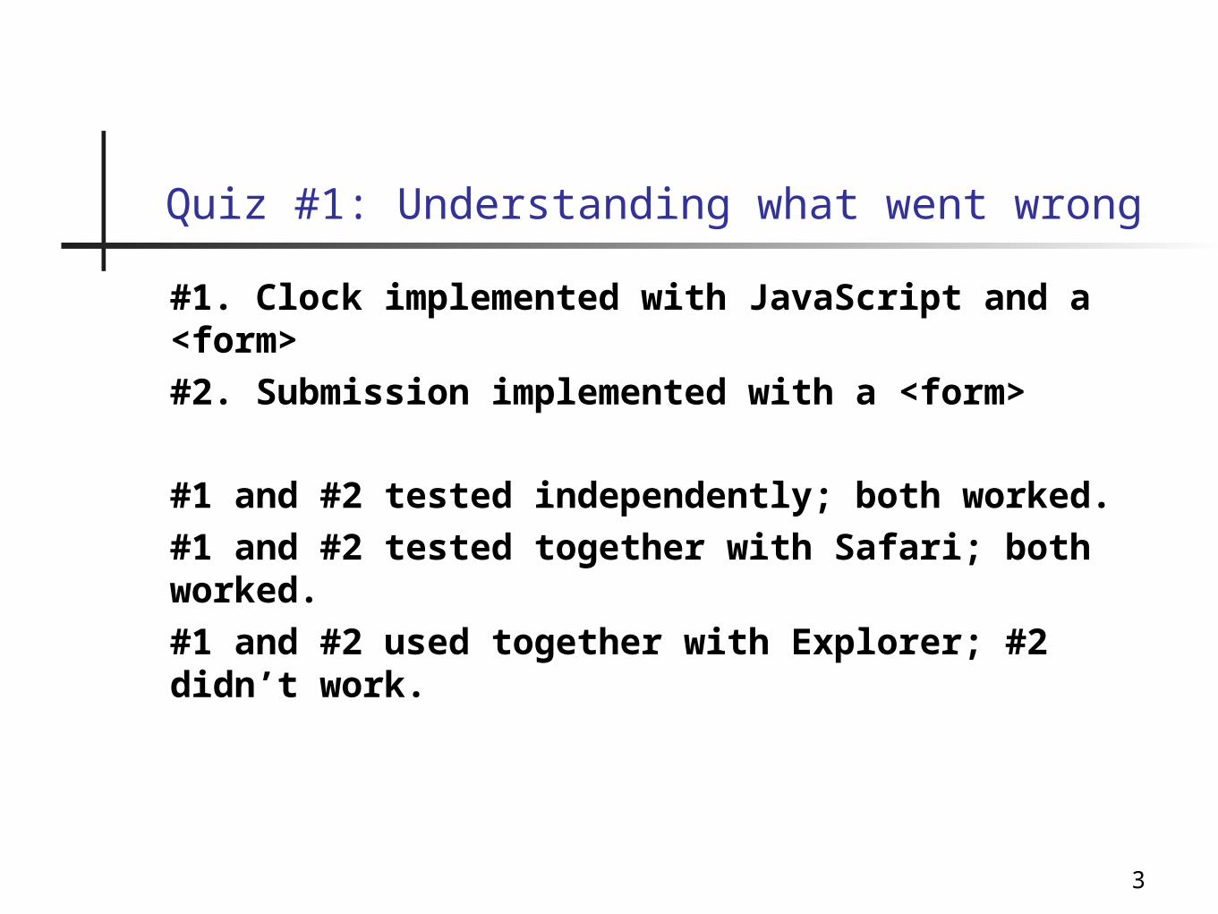
Quiz #1: Understanding what went wrong
#1. Clock implemented with JavaScript and a <form>
#2. Submission implemented with a <form>
#1 and #2 tested independently; both worked.
#1 and #2 tested together with Safari; both worked.
#1 and #2 used together with Explorer; #2 didn’t work.

4
Quiz #1: When is a <form> ignored?
Examination of HTML realed:<body onload="StartClock()" onunload="KillClock()"><center>Time Remaining: <form name="theClock"><input type=text name="theTime" size=30><form></center>
Text should have read:<body onload="StartClock()" onunload="KillClock()"><center>Time Remaining: <form name="theClock"><input type=text name="theTime" size=30></form></center>
Result: Form #2 never created

5
Midterm projects
A few groups have sent in their proposals.
“Drill-down!” Most proposals are too broad.Instead of looking at DRM, look at a specific DRM.Instead of comparing healthcare privacy in Japan, France and US, look at a specific issue in healthcare privacy.
Don’t let this go until the last week!
You will be asked to write confidential comments about your teammates and assign “cooperation grades.”

6
Designing Usable Interfaces
What is the computer interface?(collect on board)

7
Command Line
Originally developed with teletypes & printing terminals
“Glass Teletypes”
xterm, terminal, command.com, cmd.sys

8
WIMP
Windows, Icons, Mouse & Pull-downs Menues
Developed in the late 1970s early 1980s
Typified by:
Overlapping Windows
Lots of graphics
Common interface to all applications on a system.

9
Tiny WIMP
PalmOS
Pocket PC
Symbian

10
Alternative Interfaces: Non-WIMP
Speech
Gesture hands
eye-tracking
Tactile
Dance
QuickTime™ and aTIFF (Uncompressed) decompressor
are needed to see this picture.
QuickTime™ and aTIFF (Uncompressed) decompressor
are needed to see this picture.
QuickTime™ and aTIFF (Uncompressed) decompressor
are needed to see this picture.
http://www20.graphics.tomshardware.com/display/20050502/3d_stereo-06.html
11
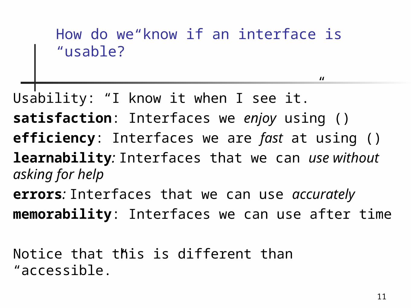
How do we know if an interface is “usable?”
Usability: “I know it when I see it.”
satisfaction: Interfaces we enjoy using ()
efficiency: Interfaces we are fast at using ()
learnability: Interfaces that we can use without asking for help
errors: Interfaces that we can use accurately
memorability: Interfaces we can use after time
Notice that this is different than “accessible.”

12
Building a usable interface: The Design Cycle
Task Analysis What problem is the user really trying to solve?
Iterative Design (usability spiral)
1. Design
2. Prototype
3. Evaluate
4. Repeat
Keep the customer in the picture!

13
Task Analysis
Observe existing work practices
Create scenarios
Create “customers” / “personas” Sally in accounting
Bob the new user
Discuss ideas with end-users
Show prototypesTry out ideas before committing to software

14
Does Task Analysis Always Make sense?
Q: What is the task that a user in a game is trying to solve?

15
“Doom as a user interface for process management”
2001 Proceedings of the SIGCHI conference on Human factors in computing systems
http://citeseer.ist.psu.edu/chao01doom.html

16
Rapid Prototyping
Build a mock-up
Low-cost techniques:Paper!
Adobe Illustrator / Photoshop
Cheap interfaces:GUI builder
Flash

17
Designing usable interfaces
Jeff Johnson, GUI Bloopers: Don’t and Do’s for Software Developers and Web Designers, Morgan Kaufmann, 2000
18
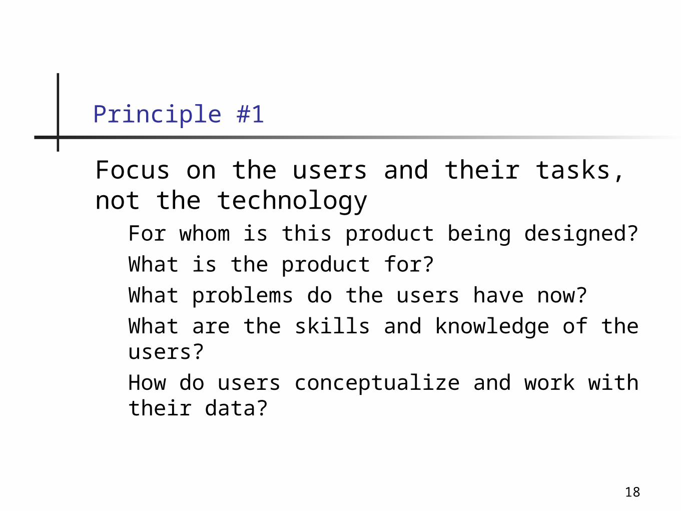
Focus on the users and their tasks, not the technology
For whom is this product being designed?
What is the product for?
What problems do the users have now?
What are the skills and knowledge of the users?
How do users conceptualize and work with their data?
Principle #1

19
Consider function first, presentation laterDoes not mean “worry about the user interface later!”
Develop a conceptual model
Keep it as simple as possible, but no simpler
Develop a lexicon (***)
Principle #2:

20
Conform to the users’ view of the taskStrive for naturalness
Use the user’s vocabulary, not your own
Keep program internals inside the program
(remember, the implementation can change!)
Principle #3:

21
Don’t complicate the user’s taskCommon tasks should be easy
Don’t give users extra problems to solveConverting a file format from TIFF to JPG for web publishing
Installing program “A” in order to install program “B”
Looking up information one screen to type it on another
Principle #4

22
Promote Learning Inside the InterfaceThink “outside-in,” not “inside-out” — The user wants to solve a problem, not learn how to use your program!
Be careful of ambiguity“He saw the woman with the telescope”
Icons that don’t make sense
Be consistent so there is something to learn!
Principle #5
23
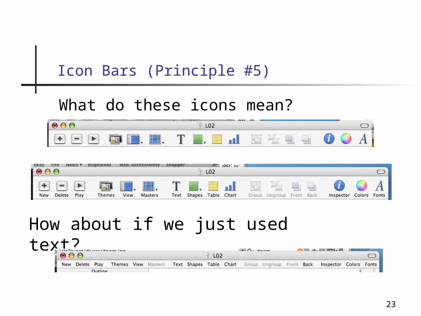
Icon Bars (Principle #5)
What do these icons mean?
How about if we just used text?

24
Deliver information, not just dataDesign displays carefully
The screen belongs to the user
Preserve display inertia
Principle #6

25
The Two Most Important Principles!
Principle 7: Design for responsivenessMany users will forgive a bad interface, as long as it is fast.
Principle 8: Try it out on users, then fix it!Testing and iteration are the keys to good interface design.
In most cases, programmers design for themselves... is that a good thing? Is that a bad thing?

26
SBook: an interface that I designed for myself…
27
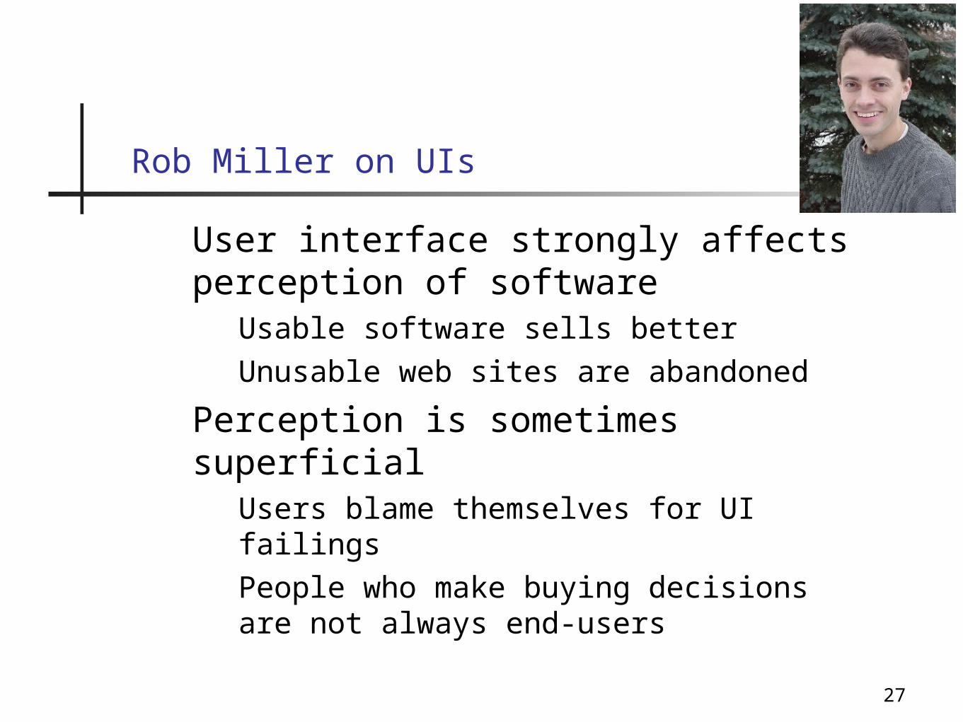
User interface strongly affects perception of software
Usable software sells better
Unusable web sites are abandoned
Perception is sometimes superficialUsers blame themselves for UI failings
People who make buying decisions are not always end-users
Rob Miller on UIs
28
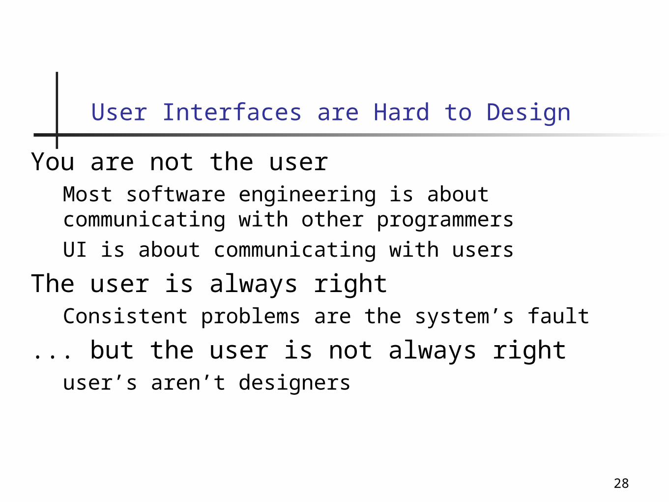
You are not the userMost software engineering is about communicating with other programmers
UI is about communicating with users
The user is always rightConsistent problems are the system’s fault
... but the user is not always rightuser’s aren’t designers
User Interfaces are Hard to Design
29
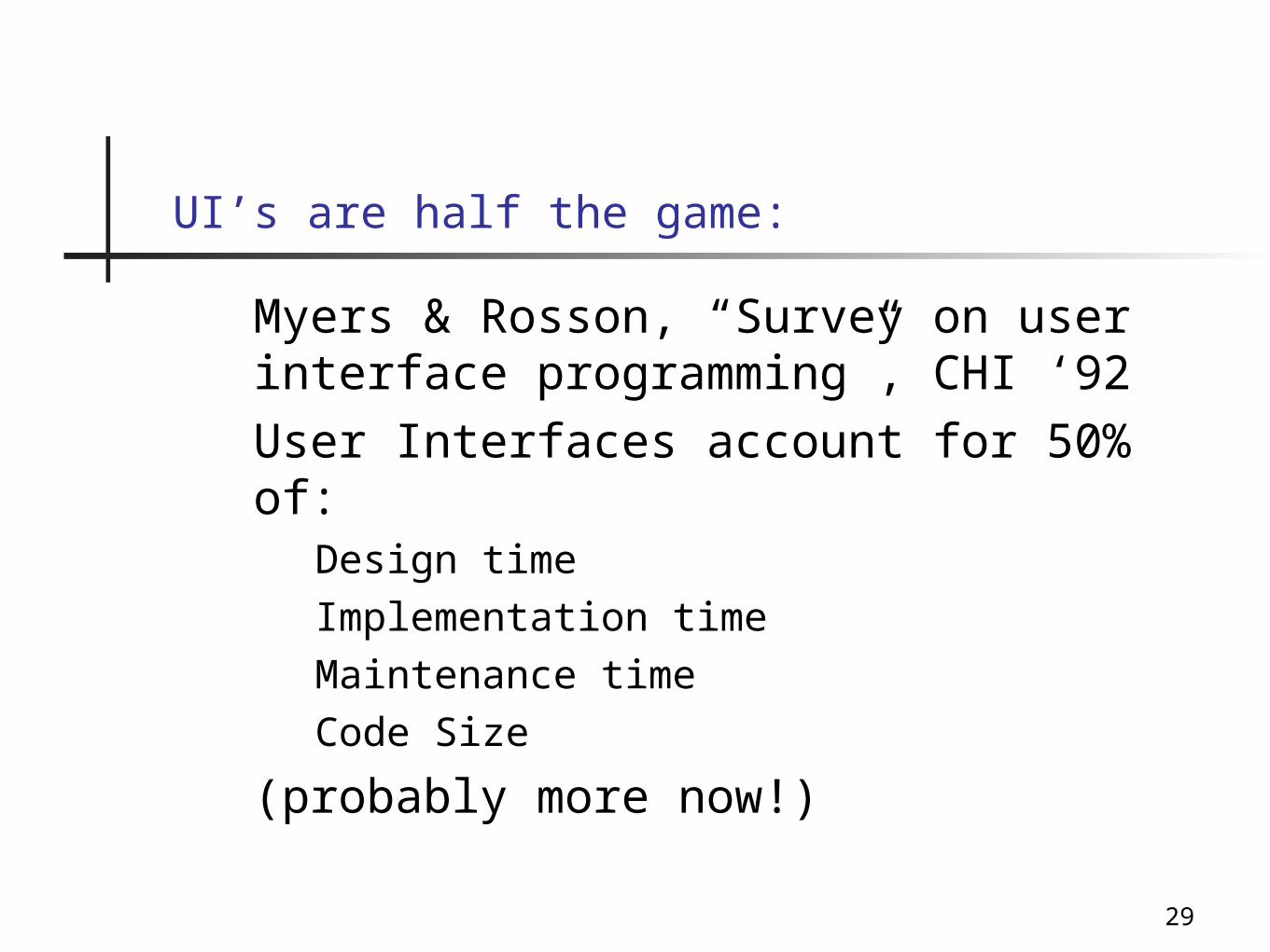
UI’s are half the game:
Myers & Rosson, “Survey on user interface programming”, CHI ‘92
User Interfaces account for 50% of:Design time
Implementation time
Maintenance time
Code Size
(probably more now!)

30
UI Hall Of Shames
http://www.rha.com/ui_hall_of_shame.htm
http://pixelcentric.net/x-shame/

31
HCI-SEC: Usability & Security
Discussed by Saltzer & Schroeder,then largely ignored until recently.
Why the recent interest?
(class)
QuickTime™ and aTIFF (Uncompressed) decompressor
are needed to see this picture.

32
Why the recent interest in HCI-SEC?
End users are system managers.
Increased connectivity.
Increased threat: home banking, phishing, etc.
Demilitarization of cyberspace

33
Why is CHI-SEC Hard?
Whitten & Tygar suggest that it is inherently difficult to create interfaces for computer security applications.
Why would this be true?

34
The Secondary Goal Property*
“People do not generally sit down at their computers wanting to manage their security; rather, they want to send mail, browse web pages, or download software.”
____
* previously called “the unmotivated user property”

35
The hidden failure property*
It is difficult to provide good feedback for security management and configuration because configurations are complex and not easy to summarize
____
* previously called “the lack of feedback property”

36
The abstraction property
Security policies are usually phrased as abstract rules that are easily understood by programmers but “alien and unintuitive to many members of the wider user population.”

37
The barn door property
Once a secret gets out, it’s out. Information disclosure cannot be reversed.Even worse, there is no way to know if an unprotected secret has been compromised is being privately circulated by others.“Because of this, user interface design for security needs to place a very high priority on making sure users understand their security well enough to keep from making potentially high-cost mistakes.”

38
The weakest link property
The security of a system is like a chain: it is only as strong as the weakest link.
“If a cracker can exploit a single error, the game is up.”

39
Question for class discussion: Do the Whitten/Tygar principles make sense?
The Secondary Goal Property
The Hidden Failure Property
The Abstraction Property
The Barn Door Property
The Weakest Link Property39
What is the use scenario that drives these properties?