04 i 2010 i issue 04islamicartsmagazine.com/images/uploads/shop/iam04_sample.pdf · -111-iam 04 i...
TRANSCRIPT

04 I 2010 I www.islamicartsmagazine.com
-98-
Issue 04258 pages
Cover image:JASMIN FAZLAGIĆ, ‘Bey’s wife’ from the Photo Monography ’Traditional clothing and jewelry in B&H’, 2010
LEARN MORE

SPIRITUAL AND ARTISTIC IN ISLAMIC ART
NEW WAY OF SEING AND BUILDING A MOSQUE
BOOK REVIEW
TRADITIONAL CLOTHING
AND JEWELRY IN B&H
ISSUE 04
CONTENT
TAJ MAHAL THE SYMBOL OF LOVE AND ARCHITECTURAL PERFECTION

LINE AND RESEARCH
SOCIAL REALITY THROUGH THE SOCIAL CONCEPT
ISLAMIC ART COLLECTION IN THE WALTERS ART MUSEUM
HUMANTREE: LOCAL ARTISTS, GLOBAL CHARITY
BOSNIAN TRADITIONAL ARCHITECTURE
BOOK REVIEW
CAIRO PHOTOGRAPHIC
TREASURE
GRAPHIC EXPERIMENTATION THAT PUSH THE LIMITS OF LEGIBILITY

-105--104-
Interview: Muiz Anwar
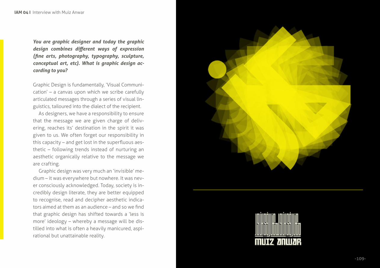
GRAPHIC EXPERIMENT-ATIONS WHICH PUSH THE LIMITS OF LEGIBILITY All photos in this article are copywritten. Copyright © Muiz Anwar

-107-
MUIZ ANWARGrew up in the industrial city of Manchester but blessed to have travelled the world at an early age. His first love was illustration - as a child he always had a pen in one hand, paper in the other. Through school he was introduced to fine art painting and sculpture. That coupled with his illustrative skills led him to become a protégé product design, being runner up in the regional final of Young Audi Designer of the Year in 2005. Upon completing a Foundation Course, he was introduced to a world of graphic work alongside fashion and photography.
All these creative out puts have gifted him with an enriched visual style, which encapsulates many ideas and concepts, considers many media - but ultimately remains as minimal and true to the message it is intended to communicate as possible. After all, whether you consider yourself an artist, designer or both, you have a role, however important, to communicate the messages as efficiently as possible.
Graphic design was crucially introduced to him as a form of visual communication. Having witnessed the global miscommunication and reinforcement of stereotypes of a faith, culture and community he’s a part of, he found his role as a ‘visual communicator’ all the more relevant and significant. He has a role and responsibility to help initiate change and promote the voice of rationale to all parties involved.
CLICK > www.muiz.co.uk
IAM 04 I Interview with Muiz Anwar
-109-
You are graphic designer and today the graphic design combines different ways of expression (fine arts, photography, typography, sculpture, conceptual art, etc). What is graphic design ac-cording to you?
Graphic Design is fundamentally, ‘Visual Communi-cation’ – a canvas upon which we scribe carefully articulated messages through a series of visual lin-guistics, tailoured into the dialect of the recipient.
As designers, we have a responsibility to ensure that the message we are given charge of deliv-ering, reaches its’ destination in the spirit it was given to us. We often forget our responsibility in this capacity – and get lost in the superfluous aes-thetic – following trends instead of nurturing an aesthetic organically relative to the message we are crafting.
Graphic design was very much an ‘invisible’ me-dium – it was everywhere but nowhere. It was nev-er consciously acknowledged. Today, society is in-credibly design literate, they are better equipped to recognise, read and decipher aesthetic indica-tors aimed at them as an audience – and so we find that graphic design has shifted towards a ‘less is more’ ideology – whereby a message will be dis-tilled into what is often a heavily manicured, aspi-rational but unattainable reality.
-111-
IAM 04 I Interview with Muiz Anwar
-110-
This trend and self-conscious design though beautiful, serves more toward artistic merit than design principle. Artistic messages are given a unique license for abstraction in their message, making them more ambiguous and interpretative. Design however, is there to communicate with clarity – to be pure in its’ conveyance of the idea. ‘Good’ design can be the difference between life and death (health & safety signage). Good design allows people to access information with greater ease and efficiency.
You experiment a lot with typography. Can you tell us something about that?
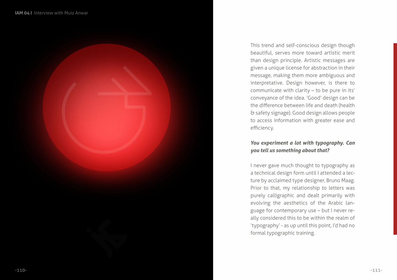
I never gave much thought to typography as a technical design form until I attended a lec-ture by acclaimed type designer, Bruno Maag. Prior to that, my relationship to letters was purely calligraphic and dealt primarily with evolving the aesthetics of the Arabic lan-guage for contemporary use – but I never re-ally considered this to be within the realm of ‘typography’ - as up until this point, I’d had no formal typographic training.

-113-
IAM 04 I Interview with Muiz Anwar
-112-
Bruno really introduced me to the cultural and his-torical significance of typography as a language and codes – he opened my eyes to the philosophy, psychology and science of linguistics and how we decipher these symbols into sonics and in turn, into language. It was a revelation, like a light bulb had been turned on in my head, it was so in keep-ing with the profound significance I had already attributed to graphic design as visual communi-cation – it affirmed the philosophy I had already formulated and realised in my design practise – design for purpose – design informing culture – design informing society – the responsibility of the designer etc. Bruno, in that hour long lecture in Manchester City centre, at the end of my final year at university, on a hot summer afternoon, was my Mr. Miyagi!
I’ve been exploring the potential to evolve Ara-bic characters through type design ever since – through graphic experimentations which push the limits of legibility – and others which challenge the seemingly conventional, calligraphic prefer-ences and parameters of legibility that most na-tive Arabic readers seem so accustomed to in cur-rent Arabic type design.
TYPE - GeoKufic - Mark2 - AynGhayn

-115-
IAM 04 I Interview with Muiz Anwar
-114- TYPE - GeoKufic - Mark2 - JeemHaKha

-117-
IAM 04 I Interview with Muiz Anwar
-116-
Arabic typography still seems inextricably linked to classical calligraphic styles, ‘clipart’ handwrit-ten styles or Orientalist notions of what Arabic should look like. There is centuries of rich, techni-cal and creative development of this language to draw upon and yet there have been so few sig-nificant leaps in the aesthetic development of the language typographically over the past century. This is partially due to the limitations of technolo-gy being able to handle the advanced and elegant nuances that make Arabic such a rich script – and also due to the decline of the arts being seen as a viable academia / career path for many individu-als from the Middle East and Asia.
It’s time that we saw Arabic that really repre-sented the design sensibilities of the new gen-eration of Arabic speakers / readers in the world today. That doesn’t mean we should ignore the centuries of technical proficiency Master calligra-phers developed and honed in over 1,000 calli-graphic styles. We should honour their technical proficiency, but also their courage to innovate.
TYPE - GeoKufic - Mark2 - Qaf

IAM 04 I Interview with Muiz Anwar
-119-
You worked on the Intellectual Lifestyle Magazine. The Issue ‘Hi-jaab’ is very interesting. You pre-sent hijab through different con-text: historical, cultural, fashion... Tell us more about this project.
ILM was a project I had been wait-ing to realise since I started univer-sity – it was the crowning project of my working practise on the prin-ciple of design with substance. It was an incredibly personal project.
ILM in Arabic means ‘Knowl-edge’ and in English, it is the ab-breviation of Intellectual Lifestyle Magazine.
As a brief, it is a bi-annual publi-cation aimed at the 16-25 year old, European/American demographic which would explore some of the worlds’ most complex and contro-versial issues with academic detail, whilst offering the most compre-hensive spectrum of opinion avail-able on said issue from experts or those directly affected or involved in that chosen topic – to give the
choice and freedom for the reader to come to their own conclusion.
My main foray into the Arabic aesthetic was primarily motivat-ed/catalysed by the War on Terror. I had never consciously identified or understood my religious, cul-tural, ethnic or political identity (like many other young Muslims of my generation), until we were put into the public spotlight following September 11th - where mass hys-teria ensued of the Muslim Men-ace propagated by media stereo-types and misinformation. No one seemed articulate enough to clar-ify who or what this community I was born into were or represented and consequently we were easily demonised and targeted.
During this process of academic and rigorous questioning of my identity - to better understand who, what, where, when, why and how my faith is the way it is - I gained a more intimate and intel-lectual relationship and aware-ness of all these things.
-118-

-121-
IAM 04 I Interview with Muiz Anwar
-120-
I wanted to put together a publication, which could provide this sophisticated information in an engag-ing format, that didn’t patronise the reader because of their age or ethnicity – but trusted and respected their intelligence to allow them to ponder and dis-cuss the facts of the situation they were reading. To provide a platform for these adolescents upon which they could feel empowered and in control of their political awakening – to the realities of cor-ruption, politics, faith, culture, finance and history – subjects which all too often are seen as worthy of a text book or classroom.
The ability to communicate sophisticated messag-es through visuals (A Picture is worth a thousand Words) was an incredibly potent sign in giving de-sign a sense of purpose beyond the superfluous / ‘soul-selling’ commercialist aesthetic. It had a func-tion / significance / power to shape communities and minds - and as a member of community in-creasingly misunderstood, I saw it as a timely op-portunity to use visual skills I had been blessed to have a lifetime’s worth of development to good use.

-123-
IAM 04 I Interview with Muiz Anwar
-122-

IAM 04 I Interview with Muiz Anwar
-124-
-127-
IAM 04 I Interview with Muiz Anwar
-126-
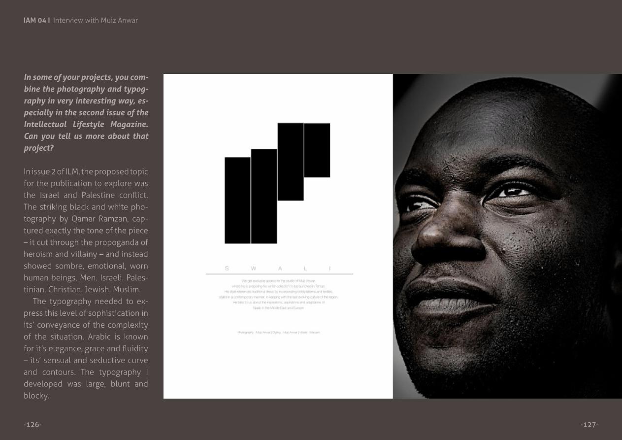
In some of your projects, you com-bine the photography and typog-raphy in very interesting way, es-pecially in the second issue of the Intellectual Lifestyle Magazine. Can you tell us more about that project?
In issue 2 of ILM, the proposed topic for the publication to explore was the Israel and Palestine conflict. The striking black and white pho-tography by Qamar Ramzan, cap-tured exactly the tone of the piece – it cut through the propoganda of heroism and villainy – and instead showed sombre, emotional, worn human beings. Men. Israeli. Pales-tinian. Christian. Jewish. Muslim.
The typography needed to ex-press this level of sophistication in its’ conveyance of the complexity of the situation. Arabic is known for it’s elegance, grace and fluidity – its’ sensual and seductive curve and contours. The typography I developed was large, blunt and blocky.

-129-
IAM 04 I Interview with Muiz Anwar
-128-
Characters which normally ex-uded a horizontal elegance were now crushed into vertical align-ment (the beh character). This was to represent the seizure of land, the lack of freedom, the political, economic and civic imprisonment of the population in Palestine. The strong vertical aesthetic – which was designed to be a stark con-trast to the grace of the horizon-tal rhythm of Arabic was intended to imply the level of disruption to heritage, history and culture. The condensed characters coupled with this vertical alignment also represented what was at the time, officially referred to as the ‘secu-rity fence,’ which is now known as the 20ft high concrete ‘security wall.’

-131-
IAM 04 I Interview with Muiz Anwar
-130-
It was a bold departure from how Arabic has always been read and seen aesthetically. And yet it re-tained a familiarity amongst all na-tive Arabic readers. Despite these voluptuous characters being dis-tilled into bold linear, condensed forms, the rhythm and distinctive features of the characters were still evident enough to make them legible.
It was a fascinating exercise in pushing Arabic into the 21 Century – pushing the boundaries of what is considered legible to a commu-nity who are so used to reading from digital renditions of classical, calligraphic scripts. It ultimately led me to my most radical typo-graphic experiment – the Morse Code Arabic.

-133-
IAM 04 I Interview with Muiz Anwar
-132-
“Morse Code” ArabicTypographically pushing Ara-bic to its’ legible & aesthetic limits. Each character is en-tirely unique in the line sim-ulation and space it occupies – so I was curious to see how I could retain their relative distinctive features by also diluting their detail and mut-ing their form.
“Morse Code” Arabic: Allah >

-135-
IAM 04 I Interview with Muiz Anwar
-134- “Morse Code” Arabic: Khadijah

-137-
IAM 04 I Interview with Muiz Anwar
-136- “Morse Code” Arabic: Muhammad

-139-
IAM 04 I Interview with Muiz Anwar
-138-
“Morse Code” Arabic: Bismillah
Would you describe your art as Islamic art?
It depends on what you would de-fine as Islamic art? People have had great debates over the clas-sification of calligraphy as Islamic calligraphy or Arabic calligraphy? Does it depend on the content of the work? The language? The country? Or the faith of the artist?
The subjects I explore bear more relation to the science, tech-nology, culture, philosophy and history of language than Islam as a theology. The fact that my typo-graphic work deals primarily with the Arabic language can make it easily classified as coming from an Islamic sphere – but this would in essence be born from a colonialist mentality whereby the Middle East and Arabic is obstensibly Muslim. The Middle East is the birth place of Christianity, Judaism as well as Islam – and there are many exam-ples of ancient Torahs and Bibles written and illuminated in Arabic,

-141-
IAM 04 I Interview with Muiz Anwar
-140-
in the same style as the Qur’ans of the time.
In conclusion, though my work uses the Arabic language – though my work deals with Middle East-ern politics – issues related to the Muslim community – It is not Is-lamic according to the Orientalist principle.
Traditional ‘Islamic’ art was re-nowned for it’s fusion of mathe-matics, science and technological proficiency and craftsmanship. It was a rare example of art inform-ing science and science informing art – a beautiful discourse produc-ing objects which are now treas-ured and marvelled in equal meas-ure by professional and experts in every field.
I’d like to think if my work was to fit any category of Islamic defini-tion, I’d aspire for it to be classified as that.
< TYPE - Salaam (Peace)

-238-
Don’t miss a thing!
Join us on Facebook:
Follow us on Twitter:
-239-
www.facebook.com/IslamicArtsMagazine
twitter.com/IslamicArtsMag