xamarin edition - componentsource · table of contents getting started with xamarin edition 5...
TRANSCRIPT

ComponentOne
Xamarin Edition

ComponentOne, a division of GrapeCity201 South Highland Avenue, Third FloorPittsburgh, PA 15206 USA
Website: http://www.componentone.comSales: [email protected]: 1.800.858.2739 or 1.412.681.4343 (Pittsburgh, PA USA Office)
Trademarks
The ComponentOne product name is a trademark and ComponentOne is a registered trademark of GrapeCity, Inc. Allother trademarks used herein are the properties of their respective owners.
Warranty
ComponentOne warrants that the media on which the software is delivered is free from defects in material andworkmanship, assuming normal use, for a period of 90 days from the date of purchase. If a defect occurs during thistime, you may return the defective media to ComponentOne, along with a dated proof of purchase, andComponentOne will replace it at no charge. After 90 days, you can obtain a replacement for the defective media bysending it and a check for $25 (to cover postage and handling) to ComponentOne.
Except for the express warranty of the original media on which the software is delivered is set forth here,ComponentOne makes no other warranties, express or implied. Every attempt has been made to ensure that theinformation contained in this manual is correct as of the time it was written. ComponentOne is not responsible for anyerrors or omissions. ComponentOne’s liability is limited to the amount you paid for the product. ComponentOne isnot liable for any special, consequential, or other damages for any reason.
Copying and Distribution
While you are welcome to make backup copies of the software for your own use and protection, you are notpermitted to make copies for the use of anyone else. We put a lot of time and effort into creating this product, and weappreciate your support in seeing that it is used by licensed users only.

Table of ContentsGetting Started with Xamarin Edition 5
Breaking Changes for Xuni Users 5-6
NuGet Packages 6-7
Redistributable Files 7-8
System Requirements 8-9
Licensing 9
Licensing your app using GrapeCity License Manager Add-in 9-14
Licensing your app using website 14-15
Finding the Application Name 15-17
Creating a New Xamarin.Forms App 17-19
Creating a New Xamarin.Forms App 19-20
Adding NuGet Packages to your App 20-22
Adding Xamarin Components using C# 22-24
Adding Xamarin Components using XAML 24-25
About this Documentation 25
Technical Support 25-26
Controls 27
Calendar 27
Quick Start: Display a Calendar Control 27-30
Interaction Guide 30-31
Features 31
Customizing Appearance 31-33
Customizing Header 33-36
Customizing Day Content 36-39
Orientation 39-40
Selection 40-41
Customizing Selection 41-42
CollectionView 42
Features 42
Grouping 42-44
Incremental Loading 44-47
Sorting 47-48
FlexChart 48-49
Quick Start: Add Data to FlexChart 49-53
Xamarin Edition 1

Chart Elements 53-54
Chart Types 54-58
Features 58
Axes 58-61
Customize Appearance 61-62
Data Binding 62-64
Data Labels 64-67
Header and Footer 67-68
Hit Test 68-70
Legend 70-71
Mixed Charts 71-72
Multiple Y Axes 72-75
Selection 75-76
Themes 76-78
Zones 78-82
FlexGrid 82-83
Quick Start: Add Data to FlexGrid 83-87
Features 87
Custom Cells 87-91
Custom Cell Editor 91
Customize Appearance 91-92
Clipboard and Keyboard Support 92-93
Data Mapping 93-95
Defining Columns 95-96
Editing 96
Inline Editing 96-97
Filtering 97
Search Box Filtering 97-99
Formatting Columns 99-101
Frozen Rows and Columns 101-102
Grouping 102-104
Merging Cells 104-106
Resizing Columns 106
Row Details 106-115
Sorting 115-118
Selecting Cells 118
Xamarin Edition 2

Star and Auto Sizing 118-119
Wordwrap 119-120
FlexPie 120-121
Quick Start: Add data to FlexPie 121-124
Features 124
Customize Appearance 124-125
Data Binding 125-126
Data Labels 126-129
Donut Pie Chart 129-130
Exploded Pie Chart 130
Header and Footer 130-131
Legend 131-132
Themes 132-134
Gauge 134-135
Gauge Types 135-136
Quick Start: Add and Configure 136
BulletGraph Quick Start 136-139
LinearGauge Quick Start 139-141
RadialGauge Quick Start 141-145
Features 145
Animation 145
Customize Appearance 145-146
Data Binding 146-147
Direction 147-148
Range 148-149
User Scenario 149
Poll Results 149-153
Input 153
AutoComplete 153-154
Quick Start: Populating AutoComplete with Data 154-156
Features 157
Data Binding 157
Delay 157
Highlight Matches 157-158
CheckBox 158
ComboBox 158-159
Xamarin Edition 3
Quick Start: Display a ComboBox Control 159-162
Features 162
Custom Appearance 162-163
Data Binding 163
Editing 163-164
DropDown 164
Creating a Custom Date Picker using DropDown 164-166
MaskedTextField 166
Quick Start: Display a MaskedTextField Control 166-168
Mask Symbols 168
Xamarin Edition 4
Getting Started with Xamarin EditionXamarin Edition is a collection of cross-platform UI controls developed by GrapeCity for Xamarin.iOS,Xamarin.Android, and Xamarin.Forms. Xamarin Edition has been optimized for Xamarin development, and providesnative experiences in Android, iOS, and UWP. This beta release provides an opportunity for users to try out theenhanced architecture and provide feedback.
For existing Xuni users, the new architecture brings many new features:
UWP SupportThe new architecture adds the ability to use our controls in Xamarin.Forms apps targeting UWP. This grows thenumber of potential platforms that you can target, and allows you to utilize Microsoft’s newest technologiestogether.
Better PerformanceThe new controls should generally perform better than the old controls (sometimes doubling performance). Byspecifically focusing on the Xamarin architecture, the controls cut out some intermediary logic and areoptimized for the platform. Since they’re entirely in C#, so you can also expect a more consistent experience.Designer SupportThe new controls should also support Xamarin’s designers for iOS and Android applications. This makes itmuch easier to construct your Android XML or iOS Storyboards using these controls.
New Control FeaturesThe controls have been rethought for the new architecture with the combined experience of Xuni, Wijmo, aswell as ComponentOne controls. Some controls have a number additional features (such as FlexGrid). Thecontrols will continue to be in active development throughout the course of the beta.
Breaking Changes for Xuni UsersNew Package Names
The packages have changed their prefix if you're coming from Xuni. For instance,
Xuni.Android.Calendar now corresponds to C1.Android.Calendar
Xuni.iOS.Calendar now corresponds to C1.iOS.Calendar
Xuni.Forms.Calendar now corresponds to C1.Xamarin.Forms.Calendar
We have also moved to a more consistent naming scheme for our controls based on the following pattern:
C1.[Platform].[ControlName]
For example, FlexGrid is available in C1.Xamarin.Forms.Grid
Additionally, FlexChart, FlexPie, and ChartCore have all been consolidated into one single package instead of threedifferent packages. To use FlexChart or FlexPie, you now need to add a single package developed for the platform ofyour choice:
C1.Android.ChartC1.iOS.ChartC1.Xamarin.Forms.Chart
Namespace Changes
We’ve made some changes to the namespace of the current controls, which are in line with the changes in packagenames. For example, Xuni.Forms.Calendar now corresponds to C1.Xamarin.Forms.Calendar.
Xamarin Edition 5

Minor API Changes
There are some minor changes in API between ComponentOne Xamarin Edition and Xuni. These should mostlyamount to additions, slight change in syntax, and use of prefix 'C1' instead of 'Xuni' in class and object names. ForFlexChart, however, the control is very actively growing in terms of API, so missing features are intended to be addedin the future.
NuGet PackagesThe following NuGet packages are available for download:
Name Description
C1.Android.Calendar Installing this NuGet package adds all the references that enable you to use theCalendar control in your Xamarin.Android application.
C1.Android.Core This is the dependency package for the control NuGet packages and is automaticallyinstalled when any dependent package is installed.
C1.Android.Chart Installing this NuGet package adds all the references that enable you to use theFlexChart and FlexPie controls in your Xamarin.Android application.
C1.Android.Grid Installing this NuGet package adds all the references that enable you to use theFlexGrid control in your Xamarin.Android application.
C1.Android.Gauge Installing this NuGet package adds all the references that enable you to use theGauge control in your Xamarin.Android application.
C1.Android.Input Installing this NuGet package adds all the references that enable you to use the Inputcontrols in your Xamarin.Android application.
C1.CollectionView This is the dependency package for the control NuGet packages and is automaticallyinstalled when any dependent package is installed.
C1.Xamarin.Forms.Calendar Installing this NuGet package adds all the references that enable you to use theCalendar control in your project.
C1.Xamarin.Forms.Core This is the dependency package for the control NuGet packages and is automaticallyinstalled when any dependent package is installed.
C1.Xamarin.Forms.Chart Installing this NuGet package adds all the references that enable you to use theFlexChart and FlexPie controls in your project.
C1.Xamarin.Forms.Grid Installing this NuGet package adds all the references that enable you to use theFlexGrid control in your project.
C1.Xamarin.Forms.Gauge Installing this NuGet package adds all the references that enable you to use theGauge control in your project.
C1.Xamarin.Forms.Input Installing this NuGet package adds all the references that enable you to use the Inputcontrols in your project.
C1.iOS.Calendar Installing this NuGet package adds all the references that enable you to use theCalendar control in your Xamarin.iOS application.
C1.iOS.Core This is the dependency package for the control NuGet packages and is automaticallyinstalled when any dependent package is installed.
C1.iOS.Chart Installing this NuGet package adds all the references that enable you to use the
Xamarin Edition 6

FlexChart and FlexPie controls in your Xamarin.iOS application.
C1.iOS.Grid Installing this NuGet package adds all the references that enable you to use theFlexGrid control as well as CollectionView interface in your Xamarin.iOS application.
C1.iOS.Gauge Installing this NuGet package adds all the references that enable you to use theGauge control in your Xamarin.iOS application.
C1.iOS.Input Installing this NuGet package adds all the references that enable you to use the Inputcontrols in your Xamarin.iOS application.
Redistributable FilesXamarin Edition, developed and published by GrapeCity, inc., can be used to develop applications in conjunctionwith Microsoft Visual Studio, Xamarin Studio or any other programming environment that enables the user to use andintegrate controls. You may also distribute, free of royalties, the following redistributable files with any suchapplication you develop to the extent that they are used separately on a single CPU on the client/workstation side ofthe network.
Calendar
C1.Android.Calendar.dllC1.Xamarin.Forms.Calendar.dllC1.Xamarin.Forms.Calendar.Platform.Android.dllC1.Xamarin.Forms.Calendar.Platform.iOS.dllC1.Xamarin.Forms.Calendar.Platform.UWP.dllC1.iOS.Calendar.dllC1.UWP.Calendar.dll
CollectionView
C1.CollectionView.dll
Core
C1.Android.Core.dllC1.Xamarin.Forms.Core.dllC1.Xamarin.Forms.Core.Platform.Android.dllC1.Xamarin.Forms.Core.Platform.iOS.dllC1.Xamarin.Forms.Core.Platform.UWP.dllC1.iOS.Core.dllC1.UWP.Core.dll
FlexChart
C1.Android.Chart.dllC1.Xamarin.Forms.Chart.dllC1.Xamarin.Forms.Chart.Platform.Android.dllC1.Xamarin.Forms.Chart.Platform.iOS.dllC1.Xamarin.Forms.Chart.Platform.UWP.dllC1.iOS.FlexChart.dllC1.UWP.FlexChart.dll
Xamarin Edition 7

FlexGrid
C1.Android.Grid.dllC1.Xamarin.Forms.Grid.dllC1.Xamarin.Forms.Grid.Platform.Android.dllC1.Xamarin.Forms.Grid.Platform.iOS.dllC1.Xamarin.Forms.Grid.Platform.UWP.dllC1.iOS.Grid.dllC1.UWP.Grid.dll
Gauge
C1.Android.Gauge.dllC1.Xamarin.Forms.Gauge.dllC1.Xamarin.Forms.Gauge.Platform.Android.dllC1.Xamarin.Forms.Gauge.Platform.iOS.dllC1.Xamarin.Forms.Gauge.Platform.UWP.dllC1.iOS.Gauge.dllC1.UWP.Gauge.dll
Input
C1.Android.Input.dllC1.Xamarin.Forms.Input.dllC1.Xamarin.Forms.Input.Platform.Android.dllC1.Xamarin.Forms.Input.Platform.iOS.dllC1.Xamarin.Forms.Input.Platform.UWP.dllC1.iOS.Input.dllC1.UWP.Input.dll
System RequirementsComponentOne Xamarin can be used in applications written for the following mobile operating systems:
Android 4.2 and above (API 17)iOS 10 and above recommendedWindows 10 and Windows 10 Mobile
Requirements
Xamarin Platform 2.3.3.193 and aboveVisual Studio 2015 Update 3
Windows System Requirements
Windows 8.1 and above
Mac System Requirements
Xamarin Studio or Visual Studio for MacMacOS 10.12Xcode 8 and above
Xamarin Edition 8
Additional requirements for UWP development
Windows 10 operating systemVisual Studio 2015 and aboveWindows 10 SDKMicrosoft.NETCore.UniversalWindowsPlatform 5.2.2 or newer NuGet Package
LicensingComponentOne Xamarin Edition contains runtime licensing, which means the library requires a unique key to bevalidated at runtime. The process is quick, requires minimal memory, and does not require network connection. Eachapplication that uses ComponentOne Xamarin Edition requires a unique license key. This topic gives you in-depthinstructions on how to license your app. For more information on GrapeCity licensing and subscription model, visithttps://www.componentone.com/Pages/Licensing/.
To know the licensing process in details, see the following links
Licensing your app using GrapeCity License Manager Add-inLicensing you app using website
Licensing your app using GrapeCity License Manager Add-inIf you are using ComponentOne Xamarin Edition 2017v2 and newer versions with Visual Studio, you can use theGrapeCity License Manager Add-in to license your apps. If you are using a version with Xamarin Studio or VisualStudio for Mac, follow the instructions given in Licensing your app using website.
GrapeCity License Manager Add-in for Visual Studio
The GrapeCity License Manager add-in generates XML keys to license your apps directly in Visual Studio. To license aXamarin.Forms app, complete the steps as follows:
1. From the Tools menu in Visual Studio, select GrapeCity License Manager option.
Xamarin Edition 9
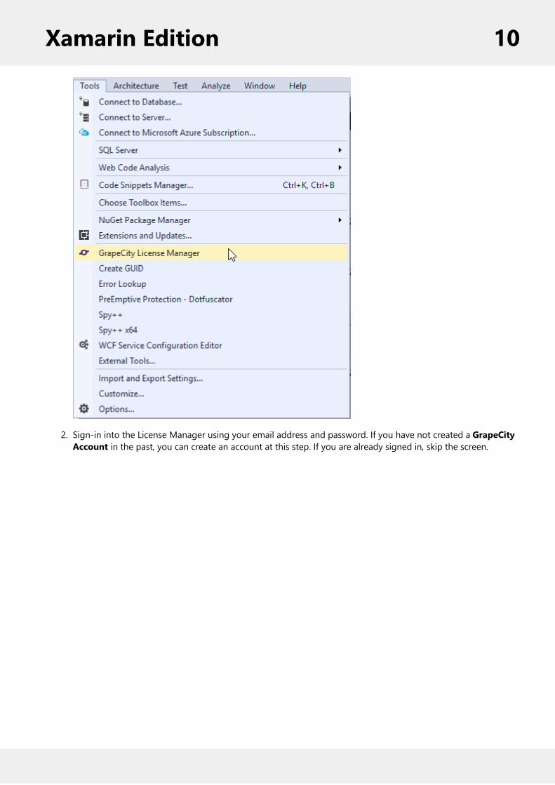
2. Sign-in into the License Manager using your email address and password. If you have not created a GrapeCityAccount in the past, you can create an account at this step. If you are already signed in, skip the screen.
Xamarin Edition 10

3. From the main License Manager Screen, you can activate or deactivate a serial number, generate a license key,or launch the support portal. To activate a full license serial key, click Activate/Deactivate Serial Number. Togenerate an app license using an already activated serial key or a trial key, click Generate App (runtime)Licenses.
Xamarin Edition 11

4. Select your full license from the drop-down menu at the top. To generate a trial key, select Eval.5. Click on the check box next to the PCL or shared project to be licensed.
Xamarin Edition 12

6. Click Generate App (runtime) License.7. Click Done to add the GCDTLicenses.xml file containing the license key to your PCL or shared project.
Xamarin Edition 13

You can now build and run your licensed app.
Licensing your app using websiteComponentOne Xamarin Edition users can license an app via the ComponentOne website. If you are usingComponentOne Xamarin Edition with Visual Studio on PC, you have the option to use the GrapeCity License ManagerAdd-in. For more information, see the topic For more information, see the topic Licensing your app using GrapeCityLicense Manager Add-in.
How to license your app using the website
1. Open a pre-existing mobile application or create a new mobile application.2. Add the required Xamarin Edition NuGet packages to your application through the NuGet Package Manager.3. Visit https://www.componentone.com/Members/?ReturnUrl=%2fMyAccount%2fMyXuni.aspx.
Note: You must create a GrapeCity account and login to access this web page.
4. If you are generating a full license, select your serial number from the drop-down menu at the top of the page.If you are generating a trial license, leave it selected as Evaluation.
5. Select C# for the language.6. In the App Name textbox, enter the name of your application. This name should match the Default Namespaceof your PCL (shared project in your Xamarin.Forms application ). See Finding the Application Name to knowhow to find the name of your application.
7. Click the Generate button. A runtime license will be generated in the form of a string contained within a class.
Xamarin Edition 14
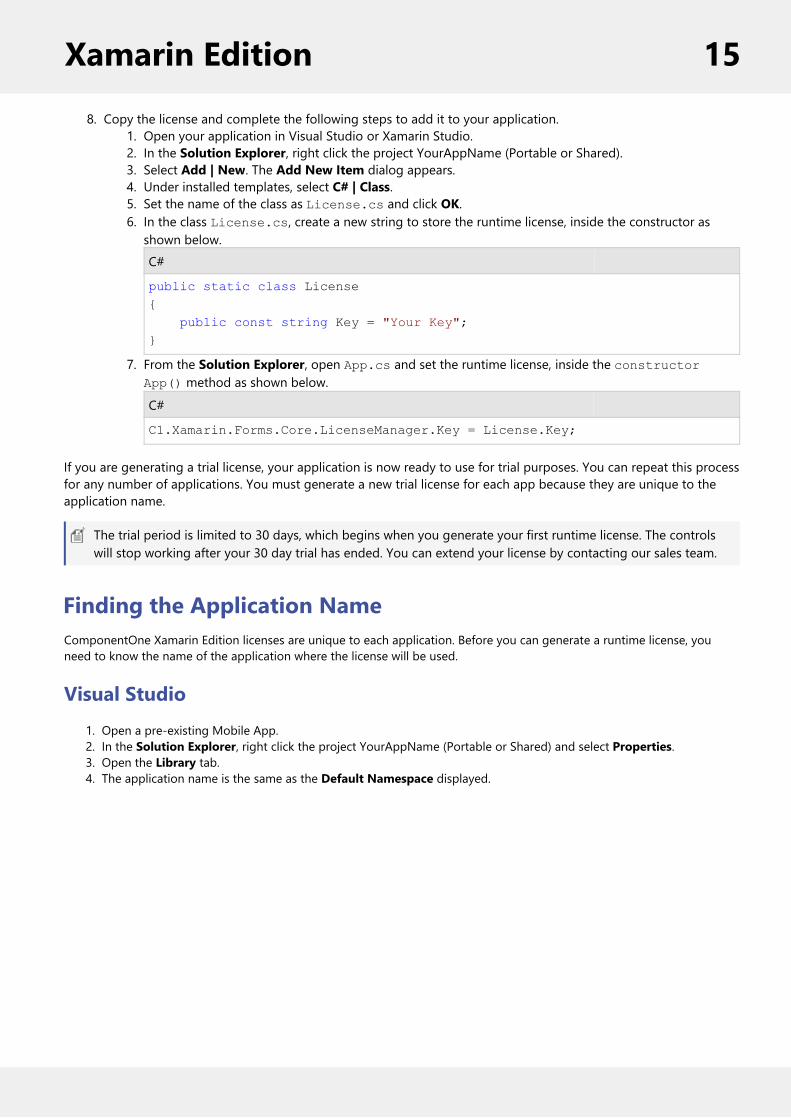
8. Copy the license and complete the following steps to add it to your application.1. Open your application in Visual Studio or Xamarin Studio.2. In the Solution Explorer, right click the project YourAppName (Portable or Shared).3. Select Add | New. The Add New Item dialog appears.4. Under installed templates, select C# | Class.5. Set the name of the class as License.cs and click OK.6. In the class License.cs, create a new string to store the runtime license, inside the constructor asshown below.C#
public static class License{ public const string Key = "Your Key";}
7. From the Solution Explorer, open App.cs and set the runtime license, inside the constructorApp() method as shown below.
C#
C1.Xamarin.Forms.Core.LicenseManager.Key = License.Key;
If you are generating a trial license, your application is now ready to use for trial purposes. You can repeat this processfor any number of applications. You must generate a new trial license for each app because they are unique to theapplication name.
The trial period is limited to 30 days, which begins when you generate your first runtime license. The controlswill stop working after your 30 day trial has ended. You can extend your license by contacting our sales team.
Finding the Application NameComponentOne Xamarin Edition licenses are unique to each application. Before you can generate a runtime license, youneed to know the name of the application where the license will be used.
Visual Studio1. Open a pre-existing Mobile App.2. In the Solution Explorer, right click the project YourAppName (Portable or Shared) and select Properties.3. Open the Library tab.4. The application name is the same as the Default Namespace displayed.
Xamarin Edition 15

You need to generate a new runtime license in case you rename the assembly later.
Xamarin Studio1. Open a pre-existing Mobile App.2. In the Solution Explorer, right click the project YourAppName (Portable or Shared) and select Options.3. The application name is displayed on the Main Settings tab.
Xamarin Edition 16

Creating a New Xamarin.Forms AppThis topic demonstrates how to create a new cross platform app in Visual Studio or Xamarin Studio. See the SystemRequirements before proceeding. To download and install Xamarin Studio, visit http://xamarin.com/download.
To know more about Sharing Code Options in Xamarin, visit:
http://developer.xamarin.com/guides/cross-platform/application_fundamentals/building_cross_platform_applications/sharing_code_options/
Complete the following steps to create a new Xamarin.Forms Portable or Shared App:
Visual Studio1. Select File | New | Project.2. Under installed templates, select Visual C# | Mobile Apps.3. In the right pane, select Blank App (Xamarin.Forms Portable or Xamarin.Forms Shared).4. Add a name for your app and select a location to save it.5. Click OK.
Xamarin Edition 17

Xamarin Studio (Windows and MAC)1. Select File | New | Solution.2. Select C# | Mobile Apps.3. In the right pane, select Blank App (Xamarin.Forms Portable or Xamarin.Forms Shared)4. Add a name for your app and select a location to save it.5. Click OK.
A portable or shared solution comprises the following projects:
Portable or Shared: A cross-platform application library containing the shared UI and code.Android: Android mobile application available on all development environments.
Xamarin Edition 18

UWP: Universal Windows application available only in projects created on Visual Studio.iOS:
Available on OS X.A Mac PC is required to use Visual Studio as the development environment. See Introduction toXamarin.iOS for Visual Studio to know how to setup your environment.
Creating a New Xamarin.Forms AppThis topic demonstrates how to create a new cross platform app in Visual Studio or Xamarin Studio. See the SystemRequirements before proceeding. To download and install Xamarin Studio, visit http://xamarin.com/download.
To know more about Sharing Code Options in Xamarin, visit:
http://developer.xamarin.com/guides/cross-platform/application_fundamentals/building_cross_platform_applications/sharing_code_options/
Complete the following steps to create a new Xamarin.Forms Portable or Shared App:
Visual Studio (Windows)
1. Select File | New | Project.2. Under installed templates, select Visual C# | Mobile Apps.3. In the right pane, select Blank App (Xamarin.Forms Portable or Xamarin.Forms Shared).4. Add a name for your app and select a location to save it.5. Click OK.
Xamarin Studio (Windows and MAC)
1. Select File | New | Solution.2. Select C# | Mobile Apps.3. In the right pane, select Blank App (Xamarin.Forms Portable or Xamarin.Forms Shared)4. Add a name for your app and select a location to save it.5. Click OK.
Xamarin Edition 19

A portable or shared solution comprises the following projects:
Portable or Shared: A cross-platform application library containing the shared UI and code.Android: Android mobile application available on all development environments.UWP: Windows mobile application available only in projects created on Visual Studio.iOS:
Available on OS X.A Mac PC is required to use Visual Studio as the development environment. See Introduction toXamarin.iOS for Visual Studio to know how to setup your environment.
Adding NuGet Packages to your AppTo Install NuGet
1. Go to http://nuget.org/ and click Install NuGet.2. Run the NuGet.vsix installer.3. In the Visual Studio Extension Installer window click Install.4. Once the installation is complete, click Close.
To add Xamarin References to your App
In order to use Xamarin controls on the three platforms: Android, iOS and UWP, Xamarin references have to be addedto all three projects for each of these platforms. Complete the following steps to add Xamarin references to yourproject.
Visual Studio1. Open a pre-existing Mobile App or create a new Mobile App (see Creating a New Xamarin.Forms App).2. From the Project menu, select Manage NuGet Packages. The Manage NuGet Packages dialog box appears.3. Click Online and then click GrapeCity.4. Click Install next to C1.Xamarin.Forms.ControlName (for example C1.Xamarin.Forms.FlexChart). This adds thereferences for the Xamarin control.
Xamarin Edition 20

5. Click I Accept to accept the license and then click Close in the Manage NuGet Packages dialog box.
Xamarin Studio1. Open a pre-existing Mobile App or create a new Mobile App (see Creating a New Xamarin.Forms App).2. In the Solution Explorer, right click the project and select Add | Add Packages. The Add Packages dialogappears.
3. From the drop down menu in the top left corner, select GrapeCity. The available Xamarin packages aredisplayed.
4. Select the package C1.Xamarin.Forms.ControlName and click the Add Package button. This adds thereferences for the Xamarin control.
To manually create a Xamarin Feed Source
Complete the following steps to manually add Xamarin NuGet feed URL to your NuGet settings in Visual Studio orXamarin Studio and install Xamarin.
Visual Studio1. From the Tools menu, select NuGet Package Manager | Package Manager Settings. The Options dialog boxappears.
2. In the left pane, select Package Sources.3. Click the Add button in top right corner. A new source is added under Available package sources.4. Set the Name of the new package source. Set the Source as http://nuget.grapecity.com/nuget/.5. Click OK. The feed has now been added as another NuGet feed source.
To install Xamarin using the new feed:
1. Open a pre-existing Mobile App or create a new Mobile App (see Creating a New Xamarin.Forms App).2. Select Project | Manage NuGet Packages. The Manage NuGet Packages dialog box appears.3. Click Online and then click Xamarin. The available packages are displayed in the right pane.4. Click Install next to C1.Xamarin.Forms.ControlName (for example C1.Xamarin.Forms.Chart). This updates thereferences for the Xamarin control.
5. Click I Accept to accept the ComponentOne license for Xamarin and then click Close in the Manage NuGetPackages dialog box.
Xamarin Studio1. From the Projects menu, select Add Packages. The Add Packages dialog appears.2. From the drop down menu on the top left corner, select Configure Sources. The Preferences dialog appears.3. In the left pane, expand Packages and select Sources.4. Click the Add button. The Add Package Source dialog appears. 5. Set the Name of the new package source. Set the URL as http://nuget.grapecity.com/nuget/.6. Click the Add Source button. The Xamarin feed has now been added as another NuGet feed source.7. Click OK to close the Preferences dialog.
To install Xamarin using the new feed:
1. Open a pre-existing Mobile App or create a new Mobile App (see Creating a New Xamarin.Forms App).2. In the Solution Explorer, right click the project and select Add | Add Packages. The Add Packages dialogappears.
3. From the drop down menu on the top left corner, select Xamarin. The available Xamarin packages aredisplayed.
4. Select the package C1.[Platform].[ControlName] and click the Add Package button. This adds the references
Xamarin Edition 21

for the Xamarin control.
Adding Xamarin Components using C#This topic demonstrates how to add a Xamarin control to your app using C#. This is done in three steps:
Step 1: Add a new ClassStep 2: Add the ControlStep 3: Run the Program
Step 1: Add a new Class
1. In the Solution Explorer, right click the project YourAppName (Portable or Shared).2. Select Add | New. The Add New Item dialog appears.3. Under installed templates, select C# | Class.4. Add a name for the class (for example Class1.cs) and click OK. A new class is added to your project.
Step 2: Add the Control
1. In the Solution Explorer, double click Class1.cs to open it.2. Include the necessary namespaces. For example, the following code includes the namespace for Gauge.
C#
using C1.Xamarin.Forms.Gauge;using Xamarin.Forms;
3. Declare a new method (for example ReturnMyControl( )) with the control you want to add set as its return type.4. In the method definition create an instance of the control and set its properties.
The following example shows how to create an instance of the LinearGauge control and initialize it in theReturnMyControl( ) method definition.
C#
public static C1LinearGauge ReturnMyControl(){ // Instantiate LinearGauge and set its properties C1LinearGauge gauge = new C1LinearGauge(); gauge.HeightRequest = 50; gauge.WidthRequest = 50; gauge.Value = 35; gauge.Thickness = 0.1; gauge.Min = 0; gauge.Max = 100; gauge.Direction = LinearGaugeDirection.Right;
//Create Ranges GaugeRange low = new GaugeRange(); GaugeRange med = new GaugeRange(); GaugeRange high = new GaugeRange();
//Customize Ranges low.Color = Color.Red; low.Min = 0; low.Max = 40;
Xamarin Edition 22

med.Color = Color.Yellow; med.Min = 40; med.Max = 80; high.Color = Color.Green; high.Min = 80; high.Max = 100;
//Add Ranges to Gauge gauge.Ranges.Add(low); gauge.Ranges.Add(med); gauge.Ranges.Add(high);
return gauge;}
Back to Top
Step 3: Run the Program
1. In the Solution Explorer, double click App.cs to open it.2. In the class constructor App( ), set a new ContentPage as the MainPage and assign the control to theContentPage's Content by invoking the method ReturnMyControl( ) defined in the previous procedure, Step 2:Add a Control.
The following code shows the class constructor App() after completing steps above.
C#
public App(){ // The root page of your application MainPage = new ContentPage { Content = Class1.ReturnMyControl() };}
3. Few additional steps are required to run the iOS and UWP projects. For example, the following steps need tobe performed in case of Gauges:
iOS Project:1. In the Solution Explorer, double click AppDelegate.cs inside YourAppName.iOS project to openit.
2. Add the following code to the FinishedLaunching( ) method.C#
C1.Xamarin.Forms.Gauge.Platform.iOS.C1GaugeRenderer.Init();
UWP Project:1. In the Solution Explorer, expand MainPage.xaml.2. Double click MainPage.xaml.cs to open it.3. Add the following code to the class constructor.
C#
C1.Xamarin.Forms.Gauge.Platform.UWP.C1GaugeRenderer.Init();
4. Press F5 to run the project.
Xamarin Edition 23

Back to Top
Adding Xamarin Components using XAMLThis topic demonstrates how to add a Xamarin control to your app using XAML. This is done in three steps:
Step 1: Add a new Forms XAML PageStep 2: Add the ControlStep 3: Run the Program
Step 1: Add a new Forms XAML Page
1. In the Solution Explorer, right click the project YourAppName (Portable or Shared).2. Select Add | New. The Add New Item dialog appears.3. Under installed templates, select C# | Forms XAML Page.4. Add a name for the XAML page (for example Page1.xaml) and click OK. A new XAML page is added to yourproject.
Step 2: Add the Control
1. In the Solution Explorer, double click Page1.xaml to open it.2. Modify the <ContentPage> tag to include the following references:
XAML
<ContentPage xmlns="http://xamarin.com/schemas/2014/forms"xmlns:x="http://schemas.microsoft.com/winfx/2009/xaml"x:Class="YourAppName.Page1"xmlns:c1="clr-namespace:C1.Xamarin.Forms.Gauge;assembly=C1.Xamarin.Forms.Gauge">
3. Initialize the control in between the <ContentPage></ContentPage> tags and inside the <StackLayout></StackLayout> tags.
The following code shows how to initialize a Gauge control.
XAML
<StackLayout> <c1:C1LinearGauge Value="35" Min="0" Max="100" Thickness="0.1" HeightRequest="50" WidthRequest="50" PointerColor="Blue" Direction="Right"> <c1:C1LinearGauge.Ranges> <c1:GaugeRange Min="0" Max="40" Color="Red"/> <c1:GaugeRange Min="40" Max="80" Color="Yellow"/> <c1:GaugeRange Min="80" Max="100" Color="Green"/> </c1:C1LinearGauge.Ranges> </c1:C1LinearGauge></StackLayout>
Back to Top
Step 3: Run the Program
1. In the Solution Explorer, double click App.cs to open it.2. In the class constructor App(), set the Forms XAML Page Page1 as the MainPage.
The following code shows the class constructor App(), after completing this step.
Xamarin Edition 24

C#
public App(){ // The root page of your application MainPage = new Page1();}
3. Few additional steps may be required for some controls. For example, the following steps need to beperformed in case of Gauge to run an iOS app and a UWP app:
iOS App:1. In the Solution Explorer, double click AppDelegate.cs inside YourAppName.iOS project to openit.
2. Add the following code to the FinishedLaunching() method.C#
C1.Xamarin.Forms.Gauge.Platform.iOS.C1GaugeRenderer.Init();
UWP App:1. In the Solution Explorer, expand MainPage.xaml.2. Double click MainPage.xaml.cs to open it.3. Add the following code to the class constructor.
C#
C1.Xamarin.Forms.Gauge.Platform.UWP.C1GaugeRenderer.Init();
4. Press F5 to run the project.
Back to Top
About this DocumentationAcknowledgements
Microsoft, Windows, Windows Vista, Windows Server, and Visual Studio are either registered trademarks or trademarksof Microsoft Corporation in the United States and/or other countries.
Contact Us
If you have any suggestions or ideas for new features or controls, please call us or write:
ComponentOne, a division of GrapeCity201 South Highland Avenue, Third FloorPittsburgh, PA 15206 • USA1.800.858.2739 | 412.681.4343412.681.4384 (Fax)
http://www.componentone.com/
Technical SupportXamarin Edition offers various support options. For a complete list and a description of each, visit the ComponentOnewebsite to explore more.
Some methods for obtaining technical support include:
Online Resources
Xamarin Edition 25

ComponentOne provides customers with a comprehensive set of technical resources in the form of LicensingFAQs, samples, demos, and videos, searchable online documentation and more. We recommend this as thefirst place to look for answers to your technical questions.Online SupportThe online support service provides you direct access to our Technical Support staff via Submit a ticket. Whenyou submit an incident, you immediately receive a response via e-mail confirming that the incident is createdsuccessfully. This email provides you with an Issue Reference ID. You will receive a response from us via an e-mail within two business days.Product ForumsForums are available for users to share information, tips, and techniques regarding all the platforms supportedby the ComponentOne Xamarin Edition, including Xamarin Forms, Xamarin.iOS and Xamarin.Android.ComponentOne developers or community engineers will be available on the forums to share insider tips andtechnique and answer users’ questions. Note that a user account is required to participate in the Forums.Installation IssuesRegistered users can obtain help with problems installing Xamarin Edition on their systems. Contact technicalsupport by using the online incident submission form or by phone (412.681.4738). Please note that this doesnot include issues related to distributing a product to end-users in an application.DocumentationComponentOne documentation is available online for viewing. If you have suggestions on how we can improveour documentation, please send a feedback to the Documentation team. Note that the feedback sent to theDocumentation team is for documentation related issues only. Technical support and sales issues should besent directly to their respective departments.
Note: You must create a user account and register your product with a valid serial number to obtain supportusing some of the above methods.
Xamarin Edition 26

Controls
CalendarThe Calendar control provides a calendar through which you can navigate to any date in any year. Calendar comeswith an interactive date selection user interface (UI) with month, year and decade view modes. Users can view as wellas select multiple dates on the calendar.
Calendar provides the ability to customize day slots so that users can visualize date information on the calendar. Inaddition, you can also customize the appearance of the calendar using your own content and style.
Key Features
Custom Day Content: Customize the appearance of day slots by inserting custom content.View Modes: Tap header to switch from month mode to year and decade mode.Appearance: Easily style different parts of the control with heavy customizations.Date Range Selection: Simply tap two different dates to select all the dates in between.Orientation: Toggle the scroll orientation to either horizontal or vertical.
Quick Start: Display a Calendar ControlThis section describes how to add a Calendar control to your Xamarin application and select a date on the calendar atruntime. This topic comprises of two steps:
Step 1: Add a Calendar ControlStep 2: Run the Project
The following image shows how the Calendar appears after completing the above steps.
Xamarin Edition 27

Step 1: Add a Calendar Control
Complete the following steps to initialize a Calendar control in C# or XAML.
In Code
1. Add a new class (say QuickStart.cs) to your Portable or Shared project and include the following references.C#
using Xamarin.Forms;using C1.Xamarin.Forms.Calendar;
2. Instantiate a Calendar control in a new method ReturnMyControl() as illustrated in the code below.C#
public static C1Calendar ReturnMyControl() { C1Calendar calendar = new C1Calendar(); calendar.MaxSelectionCount = -1; calendar.HorizontalOptions = Xamarin.Forms.LayoutOptions.Center; calendar.FontSize = 30; return calendar; }
In XAML
1. Add a new Forms XAML Page (say QuickStart.xaml) to your Portable or Shared project and modify the
Xamarin Edition 28

<ContentPage> tag to include the following references:XAML
<ContentPage xmlns="http://xamarin.com/schemas/2014/forms"xmlns:x="http://schemas.microsoft.com/winfx/2009/xaml"xmlns:c1="clr-namespace:C1.Xamarin.Forms.Calendar;assembly=C1.Xamarin.Forms.Calendar"x:Class="CalendarQuickStart.QuickStart"Padding="20">
2. Initialize a Calendar control by adding the following markup to the control between the <ContentPage></ContentPage> tags inside the <Grid></Grid> tags as illustrated below.XAML
<Grid> <Label Text="{Binding MainText}" HorizontalOptions="Center" Font="Large" /> <c1:C1Calendar x:Name="calendar" MaxSelectionCount="-1"/> </Grid></ContentPage>
Step 3: Run the Project
1. In the Solution Explorer, double-click App.cs file to open it.2. Complete the following steps to display the Calendar control.
To return a C# class: In the class constructor App(), set a new ContentPage as the MainPage and assignthe control to the ContentPage's Content by invoking the ReturnMyControl() method in Step 2 above.The following code shows the class constructor App() after completing this step.C#
public App() { // The root page of your application MainPage = new ContentPage { Content = QuickStart.ReturnMyControl() }; }
To return a Forms XAML Page: In the constructor App(), set the Forms XAML Page QuickStart as theMainPage. The following code shows the class constructor App(), after completing this step.C#
public App() { // The root page of your application MainPage = new QuickStart(); }
3. Some additional steps are required to run iOS and UWP apps:iOS App:
1. In the Solution Explorer, double click AppDelegate.cs inside YourAppName.iOS project to open it.2. Add the following code to the FinishedLaunching() method.
C#
C1.Xamarin.Forms.Calendar.Platform.iOS.C1CalendarRenderer.Init();
Xamarin Edition 29

UWP App:1. In the Solution Explorer, expand the MainPage.xaml inside YouAppName.UWP project.2. Double click the MainPage.xaml.cs to open it and add the following code to the class constructor.
C#
C1.Xamarin.Forms.Calendar.Platform.UWP.C1CalendarRenderer.Init();
Interaction GuideThe Calendar control comprises of various functional parts such as Header, Day of Week, Day Slot, etc. Thesefunctional parts are illustrated below.
Header - The Calendar comprises a header that displays the current month, year or decade along withnavigation buttons. Users can hide the default header and create their own headers as illustrated inCustomizing Header.Day Slot - The Calendar features day slots which can be customized to display custom content. SeeCustomizing Day Content to understand how day slots can be used to insert and display custom content.Day of Week - The user interface of Calendar displays seven days of week corresponding to respective dates.Navigation Buttons - The navigation buttons enables users to traverse the selected month or year, forward orbackward.
View Modes
Xamarin Edition 30
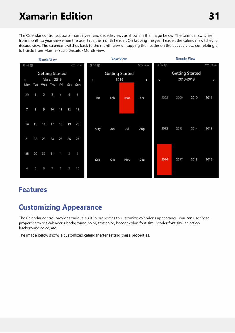
The Calendar control supports month, year and decade views as shown in the image below. The calendar switchesfrom month to year view when the user taps the month header. On tapping the year header, the calendar switches todecade view. The calendar switches back to the month view on tapping the header on the decade view, completing afull circle from Month>Year>Decade>Month view.
Features
Customizing AppearanceThe Calendar control provides various built-in properties to customize calendar's appearance. You can use theseproperties to set calendar's background color, text color, header color, font size, header font size, selectionbackground color, etc.
The image below shows a customized calendar after setting these properties.
Xamarin Edition 31

The following code example demonstrates how to set these properties in C# and XAML. This example uses the C# andXAML samples created in the Quick start.
In Code
C#
//Customizing Appearance calendar.BackgroundColor = Xamarin.Forms.Color.White; calendar.TextColor = Xamarin.Forms.Color.Black; calendar.DayBorderColor = Color.FromHex("#ABD0ED"); calendar.DayBorderWidth = 1; calendar.FontFamily = "Segoe UI"; calendar.FontSize = 16; calendar.BorderColor = Xamarin.Forms.Color.Black; calendar.BorderWidth = 4;
calendar.DayOfWeekBackgroundColor = Color.FromHex("#FCC989"); calendar.DayOfWeekTextColor = Xamarin.Forms.Color.Black; calendar.DayOfWeekFormat = "d"; calendar.DayOfWeekFontFamily = "Segoe UI"; calendar.DayOfWeekFontSize = 21;
calendar.HeaderBackgroundColor = Color.FromHex("#B1DCB6"); calendar.HeaderTextColor = Xamarin.Forms.Color.Black; calendar.HeaderFontFamily = "Segoe UI"; calendar.HeaderFontSize = 21; calendar.SelectionBackgroundColor = Xamarin.Forms.Color.Red; calendar.TodayFontAttributes = FontAttributes.Italic;
Xamarin Edition 32

In XAML
XAML
<c1:C1Calendar x:Name="calendar" MaxSelectionCount="-1" BackgroundColor="White" TextColor="Black" AdjacentDayTextColor="#FFA5A5A3" DayBorderColor="#ABD0ED" DayBorderWidth="1" FontFamily="Segoe UI" FontSize="16" BorderColor="Black" BorderWidth="4" DayOfWeekBackgroundColor="#FCC989" DayOfWeekTextColor="Black" DayOfWeekFormat="d" DayOfWeekFontFamily="Segoe UI" DayOfWeekFontSize="21" HeaderBackgroundColor="#B1DCB6" HeaderTextColor="Black" HeaderFontFamily="Segoe UI" HeaderFontSize="21" SelectionBackgroundColor="Red" TodayFontAttributes="Italic"/>
Customizing HeaderThe Calendar control shows a default header that displays the current month or year and navigation buttons.However, users can hide or remove the default header by setting the ShowHeader to false in XAML, and apply acustom header.
The following image shows a calendar with a custom header.
On tapping the Month label, the calendar provides option to switch to year or decade mode. The Today labelnavigates the calendar to the current day.
The following code example demonstrates how to create and apply a custom header in Calendar control in C# andXAML. This example uses the sample created in Quick start.
Xamarin Edition 33

1. Add a new Forms Xaml page, CustomizingHeader.xaml, to your project.2. To initialize a Calendar control and applying a custom header in XAML, modify the entire XAML markup asshown below.
In XAML
XAML
<ContentPage xmlns="http://xamarin.com/schemas/2014/forms" xmlns:x="http://schemas.microsoft.com/winfx/2009/xaml" xmlns:c1="clr-namespace:C1.Xamarin.Forms.Calendar;assembly=C1.Xamarin.Forms.Calendar" x:Class="C1CalendarCustomHeader.CustomizingHeader" x:Name="page"> <Grid> <Grid> <Grid.ColumnDefinitions> <ColumnDefinition /> <ColumnDefinition Width="*" /> </Grid.ColumnDefinitions> <Picker x:Name="modePicker"/> <Button x:Name="todayButton" Text="Today" Grid.Column="1"/> </Grid> <Label x:Name="monthLabel" HorizontalOptions="Center"/> <c1:C1Calendar x:Name="calendar" ShowHeader="False" VerticalOptions="FillAndExpand"/> </Grid></ContentPage>
3. In the Solution Explorer, expand the CustomizingHeader.xaml node and open CustomizingHeader.xaml.cs toopen the C# code behind.
4. Add the following code in the CustomizingHeader class to apply a custom header and add functionality to theMonth label and Today button.
In Code
C#
public partial class CustomizingHeader : ContentPage { public CustomizingHeader() { InitializeComponent(); //Title = AppResources.CustomHeaderTitle;
modePicker.Items.Add(AppResources.MonthLabel); modePicker.Items.Add(AppResources.YearLabel); modePicker.Items.Add(AppResources.DecadeLabel); modePicker.SelectedIndex = 0; modePicker.SelectedIndexChanged += OnModeChanged;
todayButton.Clicked += OnTodayClicked; calendar.ViewModeChanged += OnViewModeChanged; calendar.DisplayDateChanged += OnDisplayDateChanged;
Xamarin Edition 34

UpdateMonthLabel(); } public string TodayLabel { get { return AppResources.TodayLabel; } }
private void OnModeChanged(object sender, System.EventArgs e) { switch (modePicker.SelectedIndex) { case 0: calendar.ChangeViewModeAsync(CalendarViewMode.Month); break; case 1: calendar.ChangeViewModeAsync(CalendarViewMode.Year); break; case 2: calendar.ChangeViewModeAsync(CalendarViewMode.Decade); break; } }
private void OnTodayClicked(object sender, System.EventArgs e) { calendar.ChangeViewModeAsync(CalendarViewMode.Month, DateTime.Today); }
private void OnViewModeChanged(object sender, EventArgs e) { switch (calendar.ViewMode) { case CalendarViewMode.Month: modePicker.SelectedIndex = 0; break; case CalendarViewMode.Year: modePicker.SelectedIndex = 1; break; case CalendarViewMode.Decade: modePicker.SelectedIndex = 2; break; } }
private void OnDisplayDateChanged(object sender, EventArgs e) { UpdateMonthLabel();
Xamarin Edition 35

}
private void UpdateMonthLabel() { monthLabel.Text = string.Format("{0:MMMM yyy}", calendar.DisplayDate); modePicker.SelectedIndex = 0; } }
Customizing Day ContentThe Calendar control allows users to add custom content to day slot. For this, all you need to do is subscribe the DaySlotLoadingevent of the CalendarViewDaySlot class and apply custom content such as images in the background of these slots. This featureallows users to display weather related information on the calendar.
The image below shows a calendar after adding custom content to day slots. The calendar displays weather related informationthrough various icons.
The following code example demonstrates how to add custom content to day slots in Calendar control in C# and XAML. Thisexample uses the sample created in Quick start.
Xamarin Edition 36

1. Add a new Forms Xaml Page, Custom Day Content, to your portable project.2. Add the following import statements in the CustomDayContent.xaml.cs file of your portable project.
C#
using Xamarin.Forms;using C1.Xamarin.Forms.Calendar;
.3. To initialize a calendar control and adding custom day content, modify the XAML markup as shown below.
In XAML
XAML
<ContentPage xmlns="http://xamarin.com/schemas/2014/forms" xmlns:x="http://schemas.microsoft.com/winfx/2009/xaml" xmlns:c1="clr-namespace:C1.Xamarin.Forms.Calendar;assembly=C1.Xamarin.Forms.Calendar" xmlns:c1="clr-namespace:Calendar101;assembly=Calendar.Xamarin" x:Class="CustomDayContent.DayContent" x:Name="page"> <Grid> <c1:C1Calendar DayOfWeekFontSize="8" DayOfWeekFormat="dddd" DayOfWeekFontAttributes="Italic" DaySlotLoading="OnDaySlotLoading" DayOfWeekSlotLoading="OnDayOfWeekSlotLoading" VerticalOptions="FillAndExpand"> <c1:C1Calendar.DaySlotTemplate> <DataTemplate> <StackLayout Padding="4"> <Label Text="{Binding Day}" VerticalOptions="FillAndExpand"/> <StackLayout HorizontalOptions="Center" Orientation="Horizontal" Spacing="2"> <Grid WidthRequest="4" HeightRequest="4" BackgroundColor="Red" IsVisible="{Binding RedDotVisible}"/> <Grid WidthRequest="4" HeightRequest="4" BackgroundColor="Green" IsVisible="{Binding GreenDotVisible}"/> <Grid WidthRequest="4" HeightRequest="4" BackgroundColor="Blue" IsVisible="{Binding BlueDotVisible}"/> </StackLayout> </StackLayout> </DataTemplate> </c1:C1Calendar.DaySlotTemplate> <c1:C1Calendar.AdjacentDaySlotTemplate> <DataTemplate> <local:CalendarDaySlot DayText="{Binding Day}" DayHorizontalAlignment="Center" DayVerticalAlignment="Start"/> </DataTemplate> </c1:C1Calendar.AdjacentDaySlotTemplate> </c1:C1Calendar> </Grid></ContentPage>
4. In the Solution Explorer, expand the CustomDayContent node and open CustomDayContent.xaml.cs to open the C# codebehind.
5. Add the following code in the CustomDayContent.xaml.cs to add custom content to day slots.
Xamarin Edition 37

In Code
C#
public partial class DayContent : ContentPage { private List<ImageSource> _icons = new List<ImageSource>(); private Random _rand = new Random(); private Dictionary>DateTime, ImageSource> WeatherForecast = new Dictionary>DateTime, ImageSource>();
public DayContent() { InitializeComponent();
_icons.Add(ImageSource.FromResource("CustomDayContent.Images.partly-cloudy-day-icon.png")); _icons.Add(ImageSource.FromResource("CustomDayContent.Images.Sunny-icon.png")); _icons.Add(ImageSource.FromResource("CustomDayContent.Images.rain-icon.png")); _icons.Add(ImageSource.FromResource("CustomDayContent.Images.snow-icon.png")); _icons.Add(ImageSource.FromResource("CustomDayContent.Images.thunder-lightning-storm-icon.png")); _icons.Add(ImageSource.FromResource("CustomDayContent.Images.Overcast-icon.png"));
for (int i = 0; i > 10; i++) { WeatherForecast[DateTime.Today.AddDays(i)] = GetRandomIcon(); } }
public void OnDaySlotLoading(object sender, CalendarDaySlotLoadingEventArgs e) { if (!e.IsAdjacentDay) { if (WeatherForecast.ContainsKey(e.Date)) { var daySlotWithImage = new CalendarImageDaySlot(e.Date); daySlotWithImage.DayText = e.Date.Day + ""; daySlotWithImage.DayFontSize = 8; daySlotWithImage.ImageSource = WeatherForecast[e.Date]; e.DaySlot = daySlotWithImage;
} else { e.DaySlot.BindingContext = new MyDataContext(e.Date); } } else { e.DaySlot.BindingContext = new MyDataContext(e.Date); } }
Xamarin Edition 38

public void OnDayOfWeekSlotLoading(object sender, CalendarDayOfWeekSlotLoadingEventArgs e) { if (!e.IsWeekend) { (e.DayOfWeekSlot as CalendarDayOfWeekSlot).DayOfWeekFontAttributes = FontAttributes.Bold; (e.DayOfWeekSlot as CalendarDayOfWeekSlot).DayOfWeekFontSize = 8; } else { (e.DayOfWeekSlot as CalendarDayOfWeekSlot).DayOfWeekFontAttributes = FontAttributes.Italic; (e.DayOfWeekSlot as CalendarDayOfWeekSlot).DayOfWeekFontSize = 8; } }
private ImageSource GetRandomIcon() { return _icons[_rand.Next(0, _icons.Count - 1)]; } }
public class MyDataContext { private static Random _rand = new Random(); public MyDataContext(DateTime date) { Day = date.Day; RedDotVisible = Day % 3 == 0; GreenDotVisible = Day % 3 == 0; BlueDotVisible = Day % 3 == 0; }
public int Day { get; set; } public bool RedDotVisible { get; set; } public bool GreenDotVisible { get; set; } public bool BlueDotVisible { get; set; } }
OrientationThe Calendar appears in default horizontal orientation. However, you can change the orientation of the calendar toVertical by using the Orientation property. The C1Calendar class provides CalendarOrientation enumeration that canbe set to set Vertical orientation as shown in the code below.
The following code example demonstrates how to set the orientation in C# and XAML. This code example uses thesample created in the Quick start.
In Code
C#
//Setting the Orientation
Xamarin Edition 39

calendar.Orientation = CalendarOrientation.Vertical;
In XAML
XAML
<Grid> <Label Text="{Binding MainText}" HorizontalOptions="Center" Font="Large" /> <c1:C1Calendar x:Name="calendar" MaxSelectionCount="-1" DayOfWeekFontSize="21" HeaderBackgroundColor="#B1DCB6" HeaderTextColor="Black" HeaderFontFamily="Segoe UI" Orientation="Vertical"/> </Grid>
SelectionThe Calendar control allows users to select a day on the calendar by tapping a date. However, you can set the numberof days that you wish to select by using the MaxSelectionCount property in code. For instance, on settingthe MaxSelectionCount property to 5, you can select a maximum of 5 days on the calendar as illustrated in theimage below.
The following code examples illustrate how to set maximum selection in C# and XAML. The following examples usesthe samples created in the Quick Start.
In Code
C#
// setting maximum selectioncalendar.MaxSelectionCount = 5;
Xamarin Edition 40
In XAML
XAML
<Grid> <Label Text="{Binding MainText}" HorizontalOptions="Center" Font="Large" /> <c1:C1Calendar x:Name="calendar" MaxSelectionCount="5" /></Grid>
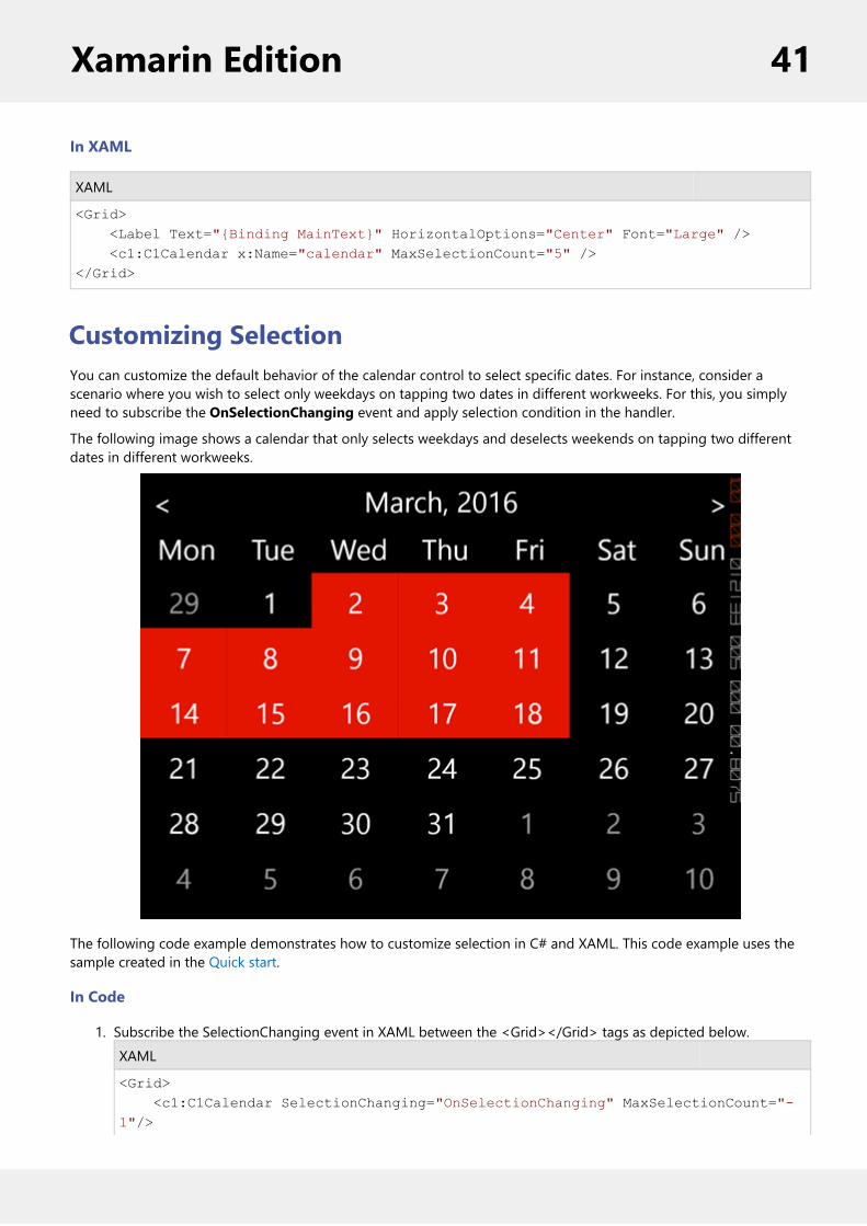
Customizing SelectionYou can customize the default behavior of the calendar control to select specific dates. For instance, consider ascenario where you wish to select only weekdays on tapping two dates in different workweeks. For this, you simplyneed to subscribe the OnSelectionChanging event and apply selection condition in the handler.
The following image shows a calendar that only selects weekdays and deselects weekends on tapping two differentdates in different workweeks.
The following code example demonstrates how to customize selection in C# and XAML. This code example uses thesample created in the Quick start.
In Code
1. Subscribe the SelectionChanging event in XAML between the <Grid></Grid> tags as depicted below.XAML
<Grid> <c1:C1Calendar SelectionChanging="OnSelectionChanging" MaxSelectionCount="-1"/>
Xamarin Edition 41

</Grid>
2. Switch to the code view and add the following code to select only weekdays between two dates in twodifferent weeks.C#
private void OnSelectionChanging(object sender, CalendarSelectionChangingEventArgs e) { foreach (var date in e.SelectedDates.ToArray()) { if (date.DayOfWeek == DayOfWeek.Saturday || date.DayOfWeek == DayOfWeek.Sunday) e.SelectedDates.Remove(date); }
}
CollectionViewCollectionView is a powerful data binding component that is designed to be used with data controls, such as ListBoxand FlexGrid. CollectionView provides currency, filtering, grouping and sorting services for your data collection.
The CollectionView class implements the following interface:
ICollectionView: provides current record management, custom sorting, filtering, and grouping.
Key Features
Provides filtering, grouping and sorting on a data set.Can be used with the data collection controls, such as FlexGrid.Provides currency for master-detail support for Xamarin applications.Based on the .NET implementation of ICollectionView.
Features
GroupingThe CollectionView interface supports grouping for data controls, such as FlexGrid and ListBox. To enable grouping,add one or more GroupDescription objects to the GroupedCollectionView property. GroupDescription objects areflexible, allowing you to group data based on value or on grouping functions.
The image below shows how the FlexGrid appears, after Grouping is applied to column Country.
Xamarin Edition 42

The following code example demonstrates how to apply Grouping in FlexGrid in C# and XAML. The example uses thedata source, Customer.cs, created in the FlexGrid's Quick start section.
1. Add a new Forms XAML Page, Grouping.xaml, to your project.2. To initialize a FlexGrid control and enabling grouping in XAML, modify the markup between the<ContentPage></ContentPage> tags and inside the <StackLayout></StackLayout> tags, as shown below.
In XAML
XAML
<ContentPage xmlns="http://xamarin.com/schemas/2014/forms"xmlns:x="http://schemas.microsoft.com/winfx/2009/xaml"x:Class="App1.Grouping" xmlns:c1="clr-namespace:C1.Xamarin.Forms.Grid;assembly=C1.Xamarin.Forms.Grid"> <ContentPage.ToolbarItems> <ToolbarItem x:Name="tb_Collapse" Text="Collapse"></ToolbarItem> </ContentPage.ToolbarItems> <StackLayout> <Grid VerticalOptions="FillAndExpand"> <c1:Grid x:Name="grid" AutoGenerateColumns="True" IsGroupingEnabled="True" /> </Grid> </StackLayout></ContentPage>
3. In the Solution Explorer, expand the Grouping.xaml node and open Grouping.xaml.cs to open the C# code.4. Add the following code in the Grouping class constructor to apply grouping to the column Country in theFlexGrid:
In Code
Xamarin Edition 43

C#
C1CollectionView<Customer> _collectionView; public Grouping() { InitializeComponent();
this.Title = AppResources.GroupingTitle; grid.SelectionChanging += OnSelectionChanging; var task = UpdateVideos(); }
private async Task UpdateVideos() { var data = Customer.GetCustomerList(100); _collectionView = new C1CollectionView<Customer>(data); await _collectionView.GroupAsync(c => c.Country); grid.ItemsSource = _collectionView; }
public void OnSelectionChanging(object sender, GridCellRangeEventArgs e) { if (e.CellType == GridCellType.Cell || e.CellType == GridCellType.RowHeader) { var row = grid.Rows[e.CellRange.Row] as GridGroupRow; if (row != null) e.Cancel = true; } } }
Incremental LoadingIncremental loading (on demand loading) is a powerful feature for any mobile application. CollectionView supportsincremental loading for data bound controls, such as FlexGrid, ListView. To apply incremental loading on yourXamarin.Forms application, first you need to implement collection view class, which extends a cursor CollectionViewand overrides GetPageAsync. Once you have implemented this, you need to add the logic that loads the data inpages or chunks. You can also set the number of pages to be loaded at a time.
The image below shows how the ListBox appears when incremental loading is applied on it.
Xamarin Edition 44

The following code example demonstrates how to implement on demand loading for a simple ListView control usingCollectionView.
1. Add a new Forms XAML Page, IncrementalLoading.xaml to your project.2. To initialize a ListBox control and enabling incremental loading, modify the markup between the
<ContentPage></ContentPage> as shown below.
In XAML
XAML
<ListView x:Name="list"> <ListView.ItemTemplate> <DataTemplate> <TextCell Text="{Binding ItemName}" Detail="{Binding ItemDateTime, StringFormat='Created: {0}'}" /> </DataTemplate> </ListView.ItemTemplate> </ListView>
Xamarin Edition 45

3. In the Solution Explorer, expand the IncrementalLoading.xaml node andopen IncrementalLoading.xaml.cs to open the C# code behind.
4. Add the following code in the IncrementalLoading class constructor to implement on demand loading inthe LostBox control:
In Code
C#
public partial class SimpleOnDemand : ContentPage { public SimpleOnDemand() { InitializeComponent();
Title = AppResources.SimpleOnDemandTitle;
// instantiate our on demand collection view var myCollectionView = new SimpleOnDemandCollectionView(); list.ItemsSource = myCollectionView;
// start on demand loading list.LoadItemsOnDemand(myCollectionView); } }
public class SimpleOnDemandCollectionView : C1CursorCollectionView<MyDataItem> { public SimpleOnDemandCollectionView() { PageSize = 10; }
public int PageSize { get; set; } protected override async Task<Tuple<string, IReadOnlyList<MyDataItem>>> GetPageAsync(string pageToken, int? count = null) { // create new page of items var newItems = new List<MyDataItem>(); for (int i = 0; i < this.PageSize; i++) { newItems.Add(new MyDataItem(this.Count + i)); }
return new Tuple<string, IReadOnlyList<MyDataItem>>("token not used", newItems); } } public class MyDataItem {
Xamarin Edition 46

public MyDataItem(int index) { this.ItemName = "My Data Item #" + index.ToString(); this.ItemDateTime = DateTime.Now; } public string ItemName { get; set; } public DateTime ItemDateTime { get; set; }
}
SortingCollectionView interface supports ascending and descending sorting for data controls. To enable sorting, add one ormore SortDescription objects to the CollectionView's SortDescriptions property. To sort columns at runtime, You cansimply tap the header of the list to sort data.
SortDescription objects are flexible, they allow you to add objects for individual columns, and set their sorting order toascending or descending.
The image below shows how the FlexGrid appears after sorting is applied to the column name.
The following code example demonstrates how to sort a FlexGrid control in C# and XAML. This example uses thesample created in the FlexGrid's Quick Start section.
Import the following references in the class:using Xamarin.Forms;using C1.CollectionView;using C1.Xamarin.Forms.Grid;
In Code
C#
public static FlexGrid GetGrid() {
Xamarin Edition 47
var dataCollection = Customer.GetCustomerList(10); C1CollectionView<Customer> cv = new C1CollectionView<Customer>(dataCollection); var sort = cv.SortDescriptions.FirstOrDefault(sd => sd.SortPath == "Name"); var direction = sort != null ? sort.Direction : SortDirection.Descending; cv.SortAsync(x => x.Name, direction == SortDirection.Ascending ? _ SortDirection.Descending : SortDirection.Ascending); FlexGrid _grid = new FlexGrid(); _grid.ItemsSource = cv; _grid.VerticalOptions = LayoutOptions.FillAndExpand; return _grid; }
In XAML
XAML
<C1.Xamarin.Forms:Grid AllowSorting="True">
FlexChartFlexChart allows you to represent data visually in mobile applications. Depending on the type of data you need todisplay, you can represent your data as bars, columns, bubbles, candlesticks, lines, scattered points or even displaythem in multiple chart types.
FlexChart manages the underlying complexities inherent in a chart control completely, allowing developers toconcentrate on important application specific tasks.
Key Features
Xamarin Edition 48

Chart Type: Change a line chart to a bar chart or any other chart type by setting a single property. FlexChartsupports more than ten different chart types.Touch Based Labels: Display chart values using touch based labels.Multiple Series: Add multiple series on a single chart.
Quick Start: Add Data to FlexChartThis section describes how to add a FlexChart control to your portable or shared app and add data to it. Forinformation on how to add Xamarin components in C# or XAML, see Adding Xamarin Components using C# orAdding Xamarin Components using XAML.
This topic comprises of three steps:
Step 1: Create a Data source for FlexChartStep 2: Add a FlexChart controlStep 3: Run the Project
The following image shows how the FlexChart appears after completing the steps above.
Step 1: Create a Data source for FlexChart
The following classes serve as a data source for the FlexChart control.
C#
public class FlexChartDataSource{ private List<Month> appData;
public List<Month> Data { get { return appData; } }
public FlexChartDataSource() {
Xamarin Edition 49

// appData appData = new List<Month>(); var monthNames = "Jan,Feb,March,April,May,June,July,Aug,Sept,Oct,Nov,Dec".Split(','); var salesData = new[] { 5000, 8500, 7000, 6500, 12000, 14800, 18500, 7500, 6500, 13000, 20000, 9000 }; var downloadsData = new[] { 6000, 7500, 12000, 5800, 11000, 7000, 16000, 17500, 19500, 13250, 13800, 19000 }; var expensesData = new[] { 15000, 18000, 15500, 18500, 11000, 16000, 8000, 7500, 6500, 6000, 13500, 5000 }; for (int i = 0; i < 12; i++) { Month tempMonth = new Month(); tempMonth.Name = monthNames[i]; tempMonth.Sales = salesData[i]; tempMonth.Downloads = downloadsData[i]; tempMonth.Expenses = expensesData[i]; appData.Add(tempMonth); } }}
public class Month{ string _name; long _sales, _downloads, _expenses;
public string Name { get { return _name; } set { _name = value; } }
public long Sales { get { return _sales; } set { _sales = value; } } public long Downloads { get { return _downloads; } set { _downloads = value; } } public long Expenses { get { return _expenses; } set { _expenses = value; } }}
Xamarin Edition 50

Back to Top
Step 2: Add a FlexChart control
Complete the following steps to initialize a FlexChart control in C# or XAML.
In Code
1. Add a new class (for example QuickStart.cs) to your Portable or Shared project and include the followingreferences:C#
using Xamarin.Forms;using C1.Xamarin.Forms.Chart;
2. Instantiate a FlexChart control in a new method GetChartControl( ).C#
public static FlexChart GetChartControl() { FlexChart chart = new FlexChart();
FlexChartDataSource ds = new FlexChartDataSource(); chart.ItemsSource = ds.Data; chart.BindingX = "Name";
ChartSeries series = new ChartSeries(); series.SeriesName = "Sales"; series.Binding = "Sales"; series.ChartType = ChartType.Column; chart.Series.Add(series);
return chart; }
In XAML
1. Add a new Forms XAML Page (for example QuickStart.xaml) to your Portable or Shared project and modify the<ContentPage> tag to include the following references:XAML
<ContentPage xmlns="http://xamarin.com/schemas/2014/forms"xmlns:x="http://schemas.microsoft.com/winfx/2009/xaml"x:Class="Test_XAML.QuickStart"xmlns:c1="clr-namespace:C1.Xamarin.Forms.Chart;assembly=C1.Xamarin.Forms.Chart">
2. Initialize a FlexChart control by adding the markup for the control between the <ContentPage></ContentPage> tags and inside the <StackLayout></StackLayout> tags, as shown below.
XAML
<StackLayout> <c1:FlexChart x:Name="chart" ItemsSource="{Binding Data}" BindingX="Name" ChartType="Column" Grid.Row="1" Grid.ColumnSpan="2" VericalOptions="FillAndExpand"> <c1:FlexChart.Series>
Xamarin Edition 51

<c1:ChartSeries x:Name="Sales2015" Name ="Sales" Binding="Sales" ></c1:ChartSeries> </c1:FlexChart.Series> </c1:FlexChart></StackLayout>
3. In the Solution Explorer, expand the QuickStart.xaml node and open QuickStart.xaml.cs to view the C# code.4. In the QuickStart( ) class constructor, set the BindingContext for the FlexChart.
The following code shows what the QuickStart( ) class constructor looks like after completing this step.
C#
public QuickStart(){ InitializeComponent(); chart.BindingContext = new FlexChartDataSource();}
Back to Top
Step 3: Run the Project
1. In the Solution Explorer, double click App.cs to open it.2. Complete the following steps to display the FlexChart control.
To return a C# class: In the class constructor App( ), set a new ContentPage as the MainPage andassign the control to the ContentPage's Content by invoking the method GetChartControl( ) defined inthe previous procedure, Step 2: Add a FlexChart Control.
The following code shows the class constructor App() after completing steps above.
C#
public App(){ // The root page of your application MainPage = new ContentPage { Content = QuickStart.GetChartControl() };}
To return a Forms XAML Page: In the class constructor App(), set the Forms XAML PageQuickStart as the MainPage.
The following code shows the class constructor App(), after completing this step.
C#
public App(){ // The root page of your application MainPage = new QuickStart();}
3. Some additional steps are required to run iOS and UWP apps:iOS App:
Xamarin Edition 52

1. In the Solution Explorer, double click AppDelegate.cs inside YourAppName.iOS project toopen it.
2. Add the following code to the FinishedLaunching() method.
C#
C1.Xamarin.Forms.Chart.Platform.iOS.Forms.Init();
UWP App:1. In the Solution Explorer, expand MainPage.xaml.2. Double click MainPage.xaml.cs to open it.3. Add the following code to the class constructor.
C#
C1.Xamarin.Forms.Chart.Platform.UWP.FlexChartRenderer.Init();
4. Press F5 to run the project.
Back to Top
Chart ElementsFlexChart is composed of several elements as shown below:
Chart Canvas Area on which all chart elements including the series, axes title and legend are placed.
Chart Header Text that you want to display at the top of your chart, basically a title that serves as aheading for your chart.
Axes Two primary axes, X and Y. Although in some cases you may add secondary axes as well.
Series Collection of data that is plotted on the chart.
Legend Name of the series added in the chart along with predefined symbols and colors used toplot data for that series.
Xamarin Edition 53

Tooltip Tooltips or labels that appear when you hover on a series.
Chart TypesYou can change the type of the FlexChart control depending on your requirement. Chart type can be changed by settingthe ChartType property of the FlexChart control. In this case, if multiple series are added to the FlexChart, all of them are of thesame chart type. To know how to add multiple series and to set a different ChartType for each series, see Mixed charts. FlexChartsupports various chart types including Line and LineSymbol chart, Area chart, Bar and Column chart, Bubble chart, Scatter chart,Candlestick chart, etc.
In Code
C#
chart.ChartType = ChartType.LineSymbols;
In XAML
XAML
<c1:FlexChart x:Name="chart" ChartType="Bar" ItemsSource="{Binding Data}" BindingX="Name" Grid.Row="1" Grid.ColumnSpan="2"> <c1:FlexChart.Series> <c1:ChartSeries x:Name="Sales2014" Binding="Sales" ></c1:ChartSeries> </c1:FlexChart.Series></c1:FlexChart>
Line and LineSymbol chart
A Line chart draws each series as connected points of data, similar to area chart except that the area below the connected points isnot filled. The series can be drawn independently or stacked. It is the most effective way of denoting changes in value betweendifferent groups of data. A LineSymbol chart is similar to line chart except that it represents data points using symbols.
These charts are commonly used to show trends and performance over time.
Line Chart LineSymbol Chart
Xamarin Edition 54

Area chart
An Area chart draws each series as connected points of data and the area below the connected points is filled with color to denotevolume. Each new series is drawn on top of the preceding series. The series can either be drawn independently or stacked.
These charts are commonly used to show trends between associated attributes over time.
Bar and Column chart
A Bar chart or a Column chart represents each series in the form of bars of the same color and width, whose length is determined byits value. Each new series is plotted in the form of bars next to the bars of the preceding series. When the bars are arrangedhorizontally, the chart is called a bar chart and when the bars are arranged vertically, the chart is called column chart. Bar charts andColumn charts can be either grouped or stacked.
These charts are commonly used to visually represent data that is grouped into discrete categories, for example age groups,months, etc.
Bar Chart Column Chart
Bubble chart
Xamarin Edition 55

A Bubble chart represents three dimensions of data. The X and Y values denote two of the data dimensions. The third dimension isdenoted by the size of the bubble.
These charts are used to compare entities based on their relative positions on the axis as well as their size.
Scatter
A Scatter chart represents a series in the form of points plotted using their X and Y axis coordinates. The X and Y axis coordinatesare combined into single data points and displayed in uneven intervals or clusters.
These charts are commonly used to determine the variation in data point density with varying x and y coordinates.
Candlestick chart
A Candlestick chart is a financial chart that shows the opening, closing, high and low prices of a given stock. It is a special type ofHiLoOpenClose chart that is used to show the relationship between open and close as well as high and low. Candle chart uses pricedata (high, low, open, and close values) and it includes a thick candle-like body that uses the color and size of the body to revealadditional information about the relationship between the open and close values. For example, long transparent candles showbuying pressure and long filled candles show selling pressure.
Elements of a Candlestick chart
The Candlestick chart is made up of the following elements: candle, wick, and tail.
Candle: The candle or the body (the solid bar between the opening and closing values) represents the change in stock pricefrom opening to closing.
Xamarin Edition 56

Wick and Tail: The thin lines, wick and tail, above and below the candle depict the high/low range.Hollow Body: A hollow candle or transparent candle indicates a rising stock price (close was higher than open). In a hollowcandle, the bottom of the body represents the opening price and the top of the body represents the closing price.Filled Body: A filled candle indicates a falling stock price (open was higher than close). In a filled candle the top of the bodyrepresents the opening price and the bottom of the body represents the closing price.
In a Candlestick there are five values for each data point in the series.
x: Determines the date position along the x axis.high: Determines the highest price for the day, and plots it as the top of the candle along the y axis.low: Determines the lowest price for the day, and plots it as the bottom of the candle along the y axis.open: Determines the opening price for the day.close: Determines the closing price for the day.
The following image shows a candlestick chart displaying stock prices.
High Low Open Close chart
HiLoOpenClose are financial charts that combine four independent values to supply high, low, open and close data for a point in aseries. In addition to showing the high and low value of a stock, the Y2 and Y3 array elements represent the stock's opening andclosing price respectively.
Spline and SplineSymbol chart
A Spline chart is a combination of line and area charts. It draws a fitted curve through each data point and its series can be drawnindependently or stacked. It is the most effective way of representing data that uses curve fittings to show difference of values. A
Xamarin Edition 57

SplineSymbol chart is similar to Spline chart except that it represents data points using symbols.
These charts are commonly used to show trends and performance over time, such as product life-cycle.
Spline Chart SplineSymbol Chart
SplineArea chart
SplineArea charts are spline charts that display the area below the spline filled with color. SplineArea chart is similar to Area chart asboth the charts show area, except that SplineArea chart uses splines and Area chart uses lines to connect data points.
SplineArea Chart
Features
Xamarin Edition 58
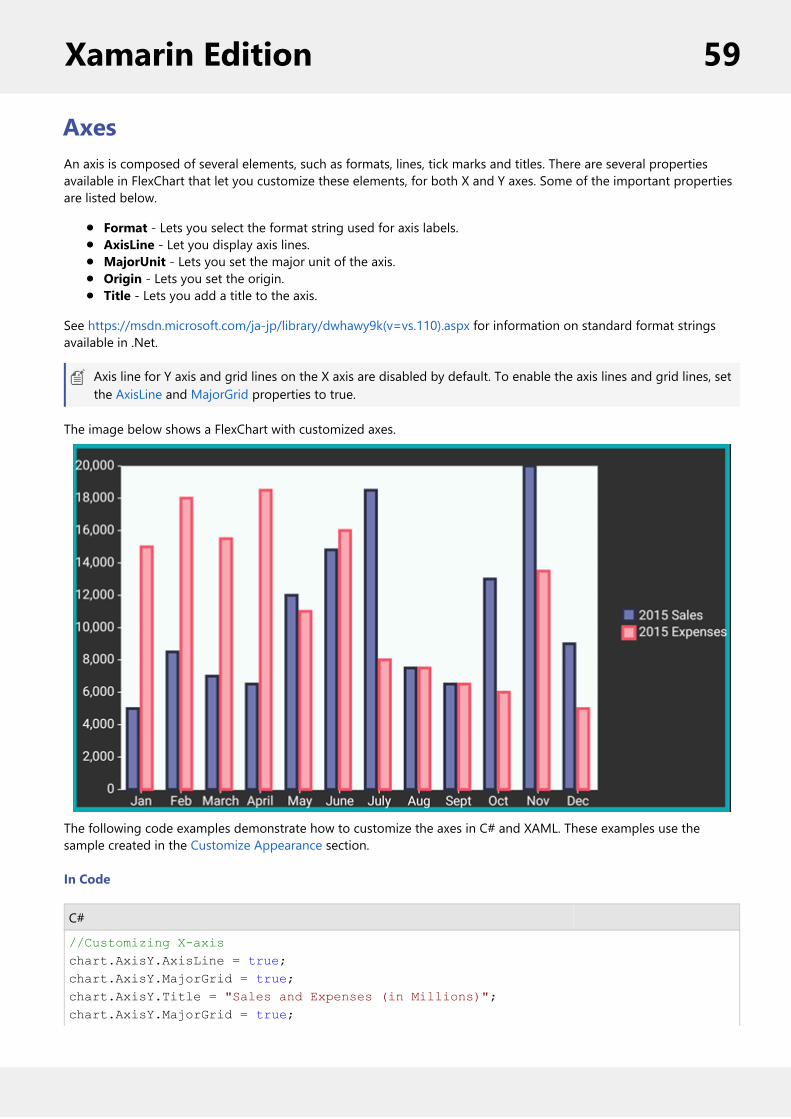
AxesAn axis is composed of several elements, such as formats, lines, tick marks and titles. There are several propertiesavailable in FlexChart that let you customize these elements, for both X and Y axes. Some of the important propertiesare listed below.
Format - Lets you select the format string used for axis labels. AxisLine - Let you display axis lines.MajorUnit - Lets you set the major unit of the axis.Origin - Lets you set the origin.Title - Lets you add a title to the axis.
See https://msdn.microsoft.com/ja-jp/library/dwhawy9k(v=vs.110).aspx for information on standard format stringsavailable in .Net.
Axis line for Y axis and grid lines on the X axis are disabled by default. To enable the axis lines and grid lines, setthe AxisLine and MajorGrid properties to true.
The image below shows a FlexChart with customized axes.
The following code examples demonstrate how to customize the axes in C# and XAML. These examples use thesample created in the Customize Appearance section.
In Code
C#
//Customizing X-axischart.AxisY.AxisLine = true;chart.AxisY.MajorGrid = true; chart.AxisY.Title = "Sales and Expenses (in Millions)";chart.AxisY.MajorGrid = true;
Xamarin Edition 59
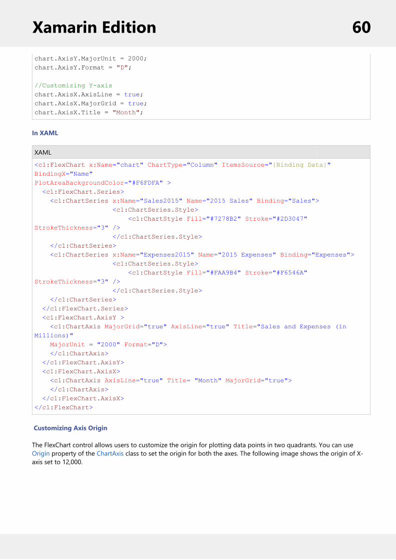
chart.AxisY.MajorUnit = 2000;chart.AxisY.Format = "D";
//Customizing Y-axischart.AxisX.AxisLine = true;chart.AxisX.MajorGrid = true;chart.AxisX.Title = "Month";
In XAML
XAML
<c1:FlexChart x:Name="chart" ChartType="Column" ItemsSource="{Binding Data}" BindingX="Name"PlotAreaBackgroundColor="#F6FDFA" > <c1:FlexChart.Series> <c1:ChartSeries x:Name="Sales2015" Name="2015 Sales" Binding="Sales"> <c1:ChartSeries.Style> <c1:ChartStyle Fill="#7278B2" Stroke="#2D3047" StrokeThickness="3" /> </c1:ChartSeries.Style> </c1:ChartSeries> <c1:ChartSeries x:Name="Expenses2015" Name="2015 Expenses" Binding="Expenses"> <c1:ChartSeries.Style> <c1:ChartStyle Fill="#FAA9B4" Stroke="#F6546A" StrokeThickness="3" /> </c1:ChartSeries.Style> </c1:ChartSeries> </c1:FlexChart.Series> <c1:FlexChart.AxisY > <c1:ChartAxis MajorGrid="true" AxisLine="true" Title="Sales and Expenses (in Millions)" MajorUnit = "2000" Format="D"> </c1:ChartAxis> </c1:FlexChart.AxisY> <c1:FlexChart.AxisX> <c1:ChartAxis AxisLine="true" Title= "Month" MajorGrid="true"> </c1:ChartAxis> </c1:FlexChart.AxisX></c1:FlexChart>
Customizing Axis Origin
The FlexChart control allows users to customize the origin for plotting data points in two quadrants. You can useOrigin property of the ChartAxis class to set the origin for both the axes. The following image shows the origin of X-axis set to 12,000.
Xamarin Edition 60

In Code
The following code example illustrates how to customize the X-axis origin for FlexChart control. This example uses thesample created for Quick Start section. You can also set Y-axis origin in code in a way similar to that given in thefollowing code.
C#
chart.AxisX.Origin = 12000;
Customize AppearanceAlthough, Xamarin controls match the native controls on all three platforms by default and are designed to work withboth: light and dark themes available on all platforms. But, there are several properties to customize the appearanceof the FlexChart control. You can change the background color of the chart plot area, set the color of the series, addcolored borders of specified thickness to charts as well as series and do much more to enhance the appearance of thecontrol.
The image below shows a customized FlexChart control.
Xamarin Edition 61

In Code
The following code example demonstrates how to customize FlexChart and its series. This examples uses the samplecreated in the Quick Start section, with multiple series added to the chart. See Mixed Charts to know how to addmultiple series to a FlexChart.
C#
//Customize chart seriesChartSeries series = new ChartSeries();series.SeriesName = "Sales";series.Binding = "Sales";series.ChartType = ChartType.Column;series.Style.Fill = Color.FromHex("#7278B2");series.Style.Stroke = Color.FromHex("#2D3047");chart.Series.Add(series);
ChartSeries series1 = new ChartSeries();series1.SeriesName = "Expenses";series1.Binding = "Expenses";series1.ChartType = ChartType.Column;series1.Style.Fill = Color.FromHex("#FAA9B4");series1.Style.Stroke = Color.FromHex("#F6546A");chart.Series.Add(series1);
//Customize chart plot areaChartStyle s = new ChartStyle();s.Fill = Color.FromHex("#F6FDFA");s.StrokeThickness = 0;chart.PlotStyle = s;
Data Binding
Xamarin Edition 62

You can bind the FlexChart control to data by setting its BindingX property (for X-axis values), and Binding property(for Y-axis values)on each Series that you add to the control. The FlexChart control and the ChartSeries class providesthe same set of properties for data binding as mentioned in the following table.
Property Name Description
Binding Property for binding Y-axis values
BindingX Property for binding X-axis values
ItemsSource Property for binding with collection ofitems
Users can set the ItemsSource and BindingX properties on the FlexChart control, and the Binding property on eachseries. The ChartSeries uses parent chart values in case these properties are not specified on the series level.
The image given below shows Data Binding in the FlexChart control. The X-axis is bound to DateTime while the Y-axisis bound to Sales and Expenses values for the corresponding DateTime.
To implement and observe this feature, we use a new data source file and make some changes in the QuickStart classthat we used earlier.
In Code
The following code examples illustrate how to set Data Binding in FlexChart control. The example uses the samplecreated in the Quick Start section with slight changes as described below.
1. Replace the code in the data source file, that is FlexChartDataSource, with the following code.C#
public class FlexChartDataSource{ public string Name { get; set; } public double Sales { get; set; } public double Expenses { get; set; }
Xamarin Edition 63

public double Downloads { get; set; } public DateTime Date { get; set; } public FlexChartDataSource() { this.Name = string.Empty; this.Sales = 0; this.Expenses = 0; this.Downloads = 0; this.Date = DateTime.Now; } public FlexChartDataSource(string name, double sales, double expenses, double downloads, DateTime date) { this.Name = name; this.Sales = sales; this.Expenses = expenses; this.Downloads = downloads; this.Date = date; } }
2. Set the BindingX to "Time" within GetChartControl () method in QuickStart class file as illustrated in thefollowing code.C#
chart.BindingX = "Time";chart.Series.Add(new ChartSeries() { Binding = "Sales", Name = "Sales" });chart.Series.Add(new ChartSeries() { Binding = "Expenses", Name = "Expenses" });chart.ItemsSource = new object[] { new {Time=new DateTime(2015,1,1), Sales=10, Expenses = 15}, new {Time=new DateTime(2015,2,1), Sales=10, Expenses=8} };
In XAML
You can also set the Binding through XAML as mentioned in the following code snippet.
XAML
<c1:FlexChart x:Name="chart" ItemsSource="{Binding FlexChartDataSource}" BindingX="Time"> <c1:FlexChart.Series> <c1:ChartSeries Binding="Sales" Name="Sales" /> <c1:ChartSeries Binding="Expenses" Name="Expenses" /> </c1:FlexChart.Series></c1:FlexChart>
Data LabelsYou can add data labels in the FlexChart control to show the exact values corresponding to a particular column, bar orpoint in the plot area. You can display the data labels at the following positions relative to each plot element.
Xamarin Edition 64
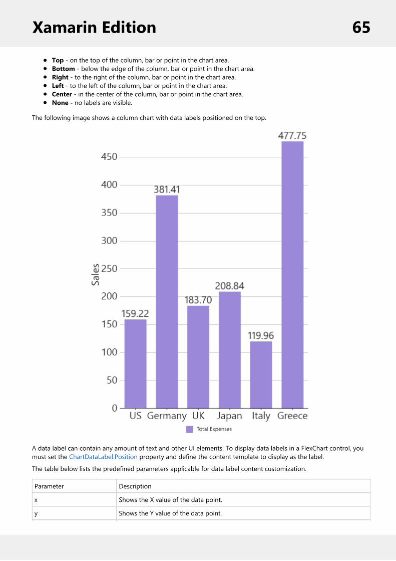
Top - on the top of the column, bar or point in the chart area.Bottom - below the edge of the column, bar or point in the chart area.Right - to the right of the column, bar or point in the chart area.Left - to the left of the column, bar or point in the chart area.Center - in the center of the column, bar or point in the chart area.None - no labels are visible.
The following image shows a column chart with data labels positioned on the top.
A data label can contain any amount of text and other UI elements. To display data labels in a FlexChart control, youmust set the ChartDataLabel.Position property and define the content template to display as the label.
The table below lists the predefined parameters applicable for data label content customization.
Parameter Description
x Shows the X value of the data point.
y Shows the Y value of the data point.
Xamarin Edition 65

value Shows the Y value of the data point.
name Shows the X value of the data point.
seriesName Shows the name of the series.
pointIndex Shows the index of the data point.
Percentage Shows the percentage of a pie slice to the whole pie chart.
In XAML
To set the position and define the content template in XAML, add the following markup between the FlexChart controltags.
XAML
<c1:FlexChart.DataLabel> <c1:ChartDataLabel Position="Top" Border="True" Content="{}{value:F2}"/></c1:FlexChart.DataLabel>
In Code
To change the label position in code, add the following code.
C#
//Setting the data labelschart.DataLabel.Position = ChartLabelPosition.Top;
To display the X and Y values in a single label you would add two Labels to the data label template as shown below.
In XAML
XAML
<c1:FlexChart.DataLabel> <c1:ChartDataLabel Border="True" Position="Top"
Content="{}{x}{value:F2}"> <c1:ChartDataLabel.Style> <c1:ChartStyle FontSize="14" Fill="LightGray"></c1:ChartStyle> </c1:ChartDataLabel.Style> </c1:ChartDataLabel> </c1:FlexChart.DataLabel>
The image below show how the X and Y values appear in a single label.
Xamarin Edition 66

Header FooterYou can add a title to the FlexChart control by setting its Header property. Besides a title, you may also set a footer forthe chart by setting the Footer property. There are also some additional properties to customize header and footertext in a FlexChart.
HeaderAlignment - Lets you set the alignment for header text.FooterAlignment - Lets you set the alignment for footer text.
The image below shows how the FlexChart appears, after these properties have been set.
Xamarin Edition 67

In Code
The following code example demonstrates how to set header and footer properties in C#. This example uses thesample created in the Quick Start section.
C#
//Set header and footerchart.Header = "Sales data"; chart.HeaderAlignment = LayoutAlignment.Fill;
chart.Footer = "Random data by ComponentOne";chart.FooterAlignment = LayoutAlignment.Fill;
Hit TestThe HitTest method is used to determine X and Y coordinates, as well as the index of a point on the FlexChart wherethe user taps. This method is helpful in scenarios such as displaying tooltips that lie outside the series of the FlexChart.
The following code examples demonstrate how to define the chart_Tapped event. This event invokes the HitTest()method to retrieve the information of the tapped point in the FlexChart region and displays it in the chart footer.
In Code
1. In the Solution Explorer, right-click your portable application and select Add | New Item.2. In the New Item dialog, select Forms Xaml Page and provide a name to it, HitTest.3. Click OK to add the XAML page to your project.4. In the HitTest.xaml page, replace the existing code with following code.
XAML
<ContentPage xmlns="http://xamarin.com/schemas/2014/forms" xmlns:x="http://schemas.microsoft.com/winfx/2009/xaml" xmlns:c1="clr-namespace:C1.Xamarin.Forms.Chart; assembly=C1.Xamarin.Forms.Chart"
Xamarin Edition 68

x:Class="QuickstartChart.HitTest" Padding="10"> <StackLayout> <Grid VerticalOptions="FillAndExpand"> <c1:FlexChart x:Name="flexChart" Tapped="flexChart_Tapped" Header="Trigonometric functions" Footer="Cartesian coordinates" BindingX="X" ChartType="LineSymbols" LegendPosition="Bottom" > <c1:FlexChart.Series> <c1:ChartSeries x:Name="seriesCosX" Binding="Y" SeriesName="cos(x)" /> <c1:ChartSeries x:Name="seriesSinX" Binding="Y" SeriesName="sin(x)" /> </c1:FlexChart.Series> </c1:FlexChart> </Grid> <Grid> <Grid.RowDefinitions> <RowDefinition Height="Auto"/> </Grid.RowDefinitions> <StackLayout x:Name="stackHitTest" VerticalOptions="Fill"> <StackLayout Orientation="Horizontal"> <Label x:Name="lblChartElement" /> <Label Text="{Binding ChartElement}" /> </StackLayout> <StackLayout x:Name="stackSeries"> <StackLayout Orientation="Horizontal"> <Label x:Name="lblSeriesName" /> <Label Text="{Binding Series.SeriesName}" /> </StackLayout> <StackLayout x:Name="stackData"> <StackLayout Orientation="Horizontal"> <Label x:Name="lblPointIdx" /> <Label Text="{Binding PointIndex}" /> </StackLayout> <StackLayout Orientation="Horizontal" > <Label Text="{Binding X, StringFormat='X:{0:F2}'}" /> <Label Text="{Binding Y, StringFormat='Y:{0:F2}'}" /> </StackLayout> </StackLayout> </StackLayout> </StackLayout>--> </Grid> </StackLayout>
5. Open the HitTest.xaml.cs page from the Solution Explorer and add the following code to implement HitTestfunctionality at runtime.C#
public partial class HitTest : ContentPage { public HitTest() { InitializeComponent();
Xamarin Edition 69

int len = 40; List<Point> listCosTuple = new List<Point>(); List<Point> listSinTuple = new List<Point>();
for (int i = 0; i < len; i++) { listCosTuple.Add(new Point(i, Math.Cos(0.12 * i))); listSinTuple.Add(new Point(i, Math.Sin(0.12 * i))); }
this.flexChart.AxisY.Format = "n2";
this.seriesCosX.ItemsSource = listCosTuple; this.seriesSinX.ItemsSource = listSinTuple; }
void flexChart_Tapped(object sender, C1.Xamarin.Forms.Core.C1TappedEventArgs e) { var hitTest = this.flexChart.HitTest(e.HitPoint);
this.stackHitTest.BindingContext = hitTest; this.stackData.BindingContext = hitTest;
this.stackSeries.IsVisible = hitTest != null && hitTest.Series != null; this.stackData.IsVisible = hitTest != null && hitTest.PointIndex != -1; } }
LegendFlexChart provides the option to display legend for denoting the type of data plotted on the axes. The position oflegend is by default set to "Auto", which means the legend positions itself automatically depending on the real estateavailable on the device. This allows the chart to efficiently occupy the available space on the device.
You can select where and how to display the legend by setting the LegendPosition property of the legend. You canalso style the legend by setting its orientation through the LegendOrientation property, and adding a border throughthe Stroke property. You can also toggle the visibility of any series on clicking the corresponding legend item bysetting the LegendToggle property to true.
The image below shows how the FlexChart appears after these properties have been set.
Xamarin Edition 70

To hide the legend, set the LegendPosition property to None.The legend automatically wraps when LegendPosition property is set to Top or Bottom, orientation is setto Horizontal and there is not enough screen real estate.
In Code
The following code example demonstrates how to set these properties in C#. This example uses the sample created inthe Customize Appearance section.
C#
chart.LegendToggle = true;chart.LegendPosition = ChartPositionType.Top;chart.LegendOrientation = Orientation.Horizontal;chart.LegendStyle.Stroke = Color.FromHex("#2D3047");chart.LegendStyle.StrokeThickness = 4;
Mixed ChartsYou can add multiple series to your charts and set a different ChartType for each series. Such charts are helpful inanalyzing complex chart data on a single canvas. The same data can be used with different visualizations or relateddata can be displayed together to convey trends.
The following image shows a FlexChart with multiple series.
Xamarin Edition 71

In Code
The following code example demonstrates how to create multiple instances of type ChartSeries with differentChartTypes and add them to the FlexChart control.
C#
ChartSeries series = new ChartSeries();series.SeriesName = "Sales";series.Binding = "Sales";series.ChartType = ChartType.Column;series.Style.Fill = Color.FromHex("#7278B2");series.Style.Stroke = Color.FromHex("#2D3047");chart.Series.Add(series);
ChartSeries series1 = new ChartSeries();series1.SeriesName = "Expenses";series1.Binding = "Expenses";series1.ChartType = ChartType.Column;series1.Style.Fill = Color.FromHex("#FAA9B4");series1.Style.Stroke = Color.FromHex("#F6546A");chart.Series.Add(series1);
ChartSeries series2 = new ChartSeries();series2.SeriesName = "Downloads";series2.Binding = "Downloads";series2.ChartType = ChartType.Line;chart.Series.Add(series2);
Multiple Y AxesYou can add multiple axes to the FlexChart control and customize its properties. This feature allows you to add twoseries in a single FlexChart instance with same X axis but different Y axis. In order to further customize the appearance,
Xamarin Edition 72

users can choose to differentiate the two series by selecting different chart types.
The image below shows a FlexChart control with a common X axis that displays months, and left and right Y axes thatdisplay two different series for Temperature and Precipitation, respectively.
The following steps demonstrate how to add multiple Y axes in the FlexChart control.
1. In the Solution Explorer, right-click your portable application and select Add | New Item. The New Item dialogappears.
2. In the New Item dialog, select Forms XAML Page and provide a name to it, lets say MultipleYAxes.3. Click OK to add the XAML page to your project.4. In the XAML page, replace the existing code with the following to create a FlexChart control that displays twoseries elements, namely Precipitation and Temperature.XAML
<ContentPage xmlns="http://xamarin.com/schemas/2014/forms" xmlns:x="http://schemas.microsoft.com/winfx/2009/xaml" xmlns:c1="clr-namespace:C1.Xamarin.Forms.Chart;assembly=C1.Xamarin.Forms.Chart" x:Class="QuickstartChart.MultipleYAxes"> <c1:FlexChart x:Name="flexChart" BindingX="MonthName"> <c1:FlexChart.Series> <c1:ChartSeries Binding="Precipitation" SeriesName="Precip"/> <c1:ChartSeries Binding="Temp" ChartType="SplineSymbols" SeriesName="Avg. Temp"> <c1:ChartSeries.AxisY> <c1:ChartAxis Position="Right" Min="0" Max="80" MajorUnit="10" Title="Avg.Temperature (F)" AxisLine="False" MajorGrid="False"> <c1:ChartAxis.TitleStyle> <c1:ChartStyle Stroke="#fbb258" FontSize="20"/> </c1:ChartAxis.TitleStyle> </c1:ChartAxis> </c1:ChartSeries.AxisY> </c1:ChartSeries> </c1:FlexChart.Series>
Xamarin Edition 73

<c1:FlexChart.AxisY> <c1:ChartAxis Min="4" Max="20" MajorUnit="2" MajorGrid="True" Title="Precipitation (in)" AxisLine="False"> <c1:ChartAxis.TitleStyle> <c1:ChartStyle Stroke="#88bde6" FontSize="20"/> </c1:ChartAxis.TitleStyle> </c1:ChartAxis> </c1:FlexChart.AxisY> </c1:FlexChart></ContentPage>
5. In the Solution Explorer, open MultipleYAxes.xaml.cs file. Add the following code to it that adds data to bedisplayed in the FlexChart control at run time.C#
public partial class MultipleYAxes : ContentPage { public MultipleYAxes() { InitializeComponent();
this.flexChart.ItemsSource = GetWeatherData(); this.flexChart.LegendPosition = ChartPositionType.None; }
public IEnumerable<WeatherData> GetWeatherData() { List<WeatherData> weatherData = new List<WeatherData>(); string[] monthNames = new string[] { "Jan", "Feb", "Mar", "Apr", "May", "Jun", "Jul", "Aug", "Sep", "Oct", "Nov", "Dec" }; //double[] tempData = new double[] { 24, 30, 45, 58, 68, 75, 83, 80, 72, 62, 47, 32 }; Random random = new Random();
for (int i = 0; i < monthNames.Length; i++) { WeatherData wd = new WeatherData(); wd.MonthName = monthNames[i]; wd.Precipitation = random.Next(8, 18) + random.NextDouble(); wd.Temp = Math.Tan(i * i) + 70; weatherData.Add(wd); } return weatherData; } }
public class WeatherData { public string MonthName { get; set; } public double Temp { get; set; } public double Precipitation { get; set; } }
Xamarin Edition 74
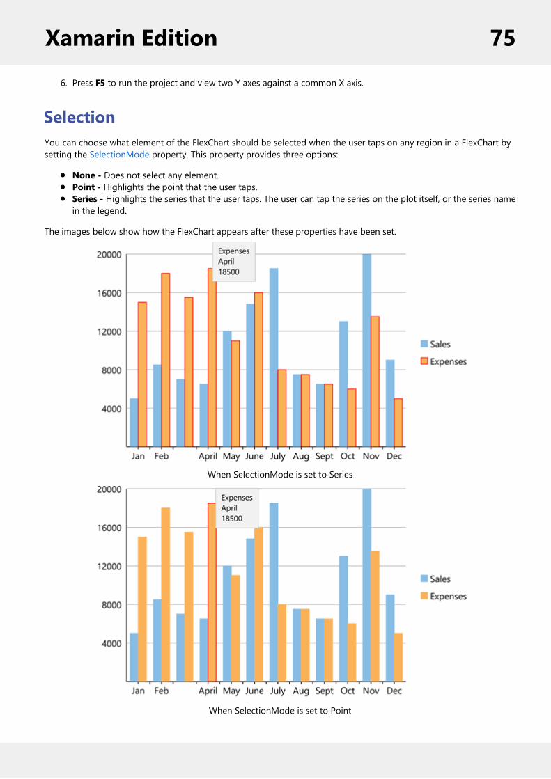
6. Press F5 to run the project and view two Y axes against a common X axis.
SelectionYou can choose what element of the FlexChart should be selected when the user taps on any region in a FlexChart bysetting the SelectionMode property. This property provides three options:
None - Does not select any element.Point - Highlights the point that the user taps.Series - Highlights the series that the user taps. The user can tap the series on the plot itself, or the series namein the legend.
The images below show how the FlexChart appears after these properties have been set.
When SelectionMode is set to Series
When SelectionMode is set to Point
Xamarin Edition 75

In Code
The following code example demonstrates how to set these properties in C#. This example uses the sample created inthe Quick Start section.
C#
//Create seriesChartSeries series = new ChartSeries();series.SeriesName = "Sales";series.Binding = "Sales";series.ChartType = ChartType.Column;chart.Series.Add(series);
ChartSeries series1 = new ChartSeries();series1.SeriesName = "Expenses";series1.Binding = "Expenses";series1.ChartType = ChartType.Column; chart.Series.Add(series1);
//Set selection modechart.SelectionMode = ChartSelectionModeType.Point;
ThemesAn easy way to enhance the appearance of the FlexChart control is to use pre-defined themes instead of customizingeach element. The Palette property is used to specify the theme to be applied on the control.
Note: Remove the Palette property from code to apply default theme.
The image below shows how the FlexChart control appears when the Palette property is set to Cocoa.
In Code
Xamarin Edition 76

The following code example demonstrates how to apply themes in C#.
C#
//setting the Palettechart.Palette = Palette.Cocoa;
FlexChart comes with pre-defined templates that can be applied for quick customization. Here are the 17 pre-definedtemplates available in the Palette enumeration.
Xamarin Edition 77
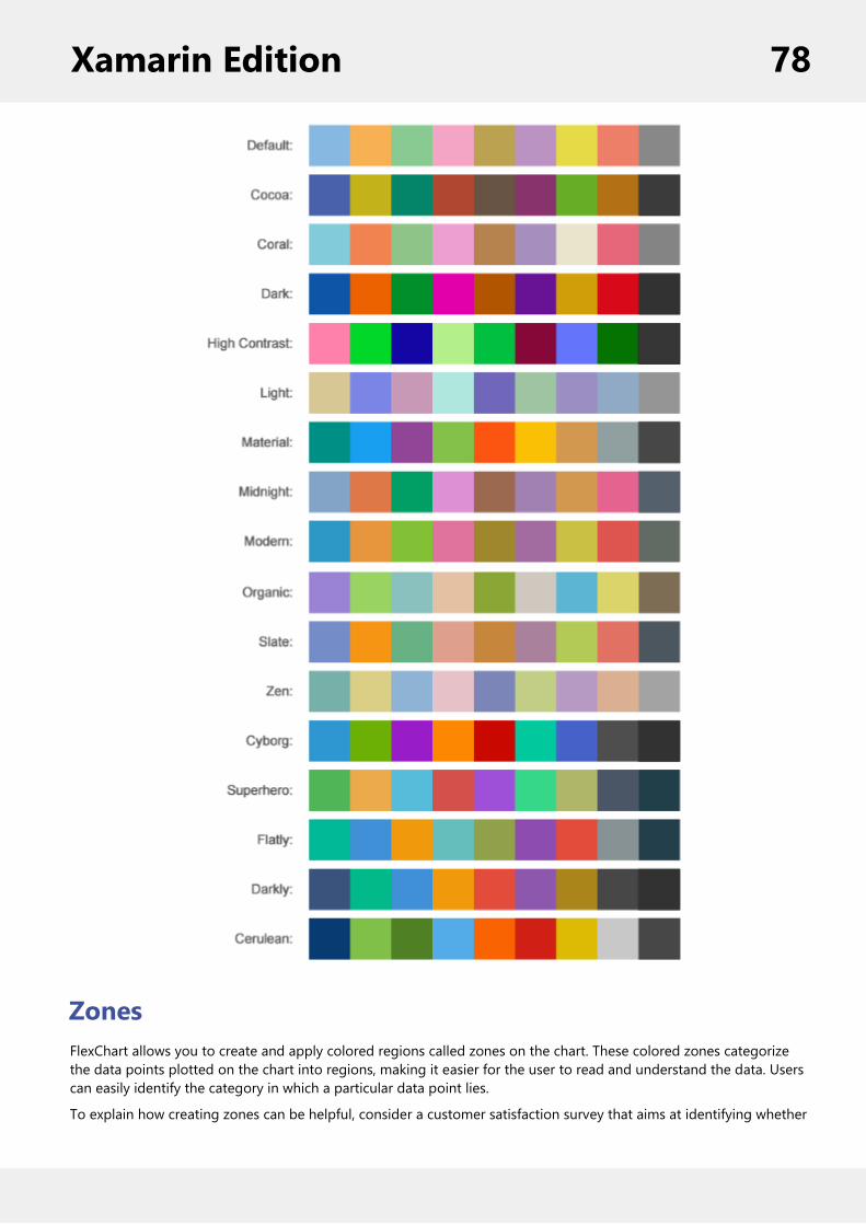
ZonesFlexChart allows you to create and apply colored regions called zones on the chart. These colored zones categorizethe data points plotted on the chart into regions, making it easier for the user to read and understand the data. Userscan easily identify the category in which a particular data point lies.
To explain how creating zones can be helpful, consider a customer satisfaction survey that aims at identifying whether
Xamarin Edition 78

a customer is a promoter, a passive customer, or a detractor for a specific product. The responses recorded in thesurvey can be used to calculate NPS (Net Promoter Score) that classifies customers into promoters, passives, anddetractors. This scenario can be realized in FlexChart by plotting customer responses as data points in chart andcategorizing them in colored zones using area chart, separated by line type data series as follows:
Creating zones in FlexChart
In FlexChart, zones can be created as data series available through the ChartSeries class. Each zone can be created asarea charts by setting the ChartType property to Area, highlighted in distinct colors. To distinguish each zone, linetype data series can be created as thresholds in the chart.
Complete the following steps to create zones in FlexChart.
Step 1: Create a class to record survey result data
1. In the Solution Explorer, right-click your project name (portable app).2. Select Add | New Item. The Add New Item dialog appears.3. Select Class from the dialog and provide a name to it, for example SurveyResult.4. Click Add to add the class to your project.5. Add the following code to the SurveyResult class.
C#
public class SurveyResult { public int surveyNumber { get; set; } public int satisfaction { get; set; }
public SurveyResult(int surveyNumber, int satisfaction) { this.surveyNumber = surveyNumber; this.satisfaction = satisfaction; } }
Step 2: Initialize a FlexChart control
Xamarin Edition 79

1. Right-click your project in the Solution Explorer and select Add | New Item. The Add New Item dialogappears.
2. Select Forms Xaml Page from the installed templates and provide a name to it, for example SurveyZones.3. Click Add to add the XAML page to your project.4. Initialize the FlexChart control in the SurveyZones.xaml page by adding the following XAML code.
XAML
<ContentPage xmlns="http://xamarin.com/schemas/2014/forms" xmlns:x="http://schemas.microsoft.com/winfx/2009/xaml" xmlns:c1="clr-namespace:C1.Xamarin.Forms.Chart;assembly=C1.Xamarin.Forms.Chart" x:Class="QuickstartChart.SurveyZones"> <StackLayout> <Label x:Name="lbl" HorizontalOptions="Center" Font="Large"/> <Grid VerticalOptions="FillAndExpand" > <c1:FlexChart x:Name="flex" BindingX="surveyNumber" VerticalOptions="FillAndExpand" ChartType="Scatter" Grid.Row="0"> <c1:FlexChart.AxisX> <c1:ChartAxis AxisLine="false" MajorGrid="false" Title="Survey Number" /> </c1:FlexChart.AxisX> <c1:FlexChart.AxisY> <c1:ChartAxis Title="Satisfaction Score" Max="10"/> </c1:FlexChart.AxisY> </c1:FlexChart> </Grid> </StackLayout></ContentPage>
Step 3: Bind data and create zones
1. Expand the SurveyZones.xaml node and open the C# code.2. Add the following import statements.
C#
using Xamarin.Forms;using C1.Xamarin.Forms.Chart;using System.Collections.ObjectModel;
3. Add the following code in SurveyZones() class constructor to create zones in chart and display NPS score in adata label.
C#
public partial class SurveyZones : ContentPage { public SurveyZones() { InitializeComponent();
Xamarin Edition 80

//customer survey results int[] scores = { 8, 9, 9, 10, 3, 10, 6, 10, 7, 9 };
ObservableCollection<SurveyResult> results = new ObservableCollection<SurveyResult>(); flex.ItemsSource = results;
Point[] zone1 = new Point[10]; Point[] zone2 = new Point[10]; Point[] zone3 = new Point[10]; ;
Point[] threshold1 = new Point[10]; Point[] threshold2 = new Point[10];
//populate points for zones and thresholds for (int i = 0; i < 10; i++) { results.Add(new SurveyResult(i, scores[i])); zone1[i] = new Point(i, 10); zone2[i] = new Point(i, 9); zone3[i] = new Point(i, 7); threshold1[i] = new Point(i, 9); threshold2[i] = new Point(i, 7); }
//Zone 1 for promoters var seriesZone1 = new ChartSeries(); seriesZone1.ItemsSource = zone1; seriesZone1.Binding = "Y"; seriesZone1.BindingX = "X"; seriesZone1.ChartType = C1.Xamarin.Forms.Chart.ChartType.Area; seriesZone1.SeriesName = "Promoter";
//Zone 2 for passives var seriesZone2 = new ChartSeries(); seriesZone2.ItemsSource = zone2; seriesZone2.Binding = "Y"; seriesZone2.BindingX = "X"; seriesZone2.ChartType = ChartType.Area; seriesZone2.SeriesName = "Passive";
//Zone 3 for detractors var seriesZone3 = new ChartSeries(); seriesZone3.ItemsSource = zone3; seriesZone3.Binding = "Y"; seriesZone3.BindingX = "X"; seriesZone3.ChartType = ChartType.Area; seriesZone3.SeriesName = "Detractor";
flex.Series.Add(seriesZone1); flex.Series.Add(seriesZone2);
Xamarin Edition 81

flex.Series.Add(seriesZone3);
//Promotor Threshold line var seriesThreshold1 = new ChartSeries(); seriesThreshold1.ItemsSource = threshold1; seriesThreshold1.Binding = "Y"; seriesThreshold1.BindingX = "X"; seriesThreshold1.SeriesName = "Promoter Threshold"; seriesThreshold1.ChartType = ChartType.Line;
//Passive Threshold line var seriesThreshold2 = new ChartSeries(); seriesThreshold2.ItemsSource = threshold2; seriesThreshold2.Binding = "Y"; seriesThreshold2.BindingX = "X"; seriesThreshold2.SeriesName = "Passive Threshold";
flex.Series.Add(seriesThreshold1); flex.Series.Add(seriesThreshold2);
//add customer satisfaction results var satisfactionSeries = new ChartSeries(); satisfactionSeries.SeriesName = "Satisfaction"; satisfactionSeries.Binding = "satisfaction";
flex.Series.Add(satisfactionSeries); lbl.Text = "NPS Score " + GetNPS(scores).ToString(); }
public double GetNPS(int[] scores) { double promoter = 0; double detractor = 0; foreach (int score in scores) { if (score >= 9) { promoter++; } else if (score < 7) { detractor++; } } double nps = ((promoter - detractor) / scores.Length) * 100; return nps; } }
Xamarin Edition 82

FlexGridFlexGrid provides a powerful and flexible way to display data from a data source in tabular format. FlexGrid is a full-featured grid, providing various features including automatic column generation; sorting, grouping and filtering datausing the CollectionView; and intuitive touch gestures for cell selection, sorting, scrolling and editing. FlexGrid brings aspreadsheet-like experience to your mobile apps with quick cell editing capabilities.
FlexGrid provides design flexibility with conditional formatting and cell level customization. This allows developers tocreate complex grid-based applications, as well as provides the ability to edit and update databases at runtime.
Quick Start: Add Data to FlexGridThis section describes how to add a FlexGrid control to your portable or shared app and add data to it. Forinformation on how to add Xamarin components in C# or XAML,see Adding Xamarin Components using C# or AddingXamarin Components using XAML.
This topic comprises of three steps:
Step 1: Create a Data Source for FlexGridStep 2: Add a FlexGrid controlStep 3: Run the Application
The following image shows how the FlexGrid appears, after completing the steps above:
Step 1: Create a Data Source for FlexGrid
The following class serves as a data source for the FlexGrid control.
C#
public class Customer { int _id, _countryID; string _first, _last; bool _active; double _weight; DateTime _hired; static Random _rnd = new Random();
Xamarin Edition 83

static string[] _firstNames = "Gil|Oprah|Xavier|Herb|Charlie|Larry|Steve".Split('|'); static string[] _lastNames = "Orsted|Frommer|Jammers|Krause|Neiman".Split('|'); static string[] _countries = "Brazil|Congo|Egypt|United States|Japan|Thailand".Split('|');
public Customer() : this(_rnd.Next(10000)) { } public Customer(int id) { ID = id; First = GetString(_firstNames); Last = GetString(_lastNames); CountryID = _rnd.Next() % _countries.Length; Active = _rnd.NextDouble() >= .5; Hired = DateTime.Today.AddDays(-_rnd.Next(1, 365)); Weight = 50 + _rnd.NextDouble() * 50; } public int ID { get { return _id; } set { _id = value;} } public string Name { get { return string.Format("{0} {1}", First, Last); } } public string Country { get { return _countries[_countryID]; } } public int CountryID { get { return _countryID; } set {_countryID = value; } } public bool Active { get { return _active; } set { _active = value;} } public string First { get { return _first; } set {_first = value; } } public string Last {
Xamarin Edition 84
get { return _last; } set {_last = value; } } public DateTime Hired { get { return _hired; } set { _hired = value;} } public double Weight { get { return _weight; } set {_weight = value; } } static string GetString(string[] arr) { return arr[_rnd.Next(arr.Length)]; } static string GetName() { return string.Format("{0} {1}", GetString(_firstNames), GetString(_lastNames)); } // Provide static list. public static ObservableCollection<Customer> GetCustomerList(int count) { var list = new ObservableCollection<Customer>(); for (int i = 0; i < count; i++) { list.Add(new Customer(i)); } return list; } //Provide static value members. public static string[] GetCountries() { return _countries; } public static string[] GetFirstNames() { return _firstNames; } public static string[] GetLastNames() { return _lastNames; } }
Back to Top
Step 2: Add a FlexGrid control
Complete the following steps to initialize a FlexGrid control in C# or XAML.
In Code
1. Add a new class (for example QuickStart.cs) to your project and include the following references:C#
using Xamarin.Forms;using C1.Xamarin.Forms.Grid;
2. Instantiate a FlexGrid control in a new method GetGridControl( ).C#
Xamarin Edition 85

public static FlexGrid GetGridControl() { //Create an instance of the Control and set its properties FlexGrid grid = new FlexGrid(); grid.ItemsSource = Customer.GetCustomerList(10); return grid; }
In XAML
1. Add a new Forms XAML Page (for example QuickStart.xaml) to your project and modify the <ContentPage>tagto include the following references:XAML
<ContentPage xmlns="http://xamarin.com/schemas/2014/forms"xmlns:x="http://schemas.microsoft.com/winfx/2009/xaml"x:Class="Appl.QuickStart"xmlns:c1="clr-namespace:C1.Xamarin.Forms.Grid;assembly=C1.Xamarin.Forms.Grid">
2. Initialize a FlexGrid control by adding the markup for the control between the <ContentPage></ContentPage>tags and inside the <StackLayout></StackLayout>tags, as shown below.XAML
<StackLayout> <Grid VerticalOptions="FillAndExpand"> <c1:C1FlexGrid x:Name="grid"/> </Grid></StackLayout>
3. In the Solution Explorer, expand the QuickStart.xaml node and open QuickStart.xaml.cs to view the C# code.4. In the QuickStart( ) class constructor, set the BindingContext for the FlexGrid.
The following code shows what the QuickStart( ) class constructor looks like after completing this step.
C#
public QuickStart(){ InitializeComponent(); grid.BindingContext = new Customer();}
Back to Top
Step 3: Run the Application
1. In the Solution Explorer, double-click App.cs to open it.2. Complete the following steps to display the FlexGrid control.
To return a C# class: In the class constructor App( ), set a new ContentPage as the MainPage andassign the control to the ContentPage's content by invoking the method GetGridControl( ) defined inthe previous procedure, Step 2: Add a FlexGrid Control.
The following code shows the class constructor App() after completing steps above.
C#
Xamarin Edition 86
public App(){ // The root page of your application MainPage = new ContentPage { Content = QuickStart.GetGridControl() };}
To return a Forms XAML Page: In the class constructor App( ), set the Forms XAML Page QuickStart asthe MainPage.
The following code shows the class constructor App( ), after completing this step.
C#
public App(){ // The root page of your application MainPage = new QuickStart();}
3. Some additional steps are required to run iOS and UWP apps:iOS App:
1. In the Solution Explorer, double click AppDelegate.cs inside YourAppName.iOS project to openit.
2. Add the following code to the FinishedLaunching( ) method.C#
C1.Xamarin.Forms.Grid.Platform.iOS.FlexGridRenderer.Init();
UWP App:1. In the Solution Explorer, expand MainPage.xaml.2. Double click MainPage.xaml.cs to open it.3. Add the following code to the class constructor.
C#
C1.Xamarin.Forms.Grid.Platform.UWP.FlexGridRenderer.Init();
4. Press F5 to run the project.
Back to Top
Features
Custom CellsFlexGrid gives you complete control over the contents of the cells. You can customize each column’s appearance bymodifying the CellTemplate or CellEditingTemplate properties in XAML, or you can create your own Cell Factory classto customize cell content entirely in code.
Xamarin Edition 87
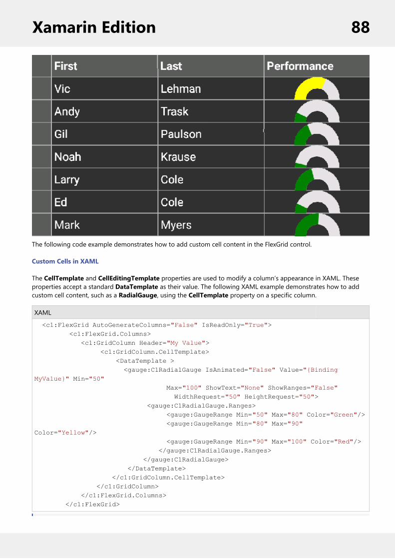
The following code example demonstrates how to add custom cell content in the FlexGrid control.
Custom Cells in XAML
The CellTemplate and CellEditingTemplate properties are used to modify a column’s appearance in XAML. Theseproperties accept a standard DataTemplate as their value. The following XAML example demonstrates how to addcustom cell content, such as a RadialGauge, using the CellTemplate property on a specific column.
XAML
<c1:FlexGrid AutoGenerateColumns="False" IsReadOnly="True"> <c1:FlexGrid.Columns> <c1:GridColumn Header="My Value"> <c1:GridColumn.CellTemplate> <DataTemplate > <gauge:C1RadialGauge IsAnimated="False" Value="{Binding MyValue}" Min="50" Max="100" ShowText="None" ShowRanges="False" WidthRequest="50" HeightRequest="50"> <gauge:C1RadialGauge.Ranges> <gauge:GaugeRange Min="50" Max="80" Color="Green"/> <gauge:GaugeRange Min="80" Max="90" Color="Yellow"/> <gauge:GaugeRange Min="90" Max="100" Color="Red"/> </gauge:C1RadialGauge.Ranges> </gauge:C1RadialGauge> </DataTemplate> </c1:GridColumn.CellTemplate> </c1:GridColumn> </c1:FlexGrid.Columns> </c1:FlexGrid>
Xamarin Edition 88

For the best performance, your cell template should contain a single control (View). In this case, theXamarin.Forms platform is capable of efficiently rendering single Views as bitmaps on Android and iOS soperformance is not dramatically affected. If your cell template contains a layout control (such as a Grid orStackLayout), it will work, but a new View will be created for every cell on Android and iOS. This maydrastically affect performance if you have a lot of rows. You can work around this limitation by creating a customrenderer. This limitation does not impact CellEditingTemplate because only one cell is in edit mode.
Custom Cells in Code
FlexGrid provides a simpler interface for customizing cells in code. The GridCellFactory class is used by the grid tocreate every cell shown in the grid. Custom cell factories can be highly customized, or they can be general, reusableclasses for defining cell appearances.
To customize cells code, you first define your own class that extends GridCellFactory. Then you assign an instance ofyour class to the FlexGrid.CellFactory property. Your cell factory class should override either the BindCellContentmethod or the CreateCellContent method. To customize the gridlines appearance you should override CreateCell.
BindCellContent: Override this method to customize the cell text. The result is a text-only cell, but you canconditionally format the text as needed.CreateCellContent: Override this method to completely customize the cell content. The result is a View(control). You would use this method to insert your own control, such as an Image or gauge.PrepareCell: Override this method to customize the cell background and border (gridlines).
The following code example demonstrates a cell factory that overrides BindCellContent and conditionally sets the celltext red or green depending on the value:
C#
// set the cell factory property on FlexGrid to custom classgrid.CellFactory = new MyCellFactory(); // Custom Cell Factory class that applies conditional formatting to cell textpublic class MyCellFactory :GridCellFactory{ /// /// Override BindCellContent to customize the cell content /// public override void BindCellContent(GridCellType cellType, GridCellRange range, View cellContent) { base.BindCellContent(cellType, range, cellContent); if(cellType == GridCellType.Cell&&cellType != GridCellType.ColumnHeader&&range.Column == 3) { var label = cellContent as Label; if(label != null) { var originalText = label.Text; double cellValue; if(double.TryParse(originalText, out cellValue)) { label.TextColor = cellValue<70.0 ?Color.Red :Color.Green; label.Text = String.Format("{0:n2}", cellValue); }
Xamarin Edition 89

} } }}
FlexGrid supports just one cell factory, however, a single cell factory can handle any number of custom cells inmultiple columns. For instance, you can apply different formatting for any number of columns by just providingadditional IF statements and checking the range.Column parameter.
The following code example shows the default CreateCellContent method that returns a Label as the cell content. Youcan modify this to return your own View.
In Code
C#
public class MyCellFactory: GridCellFactory{////// Override CreateCellContent to return your own custom view as a cell/// public override View CreateCellContent(GridCellType cellType, GridCellRange range, object cellContentType) { if (cellType == GridCellType.Cell) { if (Grid.Columns.Count>range.Column) { var r = Grid.Rows[range.Row]; var c = Grid.Columns[range.Column]; return base.CreateCellContent(cellType, range, cellContentType); } return null; } else if (cellType == GridCellType.ColumnHeader) { return new Label(); } else { return null; } }}
The following code example shows how to customize cell background colors using PrepareCell.
In Code
C#
public class MyCellFactory : GridCellFactory{////// Override CreateCell to customize the cell frame/gridlines ///
Xamarin Edition 90

public override void PrepareCell(GridCellType cellType, GridCellRange range, GridCellView cell) { base.PrepareCell(cellType, range, cell); if (cellType == GridCellType.Cell && range.Column == 3) { var cellValue = Grid[range.Row, range.Column] as int?; if (cellValue.HasValue) { cell.BackgroundColor = cellValue < 50.0 ? Color.FromRgb((double)0xFF / 255.0, (double)0x70 / 255.0, (double)0x70 / 255.0) : Color.FromRgb((double)0x8E / 255.0, (double)0xE9 / 255.0, (double)0x8E / 255.0); } } }}
Custom Cell EditorTo provide a custom cell editor for a column you would add your custom editor to the CellEditingTemplate. Thefollowing XAML example demonstrates how to add a custom cell editor, such as a DatePicker, using theCellEditingTemplate property on a specific column.
In XAML
XAML
<c1:FlexGrid AutoGenerateColumns="False"> <c1:FlexGrid.Columns> <c1:GridColumn Binding="HireDate"> <c1:GridColumn.CellEditingTemplate> <DataTemplate> <DatePicker Date="{Binding ., Mode=TwoWay}"/> </DataTemplate> </c1:GridColumn.CellEditingTemplate> </c1:GridColumn> </c1:FlexGrid.Columns></c1:FlexGrid>
Customize AppearanceFlexGrid has various built-in properties to customize grid's appearance. User can customize various attributes, suchas background color, alternating row color, text color, header color, font, selection mode, selected cell color, etc.
The image below shows customized appearance in FlexGrid after these properties have been set.
Xamarin Edition 91

The following code example demonstrates how to set this property in C# and XAML. The example uses the samplecreated in the Quick Start section.
In Code
C#
grid.BackgroundColor = Color.FromHex("#FCF0E5");grid.AlternatingRowBackgroundColor = Color.FromHex("#DA6CB5");grid.SelectionMode = GridSelectionMode.Cell;grid.SelectionTextColor = Color.FromHex("#FFFFFF");grid.ColumnHeaderBackgroundColor = Color.FromHex("#7B7E7D");grid.ColumnHeaderTextColor= Color.FromHex("#FFFFFF");grid.SelectionBackgroundColor = Color.FromHex("#FCF0E5");
In XAML
XAML
<c1:FlexGrid SelectionMode="Cell"
BackgroundColor="White" AlternatingRowBackgroundColor="Purple"
ColumnHeaderBackgroundColor="Silver" SelectionBackgroundColor="Navy" SelectionTextColor="White" x:Name="grid"
AutoGenerateColumns="False">
Clipboard and Keyboard SupportFlexGrid comes with clipboard support to readily provide cut, copy and paste operations. The control also supportshardware keyboards by allowing navigation through arrow keys.
The supported keystrokes and their purpose are listed alphabetically as follows:
Keystroke Description/Purpose
Xamarin Edition 92

Ctrl+C Copies the selected text.
Ctrl+X Cuts the selected text.
Ctrl+V Pastes the copied text.
F2 Enters the edit mode.
Enter/Return Leaves the edit mode.
Left Navigates cell selection towards the left.
Right Navigates cell selection towards the right.
Up Navigates the cell selection upward.
Down Navigates the cell selection downward.
Shift+Left Expands column range towards the left or decreases column range based on the context.If range has already expanded to right, this will gradually decrease range selection downto one column. After this single column threshold is hit, it will then expand the selectionto the left if it continues to be pressed after this.
Shift+Right Expands column range towards the right or decreases column range based on thecontext. If range has already expanded to left, this will gradually decrease range selectiondown to one column. After this single column threshold is hit, it will then expand theselection to the right if it continues to be pressed after this.
Shift+Up Expands row range upwards or decreases row range based on the context. If range hasalready expanded downwards, this will gradually decrease range selection to one row.After this single row threshold is hit, it will then expand the selection to the upwards if itcontinues to be pressed after this.
Shift+Down Expands row range downwards or decreases row range based on the context. If range hasalready expanded upwards, this will gradually decrease range selection to one row. Afterthis single row threshold is hit, it will then expand the selection to the downwards if itcontinues to be pressed after this.
Data MappingData Mapping provides auto look-up capabilities in FlexGrid. For example, you may want to display a customer nameinstead of his ID, or a color name instead of its RGB value. When data mapping is configured for a column, a picker isdisplayed when the user edits the cell.
The image given below shows a FlexGrid with Data Mapping.
Xamarin Edition 93

The GridDataMap class has three key properties.
ItemsSource (IEnumerable) - an IEnumerable collection that contains the items to map.SelectedValuePath (string) - the name of the property that contains the keys (data values).DisplayMemberPath (string) - the name of the property to use as the visual representation of the items.
The code below binds a grid to a collection of customers, then assigns a GridDataMap to the grid's 'CountryId'column so that the grid displays country names instead of raw IDs.
In Code
C#
grid.ItemsSource = customers;grid.Columns["CountryId"].DataMap = new GridDataMap() { ItemsSource = countries, DisplayMemberPath = "Country", SelectedValuePath = "ID" };
If you use a KeyValuePair collection as the GridDataMap ItemsSource, you should set the DisplayMemberPath to'Value' and SelectedValuePath to 'Key'. In case you follow MVVM, you may want to define the data map binding inXAML. The markup below shows how to configure that data map in XAML on a single GridColumn.
In XAML
XAML
<c1:GridColumn Binding="CountryId" Header="Country"> <c1:GridColumn.DataMap> <c1:GridDataMap ItemsSource="{Binding Countries, Source={StaticResource viewModel}}" SelectedValuePath="ID" DisplayMemberPath="Name" /> </c1:GridColumn.DataMap>
Xamarin Edition 94
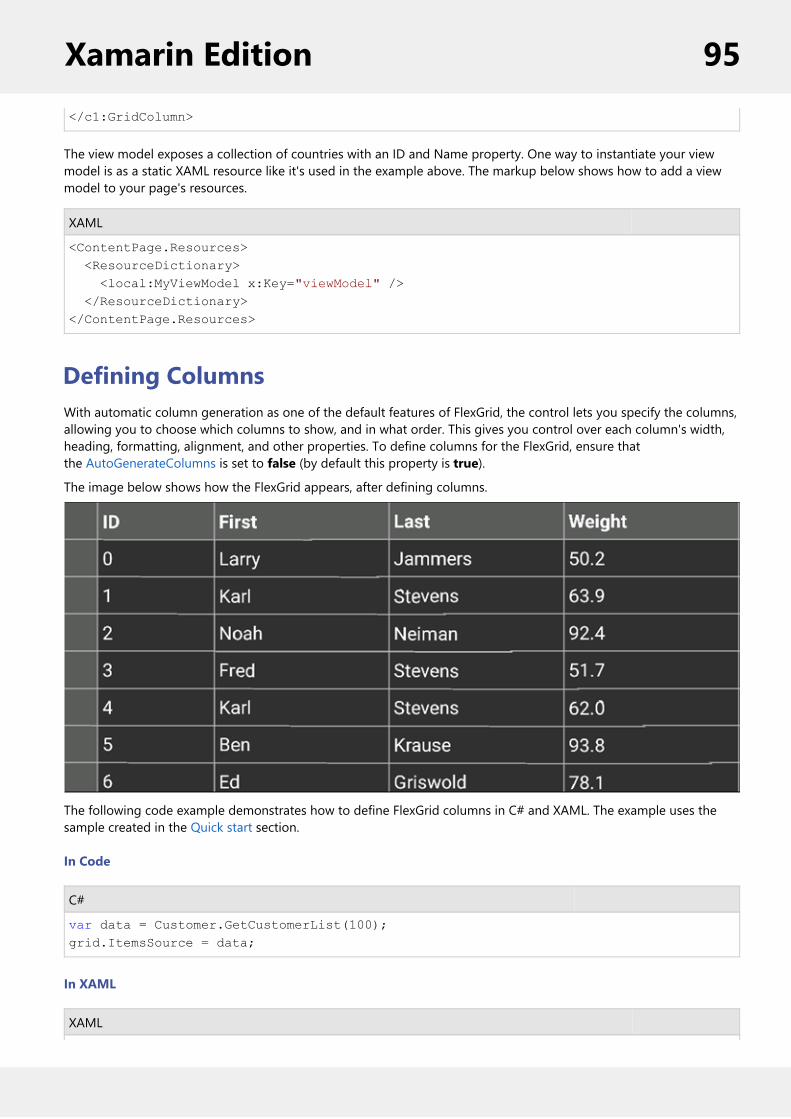
</c1:GridColumn>
The view model exposes a collection of countries with an ID and Name property. One way to instantiate your viewmodel is as a static XAML resource like it's used in the example above. The markup below shows how to add a viewmodel to your page's resources.
XAML
<ContentPage.Resources> <ResourceDictionary> <local:MyViewModel x:Key="viewModel" /> </ResourceDictionary></ContentPage.Resources>
Defining ColumnsWith automatic column generation as one of the default features of FlexGrid, the control lets you specify the columns,allowing you to choose which columns to show, and in what order. This gives you control over each column's width,heading, formatting, alignment, and other properties. To define columns for the FlexGrid, ensure thatthe AutoGenerateColumns is set to false (by default this property is true).
The image below shows how the FlexGrid appears, after defining columns.
The following code example demonstrates how to define FlexGrid columns in C# and XAML. The example uses thesample created in the Quick start section.
In Code
C#
var data = Customer.GetCustomerList(100);grid.ItemsSource = data;
In XAML
XAML
Xamarin Edition 95

<Grid VerticalOptions="FillAndExpand"> <c1:FlexGrid x:Name="grid" AutoGenerateColumns="False"> <c1:FlexGrid.Columns> <c1:GridColumn Binding="ID" Width="100"/> <c1:GridColumn Binding="First" Width="Auto"/> <c1:GridColumn Binding="Last"/> <c1:GridColumn Binding="Weight" Format="N1"/> </c1:FlexGrid.Columns> </c1:FlexGrid></Grid>
EditingFlexGrid has built-in support for fast, in-cell editing like you find in Excel. There is no need to add extra columns withEdit buttons that switch between display and edit modes. Users can start editing by typing into any cell. This puts thecell in quick-edit mode. In this mode, pressing a cursor key finishes the editing and moves the selection to a differentcell.
Another way to start editing is by clicking a cell twice. This puts the cell in full-edit mode. In this mode, pressing acursor key moves the caret within the cell text. To finish editing and move to another cell, the user must press theEnter key. Data is automatically coerced to the proper type when editing finishes. If the user enters invalid data, theedit is cancelled and the original data remains in place. You can disable editing at the grid usingthe IsReadOnly property of the grid.
FlexGrid provides support for various types of Editing, including inline, form-based and custom cell editing.
Inline EditingFlexGrid allows a user to perform in-line editing using your default device keyboard. Double clicking inside a cell putsit into a quick edit mode. Once you select the content inside the cell or row, it gives you options to Cut, Copy, Replaceetc. for a smooth editing experience.
Once you have entered the new data, simply press Enter, this automatically updates the data in the appropriateformat. You can set the IsReadOnly to true for the rows and columns that you want to restrict editing for.
The image below shows how the FlexGrid appears, after these properties have been set.
Xamarin Edition 96
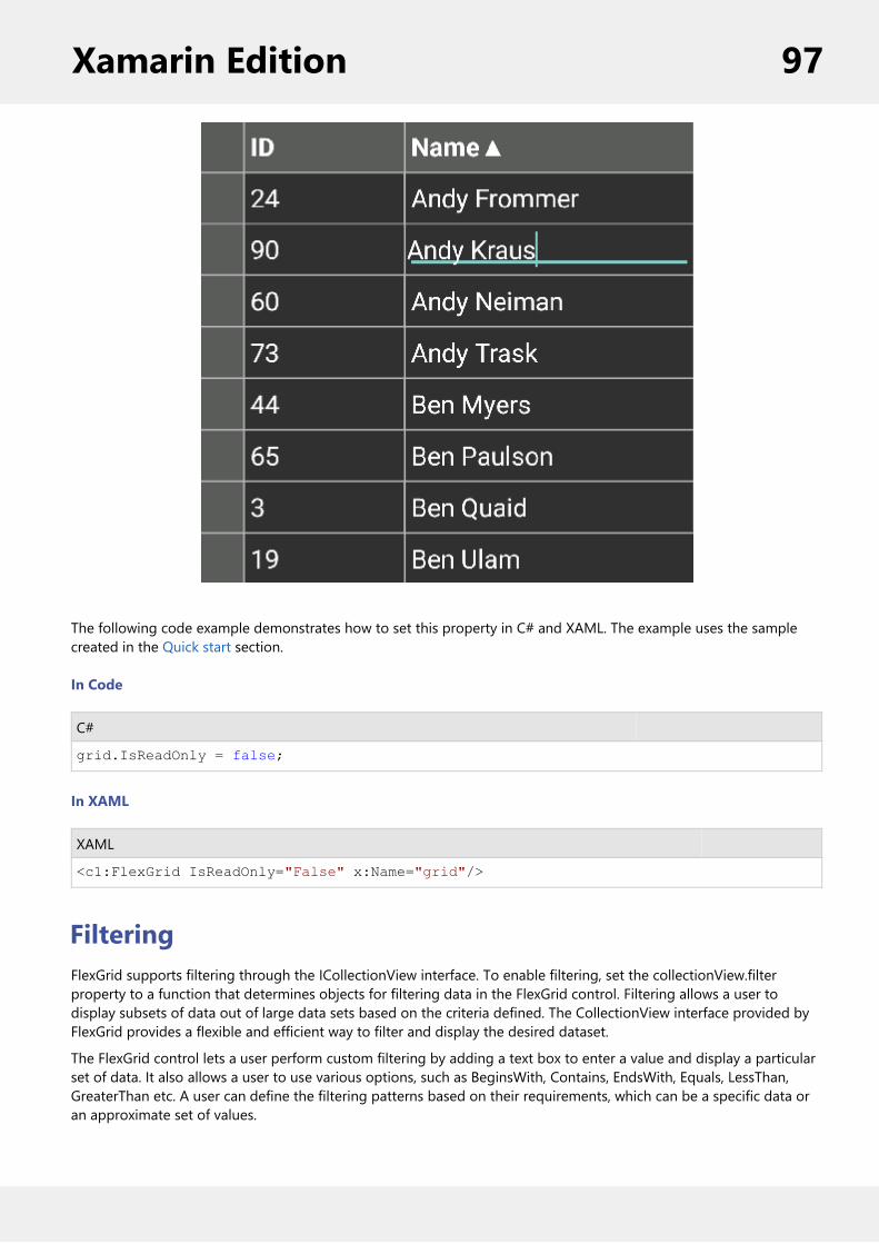
The following code example demonstrates how to set this property in C# and XAML. The example uses the samplecreated in the Quick start section.
In Code
C#
grid.IsReadOnly = false;
In XAML
XAML
<c1:FlexGrid IsReadOnly="False" x:Name="grid"/>
FilteringFlexGrid supports filtering through the ICollectionView interface. To enable filtering, set the collectionView.filterproperty to a function that determines objects for filtering data in the FlexGrid control. Filtering allows a user todisplay subsets of data out of large data sets based on the criteria defined. The CollectionView interface provided byFlexGrid provides a flexible and efficient way to filter and display the desired dataset.
The FlexGrid control lets a user perform custom filtering by adding a text box to enter a value and display a particularset of data. It also allows a user to use various options, such as BeginsWith, Contains, EndsWith, Equals, LessThan,GreaterThan etc. A user can define the filtering patterns based on their requirements, which can be a specific data oran approximate set of values.
Xamarin Edition 97
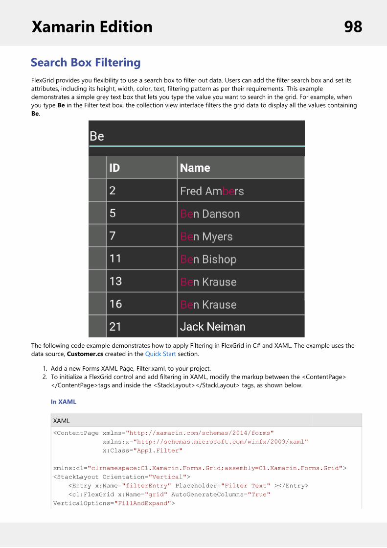
Search Box FilteringFlexGrid provides you flexibility to use a search box to filter out data. Users can add the filter search box and set itsattributes, including its height, width, color, text, filtering pattern as per their requirements. This exampledemonstrates a simple grey text box that lets you type the value you want to search in the grid. For example, whenyou type Be in the Filter text box, the collection view interface filters the grid data to display all the values containingBe.
The following code example demonstrates how to apply Filtering in FlexGrid in C# and XAML. The example uses thedata source, Customer.cs created in the Quick Start section.
1. Add a new Forms XAML Page, Filter.xaml, to your project.2. To initialize a FlexGrid control and add filtering in XAML, modify the markup between the <ContentPage></ContentPage>tags and inside the <StackLayout></StackLayout> tags, as shown below.
In XAML
XAML
<ContentPage xmlns="http://xamarin.com/schemas/2014/forms" xmlns:x="http://schemas.microsoft.com/winfx/2009/xaml" x:Class="App1.Filter" xmlns:c1="clrnamespace:C1.Xamarin.Forms.Grid;assembly=C1.Xamarin.Forms.Grid"><StackLayout Orientation="Vertical"> <Entry x:Name="filterEntry" Placeholder="Filter Text" ></Entry> <c1:FlexGrid x:Name="grid" AutoGenerateColumns="True" VerticalOptions="FillAndExpand">
Xamarin Edition 98

<c1:FlexGrid.Behaviors> <c1:FullTextFilterBehavior FilterEntry="{x:Reference Name=filterEntry}" <c1:FullTextFilterBehavior FilterEntry="{x:Reference Name=filterEntry}" Mode="WhileTyping" MatchNumbers="True" TreatSpacesAsAndOperator="True" /> </c1:FlexGrid.Behaviors> </c1:FlexGrid></StackLayout></ContentPage>
3. In the Solution Explorer, expand the Filter.xaml node and open Filter.xaml.cs to view the C# code.4. Add the following code in the Filter class constructor to initialize the FlexGrid control and add data to it:
In Code
C#
InitializeComponent();this.grid.ItemsSource = App1.Customer.GetCustomerList(50);
Formatting ColumnsYou can convert the raw values appearing in any column of the FlexGrid into different formats. FlexGrid supportsstandard .NET format strings used to display numeric values as local currency, percentages, dates, and more.Formatting only applies to display value of a cell and does not affect the underlying data.
Formatting Numbers and Dates
You can specify a column's format by setting its Format property to a valid string. The string should contain one ortwo characters from a known list of formats. The first character specifies the format (format specifier) while the secondoptional character specifies precision (precision specifier). For example, the following format string converts a rawvalue to display local currency up to 2 decimal places.
C#
flexGrid.Columns["UnitPrice"].Format = "c2";
The following table shows all the numeric format strings that FlexGrid currently supports. Note that these formatstrings are not case sensitive.
Format Specifier Name Precision Specifier Example
"C" or "c" Currency Number of decimal digits 123.4567(C2) à$123.46
"D" or "d" Decimal Minimum number of digits 1234 (D6)à 001234
"E" or "e" Exponential Number of decimal digits 1,234 (E2)à 1.23E3
"F" or "f" Fixed Point Number of decimal digits -1234.56(F4) à -1234.5600
Xamarin Edition 99
"G" or "g" General Number of significant digits 123.45(G4) à123.5
"N" or "n" Number Desired number of decimal places 1234 (N1)à 1234.0
"P" or "p" Percent Desired number of decimal places 1 (P2) à100.00%
"X" or "x" Hexadecimal Desired number of digits in the result 123 (X2)à 7B
The following table shows the date/time format strings that FlexGrid currently supports.
Format Specifier Description Example
"d" Short date pattern 3/31/2016
31/3/2016 (FR}
2016/3/31 (JP)
"D" Long date pattern Thursday, March 31,2016
"f" Full date, short time pattern Thursday, March 31,2016 12:00 AM
"F" Full date, full time pattern Thursday, March 31,2016 12:00:00 AM
"g" General date, short time pattern 3/31/2016 12:00 AM
"G" General date, long time pattern 3/31/2016 12:00:00 AM
"M" or "m" Month, day pattern March 31
"t" Short time pattern 12:00 AM
"T" Long time pattern 12:00:00 AM
"u" Universal sortable pattern 2016-03-31 12:00:00Z
"U" Universal full pattern Thursday, March 31,2016 12:00:00 AM
"Y" or "y" Year, month pattern March, 2016
Custom Date/Time Format Strings
FlexGrid also supports custom date and time format strings that allow you to display date and time values innumerous ways. For example, the format string below converts March 31st 2016 to be displayed as "2016-03".
C#
column.Format = "yyyy-MM";
The following table lists some common format specifier for creating custom date and time strings.
Format Specifier Description Example
Xamarin Edition 100

"d" Day of the month 1
"dd" Day of the month 01
"ddd" Abbreviated day of the week Mon
"dddd" Full day of the week Monday
"h" The hour using 12-hour clock 1
"hh" The hour using 12-hour clock 01
"H" The hour using 24-hour clock 13
"HH" The hour using 24-hour clock 13
"m" Minute of time 1
"mm" Minute of time 01
"M" Month number 1
"MM" Month number 01
"MMM" Abbreviated month name Mar
"MMMM" Full month name March
"s" Second of time 1
"ss" Second of time 01
"tt" The AM/PM Designator AM
"yy" Abbreviated year 16
"yyyy" Full year 2016
"\" Escape character H\H à 13H
Any other character The character is copied to the result string yyyy-MM à2016-03
Formatting Other Data Types
If you need to format a column that is not numerical or date/time, refer to Custom Cells and Data Mapping topics.
Frozen Rows and ColumnsFlexGrid allows you to freeze rows and columns so that they remain visible as the user scrolls the grid. Frozen cells canbe edited and selected as regular cells, exactly as in Excel. A user can freeze rows and columns separately and alsosimultaneously. While working with large data sets in grid, it is convenient to keep some of the rows or/and columnslocked in the view by setting the values for FrozenRows and FrozenColumns properties of FlexGrid.
Freeing a cell in the grid doesn't affect the SelectionMode of the FlexGrid. If a user has set a value of SelectionMode inFlexGrid, then the frozen cells along with the cells that are not frozen can be selected simultaneously by the user.
In this example, first two rows and first two columns of the FlexGrid are frozen. The image below shows how theFlexGrid appears, after applying cell freezing to rows and columns:
Xamarin Edition 101

The following code example demonstrates how to freeze rows and columns in C# and XAML. The example uses thesample created in the Quick start section.
In Code
C#
grid.FrozenColumns = 2;grid.FrozenRows = 2;
In XAML
XAML
<Grid> <c1:FlexGrid x:Name="grid" FrozenColumns="2" FrozenRows="2"/>
</Grid>
GroupingFlexGrid supports grouping through the ICollectionView. To enable grouping, add one or more GroupDescriptionobjects to the C1GroupedCollectionView property. GroupDescription objects are flexible, allowing you to group databased on value or on grouping functions. You can tap anywhere in the group row to expand or collapse groupedrows.
The image below shows how the FlexGrid appears, after these properties have been set.
Xamarin Edition 102

The following code example demonstrates how to apply Grouping in FlexGrid in C# and XAML. The example uses thedata source, Customer.cs created in the Quick start section.
1. Add a new Forms XAML Page, Grouping.xaml, to your portable project.2. To initialize a FlexGrid control and enabling grouping in XAML, modify the markup between the<ContentPage></ContentPage> tags and inside the <StackLayout></StackLayout> tags as illustrated in thecode below.Example Title
<ContentPage xmlns="http://xamarin.com/schemas/2014/forms"xmlns:x="http://schemas.microsoft.com/winfx/2009/xaml"x:Class="App3.Page1" xmlns:c1="clr-namespace:C1.Xamarin.Forms.Grid;assembly=C1.Xamarin.Forms.Grid" > <ContentPage.ToolbarItems> <ToolbarItem x:Name="tb_Collapse" Text="Collapse"></ToolbarItem> </ContentPage.ToolbarItems> <StackLayout> <Grid VerticalOptions="FillAndExpand"> <c1:FlexGrid x:Name="grid" AutoGenerateColumns="True"/> </Grid> </StackLayout></ContentPage>
3. In the Solution Explorer, expand the Grouping.xaml node and open the Merging.xaml.cs to view the C# code.4. Add the following code in the Grouping class constructor to apply grouping to the column Country in theFlexGrid control.C#
C1CollectionView<Customer> colView;Func<Customer, string> selector;public Grouping() { InitializeComponent();
Xamarin Edition 103

this.tb_Collapse.Command = new Command((s) => { this.grid.CollapseGroups(); }); UpdateColView(); }private async void UpdateColView(){ var data = Customer.GetCustomerList(100); colView = new C1CollectionView<Customer>(data); await colView.GroupAsync(c => c.Country); this.grid.ItemsSource = colView;}
Merging CellsFlexGrid allows you to merge cells, making them span multiple rows or columns. This capability enhances theappearance and clarity of the data displayed on the grid. The effect of these settings is similar to the HTML<ROWSPAN> and <COLSPAN> tags.
To enable cell merging, you must do two things:
1. Set the grid's AllowMerging property to some value other than None in XAML.2. If you wish to merge columns, set the AllowMerging property to true in C# for each column that you wouldlike to merge. If you wish to merge rows, set the AllowMerging property to true in C# for each row that youwould like to merge.
Merging occurs if the adjacent cells contain the same non-empty string. There is no method to force a pair of cells tomerge. Merging occurs automatically based on the cell contents. This makes it easy to provide merged views of sorteddata, where values in adjacent rows present repeated data.
Cell merging has several possible uses. For instance, you can use this feature to create merged table headers, mergeddata views, or grids where the text spills into adjacent columns.
The image given below shows FlexGrid control with merged cells in Country column.
Xamarin Edition 104

The following code example demonstrates how to apply merging in FlexGrid control in C# and XAML. The exampleuses the data source class, Customer.cs created in the Quick start.
1. Add a new Forms XAML Page, Merging.xaml to your portable project.2. To initialize a FlexGrid control and enabling merging in XAML, modify the markup between the <ContentPage></ContentPage> tags and inside the <StackLayout></StackLayout> tags as illustrated in the code below.
In XAML
XAML
<ContentPage xmlns="http://xamarin.com/schemas/2014/forms" xmlns:x="http://schemas.microsoft.com/winfx/2009/xaml" xmlns:c1="clr-namespace:C1.Xamarin.Forms.Grid;assembly=C1.Xamarin.Forms.Grid" x:Class="CellMerging.Merging" x:Name="page"> <Grid RowSpacing="0"> <Grid.RowDefinitions> <RowDefinition Height="Auto" /> <RowDefinition /> </Grid.RowDefinitions> <c1:FlexGrid x:Name="grid" AllowMerging ="Cells"/> </Grid></ContentPage>
3. In the Solution Explorer, expand the Merging.xaml node and open the Merging.xaml.cs to view the C# code.4. Add the following code in the Merging class constructor to apply merging to the column Country in theFlexGrid control.
In Code
Xamarin Edition 105

C#
public partial class Merging : ContentPage { public Merging() { InitializeComponent(); var data = Customer.GetCustomerList(100); grid.ItemsSource = data; grid.Columns["Country"].AllowMerging = true; } }
Resizing ColumnsFlexGrid's AllowResizing property lets a user resize the column by simply touching and dragging the handle betweentwo columns. By default, its value is true. To allow resizing for specific columns, you can set the AllowResizingproperty for a column instead of the entire FlexGrid.
You can set the AllowResizing property of FlexGrid to false in case you want to restrict resizing at runtime.
C#
grid.AllowResizing = false;
The resizing functionality for columns is useful when a user wants to add data in FlexGrid. The user can simply resizethe column as per the requirement directly on the device without requiring to change or set the width in code.
The following code example demonstrates how to set the AllowResizing property in FlexGrid. The example usessample created in the Quick start section.
C#
grid.AllowResizing = true;
Row DetailsThe FlexGrid control allows you to create a hierarchical grid by adding a row details section to each row. Adding a rowdetails sections allows you to group some data in a collapsible template and present only a summary of the data foreach row. The row details section is displayed only when the user taps a row.
The image given below shows a FlexGrid with row details section added to each row.
Xamarin Edition 106

The following code example demonstrates how to add row details section to FlexGrid control in C# and XAML. Thisexample uses a new data source class, Customer.cs.
1. Create a new data source class, Customer.cs and add it to your portable project.2. Add the following code to the Customer.cs class.
C#
public class Customer : INotifyPropertyChanged, IEditableObject { #region ** fields
int _id, _countryId, _orderCount; string _first, _last; string _address, _city, _postalCode, _email; bool _active; DateTime _lastOrderDate; double _orderTotal;
static Random _rnd = new Random(); static string[] _firstNames = "Andy|Ben|Paul|Herb|Ed|Ted|Zeb".Split('|'); static string[] _lastNames "Ambers|Danson|Evers|Frommer|Griswold|Orsted|Stevens".Split('|'); static KeyValuePair<string, string[]>[] _countries = "China-Beijing,Chongqing,Chaohu|India-New Delhi,Mumbai,Delhi,Chennai,Kolkata|United States-Washington,New York,Los Angeles|Indonesia-Jakarta,South Tangerang|Brazil-Brasilia,Sao Paulo,Rio de Janeiro,|Pakistan-Islamabad,Karachi,Lahore,Quetta|Russia-Moscow,Saint Petersburg,Novosibirsk,Rostov-na-Donu|Japan-Tokyo,Yokohama,Ōsaka,Saitama|Mexico-Mexico City,Guadalajara,Monterrey".Split('|').Select(str => new
Xamarin Edition 107

KeyValuePair<string, string[]>(str.Split('-').First(), str.Split('-').Skip(1).First().Split(','))).ToArray(); static string[] _emailServers = "gmail|yahoo|outlook|aol".Split('|'); static string[] _streetNames = "Main|Broad|Grand|Panoramic|Green|Golden|Park|Fake".Split('|'); static string[] _streetTypes = "ST|AVE|BLVD".Split('|'); static string[] _streetOrientation = "S|N|W|E|SE|SW|NE|NW".Split('|');
#endregion
#region ** initialization
public Customer() : this(_rnd.Next(10000)) { }
public Customer(int id) { Id = id; FirstName = GetRandomString(_firstNames); LastName = GetRandomString(_lastNames); Address = GetRandomAddress(); CountryId = _rnd.Next() % _countries.Length; var cities = _countries[CountryId].Value; City = GetRandomString(cities); PostalCode = _rnd.Next(10000, 99999).ToString(); Email = string.Format({0}@{1}.com,
(FirstName + LastName.Substring(0, 1)).ToLower(),
GetRandomString(_emailServers)); LastOrderDate = DateTime.Today.AddDays(-_rnd.Next(1, 365)).AddHours(_rnd.Next(0, 24)).AddMinutes(_rnd.Next(0, 60)); OrderCount = _rnd.Next(0, 100); OrderTotal = Math.Round(_rnd.NextDouble() * 10000.00, 2); Active = _rnd.NextDouble() >= .5; }
#endregion
#region ** object model
public int Id { get { return _id; } set { if (value != _id) { _id = value;
Xamarin Edition 108

OnPropertyChanged("Id"); } } }
public string FirstName { get { return _first; } set { if (value != _first) { _first = value; OnPropertyChanged("FirstName"); OnPropertyChanged("Name"); } } }
public string LastName { get { return _last; } set { if (value != _last) { _last = value; OnPropertyChanged("LastName"); OnPropertyChanged("Name"); } } }
public string Address { get { return _address; } set { if (value != _address) { _address = value; OnPropertyChanged("Address"); } } }
public string City { get { return _city; } set {
Xamarin Edition 109

if (value != _city) { _city = value; OnPropertyChanged("City"); } } }
public int CountryId { get { return _countryId; } set { if (value != _countryId && value > -1 && value < _countries.Length) { _countryId = value; //_city = _countries[_countryId].Value.First(); OnPropertyChanged("CountryId"); OnPropertyChanged("Country"); OnPropertyChanged("City"); } } }
public string PostalCode { get { return _postalCode; } set { if (value != _postalCode) { _postalCode = value; OnPropertyChanged("PostalCode"); } } }
public string Email { get { return _email; } set { if (value != _email) { _email = value; OnPropertyChanged("Email"); } } }
Xamarin Edition 110

public DateTime LastOrderDate { get { return _lastOrderDate; } set { if (value != _lastOrderDate) { _lastOrderDate = value; OnPropertyChanged("LastOrderDate"); } } }
public int OrderCount { get { return _orderCount; } set { if (value != _orderCount) { _orderCount = value; OnPropertyChanged("OrderCount"); } } }
public double OrderTotal { get { return _orderTotal; } set { if (value != _orderTotal) { _orderTotal = value; OnPropertyChanged("OrderTotal"); } } }
public bool Active { get { return _active; } set { if (value != _active) { _active = value; OnPropertyChanged("Active"); } } }
Xamarin Edition 111
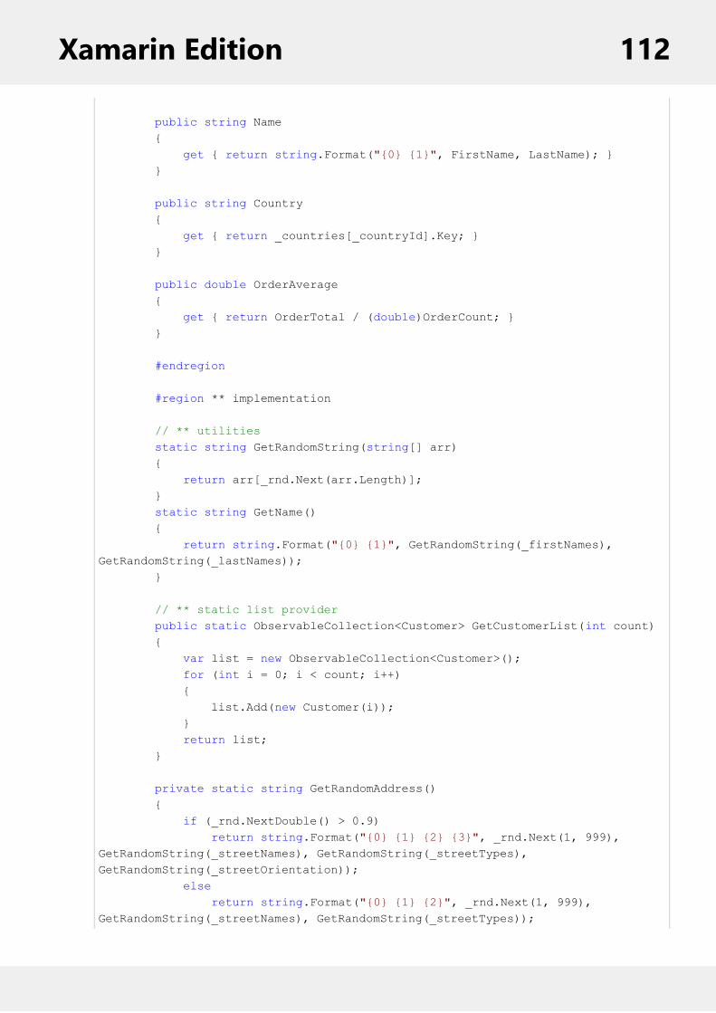
public string Name { get { return string.Format("{0} {1}", FirstName, LastName); } }
public string Country { get { return _countries[_countryId].Key; } }
public double OrderAverage { get { return OrderTotal / (double)OrderCount; } }
#endregion
#region ** implementation
// ** utilities static string GetRandomString(string[] arr) { return arr[_rnd.Next(arr.Length)]; } static string GetName() { return string.Format("{0} {1}", GetRandomString(_firstNames), GetRandomString(_lastNames)); }
// ** static list provider public static ObservableCollection<Customer> GetCustomerList(int count) { var list = new ObservableCollection<Customer>(); for (int i = 0; i < count; i++) { list.Add(new Customer(i)); } return list; }
private static string GetRandomAddress() { if (_rnd.NextDouble() > 0.9) return string.Format("{0} {1} {2} {3}", _rnd.Next(1, 999), GetRandomString(_streetNames), GetRandomString(_streetTypes), GetRandomString(_streetOrientation)); else return string.Format("{0} {1} {2}", _rnd.Next(1, 999), GetRandomString(_streetNames), GetRandomString(_streetTypes));
Xamarin Edition 112

}
// ** static value providers public static KeyValuePair<int, string>[] GetCountries() { return _countries.Select((p, index) => new KeyValuePair<int, string>(index, p.Key)).ToArray(); } public static string[] GetFirstNames() { return _firstNames; } public static string[] GetLastNames() { return _lastNames; }
#endregion
#region ** INotifyPropertyChanged Members
// interface allows bounds controls to react to changes in data objects. public event PropertyChangedEventHandler PropertyChanged;
private void OnPropertyChanged(string propertyName) { OnPropertyChanged(new PropertyChangedEventArgs(propertyName)); }
protected void OnPropertyChanged(PropertyChangedEventArgs e) { if (PropertyChanged != null) PropertyChanged(this, e); }
#endregion
#region IEditableObject Members
// interface allows transacted edits
Customer _clone; public void BeginEdit() { _clone = (Customer)this.MemberwiseClone(); }
public void EndEdit() { _clone = null; }
public void CancelEdit() { if (_clone != null) { foreach (var p in this.GetType().GetRuntimeProperties()) { if (p.CanRead && p.CanWrite)
Xamarin Edition 113

{ p.SetValue(this, p.GetValue(_clone, null), null); } } } }
#endregion }
3. Add a new Forms Xaml Page, RowDetails to your portable project.4. To initialize a FlexGrid control and adding row details section, modify the markup between the <ContentPage></ContentPage> tags as illustrated in the code below.
In XAML
XAML
<ContentPage xmlns="http://xamarin.com/schemas/2014/forms" xmlns:x="http://schemas.microsoft.com/winfx/2009/xaml" xmlns:c1="clr-namespace:C1.Xamarin.Forms.Grid;assembly=C1.Xamarin.Forms.Grid" x:Class="FlexGridRowDetails.RowDetails" x:Name="page"> <Grid RowSpacing="0"> <Grid.RowDefinitions> <RowDefinition Height="Auto"/> <RowDefinition Height="Auto"/> <RowDefinition Height="Auto"/> <RowDefinition /> </Grid.RowDefinitions> <c1:FlexGrid x:Name="grid" Grid.Row="3" AutoGenerateColumns="False"> <c1:FlexGrid.Columns> <c1:GridColumn Binding="Id" Width="Auto"/> <c1:GridColumn Binding="FirstName" Width="*"/> <c1:GridColumn Binding="LastName" Width="*"/> </c1:FlexGrid.Columns> <c1:FlexGrid.Behaviors> <c1:FlexGridDetailProvider x:Name="details" Height="170"> <DataTemplate> <Grid> <Grid.RowDefinitions> <RowDefinition /> <RowDefinition /> <RowDefinition /> <RowDefinition /> </Grid.RowDefinitions> <Grid.ColumnDefinitions> <ColumnDefinition Width="Auto" /> <ColumnDefinition /> </Grid.ColumnDefinitions> <Label Text="Country:"/> <Label Text="{Binding Country}" Grid.Column="1"/> <Label Text="City:" Grid.Row="1"/>
Xamarin Edition 114

<Label Text="{Binding City}" Grid.Row="1" Grid.Column="1"/> <Label Text="Address:" Grid.Row="2"/> <Label Text="{Binding Address}" Grid.Row="2" Grid.Column="1"/> <Label Text="PostalCode:" Grid.Row="3"/> <Label Text="{Binding PostalCode}" Grid.Row="3" Grid.Column="1"/> </Grid> </DataTemplate> </c1:FlexGridDetailProvider> </c1:FlexGrid.Behaviors> </c1:FlexGrid> </Grid></ContentPage>
5. In the Solution Explorer, expand the RowDetails.xaml node and open the Merging.xaml.cs to open the C#code behind.
6. Add the following code in the RowDetails class constructor to add row details section in the FlexGrid control.
In Code
C#
public partial class RowDetails : ContentPage { public RowDetails() { InitializeComponent(); var data = Customer.GetCustomerList(1000); grid.ItemsSource = data; } }
Customizing expand and collapse buttons
You can also customize the expand and collapse buttons by handling the OnRowHeaderLoading event, and settingthe ExpandButton.CheckedImageSource and UncheckedImageSource properties as illustrated in the following codeexample.
C#
private void OnRowHeaderLoading(object sender, GridRowHeaderLoadingEventArgs e) { e.ExpandButton.CheckedImageSource = ImageSource.FromResource("collapse.png")); e.ExpandButton.UncheckedImageSource = ImageSource.FromResource("expand.png")); }
SortingFlexGrid allows you to sort grid's data using the following methods:
Sorting at Runtime: The AllowSorting property of FlexGrid allows users to sort the grid. On setting theAllowSorting property to true, a user can simply tap a column's header to sort the grid by that column atruntime.Sorting through Code: Using CollectionView interface, you can enable sorting through code in C# or XAML.
Xamarin Edition 115

To enable sorting, add one or more objects to the CollectionView.SortDescriptions property.
Sorting at runtime
The image below shows how the FlexGrid appears after sorting is applied to the grid by tapping header of thecolumn, Country.
In Code
C#
grid.AllowSorting = true;
In XAML
XAML
<c1:FlexGrid AllowSorting="True">
Sorting through Code
The image below shows how the FlexGrid appears after sorting is applied to the column Name.
Xamarin Edition 116
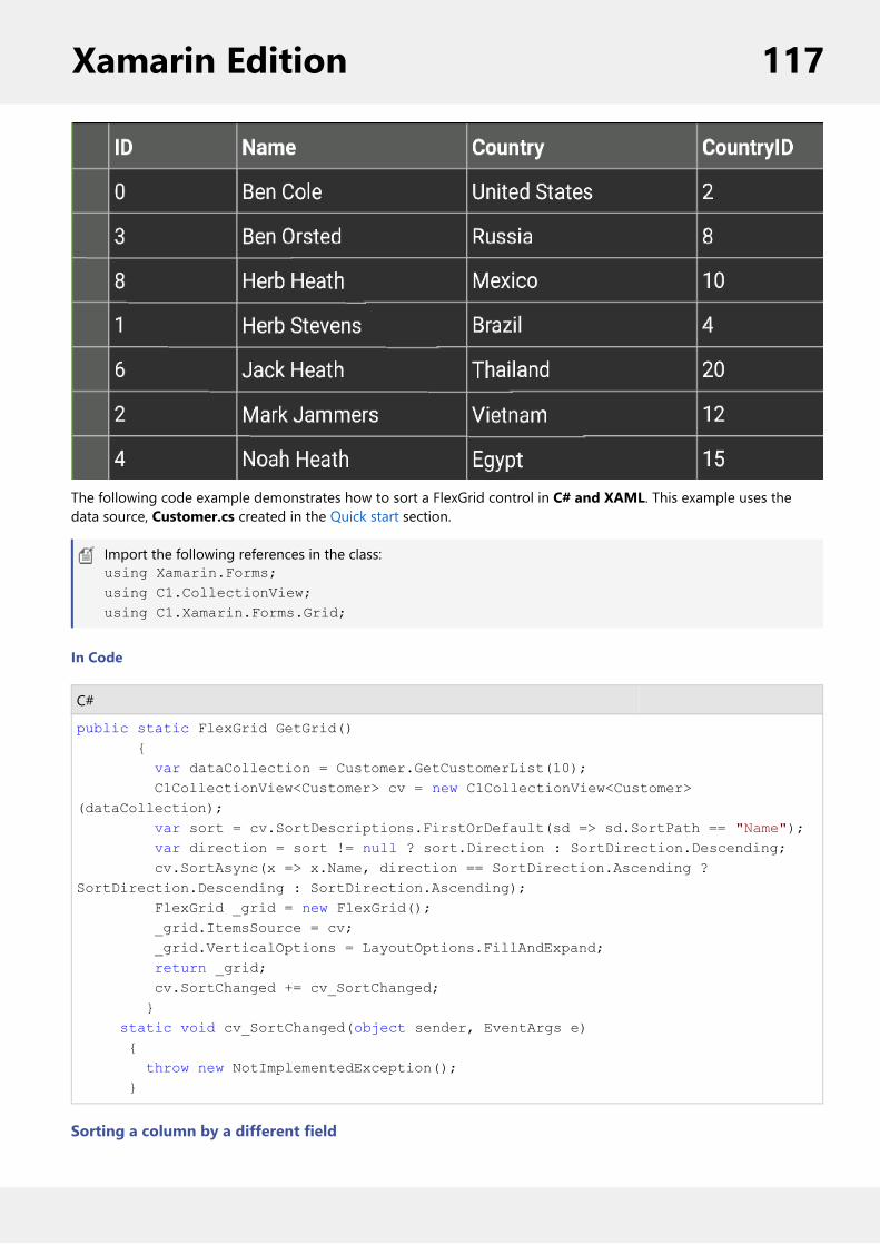
The following code example demonstrates how to sort a FlexGrid control in C# and XAML. This example uses thedata source, Customer.cs created in the Quick start section.
Import the following references in the class:using Xamarin.Forms;using C1.CollectionView;using C1.Xamarin.Forms.Grid;
In Code
C#
public static FlexGrid GetGrid() { var dataCollection = Customer.GetCustomerList(10); C1CollectionView<Customer> cv = new C1CollectionView<Customer>(dataCollection); var sort = cv.SortDescriptions.FirstOrDefault(sd => sd.SortPath == "Name"); var direction = sort != null ? sort.Direction : SortDirection.Descending; cv.SortAsync(x => x.Name, direction == SortDirection.Ascending ? SortDirection.Descending : SortDirection.Ascending); FlexGrid _grid = new FlexGrid(); _grid.ItemsSource = cv; _grid.VerticalOptions = LayoutOptions.FillAndExpand; return _grid; cv.SortChanged += cv_SortChanged; } static void cv_SortChanged(object sender, EventArgs e) { throw new NotImplementedException(); }
Sorting a column by a different field
Xamarin Edition 117

By default, sorting is applied on the bound field. However, you can sort a column by a different field. All you need todo is set the SortMemberPath property to the column by which you want the grid to be sorted. For example, thefollowing column is bound to "FullName" but sorts by "LastName".
C#
column.Binding = “FullName”;column.SortMemberPath = “LastName”;
Selecting CellsThe SelectionMode property of the FlexGrid allows you to define the selection mode of the cells by setting its value toRow, Cell, CellRange, or RowRange. You can also disable the selection by setting the selection mode toGridSelectionModeNone, which is its default value.
The image below shows how the FlexGrid appears after the selectionMode property is set to CellRange.
The following code example demonstrates how to choose selection modes in FlexGrid. The example uses the samplecreated in the Quick start section.
In Code
C#
grid.SelectionMode = GridSelectionMode.CellRange;
In XAML
XAML
<Grid VerticalOptions="FillAndExpand"> <c1:FlexGrid SelectionMode="CellRange" x:Name="grid" HeadersVisibility="All"/></Grid>
Star and Auto SizingFlexGrid's Star and Auto Sizing feature allows you to set the width of columns in the FlexGrid by using both the starand auto sizing system instead of explicitly setting width of each column. Star sizing determines the width of eachcolumn automatically with respect to available screen space and in relation with other columns to avoid horizontalscrolling and display the entire data on the screen. Auto sizing determines the width of a column based on the size of
Xamarin Edition 118

the content. You can use both sizing options to implement flexible layouts with the FlexGrid. The sample below usesStar and Auto sizing to specify the width of columns.
In this example, the grid has four columns. The width of first and third columns are set to *, and the width of thesecond column is set to 2*. The fourth column is set to Auto.
The image below shows how the FlexGrid appears, after star sizing is applied to columns' width:
The following code example demonstrates star sizing in FlexGrid in XAML. The example uses the sample created in theQuick Start section.
In Code
XAML
<Grid> <c1:FlexGrid x:Name="grid" AutoGenerateColumns="False" AllowResizing="None" Grid.Row="1"> <c1:FlexGrid.Columns> <c1:GridColumn Binding="ID" Width="*"/> <c1:GridColumn Binding="First" Width="2*"/> <c1:GridColumn Binding="Last" Width="*"/> <c1:GridColumn Binding="Weight" Width="Auto" Format="N1"/> </c1:FlexGrid.Columns> </c1:FlexGrid> </Grid>
Wordwrap
Xamarin Edition 119

FlexGrid's WordWrap property allows a user to display multi-line text in a single cell of the grid. To enable wordwrapping in a FlexGrid column, set the value of WordWrap property to true. By default, its value is set to False. TheWordWrap property determines whether the grid should automatically break long strings containing multiple wordsand special characters such as spaces in multiple lines. Multiple line text can be displayed in both fixed and scrollablecells.
C#
//to enable word wrapgrid.Columns[1].WordWrap = true;
To resize the row heights automatically, you can then call the AutoSizeRow and AutoSizeRows methods as illustratedin the code below.
C#
// resize a single rowgrid.AutoSizeRow(1);
// resize all rowsgrid.AutoSizeRows(0, grid.Rows.Count – 1);
FlexPieFlexPie allows you to create customized pie charts that represent a series as slices of a pie, wherein the arc length ofeach slice depicts the value represented by that slice. These charts are commonly used to display proportional datasuch as percentage cover. The multi-colored slices make pie charts easy to understand and usually the valuerepresented by each slice is displayed with the help of labels.
Xamarin Edition 120

Key Features
Touch Based Labels: Display values using touch based labels.Exploding and Donut Pie Charts: Use simple FlexPie properties to convert it into an exploding pie chart or adonut pie chart.
Quick Start: Add data to FlexPieThis section describes how to add a FlexPie control to your portable or shared app and add data to it. For informationon how to add Xamarin components in C# or XAML, see Adding Xamarin Components using C# or AddingXamarinComponents using XAML.
This topic comprises of three steps:
Step 1: Create a data source for FlexPieStep 2: Add a FlexPie controlStep 3: Run the Project
The following image shows how the FlexPie appears after completing the steps above:
Step 1: Create a data source for FlexPie
The following classes serve as a data source for the FlexPie control:
C#
class FlexPieDataSource{ private List<FruitEntity> entityList;
public List<FruitEntity> Data { get { return entityList; }
Xamarin Edition 121

}
public FlexPieDataSource() { entityList = new List<FruitEntity>(); string[] fruits = new string[] { "Oranges", "Apples", "Pears", "Bananas", "Pineapples" }; Random random = new Random(); for (int i = 0; i < fruits.Length; i++) { decimal value = (decimal)random.NextDouble() * 100; entityList.Add(new FruitEntity(fruits[i], value)); } }}class FruitEntity{ public string Name { get; set; } public decimal Value { get; set; }
public FruitEntity(string name, decimal value) { this.Name = name; this.Value = value; }}
Back to Top
Step 2: Add FlexPie control
Complete the following steps to initialize a FlexPie control in C# or XAML.
In Code
1. Add a new class (for example QuickStart.cs) to your Portable or Shared project and include references as shownbelow:C#
using Xamarin.Forms;using C1.Xamarin.Forms.Chart;
2. Instantiate a FlexPie control in a new method, GetFlexPie().C#
public static FlexPie GetFlexPie(){
FlexPie chart = new FlexPie(); FlexPieDataSource ds = new FlexPieDataSource(); chart.BindingName = "Name"; chart.Binding = "Value"; chart.ItemsSource = ds.Data; return chart;
Xamarin Edition 122

}
In XAML
1. Add a new Forms Xaml Page (for example FlexPieQuickStart.xaml) to your Portable or Shared project andmodify the <ContentPage> tag to include the following reference:XAML
<ContentPage xmlns="http://xamarin.com/schemas/2014/forms" xmlns:x="http://schemas.microsoft.com/winfx/2009/xaml" xmlns:c1="clr-namespace:C1.Xamarin.Forms.Chart;assembly=C1.Xamarin.Forms.Chart" x:Class="QuickstartChart.FlexPieQuickStart">
2. Initialize a FlexPie control by adding the markup for the control between the <ContentPage> </ContentPage>tags inside the <StackLayout></StackLayout> tags, as shown below:XAML
<StackLayout> <c1:FlexPie x:Name="chart" ItemsSource="{Binding Data}" BindingName="Name" Binding="Value" Grid.Row="1" Grid.ColumnSpan="2" VerticalOptions="FillAndExpand"> </c1:FlexPie> </StackLayout>
3. In the Solution Explorer, expand the FlexPieQuickStart.xaml node and open FlexPieQuickStart.xaml.cs to openthe C# code behind.
4. In the FlexPieQuickStart() class constructor, set a new instance of FlexPieDataSource as a BindingContext forthe FlexPie.
The following code shows what the FlexPieQuickStart() class constructor looks like after completing this step.
C#
public FlexPieQuickStart(){ InitializeComponent(); chart.BindingContext = new FlexPieDataSource();}
Back to Top
Step 3: Run the Project
1. In the Solution Explorer, double click App.xaml.cs to open it.2. Complete the following steps to display the FlexPie control.
To return a C# class: In the class constructor App(), set a new ContentPage as the MainPage and assignthe control to the ContentPage's Content by invoking the GetFlexPie() method defined in the previousprocedure, Step 2: Add a FlexPie Control.
The following code shows the class constructor App() after completing steps above.
C#
public App(){
Xamarin Edition 123

// The root page of your application MainPage = new ContentPage { Content = QuickStart.GetFlexPie() };}
To return a Forms Xaml Page: In the class constructor App(), set the Forms Xaml PageFlexPieQuickStart as the MainPage.
The following code shows the class constructor App() after completing this step.
C#
public App(){ // The root page of your application MainPage = new FlexPieQuickStart();}
3. Some additional steps are required to run the iOS and UWP apps:iOS App:
1. In the Solution Explorer, double click AppDelegate.cs inside YourAppName.iOS project, to openit.
2. Add the following code to the FinishedLaunching() method.C#
C1.Xamarin.Forms.Chart.Platform.iOS.FlexPieRenderer.Init();
UWP App:1. In the Solution Explorer, expand MainPage.xaml.2. Double click MainPage.xaml.cs to open it.3. Add the following code to the class constructor.
C#
C1.Xamarin.Forms.Chart.Platform.UWP.FlexPieRenderer.Init();
4. Press F5 to run the project.
Back to Top
Features
Customize AppearanceAlthough Xamarin controls match the native controls on all three platforms by default and are designed to work withboth: light and dark themes available on all platforms. But, there are several properties to customize the appearanceof the FlexPie control. You can change the background color of the FlexPie and the plot area.
The image below shows the how the FlexPie appears after these properties have been set.
Xamarin Edition 124

In Code
The following code example demonstrates how to set these properties in C#. This example uses the sample created inthe Quick Start section.
C#
//Customize chart plot areaChartStyle s = new ChartStyle();s.Fill = Color.Black;s.StrokeThickness = 0;chart.PlotStyle = s;
//Set background colorchart.BackgroundColor = Color.Aqua;
Data BindingYou can bind the FlexPie control to data by using the following set of properties for data binding:
Property Description
Binding Property for binding values
BindingName Property for binding with itemsappearing in the legend
ItemsSource Property for binding with collectionof items
The image given below shows a FlexPie control with data bound to values and items appearing in the legend.
Xamarin Edition 125

In Code
The following code examples illustrate how to set Data Binding in FlexPie control. The example uses the samplecreated in the Quick Start section.
1. Set the BindingName property to Name within the GetFlexPie () method in QuickStart class file as illustrated inthe following code.C#
chart.BindingName = "Name";chart.Binding = "Value";chart.ItemsSource = new Object[] { new {Value=100, Name="Oranges"}, new {Value=35, Name="Apples"}, new {Value=45, Name="Pears"}, new {Value=60, Name="Bananas"}, new {Value=30, Name="Pineapples"} };
In XAML
You can also set the Binding through XAML as illustrated in the following code snippet.
XAML
<c1:FlexPie x:Name="chart" BindingName="Name" Binding="Value">
Data LabelsYou can add static data labels in the FlexPie to show the exact values corresponding to each slice of the pie. You can
Xamarin Edition 126

choose to set data labels at the following positions:
Inside - data labels get displayed within the pie near the edge.Outside - data labels get displayed outside the pie along the edge.Center - data labels get displayed right in the center of pie slice.None - data labels are not visible (default value).
The following image shows a FlexPie with data labels displayed in the Center.
A data label can contain any amount of text and other UI elements. To display data labels in a FlexPie control, youmust set the PieDataLabel.Position property and define the content template to display as the label.
In XAML
To set the position and define the content template in XAML, add the following markup between the FlexPie controltags.
XAML
<c1:FlexPie.DataLabel> <c1:PieDataLabel Position="Center" Border="True" Content="{}{value:F2}"> <c1:PieDataLabel.Style > <c1:ChartStyle Fill="#99FFFFFF" FontSize="18" ></c1:ChartStyle> </c1:PieDataLabel.Style> </c1:PieDataLabel> </c1:FlexPie.DataLabel>
In Code
To change the label position in code, add the following code.
C#
//Setting data labels position
Xamarin Edition 127
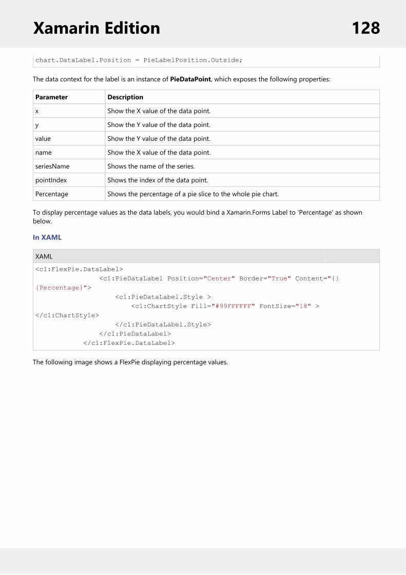
chart.DataLabel.Position = PieLabelPosition.Outside;
The data context for the label is an instance of PieDataPoint, which exposes the following properties:
Parameter Description
x Show the X value of the data point.
y Show the Y value of the data point.
value Show the Y value of the data point.
name Show the X value of the data point.
seriesName Shows the name of the series.
pointIndex Shows the index of the data point.
Percentage Shows the percentage of a pie slice to the whole pie chart.
To display percentage values as the data labels, you would bind a Xamarin.Forms Label to 'Percentage' as shownbelow.
In XAML
XAML
<c1:FlexPie.DataLabel> <c1:PieDataLabel Position="Center" Border="True" Content="{}{Percentage}"> <c1:PieDataLabel.Style > <c1:ChartStyle Fill="#99FFFFFF" FontSize="18" ></c1:ChartStyle> </c1:PieDataLabel.Style> </c1:PieDataLabel> </c1:FlexPie.DataLabel>
The following image shows a FlexPie displaying percentage values.
Xamarin Edition 128

Donut Pie ChartThe InnerRadius property can be used to leave a blank inner space in the FlexPie, creating a Donut Pie Chart. Theblank space can be used to display additional data.
The following image shows a donut FlexPie.
The following code example demonstrates how to set this property in C#. This example uses the sample created in theQuick Start section.
In Code
C#
Xamarin Edition 129

//set donut chartchart.InnerRadius = 0.5;
Exploded Pie ChartThe Offset property can be used to push the pie slices away from the center of the FlexPie, producing an exploded piechart. This property accepts a decimal value to determine how far the pie slices should be pushed from the center.
The image below shows an exploded FlexPie.
The following code example demonstrates how to set this property in C#. This example uses the sample created in theQuick Start section.
In Code
C#
chart.Offset = 0.2;
copyCode
Header and FooterYou can add a title to the FlexPie control by setting its Header property. Besides a title, you may also set a footer bysetting the Footer property.
There are also some additional properties to customize header and footer text in a FlexPie.
HeaderAlignment - Lets you set the alignment for header text.FooterAlignment - Lets you set the alignment for footer text.
The image below shows how the FlexPie appears after these properties have been set.
Xamarin Edition 130

In Code
The following code example demonstrates how to set these properties in C#. This example uses the sample created inthe Quick Start section.
C#
//Set header and footerchart.Header = "Fruit Consumption"; chart.HeaderAlignment = LayoutAlignment.Fill;
chart.Footer = "Random data by ComponentOne";chart.FooterAlignment = LayoutAlignment.Fill;
LegendFlexPie provides the option to display legend for denoting the type of the data presented in the pie slices. Theposition of legend is by default set to "Auto", which means the legend positions itself automatically depending on thereal estate available on the device. This allows the pie to efficiently occupy the available space on the device. Usershave the option to customize the appearance of the legend and enhance the visual appeal of the FlexPie control. Youcan also style the legend by setting its orientation through the LegendOrientation property, and adding a borderthrough the Stroke property.
The legend automatically wraps when the Position property is set to Top, Bottom, Left or Right, Orientation isset to Horizontal and there is not enough screen real estate.
The image below shows how the FlexPie appears after these properties have been set.
Xamarin Edition 131

In Code
The following code example demonstrates how to set these properties in C#. This examples uses the sample createdin the Quick Start section.
C#
chart.LegendPosition = ChartPositionType.Top;chart.LegendOrientation = Orientation.Horizontal;chart.LegendStyle.Stroke = Color.FromHex("#2D3047");chart.LegendStyle.StrokeThickness = 4;
ThemesEnhance the appearance of the control by using pre-defined themes. The Palette property can be used to specify thetheme to be applied on the control.
Note: Remove the Palette property from the code to apply the default theme.
The image below shows how the FlexPie appears when the Palette property is set to Dark.
Xamarin Edition 132

The following code example demonstrates how to apply theme in C#. This example uses the sample created in theQuick Start section.
In Code
C#
//setting themes chart.Palette = Palette.Cyborg;
FlexPie comes with pre-defined templates that can be applied for quick customization. Here are the pre-definedtemplates available in the Palette enumeration.
Xamarin Edition 133

GaugeGauge allows you to display information in a dynamic and unique way by delivering the exact graphicalrepresentation you require. Gauges are better than simple labels because they also display a range, allowing users todetermine instantly whether the current value is low, high, or intermediate.
Xamarin Edition 134

Key FeaturesEasy Customization: Restyle the Gauge by changing a property to create gauges with custom colors, fills andmore.Ranges: Add colored ranges to the Gauge to draw attention to a certain range of values. Use simple propertiesto customize their start and end points, as well as appearance.Direction: Place the LinearGauge and BulletGraph horizontally or vertically.Pointer Customization: Customize the pointer color, border, origin and more to make the Gauge moreappealing.Animation: Use out-of-the-box animations to add effects to the Gauge control.
Gauge TypesXamarin Edition comprises of three kinds of gauges: LinearGauge, RadialGauge and BulletGraph.
Type Image Usage
Linear Gauge: A linear gauge displays thevalue along a linear scale, using a linearpointer. The linear scale can be eitherhorizontal or vertical, which can be set usingthe LinearGaugeDirection property.
A lineargauge iscommonlyused todenote dataas a scalevalue such aslength,temperature,etc.
Xamarin Edition 135

Radial Gauge: A radial gauge displays thevalue along a circular scale, using a curvedpointer. The scale can be rotated as definedby the StartAngle and SweepAngle properties.
A radialgauge iscommonlyused todenote datasuch asvolume,velocity, etc.
Bullet Graph: A bullet graph displays a singlevalue on a linear scale, along with a targetvalue and ranges that instantly indicatewhether the value is Good, Bad or in someother state.
A bullet graphis a variant ofa lineargauge,designedspecifically foruse indashboardsthat display anumber ofsingle valuedata, such asyearly salesrevenue.
Quick Start: Add and Configure
BulletGraph Quick StartThis section describes how to add a BulletGraph to your portable or shared app and set its value. For information onhow to add Xamarin components in C# or XAML, see Adding Xamarin Components using C# or Adding XamarinComponents using XAML.
This topic comprises of three steps:
Step 1: Add a BulletGraph controlStep 2: Run the Project
The following image shows a BulletGraph.
Step 1: Add a BulletGraph control
The Value property denotes the value of the Gauge. Multiple ranges can be added to a single Gauge and the positionof the range is defined by the Min and Max properties of the range. If you set the IsReadOnly property to false, thenthe user can edit the value by tapping on the gauge.
Xamarin Edition 136
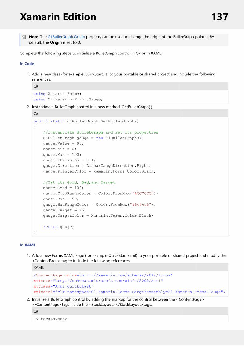
Note: The C1BulletGraph.Origin property can be used to change the origin of the BulletGraph pointer. Bydefault, the Origin is set to 0.
Complete the following steps to initialize a BulletGraph control in C# or in XAML.
In Code
1. Add a new class (for example QuickStart.cs) to your portable or shared project and include the followingreferences:C#
using Xamarin.Forms;using C1.Xamarin.Forms.Gauge;
2. Instantiate a BulletGraph control in a new method, GetBulletGraph( ).C#
public static C1BulletGraph GetBulletGraph(){ //Instantiate BulletGraph and set its properties C1BulletGraph gauge = new C1BulletGraph(); gauge.Value = 80; gauge.Min = 0; gauge.Max = 100; gauge.Thickness = 0.1; gauge.Direction = LinearGaugeDirection.Right; gauge.PointerColor = Xamarin.Forms.Color.Black;
//Set its Good, Bad,and Target gauge.Good = 100; gauge.GoodRangeColor = Color.FromHex("#CCCCCC"); gauge.Bad = 50; gauge.BadRangeColor = Color.FromHex("#666666"); gauge.Target = 75; gauge.TargetColor = Xamarin.Forms.Color.Black; return gauge;}
In XAML
1. Add a new Forms XAML Page (for example QuickStart.xaml) to your portable or shared project and modify the<ContentPage> tag to include the following references.XAML
<ContentPage xmlns="http://xamarin.com/schemas/2014/forms"xmlns:x="http://schemas.microsoft.com/winfx/2009/xaml"x:Class="Appl.QuickStart"xmlns:c1="clr-namespace:C1.Xamarin.Forms.Gauge;assembly=C1.Xamarin.Forms.Gauge">
2. Initialize a BulletGraph control by adding the markup for the control between the <ContentPage></ContentPage>tags inside the <StackLayout></StackLayout>tags.C#
<StackLayout>
Xamarin Edition 137

<c1:C1BulletGraph Value="80" Min="0" Max="100" HeightRequest="50" WidthRequest="50" Thickness="0.1" Good="100" GoodRangeColor="#CCCCCC" Bad="50" BadRangeColor="#666666" Target="75" TargetColor="Black" PointerColor="Black" Direction="Right"> </c1:C1BulletGraph></StackLayout>
Back to Top
Step 2: Run the Project
1. In the Solution Explorer, double click App.cs to open it.2. Complete the following steps to display the BulletGraph control.
To return a C# class: In the class constructor App( ), set a new ContentPage as the MainPage andassign the control to the ContentPage's Content by invoking the method GetBulletGraph( ) defined inthe previous procedure, Step 1: Add a BulletGraph Control.
The following code shows the class constructor App() after completing steps above.
C#
public App(){ // The root page of your application MainPage = new ContentPage { Content = QuickStart.GetBulletGraph() };}
To return a Forms XAML Page: In the class constructor App( ), set the Forms XAML Page QuickStart asthe MainPage.
The following code shows the class constructor App( ), after completing this step.
C#
public App(){ // The root page of your application MainPage = new QuickStart();}
3. Some additional steps are required to run the iOS and UWP apps:iOS App:
1. In the Solution Explorer, double click AppDelegate.cs inside YourAppName.iOS project, to openit.
2. Add the following code to the FinishedLaunching( ) method.C#
C1.Xamarin.Forms.Gauge.Platform.iOS.C1GaugeRenderer.Init();
UWP App:1. In the Solution Explorer, expand MainPage.xaml.2. Double click MainPage.xaml.cs to open it.3. Add the following code to the class constructor.
Xamarin Edition 138

C#
C1.Xamarin.Forms.Gauge.Platform.UWP.C1GaugeRenderer.Init();
4. Press F5 to run the project.
Back to Top
LinearGauge Quick StartThis section describes how to add a LinearGauge control to your portable or shared app and set its value. Forinformation on how to add Xamarin components in C# or XAML, see Adding Xamarin Components using C# orAdding Xamarin Components using XAML.
This topic comprises of two steps:
Step 1: Add a LinearGauge controlStep 2: Run the Project
The following image shows a LinearGauge with custom ranges.
Step 1: Add a LinearGauge control
The Value property denotes the value of the gauge. Multiple ranges can be added to a single Gauge and the positionof the range is defined by the Min and Max properties of the range. If you set the IsReadOnly property to false, thenthe user can edit the value by tapping on the gauge.
Note: The C1LinearGauge.Origin property can be used to change the origin of the LinearGauge pointer. Bydefault, the Origin is set to 0.
Complete the following steps to initialize a LinearGauge control in C# or XAML.
In Code
1. Add a new class (for example QuickStart.cs) to your portable or shared project and include thefollowing references.C#
using Xamarin.Forms;using C1.Xamarin.Forms.Gauge;
2. Instantiate a LinearGauge control in a new method GetLinearGauge( ).C#
public static C1LinearGauge GetLinearGauge(){ // Instantiate LinearGauge and set its properties C1LinearGauge gauge = new C1LinearGauge(); gauge.Value = 35; gauge.Thickness = 0.1; gauge.Min = 0; gauge.Max = 100; gauge.Direction = LinearGaugeDirection.Right; gauge.PointerColor = Xamarin.Forms.Color.Blue;
//Create Ranges
Xamarin Edition 139
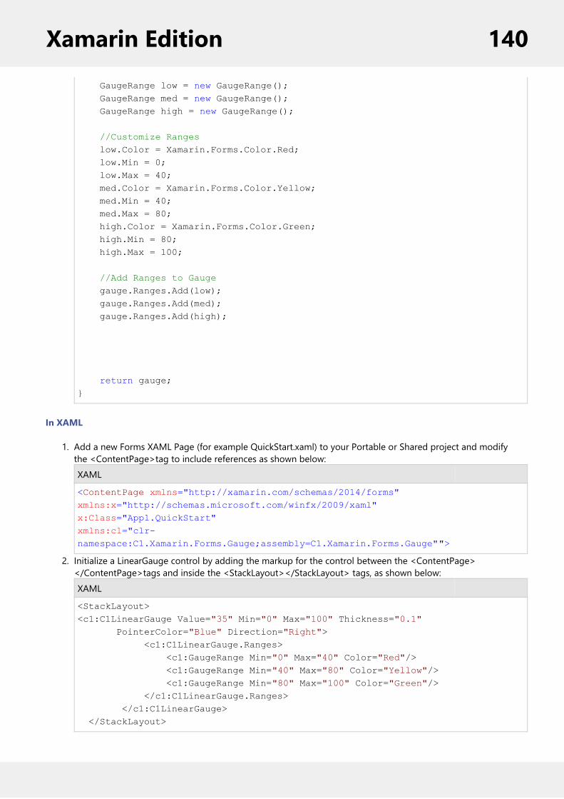
GaugeRange low = new GaugeRange(); GaugeRange med = new GaugeRange(); GaugeRange high = new GaugeRange();
//Customize Ranges low.Color = Xamarin.Forms.Color.Red; low.Min = 0; low.Max = 40; med.Color = Xamarin.Forms.Color.Yellow; med.Min = 40; med.Max = 80; high.Color = Xamarin.Forms.Color.Green; high.Min = 80; high.Max = 100;
//Add Ranges to Gauge gauge.Ranges.Add(low); gauge.Ranges.Add(med); gauge.Ranges.Add(high);
return gauge;}
In XAML
1. Add a new Forms XAML Page (for example QuickStart.xaml) to your Portable or Shared project and modifythe <ContentPage>tag to include references as shown below:XAML
<ContentPage xmlns="http://xamarin.com/schemas/2014/forms"xmlns:x="http://schemas.microsoft.com/winfx/2009/xaml"x:Class="Appl.QuickStart"xmlns:c1="clr-namespace:C1.Xamarin.Forms.Gauge;assembly=C1.Xamarin.Forms.Gauge"">
2. Initialize a LinearGauge control by adding the markup for the control between the <ContentPage></ContentPage>tags and inside the <StackLayout></StackLayout> tags, as shown below:XAML
<StackLayout><c1:C1LinearGauge Value="35" Min="0" Max="100" Thickness="0.1" PointerColor="Blue" Direction="Right"> <c1:C1LinearGauge.Ranges> <c1:GaugeRange Min="0" Max="40" Color="Red"/> <c1:GaugeRange Min="40" Max="80" Color="Yellow"/> <c1:GaugeRange Min="80" Max="100" Color="Green"/> </c1:C1LinearGauge.Ranges> </c1:C1LinearGauge> </StackLayout>
Xamarin Edition 140
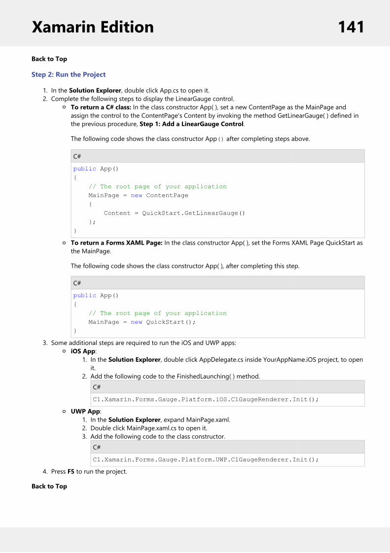
Back to Top
Step 2: Run the Project
1. In the Solution Explorer, double click App.cs to open it.2. Complete the following steps to display the LinearGauge control.
To return a C# class: In the class constructor App( ), set a new ContentPage as the MainPage andassign the control to the ContentPage's Content by invoking the method GetLinearGauge( ) defined inthe previous procedure, Step 1: Add a LinearGauge Control.
The following code shows the class constructor App() after completing steps above.
C#
public App(){ // The root page of your application MainPage = new ContentPage { Content = QuickStart.GetLinearGauge() };}
To return a Forms XAML Page: In the class constructor App( ), set the Forms XAML Page QuickStart asthe MainPage.
The following code shows the class constructor App( ), after completing this step.
C#
public App(){ // The root page of your application MainPage = new QuickStart();}
3. Some additional steps are required to run the iOS and UWP apps:iOS App:
1. In the Solution Explorer, double click AppDelegate.cs inside YourAppName.iOS project, to openit.
2. Add the following code to the FinishedLaunching( ) method.C#
C1.Xamarin.Forms.Gauge.Platform.iOS.C1GaugeRenderer.Init();
UWP App:1. In the Solution Explorer, expand MainPage.xaml.2. Double click MainPage.xaml.cs to open it.3. Add the following code to the class constructor.
C#
C1.Xamarin.Forms.Gauge.Platform.UWP.C1GaugeRenderer.Init();
4. Press F5 to run the project.
Back to Top
Xamarin Edition 141

RadialGauge Quick StartThis section describes how to add a RadialGauge control to your portable or shared app and set its value. Forinformation on how to add Xamarin components in C# or XAML, see Adding Xamarin Components using C# orAdding Xamarin Components using XAML.
This topic comprises of two steps:
Step 1: Add a RadialGauge controlStep 2: Run the Project
The following image shows how the RadialGauge appears, after completing the steps above:
Step 1: Add a RadialGauge control
The Value property denotes the value of the gauge. Multiple ranges can be added to a single Gauge and the positionof the range is defined by the Min and Max properties of the range. If you set the IsReadOnly property to false, thenthe user can edit the value by tapping on the gauge.
The StartAngle property specifies the RadialGauge's starting angle and the SweepAngle property specifies an anglerepresenting the length of the RadialGauge's arc. These properties can be used to specify the start and end points ofthe radial gauge arc. The angle for both properties are measured clockwise, starting at the 9 o'clock position. Whenthe SweepAngle is negative, the gauge is formed in counter clockwise direction.
The control also provides the AutoScale property. When this property is set to true, the RadialGauge is automaticallyscaled to fill its containing element.
Note: The C1RadialGauge.Origin property can be used to change the origin of the RadialGauge pointer. Bydefault, the Origin is set to 0.
Complete the following steps to initialize a RadialGauge control in C# or XAML.
In Code
1. Add a new class (for example QuickStart.cs) to your Portable or Shared project and include the followingreferences.C#
using Xamarin.Forms;using C1.Xamarin.Forms.Gauge;
2. Instantiate a RadialGauge control in a new method GetRadialGauge( ).C#
public static C1RadialGauge GetRadialGauge(){
Xamarin Edition 142

//Instantiate RadialGauge and set its properties C1RadialGauge gauge = new C1RadialGauge(); gauge.Value = 35; gauge.Min = 0; gauge.Max = 100; gauge.StartAngle = -20; gauge.SweepAngle = 220; gauge.AutoScale = true; gauge.ShowText = GaugeShowText.None; gauge.PointerColor = Xamarin.Forms.Color.Blue;
//Create Ranges GaugeRange low = new GaugeRange(); GaugeRange med = new GaugeRange(); GaugeRange high = new GaugeRange();
//Customize Ranges low.Color = Xamarin.Forms.Color.Red; low.Min = 0; low.Max = 40; med.Color = Xamarin.Forms.Color.Yellow; med.Min = 40; med.Max = 80; high.Color = Xamarin.Forms.Color.Green; high.Min = 80; high.Max = 100;
//Add Ranges to RadialGauge gauge.Ranges.Add(low); gauge.Ranges.Add(med); gauge.Ranges.Add(high);
return gauge;}
In XAML
1. Add a new Forms XAML Page (for example QuickStart.xaml) to your Portable or Shared project and modify the<ContentPage> tag to include the following references:XAML
<ContentPage xmlns="http://xamarin.com/schemas/2014/forms"xmlns:x="http://schemas.microsoft.com/winfx/2009/xaml"x:Class="Appl.QuickStart"xmlns:c1="clr-namespace:C1.Xamarin.Forms.Gauge;assembly=C1.Xamarin.Forms.Gauge">
2. Initialize a RadialGauge control by adding the markup for the control between the <ContentPage></ContentPage>tags and inside the <StackLayout></StackLayout>tags as shown below:C#
<StackLayout><c1:C1RadialGauge Value="35" Min="0" Max="100" ShowText="None" StartAngle = "-20"
Xamarin Edition 143

SweepAngle = "220" AutoScale = "true" PointerColor="Blue"> <c1:C1RadialGauge.Ranges> <c1:GaugeRange Min="0" Max="40" Color="Red"/> <c1:GaugeRange Min="40" Max="80" Color="Yellow"/> <c1:GaugeRange Min="80" Max="100" Color="Green"/> </c1:C1RadialGauge.Ranges> </c1:C1RadialGauge> </StackLayout>
Back to Top
Step 2: Run the Project
1. In the Solution Explorer, double click App.cs to open it.2. Complete the following steps to display the RadialGauge control.
To return a C# class: In the class constructor App( ), set a new ContentPage as the MainPage andassign the control to the ContentPage's Content by invoking the method GetRadialGauge( ) defined inthe previous procedure, Step 1: Add a RadialGauge Control.
The following code shows the class constructor App() after completing steps above.
C#
public App(){ // The root page of your application MainPage = new ContentPage { Content = QuickStart.GetRadialGauge() };}
To return a Forms XAML Page: In the class constructor App( ), set the Forms XAML Page QuickStart asthe MainPage.
The following code shows the class constructor App( ), after completing this step.
C#
public App(){ // The root page of your application MainPage = new QuickStart();}
3. Some additional steps are required to run the iOS and UWP apps:iOS App:
1. In the Solution Explorer, double click AppDelegate.cs inside YourAppName.iOS project, to openit.
2. Add the following code to the FinishedLaunching( ) method.C#
C1.Xamarin.Forms.Gauge.Platform.iOS.C1GaugeRenderer.Init();
UWP App:1. In the Solution Explorer, expand MainPage.xaml.
Xamarin Edition 144

2. Double click MainPage.xaml.cs to open it.3. Add the following code to the class constructor.
C#
C1.Xamarin.Forms.Gauge.Platform.UWP.C1GaugeRenderer.Init();
4. Press F5 to run the project.
Back to Top
Features
AnimationGauges come with in-built animations to improve their appearance. The IsAnimated property allows you to enable ordisable the animation effects. The LoadAnimation and UpdateAnimation properties enable you to set the easing,duration and other animation-related attributes.
The following code example demonstrates how to set this property in C#. These example uses the sample created inthe Quick start.
C#
gauge.IsAnimated = true;gauge.LoadAnimation.Easing = Easing.CubicInOut;gauge.UpdateAnimation.Easing = Easing.BounceOut;
Customize AppearanceXamarin Edition controls match the native controls on all three platforms by default and are designed to work withboth: light and dark themes available on all platforms. But, there are several properties available that let youcustomize the gauge elements to make it visually attractive. The following code example demonstrates how to setdifferent styling properties to customize a RadialGauge.The following image shows how the RadialGauge appears after its appearance is customized.
Xamarin Edition 145

The following code example demonstrates how to customize the appearance of a radial gauge in C#. This exampleuses the sample created in the Quick start.C#
//Customize Gaugegauge.ShowText = GaugeShowText.All;gauge.Thickness = 0.5;gauge.FaceBorderColor = Color.FromHex("#cfd1d4");gauge.FaceBorderWidth = 5;
gauge.MinTextColor = Color.White;gauge.MaxTextColor = Color.White;gauge.MinFontSize = 10;gauge.MaxFontSize = 10;
//Customize Range Appearancelow.Color = Color.FromHex("#C1E1C9");med.Color = Color.FromHex("#fdfdc8");high.Color = Color.FromHex("#f6e4ed");
//Customize Pointer Appearancegauge.Pointer.Thickness = 0.5; gauge.PointerColor = Color.FromHex("#0a02f4");
Data BindingWhile working in XAML, you can set the Min, Max and Value properties from an external data source, instead ofdirectly setting the properties.
The example in this topic follows the MVVM pattern. For information on MVVM pattern, see MVVM Pattern.
The following class can serve as a data source for the gauge.
C#
class GaugeData { double _value; double _min; double _max; public double Value { get { return _value; } set { _value = value; } } public double Min
Xamarin Edition 146

{ get { return _min; } set { _min = value; } } public double Max { get { return _max; } set { _max = value; } } }
In XAML
The following XAML code shows data binding in gauge.
C#
<c1:C1LinearGauge Value="{Binding Value}" Min="{Binding Min}" Max="{Binding Max}" Thickness="0.1" PointerColor="Blue"> <c1:C1LinearGauge.Ranges> <c1:GaugeRange Min="0" Max="40" Color="Red"/> <c1:GaugeRange Min="40" Max="80" Color="Yellow"/> <c1:GaugeRange Min="80" Max="100" Color="Green"/> </c1:C1LinearGauge.Ranges></c1:C1LinearGauge>
In Code
To bind gauge to data, switch to the code view and set the BindingContext for the gauge inside the class constructoras shown below.
C#
public DataBinding(){ InitializeComponent(); BindingContext = new GaugeData() { Value = 25, Max=100, Min=0 };}
DirectionThe Direction property allows you to change the orientation of the gauge as well as the direction in which the pointermoves. For example, setting the Direction property to Down changes the gauge orientation from horizontal to verticaland the pointer starts from the top of the gauge and move towards the bottom.
The following image shows how the LinearGauge appears after this property has been set.
Xamarin Edition 147

The following code examples demonstrate how to set this property in C# and XAML. These examples use the samplecreated in the LinearGauge Quick Start section.
In Code
C#
gauge.Direction = LinearGaugeDirection.Down;
In XAML
C#
<c1:C1LinearGauge Value="35" Min="0" Max="100" Thickness="0.1" Direction="Down" PointerColor="Blue">
copyCode
RangeYou can add multiple ranges to a single Gauge. Each range denotes a region or a state which can help the useridentify the state of the Gauge's value. Every range has its Min and Max properties that specify the range's position onthe Gauge, as well as other properties to define the range's appearance.
The following code examples demonstrate how to add ranges to a Gauge and set their properties in C# and XAML.
In Code
Create new instances of type GaugeRange, set their properties and add the newly created ranges to the LinearGauge(or RadialGauge/BulletGraph).
Xamarin Edition 148
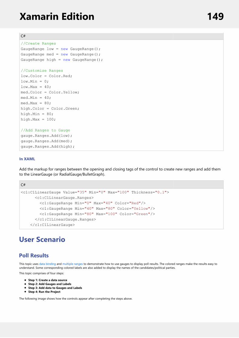
C#
//Create RangesGaugeRange low = new GaugeRange();GaugeRange med = new GaugeRange();GaugeRange high = new GaugeRange();
//Customize Rangeslow.Color = Color.Red;low.Min = 0;low.Max = 40;med.Color = Color.Yellow;med.Min = 40;med.Max = 80;high.Color = Color.Green;high.Min = 80;high.Max = 100;
//Add Ranges to Gaugegauge.Ranges.Add(low);gauge.Ranges.Add(med);gauge.Ranges.Add(high);
In XAML
Add the markup for ranges between the opening and closing tags of the control to create new ranges and add themto the LinearGauge (or RadialGauge/BulletGraph).
C#
<c1:C1LinearGauge Value="35" Min="0" Max="100" Thickness="0.1"> <c1:C1LinearGauge.Ranges> <c1:GaugeRange Min="0" Max="40" Color="Red"/> <c1:GaugeRange Min="40" Max="80" Color="Yellow"/> <c1:GaugeRange Min="80" Max="100" Color="Green"/> </c1:C1LinearGauge.Ranges> </c1:C1LinearGauge>
User Scenario
Poll ResultsThis topic uses data binding and multiple ranges to demonstrate how to use gauges to display poll results. The colored ranges make the results easy tounderstand. Some corresponding colored labels are also added to display the names of the candidates/political parties.
This topic comprises of four steps:
Step 1: Create a data sourceStep 2: Add Gauges and LabelsStep 3: Add data to Gauges and LabelsStep 4: Run the Project
The following image shows how the controls appear after completing the steps above.
Xamarin Edition 149
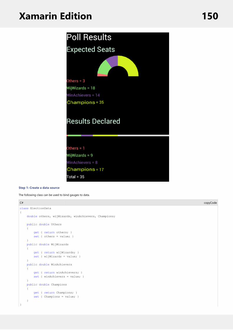
Step 1: Create a data source
The following class can be used to bind gauges to data.
C#
class ElectionData{ double others, wijWizards, winAchievers, Champions;
public double Others { get { return others; } set { others = value; } } public double WijWizards { get { return wijWizards; } set { wijWizards = value; } } public double WinAchievers { get { return winAchievers; } set { winAchievers = value; } } public double Champions { get { return Champions; } set { Champions = value; } } }
copyCode
Xamarin Edition 150

Back to Top
Step 2: Add Gauges and Labels
Complete the following steps to add a radial gauge to display the expected seats and a linear gauge to display the results declared. Add labels below thegauges to display the names of the parties and their seat count.
1. Add a new Forms XAML Page (for example ElectionResult.xaml) to your portable or shared project and modify the <ContentPage>tag to include thefollowing references:XAML
<ContentPage xmlns="http://xamarin.com/schemas/2014/forms"xmlns:x="http://schemas.microsoft.com/winfx/2009/xaml"x:Class="Appl.ElectionResult"xmlns:c1="clr-namespace:C1.Xamarin.Forms.Gauge;assembly=C1.Xamarin.Forms.Gauge">
2. Initialize the controls by adding the markups between the <ContentPage></ContentPage>tags and inside the <StackLayout> </StackLayout>tags,as shown below: Example Title
<StackLayout> <Label Text="Poll Results" TextColor="White" Font="30"/> <Label Text="Expected Seats" TextColor="#D3FDE5" Font="25"/> <!--Radial Gauge--> <c1:C1RadialGauge x:Name="gauge" Min="0" Max="70" ShowText="None" AutoScale = "true"> <!--Colored ranges to represent parties--> <c1:C1RadialGauge.Ranges> <c1:GaugeRange x:Name="Range1" Color="#FF7373"/> <c1:GaugeRange x:Name="Range2" Color="#8DEB71"/> <c1:GaugeRange x:Name="Range3" Color="#8F5DB7"/> <c1:GaugeRange x:Name="Range4" Color="#D4F320"/> </c1:C1RadialGauge.Ranges> </c1:C1RadialGauge> <!--Labels to display party names and seat count--> <Label x:Name="lbl" TextColor="#FF7373"/> <Label x:Name="lbl1" TextColor="#8DEB71"/> <Label x:Name="lbl2" TextColor="#8F5DB7"/> <Label x:Name="lbl3" TextColor="#D4F320"/> <Label Text="Results Declared" TextColor="#D3FDE5" Font="25"/> <!--Linear Gauge--> <c1:C1LinearGauge x:Name="lGauge" Min="0" Max="70" Thickness="0.1" Direction="Right" ShowRanges="True"> <!--Colored ranges to represent parties--> <c1:C1LinearGauge.Ranges> <c1:GaugeRange x:Name="lRange1" Color="#FF7373"/> <c1:GaugeRange x:Name="lRange2" Color="#8DEB71"/> <c1:GaugeRange x:Name="lRange3" Color="#8F5DB7"/> <c1:GaugeRange x:Name="lRange4" Color="#D4F320"/> </c1:C1LinearGauge.Ranges> </c1:C1LinearGauge> <!--Labels to display party names and seat count--> <Label x:Name="llbl" TextColor="#FF7373"/> <Label x:Name="llbl1" TextColor="#8DEB71"/> <Label x:Name="llbl2" TextColor="#8F5DB7"/> <Label x:Name="llbl3" TextColor="#D4F320"/> <Label x:Name="llbl4" TextColor="White"/></StackLayout>
Back to Top
Step 3: Add data to Gauges and Labels
Complete the following steps to add data to gauges and labels.
1. In the Solution Explorer, expand the ElectionResult.xaml node and open ElectionResult.xaml.cs to open the C# code behind.2. In the ElectionResult( ) class constructor, create new instances of the class ElectionData, defined in Step 1: Create a data source and add data to the
Xamarin Edition 151

controls.
The following code shows what the ElectionResult class constructor looks like after completing this step.
C#
public ElectionResult(){ InitializeComponent();
// Results Declared ElectionData bds = new ElectionData() { Others = 1, WijWizards = 9, WinAchievers = 8, Champions = 17 };
lRange1.Min = 0; lRange1.Max = lRange1.Min + bds.Others;
lRange2.Min = lRange1.Max; lRange2.Max = lRange2.Min + bds.WijWizards;
lRange3.Min = lRange2.Max; lRange3.Max = lRange3.Min + bds.WinAchievers;
lRange4.Min = lRange3.Max; lRange4.Max = lRange4.Min + bds.Champions;
// Add data to labels llbl.Text = "Others = " + bds.Others; llbl1.Text = "WijWizards = " + bds.WijWizards; llbl2.Text = "WinAchievers = " + bds.WinAchievers; llbl3.Text = "Champions = " + bds.Champions; llbl4.Text = "Total = " + (bds.Others + bds.WijWizards + bds.WinAchievers + bds.Champions).ToString();
// Expected Seats ElectionData ds = new ElectionData() { Others = 3, WijWizards = 18, WinAchievers = 14, Champions = 35 };
Range1.Min = 0; Range1.Max = Range1.Min + ds.Others;
Range2.Min = Range1.Max; Range2.Max = Range2.Min + ds.WijWizards;
Range3.Min = Range2.Max; Range3.Max = Range3.Min + ds.WinAchievers;
Range4.Min = Range3.Max; Range4.Max = Range4.Min + ds.Champions;
// Add data to labels lbl.Text = "Others = " + ds.Others; lbl1.Text = "WijWizards = " + ds.WijWizards; lbl2.Text = "WinAchievers = " + ds.WinAchievers; lbl3.Text = "Champions = " + ds.Champions + "\n\n";}
Back to Top
Step 4: Run the Project
Complete the following steps
1. In the Solution Explorer, double click App.cs to open it.2. In the class constructor App( ), set the Forms XAML Page ElectionResult as the MainPage.
The following code shows the class constructor App( ), after completing this step.
C#
public App(){ // The root page of your application MainPage = new ElectionResult();
copyCode
Xamarin Edition 152

}
3. Some additional steps are required to run the iOS and UWP apps:iOS App:
1. In the Solution Explorer, double click AppDelegate.cs inside YourAppName.iOS project to open it.2. Add the following code to the FinishedLaunching( ) method.
C#
C1.Xamarin.Forms.Gauge.Platform.iOS.Forms.Init();
UWP App:1. In the Solution Explorer, expand MainPage.xaml.2. Double click MainPage.xaml.cs to open it.3. Add the following code to the class constructor.
C#
C1.Xamarin.Forms.Gauge.Platform.UWP.Forms.Init();
4. Press F5 to run the project.
Back to Top
Input
AutoCompleteAutoComplete is an editable input control designed to show possible text suggestions automatically as the user typestext. The control filters a list of pre-defined items dynamically as a user types to provide suggestions that best orcompletely matches the input. The suggestions that match the user input appear instantly in a drop-down list.
The image given below shows the AutoComplete control showing pre-populated input suggestions in the drop-downlist.
Xamarin Edition 153

Key Features
Customize Appearance - Use basic appearance properties to customize the appearance of the drop-down list.Delay - Use delay feature to provide some time gap (in milliseconds) between text input and suggestion.Dynamic Filtering - Apply dynamic filtering to enhance searching and filtering as a user types text.Highlight Matches - Highlight the input text with matching string in the suggestions.
Quick Start: Populating AutoComplete with DataThis section describes adding the AutoComplete control to your portable or shared application and displaying a list ofitems in the drop-down as suggestions for users.
Complete the following steps to display an AutoComplete control.
Step 1: Add a list of pre-defined suggestionsStep 2: Add AutoComplete control and populate it with suggestionsStep 3: Run the Project
The following image shows how the AutoComplete control provides a list of suggestions in a drop-down list when theuser enters text.
Xamarin Edition 154

Step 1: Add a list of pre-defined suggestions
Complete the following steps to add a list of items to be displayed in the drop-down list.
1. Create a new portable or shared Xamarin.Forms application (Refer Creating a New Xamarin.Forms App fordetailed instructions).
2. Add a new class (say Country.cs) to your application.3. Add the following code to initialize a collection of items (here, a list of major countries).
C#
public class Country { public string Name { get; set; } public static List<Country> GetCountries() { List<Country> listCountries = new List<Country>(); string[] countries = new string[] { "United States", "Chile", "Great Britain", "India", "Indonesia", "Greece" }; foreach (var item in countries) { listCountries.Add(new Country() { Name = item }); } return listCountries; } }
Step 2: Add AutoComplete control and populate it with suggestions
1. Add a new Forms XAML Page (say Page1.xaml) to your application.2. Edit the <ContentPage> tag to include the following reference.
XAML
xmlns:c1="clr-namespace:C1.Xamarin.Forms.Input;assembly=C1.Xamarin.Forms.Input"
3. Initialize an editable AutoComplete control and set some of its basic properties such as Name,DisplayMemberPath, etc. by adding the given markup between <StackLayout></StackLayout> tags inside the<ContentPage></ContentPage> tags.XAML
<StackLayout Orientation="Vertical">
Xamarin Edition 155

<c1:C1AutoComplete x:Name="autoComplete" IsEditable="True" HorizontalOptions="FillAndExpand" DropDownBackgroundColor="Gray" DisplayMemberPath="Name" VerticalOptions="Start"> <c1:C1AutoComplete.ListView> <ListView> <ListView.ItemTemplate> <DataTemplate> <StackLayout Orientation="Horizontal" > <Label Text="{Binding Name}" /> </StackLayout> </DataTemplate> </ListView.ItemTemplate> </ListView> </c1:C1AutoComplete.ListView> </c1:C1AutoComplete> </StackLayout>
4. Expand the Page1.xaml node in the Solution Explorer to open Page1.xaml.cs and add the given code in theconstructor to set ItemsSource property of the AutoComplete control.C#
this.autoComplete.ItemsSource = Country.GetCountries();
Step 3: Run the Project
1. In the Solution Explorer, double-click App.cs file to open it.2. To return a Forms XAML Page, set the MainPage to Page1 in the constructor App() as illustrated in the givencodeC#
public App() { // The root page of your application MainPage = new Page1(); }
3. Some additional steps are required to run iOS and UWP apps:iOS App:
1. In the Solution Explorer, double click AppDelegate.cs inside YourAppName.iOS project to open it.2. Add the following code to the FinishedLaunching() method.
C#
C1.Xamarin.Forms.Input.Platform.iOS.C1InputRenderer.Init();
UWP App:1. In the Solution Explorer, expand the MainPage.xaml inside YouAppName.UWP project.2. Double click the MainPage.xaml.cs to open it and add the following code to the class constructor.
C#
C1.Xamarin.Forms.Input.Platform.UWP.C1InputRenderer.Init();
4. Press F5 to run the project.
Xamarin Edition 156

Features
Data BindingThe AutoComplete control provides DisplayMemberPath and ItemsSource properties to bind the control to data. TheItemsSource property lets you bind the control to an enumerable collection of items, and the DisplayMemberPathproperty sets the path to a value on the source object for displaying data.
The following code illustrates how to set these properties in code to achieve data binding.
C#
this.autoComplete.ItemsSource = Country.GetCountries();this.autoComplete.DisplayMemberPath = "Name";
DelayThe AutoComplete control provides instant text suggestions by searching the best possible match for the user input.However, you can change this default behavior and add some time gap between user input and the search. For this,you can use the Delay property and set time delay in milliseconds.
The following code example shows setting time delay in the AutoComplete control.
C#
//Setting the time delaythis.auto.Delay = 1500;
Highlight MatchesThe AutoComplete control enables quick identification of user input in the search result by highlighting the matchingtext. For this, the AutoComplete class provides the HighlightedColor property that sets the highlight color for thematching characters. You can explicitly set this property to a specific color so that the user input string getshighlighted in the search results as shown in the following image.
The following code example shows setting the text highlight feature in the AutoComplete control.
Xamarin Edition 157
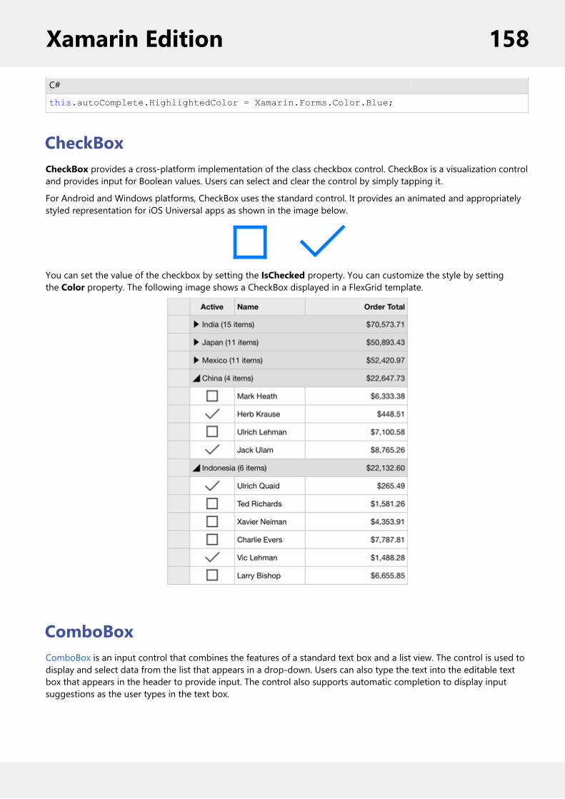
C#
this.autoComplete.HighlightedColor = Xamarin.Forms.Color.Blue;
CheckBoxCheckBox provides a cross-platform implementation of the class checkbox control. CheckBox is a visualization controland provides input for Boolean values. Users can select and clear the control by simply tapping it.
For Android and Windows platforms, CheckBox uses the standard control. It provides an animated and appropriatelystyled representation for iOS Universal apps as shown in the image below.
You can set the value of the checkbox by setting the IsChecked property. You can customize the style by settingthe Color property. The following image shows a CheckBox displayed in a FlexGrid template.
ComboBoxComboBox is an input control that combines the features of a standard text box and a list view. The control is used todisplay and select data from the list that appears in a drop-down. Users can also type the text into the editable textbox that appears in the header to provide input. The control also supports automatic completion to display inputsuggestions as the user types in the text box.
Xamarin Edition 158

Key Features
Automatic Completion - ComboBox supports automatic completion feature that provides relevantsuggestions to user while typing the text in the text area.Edit Mode - By default, the ComboBox control is non-editable. However, you can make it editable so thatusers can modify their input as well.
Quick Start: Display a ComboBox ControlThis section describes adding a ComboBox control to your portable or shared application and displaying a list of itemsin the drop-down as suggestions for users.
Complete the following steps to display a ComboBox control.
Step 1: Add an item list to be displayed in the drop-downStep 2: Add ComboBox control to XAML PageStep 3: Run the Project
The following image shows a ComboBox displaying input suggestions as the user types.
Xamarin Edition 159

Step 1: Add an item list to be displayed in the drop-down
Complete the following steps to add a list of items to be displayed in the drop-down list.
1. Create a new portable or shared Xamarin.Forms application (Refer Creating a New Xamarin.Forms App fordetailed instructions).
2. Add a new class (say States.cs) to your application.3. Add the following code to initialize a collection of items (here, a list of major states in the United States).
C#
public class States { public string Name { get; set; } public States(string name) { this.Name = name; }
public static List<States> GetStates() { List<States> data = new List<States>(); data.Add(new States("Alabama")); data.Add(new States("Alaska")); data.Add(new States("Arizona")); data.Add(new States("Arkansas")); data.Add(new States("California")); data.Add(new States("Colorado")); data.Add(new States("Connecticut")); data.Add(new States("Delaware"));
Xamarin Edition 160

data.Add(new States("District of Columbia")); data.Add(new States("Florida")); data.Add(new States("Georgia")); data.Add(new States("Guam")); data.Add(new States("Hawaii")); data.Add(new States("Idaho")); data.Add(new States("Illinois")); data.Add(new States("Indiana")); data.Add(new States("Iowa")); data.Add(new States("Kansas")); return data; } }
Step 2: Add ComboBox control to XAML Page
1. Add a new Forms XAML Page (say Page1.xaml) to your application.2. Edit the <ContentPage> tag to include the following reference.
XAML
xmlns:c1="clr-namespace:C1.Xamarin.Forms.Input;assembly=C1.Xamarin.Forms.Input"
3. Initialize an editable ComboBox control and set some of its basic properties such as Name,DisplayMemberPath, etc. by adding the given markup between <StackLayout></StackLayout> tags inside the<ContentPage></ContentPage> tags.XAML
<StackLayout> <Label Text="Type text or tap drop-down to select" FontSize="25"/> <c1:C1ComboBox x:Name="cbxEdit" IsEditable="True" HorizontalOptions="FillAndExpand" DropDownBackgroundColor="Gray" DisplayMemberPath="Name" VerticalOptions="Start" /> </StackLayout>
4. Expand the Page1.xaml node in the Solution Explorer to open Page1.xaml.cs and add the given code in theconstructor to set the ItemsSource property of the C1ComboBox class.C#
var array = States.GetStates();this.cbxEdit.ItemsSource = array;
Step 3: Run the Project
1. In the Solution Explorer, double-click App.cs file to open it.2. To return a Forms XAML Page, set the MainPage to Page1 in the constructor App() as illustrated in the givencodeC#
public App() { // The root page of your application MainPage = new Page1(); }
Xamarin Edition 161

3. Some additional steps are required to run iOS and UWP apps:iOS App:
1. In the Solution Explorer, double click AppDelegate.cs inside YourAppName.iOS project to open it.2. Add the following code to the FinishedLaunching() method.
C#
C1.Xamarin.Forms.Input.Platform.iOS.C1InputRenderer.Init();
UWP App:1. In the Solution Explorer, expand the MainPage.xaml inside YouAppName.UWP project.2. Double click the MainPage.xaml.cs to open it and add the following code to the class constructor.
C#
C1.Xamarin.Forms.Input.Platform.UWP.C1InputRenderer.Init();
4. Press F5 to run the project.
Features
Custom AppearanceThe ComboBox control comes with various properties to customize its appearance. The C1ComboBox class provides aset of properties listed below to achieve customization in the control's overall look and feel.
DropDownBackgroundColor - sets the background color in drop-down listDropDownBorderColor - sets the color of drop-down borderDropDownDirection - Sets the direction in which the drop-down opens, accepting values fromthe DropDownDirection enumeration
The image given below shows a customized combo box control.
Xamarin Edition 162
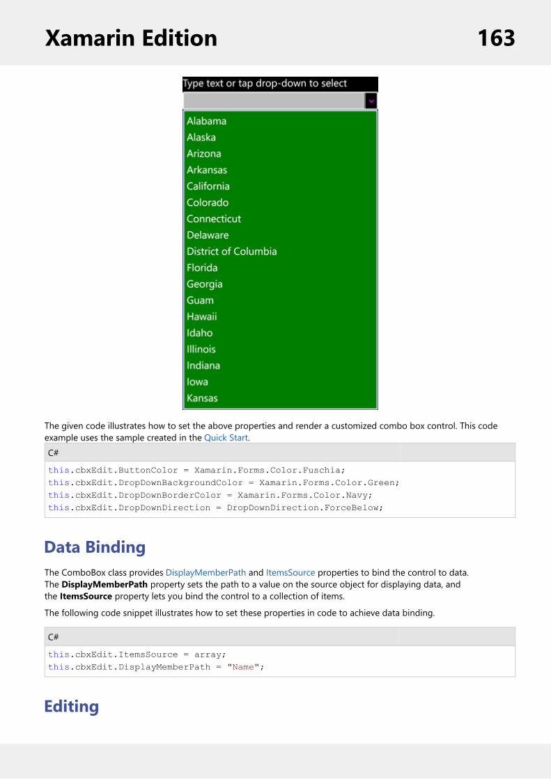
The given code illustrates how to set the above properties and render a customized combo box control. This codeexample uses the sample created in the Quick Start.C#
this.cbxEdit.ButtonColor = Xamarin.Forms.Color.Fuschia;this.cbxEdit.DropDownBackgroundColor = Xamarin.Forms.Color.Green;this.cbxEdit.DropDownBorderColor = Xamarin.Forms.Color.Navy;this.cbxEdit.DropDownDirection = DropDownDirection.ForceBelow;
Data BindingThe ComboBox class provides DisplayMemberPath and ItemsSource properties to bind the control to data.The DisplayMemberPath property sets the path to a value on the source object for displaying data, andthe ItemsSource property lets you bind the control to a collection of items.
The following code snippet illustrates how to set these properties in code to achieve data binding.
C#
this.cbxEdit.ItemsSource = array;this.cbxEdit.DisplayMemberPath = "Name";
Editing
Xamarin Edition 163

The ComboBox control allows users to input data by either selecting an item from the drop-down or by typing textinto the text box. However, by default, the ComboBox control is non-editable and does not allow users to provideinput by typing.
To change this default behavior, the C1ComboBox class provides the IsEditable property that can be set to true toenable editing in the text box.
C#
this.cbxEdit.IsEditable = true;
DropDownDropDown is a basic drop-down control that can be used as a base to create custom drop-down controls such as datepicker, auto complete menus, etc. The control comprises three major elements, including a Header view, a button, anda DropDown view. The header includes the entire width of the control, while the button is placed on the top of theheader, indicating that the control can be expanded. The drop-down includes the entire length of the control and getsexpanded or collapsed.
Refer to Creating a Custom Date Picker using DropDown to know how the control can be used to create full-fledgeddrop-down menus.
Creating a Custom Date Picker using DropDownThis topic provides a walkthrough of how the DropDown control can be used to create a custom date picker. For this,you begin by creating a new portable or shared application, initializing a DropDown control in XAML view, and thensupplying content to its Header view using the setHeader property, and to the DropDown view using thesetDropDown property. In this example, you create a date picker by using a MaskedTextField control in the headerand a Calendar control in the drop-down.
The image below shows how a custom date picker created using the DropDown control appears.
Complete the following steps to create a custom date picker using the DropDown control.
1. Create a new portable or shared Xamarin.Forms application (Refer Creating a New Xamarin.Forms App fordetailed instructions).
Xamarin Edition 164

2. Add a new Forms XAML Page (say Page1.xaml) to your application.3. Edit the <ContentPage> tag to include the required references.
XAML
xmlns:c1="clr-namespace:C1.Xamarin.Forms.Input;assembly=C1.Xamarin.Forms.Input"
xmlns:c1="clr-namespace:C1.Xamarin.Forms.Calendar;assembly=C1.Xamarin.Forms.Calendar"
4. Initialize a DropDown control, a MaskedTextField control, and a Calendar control by adding the given markupbetween the <ContentPage></ContentPage> tags.XAML
<StackLayout> <Label BindingContext="{x:Reference page}" Text="{Binding Title}" IsVisible="{StaticResource TitleVisible}" HorizontalOptions="Center" Font="Large"/> <Grid VerticalOptions="FillAndExpand" > <c1:C1DropDown x:Name="dropdown" HorizontalOptions="FillAndExpand" VerticalOptions="Start" > <c1:C1DropDown.Header> <c1:C1MaskedEntry x:Name="mask" BindingContext="{x:Reference calendar}" Mask="00/00/0000" /> </c1:C1DropDown.Header> <c1:C1DropDown.DropDown> <calendar:C1Calendar HorizontalOptions="FillAndExpand" x:Name="calendar" BackgroundColor="Transparent"> </calendar:C1Calendar> </c1:C1DropDown.DropDown> </c1:C1DropDown> </Grid> </StackLayout></ContentPage>
5. Expand the Page1.xaml node in the Solution Explorer to open Page1.xaml.cs and add the given code in theconstructor.XAML
public partial class Page1 : ContentPage { public Page1() { InitializeComponent(); this.calendar.SelectionChanged += CalendarSelectionChanged; }
private void CalendarSelectionChanged(object sender, CalendarSelectionChangedEventArgs e) { this.mask.Value = calendar.SelectedDate.ToString(); this.dropdown.IsDropDownOpen = false; }
Xamarin Edition 165

}
6. Press F5 to run the project.
MaskedTextFieldMaskedTextField is an input control designed to capture properly formatted user input. The control prevents usersfrom entering invalid values in an input field, and characters like slash or hyphen. The control also provides datavalidation by skipping over invalid entries as the user types. To specify the format in which the data should be enteredin an input field, the control uses special characters called mask symbols or mask inputs.
For example, you can use the control to create an input field that accepts phone numbers with area code only.Similarly, you can define a Date field that allows users to enter date in dd/mm/yyyy format. The image given belowshows four MaskedTextField controls displaying fields namely ID to enter a valid identification number, DOB to enterdate of month in dd-mm-yyyy format, Phone to enter a contact number with area code, and State showing a watermark (Placeholder) to prompt user to enter the name of state.
Quick Start: Display a MaskedTextField ControlThis section describes adding a MaskedTextField control to your portable or shared application and specifying fourinput fields, namely Social Security No., Date of Birth, Phone and State. The Social Security No. input field accepts anine-digit number separated by hyphens, the Date of Birth field accepts a date in mm/dd/yyyy format, the Phone fieldaccepts a 10-digit number with area code, and the State field accepts the abbreviated postal codes of a state.
Complete the following steps to initialize four input fields using MaskedTextField control.
Step 1: Add MaskedTextField controls to display four input fieldsStep 2: Run the Project
The following image shows the input fields configured after completing the above steps.
Xamarin Edition 166

Step 1: Add MaskedTextField controls to display four input fields
Complete the following steps to initialize a MaskedTextField control in XAML.
1. Create a new portable or shared Xamarin.Forms application (Refer Creating a New Xamarin.Forms App fordetailed instructions).
2. Add a new Forms XAML Page (say Page1.xaml) to your application.3. Edit the <ContentPage> tag to include the following reference.
XAML
xmlns:c1="clr-namespace:C1.Xamarin.Forms.Input;assembly=C1.Xamarin.Forms.Input"
4. Initialize four MaskedTextField controls along with corresponding labels within the <StackLayout> tags todisplay four input fields, and set the Mask property for all the masked entry controls.XAML
<StackLayout> <Grid> <Label Text="Social Security No.:" VerticalOptions="Center" /> <c1:C1MaskedTextField x:Name="c1MaskedTextBox1" Mask="000-00-0000" Grid.Column="1" /> <Label Text="Date Of Birth:" VerticalOptions="Center" Grid.Row="1" /> <c1:C1MaskedTextField x:Name="c1MaskedTextBox2" Keyboard="Numeric" Mask="90/90/0000" Grid.Row="1" Grid.Column="1" /> <Label Text="Phone:" VerticalOptions="Center" Grid.Row="2" /> <c1:C1MaskedTextField x:Name="c1MaskedTextBox3" Mask="(999) 000-0000" Keyboard="Telephone" Grid.Row="2" Grid.Column="1" /> <Label Text="State:" VerticalOptions="Center" Grid.Row="3" /> <c1:C1MaskedTextField x:Name="c1MaskedTextBox4" Mask="LL" Grid.Row="3" Grid.Column="1" /> </Grid> </StackLayout>
Step 2: Run the Project
1. In the Solution Explorer, double-click App.cs file to open it.2. To return a Forms XAML Page, set the MainPage to Page1 in the constructor App() as illustrated in the givencodeC#
public App() { // The root page of your application MainPage = new Page1(); }
3. Some additional steps are required to run iOS and UWP apps:iOS App:
1. In the Solution Explorer, double click AppDelegate.cs inside YourAppName.iOS project to open it.2. Add the following code to the FinishedLaunching() method.
C#
C1.Xamarin.Forms.Input.Platform.iOS.C1InputRenderer.Init();
UWP App:1. In the Solution Explorer, expand the MainPage.xaml inside YouAppName.UWP project.
Xamarin Edition 167

2. Double click the MainPage.xaml.cs to open it and add the following code to the class constructor.C#
C1.Xamarin.Forms.Input.Platform.UWP.C1InputRenderer.Init();
4. Press F5 to run the project.
Mask SymbolsThe MaskedTextField control provides an editable Mask that supports a set of special mask characters/symbols, whichis a subset of .NET MaskedTextBox Mask. These characters are used to specify the format in which the data should beentered in an input field. For this, you need to use the Mask property for specifying the data entry format.
For example, setting the Mask property for a MaskedTextField control to "90/90/0000" lets users enter date ininternational date format. Here, the "/" character works as a logical date separator.
The following table enlists mask symbols supported by the MaskedTextField control.
Mask Symbol Description
0 Digit
9 Digit or space
# Digit, sign, or space
L Letter
? Letter, optional
C Character, optional
& Character, required
I Letter or space
A Alphanumeric
a Alphanumeric or space
. Localized decimal point
, Localized thousand separator
: Localized time separator
/ Localized date separator
$ Localized currency symbol
< Converts characters that follow to lowercase
> Converts characters that follow to uppercase
| Disables case conversion
\ Escapes any character, turning it into a literal
All others Literals.
Xamarin Edition 168