worksight promotion 2012
TRANSCRIPT

Logotype for the Los Angeles Philharmonic (proposed)
Visual reference is made to their new location in the Frank Gehry building.
W O R K S I G H T .com

Brooklyn Business Library: capabilities brochure / pocket folder
This promotion kept within budget by serving a dual function of a brochure, and as a pocket folder by utilizing a middle
panel. Contents include 1) individual vignettes of individuals accessing the library, 2) images of Brooklyn expressing a
“pride of place,” 3) a Q & A about the library, and 4) a tuck-in business card
with map and hours. The National Library Association gave the brochure a first place award.
W O R K S I G H T .com
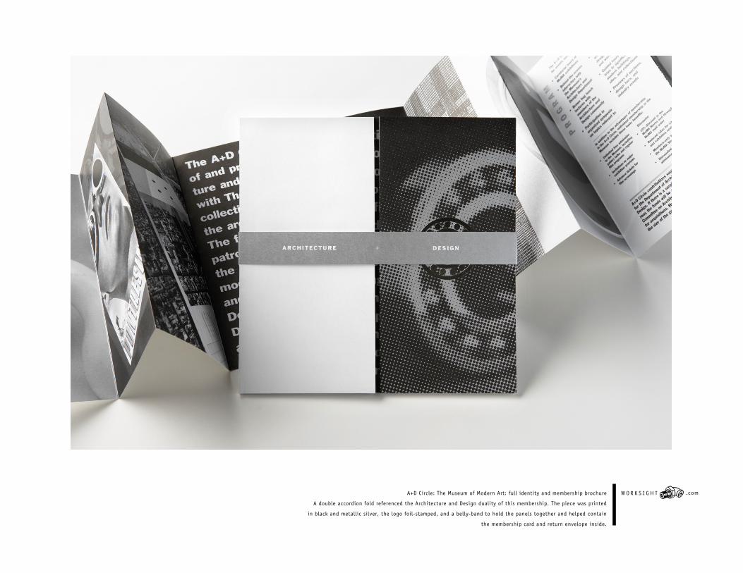
A+D Circle: The Museum of Modern Art: full identity and membership brochure
A double accordion fold referenced the Architecture and Design duality of this membership. The piece was printed
in black and metallic silver, the logo foil-stamped, and a belly-band to hold the panels together and helped contain
the membership card and return envelope inside.
W O R K S I G H T .com

Visual identity and website design for the
New York City Alliance Against Sexual Assault
W O R K S I G H T .com

Gotham Fine Arts Gallery trademark referencing the gallery’s
collection of classical sculpture and fine art prints
W O R K S I G H T .com

Absecon Textile Mills visual identity and collateral material
including binders and website.
W O R K S I G H T .com
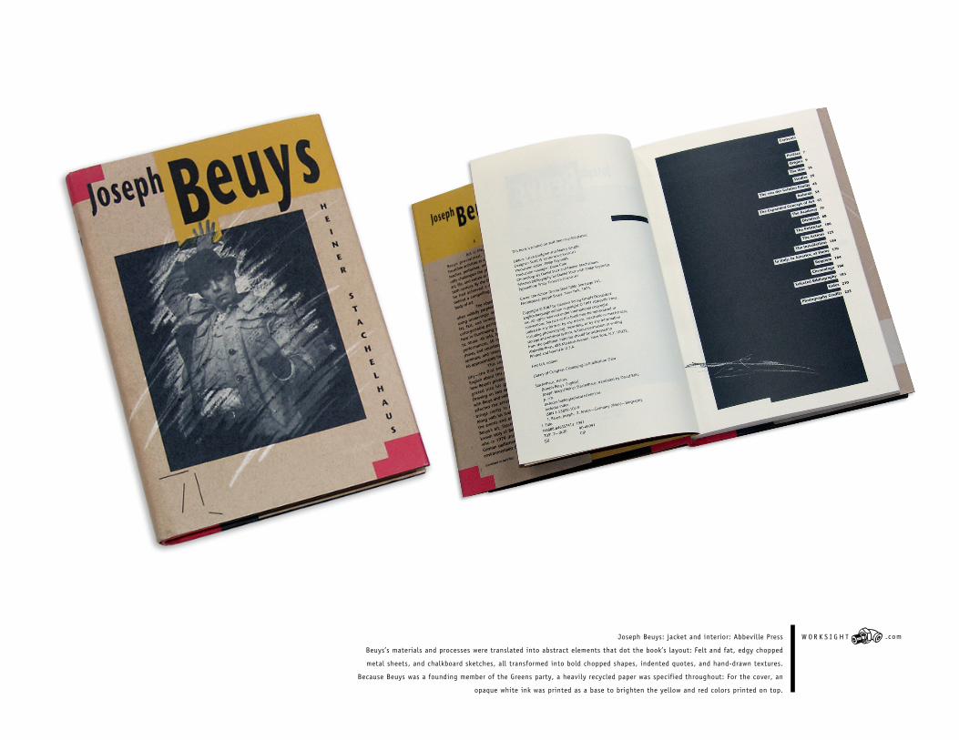
Joseph Beuys: jacket and interior: Abbeville Press
Beuys’s materials and processes were translated into abstract elements that dot the book’s layout: Felt and fat, edgy chopped
metal sheets, and chalkboard sketches, all transformed into bold chopped shapes, indented quotes, and hand-drawn textures.
Because Beuys was a founding member of the Greens party, a heavily recycled paper was specified throughout: For the cover, an
opaque white ink was printed as a base to brighten the yellow and red colors printed on top.
W O R K S I G H T .com

Brooklyn Public Library Annual Report W O R K S I G H T .com

Gilbert Paper: Searching for Coney Island
Coney Island made for a tactile paper promotion in this series. Inside front and back cover holds perforat-
ed postcards. Why does Coney still exist and why do we still find it so interesting? Answer: It’s one of the
last real places left in New York...“gritty, tough and real, no Disneyland.”
W O R K S I G H T .com

AID for AIDS Identity and brochure W O R K S I G H T .com

Rainforest Foundation calendar
This year's calendar emphasized a raw and recycled quality (100 percent). The jacket was glued
and trimmed to binder board and wire-o bound. The simple approach was consistent with
the Rainforest's work and extremely cost efficient.
W O R K S I G H T .com