working papers on design - university of hertfordshire · working papers on design ... (2007)...
TRANSCRIPT

Working Papers on Design © University of Hertfordshire. To cite this journal article: O’Donohoe, Eilish (2007) ‘Between Image and Text: Tensions in the art of Hans Haacke and Jenny Holzer’, Working Papers on Design 2 Retrieved <date> from <http://www.herts.ac.uk/artdes1/research/papers/ wpdesign/wpdvol2/vol2.html> ISSN 1470-5516
‘
Between Image and Text: Tensions in the art of Hans Haacke and Jenny Holzer Eilish O’Donohoe Swansea Institute of Higher Education
Abstract This article considers the nature of the relationship between image and text in a visual
work by the artists Hans Haacke and Jenny Holzer. It proposes a need for a formal tool
of analysis for image-text works and in the process offers an original systemic-functional
semiotic model as a methodology for analysis of dual-coded works. M.A.K. Halliday’s
linguistic model of analysis (1978), adapted by Michael O’Toole (1994:24) for the analysis
of painting, has been modified for analysis of image-text artworks, thus offering a more
challenging and enriching experience in the production and perception of meaning in
such works. The model allows for a shared language in the negotiation of meaning and
helps the viewer to articulate what is being experienced on engaging with the works. The
model also facilitates the active construction of meaning without necessarily needing a
detailed knowledge of the provenance, politico-social, philosophical and academic
debates leading up to current developments in the acceptance of such works - although
all such cultural references would indeed enrich perception - thus empowering the
viewer. This could have profound effects on the teaching of undergraduate programmes
in the Visual Arts that are concerned with the intersection of image and text, whereby
design students are enabled to both analyse visual messages all too often taken for
granted and to create work in the knowledge that where there is choice there is meaning.
The direct relationship between the typographic semiotic and the rendered image is
emphasised. The focus of this relationship is one of linguistic signifiers, the consideration
of the typographic connotations of those words, a range of social meanings produced,
the material significance of the compositions and how all of this may be decoded
through a matrix of systems of semiotic choices. The relationship between visual and
visible language, and the physical and social contexts in which it operates is emphasised.

Eilish O’Donohoe ‘Between Image and Text’ p. 2
‘
Introduction In offering a systemic-functional model for the analysis of painting, Michael O’Toole
(1994:4) stresses that
semiotics – the study of sign systems- can assist us in a search for a language
through which our perceptions of a work of art can be shared. I believe that we
should start with the impact the particular work has on us in the gallery, or even
in a book of reproductions, but this semiotic approach will also allow us to relate
the nature of this impact to the scene portrayed…
This is in reference to much gallery viewing emphasising other discourses surrounding
our perception of visual works; provenance, the voice of the expert, art theory, history
and the social, economic and political factors which can preclude a direct, primary
engagement with the visual work, leading to a sense of estrangement rather than
recognition.
The impetus of this study shares O’Toole’s concerns, but rather from a pedagogical point
of view based within the art-school context. It aims to demonstrate the efficacy of
applying a systemic-functional semiotic model to the domain of image-text works which
empowers the student, as a viewer, to consider such works without necessarily having the
cultural references already mentioned, even though these references would obviously
benefit perception. Engaging with the work in the gallery or in reproduction, the
student/viewer can be faced with an enormous amount of information and theory which
can be confusing, and which can often lead to aberrant interpretations.
Eilish O’Donohoe ‘Between Image and Text’ p. 3
‘
The model provides a way of talking about what one perceives and how to engage in an
immediate analysis and discussion of the work in question, in a rigorous and sustained
manner. The model also aids in the production of the student’s own work and helps
clarify the process of creativity itself and the creation of meaningful work. This
methodological process acts as a platform from which to conduct further research and to
become familiar with the critiques and discourses surrounding the relationship between
image and text in visual works.
The systemic-functional model presented here (O’Donohoe, 2004) is an adaptation of
the matrix O’Toole (1994) devised for the analysis of painting, for application to image-
text works. It is also influenced by Howard Riley’s (2000) matrix for drawing. It is based
on a synthesis of linguistic and visual communication theories and facilitates the domain
of typographic as a semiotic process. The works of artists Hans Haacke and Jenny
Holzer provide an ideal platform for analysing dual-coded work, in particular, the nature
of the relationship between the image and the concrete visible form of the word, the
typographic semiotic.

Eilish O’Donohoe ‘Between Image and Text’ p. 4
‘
In this study, the nature of pictures and words as a composite form of communication
within the visual arts is inflected by WJT Mitchell’s contention (1994:3) ‘that the
tensions between visible and verbal representation are inseparable from struggles in
cultural politics and political culture.’ In tracing relations between linguistic meaning,
visual representation and aesthetic principles a systemic-functional semiotic analysis of
the artists’ works explores and reveals not only dominant readings but also alternative
interpretations of the artists’ works. The study also includes the signifying processes of
the social contexts of dual-coded works and stresses the social semiotic as vital in
determining the relationships between image and text in visual works and that social
semiotic theory allows for meaningful debate as to what constitutes representation in
such works.
Social Semiotics Social semiotics is a way of construing how the relationship between codes of
communication and the (social) contexts in which they are used, construct meaning.
Michael Halliday’s (1978) seminal systemic-functional linguistic model has inspired
research in visual semiotics by Michael O'Toole, Gunther Kress and Theo Van Leeuwen,
among others. A social semiotic approach to negotiating meaning assumes that the social
context of the text is all-important. For Halliday:
a text is embedded in a context of situation... an instance of a generalised social
context or situation type...a semiotic structure... This presupposes an
interpretation of the social system as a social semiotic; a system of meanings that
constitutes the reality of the culture. (in O'Toole:1994:216).
Kress and Van Leeuwen, (1996:32) extend Halliday's linguistic model to visual language
and stress its semiotic nature:
Visual communication is always coded. It seems transparent only because we know
the code already, at least passively – but without knowing what it is we know,
without having the means for talking about what it is we do when we read an
image. A glance at the ‘stylized’ arts of other cultures should teach us that the
myth of transparency is indeed a myth.
Visual sign-making is never arbitrary and motivation should be seen in terms of the sign-
maker and the context in which the sign is produced. Sign-makers choose the signs most

Eilish O’Donohoe ‘Between Image and Text’ p. 5
‘
apt for producing their referents. Inscribed words are visual signs. Kress and Van
Leeuwen (1996:11) also contend with the nature of subjectivity as being the
‘transformative productive stance towards sign-making’ and sign-making ‘rests on the
interest of the sign-makers, which leads them to select particular features of the object to
be represented as criterial, at that moment, and in that context’. (Kress and Van Leeuwen
1996:11) They have also included the concept of the materiality of the signifier in their
work.
Materiality Kress and Van Leeuwen (1996:231) argue that the material aspects of representation, to
include surfaces, substances and tools in the making of artworks cannot be ignored, so
that: ‘a real distinction appears between the linguist's concern and the semiotician's.’ For
the signmaker/artist, the choice of material is significant; whether to use brush or knife,
canvas or paper, computer or camera is part of the signifying process. The particular
context is another vital signifier; ‘signs as materials are fully motivated though as always
the motivations are those of a particular culture and are not global’. (Kress and Van
Leeuwen, 1996:232)
The materiality of the sign and its significance as more than a vehicle for other signifiers,
be it oil, newspaper print or found objects, and first considered by the Russian
Formalists, was taken up later by Yuri Veltrusky in 1973 who emphasised: 'the materiality
of the significant (signifier) affects considerably the specific way in which the picture
conveys meaning.’ (Drucker 1994:32) In advocating materiality as a facet of an analysis
for typographical manipulation Johanna Drucker contends that:
Invoking the term materiality begs two questions immediately; that of matter,
with all the self-referential attention to questions of production… and second,
that of materialism and the discourses of cultural theory which index the analysis
of social conditions, contexts, and claims for the political effects of signifying
activity. (1994:43)
Drucker (1994:45) also insists on the materiality of the typographic sign as central in the
process of making meaning:

Eilish O’Donohoe ‘Between Image and Text’ p. 6
‘
The force of stone, of ink, of papyrus, and of print all function within the
signifying activity – not only because of their encoding in a cultural system of
values whereby a stone inscription is accorded a higher stature than a typewritten
memo, but because these values themselves come into being on account of the
physical, material properties of these different media. Durability, scale,
reflectiveness, richness and density of saturation and color, tactile and visual
pleasure – all of these factor in –not as transcendent and historically independent
universals, but as aspects whose historical and cultural specificity cannot be
divorced from their substantial properties. No amount of ideological or cultural
valuation can transform the propensity of papyrus to deteriorate into gold’s
capacity to endure. The inherent physical properties of stuff function in the
process of signification in intertwined but not determined or subordinate relation
to their place within the cultural codes of difference where they also function.
Materiality and cultural context are inseparable from the signifying process; making
meaning and assigning value are culturally specific. It is also argued that not only the
cultural context but the physical context also in which meaning is assigned to an image-
text work, is part of the signifying process.
The Work in Physical Context It is inevitable in this kind of study that the artworks being discussed cannot be seen in
their original form or context. This can be said about a discussion of the Mona Lisa as
much as about Hans Haacke’s The Right to Life (Fig. 2) In the main, the vast majority of
people who recognise images of the Mona Lisa, could be said to have never seen the
original painting, or if they have, their experience of it might well be disappointing. Less
imposing and duller than in reproductions, the Mona Lisa could be seen as diminished in
stature by comparison to its high status as a symbol of Western European artistic
achievement.
Experiencing a work of art in its original context, perhaps in a public gallery or museum,
produces a range of connotations different to experiencing the same work in a coffee-
table book. The positioning of both viewer and work in the context of the privacy of the
book format, an aspect of the Interpersonal function of communication identified in the
Eilish O’Donohoe ‘Between Image and Text’ p. 7
‘
model (Fig. 1), the quality of the reproduction, the absence of the original scale, the
absence of the aura of the space it is presented in, must contribute to a range of inflected
meanings, different to those invoked in the original setting.
Jenny Holzer’s Guggenheim Museum installation of both Laments and Inflammatory Essays
contains mobile text. This cannot be reproduced in the coffee-table book. The
interactivity of such a composition is absent, our eyes and heads do not need to travel the
text so explicitly in print. The physical dynamics are lost in transposition to reproduction.
Questions as to the efficacy of these kinds of works in non-original settings arise.
The analyses of art in this study take place in a two-dimensional form: photographs of
the originals in an art-book setting. The systemic-functional semiotic model outlined
below facilitates alternative meanings to be constructed meanings depending on the
context in which the works are engaged with, in this case, the reproduced form.
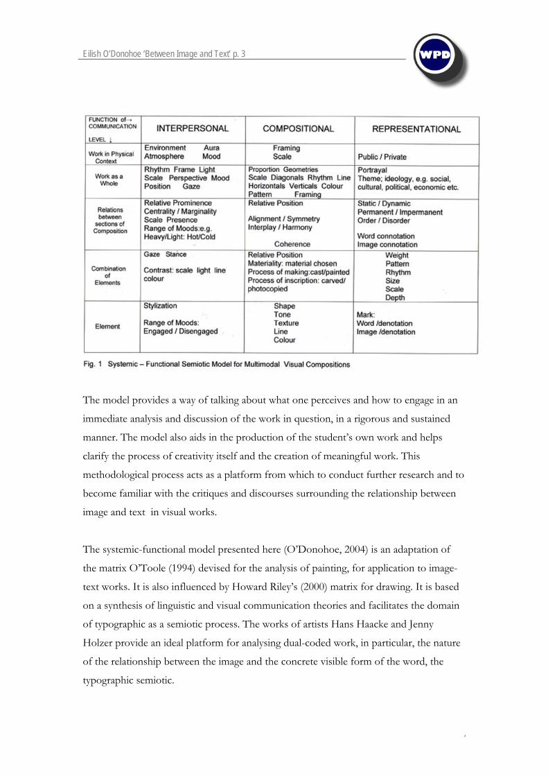
A Systemic-Functional Semiotic Model for Image-text Works As the nomenclature suggests, the model in this research is a matrix of systems and
functions which provide a mapping facility for decoding image-text works. In Fig. 1, the
Interpersonal Function positions the viewer in terms of mood and attitude towards the
work being analysed. It enables the viewer to engage with the work, and the work in its
physical space, through a range of choices from each system. The Representational
function deals with the information conveyed and the meaning of the work. It functions
to represent our experience of the world. The Compositional function, which is the
‘design’ range of choices, what might be called the tool-kit of the artist, and caters for
the media, processes and surfaces chosen by the signmaker, conveys “more effectively
and more memorably the represented subject and to make for a more dynamic relation
with the viewer” (O’Toole:1994:22) The three functions are interdependent.
What Halliday termed ‘Rank’ and O’Toole termed ‘Unit’ is here labelled ‘Level’. Each
function is divided into a means of ordering and structuring information as one travels
the matrix. There is an escalation of the depth of meaning constructed from the basic
level of a single element, to the whole work, so that for instance the external rectangular

Eilish O’Donohoe ‘Between Image and Text’ p. 8
‘
box in Hans Haacke’s The Right to Life remains at its basic denotative level of Element if
isolated from the other elements of the work or from the work as a whole. It’s
connotative meaning comes into play at the level of interaction with the rest of the work.
The systemic nature of the matrix allows for a synchronic reading of the works. The
model is laid out in a format which is familiar to Western reading protocol, from left to
right and top to bottom, or from column to column. In practice however, when looking
at the visual works such as the ones being discussed here, they are seen in their entirety –
as opposed to reading a book or watching a film – and so the systems functioning in the
production of meaning operate synchronically, or simultaneously.
In applying the model to the following case studies, not all systems are necessarily
employed at all levels, nor are they applied in a particular sequence. The sign reader can
move around the model in whatever direction desired, in no apparent sequence other
than what he/she deems fit. Unlike in conventional reading, the viewer can ‘hop’ from
box to box diagonally, from right to left or from bottom up. The subjective viewer
chooses particular systems, relative to one’s own experience, in order to negotiate
meaning. The range of the semiotic resources the viewer can call upon will determine the
depth of meaning acquired.
To this extent, as the viewer can come to the works with little or no knowledge of
history, provenance or academic critique and look at and make meaning of the work.
Equally, the viewer can engage with the works in an informed way, using their experience
and a portmanteau of cultural references. This does not preclude debate or disagreement.
Indeed, this is the ideal site for fruitful discussion and negotiation of meaning.
In the following case studies, the functions, systems and individual cells of the matrix are
italicised in order to identify them as such, and in order to differentiate the semiotic
nature of the terminology from everyday language.

Eilish O’Donohoe ‘Between Image and Text’ p. 9
‘
Case Study 1: The Right to Life (1979)
In The Right to Life (Fig.2), Haacke exposes the methods of constructing mythologies
whereby the vested interests of corporate industry are protected from public scrutiny.
The systemic-functional model (Fig.1) helps us to explore the methodology employed by

Eilish O’Donohoe ‘Between Image and Text’ p. 10
‘
the advertising industry in establishing these myths by revealing the actual process of
construction of meaning.
At the level of the work as a whole, identified in the model, the viewer is seduced by the
female gaze, a system of the Interpersonal function. Framed as a vignette, the image of
the Breck Girl allows an immediate rapport with the viewer to be established. Her bright
smile and confident gaze lure the viewer into a mood of trust and complacency.
Compositional systems of framing support this position. At the level of relations between
sections, the vignette evokes notions of intimacy; connotations of the sweetheart locket, the
ebony and ivory silhouette, the chocolate box are evoked. Chosen from the paradigm of
available frames, the vignette represents the format of intimate portraiture of classic
stature. There are no hard edges, it is a rounded feminine shape befitting a feminine
product. The work as a whole is framed discreetly, quietly protecting the cameo. Further
compositional devices endorse the mood of complacency. The interpersonal system of
centrality, functioning at the level of relations between sections, establishes the integrity of the
image:
For something to be presented as Centre means that it is presented as the nucleus
of the information which all the other elements are in some sense subservient.
(Kress and Van Leeuwen, 1996: 206)
At the level of relations between sections, the systems of coherence and harmony of the text also
maintain the mood established by the image. This is achieved by combining systems of
inscription - the use of italics and serifs along with discreet lower case typeface in the
body of the text exude an aura of classical beauty and stability. The rhythmic order
established by the flow of text is encapsulated in the traditional typographic layout. A
caption followed by an image, followed by the body of text is in the order of a soothing
melody, with a beginning, middle and end.
The semiotic of the corporate brochure - clean, apparently transparent in its delivery of
information, dignified and graceful - reassures potential customers that their interests are
being looked after. The female consumer can feel confident in buying Breck shampoo.
She will also buy into the captivating smile, the glowing complexion, the radiant hair, the

Eilish O’Donohoe ‘Between Image and Text’ p. 11
‘
allure of youth and the confident pose. Thus the myth is established. In this case, the
myth of the promise of the all-American girl is invoked. Regardless of the actual
demographics of the American female population, a specific idealisation of American
femalehood is portrayed; young, white, blonde and not overtly sexual. Unlike that other
icon of American femalehood, Marilyn Monroe, the Breck girl reassures the female
consumer that beauty and allure need not be at the expense of her modesty.
However, the cost of buying into this myth is rapidly exposed. The trusting mood of the
viewer established by the image is subverted by the information of the text. What was
initially perceived as classical and beautiful in the materiality and inscription of the text, is
exposed by the representational systems of word connotation. The viewer, formerly
complicit, is confronted with themes of a cultural and political nature not normally
associated with the purifying qualities of Breck shampoo. The myth of the promise of the
Breck Girl is shattered by information which counts the actual cost of supporting the
myth.
The subliminal codes of advertising are revealed along with the motivated methodology
of industry. Both the advertising industry and the company being advertised are exposed
and ironically subverted by their own tactics. The alluring image is shown to be an
artificial construct of the consumer industry. What was initially a seductive portrayal is
revealed as a sham. The title caption now becomes the bearer of distressing information,
the image becomes a parody of the myth and the body of the text exposes the consumer
to the tragedy of complying with advertising tactics.
If, in a visual composition, some of the constituent elements are placed in the
upper part, and other different elements are placed in the lower part of the
picture space or the page, then what has been placed on the top is presented as
the Ideal, what has been placed at the bottom as the Real. (Kress and Van
Leeuwen, 1996: 193)
The Ideal of the all-American, white, blonde, bright-eyed, girl-next-door placed in the top
part of the page, is subverted by the Real information of the demands made of the
workers producing those cosmetics which keep her beautiful. The text subverts the

Eilish O’Donohoe ‘Between Image and Text’ p. 12
‘
message of the image, causing tensions in the relationship between them, fracturing what
is usually, in advertising, an image-text composite, producing an image-text gap.
Case Study 2: Laments and Inflammatory Essays (1989-1990)
Fig. 3 Jenny Holzer. Laments, 1989-1990. LED sign. Installation. Guggenheim Museum,
New York.
In Laments and Inflammatory Essays (Figs. 3, 4 and 5), Holzer exposes tensions between
socio-cultural systems by exploring visual and verbal codes of representation. The
muteness of the visible linguistic sign is questioned by foregrounding the typographic
materiality of inscription in a context not normally available. Laments and Inflammatory
Essays were exhibited together at the Guggenheim Museum, New York, alternating with
each other on a timed loop. For the purposes of continuity here, I refer to both as
Eilish O’Donohoe ‘Between Image and Text’ p. 13
‘
Laments in the main, except when specifically referred to separately as their linguistic
significance is analysed.
Figs. 4 and 5 Jenny Holzer, Inflammatory Essays, 1989-1990. Guggenheim Museum.

Eilish O’Donohoe ‘Between Image and Text’ p. 14
‘
At the level identified in the model (Fig.1), as the work in context, the hallowed aura of the
physical space is commandeered by the brash LED (light-emitting diodes) texts encircling
the architecture. The Guggenheim Museum, one of the most prestigious centres of
cultural power and influence in the western world, is a public space whose interiors are
constructed to elicit awe and admiration, in much the same way the great cathedrals and
temples of the world were. It is a space of magnitude, of massive organic curves and
spirals, where the gaze is seduced upwards in subliminal adoration. The harmony and
symmetry of the compositional choices of repeated circles and rhythmic patterns induce a
calm and reflective mood in the viewer. The hushed atmosphere of the cathedral, a site
of prayer and reflection is represented in the cool, pale alabaster appearance of the
gallery-space. One comes here to pay homage, to venerate. The vestibule space is
designed as a space in its own right; it is not for exhibiting in – it is a work of art. Thus
we can see how the particular selections from the systems of choices identified in the
model pertaining to materials, their textures, colours and the ways they are combined,
function to position the viewer in terms of mood and attitude towards the space
represented.
Laments, however, does not conform to the cathedral semiotic. It usurps the space
whereby the interior is corralled by an invasive demonstration. The prominence of the
space’s curves, the inspirational presence of the architectural features, which help form the
museum’s identity, are captured and emasculated by the discordant, strident display. The
stature of the interior is satirised by direct intervention. The gallery’s grandeur is
subverted by the positioning of Laments directly ‘on’ the architectural features. Each
powerful spiral of the museum, is subjected to interference and resistance, and is forced
into becoming part of the composition, as opposed to being the composition. Relations
between the space and the work are tense, the silence of the space is disturbed by visual
clamouring of primary colours. These displays are not composed in delicate hues in
keeping with their surroundings, they are pulsating and raw electric colours in direct
opposition to the calm of the space, inorganic diodes contesting the natural light. These
compositional choices, in a space designed to harmonious effect, for a public congregation
engaged in private thought, allow the work Laments to represent an onslaught upon the
conventional aura of the museum.

Eilish O’Donohoe ‘Between Image and Text’ p. 15
‘
At the level of the work as a whole, Laments’ system of framing operates through the
compositional function, which facilitates the construction of meaning and serves to
alienate and dominate the framing system of the interior space. For every architectural
spiral, Laments provides an overhanging spiral. Instead of promoting unity, framing in
this coupling produces discord; they do not sit well together. ‘The absence of framing
stresses group identity, its presence signifies individuality and differentiation’ (Kress and
Van Leeuwen, 1996: 215). The individuality of the environment is subverted by the even
more strident individuality of the text. The original framing of the space - strong,
enduring and seemingly immutable, is hi-jacked by the more pronounced framing of the
typographics. What were mesmeric concentric circles have been overcome by demanding
doppelgängers which haunt and taunt the space. Between the image of the vestibule and
the image of Laments, a strong sense of antipathy is evoked, realised through the sharp
contrast of colour (a framing device) between the pale walls and the primary red and
yellow lights, with the former rendered helpless by the inflexible electronic colours.
The process of the production of materials applied in an artwork is also a system of the
compositional function operating at the level of combinations of elements in the work,
indicated in the model. The Guggenheim Museum is made from concrete, with
connotations of strength, history, permanence and classical beauty. The contours are
tactile. It is protective, it shelters one from the enemy and the elements - it is used to
maintain ambient temperatures, it appears to be natural, organic and full of resonance.
Laments, on the other hand, is constructed from nouveau materials: it cannot be touched, it
is ephemeral and lacks the dignity of history. It represents the brash contemporary in a
timeless setting. It belongs to the street and the flashing lights of the city, not to the
order and solitude – and solicitude - provided by the museum. It represents a nervous
and hyperactive dynamism in opposition to the stable, solid vestibule. A viewer may feel
its presence to be disturbing; its weight is overbearing and immodest. Laments could be
perceived by the conservative viewer as the loathsome enemy invading sacred territory.
Its presence questions the museum’s conventionality, the museum’s stature as a repository
of what is considered acceptable art. Laments is not a painting, or a sculpture, not even a

Eilish O’Donohoe ‘Between Image and Text’ p. 16
‘
photograph, there is no ‘picture’. It represents a form of popular culture usually
associated with advertising. There are no exquisite brush strokes, or chisel traces, no
mastery of hatching or sensitivity of palette. Laments does not represent the figure, or the
landscape or a tragic historical narrative – it doesn’t even represent a soup-can. Instead,
the viewer is confronted, or affronted, by the word. This might be acceptable if it were
carved into granite like a work by Eric Gill. Or if the inscription took the form of a
beautiful Chinese calligraphic in which the connotations of draughtsmanship, of rarity, of
the exotic, of age-old practices might render it fit to sit in the Guggenheim. But Laments
is not what is expected in such hallowed quarters. Its materials are selected from those
normally associated with the world of brash persuasion, of commercial communication,
of consumerism. The connotations of the image represent a resistance and polarity of
cultural forms; the exalted museum space is undermined by the presence of a visually
aggressive intruder. Tensions result.
This analysis is supported when we engage with the work at the level of its elements and a
combination of those elements: the letter forms themselves. Making language visible
through its materiality, its typographic substance, and labelling it art, is still an avant-
garde practice akin to Duchamp’s urinal. Language as a visual art is still in abeyance. It is
considered a medium for other arts like the novel or drama, or for the graphic design
industry. To render it visible, as an image in its own right, is subversive. To foreground
language in the context of a museum devoted to the visual, is subverting cultural
convention. Illuminating the word via flashing neon lights could be considered an
inferior substitute for brush and pigment. The conservative viewer’s anticipation of a
pleasant trip to the museum is further disrupted by a series of pithy disturbing
commands and exhortations:
RESTRAIN THE SENSES FORGET THE DEAD LIMIT TIME DISCARD OBJECTS LEAVE THE FAMILY FORGET TRUTHS
If the complacency of the viewer hasn’t already been disturbed, Inflammatory Essays will
surely accomplish its titular objective and produce a sense of outrage, not least induced
by confusion. Not only has the museum space been invaded by an alien visual rhetoric,
but all that is held dear in life – the dead, the family, possessions, integrity – is to be cast
aside.

Eilish O’Donohoe ‘Between Image and Text’ p. 17
‘
Conclusion As a teacher and practitioner in the ever-broadening discipline of Visual Communication,
it became necessary for me to search for pedagogical strategies which allowed for the
negotiated analysis of image-text works, and in particular, strategies which allowed for
the specific visual semiotic nature of the visible word – typographics. Although a
thorough review has yet to be completed, it could be argued that there is little, if any,
systematic teaching of typographic practices, either in the fine-art or design areas, in light
of the systemic-functional semiotic model. Typographic meaning is largely, though not
exclusively, considered transparent, and typographics as a discipline is generally
considered as a complementary tool in the construction of visual and linguistic meaning,
as opposed to a signifying process in itself.
It also seemed pertinent to consider strategies which allowed the student, as a viewer and
maker of meaning, to engage with complex dual-coded works without necessarily having
prior knowledge of either the works themselves or the cultural histories and theories
surrounding the works. It is often the case that students of art and design disciplines, in
particular at Foundation level, do not have many such cultural references and become
confused by a surfeit of information, often leading to misunderstandings.
O’Toole’s systemic-functional model for painting was identified as being appropriate for
modification for engaging with such complex works, at a primary level, thereby
facilitating the construction of meaning in image-text works, and enabling nascent artists
and designers to construct their own work. The modified matrix (Fig. 1) is based on a
synthesis of linguistic communication, visual communication theory and cultural theory.
It includes strategies to facilitate the signification of the physical and social contexts of
image-text works and for the signifying processes of visual and physical materiality. It
allows for a shared language in negotiating meaning and helps the viewer/student to
articulate the experience of engaging with the works.
The case-studies support the research that, in applying the model (Fig. 1) to image-text
works by Haacke and Holzer, fresh insights into the relationship between image and text

Eilish O’Donohoe ‘Between Image and Text’ p. 18
‘
may be revealed and this makes for a more enriching experience in the production and
negotiation of meaning in such works. These analyses also demonstrate how systemic-
functional semiotics can operate in the production of meaning in image-text works.
Specifically, the semiotic nature of typographic inscription is revealed as a co-existent
signifying practice along with visual semiotics. The social semiotic strategy reveals the
underlying values of a society which in turn, form and inform the individual’s aesthetic
and enriches perception and understanding of these complex compositions.

Eilish O’Donohoe ‘Between Image and Text’ p. 19
‘
References Drucker, J. 1994 The Visible Word; Experimental Typography and Modern Art, 1909-1923.
Chicago and London: The University of Chicago Press.
Halliday, M.A.K. 1978 ‘Language as Social Semiotic’, pp. 88-93, 359-383 in The
Communication Theory Reader, ed. P. Cobley, 1996, London: Routledge.
Kress, G. and Van Leeuwen, T. 1996 Reading Images; The Grammar of Visual Design.
London: Routledge
Mitchell, W.J.T. 1994 Picture Theory. Chicago and London: The University of Chicago
Press.
O’Donohoe, E. 2004 Between Image and Text: An Inquiry into tensions in the Relationship between
Image and Text in the works of Hans Haacke, Barbara Kruger and Jenny Holzer. Unpublished
MPhil Thesis, University of Wales.
O’Toole, M. 1994 The Language of Displayed Art. London: Leicester University Press.
Riley, H. 2001 The Intelligence of Seeing: An Inquiry into the Relationship between Perception
Theory, Communication Theory, and the Practice and Teaching of Drawing. Unpublished PhD
Thesis, University of Wales.
Contact
Eilish O’Donohoe
Swansea Institute of Higher Education
Foundation Art and Design
Alexandra Road
Swansea SA1 5DU