windows presentation foundation...windows presentation foundation next generation rich user...
TRANSCRIPT

Philip Japikse (@skimedic)
www.skimedic.com/blog
Microsoft MVP, ASPInsider, MCSD, MCDBA, CSM, CSP
Principal Consultant/Architect, Strategic Data Systems
WINDOWS PRESENTATION FOUNDATION

Principal Consultant/Architect, Strategic Data Systems
http://www.sds-consulting.com
Developer, Coach, Author, Teacher
http://bit.ly/pro_csharp
Microsoft MVP, ASPInsider, MCSD, MCDBA, CSM, CSP
Founder, Agile Conferences, Inc.
http://www.dayofagile.org
President, Cincinnati .NET User’s Group
Phil.About()

Hosted by Phil Japikse, Steve Bohlen, Lee Brandt, James
Bender
Website: www.hallwayconversations.com
iTunes: http://bit.ly/hallway_convo_itunes
Feed Burner: http://bit.ly/hallway_convo_feed
Also available through Windows Store
Hallway Conversations Podcast

State of WPF
Elements, Controls, and Events
Layout/Layout Containers
Styles and Triggers
Commands
Custom Dictionaries
Behaviors
Binding
AGENDA
4

STATE OF WINDOWS PRESENTATION FOUNDATION

WHAT IS WPF?
Windows Presentation Foundation
Next Generation Rich User Application Platform
Declarative UI (XAML)
Based on DirectX (not GDI/GDI+)
Vector Based
Supports true Hardware Acceleration
Resolution Independence
Leaps ahead with binding
Data and other Elements
6

WHAT ELSE IS IN WPF?
Flexible flow layout model
Styles and Templates
True animation – not timer based
Commands
Routed Events
7

WHAT’S NEW IN .NET 4?
DataGrid, DatePicker, Calendar
Visual State Manager
Layout Rounding
Multi-Touch support
Custom Dictionaries
Behaviors*
Animation Easing
Binding String Format
8

WHAT’S NEW IN .NET 4.5
Ribbon Control
Improved Performance with large data
Binding to Static Properties
Accessing Collections on non-UI Threads
Asynchronous Validation
Delay Updating Data Source
Retrieving Data Binding Info from Expression
And more…
http://tinyurl.com/wpf4-5

WHAT’S NEW IN .NET 4.6
Transparent child window support (Win 8.1+)
Set UsesPerPixelTransparency = true
High DPI Improvements
Reduced clipping in controls with borders
Applications straddling multiple monitors now render correctly
Touch improvements (Win 8.1+)
Adopted same behaviors as UWP

WHAT’S NEW IN .NET 4.6.1
Improved performance
Touch reports current position correctly
Improved RichTextBox support for fast input
DirectX Integration
Support for D3DImages
Easier interop with DX10 and DX11 content. (DX12 coming soon)
Spell Checking additional language support improvements (Win 8.1+)
Additional support for per-user custom dictionaries
Moving WPF samples to GitHub (200+ moved so far)
Retargeting .NET 4.5.2 (over 3.5)

ELEMENTS, CONTROLS, AND EVENTS
12

ELEMENTS & CONTROLS
Everything is an Element
Controls are elements that can receive focus and/or accept user input
Content controls hold a single element
Window (Special), Labels, Buttons, CheckBox, RadioButton, ToolTips
ScrollViewer, Border, Expander
List Controls (ItemsControl)
Selectors - ListBox, ComboBox, TabControl
Non-Selectors - Menus, ListView, GridView, TreeView, ToolBar
Range Based Controls - ScrollBar, ProgressBar, Slider
13

EVENTS
Routed Events replace usual .NET events
Bubbling - travel up the element tree
Tunneling - travel down the element tree
Can add event handlers for child elements
<Grid Button.Click=“ClickEvent” …
14

LAYOUTS AND LAYOUT CONTAINERS
15

LAYOUT
“Web”-like layout model with Flexible Flow
Gone are explicit sizing, absolute positioning, etc
Containers try to allocate element’s requested space
Layout Properties
Alignment, Margin, Padding
MinWidth/MinHeight
MaxWidth/MaxHeight
Width/Height – (note: shouldn’t really do this)
ActualHeight/ActualWidth (read only)
16
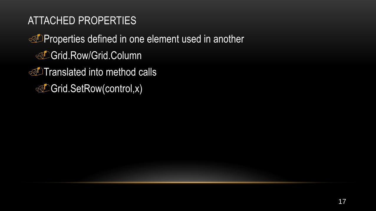
ATTACHED PROPERTIES
Properties defined in one element used in another
Grid.Row/Grid.Column
Translated into method calls
Grid.SetRow(control,x)
17

LAYOUT PROCESS
Measure and Arrange
Containers check (in order):
Minimum Size
Maximum Size
The content
Size of the container (clipping if necessary)
Alignment

LAYOUT CONTAINERS
Standard
Grid - most commonly used (default Window Panel)
StackPanel, WrapPanel, DockPanel - used for UI Tweaks
Canvas - absolute positioning (think WinForms)
InkCanvas - Supports Digital Ink
Specialized
UniformGrid, TabPanel, ToolBarPanel, ToolBarOverflowPanel
19

GRID
Most powerful and versatile layout
Default layout panel when you add a new windows
Carves up the window into sections for other layout containers
Convention is to place one element in each cell
Can be split with the GridSplitter

GRID ROWS AND COLUMNS
<Grid UseLayoutRounding-"True"><Grid.RowDefinitions>
<RowDefinition Height="100" /><RowDefinition Height="*" /><RowDefinition Height="Auto" />
</Grid.RowDefinitions><Grid.ColumnDefinitions>
<ColumnDefinition Width="Auto" /><ColumnDefinition Width="*" /><ColumnDefinition Width="Auto" />
</Grid.ColumnDefinitions><Label Grid.Row="0" Grid.Column="0">
Home:</Label><TextBox Grid.Column="1" Margin="3,0
Grid.ColumnSpan="3" /></Grid>
Three ways to size
Proportional
Automatic
Absolute
Can span rows and columns
Use Layout Rounding

Layouts
22

STYLES

XAML STYLES
Conceptually the same as CSS styles
Enables applying design choices consistently throughout the app or page
Work on all visual Elements’ dependency properties
Can be defined at the Control, Page, or Application level
Support triggers

STYLE ELEMENTS
Setters
Collection of Setter or EventSetter objects that set dependency property
values or event handlers
Triggers - allow changing styles based on an external value
Resources – items to be used with the style
BasedOn - derives from another style
TargetType - if set, the style is automatically applied to the type specified.

STYLE EXAMPLES
<Style x:Key="BigFontButtonStyle">
<Setter Property="Control.FontFamily" Value="Times New Roman" />
<Setter Property="Control.FontSize" Value="18" />
<Setter Property="Control.FontWeight" Value="Bold" />
</Style>
<Style x:Key="BiggerFontButtonStyle“ BasedOn=“{StaticResource BigFontButtonStyle}" >
<Setter Property="Button.FontSize" Value=“26" />
</Style>
<Style x:Key="BigFontButtonStyle" TargetType="Button">
<Setter Property="FontFamily" Value="Times New Roman" />
<Setter Property="FontSize" Value="18" />
<Setter Property="FontWeight" Value="Bold" />
</Style>

TRIGGERS

TRIGGERS
Allow for declaratively handling style changes based on dependency
property values
Dependency Property Triggers
Trigger/Multi-Trigger
Binding Triggers
Data Trigger
Multi-Data Trigger
Event Triggers - Animations

TRIGGERS IN ACTION<Style x:Key="BigFontButton"><Style.Setters>... </Style.Setters><Style.Triggers><Trigger Property="Control.IsFocused" Value="True"><Setter Property="Control.Foreground"Value="DarkRed" /></Trigger><Trigger Property="Control.IsMouseOver"Value="True"><Setter Property="Control.Foreground"Value="LightYellow" /><Setter Property="Control.FontWeight" Value="Bold"/></Trigger><Trigger Property="Button.IsPressed" Value="True"><Setter Property="Control.Foreground" Value="Red"/></Trigger></Style.Triggers></Style>
Triggers wait for the condition to
be true
Apply the correct value
When condition is false
Resets the value
Last Trigger wins
In XAML order

MULTI-TRIGGERS<Style x:Key="BigFontButton"><Style.Setters>... </Style.Setters><Style.Triggers><MultiTrigger><MultiTrigger.Conditions><ConditionProperty="Control.IsFocused"Value="True">
<Condition Property="Control.IsMouseOver"Value="True">
</MultiTrigger.Conditions><MultiTrigger.Setters><Setter Property="Control.Foreground"Value="DarkRed" />
</MultiTrigger.Setters></MultiTrigger>
</Style.Triggers></Style>
All conditions must be met
before the trigger will call the
setters
Since all must be true, XAML
order doesn’t matter

EVENT TRIGGERS<Style x:Key="BigFontButtonStyle">...<Style.Triggers><EventTriggerRoutedEvent="Mouse.MouseEnter"><EventTrigger.Actions><BeginStoryboard><Storyboard><DoubleAnimation ... />
</Storyboard></BeginStoryboard>
</EventTrigger.Actions></EventTrigger><EventTriggerRoutedEvent="Mouse.MouseLeave">...
</EventTrigger</Style.Triggers>
</Style>
Launch an animation based on
an event
Event Triggers need to be
reversed
Triggers can fire EventTriggers
Useful for launching
animations
Styles and Triggers
32

COMMANDS
33

COMMANDS
Enable clean reuse of code
Leverages enabled state of control(s) into commands through CanExecute
Modern use of commands (read MVVM) use Command and
CommandParameter properties of commandable controls
34

Commands
35

CUSTOM DICTIONARIES
36

CUSTOM DICTIONARIES
Enable by setting SpellCheck.IsEnabled=“True”
Text File (<name>.lex) for custom words
Add as a resource, assign to the CustomDictionaries collection, copy to
output directory
OS now adds additional support
Autocorrect (.acl), added words (.dic), and excluded words (.exc)
Place files in %AppData%\Microsoft\Spelling\<language tag>
37

Custom Dictionaries
38

BEHAVIORS
39

BEHAVIORS
Introduced in Expression Blend v3
Encapsulate functionality into reusable components
Drag & Drop
Pan and Zoom
Input Validation
Watermark Text
InvokeCommand
Additional Behaviors are available from the Expression Gallery
http://msdn.microsoft.com/en-us/expression/jj873995

Behaviors
41

BINDING
42

ELEMENT BINDING
Allows for powerful UI constructs all defined in XAML
Can bind elements value directly to another element
No more coding “onChanged” events!
43

DATA BINDING
Supports
IDataErrorInfo
INotifyPropertyChanged
INotifyCollectionChanged
Can bind to *any* Dependency Property
Choice of
Datasets
Data Objects
44

Data Binding
45

Questions?

www.sds-consulting.com
www.skimedic.com/blog
www.twitter.com/skimedic
www.hallwayconversations.com
www.about.me/skimedic
Contact Me